
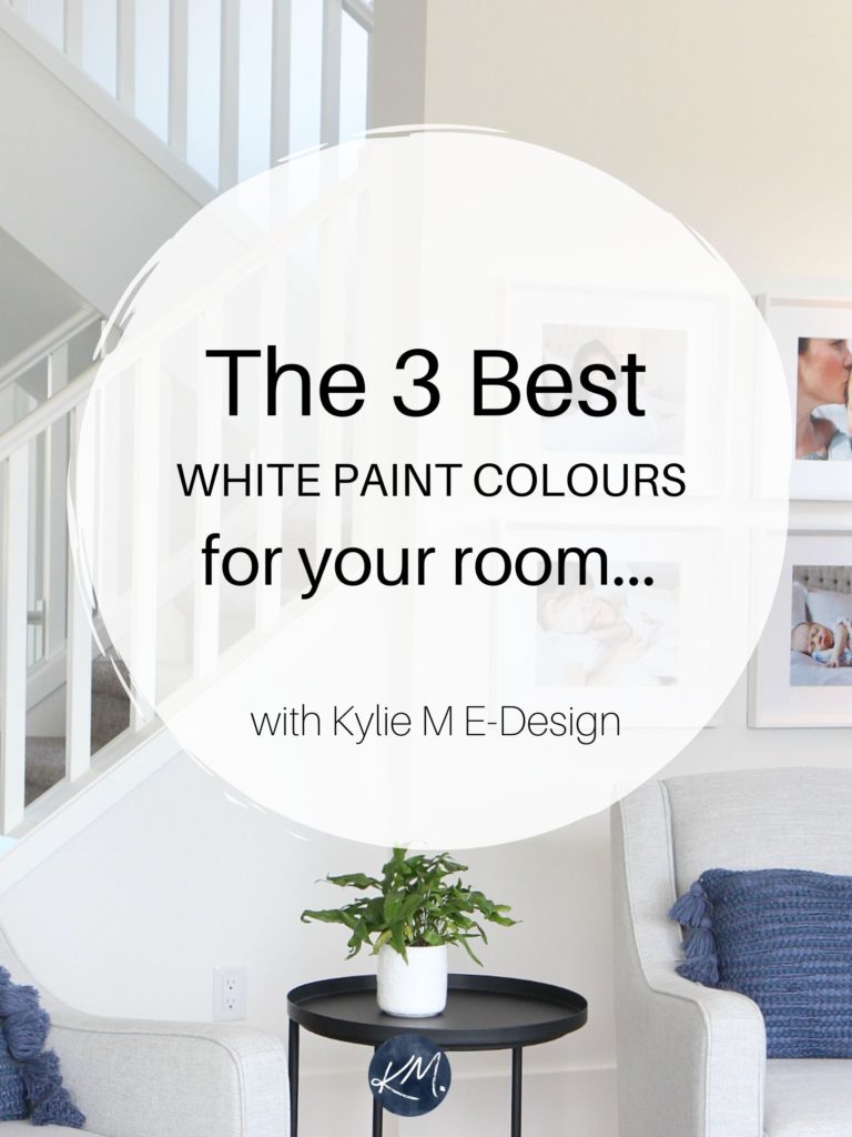
The 7 Best Benjamin Moore White Paint Colors
WALLS, CABINETS, TRIMS: THESE POPULAR WHITES HAVE YOU COVERED
If you’ve been looking for that perfect white paint color for your walls, trims, or kitchen cabinets, you know that white is a force to be reckoned with. If you’re not at that point yet, once you have 20 different shades of white slapped on your walls, are elbow-deep in a wine bottle, and are ready to toss said bottle at the wall, I’m sure you’ll jump on board the crazy train.
But don’t worry, I’m here to de-mystify whites for you. That doesn’t mean you’ll know exactly which white is best for your room and its particular needs, but it’ll help you figure out which whites you DON’T want.

To get this party started, let’s take a quick look at the steps to choosing your best white paint color…
- Determine which temperature of white best suits your space (warm, cool, or true). If you’re unsure, read this (later): The 5 Types of White Paint Colors.
- Decide whether you need a true, bright white, or soft white (based on LRV).
- Decide which undertone suits your home and its finishes.
- Find 3-4 whites that satisfy the above needs, compare them, and then choose your favorite!
And if all else fails, you know where to find me.
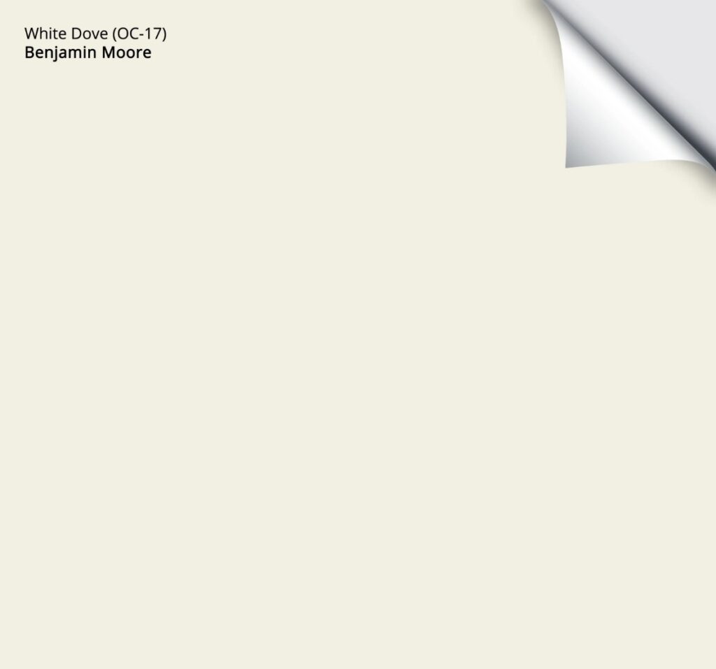
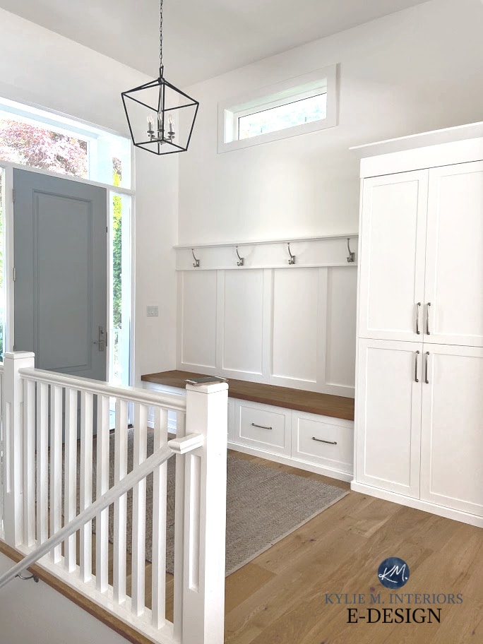
1. BENJAMIN MOORE WHITE DOVE OC-17
White Dove is a soft, warm white paint color. It has a warm creamy yellow undertone that’s WELL-grounded with a neutral gray base to calm it down. While some don’t love White Dove’s subtle warmth, compared to legit warm whites, it’s pretty darn passive.
White Dove is my favorite Benjamin Moore White Paint Color.

White Dove is one of the most versatile shades of white, accommodating a buttload of interior finishes and varying paint colors. It doesn’t come off as creamy and warm as Cloud White (below), but also isn’t as clean as Chantilly Lace (below).
With its LRV of 83.16, White Dove is a soft white, so it won’t act like white, but a softer, warmer version of it.

BEST ROOMS FOR WHITE DOVE
- No matter what the exposure of your room is, White Dove is a great option, knowing that it’ll look a bit warmer in southern light and flatter in northern light (as will any warm white).
- It’s a great starting place for rooms with cream, beige, or tan finishes (meaning you probably wouldn’t want a cooler white than this).
- If White Dove isn’t warm enough for you, you might want a creamy warm white or off-white.
WHERE NOT TO USE WHITE DOVE
Here are some situations where White Dove (along with many of the other warm whites on this page) might not look as white as you’d like…
- White Dove is usually too creamy-warm for the average big-box store white subway tile backsplash.
- If you have white kitchen appliances or GE Cafe White, White Dove will look creamy in comparison.
- If you have builder’s white on your trims and doors, White Dove’s warmth will pop against this.
- If your kitchen cabinets are factory, stock, or manufacturer’s white, make sure they have the same type of warmth as White Dove. Sometimes they can be too white and bright.
Here’s your Peel & Stick sample of White Dove…
Benjamin Moore White Dove: IMAGES, Info, & More
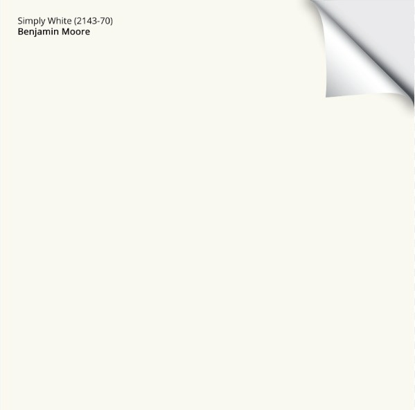
2. BENJAMIN MOORE SIMPLY WHITE OC-117
Simply White is a bright (but not true), warm white paint color with a yellow undertone. Unlike myself, this undertone can be subtle at times, acting more like a true white. On the other hand, partner it with a cool shade of white or even a true white, and it can show up at the party with yellow on (and not much else – also like myself).
With its slightly higher LRV of 89.52, Simply White offers a great, fresh, and warm approach to white. Its yellow undertone is noticeable, but isn’t always obnoxious – adding a touch of life, without too much ‘color’.
Simply White is a popular choice for trims and kitchen cabinets if you want a bright, but not stark-white look. Just be careful, as its yellow hue can pop up. This means that Simply White can act like white (in the absence of a ‘real’ white), but watch out for its warmth if you aren’t a fan of yellow-whites.
Here’s Simply White and a few other popular shades of white that I’ve covered in this blog post…

LEFT TO RIGHT: BM Cloud White | BM Simply White | BM Chantilly Lace | BM Atrium White | BM White Dove
THE BEST ROOMS FOR SIMPLY WHITE
- If you’re looking for a brighter white, not a soft white, and have northern light, it can be a fabulous choice, offering some balance to cool northern exposure.
- Simply White can add energy to flat east-facing afternoon light or west-facing morning light.
- Simply White does its best work when it’s the only white paint color in the room (whether you have it on one surface or 3+).
- It can be pretty with some light shades of blue, green paint colors, and even some purples. Make sure these aren’t TRUE colors and have a bit (or more) of gray in them. Whereas a color like White Dove offers a slightly softer white contrast, Simply White has a bit more energy.
WHERE TO AVOID USING SIMPLY WHITE
- It’s okay with grays with those undertones, but not always great with more crisp, clean, cool colors – UNLESS you love the play of that warm/cool contrast.
- I’m a bit hesitant in south-facing rooms as the warmth of the southern light can really jack up the yellow in Simply White.
Here’s your Peel & Stick sample of Simply White…
Benjamin Moore Simply White: IMAGES, Info, & More
3. BENJAMIN MOORE SUPER WHITE OC-152
Super White is a very subtly cool white. But even with this slightly cool vibe, the overall look is simple, clean, and great for modern spaces. Or if you’re Elsa – I hear she’s a big fan.
Above, BM Super White. Below, BM White OC-151

Super White has an LRV of 87.36, meaning it’s in between soft and bright (but leaning a bit more on the bright side).
Colors like this often look the most like a ‘true shade of white’, even though their slightly lower LRVs suggest otherwise!
THE BEST ROOMS FOR SUPER WHITE
- If you have a room with south-facing light, Super White is a great way to balance the warm light without tipping TOO yellow (as it will pick up some of the sun’s warmth).
- Rooms with warm western afternoon sunshine also suit the slightly cool approach of Super White, just make sure you like how it looks in the morning hours too!
WHERE NOT TO USE SUPER WHITE
- With any surface or finish even REMOTELY related to a warm Tuscan style. You’ll find these finishes most often in homes built in the early 2000s.
- Super White is usually too cool/bright for the most popular white quartz countertops.
- The average homeowner that I work with finds Super White a touch too cold/stark, as their homes usually cater to a softer or warmer look.
FULL Paint Colour Review of Benjamin Moore Super White
4. BENJAMIN MOORE CHANTILLY LACE OC-65
Chantilly Lace is a lovely white that’s one of the WHITEST white paint colors (it’s BM’s best approach to ‘true white’). It has no noticeable undertone, although it has a wee willy wink of warmth tucked deep inside. This means it’s SUPER susceptible to responding to the colors in its environment.
Chantilly Lace is my favorite BRIGHT Benjamin Moore white paint color.

Chantilly Lace is a simple, clean choice if you’re looking to use white. While it can be a tit bit nipply for a cold, north-facing room, it can be pure magic in a south-facing room. It’s often referred to as the best ‘whitest white’ paint color, even though it’s not a true white (thanks to its LRV of 90.04).
THE BEST ROOMS FOR CHANTILLY LACE
- Rooms where you want a fresh white paint colour that acts like white without being icy cold (although it could look this way in cold northern exposure).
- Chantilly Lace is an awesome choice for a ‘whole home’ trim, ceiling, and door paint color.
- It’s flexible with a wide range of paint colors.
- Its coverage isn’t great (common with whites). Make sure you prime first and ask the paint store to top off your gallon with Titanium White to help it cover a bit better.
WHEN TO AVOID CHANTILLY LACE
- If you’re looking for a soft, warm white, this isn’t it, unless you view it in the late afternoon in western sunshine.
Click HERE or on the above image to see your available packages!
5. BENJAMIN MOORE DECORATORS WHITE
Decorator’s White is a popular white paint colour with its subtle undertones of gray and purple, making it a COOL, soft white paint colour.
Decorators White might look like a pretty ‘white-white’ until you compare it to a true or warm white.
For this reason, I’d use Decorator’s White on my walls with a true white trim, but I’d NEVER use it on my trims and cabinets. But that’s me – you do you, boo.

THE BEST ROOMS FOR DECORATORS WHITE
- When you want a subtle, cool, but not overly STARK vibe.
- If you have finishes that crave a slight gray-purple hue without a ton of depth.
- Many grays with purple undertones, such as Decorator’s White.
WHEN TO AVOID DECORATORS WHITE
Again, with its undertones and lower LRV, I wouldn’t recommend Decorators White for cabinets, trims, and doors unless you always want to live in the cooler end of things (specifically, purple).
Benjamin Moore Decorator’s White: IMAGES, Info, & More
Can I Paint My North-Facing Room White?
Get my Kylie M. Curated White Color Bundle for Peel & Stick sampling!

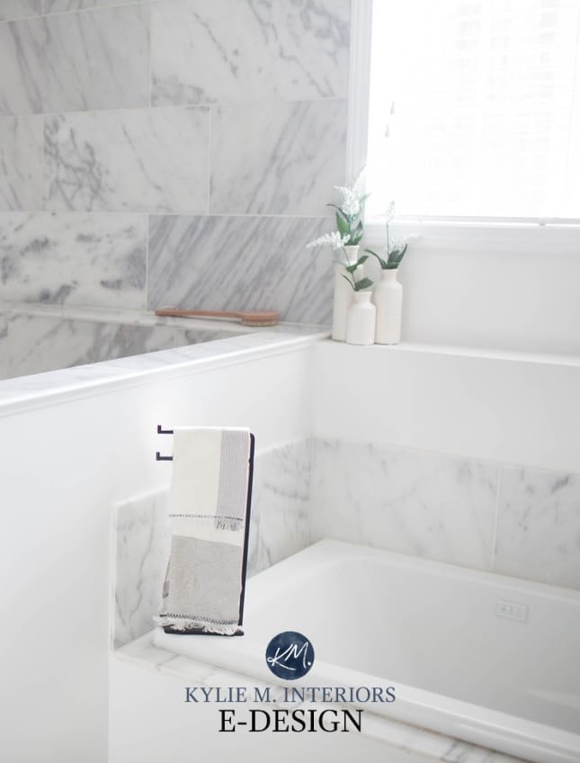
6. BENJAMIN MOORE CLOUD WHITE OC-130
Cloud White is one of Benjamin Moore’s best, most timeless warm white paint colors. With its soft cream (yellow) undertone, Cloud White offers warmth without being ‘overly colourful’, as its neutral base calms it down.
Keep in mind that Cloud White won’t always act like white, thanks to its degree of warmth and LRV of 85.05, making it a SOFT white. However, for those wanting a soft, gentle shade of white, it can be the perfect choice.
Cloud White on the left, compared to the slightly softer White Dove in the middle
The 7 Best White Trim (& Cabinet) Paint Colors
Cloud White is my favorite CREAMY Benjamin Moore White Paint Color.
In this next photo, compare the Cloud White walls to the white trim around the door. This is a great way to see the creamy warmth in Cloud White compared to a more standard shade of white…
The Best Green Paint Colors for Cabinets
THE BEST ROOMS FOR CLOUD WHITE
- When you want a relatively versatile white that works well with earth tones, like light-medium depth greiges and varying shades of tans. It’s also an interesting partner to some cool colors, like blue paint colors and shades of green, as long as they have some gray to calm them.
- North-facing rooms and those with a flat, dull light do well with soft, warm whites like this.
- Cloud White often suits homes built in the 1990s and the early 2000s.
WHEN TO AVOID CLOUD WHITE
- If you don’t love warm whites.
- If you want a legit white look.
- Cloud White is too warm for many of the best white quartz countertops, even some of the warm ones.
- If you’re trying to go with white kitchen appliances or GE Cafe White, Cloud White will look super creamy in comparison.
Here’s your Peel & Stick sample of Cloud White…
Benjamin Moore Cloud White: IMAGES, Info, & More
7. BENJAMIN MOORE SWISS COFFEE OC-45
Swiss Coffee is a popular white paint colour, due in part to Studio McGee using it in their own home, but this doesn’t mean it’s best for YOURS.
Since I don’t recommend Swiss Coffee very often, I have only a few photos of it. I do have this one of it on the trim in this living room with Sherwin Williams Accessible Beige walls…

Swiss Coffee is very comparable to White Dove, not just in LRV, but in a general approach.
However, the difference between the two is that Swiss Coffee is slightly more likely to pick up a vague hint of green. For this reason, I’m way more likely to recommend White Dove to my Online Color Consulting clients.
This said, you might not ever even SEE any green. It’s only in comparison to White Dove that it’s my second choice of the two.

As for depth, Swiss Coffee has an LRV of 81.91, making it slightly darker and denser than White Dove. This puts it between the soft white range and the wild world of warm, OFF-WHITE paint colors.
THE BEST ROOMS FOR SWISS COFFEE
- Swiss Coffee’s passive warmth makes it a great choice for any exposure, knowing it can look that bit warmer in southern light.
- If your finishes have a green undertone, they might love Swiss Coffee.
WHERE NOT TO USE SWISS COFFEE
- I would be less inclined to pair Swiss Coffee with finishes that have a pink or taupe undertone, as I would worry about the undertones clashing a bit.
- If I have a choice, I’ll choose White Dove over Swiss Coffee EVERY TIME – I find it more predictable.
PEOPLE ALSO ASK
If your question isn’t covered here, please leave a comment – I do my best to answer as many as I can!
WHAT’S BENJAMIN MOORE’S MOST POPULAR WHITE PAINT COLOR?
Benjamin Moore White Dove is their best and most popular shade of white for walls, cabinets, trim, or exteriors.

White Dove is on the walls, Chantilly Lace is on the cabinets.
Coming a close second is Benjamin Moore Swiss Coffee, followed by Chantilly Lace
This is according to Samplize Peel & Stick – between them and me, we’re likely the two largest referrers (worldwide) to BM).
WHICH BENJAMIN MOORE WHITE IS BEST FOR TRIMS & CABINETS
While it greatly depends on the needs of your interior finishes, Benjamin Moore’s Chantilly Lace and White Dove are the most popular colors for trims and cabinets.
Here’s Chantilly Lace looking crisp and clean in a traditional kitchen…

Here’s White Dove offering a bit more softness and warmth…

Ideas to Update Your 2000s Kitchen | Ideas to Update Your 1990s Kitchen
WHICH BENJAMIN MOORE WHITES ARE RISKY?
Just because they’re pretty doesn’t mean they’re versatile or suitable for the average interior finishes. Here are the whites I rarely suggest in my Online Color Consulting (for various reasons)…
- If it has ‘white’ in the name but has an LRV lower than 82, I wouldn’t use it, as it’s not a white, it’s an OFF-WHITE PAINT COLOR.
- Benjamin Moore Atrium White and Benjamin Moore Alabaster, as they both have pink undertones. BM Alabaster often gets confused with Sherwin Williams Alabaster, which is an awesome, soft, warm white paint color.
- Benjamin Moore Glacier White. Its LRV is a bit too low, and its undertones are murky.
- While it has a great LRV, Benjamin Moore Mayonnaise has too much yellow for the average home. Maybe for walls (with clean white trim), but not cabinets or trims.
READ MORE
The 7 Best White Trim Paint Colors
The Ultimate Guide to White Paint Colours
The 4 Best Sherwin Williams White Paint Colours
White Kitchen Cabinets: 3 Palettes to Create a Beautiful White Kitchen
Get expert color advice…
Check out my Online Color Consulting Packages – I’d love to help!

Originally written in 2018, awesomely updated in 2025


I notice that know one ever mentions rooms that face east or west. I can find no information on using
paint in these facing rooms. Humor me! Why aren’t they mentioned? And what changes do or don’t happen to paint color in those rooms?
Thanks for enlightening me 🙂
Patty
Hi Patty, you’re right – it isn’t talked about and I DO have a blog post waiting in my drafts about it! The reason is because east and west rooms change DRASTICALLY throughout the day – they are one way in the morn and literally the OPPOSITE in the afternoon – so there is a good degree of unpredictability with them.
I WILL be chatting about it soon though!
~Kylie
Is alabaster nice for sunroom facing north floor porcelain tile off white and beige is a farm furniture off white chimeneas in whir wash bricks I want to look conf and happy?
Hi Griseet! Alabaster is nice and the warmth of it will fall back a bit as the north facing light will gray it out slightly. Hope that helps! If you would like me to look at the room and advise I do have an affordable and fun e-design services! https://www.kylieminteriors.ca/online-decorating-design-services/
Can’t wait for the Sherwin Williams version of this post! I chose Alabaster for my open floor plan trim, doors and kitchen cabinets and I am pairing it with Agreeable Gray!
Yes, it should be a good one! I DO love Alabaster and great idea, pairing it with Agreeable Gray – you’re right on track!
This is great! But where does Ballet White fit in with these?
Hi Nancy! Ballet White is another beautiful, flexible neutral, but it has more weight to it than a typical white – I wouldn’t ever use it on trim or cabinets I’m sure! It’s a great lighter wall option though.
~Kylie
Where does Navajo White fit in here? Or doesn’t it?????
Hi Celia, I LOVE Navajo White, but it’s actually more in the ‘light’ range (on the lighter side of it) rather than the white or off-white. Navajo White does look beautiful with Cloud White trim!
~Kylie
Thanks, Kylie! So, excuse my ignorance but what’s the difference between “light” and “white”? Is a “light” color a less intense version of a particular color? (Sorry if that question doesn’t make sense).
No problem at all! So basically there is white – which is really as ‘light’ as colours can possibly get – they have the LEAST amount of colourant in them so they are the most white. Next there is off-white, white is a white with MORE colourant in it, so it’s a stitch darker. And THEN there’s a light colour, which is where you’d start seeing some decent contrast between ‘white’ trim and ‘light’ walls. Does that make sense? The more colourant that is added the darker a colour gets! Does that help???
Can Navaho white be used for ceiling?
It can be, but personally I’d go for something more muted as Navajo does have some decent colour to it. It really does depend on what you’re pairing it with/ceiling texture/exposure, but generally I might go to something softer like Cloud White.
Love your posts. And you are only a little distance from us in Vancouver 🙂
We are using White Dove for our trim throughout our 2 bedroom apartment.
What do you think of Dove Wing for a wall colour? We have a beautiful gray sofa….
Well hello West Coast Sue! I LOVE White Dove and I LOVE Dove Wing which is just so soft and gentle and won’t fall as cold on our gray days (of which there have been more lately… boooooo).
~Kylie
I have repose gray on my walls now and it looks lilac at night. I’m going to be painting my wood floors in the same room and I have been considering simply white but will it make the lilac worse? The trim color I use is pure white and I have considered that but I think it might be too harsh of a white in a large well lit space.
Hi Jacquelyn! While Simply White is one of the more safe warm whites, it might still be just a wink too warm if you’re finding the undertones of Repose Gray to be a problem. I might go to a more clean white like SW Pure White which does have a wink of warmth, but it’s fractional compared to Simply White 🙂
Thank you so much! I really appreciate the advice and tips on your blog it’s been a real help decorating my first home.
I too am curious about the Sherwin Williams best whites! I am currently painting a bath in Requisite Grey lightened 25%. Looking for a warm , soft white for trim and ceiling which will also be continued throughout our home. Heck! Gotta start somewhere. Thinking about SW White Flour or BM Cloud White. Any thoughts?
Ask and ye shall receive! https://www.kylieminteriors.ca/the-4-best-white-paint-colours-sherwin-williams/ BTW, for what you’re looking for, I think BM Cloud White would be the best choice – and SW doesn’t have one QUITE like it…
I’ve spent hours on your blog over the past week, and finally picked some colors yesterday. I have a north east exposure kitchen with white cabinets, medium oak floors, and lg viatera quartz countertops in the color minuet, bronze hardware and antique gold lighting. I picked colonnade grey by sherwin Williams. In my low-light, north facing, cathedral ceilinged (is that a triple whammy?!), medium oak floored family room I picked sw summer white (to warm things up?). In my northeast exposed master with vanilla carpet I picked collonade gray. In my northern master bath with gray cabinets, (similar to a lightened functional gray best I can tell), dark wood look tile, minuet quartz counters, antique gold lighting and bronze hardware, I picked summer white. The kids bath with white tile, same gray cabinets, and a small western window, I picked BM iceberg, which I also put in the eastern laundry and southern powder. Dark hallways and foyer into family room are summer white. So, so far my palette is collonade grey, summer white and iceberg. I’m a little stuck in my kids bedrooms. My 1 year old daughter’s room has a single, somewhat blocked western window. I wanted to do a vintage creamy white and warm pale pink and gold color scheme and I picked sw Zurich white as he backdrop. But after reading your western post, I’m rethinking that? Also, for my son’s well lit southern room (seems he has the best lighting in the house!) I was also considering Zurich white to go with a rustic navy checkered bed with pops of red and yellow. But I’m wondering if the Zurich white is right for these rooms? Would a light blue be better in my son’s room? And what do you think of the other selections? Thank you!!
Hi Alexis, thank you for the note! When it comes to detailed questions/comments like yours I Just HAVE to refer to my e-design. I get so many questions in a day via my blog/email that it’s the only way I can spend the proper time with a comment like yours which is so detailed! It is affordable and fun if you’d like to check it out! https://www.kylieminteriors.ca/online-decorating-design-services/ I try to give as much free advice as I can via my blog and then if that doesn’t work, it might be e-design time!
~Kylie
What are your favorite Sherwin Williams whites?
Thanks for the reminder April, I will be doing a blog post on this. My all-time fave though is SW Pure White….
I have a 70s house that needs serious upgrades. Picture a corner humongous brown rock fireplace, poor lighting, in an east facing room. OH my! I plan to paint the fireplace and woodwork white , and the walls a shade darker or lighter than them. Help, please! What colors would brighten up this dark cave of a room?
Hi Susan, sounds like your room is in for a BIG change! Now when it comes to questions that are personal, I DO refer to my E-design. This way I can look at the room/flooring/furnishings/size/natural lighting and of COURSE your personal tastes, so that I can come up with some options that work – otherwise I’m just guessing~!~ It is fun and affordable and I do hope you’ll give it a try! https://www.kylieminteriors.ca/online-decorating-design-services/
~Kylie
Is there a white that is just like Simply White but is a little less yellow? I love Simply White, but in my new space, it comes across as a quite golden yellow. I still want the warmth because it’s a very bright North-facing set of windows—just turn down the yellow a bit.
I think the trim is not helping as well because it’s standard white; I don’t want to use a Simply White trim since I’m taking it throughout the house (prefer a more stark white throughout).
Thanks for your very knowledgeable posts on Whites! It helps to get an idea of what’s going on.
Hmmm, you know, I was just chatting with the gal at SW the other day (not BM, but I actually then got the same info from them to confirm) that you can take a colour like Simply White and have them add 4 ounces of white to it. This doesn’t CHANGE a lot, it just cuts it back slightly. If that doesn’t work, i might look at SW Pure White which has only a FRACTIONAL amount of warmth, that being said, with north facing exposure, I don’t know if it’ll be enough warmth to hit your happy place…
Anyway, I hope that info helps!
~Kylie
Hi Kylie, I am having to pick a white for some custom cabinets in the living room. My walls are in Stonington Gray and all trim is in Chantilly lace. We have plenty of windows and are north facing. I am wondering if I should stick to Chantilly lace for the the cabinets or would it be OK to pick another white like Oxford or Simply White.
Please reply soon! 🙂
Thanks
Alifiya
Hi Alifiya! Without seeing photos and knowing what I know, I would lean toward Chantilly Lace for consistency!
Hello Kylie,
I just painted my rooms Chantilly Lace and hate the blue tone that it gives off. I want to repaint but am not sure what to pick. I want the walls to be warmer but still white. It is an east facing room with a lot of brown and beige furniture. The carpet is mocha and my paintings are all old antique wood cuts that have yellowed with age and now with the Chantilly Lace look old and dirty. Do I simply choose the BM AURA white base with no color or the Super White? I want the room to feel warm but white.
Hmmm, east facing rooms are tricky as the light does change a bit more from morning to afternoon, more so than north or south. In general, I would treat it a bit more like a north facing room as it won’t have any obvious warm sun rays coming in – slightly in the morning, but not much. Try BM Simply White, it’s probably your best bet to get a warm white. There’s SW Pure White which is a WHITE with fractional warmth, but I don’t know that it would have enough to support your exposure. I hope that helps!
~Kylie
Thanks Kylie,
I am definitely leaning towards BM Simply White but worry it will look greenish or too yellow? I do not have a Sherwin Williams store close to me, so would like to stick with Benjamin Moore. May try asking to add the 4 oz of white as you stated earlier on.
Joanna
Does BM seapearl have warm or cool undertones? Looking to paint cabinets in new kitchen a colour that will coordinate with Dulux wall colour “wood smoke”.
Hi Janie, Seapearl does have a slightly warm look vs a cool one…
Thanks a lot for your response, Kylie!
Before I saw your note, I went ahead and tried to lighten Simply White by 25% at a BM store, just to try that out. It seems like it might be a good bet based on the board that I’ve painted it on. I haven’t been able to really tell much a difference when it was painted on top of a coat of regular Simply White though, but between the boards, there seems to be a good amount of change.
I think this is similar to what you suggested, but when they lighten it, they change the actual formula (vs adding white to it)? Is it 4 oz. of white (BM’s standard white, PM-2) for a gallon? I’ve been playing with the idea of trying to lighten it by 50% as well.
The trim will be Super White, which so far looks nice paired with the lightened version of Simply White. I’m still debating the ceiling; I’m considering Super White or Chantilly Lace. I’m leaning toward Chantilly Lace since it’s known for being BM’s brightest white, but a little worried about how cold both of them might look since ceilings seem to darken any color, particularly with North-facing light, even if it’s bright.
Appreciate your help! I will also check out SW Pure White to see how that compares. I feel better with your advice that I’m headed in the right direction.
-Jen
Hi Kylie
I can’t tell you how many times I’ve looked at this post the past couple weeks! It’s so helpful! I am in the process of rebuilding after Harvey and want to paint the entire first floor white. I am torn between chamtilly lace and simply white. I like Chantilly Lace for the kitchen because we are using a marble looking quartz and subway tile, but it has an opening to the living room, which features an entire wall of two story north facing windows. I’m concerned if I choose Chantilly Lace for the kitchen and simply white everywhere else it will look dingy and vice versa. How do the two paints compliment each other from room to room?
Thank you!!
-Stephanie
Hi Stephanie, thank you for the note! I don’t know, it can totally depend on the exposure in each space, not just the north facing space. I do love Simply White for a north facing room and I don’t find that it makes Chantilly Lace look terribly dingy. You can mix whites, it’s a matter of choosing the right one for each exposure as well as the products in the room (and personal tastes of course 🙂 YOu might find that the north facing light subdued Simply White QUITE nicely!
~Kylie
Hi Kylie – OMG – Great, great article on whites. Thank you so much! I was losing my mind until I read this. Now I feel like I have some sense of direction. You are the best!
I have southern facing NYC apt and have chosen BM Barren Plain for the walls. Was debating between Chantilly Lace, Simpy White, Oxford White and Decorators White for the trim, ceiling and ceiling beam. Id like a “modern” look with a nice contrast between the Barren Plain and the white. Any suggestions between those three? (Im worried that Chatilly or Decorators would be a bad choice since Barren Plain is warm but then again not really sure on whether a warm color pairs best with warm whites or cooler whites).
Hi Raj – thank you! It all depends on the look you’re going for and you’re right, Barren Plain is a bit softer. I might lena a bit more toward Oxford White as the warmth in Simply White might be a touch too yellow for Barren Plain… 🙂
Great posts! My name is Eric from Montreal. My wife and I are looking at pain colors. built 1910 flat…great light in the front of the apartment as it is south facing and a bit darker towards the back of the apartment…high ceilings…beautiful original moldings and trim….what do you think about Simply White OC-117 for the walls and Chantilly Lace OC-65 for the trim and ceilings? We have a few other rooms to paint also (the ones I just mentioned where for the dining room, living room and foyer which are partial open concept so we might check out your design services for a package. What do you think of that original color combo though?
Hi Eric! Off the top of my head it makes me a bit nervous. I am hesitant to advise on homes when I haven’t seen photos, but Simply White is a warm, yellow base white and Chantilly Lace acts like white, but is a stitch cool, I wouldn’t say they are the BEST partnership. I might look at the simplicity of Super White even…
Which white would you recommend for cabinets with agreeable gray walls?
Thank you!
Cherie
Hi Cherie! With Agreeable Gray it depends on whether you want a more clean look or a softer look. A softer look would be Alabaster, a cleaner one would be High Reflective White. I kind of like the look of SW Pure White though. It ‘acts like white’ but has a tiny wink of yellow in it – like weeee tiny.
Kylee pure white has a wink of yellow ?
I had heard it has a wink of gray in it but not yellow before never knew that
Hi Kylie! Love all your advice, thank you so much! Is there a SW version of White Dove? My shutters are BM White Dove. I am having every inch of my trim painted and want to match, but need to go with SW.
Thanks so much!,
clair
Hi Clair! Well, you can ask SW to colour match it for you, they are usually pretty darned good. Short of that, the closest seems to be SW Alabaster, but it IS warmer. You could ask them to add 4 ounces of white, which will clean it up a bit, but I think it will still sit slightly warmer than White Dove…if you were up to playing around, I wonder if adding the 4 ounces of white, along with a wink of gray would calm it down slightly? You could ask the paint technician to help you out!