
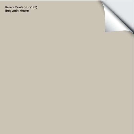
Benjamin Moore Revere Pewter (HC-172): Undertones, LRV, & Real-Home Results
Benjamin Moore Revere Pewter is one of the most popular, and believe it or not, most timeless paint colors – that’s gray, a somewhat timeless gray. But what makes it so popular on interior walls, especially open-concept spaces or whole homes?
Undertones and temperature. While its depth leaves me a little wanting at times (it’s a bit too dark), it has the right bones for a wide range of interior finishes and exposures.
But this doesn’t mean it’s an instant win. While it’s a top choice for many homeowners, it’s a hot mess for others. Let’s find out more to see if this color works for you…
*Updated with fresh content and images for 2026

IS BM REVERE PEWTER GRAY, BEIGE, OR GREIGE?
Revere Pewter is the most popular (proven), warm gray-greige paint color and a timeless choice from Benjamin Moore’s Historical Collection. That’s right – TIMELESS. This isn’t to say it’ll work in every room forever and ever, amen, but you’ll learn why it’s a great choice for so many homes.

As for what Revere Pewter IS, it’s a warm shade of gray that can easily pass for greige, thanks to its temperature. Because of this, consider your room’s exposure and interior lighting (check those Kelvins!). We’ll talk about exposures more shortly.
Is Revere Pewter warm enough to look beige?

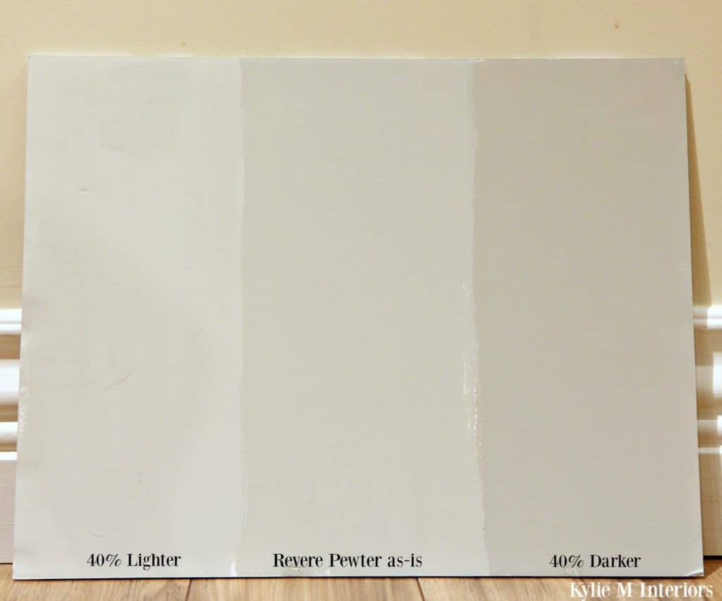
Revere Pewter is lightened by 25%
Again, give it the right (or wrong, depending on the look you’re going for) lighting, and Revere Pewter picks up the most vague beige tone; this is more about your lighting than the color itself. Adjust those Kelvins and compare it to Benjamin Moore Manchester Tan, and your perception should swing back.
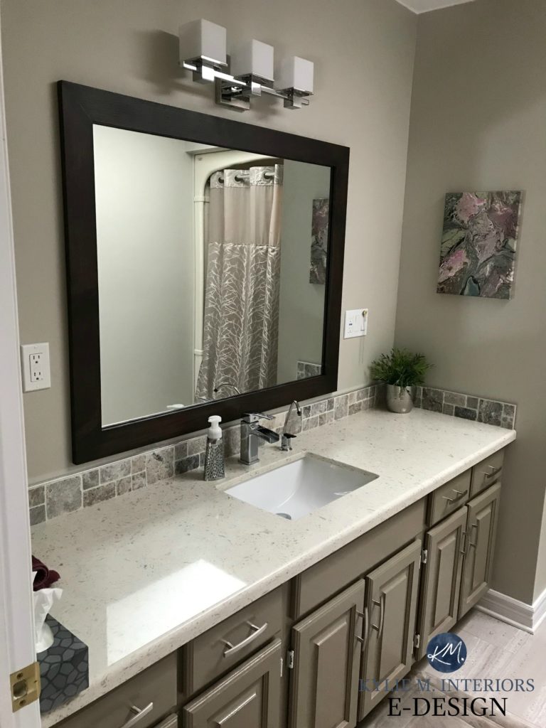
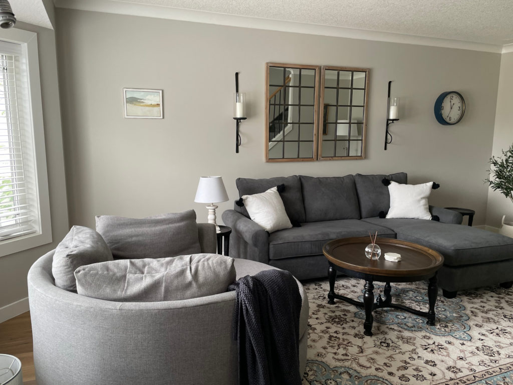
This bathroom below is the warmest I’ve ever seen it look, and this is very atypical…
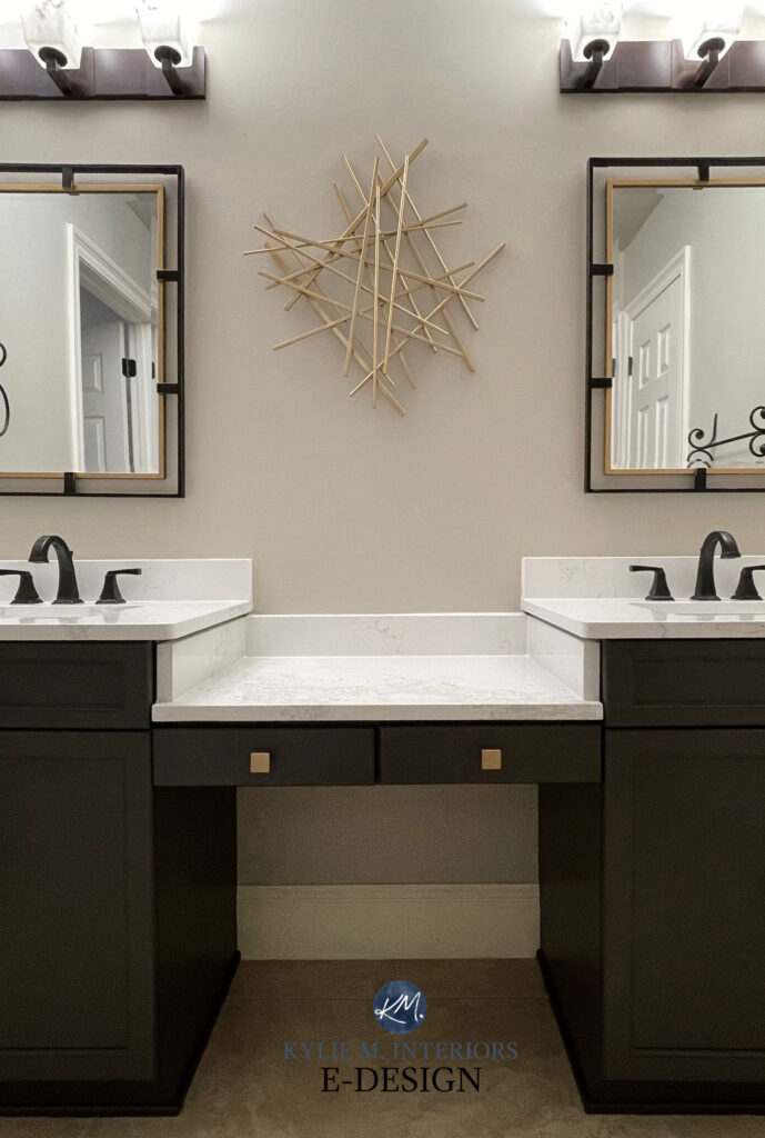
99.5% of the photos in my blog are of REAL HOMES from my Online Color Consulting clients, readers, and friends. While not always magazine-perfect, they’re packed with ideas and proven color choices to help you create a home you’ll love.
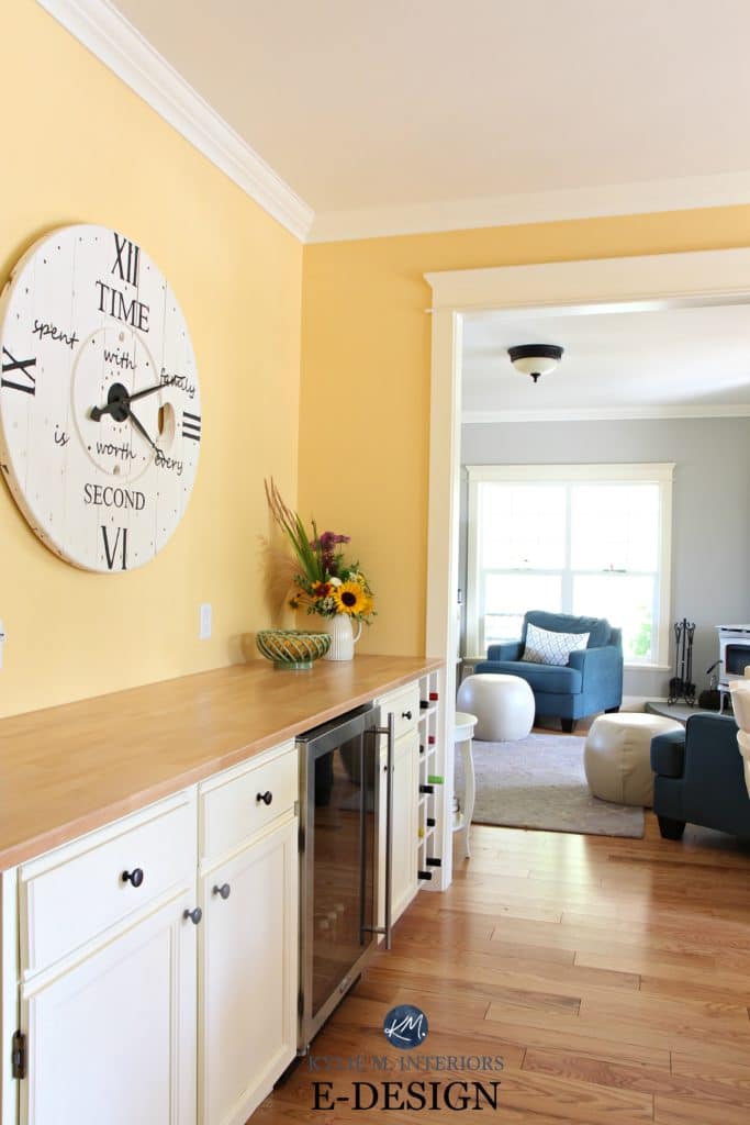
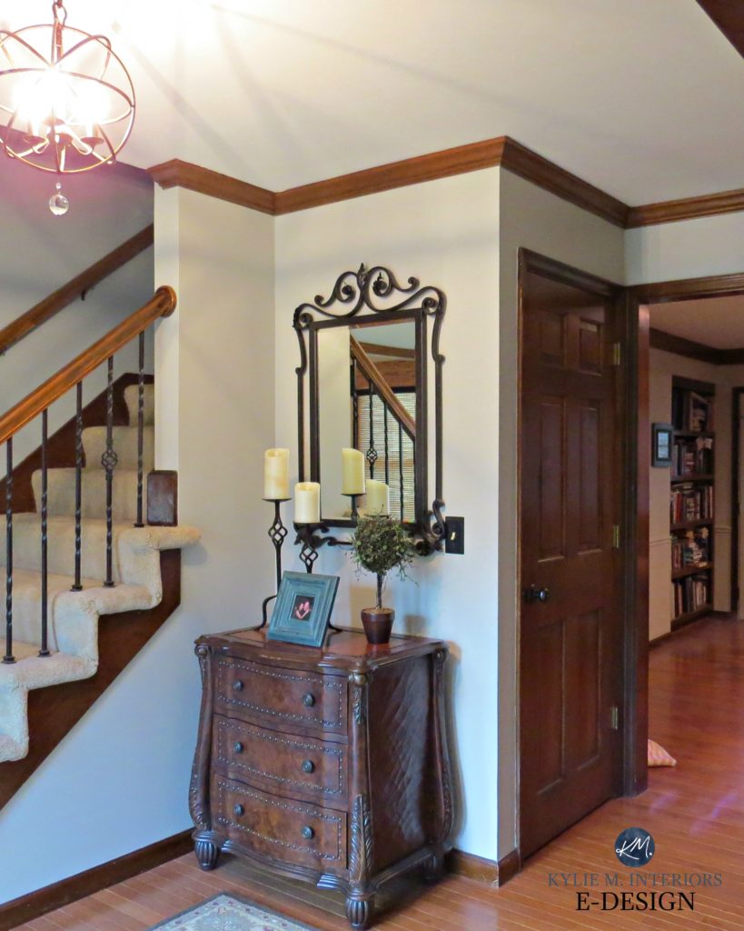
This painted interior door (below) is typically what you can expect from Revere Pewter (with Benjamin Moore White Dove walls and trim)…
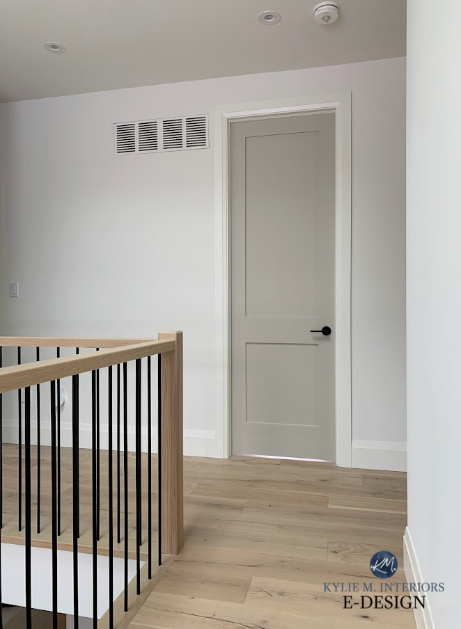
As mentioned above, while Revere Pewter is warm, it shouldn’t look beige on your walls; it’s just significantly warmer than more traditional gray paint colors.
Because of its warmth, some people find Revere Pewter too ‘muddy’ and not fresh enough when looking for a fresh, clean gray palette.
For others, it’s the perfect, soft shade for their cabinets, walls, doors, OR exterior.
LRV & DEPTH OF REVERE PEWTER
Benjamin Moore Revere Pewter is on the border of light and light-medium. According to Benjamin Moore, it’s LRV of 55.05. This means it’s not super weighted like the mid-range, but it has more depth than traditional light-depth gray paint colors and goes beyond my preferred LRV range (but it’s easily forgiven for that).

Revere Pewter looks slightly darker than expected, particularly in low-light rooms, whether due to insufficient interior lighting or small/no windows. This is because, while its LRV isn’t super low, it doesn’t reflect as much light as lighter, similar shades of gray (which we’ll look at shortly).
Not sure what LRV is? It’s VERY important (read about it HERE).
The Ultimate Guide to Choosing a Paint Color with LRV
UNDERTONES & TEMPERATURE OF REVERE PEWTER
Revere Pewter HC-172 (also known as Benjamin Moore Ice Formations 973) is a very sneaky gray-greige (as many are). It loves to shift its appearance depending on the surrounding conditions. So, while it mostly favors a mild, warm green undertone, it can sneak into the other cool gray undertones with the right encouragement from natural or interior lighting.
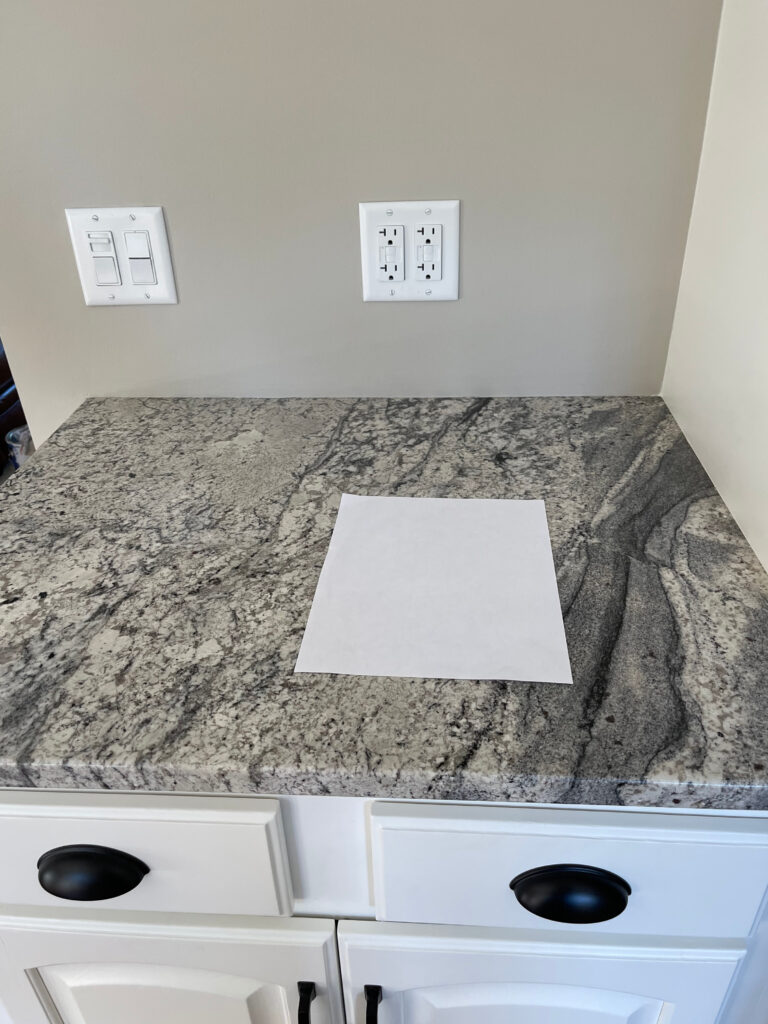
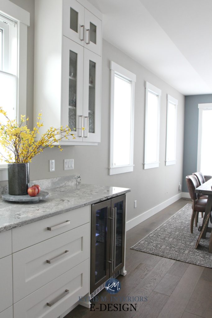
Notice how well Revere Pewter complements and updates this granite countertop.
If you aren’t really sure what undertones are, it’s a term that helps describe how a color may lean. Keep in mind that this will change in different lighting conditions.
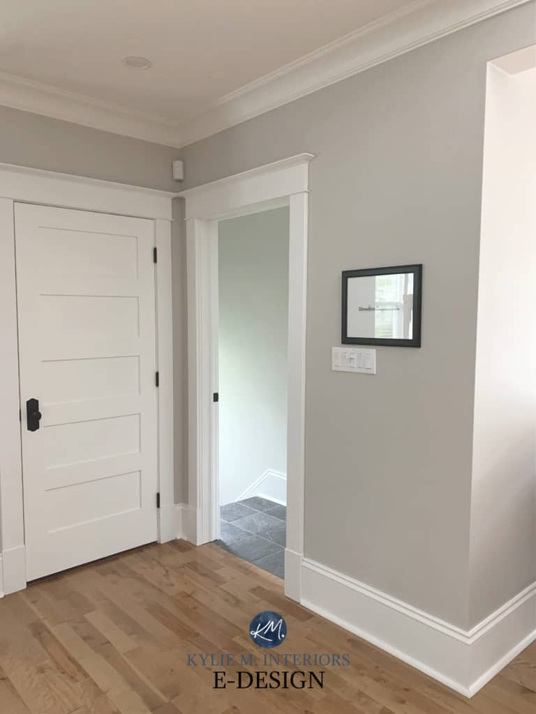
Regarding those sneaky undertones, true to its name, Revere Pewter occasionally picks up pewter hues – also known as blue undertones – much like Benjamin Moore’s Stonington Gray. Each time the blue pops up, it seems to be in rooms with multiple exposures and cream trim/cabinets.
Seems impossible? Well, believe it, sister, as it shows up pretty darn blue in this next photo…
However, this is the exception, not the rule, as Revere Pewter almost always caters to a warm green hue.
Also, order samples and move them around your room before committing to a particular color full-time.
Here’s your Peel & Stick sample of Revere Pewter…
The above information might make you feel uncertain. So, I’ll break it down into percentages for you. In my experience with Revere Pewter and its undertones (which is pretty darn extensive via my local work and Online Color Consulting), here’s what I’ve seen (approximately)…
- 5% of the time: Subtle blue hue
- 10% of the time: Slightly purple or taupe undertone
- 85% of the time: Slightly muddy, soft, green-tinged, somewhat warm gray, or just a soft neutral gray with little to no visible undertone.
Of course, all of that’s open to interpretation and subject to change with lighting; I can be pretty anal with color, and not everybody looks that closely. Some people won’t see a dang thing and think gray is gray (my hubby included). But the above undertones are still worth noting.

The bedroom is Revere Pewter | The bathroom is Benjamin Moore Wickham Gray.
CAN IT LOOK MUDDY?
The above photo shows Revere Pewter with some of its muddy green undertones. And I’m not saying muddy like it’s bad; muddy is good if you’re looking for an earth-toned, relaxing feel. However, if you prefer a fresher approach, then muddy ain’t for you, my friend, and you may want to find another shade of gray!
If you’re looking for a clean, fresh, traditional shade of gray, don’t choose Revere Pewter.
THE OVERALL APPEARANCES & MOOD
Revere Pewter isn’t a fresh, crisp gray and doesn’t necessarily give a spa-like feeling like many popular shades of gray do, thanks to its warm undertone. I’ve heard it described as murky, muddy, and ‘clay-like’ – not very spa-inspired words if you ask me, but again, open to interpretation based on your personal tastes.
Considering that one person’s feelings toward a color can differ from another’s, here are some keywords to describe HC-172 Revere Pewter…
- calming and relaxing
- slightly moody
- organic
- neutral
- subtle warmth
- versatile, flexible, accommodating
- more of a moody beach vibe rather than a ‘fresh and fun’ beach vibe
Get the best paint color advice with Kylie M’s Online Color Consulting.
WHERE REVERE PEWTER WORKS (& WHERE IT DOESN’T)
Just because you love a color doesn’t mean it’ll look good on every surface in or around your home. Let’s make a quick pro and con list before diving into specifics.
- Works well in open-concept spaces as well as whole homes (as long as rooms are well-lit)
- Great for single rooms, especially south-facing spaces
- It can be a beautiful kitchen cabinet or bathroom vanity color
- A great option for exterior siding
- Rarely works in dark rooms, either due to low natural or interior lighting
Now, let’s get into the guts n’ the glory…

Now for some specifics.
THE BEST LIGHTING & EXPOSURES FOR REVERE PEWTER
The great thing about this popular shade of gray is that it looks awesome in so many situations.
In a well-lit north-facing or east-facing room, Revere Pewter’s earthy warmth can balance the cool, gray light (although I’d still be cautious, as it could appear flat). It won’t add as much visual warmth as taupe, true greige, or beige, but if you’re not a huge fan of warm colors, it can be a great happy medium.
As for a south-facing room or one with western afternoon sun, it’s not so warm that it tips the scales too far, as its gray base holds it back a bit. However, it doesn’t look overheated in sunny spaces like warmer shades can.
In warm lights, it can look a touch muddier (again, muddy isn’t a bad thing; it’s organic). In all, Revere Pewter is an interesting option for most exposures AS LONG AS there’s a reasonable amount of natural light.
As for dark rooms, most light grays will struggle – Revere Pewter is no exception. With minimal natural light, it can look flat and murky (as shown below, which is low-light and north-facing). If you’re painting a dark room, you may want to read this blog post instead.
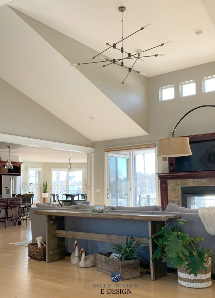
Here’s a photo of it (below) in a warmer south-facing room with vaulted, angled ceilings and a lot of natural light – it’s in its gray glory!
Colors need LIGHT to come to LIFE!
HOWEVER, REVERE PEWTER DOESN’T WORK WELL IN HALLWAYS
Hallways are generally dark and don’t always suit this depth of color, unless your hallway has a lot of light. Alternatively, check out lighter shades that are better suited to dark spaces and hallways.
You can also check out Benjamin Moore Rodeo, which has a slightly higher LRV, or Benjamin Moore Sea Salt, a beautiful lighter shade of warm gray-greige. But even those might not be enough.
DOES REVERE PEWTER GO WITH WOOD TRIM OR CABINETS?
The short answer is yes: Revere Pewter can be gorgeous with wood stains… but not all of them.
One reason is that if your room is a bit dark, Revere Pewter can look dingy without white trim to contrast with. This said, if you want a moody, organic, soft look, it can be the perfect shade.

Sherwin Williams Dorian Gray | Agreeable Gray | Revere Pewter
Revere Pewter loves stains, including golden oak, pine, and many maples. Where you want to be careful is with super-pink-toned woods. While it can handle a dark red stain, the lighter version (pink) is super hit-and-miss.

The Best Paint Colors With Dark Wood
Shlong story short, if your room has enough lighting and your woods aren’t overly pink, Revere Pewter is a great color to sample.
DOES IT GO WITH CREAM TRIM & CABINETS?
While there’s the very (ahem, very) odd cream cabinet that can handle Revere Pewter, it must be darn light and super subtle. So the answer is no, for most homes.
Most cream cabinets (e.g., Sherwin Williams Antique White) are too heavy for a gray like this.
This warm-toned, cream-inspired trim (color unknown) is about as warm as Revere Pewter can handle…

Cream cabinets and trim are super fussy. You might find yourself choosing colors you might not love in order to humor their limitations. If you’re curious about what could work, read this: The 16 Best Paint Colors With Cream Trim & Cabinets.
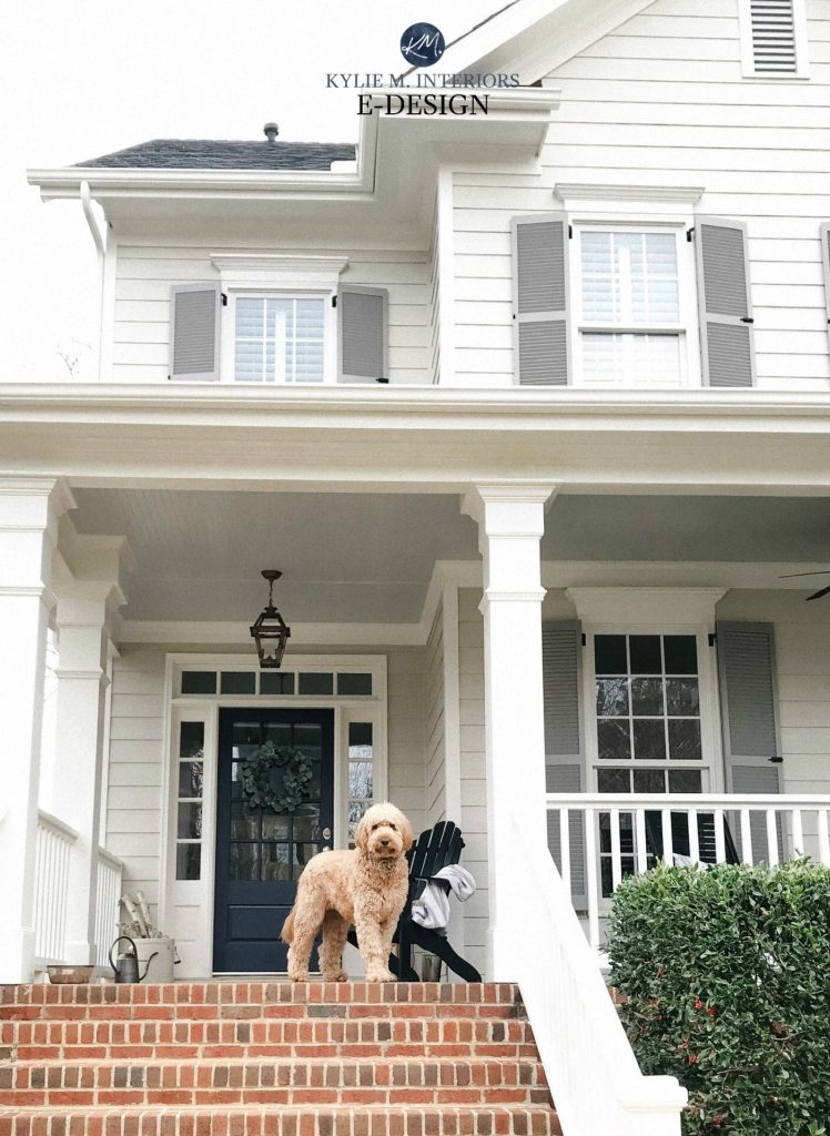
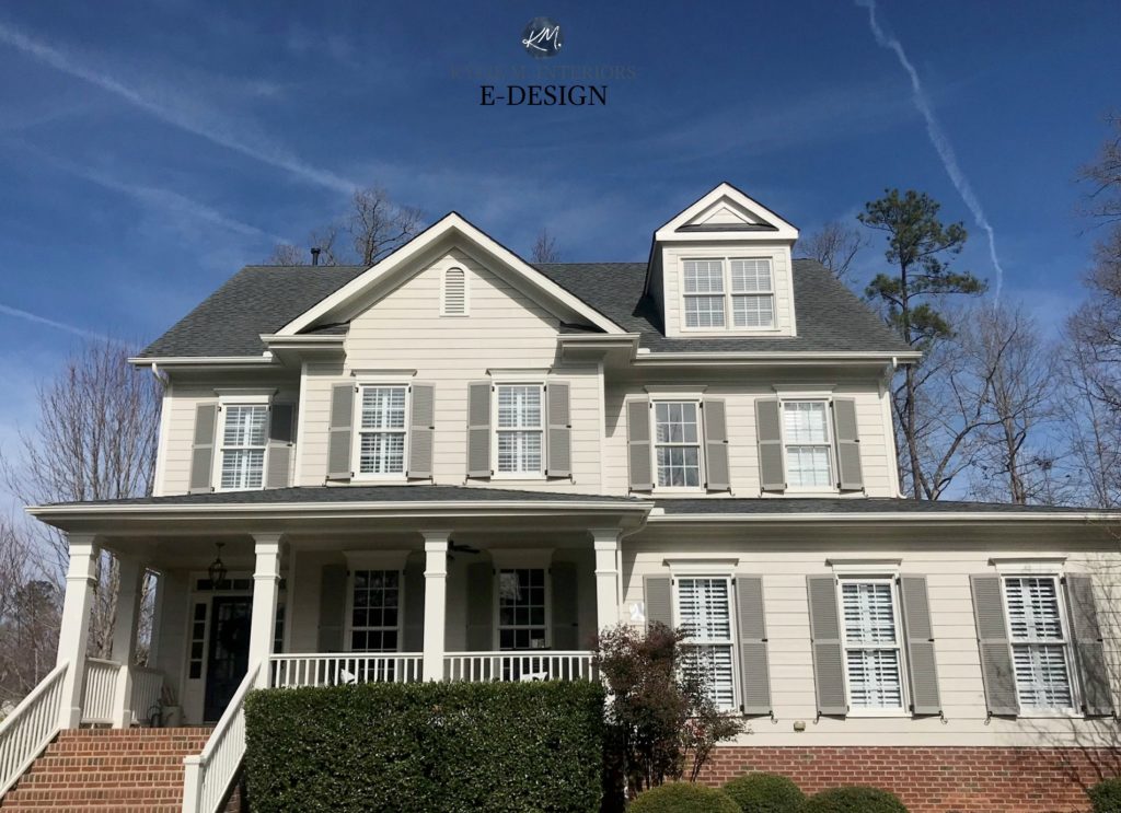
IS IT GOOD FOR EXTERIOR (SIDING, SHUTTERS, OR TRIM)?
Choosing exterior paint colors is all about what suits your stone, brick, roof, window color, or other features. Sure, interiors have the same limitations; however, grays are far less likely to look dated on an exterior, as long as they suit their surroundings.
So, yes, if Revere Pewter is the best color for your exterior finishes, it can be an awesome, timeless choice.
The 9 Best Front Door Paint Colors |
IMAGE via my Online Color client – the very talented, House of Blue Hues
For this next home, it’s the perfect choice, given its asphalt roof, brick foundation, and steps – the main features that needed to be coordinated with…
5 Steps to Choosing an Exterior Colors
My Online Color Consulting client chose Revere Pewter for her exterior and couldn’t decide on the right shutter or porch ceiling color. I gave her three coordinating suggestions, including Benjamin Moore Graystone (shutters), and it looks GORGEOUS!
IS REVERE PEWTER A GOOD CABINET COLOR?
A thousand times, yes, it’s a great cabinet color…so long as it suits your kitchen backsplash and countertop, and you don’t care about trends.
This is my kitchen below. I darkened Revere Pewter by about 25% to add more body. I felt the regular strength was too light for my personal tastes…
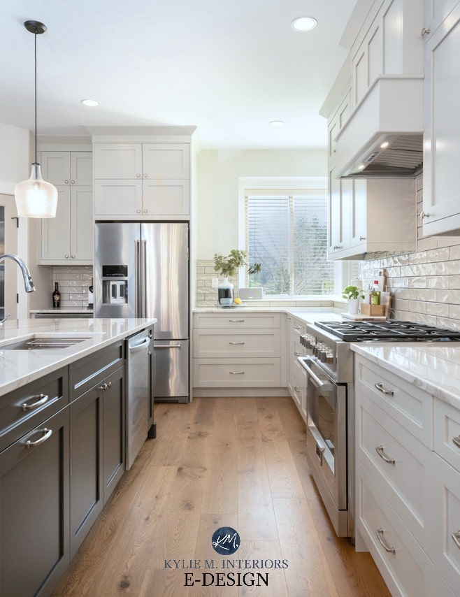
Is Benjamin Moore Revere Pewter REALLY the Best Cabinet Color for YOU?
BEST WHITE TRIM & CABINET COLORS
Revere Pewter can accommodate quite a few different whites for trim paint or cabinets, AS LONG AS they aren’t overly yellow. Benjamin Moore Cloud White can look gorgeous and slightly enhance its green undertones, but that’s as warm as I would venture.
If I’m coordinating a palette from scratch that includes Revere Pewter, I prefer…
- Benjamin Moore White Dove – the perfect soft, warm white (some people prefer Swiss Coffee, but I’m a White Dove girl all the way)
- Benjamin Moore Chantilly Lace for a fresher white look without starkness
- Sherwin Williams Pure White offers a more moderate approach to white and warmth – not bright white, but not soft and earthy either
This bedroom has Cloud White trim…

WHAT COLORS ARE SIMILAR?
In looking for alternatives to Revere Pewter, there will be shifts. Some will be lighter, darker, warmer, or cooler. Others might pick up a bit more green undertone or even drop most of the green. Here are some comparable colors…
REVERE PEWTER COMPARED TO BENJAMIN MOORE RODEO
Rodeo is a great alternative to Revere Pewter.
Why?
Well, with its LRV of 55.05, Revere Pewter can be a bit too dark for a room or potential ‘whole home’ use, either because of the lighting or the surrounding finishes. This is when Rodeo comes in handy.
While it has a similar ‘muddy warm gray’ approach, Rodeo has an LRV of almost 60, making it a lighter version of Revere Pewter and falling within the best LRV range for the average room.
As for undertones, Revere Pewter is more likely to flash a muddy green than Rodeo.
However, of the two shades, I would choose Revere Pewter for kitchen cabinets, doors, and trims because of its added depth.
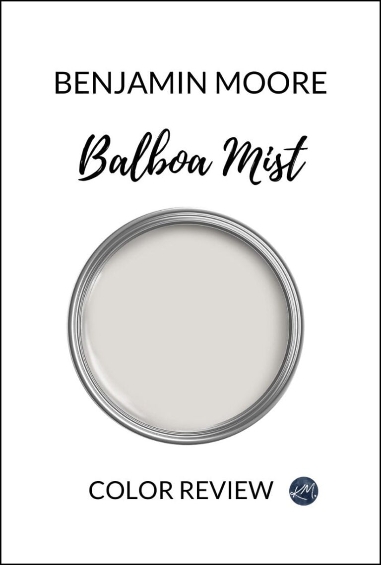
REVERE PEWTER COMPARED TO BALBOA MIST & COLLINGWOOD
Revere Pewter is a warm gray, but that’s the only thing it has in common with Benjamin Moore’s Balboa Mist and Collingwood. Both of these shades lean into a purple undertone, which goes in the opposite direction to Revere Pewter’s earthy green hue.

You might also be interested to know that more interior finishes suit a warm violet undertone than a warm green one, so if you’re having trouble coordinating your wall color, this might be why!
Revere Pewter is darker than Balboa Mist and Collingwood, sitting closer to the light-medium range than the light range. Here’s Collingwood with Benjamin Moore Simply White trim…
Benjamin Moore Balboa Mist Review | Benjamin Moore Collingwood Review
What about alternative options from Sherwin Williams?
REVERE PEWTER COMPARED TO AMAZING GRAY
When it comes to cabinets and exteriors (in particular), Revere Pewter doesn’t always have the depth and commitment we’re looking for. In this case, Sherwin Williams Amazing Gray is an interesting alternative…

Amazing Gray’s depth (LRV) is 47, which is WELL in the light-medium depths. This is darker than Revere Pewter’s 55.05, which hovers between the light and light-medium depths.

As for intentions, both colors share a murky, muddy, but not overbearing green undertone.
Sherwin Williams Amazing Gray: REVIEW
REVERE PEWTER COMPARED TO COLONNADE GRAY
Colonnade Gray is similar to Revere Pewter in its intentions; both are versions of ‘warm gray with a green undertone.‘
However, Colonnade Gray has an LRV of 53, so it’s a bit darker and has less earthy warmth, making it look a wink more gray. If you’re nervous about Revere Pewter’s undertones, Colonnade has the same green undertone but FAR less of it – in some lights, you don’t see it at all!
REVIEW: Sherwin Williams Colonnade Gray
REVERE PEWTER COMPARED TO AGREEABLE GRAY
My Online Color Consulting clients often choose between these two popular shades, although there are some key differences.

Agreeable Gray is lighter (LRV 60) than Revere Pewter by a good dose, making it a bit more suitable for a ‘whole home’ application. It’s also not as warm and earthy/muddy.
As for undertones, while Agreeable Gray ‘can’ grab a touch of green, it flexes between green and violet based on surrounding conditions, often showing NO noticeable undertone.
Sherwin Williams Agreeable Gray Color Review
WHAT COLORS GO WITH REVERE PEWTER?
GREAT question, as Revere Pewter has a ton of palette partners and good accent colors. While it depends on the surface you need this partner color for, here are some shades to explore…
- TAN & BEIGE: Light, muted beige and tan paint colors can be beautiful in adjoining rooms.
- WHITE PAINT COLORS: A wide range of whites, including warm, soft whites, as well as brighter whites.
- GREIGES: Dark greiges can be great accent colors for Revere Pewter. Lighter shades can be good in adjoining rooms.
- CREAM PAINT COLORS: Muted cream paint colors (not overly yellow) are great for adjoining rooms.
- MUTED GRAY-BLUES & NAVY BLUES: Revere Pewter loves being paired with light-medium to medium gray-blues, as well as darker gray-blues and navy blues.
- GREEN PAINT COLORS: Definitely check out dark shades of green and green gray as accent colors.
For more specific recommendations, just check: What Paint Colors Go With Revere Pewter
CAN YOU LIGHTEN OR DARKEN REVERE PEWTER?
You bet your cute little booty you can; I’ve done it many times! While Benjamin Moore Rodeo is as close as you’ll get to a lighter version of Revere Pewter, you might want to play around with Revere Pewter before switching colors entirely.
Ask the paint store to lighten or darken Revere Pewter by 25% and see how it looks. If that’s not enough, try 40-50%. Remember, the more you lighten it, the more its undertones can shift.
3 Steps to Your Perfect Paint Color: How to Lighten & Darken Colors
Technically, you’re not getting a ‘lighter version of Revere Pewter’ – you’re creating a new color. This is why sampling it carefully with your OG version and in your lighting is so important.
IS REVERE PEWTER STILL TRENDY FOR 2026?
When it comes to the wild world of gray, many aren’t trendy anymore. However, if you look at Benjamin Moore’s stats over the past 15 years, one color has repeatedly ranked in the top five alongside beiges, whites, and blues, and that color is Revere Pewter.
But just because a color seems relatively timeless doesn’t make it the best choice for every home and painting project (if you want your home to look updated).
- FOR KITCHEN CABINETS: No, it’s not a trendy, modern choice (although it’s gorgeous for many homes – I have it in mine).
- FOR EXTERIORS: Absolutely, Revere Pewter is a huge win so long as it coordinates with finishes.
- FOR WHOLE HOMES: Nope, too heavy and not updated enough on such a large scale
- FOR SINGLE ROOMS OR OPEN-CONCEPT SPACES: Single rooms – yes. Open concept spaces – so long as they have good natural light, and ideally it’s south, helping Revere Pewter lean warmer.
PROS & CONS: A QUICK SUMMARY
- Benjamin Moore Revere Pewter is a warm gray paint color that leans greige.
- It has green undertones that complement a wide range of finishes.
- Its LRV of 55.05 makes it great for a well-lit room, but it can look dingy and drab in a dark room or hallway
- It suits a wide range of warm whites, even considerably creamy ones.
- It’s not clean or crisp enough to be a ‘fresh’ shade of gray. Instead, it’s more organic and calming.
Want to see this color in action? Check out my YouTube Video Review for more great tips!
READ MORE
5 Paint Colors to Replace Revere Pewter
Benjamin Moore Revere Pewter Cabinets: A Full Review
Is Gray Still Trendy for Walls, Cabinets & More?
Colonnade Gray vs. Revere Pewter
Get the best color advice with Kylie M’s Online Color Consulting


Thank you Irene, I’m so glad it came in handy1!
Hi! I’m looking for the half strength comment. I’m painting hallway and foyer and Kylie is right that RP is too muddy/green. Did I miss where the blog says half strength of RP in hallways is better? I have tried half strength and it is better. But, I’m comparing to Cornforth White from Farrow & Ball.
Hard to pick for a foyer and hallway as there are so many different light sources! Thanks for your thoughts. 🙂
Hi Tina! I’ve done RP at 40% lighter with good luck. I’ve found that once you pass 25% lighter, there can be a shift in undertones. Now that doesn’t mean it will fall right off track, as it’s still based on the original foundation colour, but undertones can rise up/fall back…I hope that helps!
Can you recommend some coordinating colors for rockport gray. I painted my office in rock port gray. Thank you!
Hi Kylie. Loved reading this blog. We just painted our kitchen cabinets revere pewter but I need help choosing a different wall color. We chose BM Thunder AF 685 (which was a taupey gray on swatch) and it turned out blue! It’s a north facing room. Any suggestions on what color we should use to make cabinets stand out? Right now they totally blend with the wall. Should we go darker or lighter on walls? Appreciate any advice! Thanks
Melissa
Hi Melissa, thank you so much for asking! As I’ve been quite swamped with questions I’ve been referring most to my Online Consulting. This way I can get photos of the space as well as ask some important questions! If this interests you at all then here’s the link. My pricing does fluctuate a bit depending on how busy I am, so at this point your quote would be $60 and I would give you 3 paint colour options. Each option would have an explanation so you can understand how they might act in your particular space! https://www.kylieminteriors.ca/online-decorating-design-services/
Hope to hear from you!
~Kylie
Hi Kylie,
Do you have the color code for revere pewter color in 25% lighter ? I went to buy a small sample can and the guy could not do it. I told him that I will come back. Thanks for your help!
You know what, I just might still have it – it would be the Home Depot code though and won’t work anywhere else…let me go see…
Hooray, hopefully this works for you!
Sample pot: Behr Ultra Flat ULtra Pure White (this is the base of it which is important)
384th: BL 11 / CL 14 / FL 1.5
If you copy this down/print it off I’m thinking that might do the trick!
Good luck 🙂
We’re considering Revere Pewter for most of our main level. The exception is our family room, which is sunken a couple steps and has a lower ceiling so we’d like to keep it cozy with a slightly darker color. Do you know what would be similar to Revere Pewter but a shade or two darker? Thanks a million! I’ve been scouring your blog for weeks as we figure out our paint selections!
Hi Stefanie, thank you for asking! Check out BM Northern Cliffs, it might hit the spot!
Hi Kylie,
I have used RP in most of the downstairs., big bright fam room, bright dining room , kitchen and hallway. Love it!! LR is separated by a hallway painted in FB Clunch. I would like to paint the LR but it is a dark room. Presently, it is a mossy green color and I want to brighten it up. Is there a light tan that works well with RP ? Would like a warm beige / tan color. Any suggestions? Thanks in advance!!
Rosanne
Thanks for the note Rosanne! When it comes to exact colour requests, I do need to refer to my e-design so I cna see photos and spend some time with coordinating things.I try to give as much free advice via my blog and if that doesn’t work, then maybe it’s e-design time! If that interest you it is affordable! https://www.kylieminteriors.ca/online-decorating-design-services/
~Kylie
Hi Kylie,
I’m painting my dining room and I have a chair rail, so I am planning to paint two different colors on the top and the bottom separated by a chair rail. I like Northern Cliffs for the top. What would you recommend for the bottom half? The rest of the main floor is painted Rever Pewter, so not sure if I should use that or Gray Owl. The room has very little light…just a double window under the front porch. Would love your advice. Thanks so much,
Vivian
Hi Vivian, thank you for your note! This is actually the EXACT thing I do my e-design consulting for! I try to give as much complimentary advice as I can on my blog and if that doesn’t work, it might be time for me to take a closer look at your room via photos/questionnaire. My packages are off right now as I’m on a short trip, but they’ll be up and running on Monday! https://www.kylieminteriors.ca/product-category/interior-paint-colors/
~Kylie
Hello! I have painted all my walls revere pewter and now want to ‘whitewash’ my fireplace. My trim is just a regular contractor white. Do you have any advice for what white would look best? The hearth is black slate! Thanks!
Hi Brittany! I’ve had a client whitewash their stone with Revere Pewter (50/50 mix). I might lighten Revere Pewter by 50% and then mix if 50/50 with water. Otherwise I would do a standard ‘white’ whitewash. Either way, it’s about keeping undertones consistent and not throwing a new colour into the mix!
Any advice on a cabinetry paint color to go with Revere Pewter in a reasonably bright kitchen? My walls are RP but my painted cabinets, which are slightly beige/taupe, are now looking yellow against it;(
Hi Karen! When it comes to personal questions, there is a lot more to consider, like exposure, countertop, flooring – otherwise I’m 100% guessing. If you’d like to check out my E-design, I do have some affordable and fun packages that could suit your exact needs!https://www.kylieminteriors.ca/online-decorating-design-services/
~Kylie
I’m thinking about painting my home’s exterior RP. However, I am concerned it will be too light (my house faces west but there is no shade and the sun tends to wash colors out. Would you paint RP on the exterior of your home and would you darken it by 25%?
Hi! Revere Pewter is beautiful for an exterior and as long as you have some white trim it should help to show the contrast, even when the sun lightens it! And yes, 25% could help a bit 🙂
I have a large, vaulted ceiling great room with east facing windows (under a porch) as well as east facing dormer windows. Is there enough light from the east to use Revere Pewter? I was all set to use that color until I read this post…now I am questioning it! :p
Thank you!
Hi Audree, it’s hard to say, it would depend on how MUCH light you are getting from those windows and overall, what look you’re going for! I’d love to give you a definitive yes, but without seeing the room, I can’t do that comfortably!
We just bought a house and the kitchen and family room are revere pewter! They are mostly eastern (some southern) facing rooms. Currently, the northwest entry way is SW Urban Putty and so is the southwest dining/living room. The dining/living room doesn’t get a lot of natural light, so I’m curious if you think continuing the revere pewter into the dining/living room is a good option or if I should go with something lighter like BM Classic Grey or BM Light Pewter?
Hi Bailey, thank you for your note! I do try to give as much complimentary info as I can on my blog posts and if that doesn’t help, I do have an affordable e-design service! This way I can look at your home/lighting/furnishings and come up with some real solutions, rather than just guessing! https://www.kylieminteriors.ca/online-decorating-design-services/
~Kylie
Have you ever used Benjamin Moore “THUNDER”.
I was so torn between Thunder, GRay Owl and revere pewter.
But as its my kitchen, dining and living room, all one open space. With Yew flooring and Light Maple Cabinets revere pewter seems to be out from your youtube video!
Hi Courtney, Thunder is beautiful, but will come up quite different from the other 2. It has a bit more weight to it and is a stormier, warmer gray with a purple undertone to it 😉
Kylie,
Can you suggest a contrasting color to go with RP?
I’m painting bottom wainscoting RP and not sure what to paint walls above. I’m thinking BM balboa mist or Collingwood.
Wish I read review before having LR & DR painted in revere pewter. I had over 12 grey samples on my walls. They appeared purple, green, blue and silver but the RP didn’t look as muddy as final job. After spending almost a thousand having it painted in RP I have to live with it. I wanted a light grey but this, to my eyes, isn’t a grey at all. One good thing-it is next to kitchen and hallway which I did in HUSH, a color I knew and loved-they don’t clash.
Will definitely look at your reviews when picking a color for bedrooms.
I have used Kingsport Gray on the walls and Revere Pewter on the ceiling in my husband’s basement mancave and LOVE the results.
Oooo, I bet that looks awesome – love it!
Hi, Kylie. Thanks so much for the great info on RP. We have a new home with an open floor plan that is completely RP. I would like to paint the north-facing dining room a different color to add a little interest. I was thinking BM Palladian Blue or SW Sea Salt. Do you think one would work better than the other?
Would you go agreeable or anew for cherry cabinets with an expresso stain. I’ll have stainless steel appliances and I’m trying to do a light to medium matte brown floor.
This whole post is awesome, and this reply is amazing. Thanks for sharing your colour tortured soul’s insights and advice 🙂
Oh Sheila, you’re most welcome, thank you for commenting!!
I have Revere Pewter in a hallway, bath and bedroom. It has a glint of blue in only one room and only at certain times of the day. Believe!!