
The 8 Best Paint Colors for a Dark Hallway
POPULAR COLORS FOR DARK HALLWAYS & STAIRCASES
If there’s one space in a home that has the potential to be dismal, it’s the hallway. Most hallways are narrow and gloomy, leaving little room for visual interest and excitement—the same goes for staircases.
And we WILL get to the visual interest and excitement…another day (links at the end of this blog post). Today, we’re talking about paint colors for a dark hallway (or staircase) because if your walls aren’t the right color, there’s no visual interest that will save you. But before I introduce the actual colors, let’s talk about some meat n’ potatoes stuff.
LRV & DARK HALLWAYS & STAIRCASES
LRV matters a lot in dark rooms – including staircases and hallways.
Why?
With many hallways and stairs having very little natural light, paint colors need to work overtime, reflecting or absorbing whatever light they can.
They can’t do their job if you don’t give them light to reflect.
Every paint color has an LRV number, which refers to how much light it reflects or absorbs. Trust me, this little number could save your life and your marriage, so if you don’t know much about it, I suggest you read Paint Colors and LRV: The Ultimate Guide You Need to Read.
Now, there are lighter and brighter colors than the ones listed below, in other words, WHITES, but I don’t want to bore you to death with various versions of those (I’ll let this post do that). And I’m not going to lie and say that these colors will BLOW YOUR MIND with personality – they won’t. However, they might be a happy medium between a white paint color with a high LRV (that might ultimately bore the hecka-doody out of you) and shades too intense and heavy to toss down a typical stairwell or hallway.
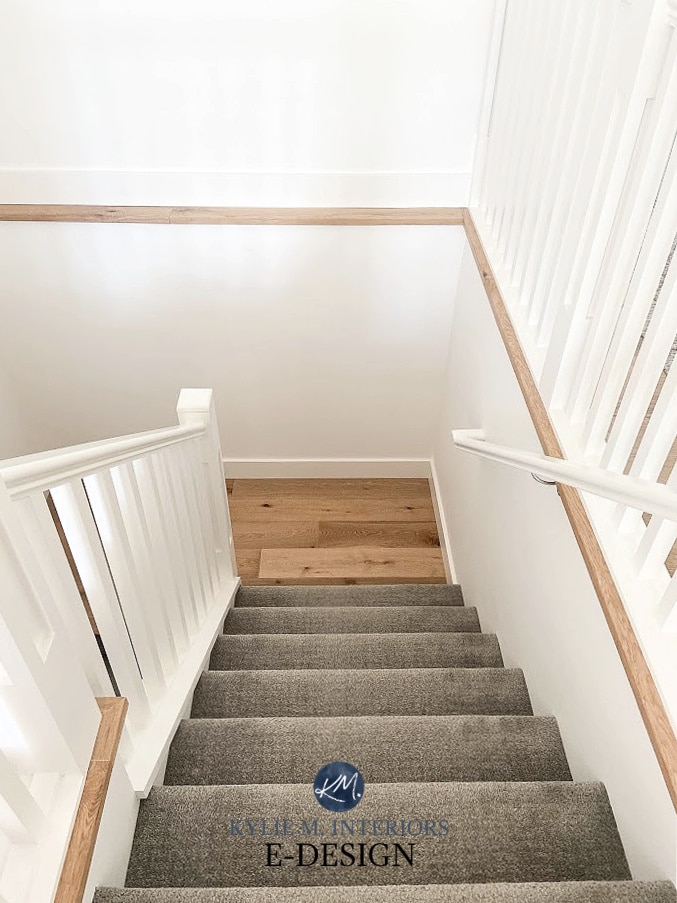
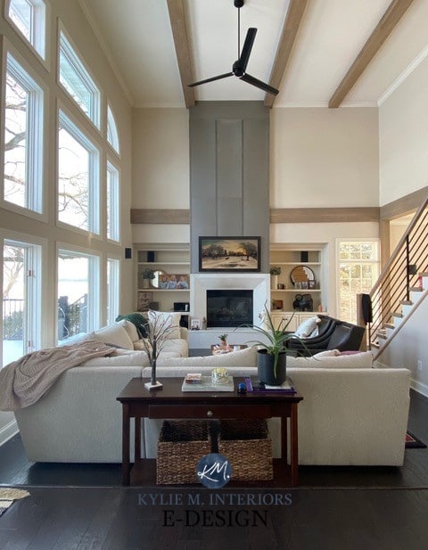
This dreary staircase doesn’t make ME want to see what’s at the bottom…
LIGHT FIXTURES & HALLWAYS
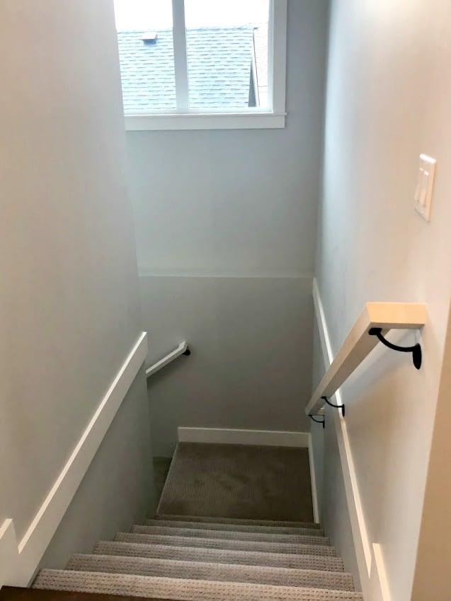
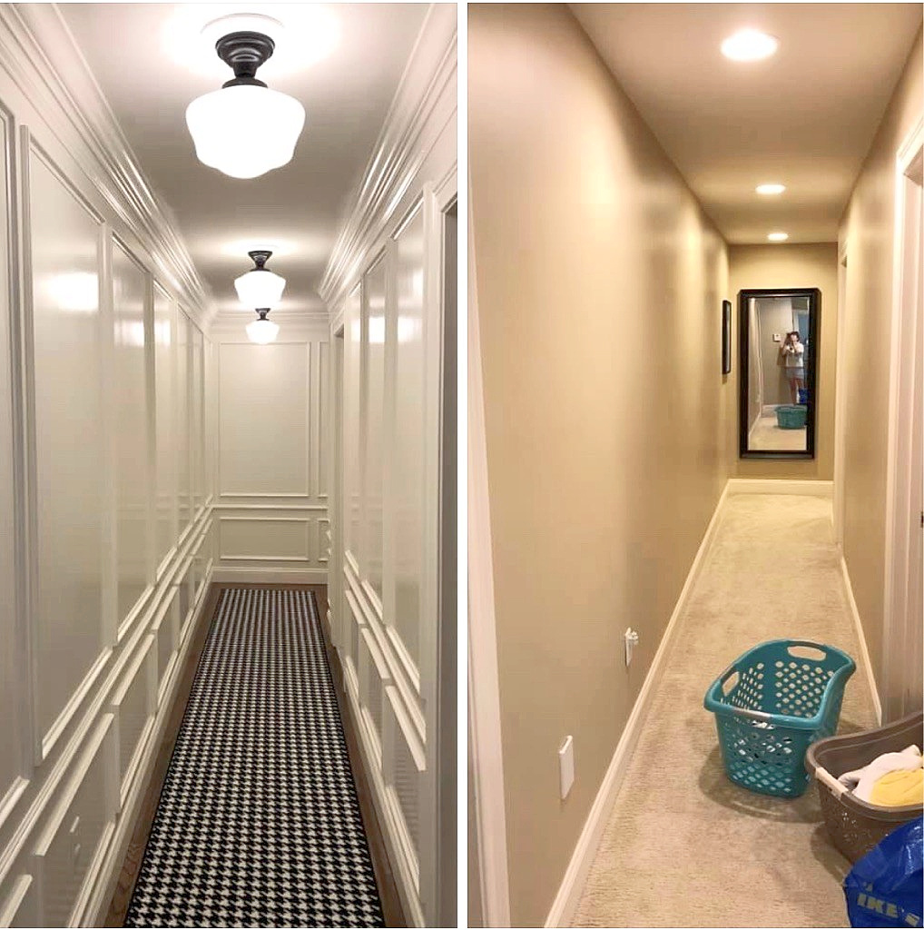
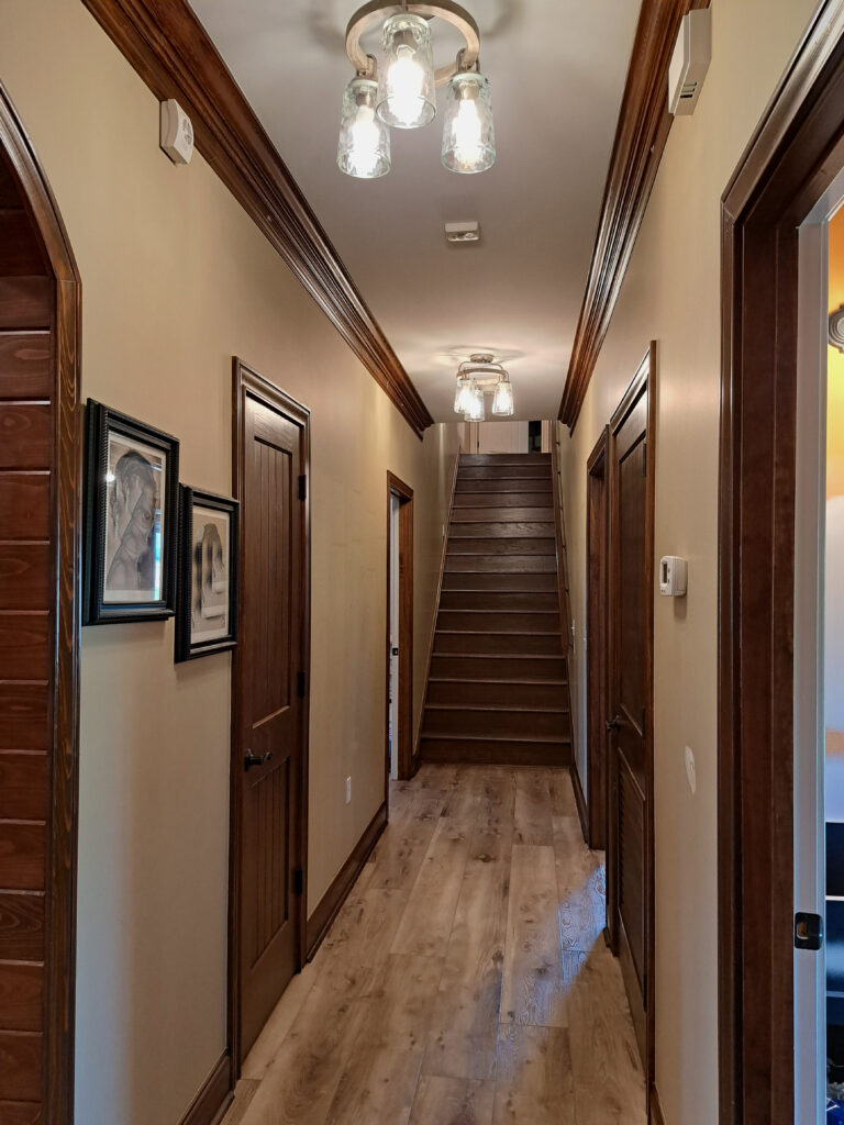
Unless you have a row of pot lights, there shouldn’t be any fixtures in your hallway that hold only one bulb. ONE STINKIN’ BULB, what do you expect it to do – work miracles? Seriously, if you have only one fixture, it should hold three – 60w bulbs. If you have two fixtures, they should each hold at least two – 60w bulbs (but the more, the merrier, as you can always reduce the wattage if you find it too much). However, if your hallway has three+ fixtures, one bulb will do (as shown below).
If you don’t have enough light, no paint color will save you—don’t expect your paint to be a miracle worker.
One of the best ways to get adequate lighting is with a flush-mount or semi-flush-mount light fixture. There are more exciting lights, but sometimes a simple flush mount does the trick for cost and availability!
So, before spending money on paint, spend SMART money on lighting first.
CONTRAST IN A DARK HALLWAY – TRIM & PAINT COLOR
This is a trickier one. Some of you have white (or off-white trim), whereas others have wood trim, which slightly changes things.
Why?
Damn you for making me think beyond the reach of my wine glass…
A DARK HALLWAY WITH WHITE TRIM & DOORS
Whereas staircases usually have less vertical trim, hallways with multiple doorways can have A LOT of trim. White trim with a light paint color is low contrast. This keeps things not only brighter but also bigger looking (wider). A brighter shade of white with a medium or dark paint color creates a high-contrast palette, which can make a space look busier and smaller (but sometimes more interesting).
While we’re not looking at dark colors, we are looking at colors that contrast with traditional white trim.
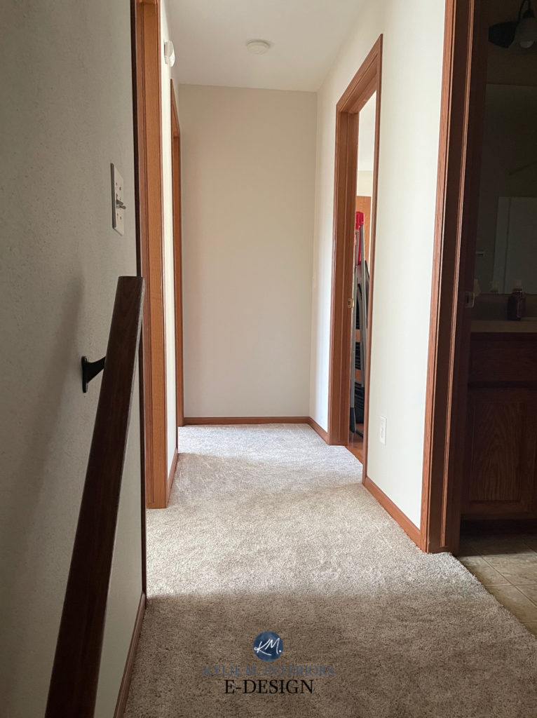
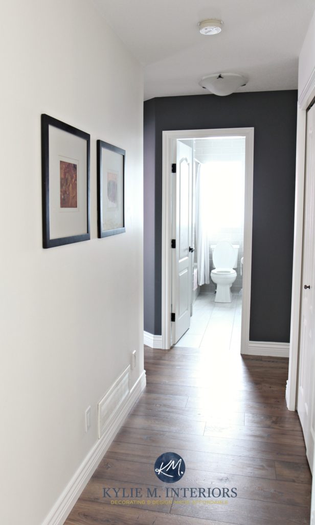
There’s no natural light in this next dark hallway, and the interior lights are off (I’m so observant, I know). Notice how the light, warm gray walls and creamy off-white trim weigh the space down. At the very least, I would paint the trim a brighter shade of white (matching what’s on the spindles) and maybe even add some wall sconces (you can get battery-operated ones on Amazon)…
A DARK HALLWAY WITH WOOD TRIM & DOORS
Medium or dark wood trim (or a dark paint color) with a light paint color is HIGH contrast. Now, your space will look brighter via the wall color; however, the contrast between the trim and the walls can make your space feel more cluttered and small. So it’s not that your space will look darker; you just aren’t getting the full-bodied effect of white trim/light walls.
Could you paint your walls a light-medium tone to blend in more with your dark trim to lower the contrast?
As this would lower the contrast level, you could make things look more simple and seamless. However, it won’t make your hallway look any ‘brighter.’ But if you can supplement with MORE than adequate lighting and decor (e.g., a mirror to reflect light), you can make up for a less-than-bright paint color and perhaps find a happy medium.
If you want to know more about paint colors for wood trim, check out this blog post: The Best Paint Colors for Dark Wood Trim.
But for the rest of you, let’s move along!
Remember, what’s boring to me and boring to you could be different things. You could be looking for wild and wonderful, and these colors AREN’T that.
These colors are geared towards the average home and average homeowner who wants to brighten up their dark hallway or stairs with a VERSATILE, flexible paint color.
Why does versatility matter?
Like entryways, hallways are transition areas with many rooms attached. If your hallway is painted a unique color, you’ll have a much harder time coordinating the adjoining rooms and creating a color palette that flows.
If you want a more unique color or want me to curate the best color options for you and your home, check out my Online Paint Color Consulting – I’d love to help!
LET THE COLOR GAMES…BEGIN!

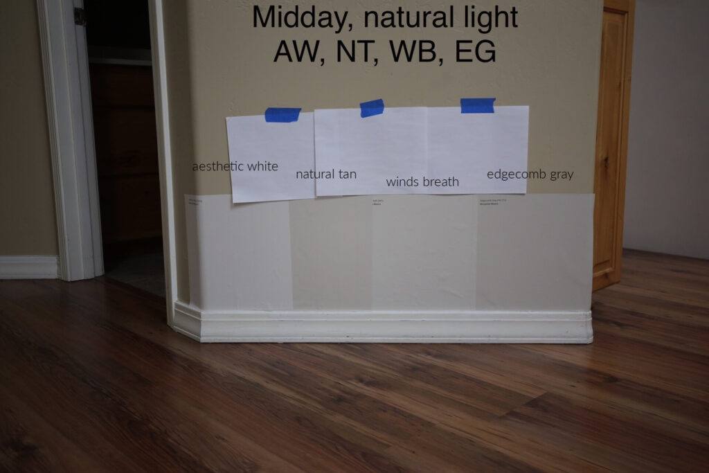
1. BENJAMIN MOORE WINDS BREATH OC-24 / 981
Winds Breath is a beautiful, subtle neutral. Thanks to its blend, it doesn’t commit to a particular color and can politely nod at beige, tan, and cream, with a decent touch of gray to calm it all down.
Will it look dingy in a super-dark hallway or stairwell? YUP, but any color will. That’s where you need enough lighting, and I would probably stick to 3000K in your bulbs. As for a trim color that goes with Winds Breath, I’d lean into bright whites like Benjamin Moore Chantilly Lace and Sherwin Williams Extra White.
Does Winds Breath look good with wood trim?
It depends. The combo isn’t so hot if the trim has a ton of red-pink. However, for the ‘average wood trim,’ Winds Breath can be gorgeous.
My FULL Color Review of Benjamin Moore Winds Breath
2. SHERWIN WILLIAMS ALABASTER SW 7008
Okay, I lied; I AM going to bore you with white…but just one glorious shade of it. This is because Alabaster isn’t a typical white. With its LRV of 82, Alabaster is a SOFT white that borders on the off-white/cream world. If you have brighter white trim, Alabaster offers brightness with a touch of warmth and softness that can be gorgeous and add personality and life to a dark, narrow, or small hallway.
FULL Paint Color Review of Sherwin Williams Alabaster
Here’s another shot of Alabaster in a slightly darker back hallway/mudroom…LOVE IT…
Sherwin Williams 3 Best Warm White Paint Colors
I ONLY use photos from my Online Paint Color Consulting clients (or my own photos), so I don’t always have the EXACT example I need. I do my best to show you REAL HOMES with REAL BUDGETS. Thank you for sending your photos in!
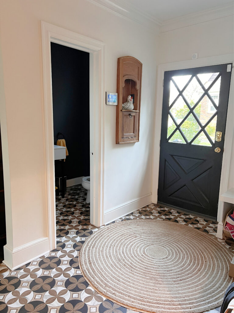
3. BENJAMIN MOORE EDGECOMB GRAY HC-173…LIGHTENED
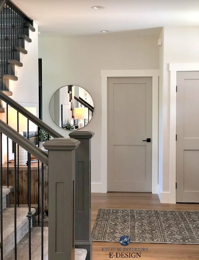
I love Edgecomb Gray (also known as Baby Fawn), whether it’s for walls, trims, cabinets, or exteriors. However, for dark hallways and staircases, in particular, Edgecomb Gray is BEST when it’s lightened by either 25% or 50%. This way, you get similar bones but a lighter look (with AMAZING flexibility for your color palette). Being a color that bridges the gap between gray and beige and with minimal undertone, Edgecomb Gray is one of the more popular neutrals in today’s color market and will continue to be a top choice going into 2024.
Let’s look at a few spaces with regular and lightened versions of Edgecomb Gray in action…
This first entryway and hallway show Edgecomb Gray 50% lighter, with what is likely Benjamin Moore White Dove on the trim and door (I’d love to see this door painted a gorgeous, darker accent color)…
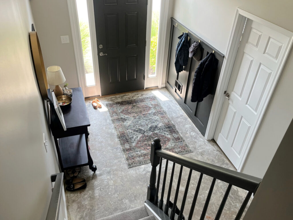
This next entryway is Edgecomb Gray mixed 25% lighter, with Sherwin Williams Urbane Bronze on the front door and board and batten/hook wall…
Again, it’s 25% lighter on the walls in this hallway and super dark transition area…
Lastly (below), here’s Benjamin Moore Edgecomb Gray 75% lighter in my OWN home…
The only natural light is from the transom window above the door and ambient lighting from adjoining rooms.
Usually, I don’t recommend lightening a color 75% unless it’s for your trims or ceiling (and it doesn’t always work). However, I love being a guinea pig in our home and adjusting colors to see what they do. This way, I can learn more and better advise YOU about your home!
FULL Paint Color Review of Benjamin Moore Edgecomb Gray
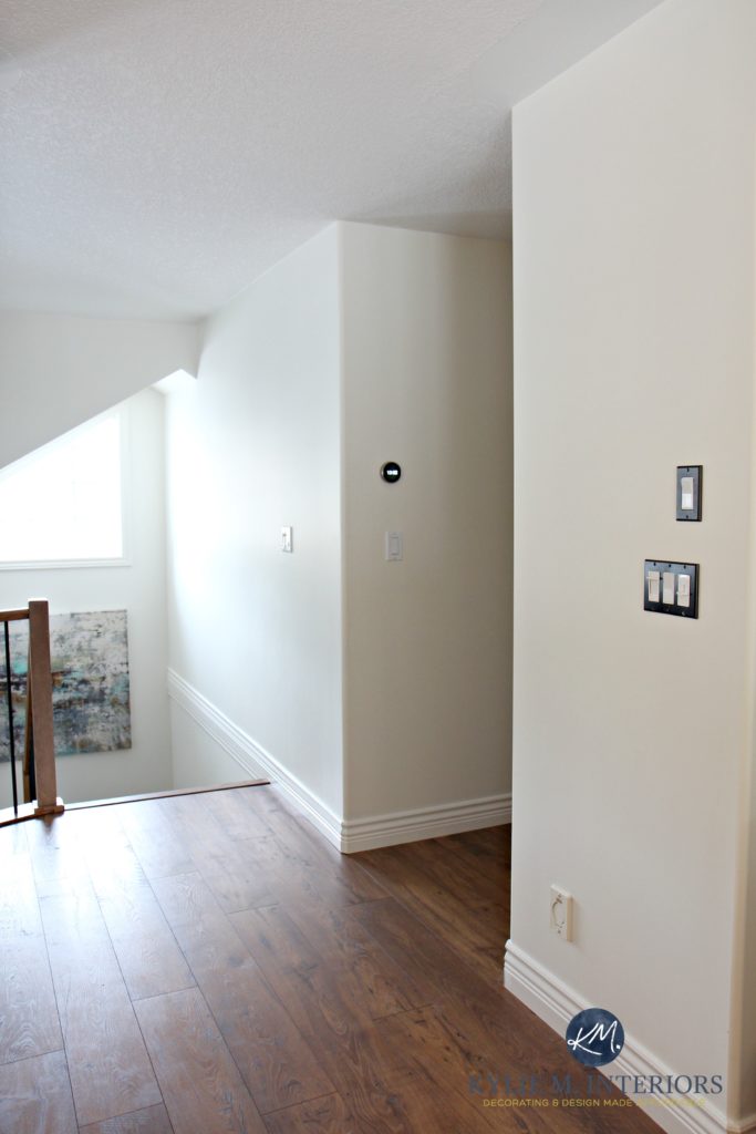
4. SHERWIN WILLIAMS AESTHETIC WHITE SW 7035
Beige gets a bad rap thanks to the Tuscan trend from the early 2000s.
But beige has come a long way, baby.
Aesthetic White is one of my favorite shades of beige. Rather than being rich and golden-warm, Aesthetic White has a dusting of gray to calm it down. While a brighter, more colorful beige (coming up shortly) is better for a dark hallway with bad lighting, if you improve your lighting, Aesthetic White is an awesome approach to a modern beige look.
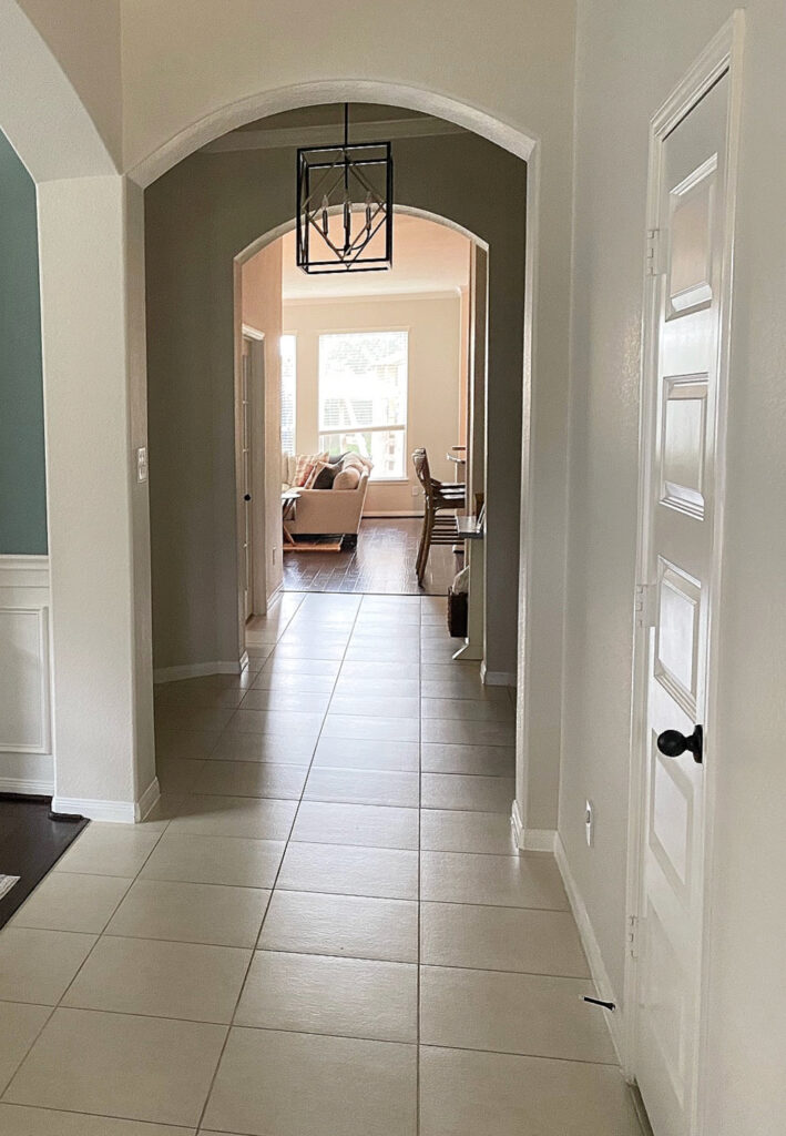
Here’s Aesthetic White in a narrow hallway with beige carpet and orange-toned wood trim…
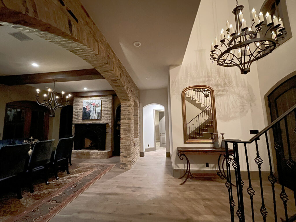
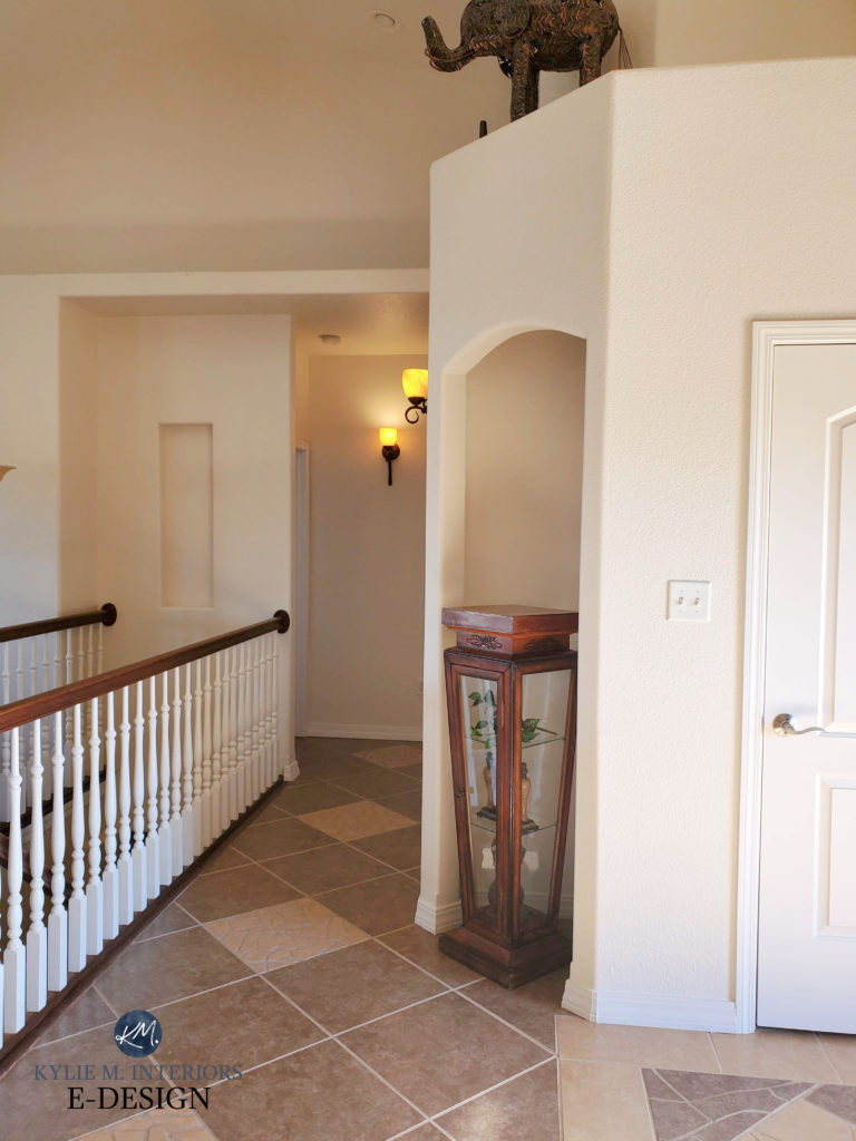
And here it is in a moody, Spanish-style entryway with a beautiful brick arch…
FULL Paint Color Review of Sherwin Williams Aesthetic White
Paint sampling just got a lot easier (and more affordable, too!)
Get your PEEL & STICK SAMPLE here!
5. SHERWIN WILLIAMS CREAMY SW 7012
If you like the idea of a creamy white like Alabaster but want a wink more depth, check out Sherwin Williams Creamy. This is an off-white shade of cream without much yellow, making it more appealing than some of the stronger shades. Creamy has a subtle freshness without a huge commitment to color.
Will stronger, more yellow-based creams make your hallway look brighter?
Yup, as long as they’re a similar depth to Creamy or lighter (heavier creams won’t work as well). However, these creams aren’t always as popular because of their increased chroma (color). When choosing a color, it’s often about finding a happy medium between those that lighten your space that are also colors you can LIVE IN and love!
In this next photo (our old home), notice how Creamy is significantly lighter and brighter on the well-lit walls but doesn’t fall too flat down the hallway (which had no lights on when this photo was taken)…
The Best Creamy White & Off-White Paint Colors
Here’s a full shot of the hallway with its dark accent color at the end (I love playing with pops of color, as they’re GREAT for adding personality to a boring space like a hallway)…
Creamy isn’t EXCITING by any stretch of the imagination, but it’s simple and bright and reflects the light given quite nicely. In the above photo, you can see how it looks more or less like a white hallway; it’s just not as stark or harsh as Creamy offers a passive warmth and subtle contrast with the trim.
FULL Paint Color Review of Sherwin Williams Creamy
WANT A CREAM THAT’S A BIT DARKER?
- Benjamin Moore Navajo White is a bit darker and warmer/creamier than Creamy.
- Sherwin Williams Casa Blanca is a slightly more cheerful but still muted approach to cream with more color and depth than Creamy.
Why suggest these other paint colors?
Comparison is the most important part of choosing your best paint color (and researching on ma blog). Remember, what suits one home won’t necessarily suit another; grab several versions of the type of color you like and COMPARE COMPARE COMPARE!
6. SHERWIN WILLIAMS DIVINE WHITE 6105
If your home was built in the early 2000s or has many beige finishes, you might like Divine White, a more modern, off-white beige. While I personally love the more muted look of Sherwin Williams Aesthetic White and Benjamin Moore Maritime White, Divine White has a bit less gray and is a bit more colorful for those dark hallways and entryways.
Divine White is an off-white shade of beige. Whereas colors like Aesthetic White and Winds Breath are more muted and neutral, Divine White has a reasonable degree of color while still parking itself in the neutral world. With the right lighting, Divine White gives off a soft, inviting, warm glow.
My FULL Paint Color Review of Sherwin Williams Divine White
Those are my FAVES, but these can be tweaked (undertones/depth/temperature) to suit particular finishes/flooring/etc.
If the above colors leave you a little bored, I have a few more options, but they come with three conditions…
1. The more colorful your hallway, the more it can limit your color choices in adjoining rooms. Why? Colors can be more challenging to integrate into a full palette—neutrals can be easier. This said, if you have a home full of colorful rooms and walls, cool beans.
2. If you have a neutral home, it can be odd if your hallway is one of the few colorful areas. It’s more common to have the hallway neutral and the attached rooms a more colorful shade (or a neutral).
3. While these colors can help a dark hallway (even more than previously suggested), you still must improve your lighting.
So, for those who are more colorful, let’s get this party started…
How the Kelvin’s of Light Bulbs Affect Paint Colors
7. BENJAMIN MOORE PALLADIAN BLUE HC-144
Palladian Blue is a popular blue-green from Benjamin Moore’s Historical Collection. It’s a beauty, especially in a dark hallway.

The Best Blue-Green Paint Colors
Palladian Blue is great for a coastal, beachy, spa-vibe, but again, consider how it flows into its attached rooms, as hallways often have a LOT of rooms to humor!
8. SHERWIN WILLIAMS ANTIQUE WHITE 6119
While it’s not as cheerful as Palladian Blue, Antique White is popular. It’s also an interesting choice for those who prefer a neutral hallway but want a bit of color/depth.
Antique White is more about giving your dark hallway a bit of warmth and personality rather than brightening it.

It also depends on how it partners with your trim color. Antique White is reasonably flexible and enjoys several shades of white, including Sherwin Williams Pure White (above and below) and Alabaster for a softer contrast.

A few more colors didn’t make the list, but were darn close. One important point about using a lot of these colors is that they do their best work when partnered with a brighter, cleaner shade of white. This creates a clear contrast between walls and trims/doors.
- Sherwin Williams Eider White (purple undertone)
- Benjamin Moore Swept Away (blue-green)
- Sherwin Williams Casa Blanca (gorgeous shade of cream)
- Benjamin Moore American White (purple undertone)
- Benjamin Moore Bunny Gray (a cooler shade of gray-violet-blue)
WHAT SHEEN OR PAINT FINISH IS BEST FOR A DARK HALLWAY OR STAIRCASE?
This is a tough one. The shinier a paint finish is, the more light it reflects. However, shiny walls aren’t desirable in the average home—even a moderate sheen can be off-putting, especially if you have textured walls.
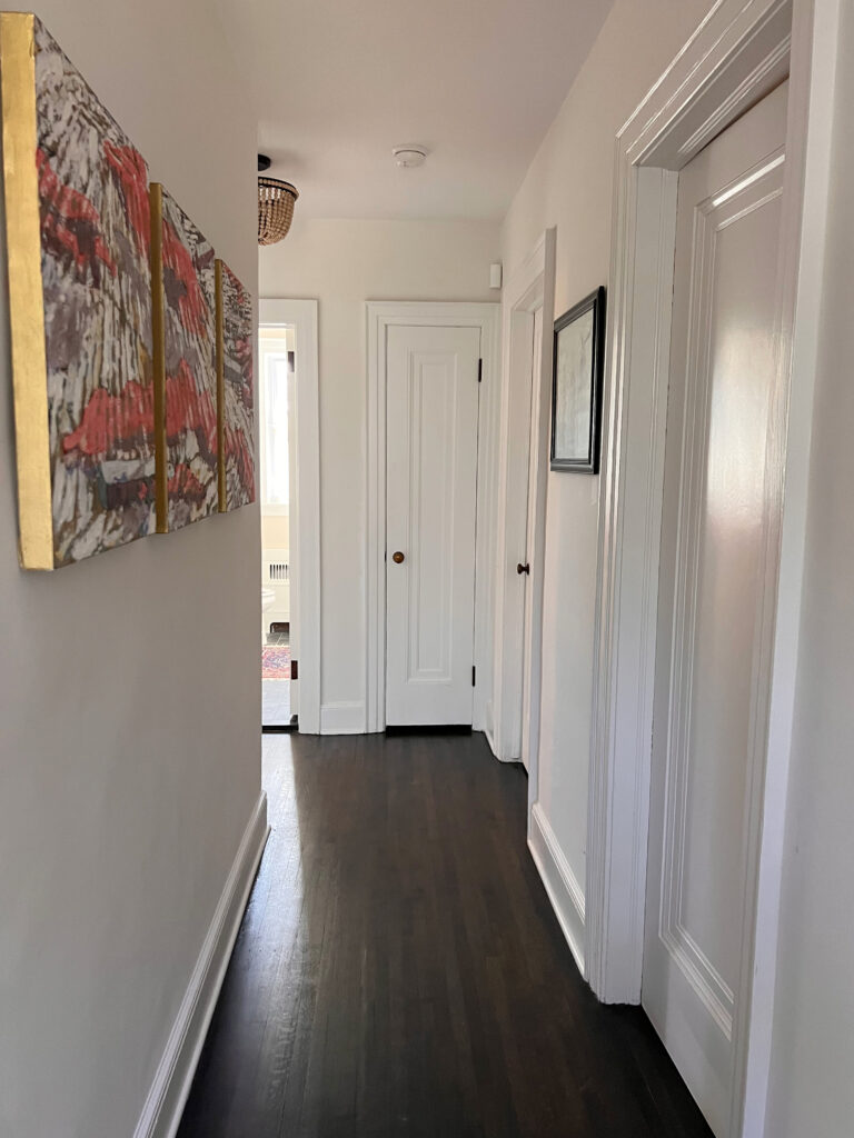
This next hallway has no natural light and suits a shiny(er) finish as the walls are covered in moldings, usually painted in a satin finish. I’d take it down a notch if it were my home (I bet it’s semi-gloss or even high gloss)…
Personally, I’m going to worry more about the color I choose and the quality of my light fixtures and less about my paint finish. Sure, I know the sheen will bounce more light, but it doesn’t always LOOK as good, which kind of kills the point.
Sooooo, long story short (as usual), I would use a washable matte finish on my walls or an eggshell sheen at most.
READ MORE
Ideas to Make a Dark Hallway Less Boring!
The Best White Paint Colors for a Long Dark Hallway
The Best LIGHT Paint Colors for a DARK ROOM
The 10 Best Off-White Paint Colors
The Ultimate Guide to Paint Colors & Undertones
LET ME PICK YOUR PAINT COLORS FOR YOU!


ORIGINALLY WRITTEN IN 2019, UPDATED IN 2024


Which gray owl is the one you used? Oc-52 or 2137-60 ?
I tried the OC-52 in my house just as test area. It doesn’t look anything like this pic . The pic looks brighter
Hi Aleyfiyah! They are actually the same Gray Owl, they are just numbered differently as they are in 2 different fan decks – just to make our lives interesting! And yes, what you see online vs how it looks in your home can be quite different depending on your lighting/exposure/etc… so that’s not surprising!
~Kylie
Hiya
Just wondered what you thought of farrow and ball elephant breath for a dark hallway…I like the idea of a gray with a hint of the purple, but does that work?
Hi Zee, I would LOVE to help but I don’t have that Farrow and Ball fan deck (insert sad face here…)
~Kylie
I love the grey owl in the stairwell and hallway and I think this would look great with wood molding and trim.
Just moved a month ago. Having the hardest time deciding on a living room colour. The colour I pick will continue down our hall. I am loving this Grey Owl. My question is will it be ok with Sea Salt? That is what our high foyer is painted- a great lighted area, that the living room is next to. Thx so much!
Hi Mandi, yes, Gray Owl and Sea Salt are lovely together – no problem there!
I just started reading your blog posts. Wonderful and so informative!!!,
Catching up on past blogs also. Can you do a blog on east and west facing paint colors? I have read several on north and south facing,
That said, I just painted a master bath BM Brittany Blue with white dove trim, ceiling, and cabinets with a cream/white tile floor. Now the room comes off as modern, no personality and very bright overall(need sunglasses), whereas traditional off white with pops of medium LRV color is my style. What did I do wrong and how to correct it? You Walk through an east facingMaster BR ( needs new color also) to go into this bath.
Thank you for teaching us with your gingerly humor and knowledge.
Hi Robin! I’ve actually written blog posts on BOTH of those things – hooray!
Here’s the West facing one… https://www.kylieminteriors.ca/the-best-paint-colours-for-west-facing-rooms/
And here’s the East facing one… https://www.kylieminteriors.ca/the-best-paint-colours-for-east-facing-rooms/
As for your bathroom, seems silly, but can you lower the wattage of your light bulbs? This can actually help A LOT to soften a space. You can also play around with the temperature of them. A lot of times bathroom bulbs are cool or daylight – maybe ‘warm’ bulbs will help?
I came here from Pinterest for the lovely carpeted stair treads and then was delighted to find the wall color was Edgecomb Gray, which we’ve used as the color in our main living spaces as well. Could you tell me what the carpet is? And was the carpet applied before or after installing the treads? It looks like the perfect compromise in the carpet vs runner debate for a contemporary space.
Hi Carla! Unfortunately it was a couple of years ago and I don’t have the info on file anymore! The carpet was installed after the treads were screwed down…
Kylie, I am so grateful for your posts! I have learned so much from LVR, colour undertones, to effects of lighting in north vs. south facing rooms. After reading this post earlier this year, we chose Grey Owl (at 50%) for our upstairs hallway which has limited natural light. It looks great! Now the issue is connecting Grey Owl hallway upstairs with the hallway downstairs which is Edgecoomb Grey. The two colours together aren’t working for me and so its time for a change. Should I continue with Grey Owl, either at full strength or less, for the foyer and hall downstairs (need it to pair up with Museum Piece and Overcoat in other rooms)?
Hi Teresa, thank you for your note! When it comes to personal questions, I do need to refer to my E-design so that I can look at photos and your questionnaire, otherwise I’m just guessing! It’s affordable and fun if you’d like to check it out! I do try to give as much good info as I can on my blog and if that doesn’t work, it might be time for a closer look! https://www.kylieminteriors.ca/online-decorating-design-services/
~Kylie
Hi Kylie. We have a short, narrow hallway with 6 doors (3 closet, 2 bedroom & 1 bath). The hallway is painted Colonnade Gray. I was wondering if the doors to the bedrooms & bathroom should be painted to match the wall color of the rooms, or the hallway. Thank you!
Hi Stacy! I would paint the doors the same colour as the trims for sure!
Thanks for all the helpful posts on paint colours! Do you think an edgecomb gray stairwell (lightened 25%) would match with a dove wing living room?
It can all depend on the interior/exterior lighting, but it sounds like it could be quite lovely!
Kylie, I love this blog! Actually managed to get my husband to read it with me (does that count as quality time?!). Don’t worry…I’m not going to ask about colours for a house you can’t see or feel…my husband is asking though if it is acceptable ever to paint both portions of a wall (above and below a dado rail) the same colour leaving the dado white… We are talking light shades like Gray Owl…and just hypothetical!
Thanks Kylie
Abi
Hi Abi, bless your heart – you even got the hubs to read it – hooray! And yes, absolutely. In fact, that is the more modern approach, painting both colours above and below the chair rail. It’s a bit more of a traditional or sometimes a country look to do 2 different colours. So loooong story short (as usual) YES!
~Kylie
I have a quick question. In he past I have used Magnetic Gray on a flip house. It was large and looked lovely. We recently bought a rental home that is smaller and I am afraid the magnetic gray might but too dark. I love the color but I am looking for a lighter tone of it, I think sea salt is too green. gray owl is nice but looks very crisp. think the magnetic gray is a muddier color. Doe that make sense. can you guide me to a lighter color.
thanks for your input.
Oh Jennifer, you HAVE to look at SW Silver Strand, it literally IS like the lighter version of Magnetic Gray and might just hit it right on the money! And your instincts are right, Magnetic would likely have been a bit much!
~Kylie
Thanks for your post! We are painting our great room because right now it feels dark and lifeless. We have medium wood floors and cabinets and I love all things gray. Should I pick a griege? I’m worried the brown wood will turn the griege more brown and I will hate it. That room doesn’t have a lot of natural light, so would mindful gray be too dark? I want to lighten it up but also have a color that doesn’t show up as white during daylight.
Hi Rachael! Well depending on the greige you pick you might just find that your brown wood makes the greige look more gray IN COMPARISON – which is possibly a good thing for you! Off the top of my head i DO like Mindful Gray, it depends on so many things as to whether it could work for you. If it’s darker, I lean toward saying it might be a bit TOO dark. If you want me to take a look at your home, I do have a fun E-design service and it’s affordable! This way I’m not just guessing at things 😉 https://www.kylieminteriors.ca/online-decorating-design-services/
~Kylie
HI Kylie,
In my current home I have Revere Pewter. I am moving into a new build home and want to go with a gray color for Great Room, Nook, Kitchen Foyer and dining..all open. I feel like the Revere Pewter tends to look brown at times. I don’t like that. Do you have the perfect gray color you can suggest that is not too dark, But a lovely romantic gray? We start painting this Friday! Help. Cheers, Krista
Hi Krista, I wonder if you might like SW Repose Gray? I find that lightening it by 25% tends to hit a pretty good happy place 🙂
Hi Kylie,
I am so thankful for your website and the reams of education you provide those of us that have no idea about colours! Adding some science in your LRV analysis of colour also makes way more sense to those of us who are more on the “science-right brain” side 😉
Would you suggest a comparable BM version of the SW Creamy you mentioned in your “Dark Hallway” blog? And would you give a thumbs up or down to replicating the Creamy hallway with a Gray accent wall if the room the hallway leads into (and you can see into) is BM Van Deusen Blue? I like the idea of a hallway accent wall but am not really interested in a patchwork look as you walk down the hallway.
Leslie
PS loved the post about the glass beach in Sidney. I was there “hunting” with my daughter just a few weeks back. My parents have a home there. I am sooooo recommending they check you out as they are wanting to update their house.
My question is, I have granite counter tops in my master bath Kind of looks like emerald pearl, but the green isn’t real prominent, *you kind of have to look for the green* It is dark with specks of green. I don’t want to pull too much green, but I don’t want to clash. Do you think the Gray Cashmere would work? I also have stained cabinets, but considering painting them white. I was also considering Sea Salt as this is what I have in my current bathroom. But I have white cabinets and white quartz counter tops.
We are buying a (new to us) house.
Hi Kymber, without seeing the room it ‘sounds’ like you’re on the right track – no red flags jumping up at me. Both colours CAN lean a bit blue, so just make sure you sample them to see that they hold their green for you 🙂
Ive used Farrow & Ball in a “Dark & Narrow ” Hallway with no natural lighting and it was lovely with halogen lighting. This color changes hues dramatically depending on the light. Love the F&B line. Pigments are so much richer than most paint. Benjamin Moore has come out with a new line called Century which has a soft touch mat finish and rich velvety colors. Just used it for a powder room and it is stunning!
KYLIE, REALLY ENJOY YOUR SITE HERE!
Thank you, Michele! I haven’t had much experience with F&B unfortunately, but I have chatted with BM about their century paint – expensive but WHAT a magical finish!
~Kylie
I want to transition my main floor from tans/browns to greys. I think Owl Grey might be the color to start and put everywhere, but I’m worried how it will work with my Natural Red Oak floors, we have white trim with it. Will this color work? We are also a North facing house that tends towards dark.
Thanks, Kristie.
Hi Kristie, thank you for your note! When it comes to personal questions for such a large area, it’s better to go through my E-design, so that i can take a look at photos, furniture, countertops, fireplace, etc…as when you’d dealing with a main floor, there is a lot to consider. It also depends on how much northern light you have/how big the windows are/foliage. If that interests you, it’s afforable and fun! https://www.kylieminteriors.ca/product-category/interior-paint-palettes/
~Kylie
Hi Kylie,
What wonderful advice and suggestions for brightening dark spaces! This is very timely for me, because we have several areas of our home undergoing restoration due to flooding from frozen and burst pipes! I’m frequently perplexed when choosing the correct white for trim. What white would you suggest for using with BM Revere Pewter, SW Creamy and SW Kilim Beige? Those are currently on my walls and my trim is in desperate need of refreshing. These could possibly be my go-to colors for the rooms needing restoration, so I’d love to have some guidance on trim paint. Thank you so much!!
Carolyn
Hi Carolyn, I’m glad you found it helpful! Check out SW White Dove – this could be a white that could hit on the needs of each colour, without alienating them -it’s one of my fave whites!
Hi Kylie,
Just finished a bathroom with small window , north facing, little natural light but lots of new fixtures. We have dark grey charcoal wood look tiles and marble look tiles in shower and vanity. The BM Grey Owl is perfect when there is a brief period of natural light but the rest of the time looking way too green. Had a bunch of colors on the walland Gray Owl seemed right but it’s not. Love it all but the color. Your tips are the best and I have learned a lot! Maybe a grey that pulls more blue then green?
I have used Edgecomb Grey with Oxford White trim in our bedroom and love the colour. makes the room look so bright and cheerful even on the darkest day!!
Have Stone Hearth through the rest of our open concept home.
Ashley Grey in guest bedroom.
Use blackout curtains for windows.
Ooo, that sounds like a BEAUTIFUL palette, thank you for sharing!
Hi Kylie,
Great post 🙂 We’ve been looking for ways on how to brighten our dark hallways, your post has just been very helpful. Hopefully, paint and light fixtures would work. Paint? Our top pick is the Benjamin Moore Edgecomb Gray.
Thank you for sharing 🙂
Cheers,
Jessica