
Benjamin Moore’s 8 Best Warm Grays
WHAT BENJAMIN MOORE GRAY PAINT COLORS ARE WARM?
If you’re looking for the PERFECT shade of warm gray, you’re not alone, and you’ve come to the right place (drink the Koolaid, it’s goooood). Trends are shifting away from cool grays and simple whites into softer and warmer colors. And while some are leaning toward beige, many are still on the gray train – they just don’t know which station to get off at!
But aren’t all grays cold? I mean, they are GRAY.
HECK NO! In my Online Paint Color Consulting, I deal with three main types of gray.
WARM GRAY PAINT COLORS
Warm grays are by FAR the most popular shades. With subtle violet or green undertones, these light grays are most often found on walls and cabinets.
Benjamin Moore Rodeo: Paint Color Review
STORMY GRAY PAINT COLORS
Stormy shades of gray are often classified (scientifically) as WARM GRAYS, but to most people, they look anything but warm. This includes shades like Benjamin Moore Gray Owl and Stonington Gray. Stormy grays can flash blue, green, or violet undertones, whereas warm grays won’t have blue undertones.
Stormy gray paint colors are popular on walls, exteriors, and cabinets. Darker stormy grays, in particular, are popular on kitchen islands.
Benjamin Moore Stonington Gray: Paint Color Review
COOL GRAY PAINT COLORS
As for legitimately COOL grays, they’re only popular in the dark end of things – the light, cool, and icy grays aren’t floatin’ many boats. As for undertones, the most popular cool grays cater to blue-violet, with the odd green popping up here and there. Of course, some grays show little to NO undertone, but this doesn’t mean your exposure, light bulbs, or interior finishes won’t encourage them otherwise.
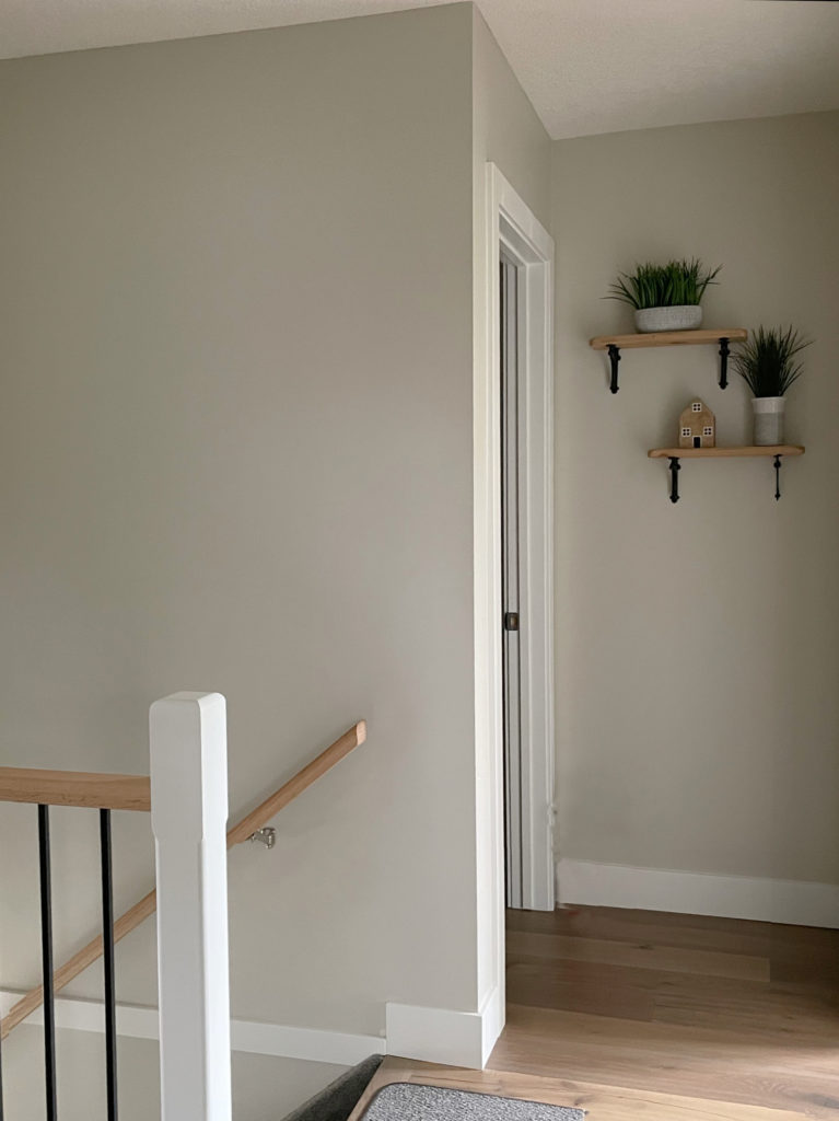
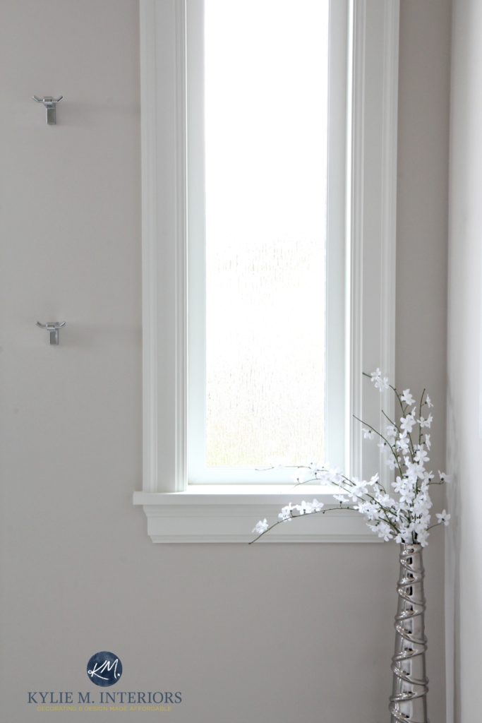
Benjamin Moore Steel Wool, shown on the lower walls in this entryway, is an example of a popular cool shade of gray (violet-blue undertones)…
Benjamin Moore Steel Wool Paint Color Review
HOW CAN YOU TELL IF A GRAY IS WARM, STORMY, OR COOL?
1. Cool and stormy grays often have a blue undertone but can also have violet (violet-blue) or green-blue.
2. Warm grays cater to a green or violet undertone – no blue. If you see dominant blue, this is more about the surrounding environment (exposure/bulbs/etc…) than the color itself.
3. The best way to SEE the above undertones is to COMPARE grays to each other – order 6-8 grays of a similar depth and butt them up to each other (vertical on the wall, with white paper surrounding them – NEVER on your existing wall color).
- Notice how the ‘color’ changes from one color to the next.
- Does one seem ‘more violet/blue/green’ than another? If you see more blue, you’re looking at a stormy or cool gray.
- Does one seem warmer or cooler than another?
- Do any shades look muddier or earth-toned compared to others? These could be your warm grays.
4. Visit Kylie M Interiors, Online Paint Color Consultant
Now, if you’re ready, we’re focusing on warm shades of gray today because they’re the most popular of the three groups. As for depth, the top dogs sit in the off-white, light, and light-medium ranges (find the best DARK gray paint colors here).
BENJAMIN MOORE’S POPULAR WARM LIGHT GRAY PAINT COLORS
Remember, just because a color is popular doesn’t mean it’s the best choice for your walls, cabinets, or exterior. Make sure the undertones of your chosen gray suit your interior finishes—every gray has undertones!
1. BENJAMIN MOORE COLLINGWOOD OC-28
Collingwood is a light, warm gray with a soft violet undertone. Some grays can flex with their undertones – not this one. Collingwood commits to its undertones without being overbearing. In fact, these violet undertones suit more interior finishes than gray-green undertones.
FULL Paint Color Review of Benjamin Moore Collingwood
Regarding popular shades of gray, Collingwood has been a hit with my Online Color Consulting. Warm violet undertones are more likely to suit the average interior finish than blue or green. From there, it’s just about how WARM you want it and how obvious or subtle!
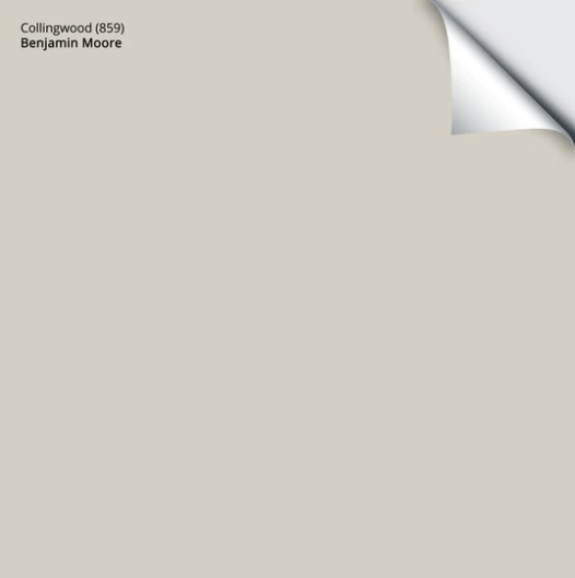
Get your PEEL & STICK SAMPLE OF COLLINGWOOD
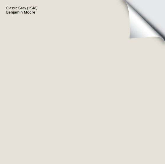
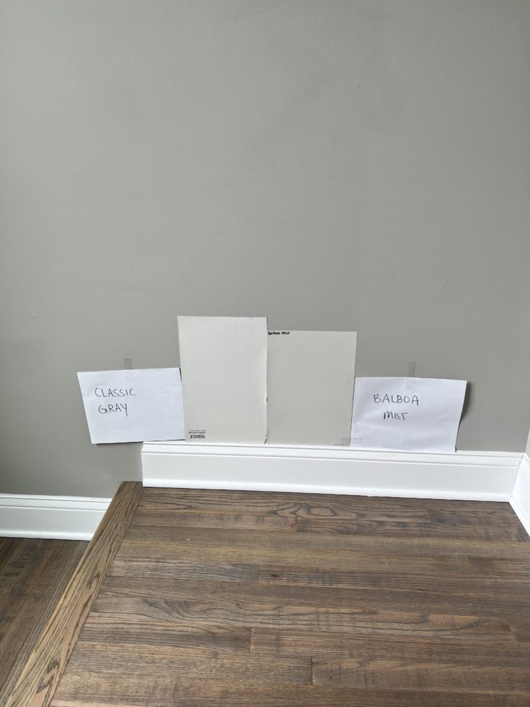
2. BENJAMIN MOORE CLASSIC GRAY OC-23
Classic Gray is another warm gray (so warm it’s like a taupe) with a violet undertone, but it’s lighter than Collingwood and a bit more violet-pink.
Why violet-PINK?
Because Classic Gray has a little extra warmth, and with that warmth comes a wink o’ pink (fractional, at best)! And while Classic Gray can be tricky on cabinets due to its depth, it’s SUPER popular on walls.
Benjamin Moore Classic Gray FULL Paint Color Review
Classic Gray is also a hit in the home staging world. It offers a hint of color without being overwhelming. While many people SAY they don’t love violet undertones, I’m always surprised to see how many really do once they see them in the right color!
The Best Neutral Flooring with Gray Floors & Countertops
Get your PEEL & STICK SAMPLE OF CLASSIC GRAY!
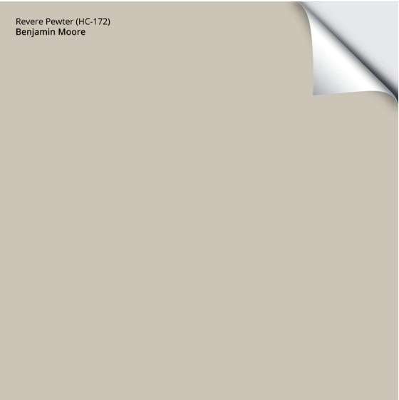
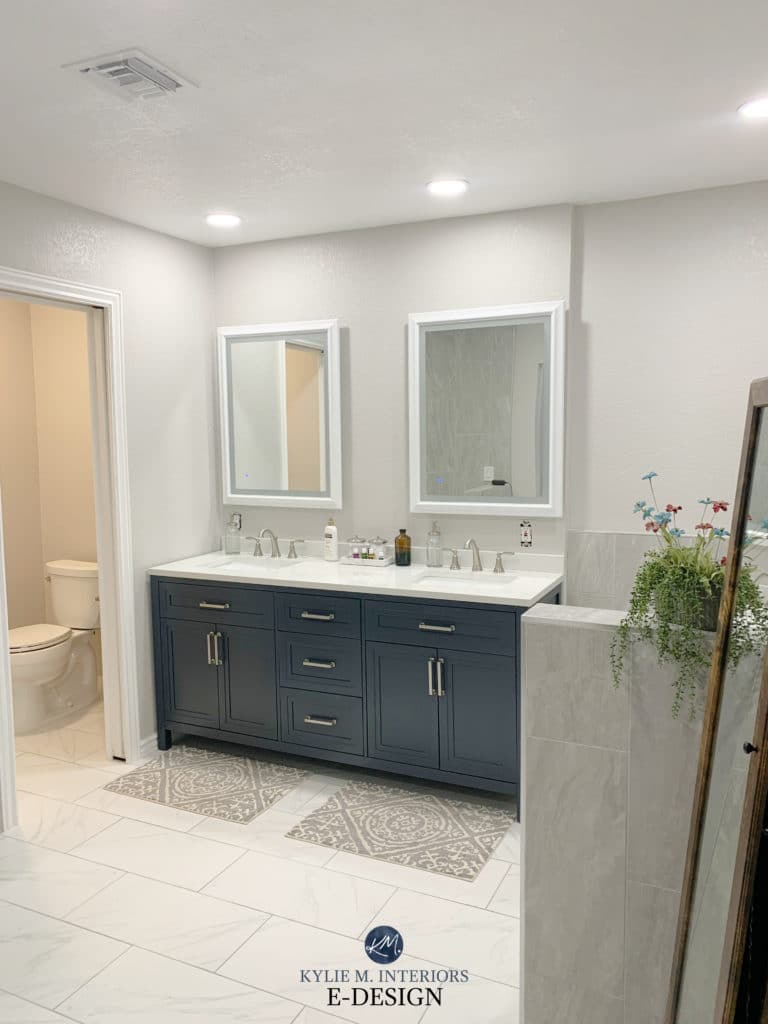
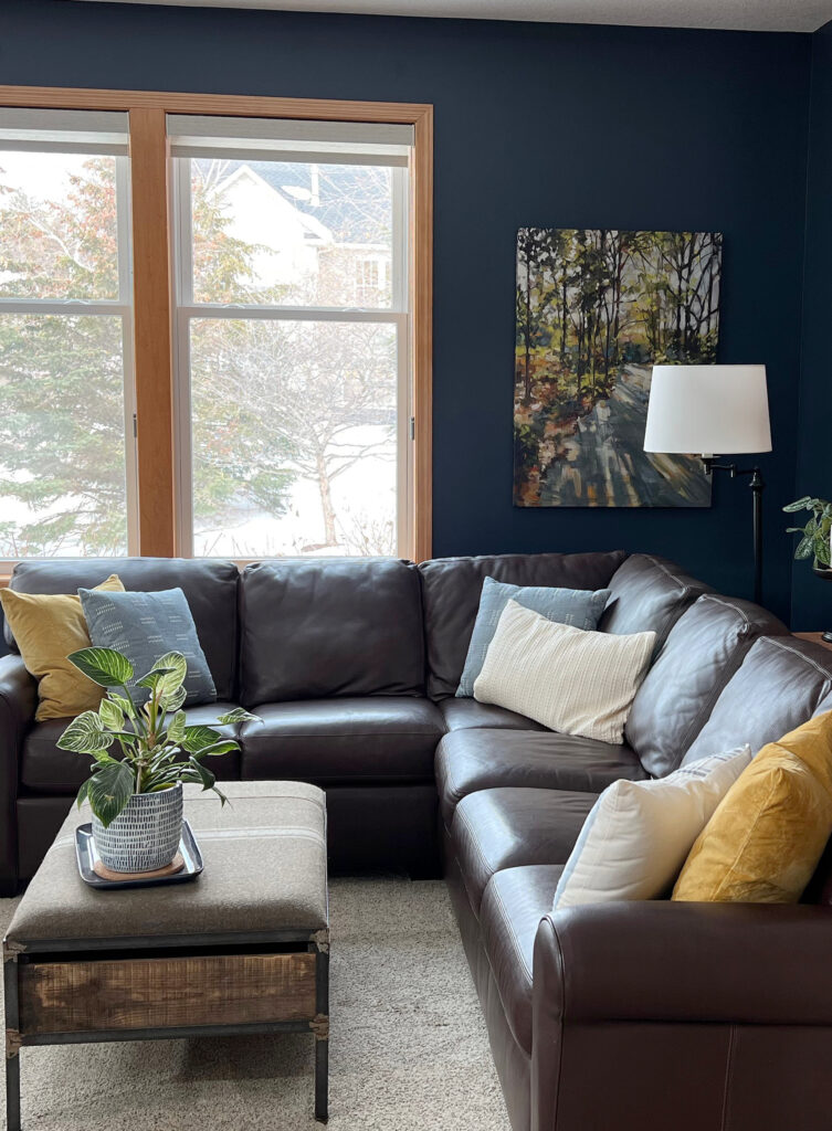
3. BENJAMIN MOORE REVERE PEWTER HC-172
Revere Pewter is amazeballs. Despite considerably warmer trends, Revere Pewter (and Classic Gray) are still strong due to their soft warmth and subtle undertones. These features make them great for the long term as they can be more timeless in the right home.
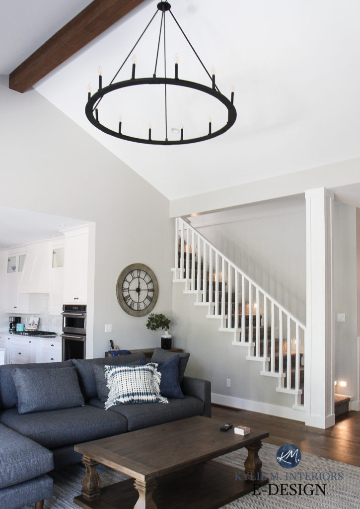
But unlike the previous three shades, Revere Pewter has an earthy green undertone. It also has a bit more depth than the others, bordering on the light-medium range, with an LRV of 55.
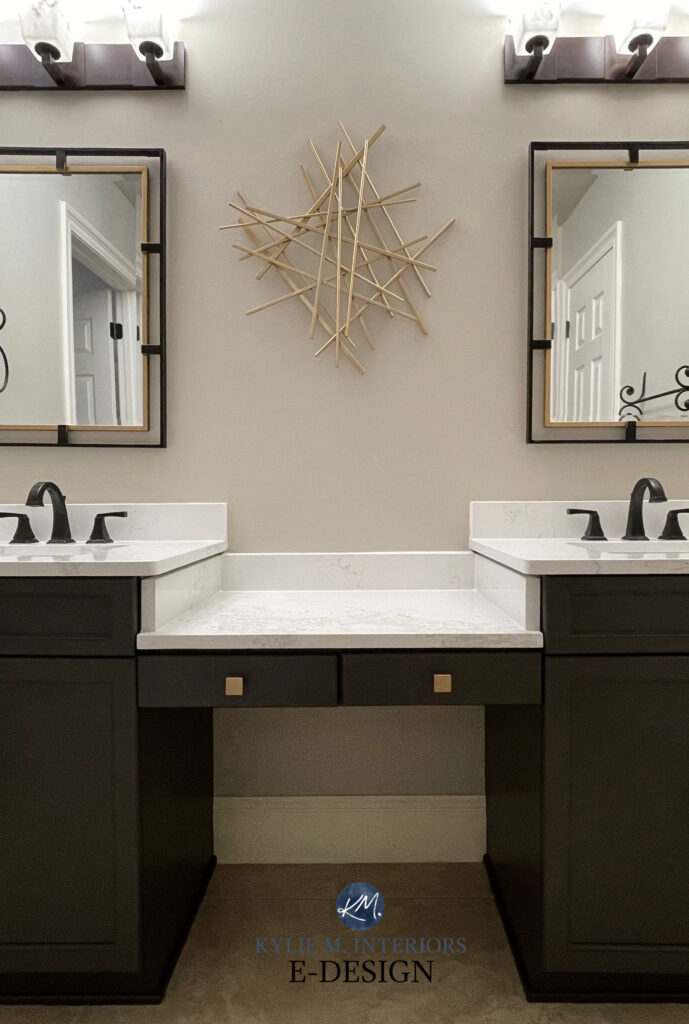
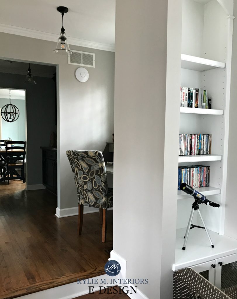
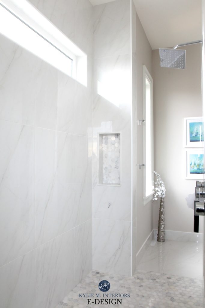
The above bathroom is about as warm as Revere Pewter looks (and is likely being helped out by lower KELVIN bulbs). This next photo is a more ‘typical’ shot of Revere Pewter in action…
FULL Paint Color Review of Benjamin Moore Revere Pewter
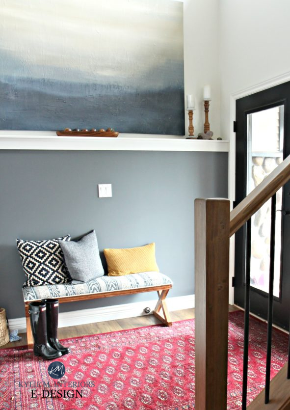
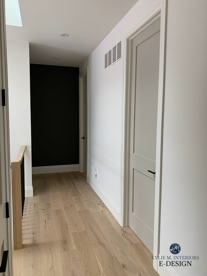
In recent years, Revere Pewter has been a top choice for exterior siding, interior walls, cabinets, and even trims! I used Revere Pewter on my interior doors and kitchen cabinets.
And look at how gorgeous it looks on the board and batten in this updated entryway (love the black door)…

This next photo shows my client’s home with Benjamin Moore White Dove and Revere Pewter on the door…
Get your PEEL & STICK SAMPLE OF REVERE PEWTER
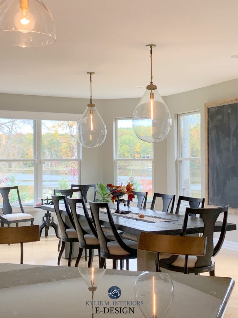
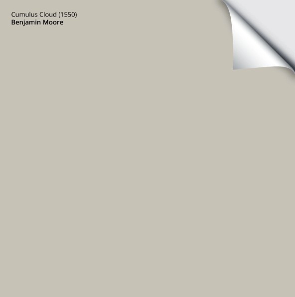
4. BENJAMIN MOORE CUMULUS CLOUD 1550
Cumulus Cloud isn’t as popular as the previous four shades.
Why?
There are two main reasons…
1. Most people want a lighter, softer approach when choosing a warm gray with a violet undertone. With its LRV of 52.31, Cumulus Cloud is light-medium in depth and not as suited to darker rooms or hallways.
2. Cumulus Cloud has flexible underrtones. This means that while it can grab a subtle violet, the odd wink of green pops up (as shown on the left side of the above photo). The less committed a color is to ONE undertone, the more likely it is to pick up a range. This makes Cumulus Cloud not as popular because many finishes need more commitment to a particular undertone.
CHECK OUT MY ONLINE PAINT COLOUR CONSULTING, COURSES & E-BOOKS!
Get your PEEL & STICK SAMPLE OF CUMULUS CLOUD
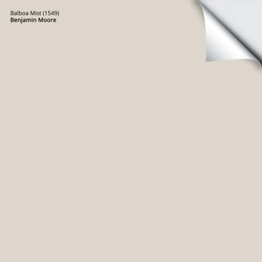
5. BENJAMIN MOORE BALBOA MIST OC-27
Balboa Mist is similar to Collingwood in its overall approach and popularity. As for depth, it’s lighter than Collingwood but darker than Classic Gray, making it a great happy medium between these two shades.
Benjamin Moore Balboa Mist FULL Paint Color Review
Balboa Mist ALSO has a violet undertone that can show up to the party a bit more, especially in north-facing rooms, but again, it’s an undertone that suits many interior finishes. As for temperature, Balboa Mist is definitely a warm gray, but you’ll be hard-pressed to have it lean very far into taupe and definitely not beige.
Here’s a good side-by-side comparison of Classic Gray and Balboa Mist, using Samplize Peel & Stick samples…
Get your PEEL & STICK SAMPLES OF BALBOA MIST!
6. BENJAMIN MOORE LIGHT PEWTER 1464
Light Pewter is similar to Balboa Mist (#3), with the main difference being TEMPERATURE. While both are warm grays, Light Pewter isn’t quite as warm as Balboa Mist. And while you’d be hard-pressed to have it look super COLD, it can look a titbit nippy in a north-facing room.
But like Balboa Mist, Light Pewter has a violet undertone. In comparison, Balboa Mist can look sliiiiightly violet-pink (the pink being not dominant at ALL).
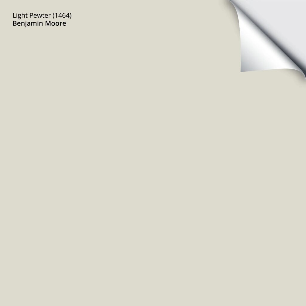
Get your PEEL & STICK SAMPLE OF LIGHT PEWTER
Photos found online and/or taken by professionals sometimes distort the color from how it really looks and often aren’t EVEN the right color! I’m proud only to show photos provided by myself or my Online Paint Color Consulting clients. This way, I KNOW that what you’re looking at is the actual color – Thank you for sending your photos in; you make my colorful lil world go round!
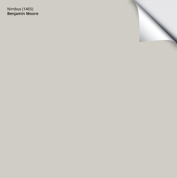
7. BENJAMIN MOORE NIMBUS 1465
Nimbus is like a slightly darker version of Light Pewter. With its LRV of 59.4, Nimbus parks itself in the slightly darker end of the light range.
And while Nimbus has its place, it seems more people fall for Collingwood’s similar but slightly warmer gray approach.
And like most of the others on this page, Nimbus also has a LOVELY violet undertone. While it’s not suuuuuuper subtle, you also won’t feel like Barney did a jig on your walls.
FULL Paint Color Review of Benjamin Moore Nimbus
Get your PEEL & STICK SAMPLE OF NIMBUS!
8. BENJAMIN MOORE SILVER SATIN OC-26
Silver Satin is an off-white warm gray—similar to Classic Gray but not quite as warm. Because of this reduced warmth, Classic Gray is the more popular choice of the two shades.
As for undertones, Silver Satin can flash a wee willy wink more violet than the previous violet-inspired shades—sometimes a bit too much, but it depends on the finishes you’re coordinating with and your tolerance level—you might find it just perfect!
FULL Paint Color Review of Benjamin Moore Silver Satin
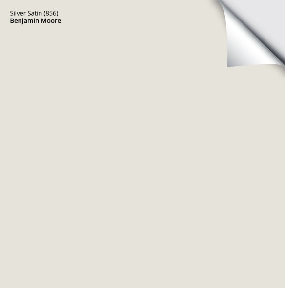
Get your PEEL & STICK SAMPLE OF SILVER SATIN
PEOPLE ALSO ASK…
WHAT COLORS GO WITH WARM GRAYS, IN PARTICULAR, WHITES?
While it depends on the warm gray you choose, they often like white paint colors with a more passive warmth, not too much yellow. Brighter, more classic shades like these TOP 5 whites offer a bit more contrast and a slightly cleaner approach.
As for actual COLORS, tons look great with warm gray. While it can depend on the exact depth and undertone of the shade you’re coordinating, start with muted shades of gray-blue, darker gray-greens like Benjamin Moore Amherst Gray, more colorful medium and dark greens, and classic navy blues like Hale Navy.
How to Shift Your Home Out of the Millenial Gray Trend
WHICH WARM GRAY PAINT COLOR IS ‘THE’ MOST POPULAR?
According to Samplize, Sherwin Williams Repose Gray is the most popular shade of gray. However, it’s not MY favorite as I don’t trust it to do what I need it to (read its review to learn more).
Sherwin Williams 10 Best WARM Gray Paint Colors
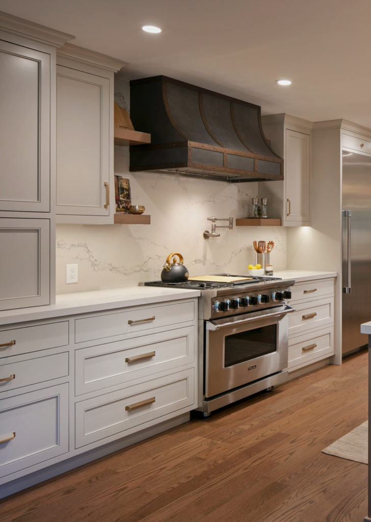
Benjamin Moore Revere Pewter cabinets – see the full project HERE
As for Benjamin Moore, Revere Pewter is the top warm gray shade, followed closely by Classic Gray. This is interesting as Revere Pewter’s green undertone is a bit less likely to humor the ‘average’ interior finish. Regardless, Revere Pewter’s popularity has been strong for years; I even have it on my kitchen cabinets!
HOW DO YOU MAKE GRAY PAINT LOOK WARMER?
The gray trend had us doing gray-on-gray…on gray. It can be tough to transition out. Here are a few tips…
- If you have warm trim, it could make your gray look cooler than it is (opposites attract). Consider a more moderate shade of white. This won’t stop your walls from looking cool gray, but it won’t ENHANCE them like a warm, creamy white will.
- Try lowering the KELVINS of your light bulbs. This small change can shift the undertones of your gray and offer more warmth than the brighter or cooler Kelvins.
- Use toss cushions, decor, and area rugs to add warm accent colors. Even plants and wood tones can help a cold gray room look more inviting!
FOR MORE TIPS, READ THIS: How to Make Your Gray Room Look Warmer
READ MORE
Are Gray Paint Colors Still Trendy?
Sherwin Williams 10 Best WARM Gray Paint Colors
Sherwin Williams City Loft: Paint Color Review
What Are the BEST TRUE Gray Paint Colors With NO Undertones?
The 12 Best Light Greige & Taupe Paint Colors
STOP STRESSING; START PAINTING…
KYLIE M’S ONLINE PAINT COLOR CONSULTING PACKAGES


I like the fact that you are talking Kelvins. Harsh blue lighting can totally change the feel of a room for the worse. It’s something we all need to be educated on.
Helpo Kylie,
Not sure if you will see this comment. I’ve been watching your stuff for a couple years now. I really want a warm gray on my walls. Why question is, if I have warm honey cabinets, will that typically bring out more of the green undertones in revere pewter, or recede them?
I love your videos and website. And by the way, your hair is amazing!
Hiya! It’s hard to say as sometimes it’s more about the lighting in the room vs the wood cabinets. Like, if you want to see green, you might look at bulbs that have lower/warmer Kelvins.
I just got done painting our home office and really liked mindful gray but determined it was too dark for my space. I chose repose gray for the laundry room and the office (east facing), but man…all I see is blue and am re-thinking re-painting the whole thing. I’m really bummed. I really would like a warm gray w/ tan undertones, but don’t know if that’s even possible. Maybe light tan w/ gray undertones?
Kim
What about something like SW Egret White or Modern Gray – they aren’t tan-grays, but they’re LOVELY hybrid colors! Natural Tan is a bit more tan-gray 🙂
Just want to say thank you! I researched lots of warm gray paint colors and went with Colingwood due to a different post you wrote. Thank you for your recommendation! I absolutely love it in our home! It looks beautiful with our white trim and dark wood floors. I almost passed on it because it’s not one of the “popular” gray colors. It does not get the credit it deserves. Thank you again!
OH wow, what a lovely comment to get, thank you very much Denise!
Hello! I am looking for a light grey for my kitchen what has White Dove cabinets and trim and dolomite marble counters. The dolomite does have some creamy white mixed in with grey. I can’t find a paint color that works with both. Whites are too warm or brighter whites make the white dove look too creamy and greys are or too blue or green and greige doesn’t looks right. Help! 🙂
Hey Sandy, it’s SO hard to say without seeing your Dolomite and the room its in! If you do white, I’d stick with White Dove, which could make things a lot easier As for grays, White Dove can be a bit fussy and it would really depend on satisfying that Dolomite!
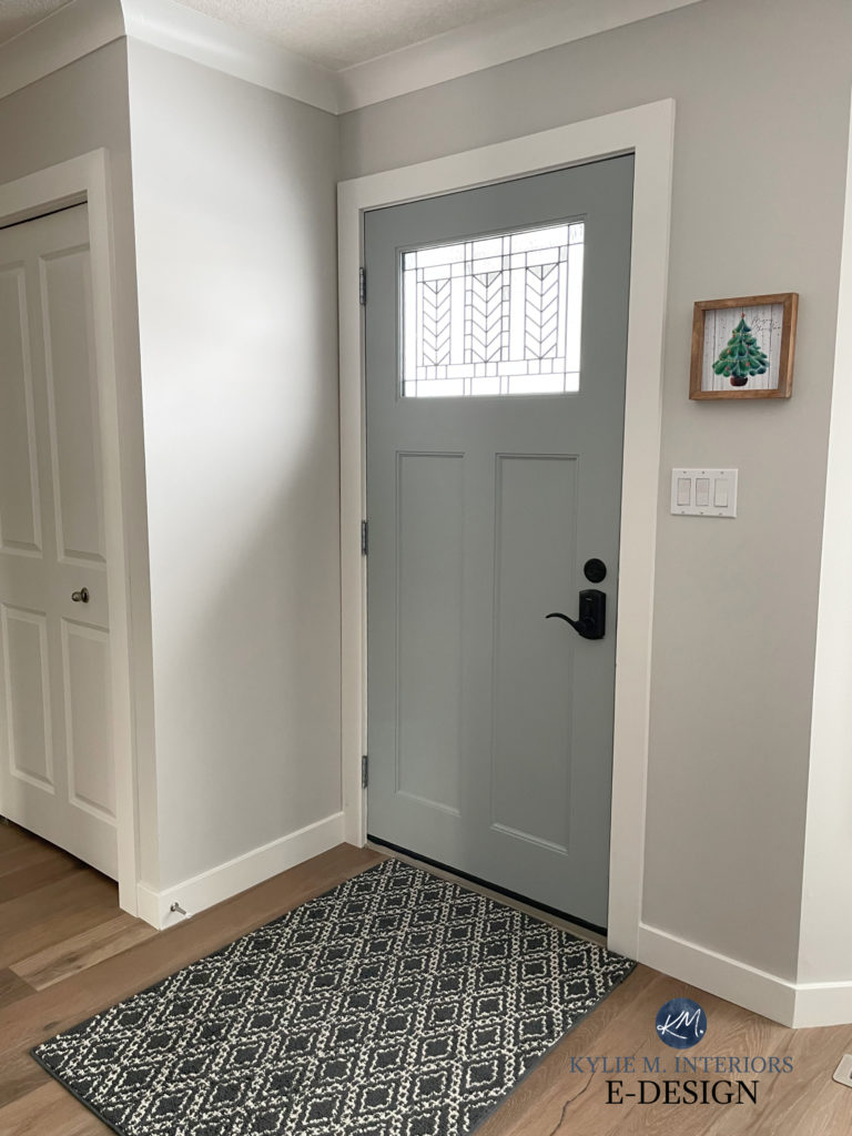
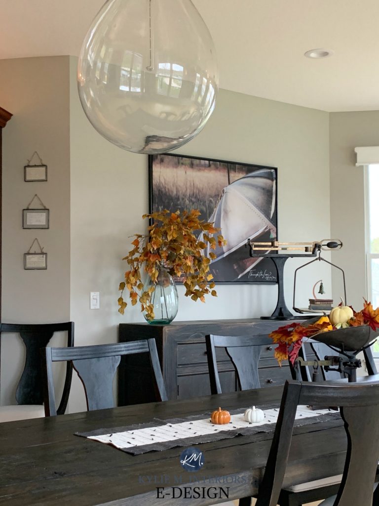
Hi Kylie, can you please tell me what color the inside of the front door is painted ( black geometric rug and tree picture to the right). I just love it! Thank you.
Ahhh, that’s the beautiful Sherwin Williams Mineral Deposit 🙂
I love your insights on neutral colors. We are about to paint kitchen cabinets, bookshelves, interior walls in all main rooms, and trim. We love classic gray on our walls (accessible beige and repose gray looked muddy in some rooms) but we were planning to do SW alabaster kitchen cabinets and bookshelves in family room. Will those work together and if so, what trim? I wanted SW extra white but painter said it was not a good paint for coverage. I would love your thoughts?
Oooo yikes, I wouldn’t to Classic Gray and Alabaster – nope, Alabaster is too yellow. Pure White would be a better choice with Classic Gray, and then you can use it on the trim, too (it’s ideal to have the same white on your cabinets/trims/doors/etc rather than mixing and matching whites :). And I haven’t heard of Extra White not covering as well as it has a slightly lower LRV than some whites. You COULD ask them to top up each gallon of paint with white tint. There’s usually enough room left in the can for a bit extra, which can help!