Benjamin Moore Edgecomb Gray (Baby Fawn): Undertones, LRV, & Best Uses
Benjamin Moore Edgecomb Gray. While its name might have you thinking it’s out of style, don’t be fooled – never judge a book by its cover, a wine by its label, or a color by its name.
This flexible warm neutral has been kickin’ it for years on interior walls, especially in open-concept spaces or whole homes. It also shows up on exteriors and cabinets.
This fab shade is undoubtedly one of my top 10 neutral paint colors and one that I refer to ALL THE TIME in my Online Paint Color Consulting. Why? Let’s take a look…
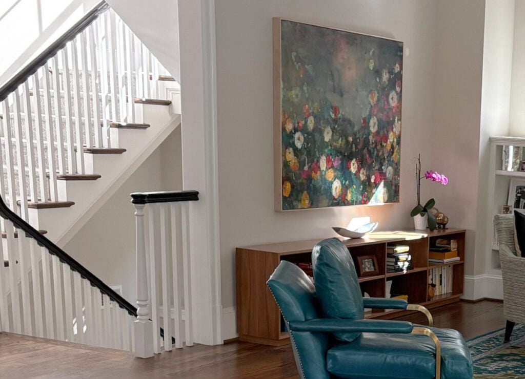
FUN FACT: All the photos in my blog are from my Online Color Consulting clients, readers, and friends— because real homes deserve to be celebrated (dirty laundry and all!) While not magazine-perfect, they’re packed with ideas and proven color choices to help you create a home you’ll love.
Updated with fresh content and images for 2026.
IS EDGECOMB GRAY WARM OR COOL?
Edgecomb Gray HC-173 (also known as Baby Fawn OC-15) is a warm neutral paint color, nestled snugly in the bosom of beige and gray.
Is it gray, beige, taupe, or greige?
Because it isn’t in the warm beige or cool gray world, it’s a greige-taupe. What do I mean by greige-taupe? Well, some neutrals like this commit to their green or purple-pink undertones, and it’s easier to put them in a group. Edgecomb Gray isn’t easy…in a good way. We’ll get into its undertones shortly, so you can understand why.
Edgecomb Gray is perfect for creating a soft, warm, and organic look that’s extremely versatile when paired with other colors.
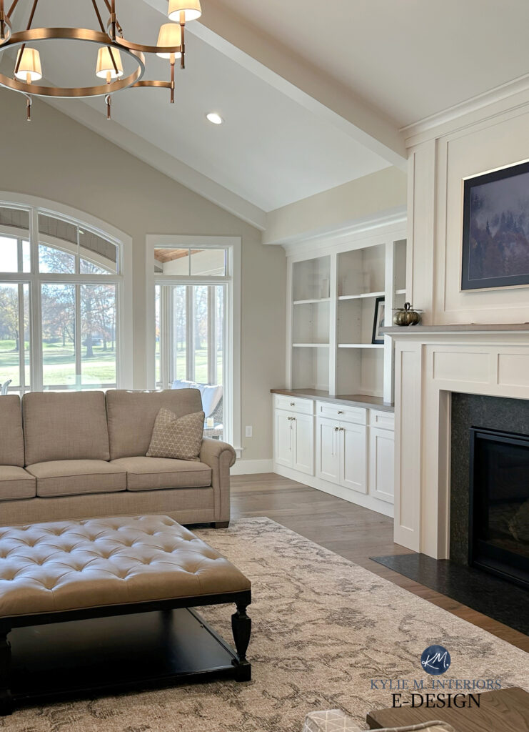
Like many greige-taupe paint colors, Edgecomb Gray can shift in appearance throughout the day, depending on exposure, interior lighting, and surrounding finishes.
If you have a room with north-facing light, Edgecomb Gray might lean a wink more into its gray base. It can lean a touch warmer in south-facing or warm afternoon western sunshine, even looking slightly beige.
North, East, South, West – Which Paint Color is the Best?
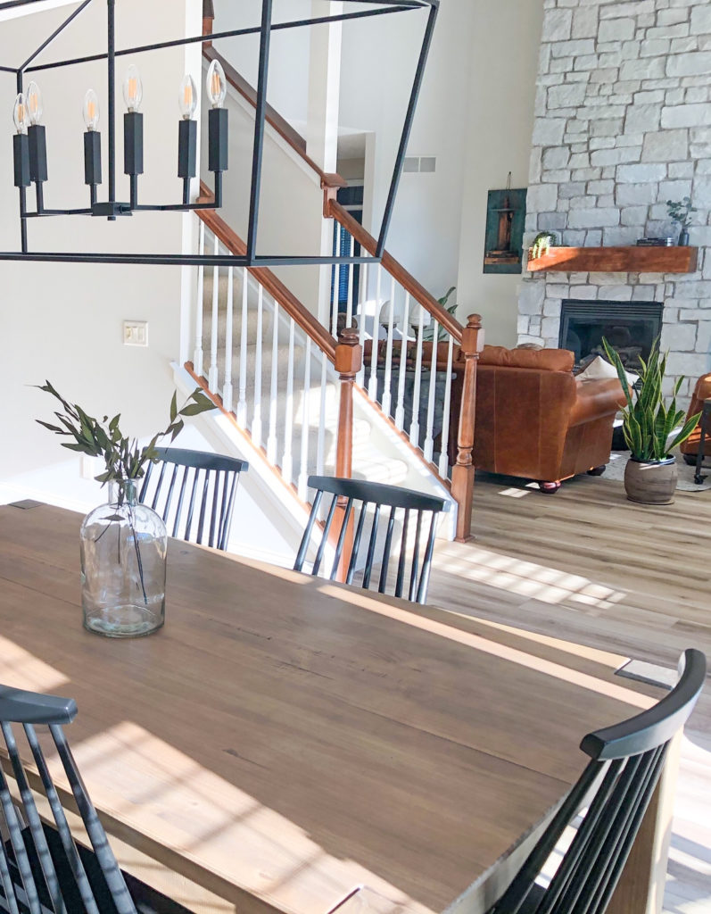
WHAT’S EDGECOMB GRAY’S LRV?
The LRV of Edgecomb Gray is 63.09. This means it isn’t a typical light and fresh color, but it’s certainly lighter than some other popular greige and taupe paint colors.
With this LRV, is Edgecomb too dark for a dark hallway or room?
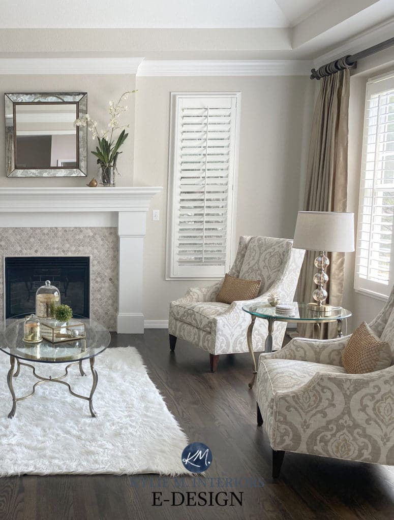
It can be. Because Edgecomb Gray is neutral, without enough light to support it, it can look a touch dingy in dark rooms, hallways, and basements. On the other hand, with an LRV of 63.09, Edgecomb Gray holds up well in considerably bright rooms without washing out, unlike some colors in the higher LRV ranges.
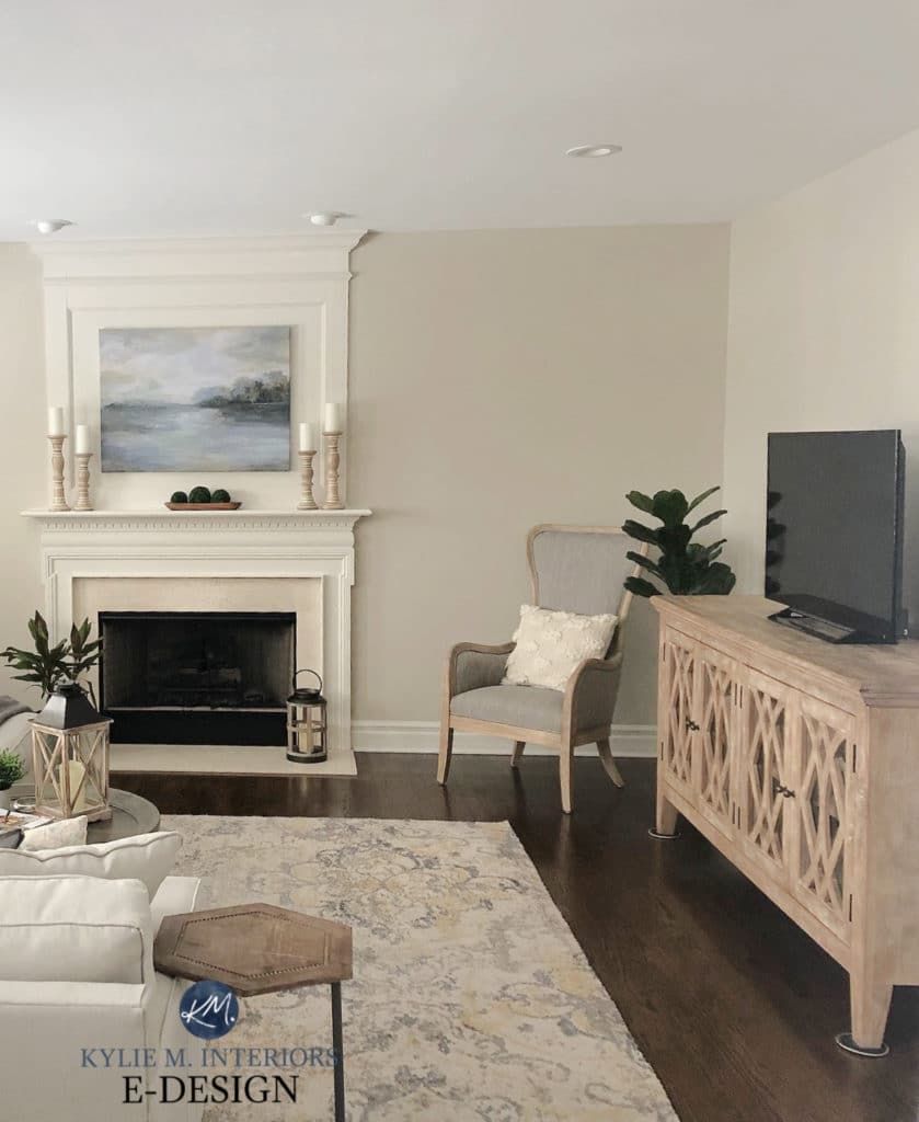
While the trim in the above photo is just a wink too creamy for Edgecomb Gray, my clients didn’t want to paint their trim. We darkened E.G. by 25% to make it happen.
Sometimes, you’ve gotta work with what you’ve got, and luckily, we managed to squeeze Edgecomb Gray in.
However, in most cases, Edgecomb Gray is too muted and soft to be paired with cream cabinets—they’ll clash hard (read more here about how to pair paint colors with cream cabinets and trim).
Not sure what LRV (Light Reflectance Value) is? Read here…The Ultimate Guide to Choosing the Right Paint Color: LRV
WHAT ARE EDGECOMB GRAY’S UNDERTONES?
Benjamin Moore Edgecomb Gray is one of the most neutral greige/taupe paint colors, thanks to its minimal undertones. While it lives in the yellow family, your walls won’t look ‘yellow’ – it’s too neutral for that.
Most greiges take on a green undertone, whereas taupes can favor a violet-pink undertone. Edgecomb Gray easily winks at either.

This lack of a real commitment to undertones means Edgecomb Gray can change its appearance depending on its surroundings and your perception of it. In the right (or wrong) lighting conditions, it can appear ‘slightly’ green (more common) or ‘slightly’ pink. This is why sampling it alongside your finishes and at different times of day is so important.

Edgecomb Gray’s minimal undertones and moderate depth (LRV) are 2 things that make it a great place to start, especially for homeowners who are new to the painting world and unsure what will work.
WILL IT LOOK GRAY OR BEIGE?
Again, a lot comes down to perception. Depending on the exposure of a room, interior lighting, surrounding finishes, and perception, Edgecomb Gray can appear a bit beige, especially when paired with gray or cooler finishes.
On the other hand, for those who love warmer shades, Edgecomb Gray can come off a bit too gray and not warm enough.
I wouldn’t say it comes off GRAY, but it can be a far cry from beige for many. This is what makes it a great happy medium for many. Like the Late Great Goldilocks once said, ‘Not too warm…not too cold…mmmmm, just right’.
Compare it to a few of these grays to see how far it sits from that world…

WALL COLOR: BM Edgecomb Gray | SW Agreeable Gray | BM Stonington Gray | SW On the Rocks | SW Light French Gray
If you’re concerned that Edgecomb Gray looks too beige or warm, consider grabbing a sample of Benjamin Moore’s Manchester Tan to see how lovely and balanced it is.
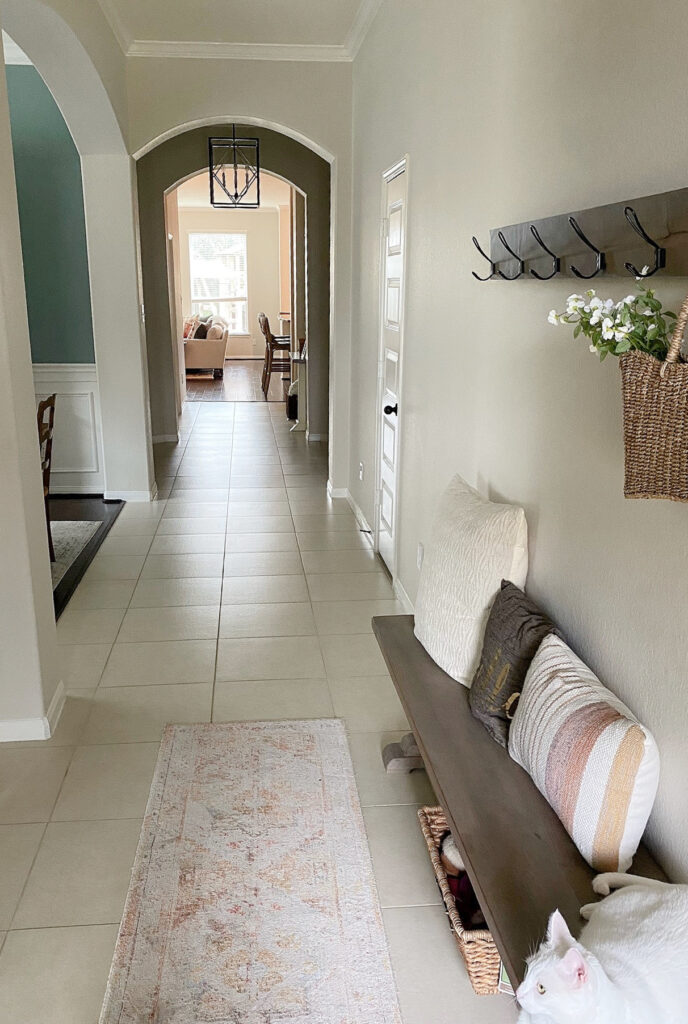
Edgecomb Gray 25% lighter
If you’re sampling Edgecomb Gray and notice a strong undertone, there could be a few reasons.
- Your exposure, especially afternoon western sunshine.
- You have a lot of green nearby. Green and red (the origin of pink) are opposite, so they enhance each other. And while Edgecomb Gray doesn’t cater to much pink, put it next to something super green, and it could SEEM like it does.
- You have cream nearby (i.e., your existing paint color) or white trim that’s warmer than average. Colors will enhance each other, and any yellow could make Edgecomb Gray look surprisingly pink.
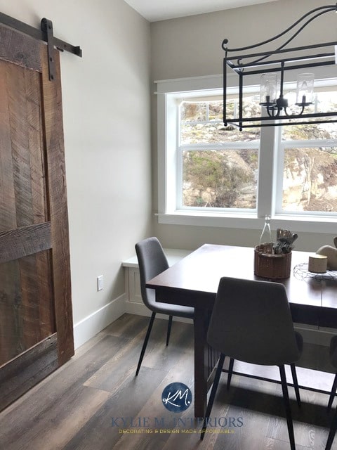
IS EDGECOMB GRAY THE LIGHT VERSION OF REVERE PEWTER?
Nope, they’re different colors. Just because colors sit above or below each other on a color strip doesn’t mean they’re directly related. They can be SIMILAR but can easily have different undertones.

It’s like when people see my redheaded friend and me walking together; they assume we’re related because we look similar and walk close together (and are so darn cute, wink wink). Long story loooong, we’re not related, and neither are Edgecomb Gray and Revere Pewter.
Benjamin Moore Revere Pewter: IMAGES, Info, & More
EDGECOMB GRAY IN DIFFERENT LIGHTING
In a well-lit space, Edgecomb Gray will look lighter and brighter as the natural light bounces off it (as any color will when given light). This will create a low-contrast look with white trim. However, in a room with average lighting (below), Edgecomb settles at its very best.
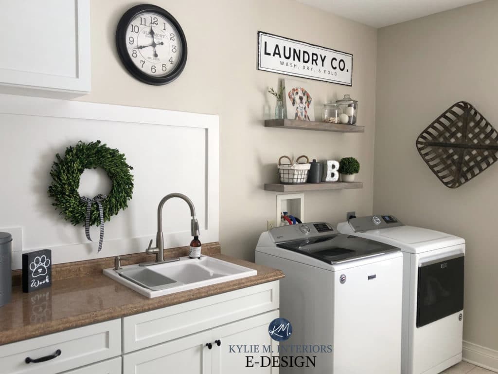
If you have a very bright room or wall, you can expect Edgecomb Gray to wash out a lot, but the color and contrast will return once the direct light softens.
On the other hand, if you have a dark or low-light space, Edgecomb Gray will lean a bit darker, which can also make it look slightly warmer. Please note that in some low-light situations, it may appear drab.
In the next photo, notice how Edgecomb Gray looks on the lower parts of the staircase compared to the higher parts…
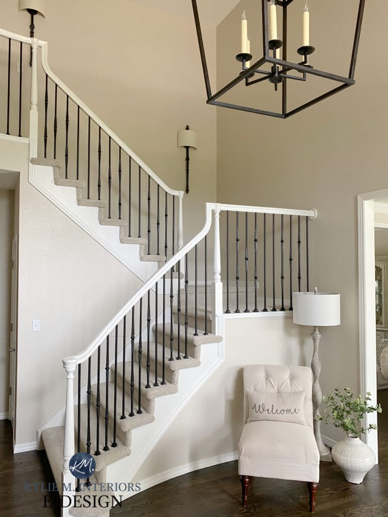
Ideas to Update Your 1990s Staircase
Here’s your Samplize PEEL & STICK SAMPLE of Edgecomb Gray
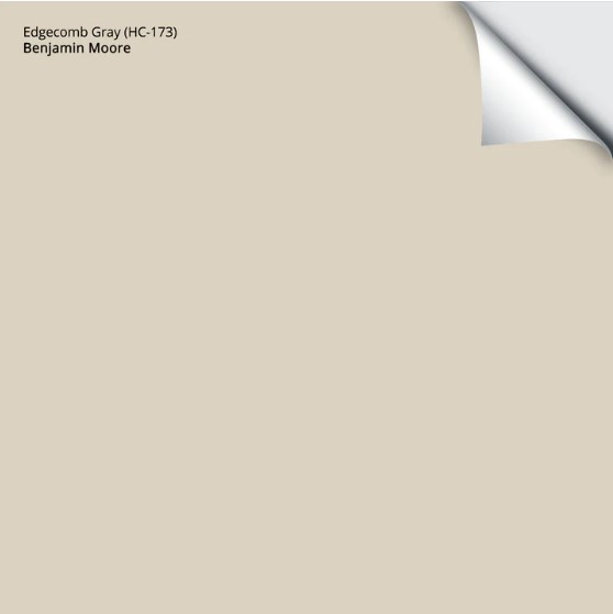
Delivered to your doorstep in ONLY 1 DAY!
Before, this entryway looked heavy with the dark wood trims, doors, railings, and gray walls…
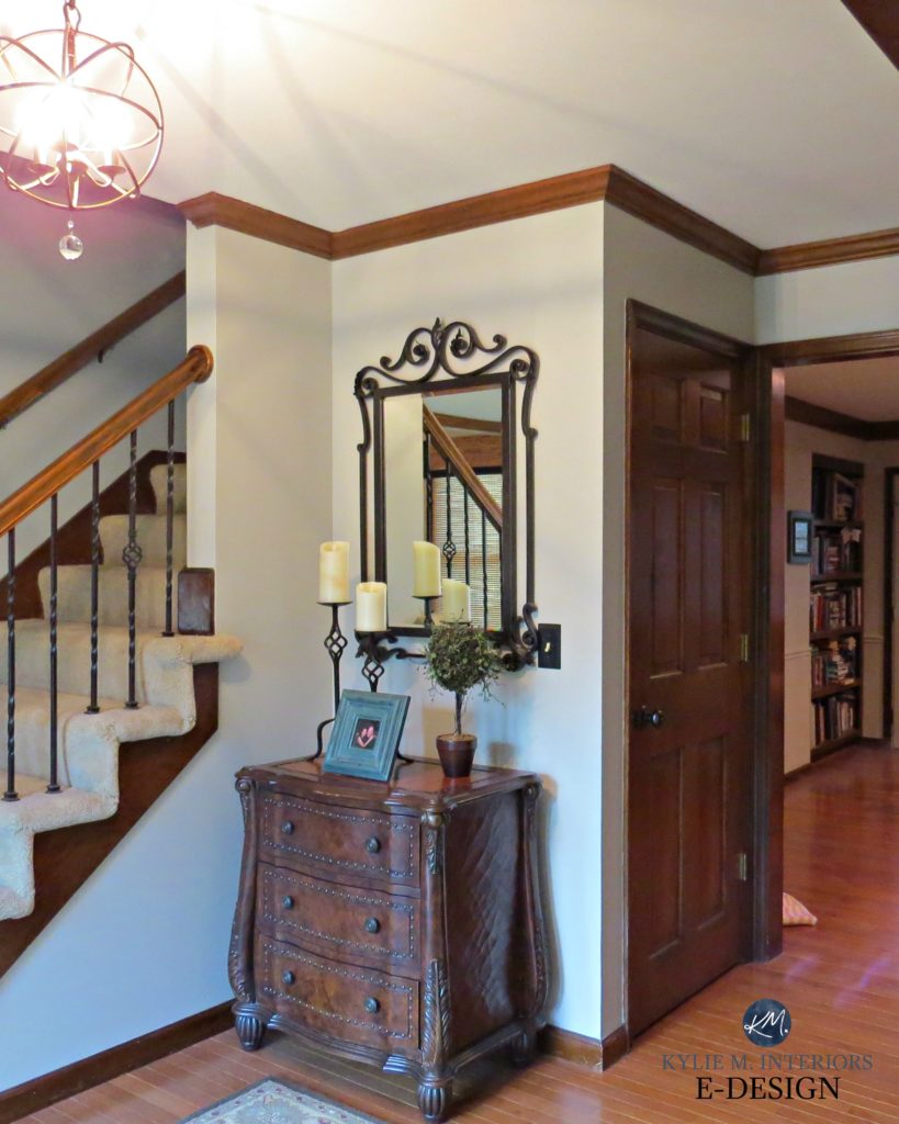
Edgecomb Gray and Benjamin Moore White Dove update this foyer while allowing for some charm and contrast with black accents…
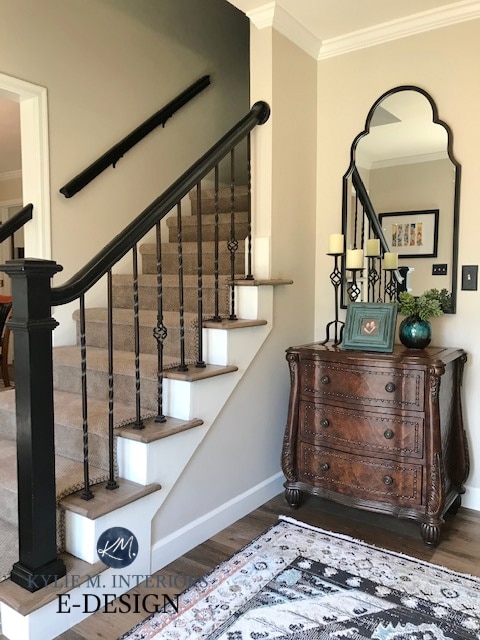
Ideas to Update Your 1990s Staircase!
Notice how well it complements the taupe carpet and wood flooring, setting a neutral stage for the rest of the home to play with.
WHAT’S A LIGHTER VERSION OF EDGECOMB GRAY?
There is no technical ‘lighter version’ of Edgecomb Gray. While Benjamin Moore’s Winds Breath is equally non-committal regarding undertones, it can look creamier than Edgecomb Gray (because it’s lighter).

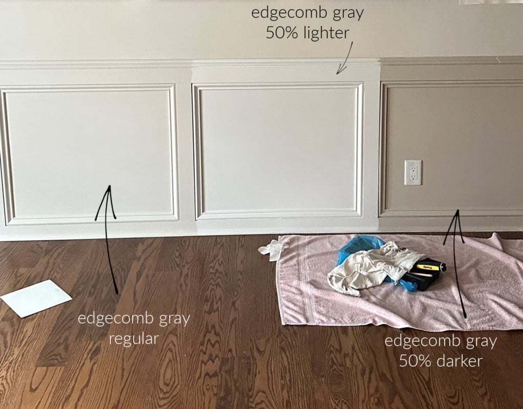
WALL COLOR: Edgecomb Gray | LEFT: 25% lighter | RIGHT: 50% LIGHTER
Your best shot at a lighter version of Edgecomb Gray is to ask your paint store technician to make a sample pot 25-50% lighter.

The undertones CAN shift when lightening a color (especially at 50%), but at least you’re working with similar bones.
MORE OF BM EDGECOMB GRAY LIGHTENED…
In my MAD quest for the perfect paint color for my home, I decided to play around with Edgecomb Gray and lightened it by 75%. This is not for the faint of heart!
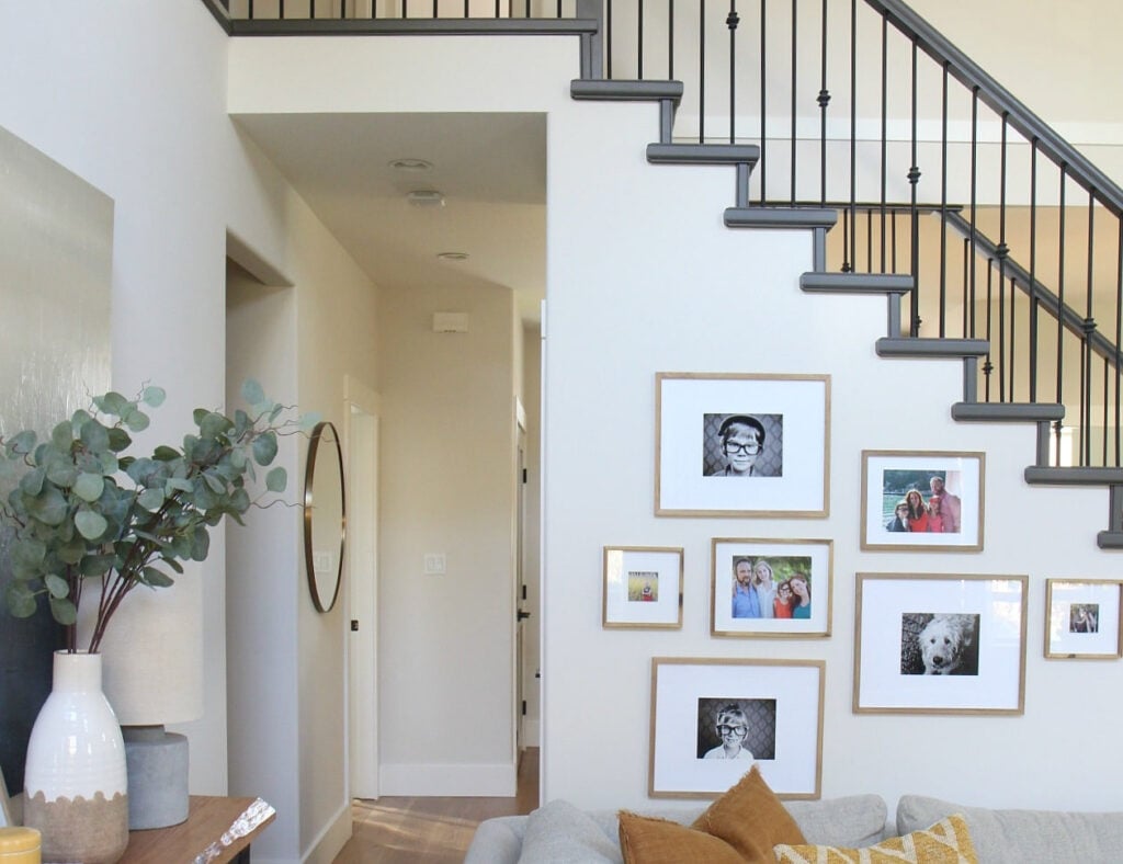
While lightening a color by 25% is a subtle shift, 50% results in a noticeable change, and 75%, well, it’s a whole different ball game.
Most people find Edgecomb at 50% a bit easier to manage…
The pure magic of this color is that its undertones shift throughout the day, and I’ve yet to see a version of it that I don’t love, whether day or night.

Here’s another great sampling example…
At 75% lighter, Edgecomb Gray is definitely in the off-white range, as shown below. In the upper hallway, it’s easier to see the contrast with the trim (and all of the love notes I have on my daughter’s doors).
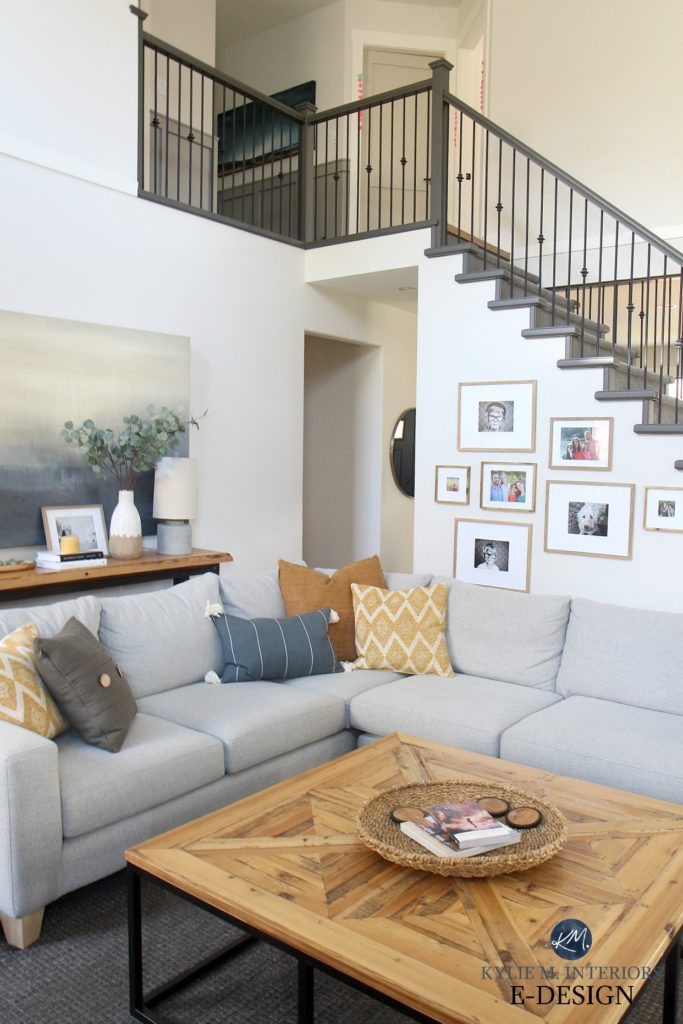
Let’s revisit Edgecomb Gray, lightened by 25% in my Online Color Consulting client’s hallway…
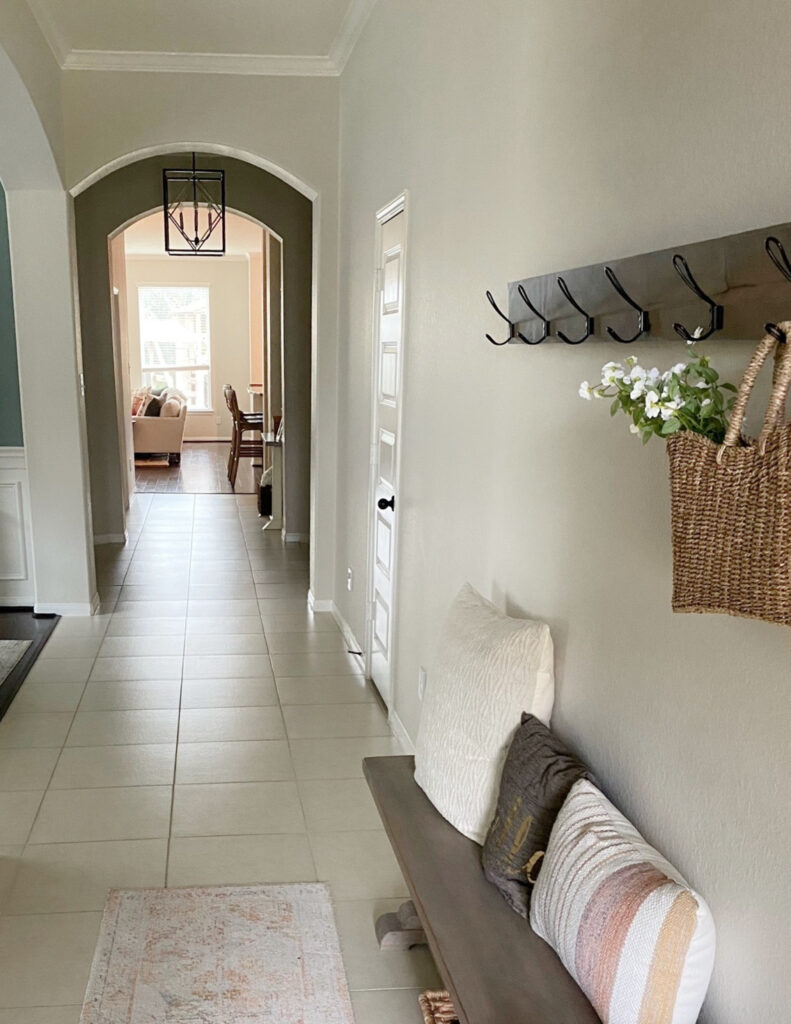
WHERE EDGECOMB GRAY DOES (& DOESN’T) DO ITS BEST WORK
When it comes to popularity, Benjamin Moore Edgecomb Gray is definitely near the top of the list for a variety of surfaces. However, this doesn’t mean it’s a no-brainer. Let’s look at a few general ‘best’ areas, then hone in on a few specifics…
- As a whole home paint color, or for a single room or open-concept space
- On the exterior of a home
- In rooms with adequate natural lighting
ON KITCHEN CABINETS…
Edgecomb Gray could be a good choice for cabinets if it suits the backsplash and countertop it’s paired with, especially since current trends favor warm, neutral, off-white, and light cabinets.

Edgecomb Gray settles nicely on cabinets if you have a dark kitchen
The tricky thing is that, with a reasonable amount of lighting, Edgecomb Gray often looks a bit lighter and warmer than expected on cabinets.
Sample and compare other colors carefully!
The Best White Paint Colors for Kitchen Cabinets
ON WALLS…
Edgecomb Gray is a hugely popular choice for single rooms and entire homes, and I don’t see that changing anytime soon. With warmer trends, you can expect more colors like Edgecomb Gray to show up at the party with tassels on and not much else. That said, many are leaning into even warmer neutrals.
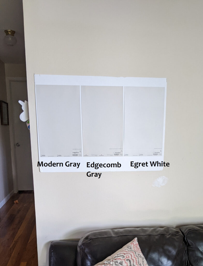
REVIEWS: Sherwin Williams Modern Gray | Egret White
ON THE EXTERIOR OF A HOME…
Edgecomb Gray can be a beautiful exterior paint color if it suits the stone, brick, or roof it’s paired with. However, just as with cabinets, expect it to look LIGHTER and WARMER than expected.
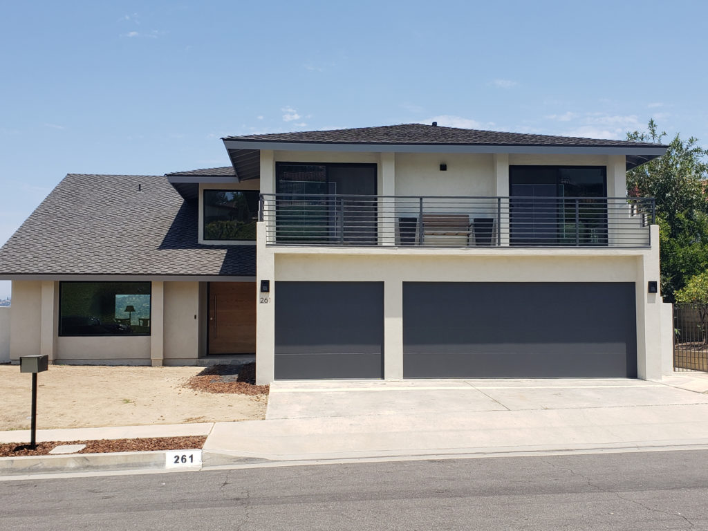
5 Easy Steps to Picking Your Exterior Paint Colors
Here’s Edgecomb Gray on a front door with a gorgeous brick exterior…
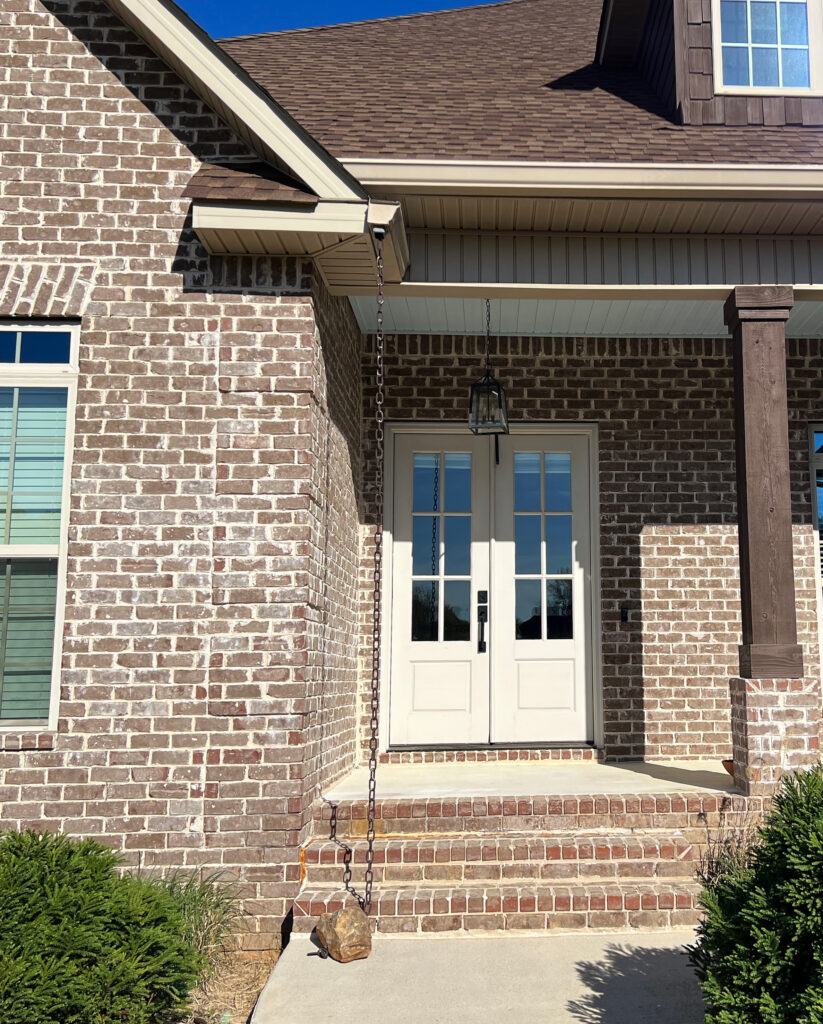
The Best Front Door Paint Colors
DOES IT GO WITH CREAM CABINETS OR TRIM?
That’s a hard no. Edgecomb Gray doesn’t have what it takes to satisfy the specific needs of the average cream-colored cabinet or trim. If you need help, I have a blog post on the best paint colors with cream cabinets and trims for you to check out.
My next Online Color Consulting client came to me hoping for a new color for her walls (as Edgecomb Gray wasn’t working)…

The challenge is that the cabinets are too cream for Edgecomb Gray. Even the stone fireplace and carpet aren’t happy with the degree of yellow in these cream cabinets. Instead, I came up with a new plan for her (and can’t wait to see the after photos)!
Regardless, it goes to show how Edgecomb Gray isn’t BFF’S with cream cabinets and trims
In this next home, the trim and doors are getting painted a more timeless shade of white, but shows how Edgecomb Gray (and other, similar neutrals) don’t work…

Edgecomb Gray is on the bottom and is lightened by 25%. Even at full strength, it’s a hard no.
DOES IT GO WITH WOOD CABINETS & TRIMS?
Edgecomb Gray can be beautiful with a wide range of wood stains, whether on your cabinets, trims, flooring, or furniture.
I might just be careful when pairing it with woods with a strong red undertone. This next image is my client’s BEFORE photo, and you can see how it sits a bit off/murky with the red hue of the flooring…

WHAT’S THE BEST WHITE TRIM WITH EDGECOMB GRAY?
I’m partial to two Benjamin Moore whites:
- Benjamin Moore White Dove, a soft, warm shade of white
- Benjamin Moore Chantilly Lace, which is a brighter white, offering a cleaner contrast with Edgecomb Gray
If you have a bright room, the increased contrast with Chantilly Lace could help you see the color on the walls more when it’s most washed out. HOWEVER, one of my favorite whites with Edgecomb Gray is Sherwin Williams Pure White.
Before, this entryway looked heavy and drab with its gold-inspired walls…
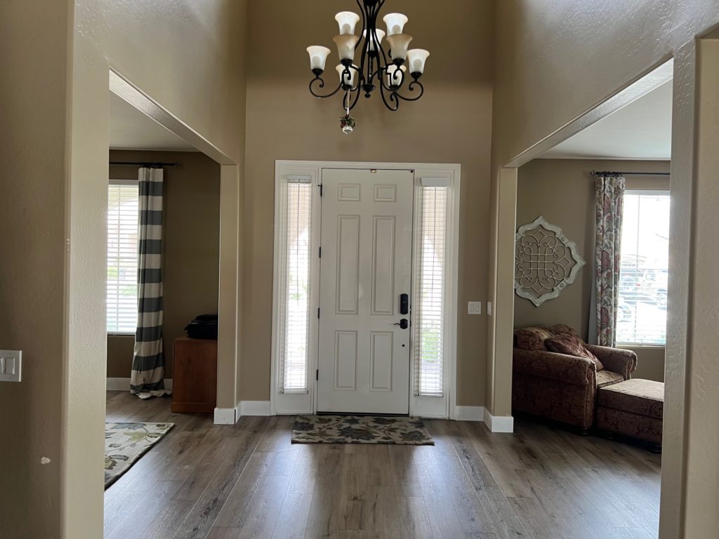
After, Edgecomb Gray (with Sherwin Williams Pure White trim) adds a fresher, brighter face to this beautiful home…
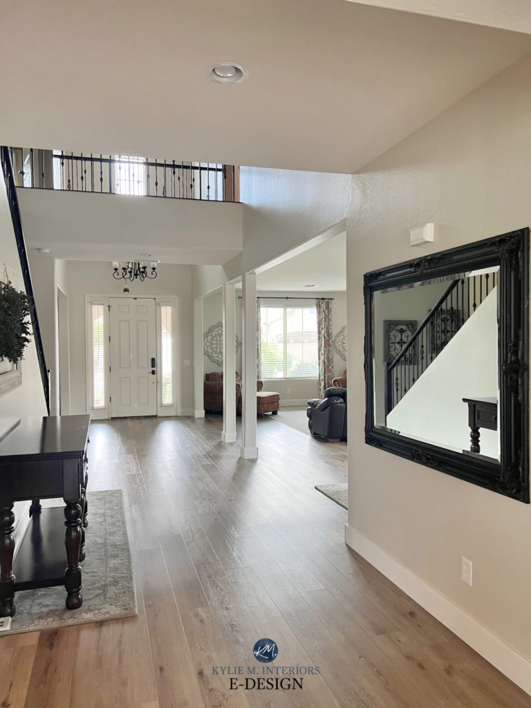
Ideas to Update Your 2000s Home: SERIES!
WHAT COLORS ARE SIMILAR TO EDGECOMB GRAY?
I have many clients who LOVE Edgecomb Gray but want it in Sherwin William’s paint—no such luck, Chuck.
Every paint color has nuances based on the foundation it’s built with—different paint companies use different foundations. This doesn’t mean you can’t get the same color, but you can’t even get a perfect color match.
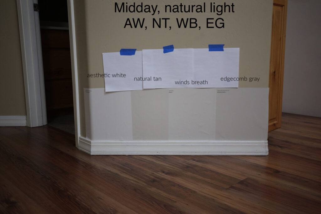
However, some colors pick up what Edgecomb Gray is throwing down regarding INTENTIONS (being a flexible, warm neutral), just with a little twist.
EDGECOMB GRAY VS. BENJAMIN MOORE REVERE PEWTER
As mentioned earlier, while these two colors may sit next to each other in the fan deck, this doesn’t mean they’re related. However, being equally as beautiful, they often vie for the same project!

Starting with depth, Edgecomb Gray’s LRV of 63.09 is a good dose lighter than Revere Pewter’s LRV of 55.05. This lower LRV means Revere Pewter falls toward the darker end of the light range.
Revere Pewter is also grayer, coming in more like a muddy, earth-toned, warm gray-greige.
Benjamin Moore Revere Pewter: IMAGES, Info, & More
EDGECOMB GRAY VS. BENJAMIN MOORE CEDAR KEY
If Edgecomb Gray falls a bit flat for you, you might love the added, taupe-based warmth of Cedar Key.
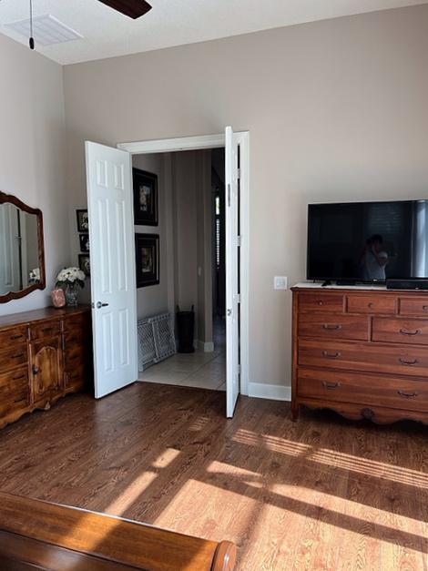
Cedar Key has an LRV of 61.03, making it slightly darker than Edgecomb Gray but still comparable.

BM Cedar Key | BM Edgecomb Gray | BM Pale Oak | BM Sea Pearl
BTW, in the above photo, this shows how Edgecomb Gray CAN look a bit pinkish at times – crazy, eh?!
WHICH SHERWIN WILLIAMS COLORS ARE SIMILAR?
If you need a good alternative to Edgecomb Gray, Sherwin Williams has some gorgeous options. Of course, there’s no exact match – that’s not how it works, but there are a few shades with similar intentions, including…
- Sherwin Williams Modern Gray. This is the best comparison if you need to switch brands.
- For a bit more depth and warmth, Sherwin Williams Accessible Beige is interesting. I wonder how they’d compare if Accessible Beige were mixed 25% lighter…
- While it’s lighter and grayer, I love Sherwin Williams Egret White for a slightly different approach to the subtle, neutral world.
Here’s a good shot of Egret White in action…
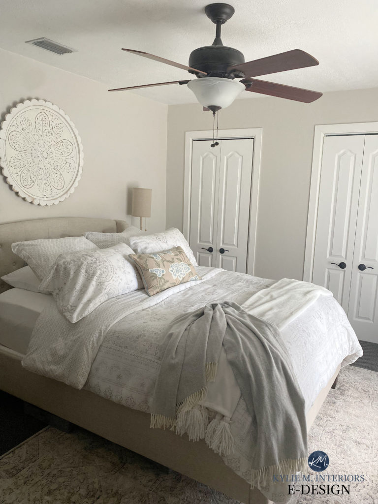
WHAT PAINT COLORS GO WITH EDGECOMB GRAY?
While it depends on what you’re using them for (cabinets, adjoining room, accent wall, etc.), there are a bunch of colors that look good in a palette with Edgecomb…
- WARM OFF-WHITES: subtle and muted warm off-white paint colors
- GRAY-BLUES: grays that are slightly darker with a blue, green, or blue-green undertone
- greige paint colors that are darker than Edgecomb Gray (at least 10 LRV points darker is a good place to start).
- WHITES: a range of soft and bright white paint colors
- GREIGES: Light to medium (or even darker) greiges can be beautiful with E. Gray, so long as they’re darker than it is
WHAT ACCENT COLORS GO WITH EDGECOMB GRAY?
Edgecomb Gray is a great partner to so many gorgeous shades, including…
- STORMY GRAY-BLUE-GREENS: mid-toned or darker blue-green-gray blends can be gorgeous accents, either on walls, doors, or home decor
- DARK EARTHY GREENS: darker, earthy green paint colors are my favorite pairings with E. Gray
- DARK GRAY-GREENS: considerably darker grays with a green undertone can be complementary, creating an organic palette
- DARK GREIGE: Please, check out a range of dark greiges as they can be STUNNING partners
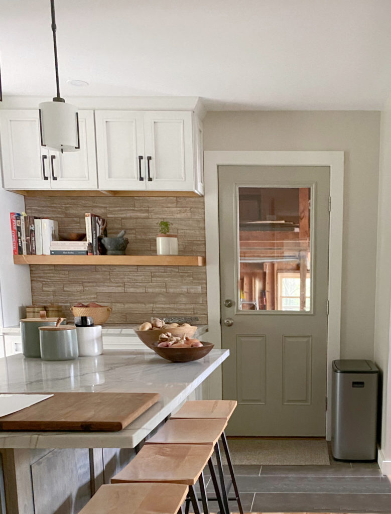
PROS & CONS: SUMMARY OF EDGECOMB GRAY
While the above blog post gives you the full details on this top-selling neutral from Benjamin Moore, let’s hit the basics…
- Edgecomb has very little commitment to undertone, making it quite flexible.
- Because of this lack of commitment, if your finishes lean considerably pink, it could look a touch green (minor) in comparison.
- On the other hand, if your finishes lean greener, they could appear a shade pink in comparison (minor)—this happens with colors that have minimal undertone allegiance.
- Edgecomb Gray’s LRV of 63 makes it a great choice for walls in a room with an average (or higher) amount of light.
- If your room is dark or low-light, Edgecomb Gray can look a bit dingy.
- It looks great with a wide range of wood stains and finishes, including cabinets, trims, and floors.
- Suits the average slightly bright or slightly warm white paint color for trims and cabinets.
- It’s a great color for resale as it has a ton of mass appeal.
READ MORE
The Best Warm Neutrals That AREN’T BEIGE!
The Best Warm Neutrals With NO YELLOW!
Paint Color Review: Sherwin Williams Taupe of the Morning
Paint Color Review: Benjamin Moore Gray Mist & Fog Mist
Get the Color Expert that Designers hire.


Eek! I’m torn between edgecomb gray and agreeable for cabinets. Walls will be pure white (SW) & island will be pewter green (SW).
North facing kitchen with lots of windows but tons of light and we have to keep our glossy black counters for now….
I want cozy/ warm/ neutral.
Any thoughts off the top of your head?
Oooo, if I had to choose RIGHT NOW…Edgecomb Gray.
That’s what I leaned too! Thanks!