
Sherwin Williams Creamy (7012): Undertones, LRV, & Best Uses
Sherwin Williams Creamy is a warm, off-white cream paint color. It works well on interior walls, especially in open-concept spaces and whole homes, as well as cabinets and trims in select spaces.
Based on surrounding finishes, exposure, and interior lighting, shades like Creamy can change in appearance from one room to the next.
The key is to learn what a color is made up of before slappin’ it on your walls. This is where my color reviews come in handy. So, let’s jump in and see what Creamy has to offer…
I always get a giggle when my Online Paint Color Consulting clients say they love cream but don’t love yellow.
Why is that funny?
Well, because a) I’m easily amused when I’ve pounded two glasses of wine and a bag of Boom Chicka Pop, and b) because without yellow, there is no cream!

The basic idea behind cream is to start with a light yellow color and add a neutral, like beige/black/gray. Once you do that, your ‘yellow’ turns into cream. The more neutral you mix in, the less yellow it gets until you eventually have beige or greige.
You’ll also find creams with notes of orange, red, or green in them, adding more layers of flexibility.
IS SW CREAMY CREAM, WHITE, OR OFF-WHITE?
Creamy is a warm, off-white, neutral paint color. Being an off-white, it has more depth than traditional shades of white…but only by a wink and a nudge.
- If you’re looking for a SUPER light and subtle shade of cream, Creamy could hit the spot as it’s one of the lightest cream paint colors.
- However, if you want a soft, creamy shade of white, Creamy could also be the look you’re going for as it tiptoes on the light between white and off-white.
However, its flexible depth makes it not as usable on trims and cabinets (in the average home, I’ve got way better options for those surfaces).
Why is Creamy so tricky?
There are a few reasons.
- The most popular shades of cream have more obvious warm yellow undertones. Because creamy is toned down, it’s not always warm enough for the average cream connoisseur.
- It’s not white, it’s not off-white, and it doesn’t always satisfy the need for either.
So, if it’s not really a creamy white and it’s not a traditional shade of cream either, what type of color is Sherwin Williams Creamy?
As mentioned above, Creamy is a warm, flexible, off-white, neutral paint color…with yellow undertones.
WHAT’S THE LRV OF CREAMY?
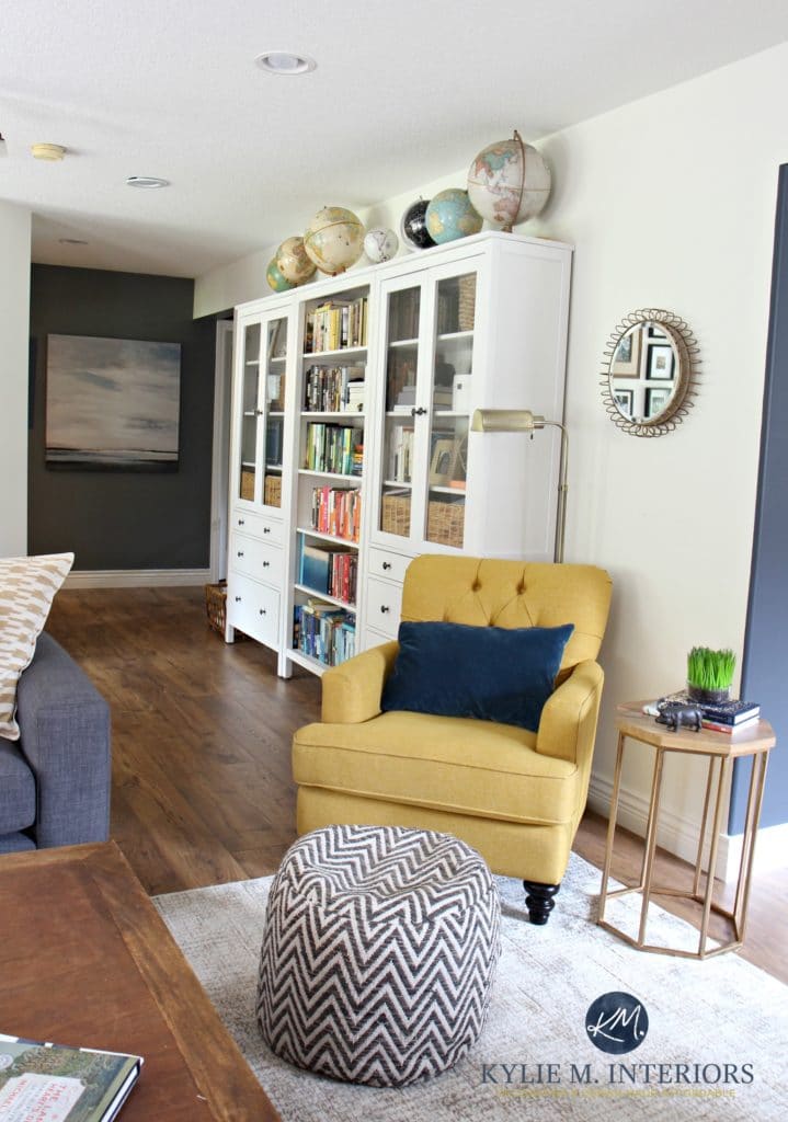
Creamy has an LRV of 81, which in the color world is PRETTY DARNED HIGH, and plants it on the edge of the white and off-white range. This is one reason why Creamy is often mistaken for a white paint color and mistakenly applied to trims and cabinets (or sometimes on purpose).
While it suits some interior finishes, especially those from the early 2000s, Creamy isn’t flexible enough, is too dark, and is FAR too yellow for the average home’s finishes.
If you aren’t familiar with LRV, you should read this. It’s a game-changer when choosing colors – trust the Ginger. The basic idea is that the higher the LRV number is (on a scale of 0 to 100), the lighter a color is (closer to pure white); the lower the LRV number is, the darker the color is (closer to pure black).
WHAT ARE CREAMY’S UNDERTONES?
YELLOW—surprise, surprise! Well, yellow is its actual ‘color,’ but it has a neutral undertone that calms it down so that it’s not day-glo yellow—it’s a muted shade of cream.
That lovely neutral base helps it stay a bit softer and more neutral compared to a slightly more yellow off-white like Sherwin Williams Dover White (which I find a touch too yellow, personally).
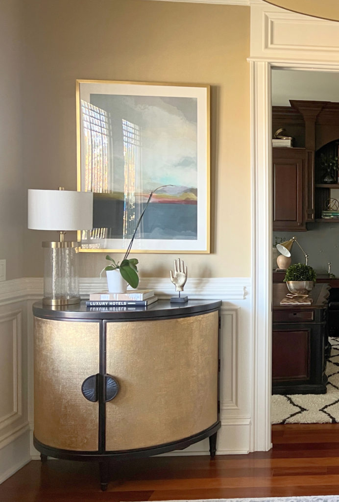
CREAMY IN A SOUTH-FACING ROOM
South-facing light is a warm, yellow light that enhances warm colors, bringing out their glorious warmth. So, when you place Creamy in a south-facing room with average light, you can expect the creamy yellow warmth to rise and become a bit more noticeable. You may notice a similar effect in the afternoon in a west-facing room, where the light becomes more golden-toned as the day progresses.
The next photo shows the absolute warmest, most yellow I’ve ever seen Creamy look (south-facing/warm bulbs)…
The Best Paint Colors for a South-Facing Room
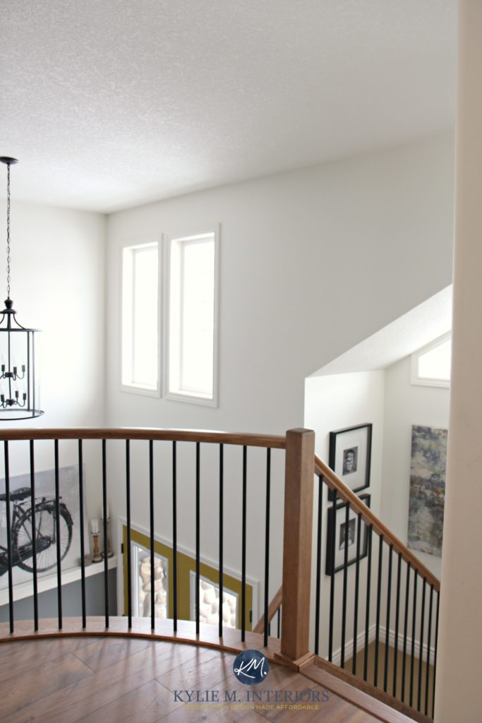
CREAMY IN A NORTH OR EAST-FACING ROOM
I LOVE Creamy in a north-facing space; I believe that’s where it’s at its very best.
Northern light is a gray light that can have a slight cool cast. This cool natural light calms Creamy, so it acts like a soft, subtle, almost not creamy color. It still has residual warmth, but it’s not noticeably as ‘yellow’ (you may see a similar effect in an east-facing room).
Shown here with Benjamin Moore Cloud White trim color
The Best Paint Colors for a North-Facing Room

Click HERE or on the above image to see available packages!
IS CREAMY A GOOD OFF-WHITE FOR A DARK ROOM?
Well, I’ve said it before, and because I like to hear myself talk, I’ll say it again…
If you have a dark room & not enough artificial or natural light, no paint color will save you – Moi.
You need to improve your interior lighting before you pick a paint color. Sure, Creamy will ‘help’ and might reflect some of the minimal natural or artificial light, but don’t expect it to work wonders if there’s not enough light to play with.
Can you not add more lighting to your room or hallway? Amazon sells wall sconces that are battery or remote-controlled!
Here’s your Peel & Stick sample of Creamy…
IS CREAMY A GOOD COLOR FOR A BRIGHT ROOM?
With its higher light reflectance value (81), you can expect Creamy to wash out on a well-lit wall, particularly at the height of day with direct sunlight on the walls. If you’re okay with a bright softness, this could be perfect.
However, if you prefer to ALWAYS see a contrast between your walls and trims, you might sample shades of cream with lower LRVs, flexible warm off-whites, or muted beiges.
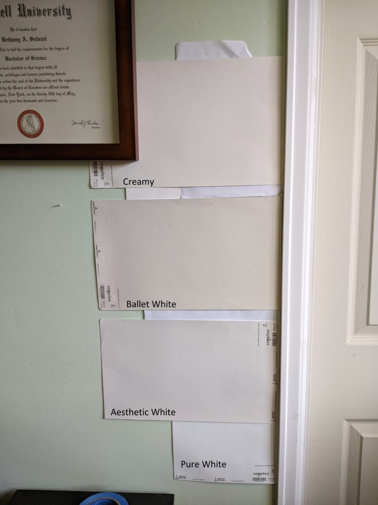
SW Creamy | BM Ballet White | SW Aesthetic White | SW Pure White
In a room with average or slightly bright natural light, Creamy should hold itself as a soft, warm white, creamy off-white as long as it has a brighter white (trim/cabinets) to contrast with.
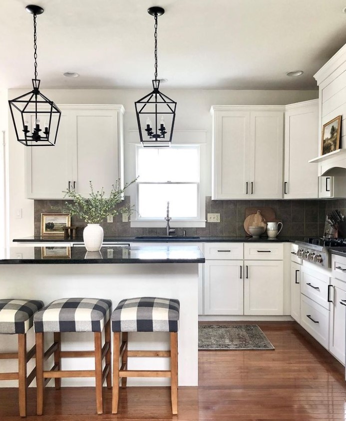
Note the slight difference between the Creamy walls and warm white trim
IS CREAMY A GOOD COLOR FOR CABINETS & TRIMS?
Hard…no. If we’re talking about the average homeowner and average home, Creamy is too dark and too warm/yellow for cabinets and trims.
What do I mean, too dark, warm, and yellow?
Of course, you want the color of your trims and cabinets to match the surrounding finishes. The best way to do this is with a versatile, flexible shade of white—which Creamy is not. These shades of white tend to have LRVs starting at 82 but more commonly hit 85-93. This increased brightness makes them easier to coordinate with, should you want to change wall colors/finishes in the future.
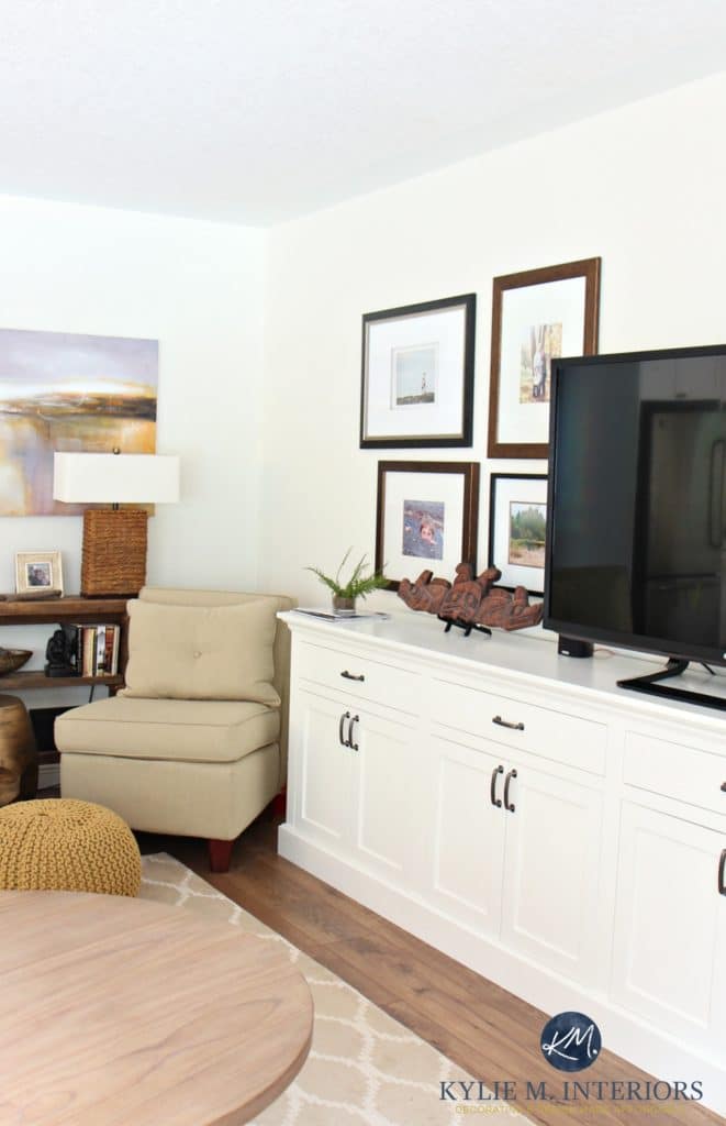
Don’t get me wrong—Creamy is gorgeous on walls (I had it in our last home); it’s just a tougher sell for cabinets and trims UNLESS your home has particular finishes that need more depth and warmth. These finishes are common in homes built in the early 2000s but also show up in more cottage, country, and even traditional-style homes.
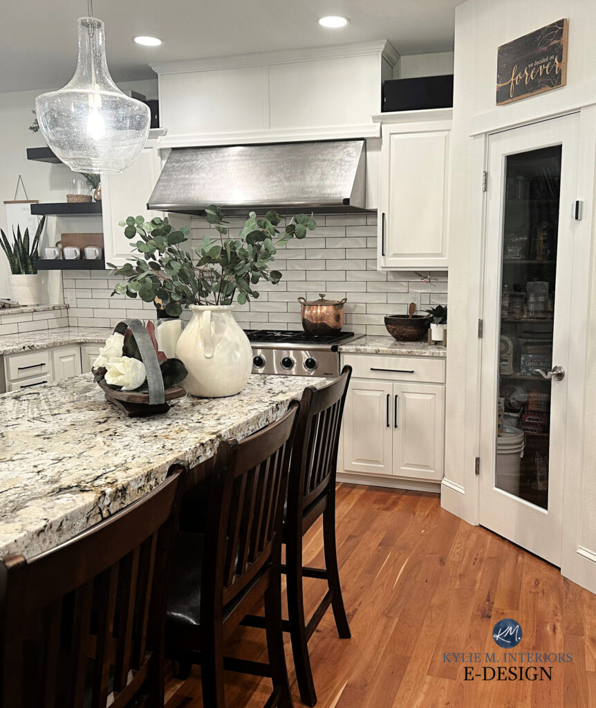
While these next cabinets aren’t Creamy, they give off a very familiar creamy vibe. My client hired me because they had chosen the wrong color for their cabinets, as you can see…

Colors like Creamy are too warm for slightly cooler finishes or brighter white walls, as shown in the above kitchen.
The Best Modern Cream Paint Colors for Cabinets
What I’m saying is that Creamy could be good for your cabinets and trim; just make sure your home needs its particular depth and warmth, as it’s not the ‘typical’ or popular choice. For example, this next home suits Creamy perfectly.
The 5 Best Creamy White & Off-White Paint Colors
IS CREAMY GOOD WITH CREAM CABINETS & TRIMS?
If you have cream cabinets and trims and want to paint your walls Creamy, it’s not going to work. Your cream cabinets will be darker than Creamy (as if they’re lighter, they aren’t cream, they’re either white or too yellow).
It can look weird to have cream cabinets with lighter, warm white/cream walls.
Are there exceptions? There are very, very odd exceptions, but don’t expect your home to be one.
DOES CREAMY GO WITH WOOD TRIMS & CABINETS?
Creamy can look good with some wood finishes, depending on their undertones.
Generally, I wouldn’t pair Creamy with a pink-toned wood. I’d be equally as cautious with red-stained woods, but it can work better than pink.
However, if your wood has a yellow or slightly golden undertone (e.g., golden oak), Creamy could be an interesting partner, but this depends on the surrounding finishes.
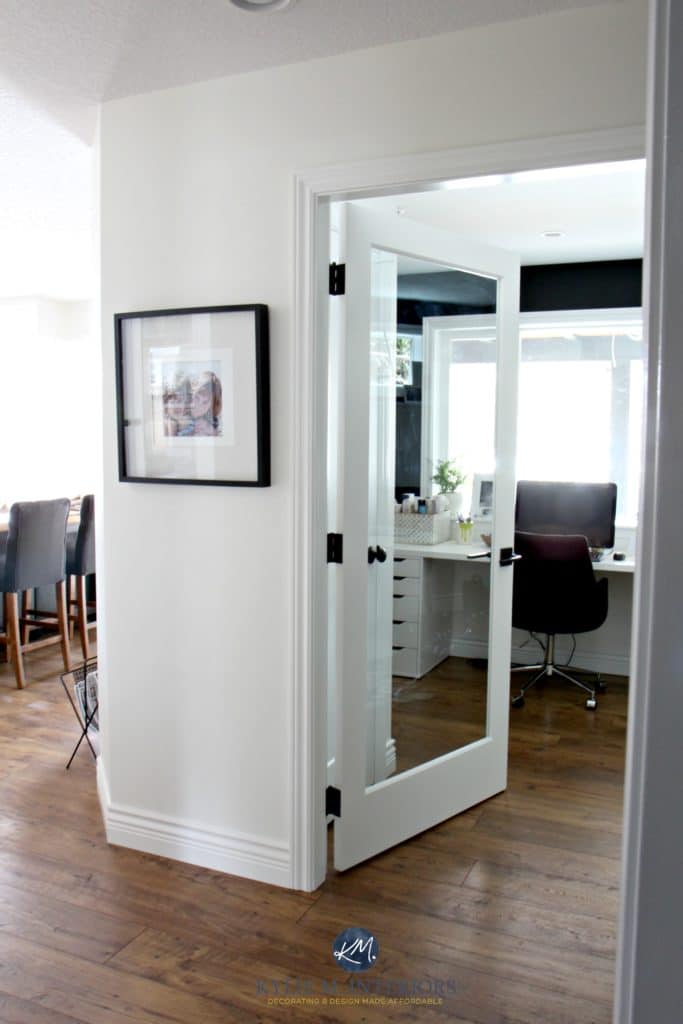
WHAT WHITE TRIM OR CABINET COLOR GOES WITH CREAMY?
Most shades of white suit themselves when coordinating wall colors with trims and cabinets. Because Creamy has a bit more depth, several shades of white coordinate with it for cabinets and trims…
- Benjamin Moore Cloud White
- Sherwin Williams White Snow – for a brighter, slightly cleaner pairing and more obvious contrast
Sherwin Williams Creamy walls with Cloud White trim
The 8 Best Benjamin Moore White Paint Colors
IS CREAMY A GOOD EXTERIOR PAINT COLOR FOR SIDING OR BRICK?
I wouldn’t do it.
Why?
While Creamy is a more muted shade of cream, it still has a reasonable amount of yellow that can come up CONSIDERABLY on an exterior, especially on your south or afternoon-west facing side.
If you want to paint your home a warm, soft white or off-white (like the one above), there are many better options available, some of which you’ll find links to next. However, if you WANT a soft yellow home…fill ‘yer boots.
WHAT COLORS ARE SIMILAR TO CREAMY?
If you’re looking for similar colors, remember there will always be a shift in undertones, depths, and temperature. There are no perfect matches between brands (especially not with color matching).
However, for colors with similar intentions, I’ve got some great ones for you to explore…
SHERWIN WILLIAMS CREAMY VS. ALABASTER
Alabaster is slightly lighter than Creamy but has a comparable degree of warmth. Regarding cabinets and trims, Alabaster is by far the more popular choice as it has more flexibility than Creamy. If you’re looking for a nice trim color with Creamy, Cloud White offers a SUPER subtle contrast.
FULL Paint Color Review of Sherwin Williams Alabaster
SHERWIN WILLIAMS CREAMY VS. DOVER WHITE
Creamy and Dover White have one interesting thing in common—they’re both whites, which I love for walls but hesitate to suggest for cabinets and trims.
When comparing Creamy and Dover White, you’ll see that Dover White has more chroma, meaning it’s a TOUCH more colorful. And while neither is really green-inclined, Creamy is slightly less likely to grab green, which is good for the average home.

FULL Paint Color Review of Sherwin Williams Dover White
SHERWIN WILLIAMS CREAMY VS CASA BLANCA
I love comparing these two popular shades of cream! Why? Casa Blanca shows how muted and neutral Creamy is. Thanks to its higher chroma and beautiful warmth, Casa Blanca is closer to what most people consider a ‘real shade of cream. ‘ Not to say Casa Blanca is TOO warm; it’s one of my favorite cream paint colors because it says it’s cream and yellow-hued without punching you upside the head with color.
Here’s your Peel & Stick sample of Casa Blanca…

Casa Blanca is also darker than Creamy. With an LRV of 76 (to Creamy’s 81), Casa Blanca is a more traditional off-white paint color and offers more contrast with the average white trim color.
Sherwin Williams Casa Blanca: IMAGES, Info, & More
WHAT COLORS LOOK GOOD WITH CREAMY?
Creamy is an easy partner to live with and suits many partners (just like me, wink wink…just joking). However, as a cabinet or trim color, you’ll have a tougher time finding a fit, so you may want to explore THE 16 BEST WALL COLORS TO UPDATE CREAM CABINETS OR TRIM.
These colors are best for adjoining rooms.
- Creamy looks great with many stormy and warm shades of gray, as long as they’re DARKER than Creamy.
- Consider shades of greige with slightly noticeable green undertones to play with the warmth of Creamy, colors like Sherwin Williams Amazing Gray and Jogging Path.
- Accent walls in green, navy blue, and even some dark charcoal grays look GORGEOUS with Creamy. Check out my medium to dark green blog post and the best shades of navy blue. If you’re looking for warmer accents, I’d hop over to Benjamin Moore, as they have a much wider range of rusty red oranges like Sherwin Williams Tawny Rose and Fresh Clay.
- Creamy will be happy with many shades of tan but fussy with stronger creams and some shades of beige.
READ MORE
The 13 Best Cream Paint Colors
The 5 Best Creamy White & Off-White Paint Colors
Paint Color Review of Benjamin Moore Ballet White
The Best WHOLE HOME Warm Neutral Paint Colors
Get the BEST color advice…
Check out my E-Design and Online Color Consulting packages!


Originally written in 2018. Awesomely updated for photos, grammar n’ stuff 2025


Hi Kylie,
Do you think BM White Dove would be a good trim for SW Creamy Walls? Also thinking of using White Dove on my cabinets.
Just curious if the two go together well. Thank you.
Kylie,
What is the dark color on the accent wall?
Hi Kathy, that’s BM Gray 2121-10 🙂
Hi Kathy, that’s BM Steel Wool 🙂
Thank you! I love the dark color pop! I am thinking about Creamy on my LR walls (north facing room with some east facing light) and an accent wall in Dorian Gray.
I have painted all trim in house SW pure white… I love it, not too warm or cool. Lightening my bedroom from some unremembered SW light beige color. Do you like dover or creamy on walls with pure white? (alabaster throws gray tones in my home). Thank you for thoughts!
I am a BIG fan of Creamy, I had it in our last home and loved it!
Thank you Kylie, apologies. …it took a while for question to post the first time so didn’t think it went though. Apologies for the repeat! I love creamy too… just wasn’t sure if enough contrast with SW Pure White trim so thanks for the advise! Love reading your blog!!!!
Hi Kathy, love your color advise. I find that dover white throws a tad more yellow than creamy in the shaded areas of my home, but in areas where flooded with natural light I can hardly tell the two colors apart even with huge swatches painted lol. I love both of them.. so was wondering of the two which do you think plays the best off SW pure white as trim color ?
Hi Kylie,
I appreciate all of your information on Creamy. I has been so helpful, particularly how the colour changes with different exposure. I think I will use Creamy in the main areas of my home and will be using BM Cloud white for the trim. My only question is that the colour of Creamy in the paint fan seems a hint different than that on the paint chip from the SW store. I prefer the colour in the paint fan. How do I make sure this is the colour that I get?
Hi Cheryl! Oh, welcome to the world of paint. Yes, sometimes there can be a slight variation in fan decks for sure as well as paper samples depending on when they were made. Really, it’s about having them dry two coats for you in store, and making sure it blends into the paper chip you have on hand, keeping in mind that sheen can slightly shift how a colour looks too!
I think your tip about two coats is important. I’ll be sure to have them do this. Thank you very much for the advice!
Hi Kylie!
It is so refreshing to hear you talk about paint colors! What an ordeal ( and a few fights between me and my husband) this has been! I am very invested in making our cabin beautiful. He wants me to make up my mind QUICKLY! Ha! Kinda hard with paint. This is also our first “go” with any project from start to finish!
I was wondering if you would recommend Creamy for a wood ceiling. We are priming and painting 8″ pine boards to go up on a vaulted ceiling. Good idea? Ha! Will this color look good on a ceiling? I would love your opinion!!
We are painting our Mediterranean home creamy and were wondering which white would work for the trim to subtly contrast?
This colors looks so subtle and soft! Do you think it would pair well with a beige like SW accessible or SW balanced?
Oooo, I might not put it with Accessible Beige, it’s okay with Balanced Beige, but still not great as it has considerably more yellow/colour to it compared to the more muted approach of Balanced Beige :).
I know this article was written 2 years ago and I am surprised at how many comments it got!! Years ago in another home I painted 3 ceilings creamy and they were GORGEOUS. So in a new home I painted my kitchen/dining walls creamy as well as my master bath and I TRULY believe if your lighting is awful, even the most beautiful of colors can look terrible. My kitchen looks fine but a corner of my dining room looks bright yellow. My master bath looks AWFUL. AWFUL. AWFUL. Did I mention the master looks AWFUL. Now I live in a townhome and NONE of my bathrooms have windows so no natural light. My gameplan? Get all the new fixtures in, flooring, towels, LIGHTING, etc…. And then the very LAST thing I will do is pick a paint for that master bath. This will be the THIRD time I have painted it. Now to find the right white for the rest of the house!!!! ARGGGGGGG!! By the way Kylie I am very very critical of blogs. I admit I did NOT like your blog at first even though I e-consulted with you. But I stuck with you and to your credit you grew on me and now I love you!! Bravo!!! Because I don’t have a stick up my bum like I used to!! Hooray!!
Okay Dani, you made me laugh so hard and I’m glad you have removed the stick from your bum – it never feels good ;). And yes, it can be SO hard to shift a colour from one house to another as the lighting can REALLY mess with things – I’m sorry you didn’t love Creamy as much in your new home – thank goodness for wine ;).
The gods have smiled downed on me! SW Creamy is so beautiful in our great room. The dark wood vaulted ceiling & medium tone wood floors look exceptionally wonderful against Creamy. All of our paintings & decor really came to life. The large room faces both East and West. Trim is done in BM Simply White . Large jute rugs really frame everything. Thank you got this post because it gave me the confidence to try something out of the box for me.
I thought I saw a post where a clients kitchen cabinets were done in SW Creamy, but now you’re saying don’t do it. I’ve tried about 15 samples and everything is off, except Creamy. We have dark Baltic brown countertops and the whites are not matching.
I don’t think I have a kitchen with Creamy…I do have some photos of BM White Down, which is similar, but a bit more muted :).
Hi Kylie! A few years ago you recommended Benjamin Moore Muslin for our master bath with travertine tile (I was trying to minimize contrast where the wall meets the tile to not draw attention to the shoddy workmanship in that area) and it is perfect! I need to send you a photo. I recently painted my northeast facing LR Ballet White, also based on you recommending that color on your blog – and I LOVE IT. Seriously love it – it’s perfect. Warm and neutral, very cozy and soothing. I am currently quarantine-painting the majority of my house but am seriously struggling in choosing the right warm off white/cream for our cavernous, open floor plan basement, with 5 small, low to the ground windows and wall to wall carpeting that’s somewhere between greige and tan. If I look at the carpet against a warm peachy off-white – like Timid White – the carpet goes more griege and maybe even a bit dingy looking. With Swiss Coffee and it’s yellow-green undertone,, the carpet reads more orange-beige. I painted our basement home gym in Swiss Coffee at 75% because I wanted something not stark white but also not overly warm, and I like it there – but I want something warmer and cozier for the rest of the basement. I have tried a LOT of BM shades of white/off white and I am still struggling to choose. The current top contenders is Ivory White. I am also considering White Down. I painted one small wall Ivory White, and it’s very soft looking – but possibly too yellow. It’s hard to tell because the rest of the room is painted a bright YELLOW (BM Wildflowers) so probably the wall I painted Ivory white is reflecting quite a bit of yellow from the other walls. Before I proceed with Ivory in the rest of the room – I was hoping you might compare Ivory/Acadia White and White Down with Creamy. I have only used BM colors so far, but am willing to branch out to find the right color… I have decided on Pointing by F&B for our north facing mudroom and hallways, but would rather not use it in the basement – because it just isn’t quite right there with the green-greige tones in the carpet. Help!
Hi
So I was thinking I would use SW Creamy on my trim and crown molding and use SW Shiitake on the walls. Would these pair well?
Hi Shannon, I REALLY feel like Creamy is too yellow/cream for the more muted beige/tan approach of Shittake!
I’m one of those “I like cream but not yellow” people. I have a north-facing condo with a ton of greenery just outside and am on a mission to find the perfect colour. When you darken Creamy, would it look more yellow? I just love the pictures of it, even in the south/warm light, but I have nightmares of darkening it by 25% and having it turn into day-glo yellow. Will paint stores darken the sample size pots? Thanks for all the info!!
Well, in my experience in my OWN home, I did find it a wink more yellow when I darkened it. I wonder if BM White Down might be a bit better for you?
We went with regular strength Creamy and it’s absolutely gorgeous!
Do Gibraltar Cliffs play nice with Creamy?
Another satisfied “Creamy” enthusiast! We needed to repaint our “Standish white” walls with something less yellow. The 1930s walls are textured plaster and coved, so we need one color for walls and ceilings. I didn’t want a gray-white because we live in a northern, gray climate, but also not too yellow like Standish white. Creamy is perfection. It’s fresh, modern, and is the perfect neutral backdrop. Thanks for the recommendation.
Wahoooo! Creamy will be SUCH a nice shift for you – more modern, but still soft and warm – good call!
I ordered both Creamy and Aged White from Samplize and am torn between the two. I’m intrigued by your comment about darkening Creamy. How does Creamy darkened by 25% compare to Aged White?
Hi Stephanie! 25% is just a tweak, so it won’t take you near Aged White. I will say that of the two I NATURALLY gravitate towards Creamy as it’s a bit cleaner looking while still being soft, whereas I’m usually nervous with Aged White because it looks so…aged. HOWEVER, it’s about what best suits your home! I had Creamy regular strength and 25% in a previous home and LOVED it!
Hi! Would you recommend Benjamin Moore’s Feather Down for a South/Southeast facing exterior?? Thank you!
Hello Kylie,
Thank you for this post! We are moving into a new home; ranch style and all rooms flow from Living room (gigantic east facing window), to the Kitchen (one large west facing window) to the den with two double windows (west and north)…and then the hallway is off the living, kithen with no natural light. I was planning on SW Creamy for all the walls. BM Hale navy accent wall in foyer (open to Living) and on the built ins in the den; kitchen cabinets painted SW Evergreen Fog. Floors a light to medium wide plank rustic oak. Window casings, doors and trim all oak. What do you think of Creamy in this case…? Thanks so much
Julie, I think this sounds loooovely and would absolutely LOVE to see it all done! BTW, if you’re curious, check out BM White Dove 25% darker as well :).
Kylie,
Thanks so much! I will give the BM White Dove (25% darker) a look also. It will be awhile before I can update with everything completed😊
Hi! Your posts have helped me choose A LOT of colors so far! Just one more I’m struggling with is a ceiling color to pair with SW Creamy walls and trim either BM Cloud White or White Dove. Would you paint the ceiling the same as the trim in either of those cases? Or something different? Obviously, trying to avoid my contractor painting my ceilings a stark white when everything else is warm. Thanks SO much!!
Hi Danielle! In one of your last homes I had Creamy with Cloud White and it was VERY soft and subtle, i loved it. I would also lean towards doing the ceilings the same as the trim :). If you’d like to see a bit more contrast with walls/trim, you could bump up to Simply White :).
Love all the comments about creamy. I painted my kitchen creamy but it’s picking up some pink undertones from my dark maple wood floors. Also, I have one big east facing window that washes out the color. Any suggestions? Can I darken creamy by 50%? Yellow doesn’t scare me. Thank you !
Hmmmm, interesting. What about bumping into BM Navajo White or SW Casa Blanca – they’re both GOOOORGEOUS.