
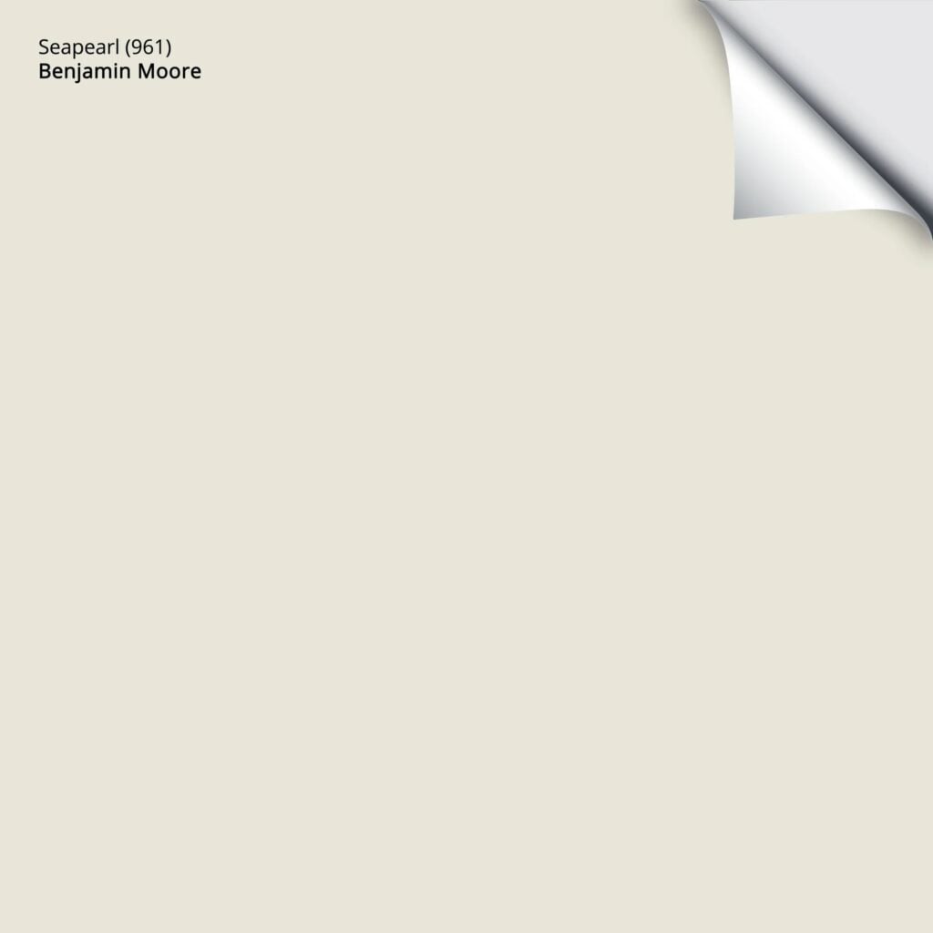
Benjamin Moore Seapearl: Undertones, LRV, Best Uses
Benjamin Moore Seapearl is a warm, neutral, off-white paint color – that’s the easy part. The hard part is putting a label on it, like ‘taupe, cream, beige, gray, greige, etc’.
This is because, unlike many, Seapearl is an exceptionally fluid color. It doesn’t commit to a set warmth or undertones and can be unpredictable. Pretty? Oh, for sure, but not always easy (a little like me – wink wink).
But the more you know about a color, the easier it’ll be for you to make a choice. So, let’s dive into what makes Seapearl an interesting color for you and your home.
FUN FACT: Benjamin Moore Seapearl OC-19 is also known as Seapearl 961, China White PM-20, and China White OC-141 – these are all the same color.
THE LRV OF SEAPEARL & WHY IT MATTERS
According to Benjamin Moore, Seapearl (also known as China White) has an LRV of 76.43. This makes it an off-white paint color. Many of the popular off-whites sit around 74. While this shift is notable, it’s not drastic, as it’s still not in the ‘white’ world.
A color in this off-white range will easily wash out in a bright room; nature o’ the beast.
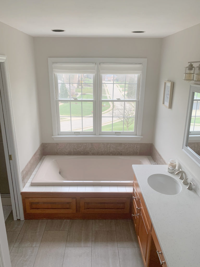
As for Seapearl in a dark room, it’s not my favorite. While there are certainly worse colors, it doesn’t have a ton of color (chroma) to help battle the low light. This means it could look a touch drab, dingy, or dirty. However, improve your interior lighting, and Bob’s your Uncle.
ROOMS THAT BENEFIT MOST FROM THIS DEPTH (LRV)…
- If you have a room with ‘average’ light – not overly bright, but not dark and flat, a color with Seapearl’s depth can be perfect.
- Small rooms, where the homeowner wants them to look bigger (that said, I personally prefer leaning into a small room with some personality/color/depth).
- Rooms with a lot of finishes and undertones to humor. A color like this can sometimes be a great happy medium for different needs – not making 100% of the finishes happy (which is impossible sometimes), but nodding politely at many.
THE UNDERTONES OF SEAPEARL & WHY THEY SHIFT
There’s a reason I don’t often suggest Benjamin Moore Seapearl to my Online Color Consulting clients. While it can be gorgeous, as mentioned earlier, it’s wildly unpredictable.
Now, you might say, ‘Kylie, isn’t every color a bit unpredictable?‘ and you’d be right – colors can change drastically in different lighting conditions and environments. HOWEVAAAAAH, it’s the WAY that Seapearl changes that makes it a trickier shade.
Check out how it changes with only natural light vs. natural light (south-facing) and interior, warm lighting…


Notice how the warm lighting (possibly 2700K) makes the walls look a touch more peachy/warm.
- Can Seapearl look a touch creamy-yellow sometimes? Yes. If you’re sensitive to cream, especially on the exterior, sample it carefully with similar shades. It’s a warm paint color, and that warmth has to come from SOMEwhere.
- Can it pick up a touch of green from its environment? Yup, although it’s a bit more pink-inclined than green.
- You mean it can look pink at times? Oooh ya.
- What about it looking a bit drab and grayish at times? You bet your cute little booty it can.
BTW, my recommended Kelvins (light bulb temperature) for a color like Seapearl is 2700-3000K.
Here it is looking pretty darn peachy-pink in my client’s bedroom…

Also shown, BM Pale Oak | BM Edgecomb Gray | BM Cedar Key
That said, it rarely looks as pink as it does in the image above.
This means that while it can look beautiful, its mood can change more than mine at my time of the month. This is because Seapearl doesn’t have a ton of committed color (chroma). Being quite neutral, it easily picks up cues from its environment, including reflections and lighting conditions. C’est la vie, which is French for – MOVING ALONG! Which isn’t true, but anyway…
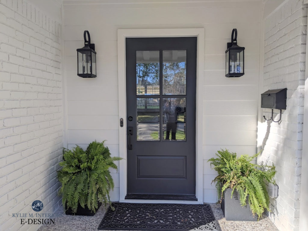
BEST WHITE TRIM & CABINET COLORS WITH SEAPEARL
In my experience, Seapearl can be a bit fussy with softer, warmer, or yellowish trims. Instead, it favors whites that are a bit brighter and cleaner, but not necessarily stark, harsh, or cold. Check out…
- Benjamin Moore Chantilly Lace. It’s my favorite choice for a simple, noticeable contrast.
- I also like Sherwin Williams White Snow, which is a wink softer and warmer than Chantilly Lace.
Seapearl also does well when used on walls and trim (color drenching)…
Again, this is a room with south-facing exposure
WHITES THAT MAKE ME NERVOUS…
- Benjamin Moore Simply White (because it has a stronger yellow hue)
- Benjamin Moore Swiss Coffee (because its undertones can clash with Seapearl)
- White Dove, which is just a bit too soft and warm to offer a nice contrast.
WILL SEAPEARL WORK IN YOUR HOME? BEST ROOMS & FINISHES
Being a more finicky neutral, there are many considerations when using a color like Seapearl. Here’s a large-scale look at where it often looks best…
- In a single room with decent natural light
- As an exterior paint color (siding or stucco)
- An open-concept space or closely adjoining rooms
As for where I don’t usually suggest using it…
- As a whole home neutral paint color, especially in rooms with different exposures. With it being unpredictable, it’s even harder to know what you’ll end up with.
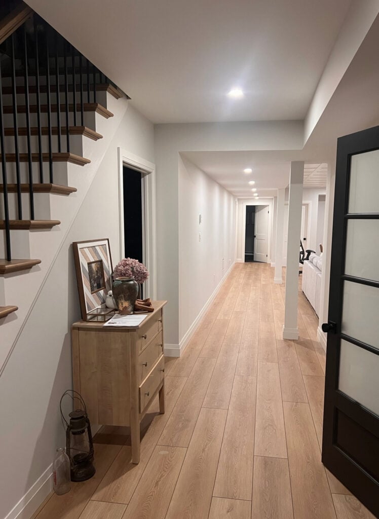
- In a dark hallway, it could look a bit drab and flat
- On cabinets. Its undertones are unpredictable, and your cabinets could seem a bit ‘off’ compared to white trim.
As for pairing it with your existing, potentially outdated finishes or with new ones, let’s hit a few hot topics.
DOES SEAPEARL GO WITH WOOD FLOORS & CABINETS? USUALLY
Seapearl usually pairs well with average wood. What’s average? Oh, I’d say 5-6″. Oh, not that kind of wood. Right.
Instead, it works well with woods that aren’t OVERLY orange or yellow. It can even work well with a range of golden oak finishes, as well as orange-toned maple and red cherry. These stains can be on cabinets, flooring, trims, or furniture. You can expect a nice contrast, so long as your wood isn’t a completely natural white oak. Even then, it can look pretty, too; it’s just a lower-contrast combo.
WITH WOOD TRIM: Generally speaking, yessss. Again, I’d be more cautious with woods with a super strong stain color (e.g., yellow/orange), but overall, it can be a pretty partner to wood trims. That said…
Colors like Seapearl (depth-wise) often pair well with white trim, as the white CONTRASTS with the walls, letting the paint color do its best work. With wood trim, the walls can look lighter and not as notable as expected.
WITH QUARTZ OR GRANITE COUNTERTOPS…IFFY
Seapearl can be a pretty choice with a wide range of countertops, especially those with ‘hard to match’ light-colored flecks. As for white quartz, because they aren’t always as ‘white’ as they seem, I worry that one or the other could appear dingy in comparison – I’d sample carefully.
How to Update Older Granite Without Replacing It
Here’s your Peel & Stick sample of Seapearl…
WITH KITCHEN CABINETS…IT DEPENDS
Seapearl has some limitations, but for the most part, it suits a wide range of cabinet colors.
WHITE CABINETS: If your cabinets are a brighter, cleaner white, then yes, this pairing could be pretty.
SOFT, WARM WHITE CABINETS: Creamy whites don’t sit as well with Seapearl. Even a creamy white as mild as White Dove gives me mild hyperventilation.
CREAM OR CREAM-GLAZED CABINETS: If I could say no in 10 languages, I would. Seapearl is too light and grayed out to pair with any cream cabinets. Instead, look at these colors.
As for cream trim, it’s a super hard no; so hard I’m getting a little excited. Seapearl is a hot mess with cream finishes.
GRAY, GREIGE, OR TAUPE CABINETS: If the cabinets have an LRV of 60 or lower, I’ll give it a solid…maybe. From there, consider how Seapearl’s potential undertones might settle. For example, if your gray cabinets have a purple undertone, Seapearl could look too creamy in comparison. If the undertone is green, expect some contrast.
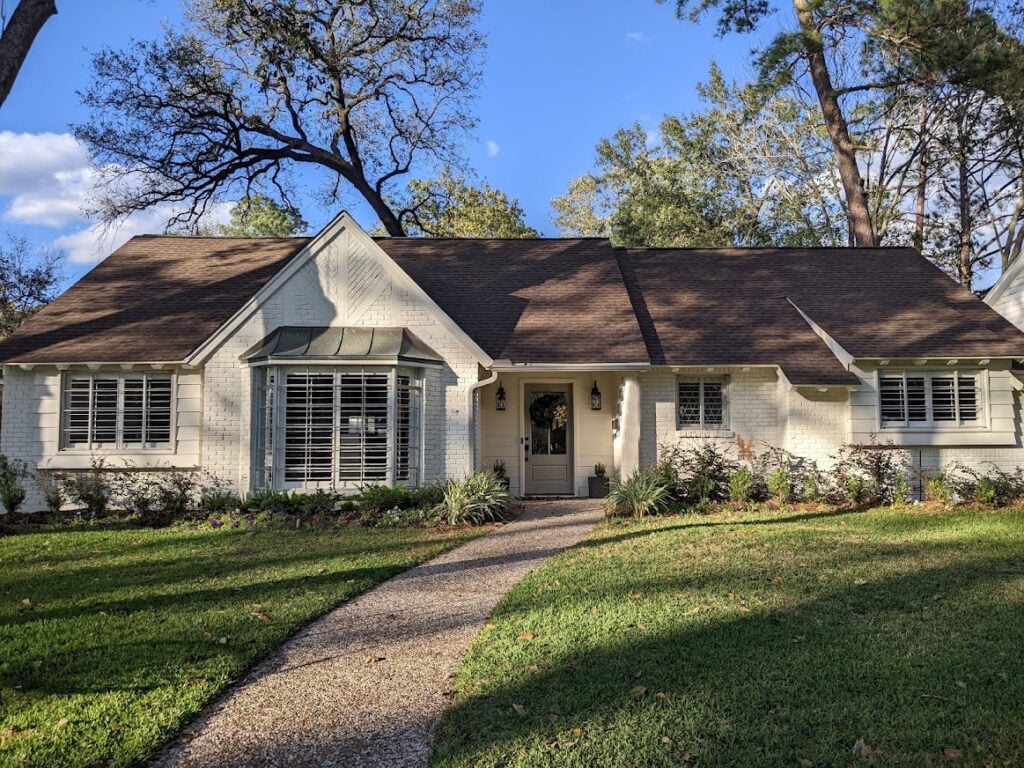
SEAPEARL AS AN EXTERIOR PAINT COLOR IS AMAZEBALLS
While the white exterior trend had me twitchy n’ bitchy, today’s off-white exterior has a much softer, more organic look, while still offering a pretty brightness.
Here’s Seapearl on a painted brick home I helped with, looking sophisticated and subtle on a cloudy day (could look similar in north-facing light)…
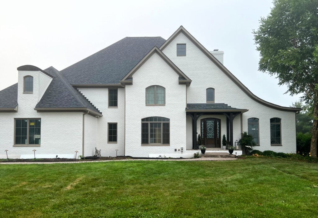
Here it is with full sun exposure…

On exterior siding or stucco (or painted brick), Seapearl often lands in the perfect place between ‘too bright/white’ and ‘too dark’, especially for those who want to paint their trim the same color as their house.
The Best Off-White Exterior Paint Colors
Its undertones often settle far more muted, too. This leaves your home with a more muted, natural, almost creamy warmth, rather than an overt pink or strong yellow hue.
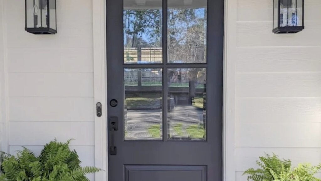
The Best Paint Colors For Your Front Door
COLORS THAT ARE SIMILAR TO BENJAMIN MOORE SEAPEARL
When finding your best paint color, comparing similar shades is a great idea. Sometimes, a ‘little warmer, cooler, lighter, or darker’ gives you your perfect color. I’ll also share a few alternatives from Sherwin Williams…
Benjamin Moore Pale Oak: A bit darker and more taupe-inclined compared to Seapearl. This means its undertones could pop up a wink more. It’s also FAR less likely to look creamy.
Benjamin Moore Silver Satin: It has less color (chroma) than Seapearl and is a tiny touch lighter. It’s also less pink-warm inclined. Because of that, it can easily pick up a purple undertone and look cooler.
Sherwin Williams White Heron: This is one of the closest alternatives in SW paint, and it’s equally as pretty, but just as unpredictable. Its LRV of 76 is dead-on with Seapearl’s. While it has a slight tendency toward more red (pink), it’s fractional. Seriously, these 2 are pretty damn close as far as the paint world goes.
PAINT COLORS THAT GO BEST WITH SEAPEARL (& ONES THAT DON’T)
While there are many colors in the light-medium to dark range that go well with it, the off-white and light worlds are touch-and-go, simply because Seapearl’s undertones are unpredictable, making it hard to know how it will react with somewhat similar depth shades.
Now, of course, it depends on what you need a color for – an accent wall, adjoining room, cabinets, etc., but these groups should get you started…
GOOD COLOR PALETTE PAIRINGS
- LIGHT TAUPE: Some light taupes can go okay, as well as taupes with a bit more depth.
- GREEN-GRAYS: If you’re looking for a beautiful accent color, green-grays, especially those around 40 LRV or lower, can be gorgeous.
- DARK GRAY-BLUES: I love darker gray-blues with Seapearl, especially on shutters (with S.P. as the main exterior color).
- STORMY GRAY-BLUES: Gray-blues in the light-to-medium range can be pretty.
- GREIGES: Greiges with a more noticeable green undertone can be pretty complements.
COLORS TO AVOID…
- Other off-whites – with very few exceptions
- Cream paint colors
- Warm, creamy whites
- Colors that have a good amount of chroma (color). Seapearl prefers colors with a LOT of gray in them, or neutrals.
WHAT TO EXPECT FROM SEAPEARL IN A REAL HOME
What is a ‘real home’? It’s what you don’t see in a magazine. Real homes don’t always have the perfect lighting, editing, and interior finishes – they need a little grace.
And while we covered a few of these topics previously, it’s nice to see a full list. Here are some of my professional experiences with Seapearl…
- It can look dingy and drab in a dark room or basement
- It will wash out in a super bright room
- It’s not great for cabinets unless you sample it carefully (with a quart of paint from the same line/sheen you’ll use on your cabinets) and confirm it looks like you want.
- If you don’t have reasonably white trim, it can look a lil’ janky and mismatched.
MY HONEST OPINION OF SEAPEARL: PROS, CONS, & TIPS
KYLIE M’S 0-10 RATING: 5
While it has its place, I don’t trust Benjamin Moore Seapearl enough to suggest it to my clients on a super regular basis for any kind of room’s walls. While it might work and be the perfect choice sometimes, you also risk a bit too much yellow, warmth, pink, etc. If you want to try it, sample carefully and compare it to similar shades.
As for cabinets, it’s usually a no. Sure, there are exceptions. For example, maybe you have wood trims, and Seapearl is the perfect color for your backsplash and countertop – amazeballs. Short of that, it’s not a color I use often.
That said, I love it on exteriors, as it offers that soft warmth without looking stark. Oh sure, it’ll brighten right up in natural light, but it won’t glow in the dark like a true white home.
READ MORE
The Best Off-White Paint Colors
The Best Warm Neutrals With No Yellow
Get the best paint color advice with Kylie M’s Online Color Consulting


Interesting article. SeaPearl is one we chose to paint our living room and dinning room. Painted on a little area. It has no warmth. The color chip looks like it has some warmth but on the wall, looks way too plain white.