
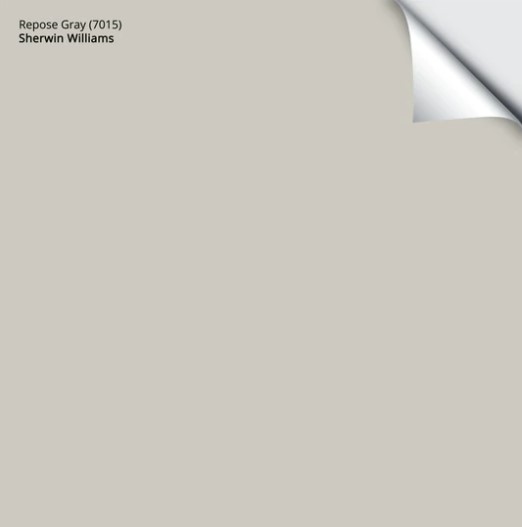
Sherwin Williams Repose Gray (7015): Undertones, LRV, & Real Home Results
Sherwin Williams Repose Gray is a light, warm gray paint color. It works well on interior walls, especially open-concept spaces and bedrooms, as well as cabinets.
Repose Gray’s undertones and overall appearance can change depending on a room’s exposure, light bulbs, and surrounding finishes.
Now, are you feeling nervous about gray’s sneaky green, blue, and purple undertones? You should be, as Repose Gray has a lot up its sleeve. Today, I’m on a mission to demystify Repose Gray and see if it will work for you.

WHAT KIND OF GRAY IS REPOSE GRAY? WARM OR COOL?
Repose Gray is a gray paint color (I’m not just good-looking, you know). However, it’s not a true neutral gray; it has a wee bit of brown in it, making it a warm gray. This bit of warmth doesn’t make Repose Gray close to beige but puts it a step away from traditional shades of stormy or cool gray like Sherwin Williams Big Chill and Light French Gray.
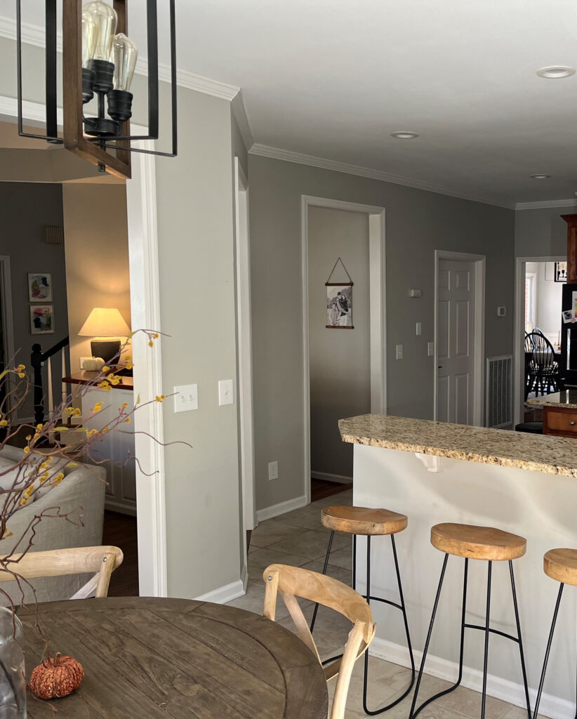
This next photo is as awarm as I’ve ever seen Repose Gray look. Usually, it caters harder to gray…
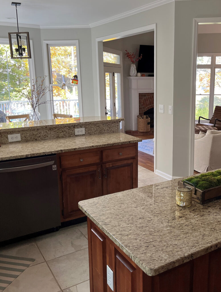
How to Update Your Outdated Granite Countertops – Venetian Gold/Santa Cecilia
WHAT ARE REPOSE GRAY’S UNDERTONES?
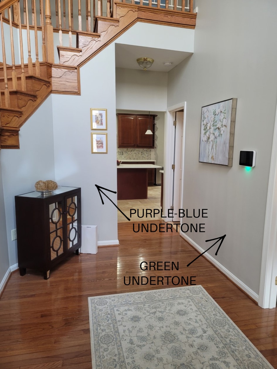
While Repose Gray can favor a soft violet undertone, it also has a bit of a green undertone. And believe it or not, once in a while (given the right exposure/interior finishes), I’ve seen Repose Gray flash a touch blue.
While every gray has undertones, some grays flex a bit more, and Repose Gray is definitely one of these grays, which makes it a complete bugger to rely on. Because Repose Gray can be unpredictable, I highly recommend ordering the Samplize version to see how it settles in YOUR room.
By the way, my blog runs 99% on wine, Doritos, and my Online Color Consulting clients’ and readers’ photos—thank you so much for sending them in!
Now let’s hit a few specific questions that often come up when talking about Repose Gray and undertones…
WILL REPOSE GRAY LOOK OVERLY BLUE?
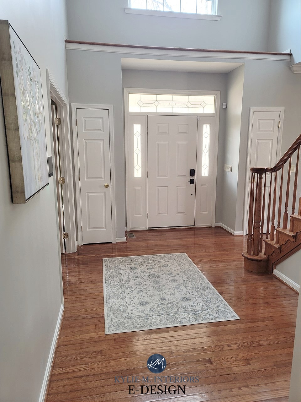
While Repose Gray doesn’t want to look blue in the right environment (i.e., exposure-based or with trim that’s overly warm), it CAN pick up a blue hue. However, of the three gray undertones, blue is the least likely to show up, as shown in this next photo (hardly a wink of blue to be seen).
WILL REPOSE GRAY LOOK OVERLY GREEN?
Repose Gray can nod politely at green but rarely commits on a large scale. If you’re sensitive to green, it shouldn’t set off any alarm bells, but sample carefully. If you place Repose Gray with a finish that has a purple undertone, it could seem a touch green in comparison.
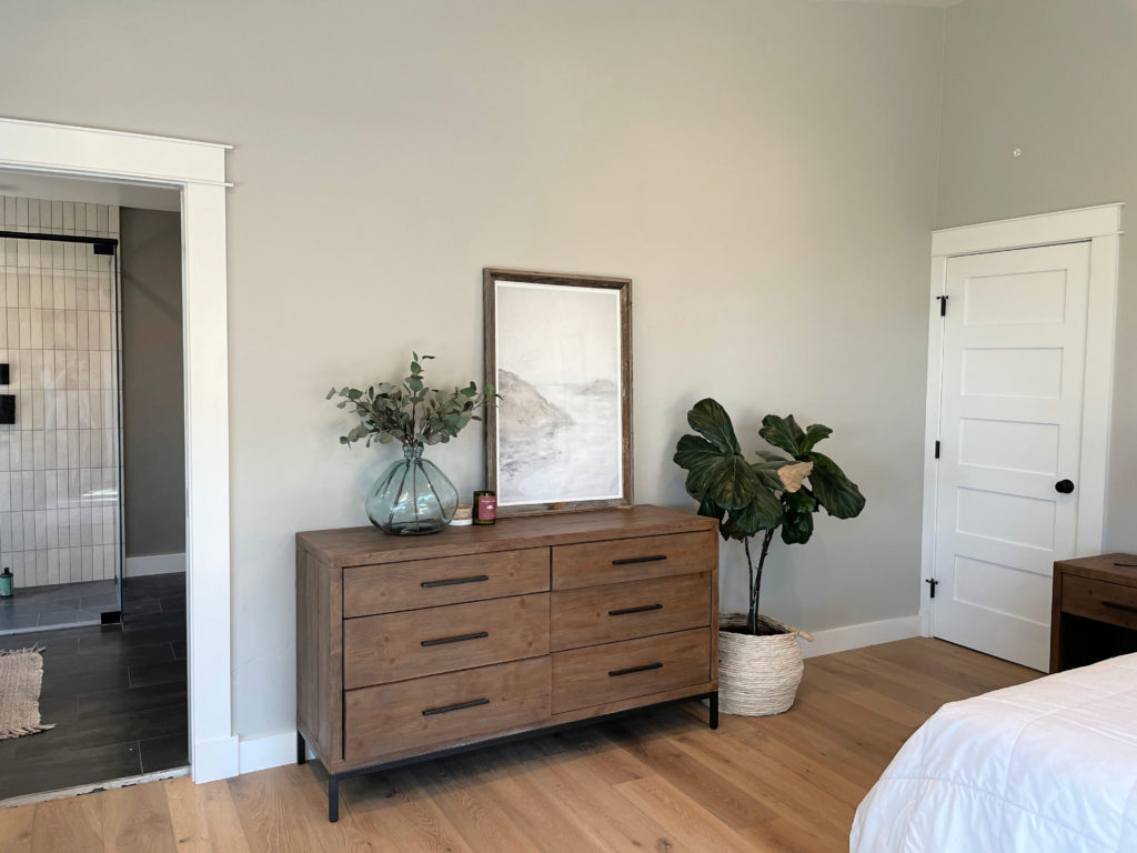
This next photo shows Repose Gray picking up a subtle green hue…
However, as shown earlier, notice how Repose Gray’s undertones shift depending on which part of the room you’re looking at, the time of day, and the light bulb temperature…
If ANY degree of green makes you nervous, you may want to read this…
The Best Gray Paint Colors With VIOLET/Purple Undertones
WILL REPOSE GRAY LOOK OVERLY PURPLE?
Just as with the green undertone, Repose Gray can pick up a touch of purple without hardcore commitment. If you don’t want any chance of violet – you’re looking at the wrong color. Instead, explore shades of gray that are more inclined towards green.
Remember, EVERY gray has undertones – find the one that best suits the finishes in your home!
As for blue undertones, while it can grab some blue, the undertone in this next image is the exception, not the rule, when it comes to Repose Gray…
This isn’t common, but you still have to be careful! Ideas to Update Your 1990s Home
Long story…long, Repose Gray is a sneaky little bugger.
WHAT’S REPOSE GRAY’S LRV?
Repose Gray has an LRV of 60. With an LRV of 60, it won’t look like a heavy color in a room with an adequate amount of light, but it also won’t bring a ton of reflective value to the table (or the wall, in this case) if you have a darker room. Also, with its particular warmth and undertones, it can look a bit drab and dirty in low-light spaces, which we’ll look at next.

The Ultimate Guide to Choosing Paint Color with LRV
REPOSE GRAY IN A LOW-LIGHT/DARK ROOM (OR COOL EXPOSURE)
A room might have low or cool-toned natural light for a few reasons:
- it’s north-facing
- it has east-facing afternoon light or west-facing morning light
- there are a lot of trees outside blocking the sky
- it doesn’t have many windows (or any windows)
- there’s a large overhang outside the window (like a deck or large soffits)
Any of the above reasons will contribute to Repose Gray’s changing overall appearance, flexing through the cool undertones and going from a warm gray to a slightly cooler-looking one.
SAMPLE AND COMPARE SIMILAR SHADES—make sure Repose Gray looks like you want it to in your space!
In this next image, Repose Gray is at its best. The room isn’t so bright that the color washes out or so dark that it looks drab, although that could be open to perception, especially if you want a cleaner, cooler shade of gray.
If you have a darker room, Repose Gray can look heavy and drab due to the color itself…
1. Repose Gray lacks much chroma or ‘color’. Color is often used to add interest and personality to a room with muted light.
2. Repose Gray has a slightly lower-than-average LRV (as discussed earlier). That low LRV, combined with the low chroma, can leave it pretty flat-looking. You need to improve your interior lighting and choose the right light bulbs to bring it to life!
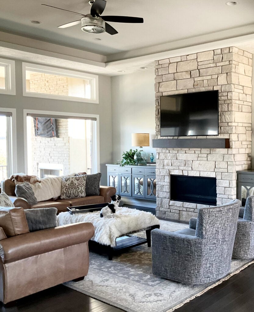
REPOSE GRAY IN A BRIGHT ROOM
Because Repose Gray has an LRV of 60, it will still wash out a bit in an ULTRA-bright room but will hold itself better than many of the lighter gray paint colors.
In this next photo, you can see a dramatic shift from the left side of the fireplace to the right (okay, I may be exaggerating). Notice how the depth and undertones change with the shift in natural light (the left side is bright northern light).

Paint sampling just got a whole lot easier!
Get your Peel & Stick sample of Repose Gray
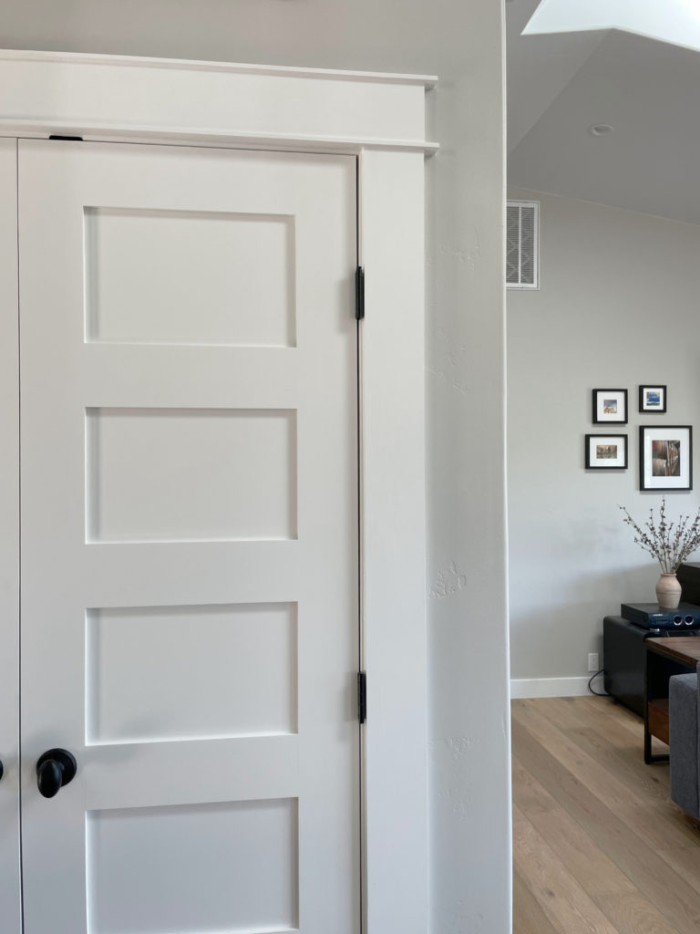
WHAT WHITE TRIM GOES WITH REPOSE GRAY WALLS?
When looking for a white paint color for trim, cabinets, ceilings or doors, lean into those that aren’t OVERLY warm, for example…
- Sherwin Williams Pure White with its wink of softness
- Sherwin Williams High Reflective White for a cleaner approach
- Repose Gray does NOT want to be partnered up with an overly warm white!
Sherwin Williams 4 Best White Paint Colors
WHAT ABOUT WALL COLORS WITH REPOSE GRAY CABINETS?
On the other hand, thanks to the gray trends of 2010-2020, many have Repose Gray cabinets. It’s TOUGH to change wall colors when you have a color in this range, regardless of whether it’s gray, beige, taupe or otherwise.
It’s ideal if you have 15-20+ (20+ being ideal) LRV points between your Repose Gray cabinets and your walls, meaning your walls will have an LRV of approximately 75-80+. Tread carefully, as Repose Gray is DAMN FUSSY. If you ask me (which you kind of are), your best bet is white.
The Best White Paint Colors to Go With Gray Floors, Countertops, Etc.
WHICH PAINT COLOR IS SIMILAR TO OR MATCHES REPOSE GRAY?
There will be no perfect match when it comes to different brands – each color will have its nuances, undertones and intentions. This is even more the case with Repose Gray, as Benjamin Moore doesn’t have anything even close. However, these colors have similar intentions…
- Benjamin Moore Nimbus
- Benjamin Moore Cumulus Cloud (much warmer)
- also, check out Sherwin Williams On the Rocks and Knitting Needles for a slightly different look
And if you’re thinking of color matching between brands, you might want to read THIS first.
Sherwin Williams Agreeable Gray vs Repose Gray, Revere Pewter & More
My FULL Paint Color Review of Sherwin Williams Knitting Needles
WHAT PAINT COLORS GO WITH REPOSE GRAY?
If you’re looking for colors that compliment Repose Gray in a room-to-room palette, check out…
- whites that are bright or only slightly warmer (i.e. Sherwin Williams Pure White)
- shades of gray with similar undertone profiles but more DEPTH, like Dorian Gray or Dovetail
- GRAY-blue-green blends, especially those in the light-medium or medium range (i.e. Sherwin Williams Argos is awesome)
- slightly darker BLUE-GREEN-gray blends (meaning the gray takes a step back).
- DARK blue-gray blends can be magical with Repose Gray.
- Dark green-grays like Sherwin Williams Grizzle Gray, as well as a wide range of medium to dark green paint colors.
- Repose Gray doesn’t always like paint colors that are cooler and lighter than itself OR darker and warmer
FUN FACTS ABOUT REPOSE GRAY
- Repose Gray is not a typical ‘fresh’ gray; it’s soft and warm, even though it can look cooler in some situations.
- Of the warm gray paint colors, Repose Gray is one of my least favorites as it’s more unpredictable than my time of the month (thank you, menopause).
- If you don’t like purple undertones, you’ll want to tread carefully with this color. That being said, I have many Online Color Consulting clients who don’t like purple undertones who LOVE Repose Gray. The same goes for green!
- Repose Gray was super popular about five years ago, and I hardly hear about it now.
Finally, let’s cover a few common questions with…
PEOPLE ALSO ASK THIS ABOUT REPOSE GRAY…
IS REPOSE GRAY STILL A POPULAR PAINT COLOR – IS IT OUTDATED?
While Repose Gray has a small following, with trends leaning warmer, it’s not popping up nearly as much. The facts are, there are other warm neutrals with more predictability and flexibility.
IS REPOSE GRAY BETTER THAN AGREEABLE GRAY?
A question like this is ALWAYS open to perception. However, in my Color Consulting, Agreeable Gray is 100 times more popular than Repose Gray and is often the better choice for the average room, not just for its warmth, but for its slightly lighter depth.

My FULL Paint Color Review of Sherwin Williams Agreeable Gray
DOES REPOSE GRAY GO WITH EVERYTHING?
Heck…no. While Repose Gray can be reasonably flexible, it’s often a bit too cool for interior finishes and rooms with ‘less than ideal’ lighting.
Not sure if Repose Gray is the right color for you? I’ve got more!
READ MORE
The Top 10 Warm Gray Paint Colors
The 12 Best WHOLE HOME Gray & Greige Paint Colors
Paint Color Review of Sherwin Williams Colonnade Gray
Sherwin Williams Agreeable Gray Paint Color Review
Paint Color Review of Sherwin Williams Light French Gray
NEED HELP?
Check out my Online Consulting / E-Design Services!

Written in August 2015, updated in 2024


Hi Kylie,
Great blog by the way! I just painted Repose Gray in my dining room, and plan to carry it through the open concept kitchen and living room but the dining room is looking blue. Ive already bought a 5 gallon bucket so I feel like I’m stuck with color. My question to you is, Is there anything they can add to the tint to offset the blueish it has in our home?
I oringally painted a ton of cardboard cuts out with all different grays you’ve suggested and my husband and I both liked this color the best but now getting it on the walls we are a bit nervous to do all of it. ????
Thank you so much!
Hi, my wife and I are looking for a grey paint to use in the kitchen with our cream cabinets. We have dark wood floors and caramel fantasy counters. Which have a bit of grey in them as well. Any recommendations? We have been trying to find a color for four years now….ugggh
Hi Demetri, I have my E-design services which is built for questions just like yours – and its affordable too! This way I can actually spend some time with your home via photos/questionnaire, rather than just rattling off an answer from the top of my head. If you’re interested, the link is here… https://www.kylieminteriors.ca/online-decorating-design-services/
Scared I chose poorly! New construction. White shaker cabinets, med stain wood floors, very bright kitchen, lots of windows.
Used Repose gray for the island cabinets as well as the range hood that goes to the ceiling.
Walls are set to be done in Owl Gray (BM 2137-60). Will this look awful?! Cant change the cabinets but could try to change the wall color – HELP!
Hi Margaret! I’m not sure that I would put those 2 together. Don’t worry as it won’t be BAD, I just think it could be a bit better. My concern being that Gray Owl is a bit unpredictable and can be a soft gray, but can also EASILY look a bit green or blue. I might look at something a bit softer, along the lines of BM Balboa Mist perhaps. It’s hard to say without seeing your lighting/flooring/etc…
If you’d like me to look into this, I do have an e-design service that is affordable and fun! https://www.kylieminteriors.ca/online-decorating-design-services/
~Kylie
I am wanting to paint an accent wall in my formal living room. The entire house is Repose Gray, and I have accents of blue throughout. What blue would you put on one accent wall? Love the navy trend right now?
Hi Cheree, thank you for your note! I actually have an Edesign business that I’ve created for questions like yours! I try to give as much complimentary info as I can on my blog posts and if that doesn’t work, it might be time for a closer look, this way I can see your furnishings, flooring, etc…otherwise I’m totally guessing!
https://www.kylieminteriors.ca/online-decorating-design-services/
~Kylie
Hi Kylie,
I’m getting ready to paint my open concept main areas and am considering BM Nimbus. Am looking for a warm grey with no yellow or green undertones. Going to compliment it with a wall in BM Smoke or Sea Star. Any thoughts on Nimbus? I have. Looked at so many SW colors, and almost went with a lighter Requisite grey but think it’s too dark. Thanks!!!
Hi Donna, sounds like you’re on the right track, Nimbus is gorgeous! However it is only a slightly warm gray, fractional at best. You can also look at BM Collingwood which is quite beautiful!
Hello Kylie !
I”m looking for a greige color for the exterior of my home. I’m looking at Agreeable Gray and Repose Gray. I seen you said both have a touch of purple in them. I am afraid in the sun, the purple will show. which would you say has the least amount of purple and would better suit the exterior of the home?
Thank you for your time,
Erica J
Hi Erica, of the 2, Agreeable Gray might be a safer bet!
Wow your posts have been so valuable in my renovation, thank you. So I would love your thoughts on Repose Gray throughout an entire main floor, open concept family room/kitchen with white cabinets, large windows which also extends into hallways and smaller rooms with less light. I want one color throughout and think I have looked at everything! I am saving Grey Owl for my bedroom :-), love Passive but it seems too icy/blue on wall sample. I need a Neutral, not too beige, not too gray. Thank you, Ashley
Hi Ashley, I want you to check out Agreeable Gray – it is the epitome of not too beige, not too gray!~
Hi Kylie,
I painted my family room Repose Gray and it turned green. I researched a ton to try to find the right gray for this room that has low natural light. I don’t understand how this happened? We also painted our upstairs hallway and it looks blue up there? Go figure. Can you give any insight? I would love to post a picture so you can see it but I don’t know how.
Ooooo you have experienced the chameleon-like nature of Repose Gray! So, in my time using it and referring to it, I find that MOST of the time it does what it SHOULD do, which is act like a soft warm gray that favours a very vague purple undertone. However the rest of the time it slides either blue or green, more often green. The slightly darker version of it, Mindful Gray can do this as well, but I’ve found that as the colours on this strip get darker, that risk fades away. Some grays are just that way, it’s about the different colours that are used to create them, meaning that under the right circumstances, they can flash a bit green. I can’t say it’s the low natural light in particular, as I’ve used it in rooms with low-natural light with no green. Sometimes it’s the colour of the trim that makes it shift this way or the light bulbs or the exterior exposure/greenery outside. I know, it can be a bugger…I’m sorry it didn’t turn out the way you hoped! I mean, even the fact that it turned into a blue undertone in your upstairs is a bit more unique for this colour!
~Kylie
Hi Kylie, I watched your video on repose gray which I plan to use. Can you suggest a warm white trim color?
Hi Jan! Take a look at SW Alabaster which is a soft, warm white!
We used Repose Gray on interior rooms (no windows) with fluorescent overhead lighting. It is lovely, but definitely shows the green undertone.
That is good to know, it’s things like this that help others make their decision, thank you!
Hello! We are getting our whole house professionally repainted…right now the walls are a light tan color. We’ve painted large swatches of both repose gray and agreeable gray on different walls throughout our living room. Repose looks blue on all of the swatches on the walls. Could that be due to the existing tan color that is underneath? I love how repose looks in all the pictures online but I’m so scared my whole house will look light blue. Agreeable gray looks really nice but I’m just worried it might turn out too beige and not give us a big enough difference overall. Any advice?
Hi Lan! Yes, things could easily be influenced by the colour underneath. The best way to sample is to paint 2 coats on a white poster board and leave a white border around it, so you can visually separate it from the old colour. However, Repose Gray is unpredictable and I have seen it go a bit blue (but if you have different exposures in each room, it shouldn’t do it EVERYwhere. If I were to choose between the 2, I would lean toward Agreeable Gray myself as while it can lean into a slight gray-blue in certain lights, it is more of a cool greige tone.
~Kylie
Thank you!
We made a white border around our paint samples and it totally changes the way we see the color! The repose no longer looks blue…it almost has that slight green undertone to it and is beautiful! And the agreeable looks more Greige/beige now! Both are such great colors and now I’m torn! In your experience…which gives a fresher feel to it?
Does agreeable gray blends well with dovetail?
Hi Kati, yes, they can complement each other nicely!
Kylie-
I’m going to do you online consulting for my house, but wondering about my daighter’s Would Classic Gray work with these accent colors? Turquoise, mustard, indigo, orange, pink…
Hi Sheila, it can depend on the room as Classic Gray can go quite warm or quite gray. If it goes warm I don’t know if it feels QUITE as nice with those accents, but not bad.
Hi! I’m wondering your opinion on repose gray if all out trim and kitchen cabinets are Decoratirs White by BM? I’m also wondering what your opinion would be in ceiling color throughout house since our trim and crown moulding is decorators white. I’m just worried it may be too white for a ceiling. Thanks!
Hi Amber, I see no problem with Repose Gray and Decorators White! DW is a cool white that does favour cool colours, and although Repose is a warm gray, it loves picking up cool undertones! And remember, ceilings generally shade themselves a bit, so white isn’t always as white is it seems 🙂
Would you recommend repose for a basement color?I am looking for a nice fresh color that reflects a touch of warmth /green , what is the LRV of this color? If not what would you recommend?I also like floritine plaster BM , until I came across your very helpful information on this color. Thanks , Carole ????
Your reviews of paint samples are so helpful. I recently painted the middle of our home SW Repose Gray. I am now repainting all of the bedrooms. I want to take the Repose Gray into each of the boys bedrooms (girls get their own color) with an accent wall in each. For the first one, I chose SW Denim which was perfect with the Repose Gray. I need a gray or greige accent wall that will pair nicely with Repose Gray for the other bedroom. Any suggestions? I really wanted to love Gauntlet, but the one single window in this north-facing bedroom made it feel way too dark.
Thank you,
Jen
Hi Kylie,
What is a good alternate in a north east exposure room. Looking for that coastal Hamptons look.
Repose looks too cold in this room.
Thanks Sophia
Just discovered your playful yet sage painterly advice. My guest bedroom I am going with Revere Pewter, but if I tweek by 25% white, what will be the revised lrv? I don’t want the eastern exposure to be too dark with our oak trees in the one large window.
Hi Nancy! It’s not about adding white, it’s about having them lighten Revere Pewter by 25%, they’re really just cutting back the ingredients that are going in the can, if that helps ;). Now re: the LRV, it can depend on the colour and how much black it has. Some colours adjust a bit more than others. I’ve found that 25% results in an approx 3-5 point raise, so Revere Pewter could have an LRV a bit closer to 60 :).
hi
i painted my basement walls repose gray with pure white trim and love it….will a dark brown couch go ok with it?
Hi Billy, without seeing the exact brown it’s hard to say, but off the top of my head, yes 🙂
Hi Kylie,
You have such an informative blog and youtube channel. Help! I have PURE WHITE on trims and doors. I have an option to choose 1 color out of Natural choice and Repose Gray for the whole home and ceilings. Natural choice looks like a safe option but Repose gray leans on a modern look. Please advice which one will give a nice tone yet a distinguished look.
P.S- I want to have a clean bright look with the combination. DO NOT wan’t the home to look darker.
Thanks