
Sherwin Williams Repose Gray (7015): Undertones, LRV, & Real Home Results
Sherwin Williams Repose Gray is a light, warm gray paint color. It works well on interior walls, especially open-concept spaces and bedrooms, as well as cabinets.
Repose Gray’s undertones and overall appearance can change depending on a room’s exposure, light bulbs, and surrounding finishes.
Now, are you feeling nervous about gray’s sneaky green, blue, and purple undertones? You should be, as Repose Gray has a lot up its sleeve. Today, I’m on a mission to demystify Repose Gray and see if it will work for you.

WHAT KIND OF GRAY IS REPOSE GRAY? WARM OR COOL?
Repose Gray is a gray paint color (I’m not just good-looking, you know). However, it’s not a true neutral gray; it has a wee bit of brown in it, making it a warm gray. This bit of warmth doesn’t make Repose Gray close to beige but puts it a step away from traditional shades of stormy or cool gray like Sherwin Williams Big Chill and Light French Gray.
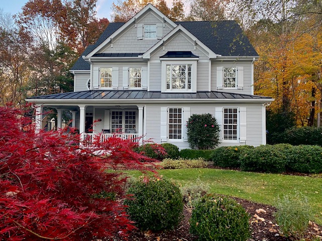
This next photo is as awarm as I’ve ever seen Repose Gray look. Usually, it caters harder to gray…
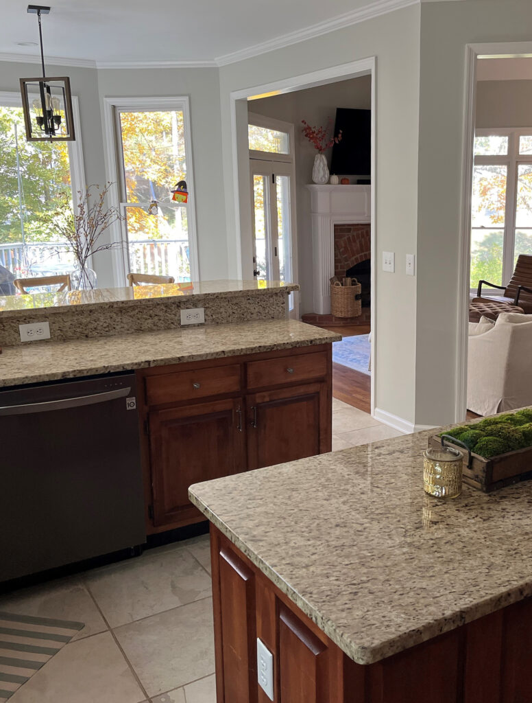
How to Update Your Outdated Granite Countertops – Venetian Gold/Santa Cecilia
WHAT ARE REPOSE GRAY’S UNDERTONES?
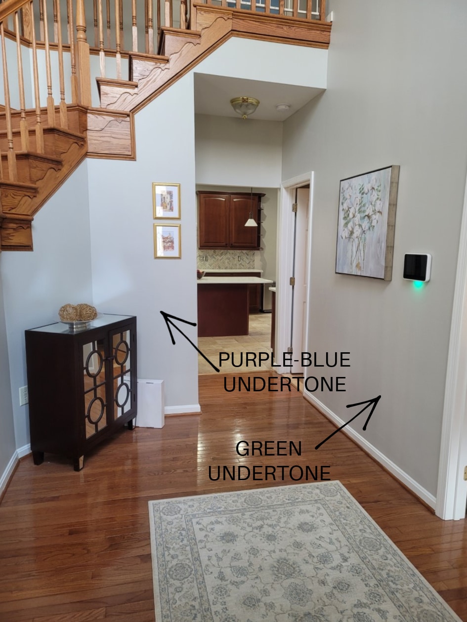
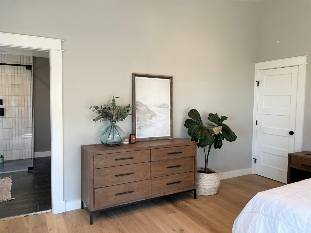
While Repose Gray can favor a soft violet undertone, it also has a bit of a green undertone. And believe it or not, once in a while (given the right exposure/interior finishes), I’ve seen Repose Gray flash a touch blue.
While every gray has undertones, some grays flex a bit more, and Repose Gray is definitely one of these grays, which makes it a complete bugger to rely on. Because Repose Gray can be unpredictable, I highly recommend ordering the Samplize version to see how it settles in YOUR room.
By the way, my blog runs 99% on wine, Doritos, and my Online Color Consulting clients’ and readers’ photos—thank you so much for sending them in!
Now let’s hit a few specific questions that often come up when talking about Repose Gray and undertones…
WILL REPOSE GRAY LOOK OVERLY BLUE?
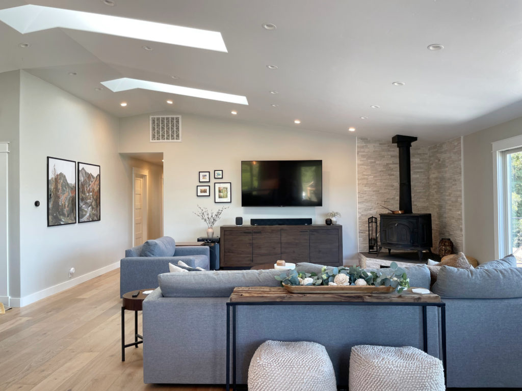
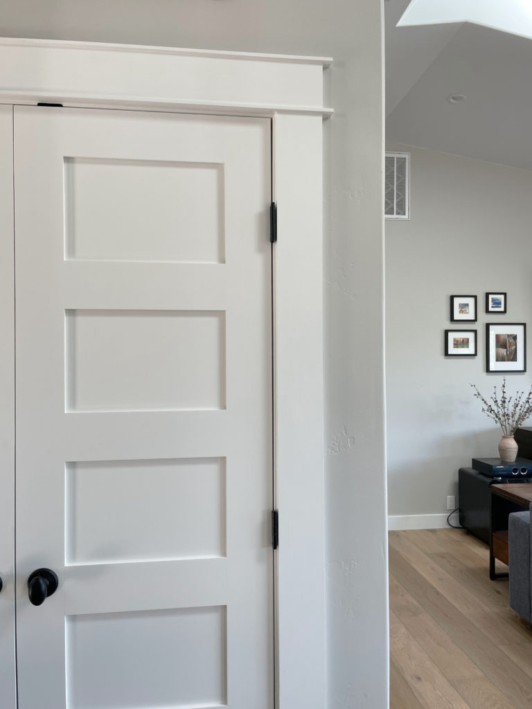
While Repose Gray doesn’t want to look blue in the right environment (i.e., exposure-based or with trim that’s overly warm), it CAN pick up a blue hue. However, of the three gray undertones, blue is the least likely to show up, as shown in this next photo (hardly a wink of blue to be seen).
WILL REPOSE GRAY LOOK OVERLY GREEN?
Repose Gray can nod politely at green but rarely commits on a large scale. If you’re sensitive to green, it shouldn’t set off any alarm bells, but sample carefully. If you place Repose Gray with a finish that has a purple undertone, it could seem a touch green in comparison.
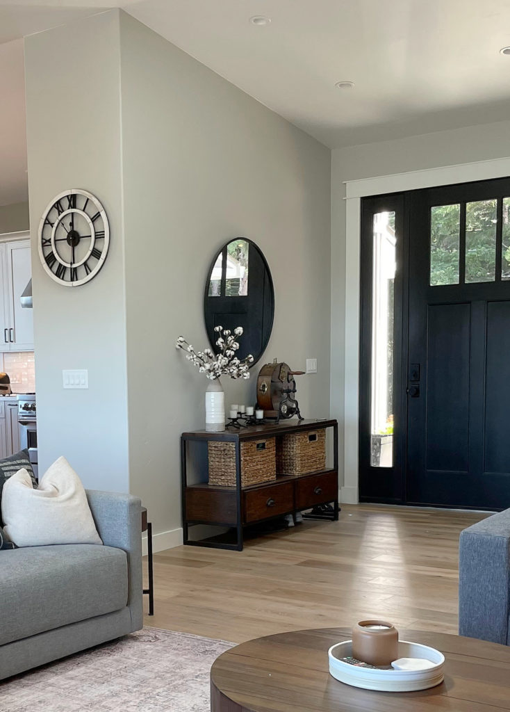
This next photo shows Repose Gray picking up a subtle green hue…
However, as shown earlier, notice how Repose Gray’s undertones shift depending on which part of the room you’re looking at, the time of day, and the light bulb temperature…
If ANY degree of green makes you nervous, you may want to read this…
The Best Gray Paint Colors With VIOLET/Purple Undertones
WILL REPOSE GRAY LOOK OVERLY PURPLE?
Just as with the green undertone, Repose Gray can pick up a touch of purple without hardcore commitment. If you don’t want any chance of violet – you’re looking at the wrong color. Instead, explore shades of gray that are more inclined towards green.
Remember, EVERY gray has undertones – find the one that best suits the finishes in your home!
As for blue undertones, while it can grab some blue, the undertone in this next image is the exception, not the rule, when it comes to Repose Gray…
This isn’t common, but you still have to be careful! Ideas to Update Your 1990s Home
Long story…long, Repose Gray is a sneaky little bugger.
WHAT’S REPOSE GRAY’S LRV?
Repose Gray has an LRV of 60. With an LRV of 60, it won’t look like a heavy color in a room with an adequate amount of light, but it also won’t bring a ton of reflective value to the table (or the wall, in this case) if you have a darker room. Also, with its particular warmth and undertones, it can look a bit drab and dirty in low-light spaces, which we’ll look at next.

The Ultimate Guide to Choosing Paint Color with LRV
REPOSE GRAY IN A LOW-LIGHT/DARK ROOM (OR COOL EXPOSURE)
A room might have low or cool-toned natural light for a few reasons:
- it’s north-facing
- it has east-facing afternoon light or west-facing morning light
- there are a lot of trees outside blocking the sky
- it doesn’t have many windows (or any windows)
- there’s a large overhang outside the window (like a deck or large soffits)
Any of the above reasons will contribute to Repose Gray’s changing overall appearance, flexing through the cool undertones and going from a warm gray to a slightly cooler-looking one.
SAMPLE AND COMPARE SIMILAR SHADES—make sure Repose Gray looks like you want it to in your space!
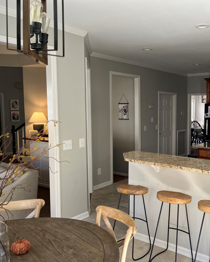
In this next image, Repose Gray is at its best. The room isn’t so bright that the color washes out or so dark that it looks drab, although that could be open to perception, especially if you want a cleaner, cooler shade of gray.
If you have a darker room, Repose Gray can look heavy and drab due to the color itself…
1. Repose Gray lacks much chroma or ‘color’. Color is often used to add interest and personality to a room with muted light.
2. Repose Gray has a slightly lower-than-average LRV (as discussed earlier). That low LRV, combined with the low chroma, can leave it pretty flat-looking. You need to improve your interior lighting and choose the right light bulbs to bring it to life!
REPOSE GRAY IN A BRIGHT ROOM
Because Repose Gray has an LRV of 60, it will still wash out a bit in an ULTRA-bright room but will hold itself better than many of the lighter gray paint colors.
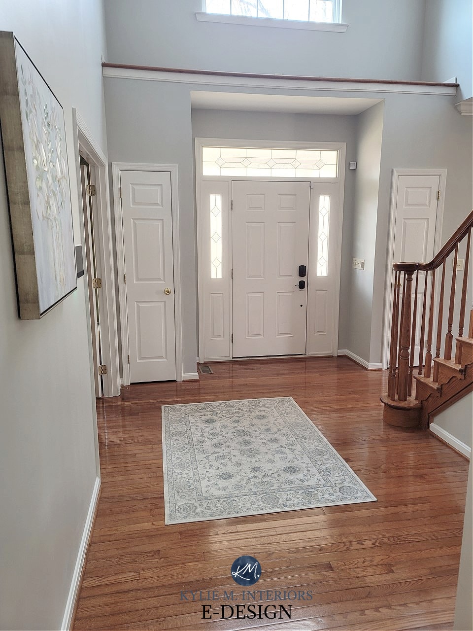
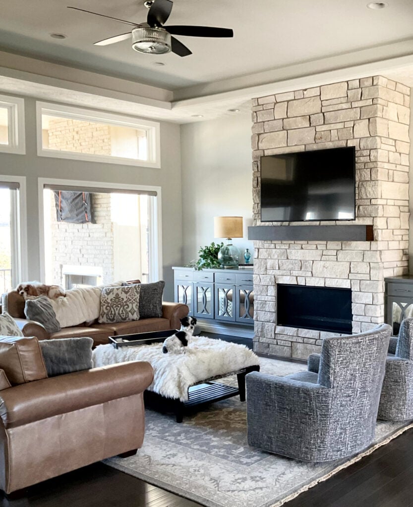
In this next photo, you can see a dramatic shift from the left side of the fireplace to the right (okay, I may be exaggerating). Notice how the depth and undertones change with the shift in natural light (the left side is bright northern light).

Paint sampling just got a whole lot easier!

Get your Peel & Stick sample of Repose Gray
WHAT WHITE TRIM GOES WITH REPOSE GRAY WALLS?
When looking for a white paint color for trim, cabinets, ceilings or doors, lean into those that aren’t OVERLY warm, for example…
- Sherwin Williams Pure White with its wink of softness
- Sherwin Williams High Reflective White for a cleaner approach
- Repose Gray does NOT want to be partnered up with an overly warm white!
Sherwin Williams 4 Best White Paint Colors
WHAT ABOUT WALL COLORS WITH REPOSE GRAY CABINETS?
On the other hand, thanks to the gray trends of 2010-2020, many have Repose Gray cabinets. It’s TOUGH to change wall colors when you have a color in this range, regardless of whether it’s gray, beige, taupe or otherwise.
It’s ideal if you have 15-20+ (20+ being ideal) LRV points between your Repose Gray cabinets and your walls, meaning your walls will have an LRV of approximately 75-80+. Tread carefully, as Repose Gray is DAMN FUSSY. If you ask me (which you kind of are), your best bet is white.
The Best White Paint Colors to Go With Gray Floors, Countertops, Etc.
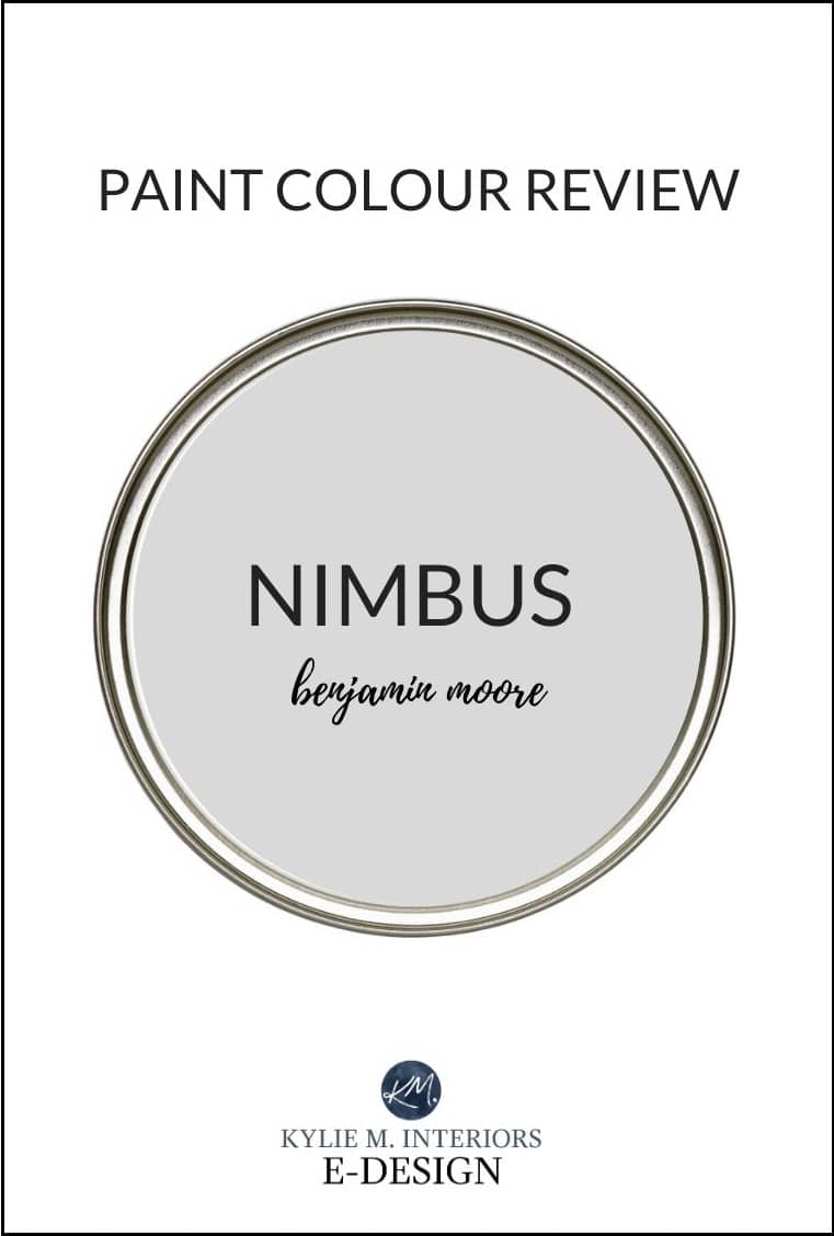
WHICH PAINT COLOR IS SIMILAR TO OR MATCHES REPOSE GRAY?
There will be no perfect match when it comes to different brands – each color will have its nuances, undertones and intentions. This is even more the case with Repose Gray, as Benjamin Moore doesn’t have anything even close. However, these colors have similar intentions…
- Benjamin Moore Nimbus
- Benjamin Moore Cumulus Cloud (much warmer)
- also, check out Sherwin Williams On the Rocks and Knitting Needles for a slightly different look
And if you’re thinking of color matching between brands, you might want to read THIS first.
Sherwin Williams Agreeable Gray vs Repose Gray, Revere Pewter & More
My FULL Paint Color Review of Sherwin Williams Knitting Needles
WHAT PAINT COLORS GO WITH REPOSE GRAY?
If you’re looking for colors that compliment Repose Gray in a room-to-room palette, check out…
- whites that are bright or only slightly warmer (i.e. Sherwin Williams Pure White)
- shades of gray with similar undertone profiles but more DEPTH, like Dorian Gray or Dovetail
- GRAY-blue-green blends, especially those in the light-medium or medium range (i.e. Sherwin Williams Argos is awesome)
- slightly darker BLUE-GREEN-gray blends (meaning the gray takes a step back).
- DARK blue-gray blends can be magical with Repose Gray.
- Dark green-grays like Sherwin Williams Grizzle Gray, as well as a wide range of medium to dark green paint colors.
- Repose Gray doesn’t always like paint colors that are cooler and lighter than itself OR darker and warmer
FUN FACTS ABOUT REPOSE GRAY
- Repose Gray is not a typical ‘fresh’ gray; it’s soft and warm, even though it can look cooler in some situations.
- Of the warm gray paint colors, Repose Gray is one of my least favorites as it’s more unpredictable than my time of the month (thank you, menopause).
- If you don’t like purple undertones, you’ll want to tread carefully with this color. That being said, I have many Online Color Consulting clients who don’t like purple undertones who LOVE Repose Gray. The same goes for green!
- Repose Gray was super popular about five years ago, and I hardly hear about it now.
Finally, let’s cover a few common questions with…
PEOPLE ALSO ASK THIS ABOUT REPOSE GRAY…
IS REPOSE GRAY STILL A POPULAR PAINT COLOR – IS IT OUTDATED?
While Repose Gray has a small following, with trends leaning warmer, it’s not popping up nearly as much. The facts are, there are other warm neutrals with more predictability and flexibility.
IS REPOSE GRAY BETTER THAN AGREEABLE GRAY?
A question like this is ALWAYS open to perception. However, in my Color Consulting, Agreeable Gray is 100 times more popular than Repose Gray and is often the better choice for the average room, not just for its warmth, but for its slightly lighter depth.

My FULL Paint Color Review of Sherwin Williams Agreeable Gray
DOES REPOSE GRAY GO WITH EVERYTHING?
Heck…no. While Repose Gray can be reasonably flexible, it’s often a bit too cool for interior finishes and rooms with ‘less than ideal’ lighting.
Not sure if Repose Gray is the right color for you? I’ve got more!
READ MORE
The Top 10 Warm Gray Paint Colors
The 12 Best WHOLE HOME Gray & Greige Paint Colors
Paint Color Review of Sherwin Williams Colonnade Gray
Sherwin Williams Agreeable Gray Paint Color Review
Paint Color Review of Sherwin Williams Light French Gray
NEED HELP?
Check out my Online Consulting / E-Design Services!

Written in August 2015, updated in 2024


Hi Karen! I love SW paints. If you are in Canada it’s the Opulence line, if you’re in the States its called Cashmere. Its the middle of the road and I love the quality/price point. Now keep in mind that flat finishes can be ‘wipeable’ (barely) but not washable. I’ve yet to find a good washable ulti-matte paint!
Thanks for asking!
~Kylie
Do you think Repose grey would pair well with Alabaster on the cabinets and trim? Thanks!!
Hi Kay, yes Alabaster and Repose Gray are a beautiful combo together!
Oh Emma, YES, this has happened before! In fact, I was just my Repose Gray post today to chat a bit about that. I would say it’s ‘rare’ but you are the third person I’ve heard of this happening with. Exposure can affect things for sure but keep in mind, with yellow and hunter green underneath, even 2 coats (if it’s not high quality paint) might not be enough and you ‘could’ have some of that original colour flashing through, distorting things…
What color gray would be better with cherry floors?
Hi Jacquelyn! I know, Pinterest can be SO deceiving as to how things will ‘really’ look. A lot of the images online have been edited, particularly the more professional ones on Pinterest/Houzz. In a really well-lit room, REpose Gray will still show up to the party, but you wouldn’t see as much contrast as you might see in a more average/moderately lit room. If you have great light, I might just bump right on down to Mindful – and since they are in the same colour range you might just need to do 1 coat if you do a good job!
~Kylie
Hi – Have you heard of mixing 50 % mindful gray with 50% repose gray – and what the results might be like?
Hi Mary, nope I haven’t heard of that! Usually i just suggest either lightening one or the other – I’ve found that 40% is the magic number that does the trick to get me ‘in-between’ 2 colours.
Hope that helps!
~Kylie
Hi Kylie – I can’t tell you how helpful your blog has been to me!!
We recently bought an old 1930’s fixer upper on 40 acres. The house is a big L shape – lots of big different facing windows hallways, high ceilings, dark staircase, etc…outside trees – but still good light. Because of multiple window directions…the light changes by the minute! I wanted to brighten it up with grays, but about $500 later in various BM gray paint choices…everything, and I mean everything, kept turning blue – pink blue, purple sweet tart blue, periwinkle blue…ugh! I would use a sample, and it would look great, but then show up completely different on 2 walls in the same room!
I found your blog, switched gears, and grabbed samples of all the paints on the SW Repose, Mindful, Dorian strip and…voila! I had to change shades from room to room according to the light – but it all flows and looks really pretty. There are still some slight blue undertones, but mostly just a nice fresh, gray feel. To note – the Mindful is a welcoming bluish/gray in the bright foyer but looks the exact same color as the Repose in another hall/office/breezeway…the front room and DR which are immediately off the foyer, are in Dorian – but only a little darker looking than the Mindful! A half bath (small but decent window) in Mindful has not even a smidgen of blue…but more taupe, and looks darker than the Dorian in the DR.
I decided I am doing the kitchen walls in white, mostly just to break up the blue/gray feel from everywhere else…so I must ask…do I go with Eider White since these tones seem to work? Or will that come off feeling like an extension of the other rooms, just lighter? I’ve noticed you like BM’s White Dove? Any other thoughts for whites? (with plain white trim)
*Also, an interesting side note…salvaged from my troubling BM relationship – I painted our dark stairwell in BM’s Winter Solstice with plain white trim (with dark wood banister & risers)….and by all accounts it looks gorgeous! Oddly, the stairs open to the Dorian in our front room and I am not sure you would even notice. Under closer inspection WS is cooler – but kind of a rich, warm coastal feel (…Cape Cod in winter by a fire??)
Thanks so much for all the great info – hopefully, this may help another poor soul stuck in the gray blues!!!
-Laurie
Hi Laurie, sorry for the delayed reply and I’m SO glad you’ve find my blog helpful! And you are RIGHT, I LOOOOVE me some White Dove! Eider White is pretty but can have a vague purple undertone. Bad? No, but I like the subtle neutral warmth of White Dove, particularly if a lot of your colours are flexing to the cooler side rather than the warmer side. Also check out BM Calm https://www.pinterest.com/search/pins/?q=benjamin%20moore%20calm&rs=typed&term_meta%5B%5D=benjamin%7Ctyped&term_meta%5B%5D=moore%7Ctyped&term_meta%5B%5D=calm%7Ctyped which is like Eider White but with a weee wink of softness/greige to it.
Hope that helps!
~Kylie
We have to choose our interior pint color on our house being built without seeing samples on the wall.s. It will be the same color throughout the entire house. Our trim and cabinets will be pure white. I have it narrowed to repose gray, light French gray, and knitting needles. I am so scared of undertones. Any suggestions??
Hi Brenda! If you’re nervous about undertones I would think that the MOST safe would be Repose Gray. It can flex around a bit, but it’s always pretty. Knitting Needles can come up a bit too purple. Light French Gray is beautiful, but I think Repose is a bit more safe 🙂
~Kylie
Hello I love your Blog, you give excellent advice. I am going with BM Gray Owl bcs of your advise, my furniture is gray and accents are coral, yellow and aqua. My problem is that my Living Room, Dining room and kitchen are right next to one another with very little wall space in between the LR and DR. The Dining and Kitchen are connected (one room). My kitchen cabinets are all white, dining table grayish silver. I have 6 windows in the Living Room, and 1 window in the dining room/ kitchen area. Yes, very dark area. Should I paint the dining/kitchen another color? only 2.5 walls in dining room (1 of those has the lonely window) and little wall space in kitchen mostly cabinets and appliances with an Island. I was thinking about yellow, but what shade of yellow should I use with BM Gray Owl? Or paint all the rooms with Gray Owl, since they are in close proximity of one another? I will be forever grateful for your advice.
~Regina
Hi Regina, thank you for your note! Now with personal questions with a bit more detail I usually refer to my Online Consulting as I do have a ‘feature wall’ package that’s affordable! Based on what i can read, I’m thinking that they could all be the same, but unfortunately it’s hard to tell without photos 🙂
~Kylie
Hi Kylie!
Your blog has been enormously helpful to me. I can’t thank you enough for all that I’ve learned! The painters are coming in 2 days and I’m still on the fence about my kitchen wall color with my cabinets to be painted Dorian Gray. I’m using Repose Gray in the den, foyer, up the stairs, and in my husband’s office. For some reason, I just can’t commit to Repose on the kitchen walls….so much gray. I saw your thoughts on Eider White (purplish-ick) . My painter likes Pearly White with it. I’d like a decent contrast with the white trim. My table and chairs are orangey wood and the floor a light , neutral tile. My fingers are crossed with the hope that you can advise and celebrate with me the passing of my old oak cabinets!
Kris
Hi Kris! it’s really hard to consult without seeing photos (which is why I usually refer to my e-design) but have you looked at Agreeable Gray for a subtle shift into something a wink more greige?
Hi Kylie!
I’ve painted my kitchen and entire first floor Repose Grey. I want to paint my cabinets and I’ve been sitting on this decision for months! I am trying to decide between Dovetail, Pavestone, Acier or Gauntlet Grey for the cabinets.
Any thoughts on a good cabinet color to go with Repose Grey walls?
Thanks so much for all of your great posts!
Hi Sara! Well the best advice I can give is that cabinets seem to look lighter than you THINK they will once all is said and done – so with that being said, I would lean toward Dovetail as the ‘just right’ choice – not too dark, not too light.
~Kylie
Hi Kylie! I’m in a major dilemma. Currently I have revere pewter in my large family room downstairs, with high ceilings, lots of windows (I’m on an end unit) which gets TONS of sun in the morning, into afternoon. I’m repaintjng, due to a small candle fire, and just can’t find the right color. My plan was repose gray, but was afraid it was too beige-y as I have a couch that can sometimes pull green. At SW yesterday, I saw how similar repose is to revere, and decided to try more grays. The rep turned me to knitting needles and zircon, true grays. At first I loved zircon, but woke up this am and it’s far too light, against my furniture. So I painted more of the knitting needles around. This room goes into my dining room and to my kitchen, so there’s no breaking point to change colors. (My kitchen cabinets are painted in Chelsea gray. )
Can you give me any thoughts? I’ll lose my mind if I have to keep running back to SW, as it’s not very convenient and need to get this decided on by the weekend. Any help you can give would be amazing! Thank you 🙂
Hi Ashlee! I have to say that the one problem people don’t have with Repose Gray is beige and in fact it sounds like it could work really well for you! The amount of beige it has in it is SOOOOO fractional – it barely qualifies as a warm gray and doesn’t even TIPTOE close to greige. I’ve also had it pick up a variety of cool undertones that you’d find in those more traditional cool toned grays such as blue/green/purple. I don’t know, it sounds like it could be just fine to me!
~Kylie
I had no idea it would be so difficult to pick the perfect shade of gray. We currently have samples of repose. Passive, knitting needles, lazy gray, front porch and Argos on the walls of our living room, entry and stairwell. None of these areas receive a great deal of light but the colors look different in each spot. All will be against white trim but the living room is adjacent to the dining room which is painted a light sage/mint green. Although we were in search of a true gray, we are leaning toward repose as most of the others look too dark and passive a bit blue. Any suggestions would be greatly appreciated.
Hi Vicky, thank you for the note! I try to give as much complimentary info as I can on my blog and if that doesn’t work, it might be time for a closer look via my e-design! It’s fun and affordable and this way I can look at photos/questionnaires and come up with some options that make sense, rather than just guessing! If that interests you, the link is here… https://www.kylieminteriors.ca/product-category/interior-paint-colors/
Chat soon!
~Kylie
Hi there! We are expecting a baby girl and just painted the nursery BM Stonington Gray. The swatches we painted looked beautiful (which is why we chose it), but now that the room is painted it is reading WAY too blue. I am a fan of warm grays – my favorite is Mindful Gray, which I have used in a number of other rooms in our home. I am considering repainting using that, but really wanted a lighter gray so I was thinking of using Repose Gray since they are in the same family. Do you think Repose Gray will read blue since Stonington Gray did? Would I be better off lightening Mindful Gray? This room has one east facing window and our trim is cream (not a true white). Thank you!
Hi Jessica! Well, Stonington Gray DOES read blue because it has that undertone. Now REpose Gray is a very slightly warm gray but it does have some cool undertones and is well known for flexing into them – particularly purple. A handful of times it’s picked up a subtle blue, but certainly not often. I would also lighten it by 25% as because it’s a touch more muddy, it could be a bit heavy for a baby room…
I hope that helps!
Hi Kylie!
We are painting our basement repose gray, thank you for a helpful review! We are trying to find a nice coordinating color for the full bathroom that is in the basement. Though it’s a full bath it’s very small and has no window since its in the basement. I like Cucumber and white mint through Sherman Williams, but do they clash with Repose Gray? Any other suggestions? Thanks!!
Hi Amy, thank you for your note! Those colours are lovely, but a touch too ‘lively and colourful’ for the likes of Repose Gray. You may want to explore colours with more gray in them. When it comes to actual colours, I’d only be guessing as I don’t know what your tile/countertop/etc… looks like. When it comes to personal questions I do refer to my E-design. It’s affordable and fun and this way I can take a look at your room… https://www.kylieminteriors.ca/online-decorating-design-services/
~Kylie
Hello Kylie!
Thank you for your helpful videos!
We’re designing a house with a warm midtone wood look tile, beige carpets and white kitchen/white quartz (no warm tones in the kitchen). Most of the house has nice natural light.
Would Repose Gray sound like it could work for the whole house, to break up the “beige”? Or would a warmer floor clash w/ the purple/pink undertones?
Hmmmm, it does depend on the TYPE of beige, but in general I would say that it might be a smidge too gray/purple…
Hello! What an AWESOME space to stumble upon! Extremely helpful!! We are building – open ranch. I’m stuck between agreeable gray and repose gray. Cabinets and trim will be SW pure white. Our kitchen island, beams, and stair railing will be stained. We will have LOTS of natural light. Which colors would you go with?
THANK YOU!!!!!! -Mandy
Wellll, if it were me, while EVERYONE ELSE seems to grab Repose, I’d go for Agreeable. I like its flexibility. It can look like a greige, but it can just as easily lean considerably more gray and pick up a vague cool blue (given the right exposure). I just think it’s fab. Repose is great too, but I find it a touch heavy (in which case you could lighten it by 25%) but I DO miss the very subtle warmth/balanced that Agreeable offers…hope that helps! Normally I send questions along to my E-design, but you caught me at a good time!
~Kylie
Kylie,
Loved your post! would you recommend Repose Grey for an English basement with only 2 windows. Want to keep the space warm and as light as possible
Nope! I think it would be too heavy and dark. If you’d like me to take a look and come up with some good solutions, I do have an affordable E-design service that is fun too! This way I can take a look at your flooring, interior lighting and furnishings and give you some great options to choose from… https://www.kylieminteriors.ca/online-decorating-design-services/
~Kylie
Hi Kylie,
I have an accent wall that is Fairview Taupe by BM in a large great room with a lot of natural light. Do you think Repose Gray would work for the other walls?
Ooo, I think the undertones in REpose Gray are too unpredictable for Fairview Taupe…
I am doing a kitchen remodel. My den that my dining room opens up into is new (recent ad on). My walls in the den are repose grey and my trim is white. I will be repainting the dining and kitchen to match. So, my question is, if I want grey kitchen cabinets what color grey do I go with (in your opinion)? Suggestions please.
Hi Sally! I do try to give as much complimentary advice as I can on my blog and if that doesn’t help, it might be time for a closer look! This way I can look at your countertops, flooring, exposure, etc.., otherwise I’m totally guessing and that won’t do you any good! If that interests you, the link is here… https://www.kylieminteriors.ca/product-category/interior-paint-palettes/
I painted my daughter’s room in mindful gray. Looked great! Used Agreeable gray in the bathroom and it looked beige, so I switched to mindful on the cabinet and repose on the wall. Repose is totally light blue. And you would never know the mindful on the cabinet is the same as the wall. I then painted my kitchen repose gray and it too looks blue. Only this time I wanted the blue undertone because my kids did not want me to change the bluish gray cashmere that was already there but I wanted a change. Oh, and just about all soft grays look lavender in my hallway! Even after I changed the lightbulbs too. These colors are so dependent on the lighting….
I know Karen, isn’t it just mind boggling! I’ve found that Repose Gray, IN PARTICULAR, is one of the BIGGEST chameleons in the gray world too!
Thank you for your wonderful blog! I’ve been reading a lot of your blog lately while trying to paint our entire main floor ceilings over naptime and between having several sick kids (Gong on 4 weeks now). All of your detailed reviews have my indecisive self leaving towards agreeable grey for our split foyer main living\entry. Hoping it doesn’t become washed out as I’m used to the sw latte that have been on the walls since before purchasing (oak floor and orange maple\oak cabinets. Who remodels with the same tone wood cabinets as the floors these days? Ick! I’m so sick of the brown everywhere!)
You have given me so much knowledge on LRV and lighting! I would love to use you for am online consult someday when it’s in our budget for our remaining rooms. Until then, I just wanted to say thank you!!!! <3