
Benjamin Moore Collingwood OC-28: Undertones, Real Home Use & More
If you’ve been perusing Pinterest lately, you may have noticed a shift from gray to beige, taupe, and greige. I see this same trend in my Color Consulting adventures; I’m getting more and more requests for the warmer end of things.
However, some grays straddle both worlds. They are committed to a traditionally cool gray look but aren’t gratuitously warm, either. In this department, Benjamin Moore Collingwood has to be the winner-winner chicken dinner.
WHAT TYPE OF COLOR IS COLLINGWOOD?
Collingwood OC-28 is a gray paint color. While it’s certainly a warm gray and softer than traditional shades of gray, it’s not warm enough to step into the taupe or greige end of things and is definitely not beige or anywhere near it.
As it relates to Benjamin Moore’s best-selling gray paint colors, Collingwood is near the top of the list (along with Classic Gray, Revere Pewter, and Stonington Gray—the OGs of the gray world).
But what is a warm gray?
Traditionally, gray is a cool color with either blue, green, or purple undertones. Once you add a bit of brown-beige to the mix, it becomes a warm gray (it’s way more technical than that, but I’m a meat n’ potatoes gal here).
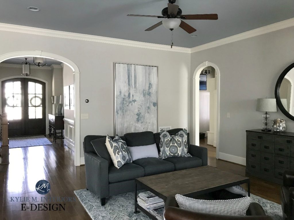
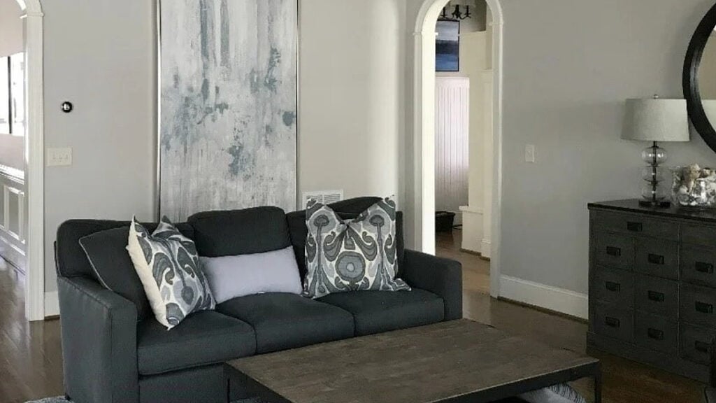
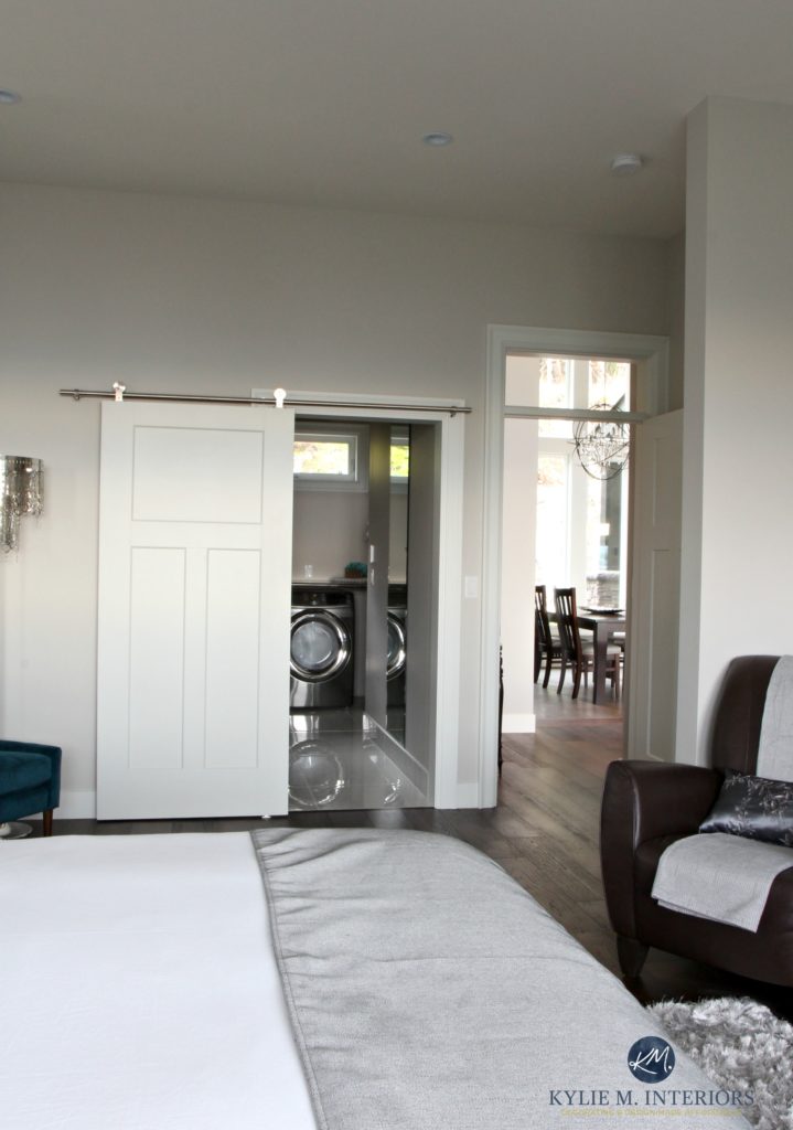
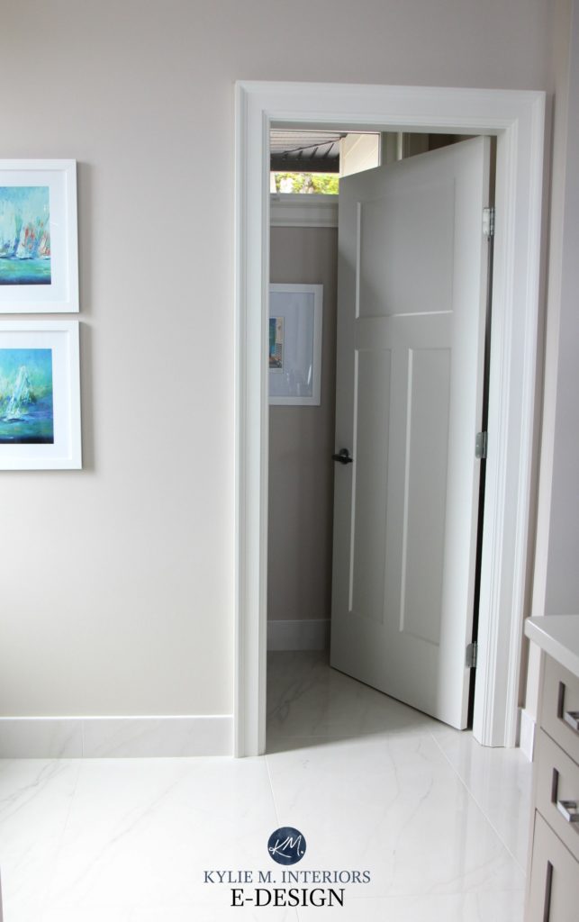
Collingwood looks gorgeous in my client’s living room, which has a slightly darker, cooler shade of gray on the ceiling.
WHAT ARE ITS UNDERTONES – WILL IT LOOK PURPLE?
Benjamin Moore Collingwood is a neutral paint color at its heart, but it also has a soft, slightly purple undertone. Will your walls look legit PURPLE? If you have a north-facing room and a hate-on for this particular shade, it might make you twitch – just a bit. But generally speaking, the purple is more about the softness of the color. This undertone is also a great way to get gray without blue or green.
If you’re not familiar with the word ‘undertones’, it’s a slang term for how a color may lean. Just know that this will change in different lighting conditions!
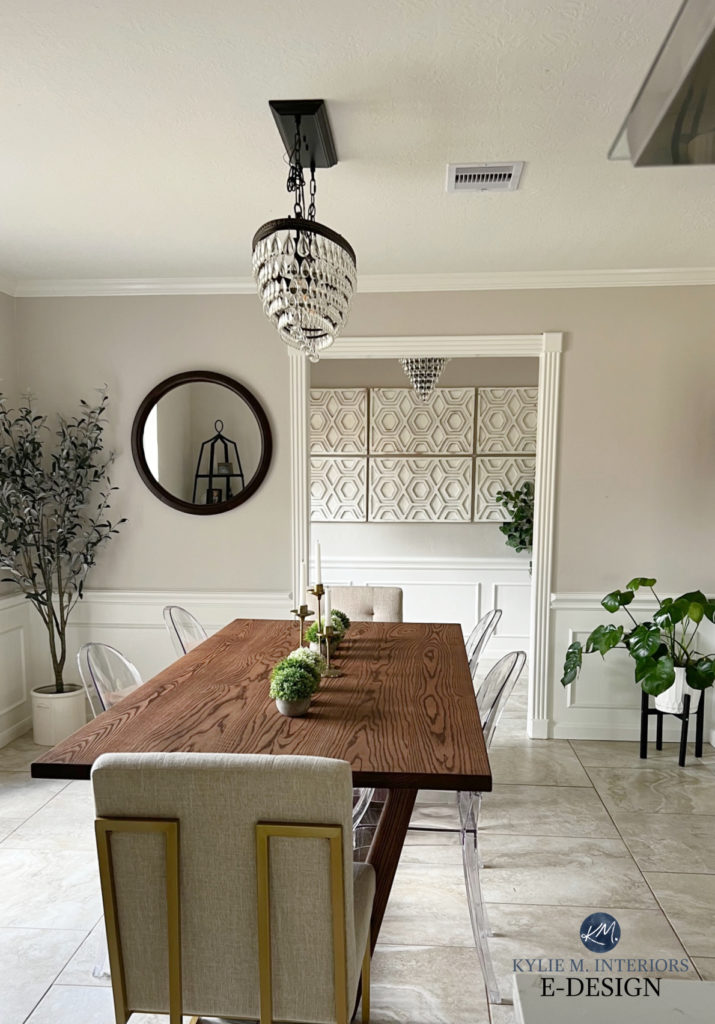
In my client’s kitchen (below), notice how the undertone of Collingwood rises on the left-hand side. I love it, but it’s unusual, as the undertone is usually more passive (considerably). To get this actual look, you may need a color with more undertone or even a color with a more committed purple hue.

This next photo shows the walls in one of my favorite local clients’ homes, where Collingwood’s violet undertone looks more natural.

THE LRV OF COLLINGWOOD
The LRV of Collingwood is 62 (61.52) – MY MAGIC NUMBER! You’ll know this is a pretty rad number if you’ve read my previous blog posts on LRV. If you haven’t read those posts, you get three slaps with a wet noodle and better get your reading glasses on…
62 is a great LRV because it’s a depth the ‘average room’ can handle. With Collingwood having this LRV, if your room gets adequate lighting (natural or otherwise), it will hold its own. If you have an overly bright room, any paint color with this LRV (or higher) will wash out, as will Collingwood.
On the other hand, if you have a slightly darker room, Collingwood has a noticeable depth without looking too dark (although that would be open to perception). However, don’t expect it to work any wonders, as dark rooms need light to come to life. You might need a bit more commitment to color to get it showing up at the party.
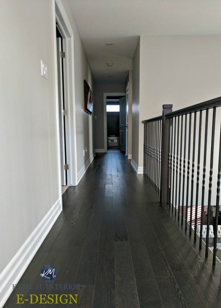
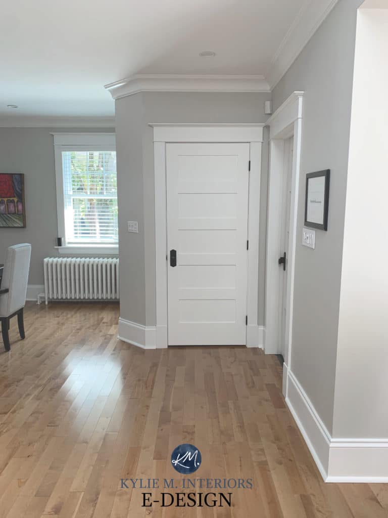
In this hallway with dark wood flooring, Collingwood looks classic and soft, but notice how it dies off as the hallway gets darker…
While it might not be the perfect color for every room, its LRV sets it up for success.
Get the Online Color Expert that DESIGNERS hire!

COLLINGWOOD IN A NORTH-FACING ROOM
North-facing light is cool natural light with a slightly cool gray cast. Just like cool light bulbs, northern light can slightly enhance other cool colors, so in a north-facing room, you can expect Collingwood to look less warm gray and more neutral gray while still keeping a soft, subtle violet undertone.
In the above photo, look at the highest part of the wall, just above the closet. This shows Collingwood in its usual form.
COLLINGWOOD IN A SOUTH-FACING ROOM
In a south-facing room, Collingwood is a nice, neutral way to cool down the warm yellow light flooding through your windows. It offers a neutral but not cold balance.
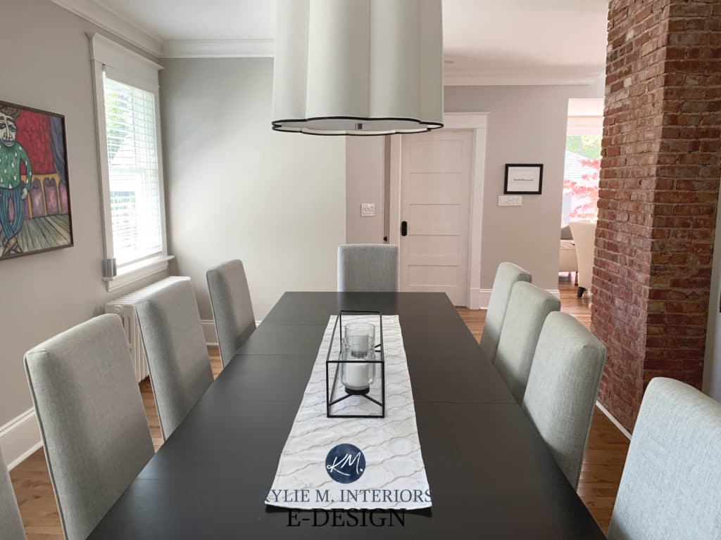
These next two rooms showcase Collingwood in what is likely a south-facing light…

If you have a south-facing room and love a more traditional gray, you might not find Collingwood cool enough. If so, check out a more traditional-looking gray like Gray Owl or Stonington Gray. Gray Owl is a bit more stormy and has a green-blue undertone. Stonington Gray is also stormy but a bit darker and has a bit more blue in its hue—especially compared to the warm softness of Collingwood. While these can look a bit muddy or weirdly warm in some lights, they’re popular colors overall.
Here’s your Peel & Stick sample of Collingwood…
…delivered to your front door in 1 DAY!
BENJAMIN MOORE COLLINGWOOD IN AN EAST OR WEST-FACING ROOM
Oooo, these rooms are buggers. While north and south-facing rooms have more consistency throughout the day, east and west-facing rooms change quite drastically. Here are a few tips to help you decide if Collingwood can work for you…
EAST-FACING ROOM
In the morning, Benjamin Moore Collingwood will look lovely and quite natural. However, if you don’t have adequate interior lighting, it can look a bit flat and drab in the afternoon.
WEST-FACING ROOM
In the morning, Collingwood will look a touch flat and drab. However, in the afternoon, it will shift into a gorgeous, soft, warm gray.
The key is to figure out what time of day you spend the most time in your room and see how Collingwood feels in that light.
North, East, South, West – Which Paint Color is the Best?
WHAT’S THE BEST WHITE TRIM COLOR FOR COLLINGWOOD?
If you’re looking for a white for your trims or cabinets, Collingwood loves a slightly cleaner approach.
- I would lean into Benjamin Moore Chantilly Lace the most.
- However, Simply White is also a beautiful choice.
- Benjamin Moore White Dove looks pretty too, for a slightly lower contrast look.
DOES COLLINGWOOD GO WITH CREAM TRIM?
That’s a big fat no. Collingwood is a hot mess with cream trim, and I’d avoid it at all costs.
The Best Paint Colors to Update Cream Trim
DOES IT GO WITH WOOD TRIM OR CABINETS?
Collingwood can look amazing with so many wood stains and finishes. Maple, cherry, oak, yellow, orange, and red—Collingwood is no one-trick pony and accommodates almost everything.

The Best Paint Colors with Red Wood Finishes | Paint Colors That Go With Pink-Stained Woods
WHAT COLORS ARE SIMILAR TO COLLINGWOOD?
In the battle of the warm grays, Collingwood has some serious competition. Let’s examine some of Benjamin Moore’s and Sherwin William’s top-selling shades to see which ones compete.
COLLINGWOOD VS. BALBOA MIST
Benjamin Moore Collingwood and Balboa Mist are often in the running for the same project. This is because they have similar intentions: warm grays with a violet undertone. However, when you compare the two, you’ll see that while both colors are in the light range, Collingwood is darker (LRV of 61.52), whereas Balboa Mist is a bit lighter (LRV of 65.53). Another difference is that Balboa Mist can show a bit more undertone, and the odd time a bit more pink mixed into its violet undertone.
Unlike many comparable shades, thanks to the shift in depth and tweak in undertones, Collingwood and Balboa Mist look good in a palette together (e.g., adjoining rooms). Collingwood also goes well with Classic Gray, another similar shade of gray; it’s just much lighter with its LRV of 73.67 and has a bit more warmth (read its review HERE).
FULL Paint Color Review of Benjamin Moore Balboa Mist
COLLINGWOOD VS. AGREEABLE GRAY
Okay, now we’re comparing apples to apples! Agreeable Gray and Collingwood are super similar. Collingwood’s LRV is 61.52, whereas Agreeable Gray is a touch darker with its LRV of 60 – you’re splitting hairs, and they’re short and curly.

The real difference, however subtle, is that Collingwood commits to a violet undertone. In contrast, Agreeable Gray is a bit more flexible – it can look slightly green OR slightly violet depending on its surroundings. Then there are times when you don’t see any undertone at all, but that can apply to both colors! When I have a client greatly opposed to purple undertones, I suggest Agreeable Gray over Collingwood, as long as it suits their space (but still mention that it can pick up the odd flash of violet).
My FULL Paint Color Review of Sherwin Williams Agreeable Gray
WHAT DARK COLORS GO WITH COLLINGWOOD?
Heck yes, but it’s not as easy as grabbing any old hue. While not all of these are meant to be directly beside Collingwood, they include colors that work in a color palette/adjoining room.
- Collingwood is a soft neutral, and it likes toned-down or slightly earth-toned colors.
- This includes popular shades of blue-grays (with a bit of green) such as Benjamin Moore Brewster Gray, Silver Mink, and the darker, striking navy-gray approach of Benjamin Moore Anchor Gray.
- Muted off-whites can be gorgeous (avoid an off-white that’s colder than Collingwood or overly creamy).
- I love Collingwood with more committed blue-green-gray blends like Benjamin Moore’s Gray Wisp.
- As for green, again, a little dab will do ya. Check out the more muted, earthy greens such as Benjamin Moore’s October Mist, the darker green-gray look of Cos Cob Stonewall, and many darker shades of green as well.
- darker grays with similar undertones, including Sherwin Williams Dovetail
- dark blue-gray blends, including blue-violets and blue-greens
- popular navy blue paint colors, including Benjamin Moore Hale Navy
Want something a bit different? I GOT MORE!
RELATED BLOG POSTS
Paint Color Review of Benjamin Moore Balboa Mist
Paint Color Review of Benjamin Moore Nimbus
The 12 Best WHOLE HOME Gray & Greige Paint Colors
Paint Color Review: Benjamin Moore Classic Gray
The Best Benjamin Moore Gray Paint Colors
Need HELP?
Check out my Online Paint Color Packages!


This post was originally published in 2017 but was updated and revamped in 2024


HELP! I love your color reviews. I painted sample boards and scoured the internet and I loved Collingwood in every photo and on my board. My painters used it in my upstairs hallway and it is tan/beige! I am so disappointed. Not the soft gray/greige I was expecting. Any advice to help it pick up more gray and any other color suggestions I could use to get that soft gray look I was hoping for in the downstairs areas I was planning to use Collingwood in? I am desperate as the painter needs to know my plan! Thank you for any help.
Hi Kristen, have you tried playing with your light bulbs? Maybe a daylight bulb would help to enhance the cooler tones? It really shouldn’t be tan/beige…even though it is a warmer gray.
I agonized for weeks over Collingwood or Revere Pewter for a bathroom. I think I really wanted to like RP because it seems it was “the” go to colour that everyone was using. However it just didn’t quite hit the mark so I chose Collingwood and love, love, love it. Have recommended it so many times.
My local paint store also recommended Collingwood, but the swatch looks slightly purple in my home. Are there any warm greiges without the purple or pink undertones?
Hi Rachel, check out BM Edgecomb, it will be your best bet for avoiding purple!
Kylie, thank you so much for your suggestion. Silly question, but is Edgecomb the same colour as Baby Fawn?
Your e-design before and after of the funky kitchen is remarkable! Collingwood looks perfect in there and makes the kitchen sing! SO impressed! Love seeing examples like this.
Thank you Elle! I know, I was SO tickled when she sent the after photos – it turned out so lovely!
~Kylie
What’s the best curtain color / pattern for gray walls in bedroom?
Hi Linna! That is a tricky question as it all depends on the size of the room, the type of gray you have on the walls (what undertones it has) as well as flooring, bedding and personal tastes! Personally, I’d choose a curtain that is either a darker or lighter version than the wall colour, to keep things simple. That being said, there are some fabulous patterns out there or complementary colours like teal that could look quite lovely!
~Kylie
Love your blogs. I have Collingwood in my East facing ensuite. I am surprised to hear it pulls purple as Its beautiful in my ensuite and doesn’t show any purple. And it doesn’t really change to anything offensive throughout the day. Just nice and neutral. I would love to see a post on paint colours for basements that usually have tiny windows and not many at that! Thanks for all your info.
Ooo good to know, thank you Cammy! And I do have a blog post for basement colours, if you want to check it out! There’s also links within this blog post, to other related blogs posts 🙂 https://www.kylieminteriors.ca/the-best-light-paint-colours-for-a-dark-room-basement/ If you’re ever looking for something, type a keyword into my search bar on the right-hand side and you might be surprised at what you find! https://www.kylieminteriors.ca/the-best-light-paint-colours-for-a-dark-room-basement/
~Kylie
Just wondering what you would recommend in a west facing bedroom that would be slightly warmer in the morning and still maintain a warm ness in the afternoon without being too dark and without green or blue undertones.
Hi Sandra, thank you for your note! YOu might want to check out my blog post re: West Facing rooms, it might be helpful for you! https://www.kylieminteriors.ca/the-best-paint-colours-for-west-facing-rooms/ I do try to give as much complimentary info as I can on my blog and if that doesn’t help, then it might be time for a closer look with my E-design! https://www.kylieminteriors.ca/online-decorating-design-services/
~Kylie
Hi Kylie,
Great, informative post, as usual. I just had to tell you that I think your suggestion to use Collingwood for that Funky Kitchen was genius! What a transformation. Not only does it seem to make the orange tile and cabinets look pretty instead of garish, but it seems to go with the floor perfectly, too! It looks like a funky designer kitchen now! How do you do all that from online photos? Amazing abilities you have, girl!
BTW–do you have to do a professional type calibration on your moniter to make sure the colors are accurate? Just wondering, as I can’t seem to get my moniter to calibrate well just using the standard windows calibration settings. Thanks.
Hi Phyllis, thank you! I don’t have professional calibration, I’ve just got a darned good eye and a quality computer! SO many of the floorings, tiles, countertops, I’ve seen in my local decorating adventures (literally thousands of homes) so a lot of it is so familiar to me!
~Kylie
Kylie, I love your style, advice and quick wit! Wondering, how do you feel about Collingwood for an exterior? We are painting over our 1950s peachy-pink brick and looking for a fool-proof, soft, modern gray.
Hi Sara! I haven’t done much of Collingwood on an exterior and it could depend on your roof, but i DO love it!
Hi, we are painting our two-story family room in Collingwood, we just love this color. I’m wondering which white semi gloss to pick to go with it for our trim and fireplace mantle?
Hi Susan! I like the look of BM White Dove, which is a warm white with a neutral undertone. It’s a softer look than a clean crisp white, but not too warm like Cloud White.
Hello, my first and second floors are painted with BM Collingwood. I plan to use a contractor to paint the basement in a equivalent SW color (he gets a discount on SW paints). Can you give me a recommendation?
Hi Steve, in order to really GET Collingwood, I recommend you have SW do a colour match for you. Most of them have the fan decks of BM in their store, or you can bring them your colour chip. Just check the match before you leave to make sure they hit it right on!
Hi! I think I have narrowed it down to Collingwood for my large family room after currently having 12 different paint samples on the walls, so I was glad to find your post here! My issue is our whole house was painted in linen white trim (yuck) but there is sooo much of it everywhere and it would be too expensive right now to paint all of the trim too. Do you think Collingwood could go OK (I know not the best choice) with linen white trim or do you have a better suggestion. I want to try to stay in the gray family and Edgecomb gray is too yellow with linen white.
Hi Kylie, very informative and helpful site. Thanks for helping with such a big decision as is choosing a color for the home.
I have a 2 story living room that faces south. I want to have a soft , warm kind of creamy color. I have gone with the greige colors. Actually I have tried 3 walls (catwalk hallway, stairs wall and one of the living room wall) with Gracioous Greige from HGTV SW and in each one of the 3 walls I have different colors. On the second floor a warm , soft beige, on the stairs wall a greige and on the wall in the living room a kind of gray that is dull. This is driving me crazy… I love the tone I have on the second floor… it shows a little gray but it looks more like a creamy , soft beige. I tried Agreeable gray (which to me they seem pretty similar) but I dont like the dull color I have in the main living room. Any suggestions in what way I can go choosing a greige that is creamy and warm and more beige than gray?? It sounds complicated right?
Hi Karla, thank you for your note! When it comes to personal questions like this, I really do need to refer to my E-design business! I try to give as much complimentary info as I can on my blog, and if that doesn’t help it might be time for a closer look, this way I can look at how much light you have, flooring, furnishings, etc…otherwise it’s a 100% educated guess…if that interests you, the link is here… https://www.kylieminteriors.ca/online-decorating-design-services/
The only basic idea I can throw at you is SW Accessible Beige…maybe it could work?
Just painted oak kitchen cabinets BM Collingwood. Floors , baseboards and trim medium oak. Keeping white appliances. |Planning on getting white counter and backsplash. What would be a good wall color.
Hi! I came upon these post after I chose Collinwood for a small east facing retreat. All the trim., 3 doors and 2 large window sills are painted in the builders kwal paint called floral white. I’m trying to decide if I should paint the ceiling Collingwood as well or paint it the same color as trim or another white. There is no trim on ceiling. And should the ceiling be eggshell (as my walls will be I think) or flat. Thank you and I’m loving all the info!
Which would you choose for a hallway and entranceway when you have Balboa Mist in the living room…Collingwood or Edgecomb Grey?
Ps. What is your opinion of Abalone? Would it go with Balboa Mist??
I would definitely do Collingwood OVER Edgecomb if you have Balboa Mist in a room already :).
HI there, great blog! We are looking to paint our colonial in a soft gray / greige color but I am having such a hard time deciding and COMMITTING! Someone at the paint store recommended collingwood, I am wondering your thoughts? I cant really find pics online of it for exterior…I want a very soft gray or griege with white trim and a navy door. Something that doesnt look too white/light in the bright sun, but that stays very soft as the sun goes down… our roof is black! thanks so much!
Hi Meg! Collingwood is AAAAMAZING, but like any light colour, it WILL wash out and lighten up in the sun. You’d need to add more depth to avoid it – you can try Cumulous Cloud for a shift, see if that gives you a bit more body perhaps?
Hi Kylie!
Do you have a color review on pale oak? If so, can you provide the link? I just painted all the main room in our two story townhouse Pale Oak and I hate it. It looks lavender and chalky to me. I’m curious to know how you would describe this color and where it looks best; maybe I can spot why it looks so terrible in my home. Also, do you have a link to more neutrals that I can consider for the future? I’m already counting the days until I can repaint this place. I might try your online consult in the future, but for now Id like to gather some resources. Thank you!!
Oh MAN! Yes, Pale Oak is a tough one. It’s a warm greige with a considerable taupe look to it (purple/pink). I know it’s not one of MY fave colours just because of this funny warmth, so I’m not surprised to hear that you aren’t in love. I wonder if you have a certain exposure that’s making it feel a bit off as well – maybe south facing?
Now any neutral ‘like this’ will have purple undertones, this is the range you’re in. And I see you’re in the Collingwood post and while it does have a purple undertone, it is more GRAY which I find makes it DRASTICALLY easier to work with and live with. Short of that, it would be about trying to pick up a bit of blue-green, which would lean you a bit cooler, like BM Shoreline perhaps.
I hope that helps a bit!
Thank you Kylie!! You seem like you’re really busy so I really appreciate that you take the time to respond to as many inquiries as you can. The paint looks the most lavender on the south facing walls – you’re good! I will grab a sample of shoreline. I was also thinking of sampling edgecomb and maybe having it lightened as you did on your walls. I’ll keep up the research as well. Thank you again. Keep up the great work!
I was planning on painting the exterior of my west facing Cape with Collingwood BM,. Do you think it will look to cream/white in the afternooon when the sun hits it?
Thanks, Maryann
Well, I mean, it will definitely look BRIGHT where the sun directly hits. You’ll want to make sure you have some nice white trim so you can have a frame of reference for the real CONTRAST of it. And yes, that western light will definitely warm it up! I like Cumulus Cloud too, which has just a bit more depth.
What color trim would you pair with Cumulus Cloud? I’m loving that warm gray!
Ooooo, I love BM Chantilly Lace although you could do the softer SW Pure White :).
Thank you so much!! My builder typically uses white dove and i thought it might be a bit too gray. Thanks!
Hi! Sorry to bother you, do you think collingwood will get washed out for an exterior paint?
Ermmmm…it definitely can, especially if you have southern light or good eastern/western – which you obviously will on OTHER sides of your home, but it would be the FRONT exposure I’d worry about the most :). Collingwood could be okay with northern light, but that’s about it. :). If you go to my SEARCH at the top of the sidebar and type in ‘exterior’, you’ll see I have some great blog posts on choosing exterior colours that could be helpful!
Hi Kylie! What color is on the ceiling in the second picture? I find your blog to be very informative and helpful! Thank you very much!