

Benjamin Moore Collingwood: Undertones, Real Home Use & More
By Kylie
January 2, 2024
If you’ve been perusing Pinterest lately, you may have noticed a shift from gray to beige, taupe, and greige. I see this same trend in my Color Consulting adventures; I’m getting more and more requests for the warmer end of things.
However, some grays straddle both worlds. They are committed to a traditionally cool gray look but aren’t gratuitously warm, either. In this department, Benjamin Moore Collingwood has to be the winner-winner chicken dinner.
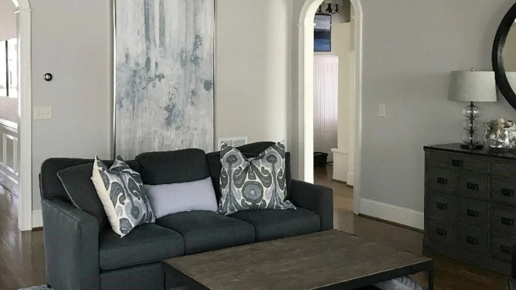
WHAT TYPE OF COLOR IS COLLINGWOOD?
Collingwood OC-28 is a gray paint color. While it’s certainly a warm gray and softer than traditional shades of gray, it’s not warm enough to step into the taupe or greige end of things and is definitely not beige or anywhere near it.
As it relates to Benjamin Moore’s best-selling gray paint colors, Collingwood is near the top of the list (along with Classic Gray, Revere Pewter, and Stonington Gray—the OGs of the gray world).
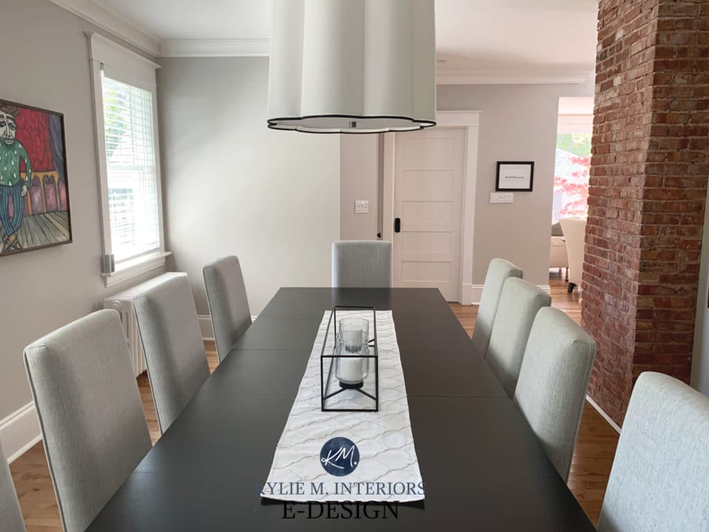
But what is a warm gray?
Traditionally, gray is a cool color with either blue, green, or purple undertones. Once you add a bit of brown-beige to the mix, it becomes a warm gray (it’s way more technical than that, but I’m a meat n’ potatoes gal here).
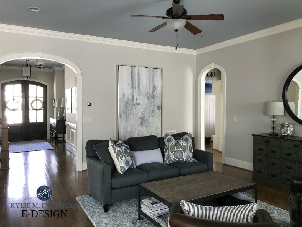
Collingwood looks gorgeous in my client’s living room, which has a slightly darker, cooler shade of gray on the ceiling.
WHAT ARE ITS UNDERTONES – WILL IT LOOK PURPLE?
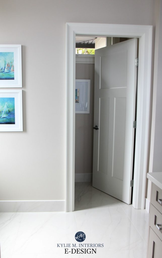
Benjamin Moore Collingwood is a neutral paint color at its heart, but it also has a soft, slightly purple undertone. Will your walls look legit PURPLE? If you have a north-facing room and a hate-on for this particular shade, it might make you twitch – just a bit. But generally speaking, the purple is more about the softness of the color. This undertone is also a great way to get gray without blue or green.
If you’re not familiar with the word ‘undertones’, it’s a slang term for how a color may lean. Just know that this will change in different lighting conditions!
In my client’s kitchen (below), notice how the undertone of Collingwood rises on the left-hand side. I love it, but it’s unusual, as the undertone is usually more passive (considerably). To get this actual look, you may need a color with more undertone or even a color with a more committed purple hue.
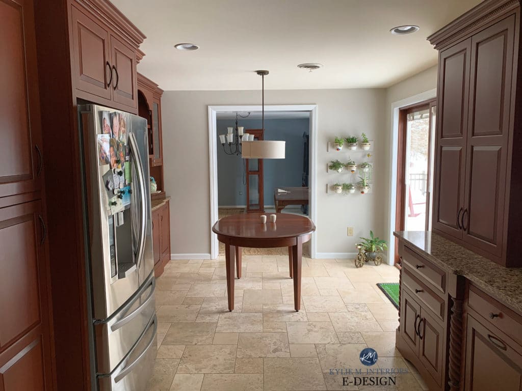
This next photo shows the walls in one of my favorite local clients’ homes, where Collingwood’s violet undertone looks more natural.

THE LRV OF COLLINGWOOD
The LRV of Collingwood is 62 (61.52) – MY MAGIC NUMBER! You’ll know this is a pretty rad number if you’ve read my previous blog posts on LRV. If you haven’t read those posts, you get three slaps with a wet noodle and better get your reading glasses on…
62 is a great LRV because it’s a depth the ‘average room’ can handle. With Collingwood having this LRV, if your room gets adequate lighting (natural or otherwise), it will hold its own. If you have an overly bright room, any paint color with this LRV (or higher) will wash out, as will Collingwood.
On the other hand, if you have a slightly darker room, Collingwood has a noticeable depth without looking too dark (although that would be open to perception). However, don’t expect it to work any wonders, as dark rooms need light to come to life. You might need a bit more commitment to color to get it showing up at the party.
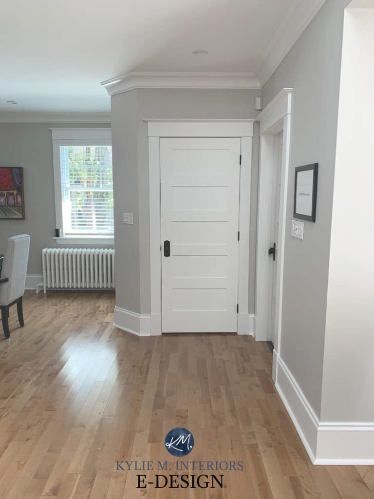
In this hallway with dark wood flooring, Collingwood looks classic and soft, but notice how it dies off as the hallway gets darker…
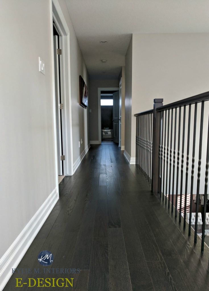
While it might not be the perfect color for every room, its LRV sets it up for success.
Get the Online Color Expert that DESIGNERS hire!
COLLINGWOOD IN A NORTH-FACING ROOM
North-facing light is cool natural light with a slightly cool gray cast. Just like cool light bulbs, northern light can slightly enhance other cool colors, so in a north-facing room, you can expect Collingwood to look less warm gray and more neutral gray while still keeping a soft, subtle violet undertone.
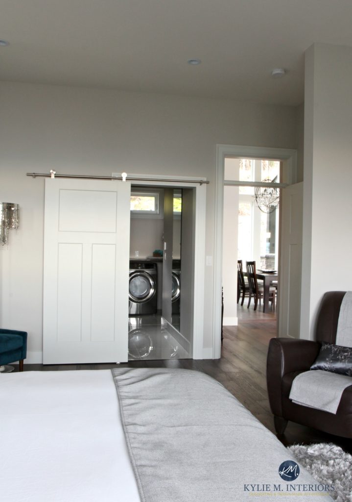
In the above photo, look at the highest part of the wall, just above the closet. This shows Collingwood in its usual form.
COLLINGWOOD IN A SOUTH-FACING ROOM
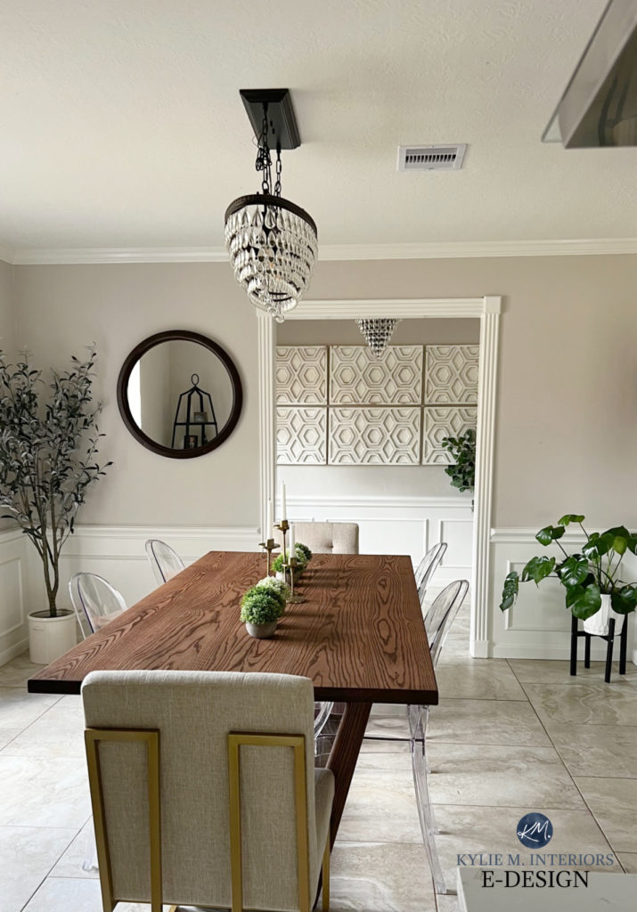
In a south-facing room, Collingwood is a nice, neutral way to cool down the warm yellow light flooding through your windows. It offers a neutral but not cold balance.
These next two rooms showcase Collingwood in what is likely a south-facing light…

If you have a south-facing room and love a more traditional gray, you might not find Collingwood cool enough. If so, check out a more traditional-looking gray like Gray Owl or Stonington Gray. Gray Owl is a bit more stormy and has a green-blue undertone. Stonington Gray is also stormy but a bit darker and has a bit more blue in its hue—especially compared to the warm softness of Collingwood. While these can look a bit muddy or weirdly warm in some lights, they’re popular colors overall.
Here’s your Peel & Stick sample of Collingwood…
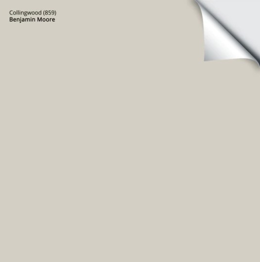
…delivered to your front door in 1 DAY!
BENJAMIN MOORE COLLINGWOOD IN AN EAST OR WEST-FACING ROOM
Oooo, these rooms are buggers. While north and south-facing rooms have more consistency throughout the day, east and west-facing rooms change quite drastically. Here are a few tips to help you decide if Collingwood can work for you…
EAST-FACING ROOM
In the morning, Benjamin Moore Collingwood will look lovely and quite natural. However, if you don’t have adequate interior lighting, it can look a bit flat and drab in the afternoon.
WEST-FACING ROOM
In the morning, Collingwood will look a touch flat and drab. However, in the afternoon, it will shift into a gorgeous, soft, warm gray.
The key is to figure out what time of day you spend the most time in your room and see how Collingwood feels in that light.
North, East, South, West – Which Paint Color is the Best?
WHAT’S THE BEST WHITE TRIM COLOR FOR COLLINGWOOD?
If you’re looking for a white for your trims or cabinets, Collingwood loves a slightly cleaner approach.
- I would lean into Benjamin Moore Chantilly Lace the most.
- However, Simply White is also a beautiful choice.
- Benjamin Moore White Dove looks pretty too, for a slightly lower contrast look.
DOES COLLINGWOOD GO WITH CREAM TRIM?
That’s a big fat no. Collingwood is a hot mess with cream trim, and I’d avoid it at all costs.
The Best Paint Colors to Update Cream Trim
DOES IT GO WITH WOOD TRIM OR CABINETS?
Collingwood can look amazing with so many wood stains and finishes. Maple, cherry, oak, yellow, orange, and red—Collingwood is no one-trick pony and accommodates almost everything.

The Best Paint Colors with Red Wood Finishes | Paint Colors That Go With Pink-Stained Woods
WHAT COLORS ARE SIMILAR TO COLLINGWOOD?
In the battle of the warm grays, Collingwood has some serious competition. Let’s examine some of Benjamin Moore’s and Sherwin William’s top-selling shades to see which ones compete.
COLLINGWOOD VS. BALBOA MIST
Benjamin Moore Collingwood and Balboa Mist are often in the running for the same project. This is because they have similar intentions: warm grays with a violet undertone. However, when you compare the two, you’ll see that while both colors are in the light range, Collingwood is darker (LRV of 61.52), whereas Balboa Mist is a bit lighter (LRV of 65.53). Another difference is that Balboa Mist can show a bit more undertone, and the odd time a bit more pink mixed into its violet undertone.
Unlike many comparable shades, thanks to the shift in depth and tweak in undertones, Collingwood and Balboa Mist look good in a palette together (e.g., adjoining rooms). Collingwood also goes well with Classic Gray, another similar shade of gray; it’s just much lighter with its LRV of 73.67 and has a bit more warmth (read its review HERE).
FULL Paint Color Review of Benjamin Moore Balboa Mist
COLLINGWOOD VS. AGREEABLE GRAY
Okay, now we’re comparing apples to apples! Agreeable Gray and Collingwood are super similar. Collingwood’s LRV is 61.52, whereas Agreeable Gray is a touch darker with its LRV of 60 – you’re splitting hairs, and they’re short and curly.

The real difference, however subtle, is that Collingwood commits to a violet undertone. In contrast, Agreeable Gray is a bit more flexible – it can look slightly green OR slightly violet depending on its surroundings. Then there are times when you don’t see any undertone at all, but that can apply to both colors! When I have a client greatly opposed to purple undertones, I suggest Agreeable Gray over Collingwood, as long as it suits their space (but still mention that it can pick up the odd flash of violet).
My FULL Paint Color Review of Sherwin Williams Agreeable Gray
WHAT DARK COLORS GO WITH COLLINGWOOD?
Heck yes, but it’s not as easy as grabbing any old hue. While not all of these are meant to be directly beside Collingwood, they include colors that work in a color palette/adjoining room.
- Collingwood is a soft neutral, and it likes toned-down or slightly earth-toned colors.
- This includes popular shades of blue-grays (with a bit of green) such as Benjamin Moore Brewster Gray, Silver Mink, and the darker, striking navy-gray approach of Benjamin Moore Anchor Gray.
- Muted off-whites can be gorgeous (avoid an off-white that’s colder than Collingwood or overly creamy).
- I love Collingwood with more committed blue-green-gray blends like Benjamin Moore’s Gray Wisp.
- As for green, again, a little dab will do ya. Check out the more muted, earthy greens such as Benjamin Moore’s October Mist, the darker green-gray look of Cos Cob Stonewall, and many darker shades of green as well.
- darker grays with similar undertones, including Sherwin Williams Dovetail
- dark blue-gray blends, including blue-violets and blue-greens
- popular navy blue paint colors, including Benjamin Moore Hale Navy
Want something a bit different? I GOT MORE!
RELATED BLOG POSTS
Paint Color Review of Benjamin Moore Balboa Mist
Paint Color Review of Benjamin Moore Nimbus
The 12 Best WHOLE HOME Gray & Greige Paint Colors
Paint Color Review: Benjamin Moore Classic Gray
The Best Benjamin Moore Gray Paint Colors
Need HELP?
Check out my Online Paint Color Packages!


This post was originally published in 2017 but was updated and revamped in 2024
Share this!

Tagged with:

Meet Kylie
Do you need help, but aren’t quite sure what ‘help’ looks like? Are you drowning in paint samples and decision fatigue?
Does every color you like at the paint store look terrible in your lighting or pick up a funky undertone? I’d love to help.

Hi, I’m Kylie
For over 24 years I’ve helped 12,000+ homeowners and renters make more confident decisions on paint colors and affordable home updates using real home examples and practical, experience-based advice. My goal is simple: help you love the home you have.
Do-it-yourself, the smart way
Grab one of Kylie’s guides
Affordable, downloadable shortcuts to the colors and combos I’d pick for you. Yours to keep, forever.

Homeowner’s Guide: White Kitchen Cabinets
This isn’t another ’10 Best Cabinet Colors’ list, because there is no SINGLE best white for every home and every kitchen.
Learn how to choose a white cabinet paint color that works with your countertops, backsplash, flooring, trim, lighting, and home—so you can rule out the wrong whites, sample fewer colors, and choose with confidence.
158-page PDF – Instant Download
$34.95Accent Colors – And How to Use Them
This isn’t about plastering your home in the ‘Color of the Year’ or following the latest trends (unless you really want to).
It’s about finding accent colors that work with YOUR home, YOUR style, and YOUR comfort level.
Because the best accent color isn’t one you love on a paint chip, it’s one that makes everything around it look better.
118-Page PDF – Instant Download
$34.95
Homeowner’s Guide: Exterior Paint Colors
Painting your home’s exterior is a BIG investment and choosing a color based on a tiny paint chip, a trend or the house down the street can be an expensive mistake.
Learn how to look at YOUR roof, YOUR windows, YOUR brick (or stone) and YOUR home as a whole so you can understand what colors make sense.
The goal? Less guessing, fewer samples and a lot more confidence before gallons of paint go on your home.
206-page PDF – Digital Download
$44.95Exterior Trim Paint Colors
This isn’t a list of ‘the best trim colors’, although you’ll get a ton of links to great shades!
You’ll learn how to look at your home and understand whether it needs contrast, repetition, connection, or a little visual peacekeeping to pull it all together.
Because trim might seem like a small detail…but spread it around all four sides of your home on multiple surfaces and it suddenly has a pretty big job.
118-page PDF – Instant Download
$24.95




Comments
-

Kylie I love reading your blog. You mention how color changes in different light. Also which way the room faces makes a big difference. What happens when you have a room with three large windows facing east, north and south?? Hard to follow when it says if you have a East facing room or a north facing the color will pick up this undertone.. So if the room faces east with a window, but has windows on the north and side do I still go by a east facing room.? So confused…I’m I just reading to much into this…
-
Hi Kathleen! You’re right, sometimes we get so caught up in something that we need to step back – I do it with my home ALL the time, I over think the heck out of it! It can be about when you use the room the most, or which exposure is the dominant one. In the end, it ‘sounds’ like your room will be relatively flexible, more so than a room with only 1 exposure, so I think you probably have a good range to consider and can put more focus on coordinating with the products in your home (ie: countertops/flooring/furnishings). If I ever HAD to choose an exposure to honour, I PERSONALLY would lean to the south over the north, but that’s because I generally prefer slightly warmer colours – someone who prefers cooler colours would lean to the northern/cool end!
I hope that helps 🙂
~Kylie-
Would this color look ok in a north facing-wall of windows room with a warm beige stone fireplace and maple windows? A lot of people are trying to update the warm beige/browns with the popular gray/greige colors but it’s seems like it would be hard to do if your not willing to paint the wood trim or change a fireplace facade. How do you bring in a Collingwood color with the warmer unchangeables in a home ? Btw, my daughter is a Kylie M too!
-
Hi Lori! Collingwood is pretty flexible. I’ve found it can flex a bit more into it’s gray, subtle purple MORE in a north facing room, so you’ll want to see how it settles for you. If it’s just a bit gray, you might need to warm things up a bit! If you’d like me to take a look at your room I do have an affordable and fun E-design service! https://www.kylieminteriors.ca/the-best-paint-colours-for-west-facing-rooms/
~Kylie
-
-
-
I am getting collingwood in my room and it has north and west windows so I would like to know which colours would really complement the room.
-
-
Hi Kylie,
I’ve painted most of the interior of my home BM Revere Pewter, but find it a bit too muddy and dark in my north facing (very small) kitchen with limited light due to a big tree in front of my window.Do you think Collingwood would work as a replacement on my kitchen walls, and do you feel it will it ‘blend’ well enough with the rest of the Revere Pewter walls throughout the house?
PS – love your site and all your posts. Thank you so much form Kelowna!!
-
Oh Tammie, it’s hard to say! There’s so much to consider – not just the Revere Pewter in the adjoining rooms. Even MORE important are the countertops, cabinet colour, flooring, etc… so while they certainly find together, I can’t say it will look good in your own kitchen – but it is a beautiful colour and will be fresher than RP!
-
Thanks for this. My husband picked Revere Pewter and I picked Collingwood. We have White Dove trim. We plan to do the family room/kitchen (all open). Also the 2 story foyer and hallway.
TIme to get the swatches on the wall and see what happens!!
-
-
-
Great article! Just the info I was looking for! What color trim works best with Collingwood? Thank you! Beth
-
Good good – that’s what I like to hear! For trim colour, I might look at BM White Dove for a soft warm, but not too creamy approach, or keep it CLEAN AND CRISP with Super White!
-
-
Kylie, I’m a huge fan! I’m a color consultant in Northern California and find my taste and esthetic very similar to yours. Thank you for your witty and informative blogs!. I’m a Sherwin Williams gal. Do you have a fave SW that compares to Collingwood?
-
Well, thank you Barbi! Oh, I do looooove Collingwood and SW just doesn’t have one that quite hits it. The best would probably be SW Agreeable Gray, but it would need to be lightened to hit the right depth. Modern Gray is also similar…ish, but warmer/more greige…
When it comes to Collingwood, I’d be more inclined to ask SW to colour match the actual paint chip right into their brand 🙂
Thanks for writing!
~Kylie
-
-
Best design blog on paint on the web
-
Wow, thank you Mariza – that made my day!
-
Agree – I find you so entertaining AND informative Kylie!
-
WAHOOOO, thank you 🙂
-
-
-
Good article! Thanks Kylie! Would love to hear your thoughts on BM Baby Fawn, Cedar Key and Pale Oak.
Wendy
-
Hi Wendy, thank you for the note! Now those colours could ALL get blog posts on their own, so I can’t go too far with my thoughts. In general, these are all soft, feminine warm gray/greiges. If you are wanting to avoid the blue/green type of grays and like a softer touch, they are very valid choices!
~Kylie
-
-
Love the color….I was going to use revere peweter but I saw it in a home with lots of light and in a bedroom with not so much. I think I’ll go with this choice.
I have to paint the ceiling in the bedroom, could I do a darker Greyish/blue color?-
Hi Tana, yes I think you could pull that off, absolutely!
-
-
I love love this color! I have a swatch on the wall and so far like it a lot. Your post helped me pick this color so thank you. Its between this one and Colonnade Gray lightened by 25% I just want to see if any funny business will happen with Collingwood in east and west facing rooms?
Thank you.-
Hi Jadena, that’s a tough one! I have seen Collonade pick up a tiny (tiny) wink of green. Big deal, no, as long as you’re okay with that (and it’s rare that it shows up to the party). I lean a bit more toward Collingwood…
-
-
What Sherwin Williams color is most like Collingwood Gray?
-
Well, Collingwood is a creature unto itself! The closest you could probably get is SW Agreeable Gray, lightened by 25%…
-
Hi! I have a brick fireplace and it clearly has some purple undertones to it, so I was hoping to math the undertones to my fireplace, but whatever color I choose will go throughout my kitchen, living room, and dining area (all open concept). We have 8 foot ceilings across, and a decent amount of windows, so I’d like to brighten the space up a bit, without if feeling “white” everywhere. Collingwood seems like the undertones could be good, but seems like it might be a bit dark for this much space. Any suggestions for a similar color but one that might brighten up the space a bit?
-
A colour like BM Balboa Mist is pretty, the undertones can come up a WINK more though.
-
-
-
Hi Kylie! I am painting my house in Collingwood thanks to your suggestion! I want to do a couple accent walls. I tried to buy Escarpment at Home Depot but they don’t have it in their system. Are there any other accent wall colors you’d recommend? Thank you!
-
Hey Christy, good to hear from you! On a softer note, BM Thunder is really pretty and a more striking one, BM Metropolis…I also LOOOOVE SW Dorian Gray…
Short of that, if you can get the Escarpment chip from BM, Home Depot will be able to match it for you!
-
-
I want to use BM Stone Harbor for my laundry room. There are no windows in the room. Can I use the same colour for the ceiling?
-
If it’s a flat ceiling you can, if you have adequate lighting. If it’s textured, I wouldn’t…
-
-
Considering this color for our living room, kitchen and entryway, LR and entryway face east, kitchen west, great lighting with windows, skylights, can lighting.
I was leaning toward SW Agreeable Gray until I saw Collingwood! I am trying to get a nice gray paint with a warm feeling and want to avoid the cooler blue tones of other grays without going too brown. This color seems like a nice compromise. Our furniture is neutral leathers and warm teak. Your opinion??
-
Hi Susan, could be a nice choice! I’m hesitant to say anything for sure without photos – but I DO love Collingwood!
-
The house is unfinished, just finished drywall this week. Power line in but not yet turned on, but hopefully soon. I am trying to get ahead of the game so to speak and narrow down some of my choices. I did walk through twice this week at different times of the day. I am headed to the paint store tomorrow, saved drywall pieces and cut them down to 2×2 foot pieces which my husband has primed. Once painted I can move them around during the day and night to see how all of them look. I think this color will work well, guess I’ll find out! I had also looked at SW Passive and BM Stoningham but fear they will go blue on me.
I have 2 runs of hallways that will only be lit with wall sconces and solatubes. Thinking to go lighter with BM Shoreline there and in our entry hall. The wall sconces are ceramic and a medium granite gray color.
Great LRV info on your site, it has helped a lot!
-
-
-
I painted my entire house in collingwood two years ago and I love it. I would like to do an accent wall in the master bedroom in witg blue tones. Is there a paint colour that would match collingwood or should I stay with the colours you have suggested. The bedroom faces south – lots of light.
Collingwood matched my Bellingham quart in the kitchen and then we went with it throughout.
I am happy to see you love collingwood!
-
I have been scouring your blog for the past few weeks trying to soak up as much information I can. You really know your stuff and you are amazing and hilarious at putting this in a way we would understand it! Personally my poor husband has painted our living room three colours now and about ten sample colours now and nothing has hit that jackpot. We have dark walnut floors, brown couches and we’re just trying to give the room a more modern look, so we assumed grey! But we have two large east facing windows that seem to change every colour as soon as we put it on the wall! We’re aiming for an LRV around 60 (thanks to your fabulous info) we’ve found anything lower is too dark and anything higher is going white. Currently pale oak is on the walls and it has gone very cold (which I was hoping for some warmth) and almost white. Do you think collingwood would be worth a try? As it is darker and the darker version of balboa mist, or will it still be cold with our east facing windows?
-
Hi Danielle, if you are finding Pale Oak to be too gray, you likely won’t find Collingwood much better – it’s tricky, I know! And when it comes to personal questions, I do try to refer to my E-design, this way I can take a look at your room and come up with options based on your exposure, furnishings, floorings, etc…, otherwise I’m just guessing! I do have fun and affordable packages! https://www.kylieminteriors.ca/online-decorating-design-services/
~Kylie
-
-
Hi, love your posts… so much great information. We recently moved into a new house and updated our kitchen. Our cabinets are BM Simply white and our counters are grey and white (Atlantic Salt). Now I am faced with painting the walls. We have tried three different ‘Grey’s and found the blue undertones too much so now I am torn between Balboa Mist and Collingwood. Or to complicate it SW Agreeable Grey. What would you suggest; we have North facing windows. Thank you, Liz
-
Hi Liz! Ooooh, when it comes to personal questions I do prefer to go through my E-design, otherwise I’m just guessing on your room and the type of gray in the counters/amount of light coming in/etc… I do try to give as much info on my blog and if that doesn’t work, it might be time for a closer look! It’s affordable and fun 😉 https://www.kylieminteriors.ca/online-decorating-design-services/
~Kylie
-
-
I am enjoying your blog! I am trying to find a gray for our older, wood-trimmed home, so I wanted a warm gray. I have tried about 7-8 samples and am leaning towards collingwood but in some places like the hallway it feels too dark (it’s open, so no great cut off point to switch colors). Is there a color slightly lighter, soft, and pretty that you would recommend? I also love blue/greens and would like to do an accent wall to incorporate those colors. Any suggestions?
-
Hi Anita, thank you for writing! When it comes to personal questions, there’s so much more for me to consider – flooring, flow of light, size, decor…So, I would recommend you check out my E-design service which is affordable and fun! https://www.kylieminteriors.ca/online-decorating-design-services/ This way I can spend some quality time with your room, rather than just guessing.
~Kylie
-
-
Kylie, you are a great instructor. I’m a newbie And thoroughly enjoying all of your posts I’ve worked through.
Does Collingwood like cooler brown/tans?
Do you have a post about cooler greige’s with the 2006/07 brown/tans ceramic tile? It was a neutral back then with the blues… not so much now.
Thanks. -
Hi,
I am re-doing guest bathroom and want a grey with purple hue; is this a good color? Bathroom only has very tiny window above shower, so really no light
-
Hi Jeanie! When it comes to personal questions there are SOOO many other things to consider – tile, countertop, flooring, etc… The only way for me to give GOOD advice is via my E-Design, which is affordable and fun, especially just for 1 room! https://www.kylieminteriors.ca/online-decorating-design-services/
~Kylie
-
-
I just painted my house with collingwood and one feature wall with hale navy and I am loving it! Thank you for all your color reviews… they helped me make the right decision.
Nawal.
-
You are most welcome Nawal, I’m glad it all helped!
-
-
Thank you for this great info! Our new kitchen faces east and we have decided to do our perimeter cabinets in Collingwood and the island in BM Hunter Green. This post just solidified my notion about how perfect Collingwood is as I was trying to avoid green in the gray I chose. Thank you SO much for all the info!
-
Jennifer, you are MOST welcome, thank you for the note!
-
Jennifer I am considering Collingwood for my kitchen cabinetry. Do you have a picture of the end result to share!?!
-


Leave a Reply