
The 16 Best Paint Colors for North-Facing Rooms
When choosing the best colors for rooms with northern exposure, it’s about balancing the amount of light you get vs. your paint color’s temperature, depth, and color. The fact is, rooms with north-facing light can appear a heck of a lot cooler than those with south or west-facing light, and paint is a great way to warm-up a cool-looking room.
The challenge with north-facing rooms is that they don’t get direct sunshine throughout the day. Sure, they may get a ton of natural light (or not), but no direct sunshine. If you’re lucky enough to have mixed exposures, such as north-south, northeast, or northwest, you’ll get sun at certain times; however, a room with dominant northern light can look a tit bit nipply.
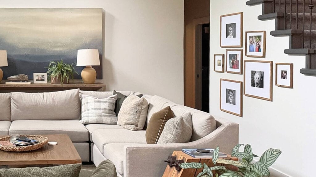
Updated with fresh content and images for 2026
When choosing paint colors with a room’s exposure in mind, it’s never a ‘wall-to-wall’ decision; it’s an ‘overall’ choice. You’ll drive yourself crazy(er) examining how your natural light changes your paint color on a foot-by-foot basis. Here’s a shortlist of the many things that can affect how your paint color looks (related to exposure).
- How big your window is
- How tall your wall/high your ceiling is
- If you have landscaping outside the window that partially blocks light, or the light filters through it
- You live in a place that’s cloudy a lot of the time
- If your neighbor’s home or a tall building blocks some light.

That’s why when considering how your room’s exposure MIGHT affect your paint color, it’s about considering your room as a WHOLE and how its exposure might affect it. When looking into your room, does it APPEAR cool or warm? That could be your exposure?
THE TWO TYPES OF NORTH-FACING ROOMS
Aside from mixed exposures (e.g., northeast/northwest/etc), there are two types of north-facing rooms…
1. DARK, NORTH-FACING ROOMS WITH LOW NATURAL LIGHT
North-facing rooms with low light most often have small windows. However, low light can also be caused by an overhang above the window, a close neighbor or tall building, or dense landscaping that blocks natural light.
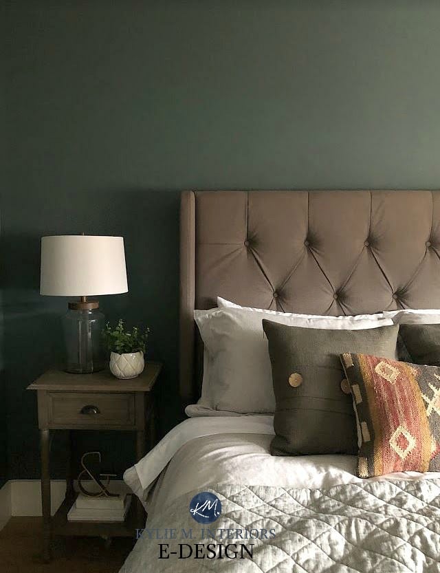
North-facing rooms naturally have cool gray light. Add on a lack of natural light, and it’s like a double-whammy (Tim’s favorite Friday night move…).
North-facing rooms with minimal natural light really need a well-designed interior lighting plan with some warmth.
No paint color on earth will save your dark room, no matter its exposure – you need to add interior lighting.
2. NORTH-FACING ROOMS WITH A LOT OF NATURAL LIGHT
Light and bright north-facing rooms usually have large or multiple windows, with no patio overhang or landscaping blocking the natural light. But beware: just because these rooms are ‘bright’ doesn’t mean they look warm and inviting. It’s the opposite for me – just because I’m inviting doesn’t mean I’m very bright (wink wink).
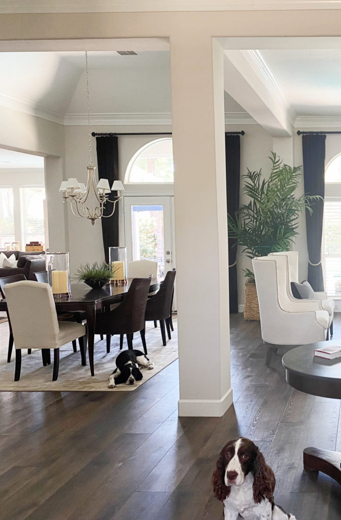
The next photo shows a dining room with an inviting warmth; however, that’s via the light bulbs, not the exposure. Look at the living room to the right, and you’ll see the cool cast of the natural, northern light coming in.
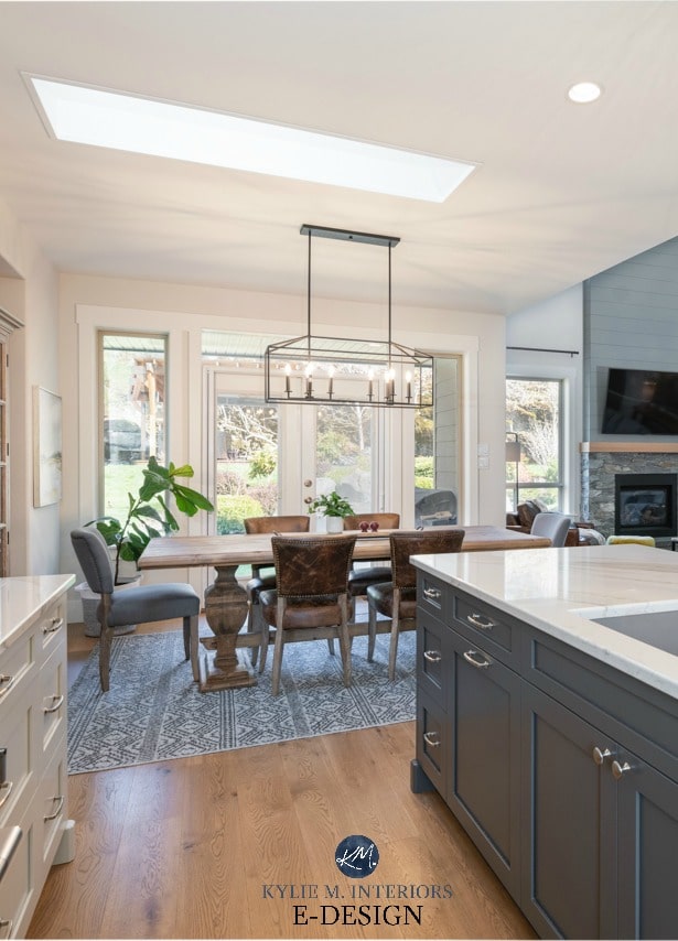
How to Pick Colors for Rooms With 2 Exposures (also linked at the end of this blog post)
The above example shows how you might consider your room’s exposure as a WHOLE in how it makes a room feel. The living room to the right FEELS a bit cold overall!
I rarely prioritize a room’s exposure over interior needs when choosing paint colors. A room’s finishes, lighting, size, and much more are usually more important.
THE 3 WAYS OF DEALING WITH NORTHERN EXPOSURE
While there’s no way to predict exactly how a paint color WILL look in any given exposure (there are way too many variables), there are several approaches you can take when looking for your best color.
1. PURPOSEFULLY WARM NEUTRALS
These are warm neutrals with a committed warmth, meaning they have a more noticeable orange, yellow, or pink undertone.

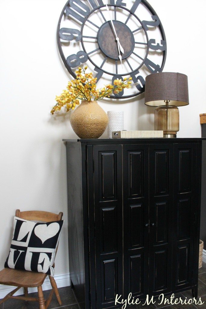
While a color like Sherwin Williams Row House Tan is beautiful, it’s not light enough to be a popular choice for today’s home.
Now, because my goal is to suggest the best, most paint colors for north-facing rooms, I rarely go overboard with color (as not many people want that much warmth). Instead, you’ll find colors that wink at a warm glow without making your home look like an easy-bake oven.
2. PASSIVELY WARM NEUTRALS
Passively warm neutrals run the gamut (whatever a gamut is) from beige and cream to warm gray, greige, and taupe.

Benjamin Moore Standish White is between ‘too colorful’ and ‘passive’. All the same, it’s a bit too colorful for the average homeowner.
These colors will lose some of their warmth in northern light, offering a subtle balance to a north-facing room.
These colors are great for those who don’t want to paint their walls a cool paint color, but don’t love traditionally warm colors.
3. COLORS
Because we’re dealing with north-facing rooms, you might be thinking of warm shades of yellow, orange, and red – heck no. Fewer people want their rooms painted these colors.

A smoky green-gray like Sherwin Williams Evergreen Fog can look inviting with the warmth of Benjamin Moore White Dove and thoughtful home decor.
Instead, we’re looking at gorgeous greens and blue-green blends that can add INTEREST to a cold, north-facing room, even though they aren’t warm-toned.
Northern light can wash out some warmer paint colors while enhancing cool colors like blue, green, and purple.
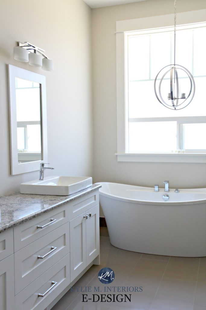
However, there’s a big, Kardashian-inspired but here…
You can’t humor your exposure at the EXPENSE of your interior finishes.
If warm colors don’t suit your countertop, tiles, carpet, or furnishings, consider catering to your finishes first and worry about the exposure later.
How do you do this?
It means you might have to paint your room a cooler shade, but supplement with thoughtful lighting, texture, and visual interest that adds the cozy factor to your cool-looking room.

LASTLY…
WHEN CONSIDERING YOUR EXPOSURE, IT’S ABOUT YOUR ROOM AS A WHOLE
It’s easy to get caught up in how our paint colors look on a wall-to-wall basis. However, natural lighting changes drastically throughout the day, as will the paint color on your walls.
When considering your room’s exposure, in particular, it’s about the overall appearance and FEELING of your room. The natural light your room receives (quality/amount/etc.) can easily affect this.
And yes, I talk this much in real life, too. Now that we’ve got the basics down pat, let’s look at some COLORS! If you can’t find a color you and your room love, consider HIRING ME to choose your colors!
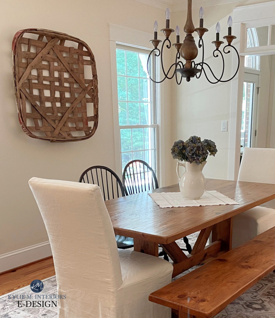
1. BENJAMIN MOORE NAVAJO WHITE OC-95 (or 947)
Navajo White is a light cream paint color and one of Benjamin Moore’s more timeless, flexible shades. Cream is a yellow paint color with a neutral base added to calm it down.
Northern light helps to calm the degree of yellow in a cream paint color, while the remaining yellow can help balance the effect of northern light.
And that’s what I love about Navajo White – it’s cream, but it’s not obnoxiously yellow.
- Navajo White works well in north-facing rooms with big windows or not much light at all! Just remember, the lighter a color is, the more it will wash out in bright light, regardless of your room’s exposure.
- The LRV of Navajo White is 78.26, telling you it’s an off-white color. Not sure what LRV is? You shouldn’t pick a paint color WITHOUT it!
SIMILAR COLORS TO SAMPLE & COMPARE
- Benjamin Moore Gentle Cream (#3), a heavy shade of cream that winks at beige
- Sherwin Williams Antique White, a super popular cream paint color for walls and cabinets (although I don’t personally love it for cabinets, but you do you, boo).
- If you want a bit more noticeable warmth without stretching right into yellow, try Sherwin Williams Casa Blanca.
Sample a range of my favorite cream paint colors with my CURATED CREAM COLOR BUNDLE.
Benjamin Moore Navajo White: IMAGES, Info, & More!
2. BENJAMIN MOORE WINDS BREATH OC 24 (or 981)
If you want a more passive approach to warmth, and your room has a good amount of natural light, Wind’s Breath is an interesting paint color. Wind’s Breath can throw a range of warm neutrals at you without committing 100% to one in particular. Depending on your space, you might see flashes of cream or tan, accompanied by intimate whispers of gray (see, paint can be sexy!).
According to these guys, Wind’s Breath gets 4 out of 5 on the woof scale.
- Wind’s Breath is best for a room that receives a reasonably good amount of natural light. In darker, north-facing rooms, it could look a bit dingy.
- With an LRV of 69.59, Wind’s Breath is on the higher end of the light range.
- While Wind’s Breath is definitely muted, there’s still enough warmth to add a touch of balance to your cool northern light.
- If you’re looking for committed warmth, you might want to step into the cream world a bit further, as Wind’s Breath might not hit the spot.

PAINT COLORS THAT ARE SIMILAR TO WIND’S BREATH
- Sherwin Williams Aesthetic White is one of my favorite off-white paint colors
- Sherwin-Williams White Duck offers a touch more cream/less gray
Paint Color Review of Benjamin Moore’s Winds Breath
3. BENJAMIN MOORE GENTLE CREAM OC-96
Gentle Cream (also known as Barely Beige CC-140 or 1066) is rich enough to add warmth to your space without weighing it down as much as beige or tan.
This heavy cream’s yellow-orange base will help balance out your cool northern light without looking overly colorful on your walls.

In a north-facing room, the undertones may be less obvious, and it’s more likely to settle as a warm, overall ‘neutral-looking’ paint color, rather than being overly golden.
Here’s your Peel & Stick sample of Gentle Cream…

SIMILAR COLORS TO SAMPLE & COMPARE
If Gentle Cream isn’t quite right, or even if it is, you should sample and compare a few other shades, including…
- Benjamin Moore Navajo White (#1)
- For a more traditional cream look, read this: The Best Cream Paint Colors
- Sherwin Williams Casa Blanca, one of my favorite cream paint colors
- Sherwin Williams Lotus Pod for a bit more depth, body, and a slightly more beige approach.
- Sherwin Williams Antique White is a touch less colorful and more grounded, but has a similar approach and LRV.
Benjamin Moore Gentle Cream: IMAGES, Info, & More
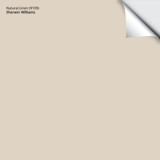
4. SHERWIN WILLIAMS NATURAL LINEN SW 9109
As for the best paint colors for north-facing rooms, beige is one of the best. Plus, beige is BACK, so it makes sense to explore a few shades for your cool, north-facing room!
Natural Linen is amazeballs, and is hands down, my favorite shade of beige (this week, anyway). It’s a light shade of beige with a calm neutral base, toning it down.

I know it sounds weird to say it has a ‘neutral base’, since it’s a neutral paint color. However, some ‘neutrals’ (beiges) are more colorful than others, so you see their orange/pink/yellow/green undertones more clearly.
Natural Linen isn’t as extroverted as its friends – it’s more of an ambivert as it shows up at the party for a drink, but isn’t the one doing a Keg stand (like orange and yellow).
As for its undertones (the way a color leans), it centers on an orange undertone (as beiges tend to do), with a balance of warmth, so it doesn’t lean too hard towards orange-yellow or orange-pink.
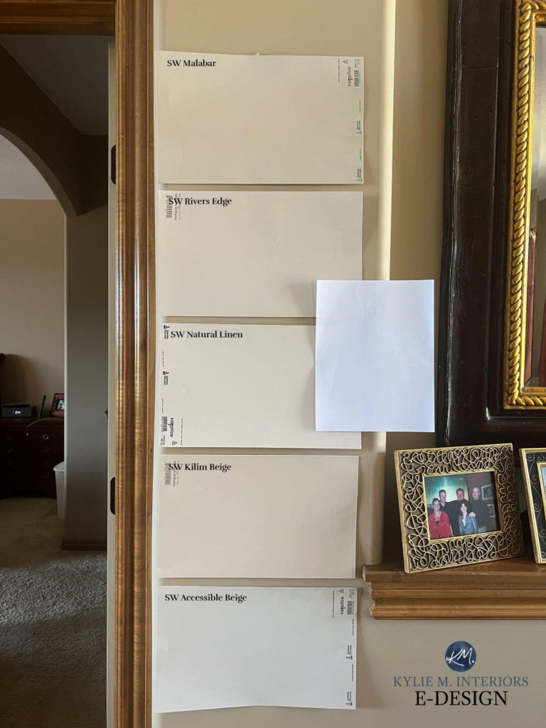
SW Malabar | SW River’s Edge | SW Natural Linen | SW Kilim Beige | SW Accessible Beige
FULL Paint Color Review of Sherwin Williams Natural Linen
- Natural Linen does best in a room with an average amount of light (as do all colors). Expect it to look more muted in a low-light room, but it can still be lovely.
- Natural Linen is a popular choice for homes built in the 1990s and Tuscan-style homes from the 2000s, as it often suits the finishes from these years.
- Whereas more grayed-out beiges and tans can suit south-facing rooms, northern exposures appreciate a little (or more) added warmth.
COLORS TO COMPARE WITH NATURAL LINEN
You should never choose a color based on how it looks by itself. SAMPLE AND COMPARE! A small tweak in temperature, undertone, or depth could make all the difference!
- Benjamin Moore Muslin is a classic, almost timeless shade of beige. It’s similar to Natural Linen but a touch more colorful.
- Sherwin Williams Kilim Beige is a beige with a bit more depth and a more noticeable orange-based warmth.
Here’s your Peel & Stick sample of Natural Linen…
5. SHERWIN WILLIAMS GRASSLAND 6163
If you’re looking for something beyond the everyday neutral and love green, Grassland could be the hue for you – it definitely Hakuna’s my matatas.
Grassland is a light-medium-depth shade of green with a subtle, slightly greige warmth. On those super flat, cloudy north-facing days, it has enough color to make your room interesting without being so green that it’s overwhelming.
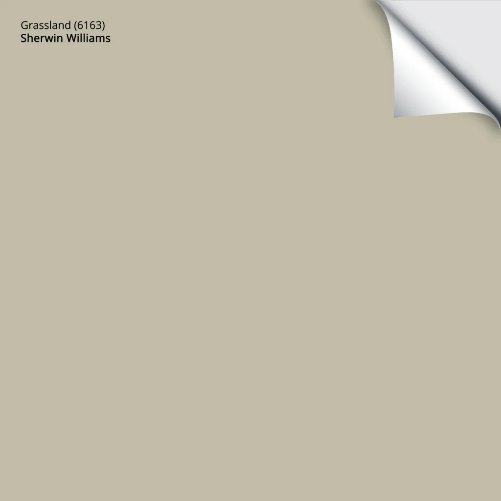
Get your PEEL & STICK SAMPLE OF GRASSLAND
- Thanks to its color, Grassland does reasonably well in rooms with good natural light and lower-light rooms.
- Sherwin Williams Ancient Marble is like a lighter version of Grassland
- For greens that are a touch more vibrant and have less yellow, check out Sherwin Williams Softened Green and Liveable Green – remember, north-facing light can make them look that bit cooler.
Check out my blog post on The Best Light Green Paint Colors.
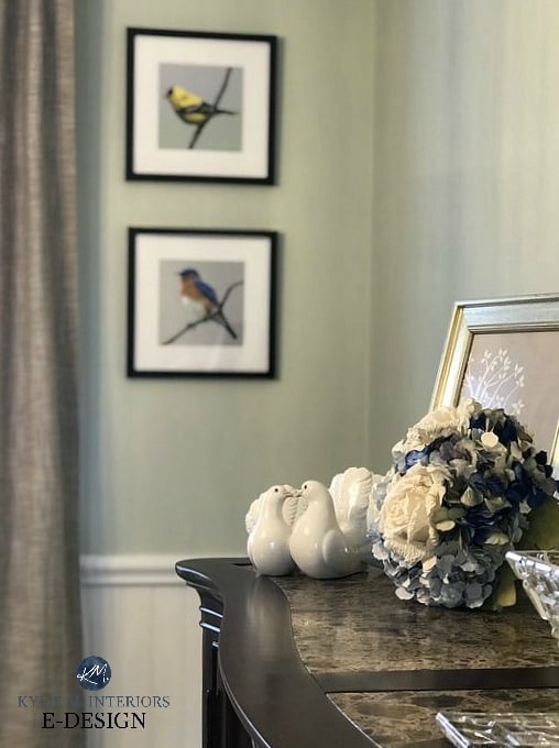
Sherwin Williams Liveable Green
All the photos in my blog are from my Online Color Consulting clients, readers, & friends— because real homes deserve to be celebrated (dirty laundry & all!) While not magazine-perfect, they’re packed with ideas & proven color choices to help you create a home you’ll love.
6. BENJAMIN MOORE BALLET WHITE OC 9
Ballet White is a perfectly muted cream. While it has a touch of yellow for warmth, its neutral base calms it down, leaving enough warmth to balance some cool northern light.
If you want your north-facing room to have a very…very passive warmth, colors like Ballet White can be great happy mediums between the cool world and the overly warm one.
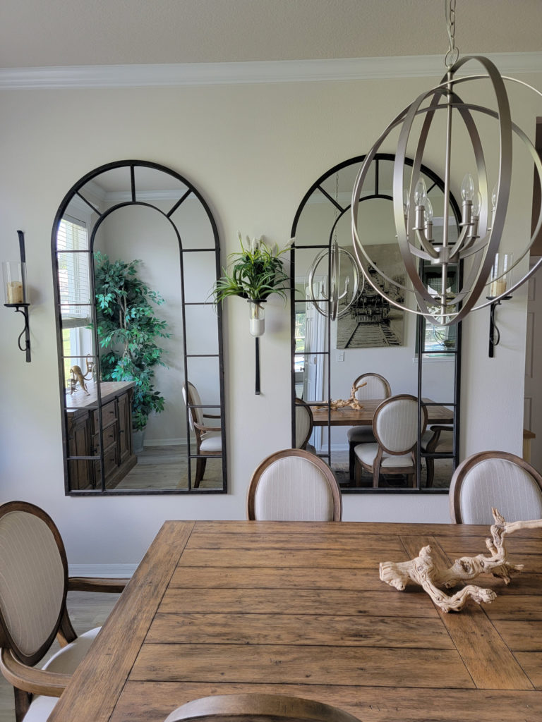
Paint Color Review: Benjamin Moore Ballet White
- Ballet White does best in rooms with adequate natural lighting. However, it can fall a bit flat and dingy in some darker north-facing rooms.
- Notice the subtle warmth of a color like Ballet White in the above photo – juuuuust right.
- If Ballet White isn’t warm enough for you, check out the best cream paint colors.

SW Creamy | SW Steamed Milk | SW Neutral Ground | BM Simply White
COLORS TO COMPARE WITH BALLET WHITE…
- Sherwin Williams White Duck is lighter and not quite as warm as Ballet White.
- Sherwin Williams Shoji White is the kissin’ cousin of White Duck and another great comparable. Again, these are very (very) muted.
7. BENJAMIN MOORE EDGECOMB GRAY HC 173
Many of my Online Paint Color clients want warmth without dipping into beige, tan, or cream. This is when I introduce them to Edgecomb Gray.
Edgecomb Gray is a beautiful blend of gray and beige with an almost creamy undertone. Along with Wind’s Breath, it’s another popular option for those who want a neutral color that’s not overly warm or cold.
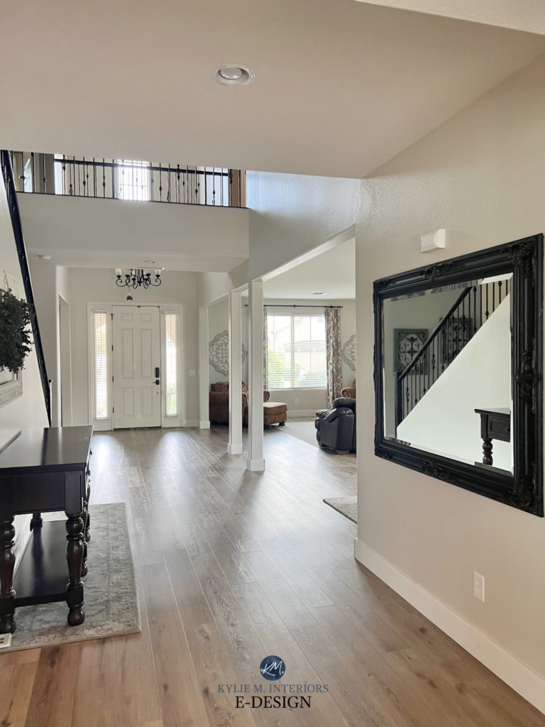
In a north-facing room, Edgecomb Gray can lean toward the gray side more than creamy beige without ever losing its warmth entirely.
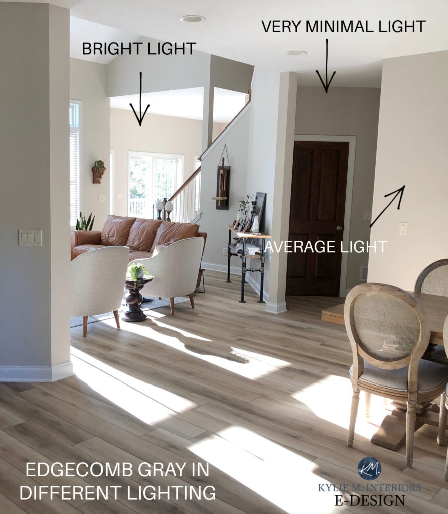
- With its neutral blend and LRV of 63, Edgecomb Gray might be too dirty and drab for a north-facing room that isn’t well-lit. Make sure your room is bright enough to support your paint color!
COLOR TO COMPARE WITH EDGECOMB GRAY
If Edgecomb Gray has you tinklin’ on your toenails (if you’re +40, it probably doesn’t take much), I’ve got a few more beauties for you to explore, including…
- Sherwin Williams Modern Gray is a great alternative to Edgecomb Gray.
- Sherwin Williams Egret White offers a lighter, brighter, but slightly cooler approach.
- Benjamin Moore Winds Breath is kiiiind of like a lighter version of Edgecomb Gray.
- Check out Sherwin Williams Natural Tan for a wink more warmth.
Benjamin Moore Edgecomb Gray: Paint Color Review
8. BENJAMIN MOORE WOODLAWN BLUE HC 147
While I generally avoid cool colors in a north-facing room, I love Benjamin Moore Wythe Blue and Woodlawn Blue. Their increased CHROMA (color) brings your walls to life!
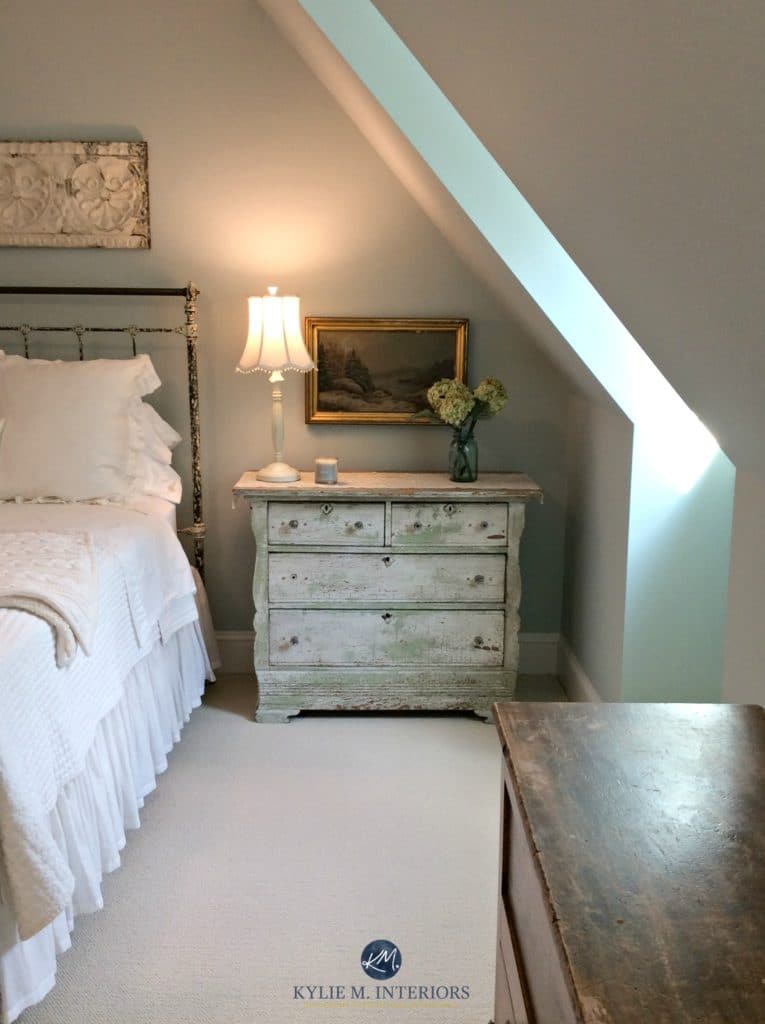
Why can Wythe and Woodlawn work where other cool shades of blue fail?
Wythe is a beautiful blend of blue-green-gray (pretty balanced). Woodlawn Blue is a blue-gray with a wink of green. And even though blue and green are both traditionally cool colors, adding green to blue can make it look softer and more inviting!
Schlong story short, if I were to pick a blue for a north-facing room, I would pick a blue with green in it.
The Best Blue-Green Paint Colors
The 2 Types of Blue Paint Colors and How to Use Them
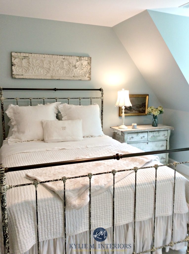
- Any cool color in a north-facing room should be balanced with warm wood tones and texture.
- Sherwin Williams Rainwashed is similar to Woodlawn Blue but has more green mixed in.
- Check out some of my favorite blue-green blends in my CURATED BLUE-GREEN COLOR BUNDLE.
9. BENJAMIN MOORE GUILFORD GREEN HC-116
If you want a more noticeable shade of green (compared to Grassland), Guildford Green’s warm glow will help balance the cool gray of your north-facing light.
This is because Guilford Green is a warm green—a green-yellow. An earthy, organic, greige backdrop calms Guilford Green down, but not nearly enough to make this color look even close to neutral.
Here’s your Peel & Stick sample of GUILFORD GREEN
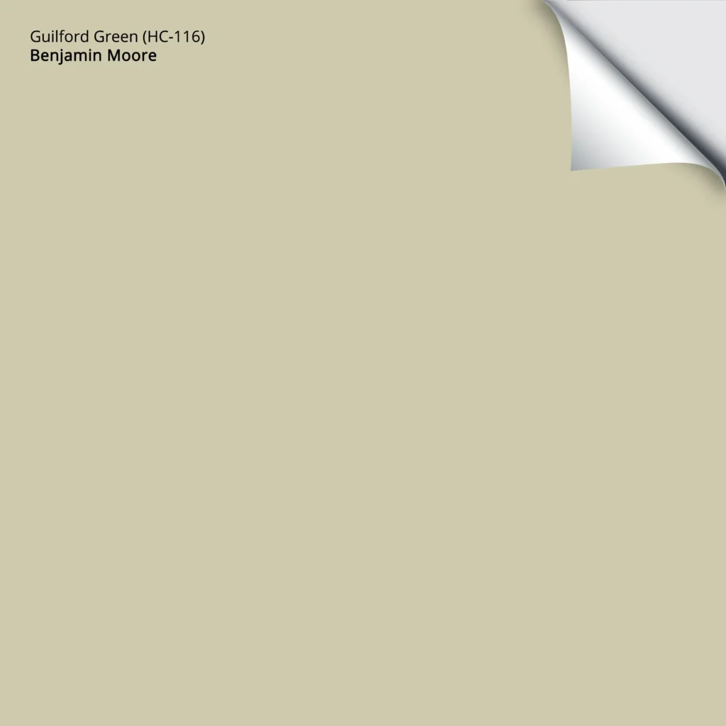
- Guildford Green looks pretty in well-lit spaces as well as darker rooms. Generally, the more ‘color’ a shade has, the more it can show up in a low-light space (that said, not everyone wants a ton of ‘color’ on their walls).
The Best Green Bedroom Paint Colors
10. SHERWIN WILLIAMS VANILLIN 6371
If you really want some visual warmth on your north-facing walls, Vanillin could be a gorgeous choice.
I love Vanillin in my next client’s home as its creamy warmth is committed without being obnoxiously yellow…
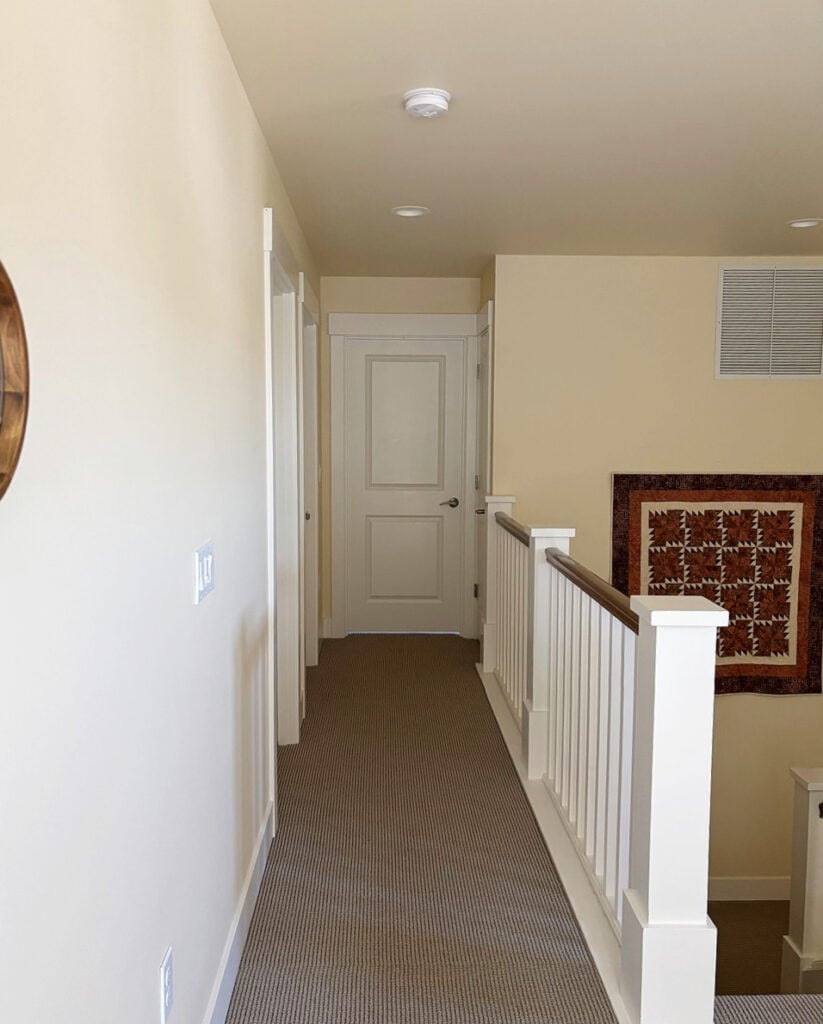
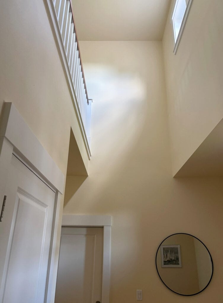
Vanillin is a cream paint color (LRV of 78) with a stronger warmth than colors like Navajo White and Gentle Cream. This makes it great for both darker and lighter north-facing rooms. That said, I’d still compare it with the other 2.
The previous photo and this next one show Vanillin getting a hit of natural light, as well as how it appears in darker areas…
10. SHERWIN WILLIAMS AESTHETIC WHITE 7035
Aesthetic White is another great color for those who are naturally averse to warm paint colors but are learning how to balance their north-facing rooms. This isn’t to say that Aesthetic White brings a LOT to the party, but again, some people just want a wink o’ warmth!

Traditional shades of beige get a bad rap (not as bad as Vanilla Ice, but close), as they’re reminiscent of the Tuscan-style trend of the early 2000s. Aesthetic White is not that kinda beige.
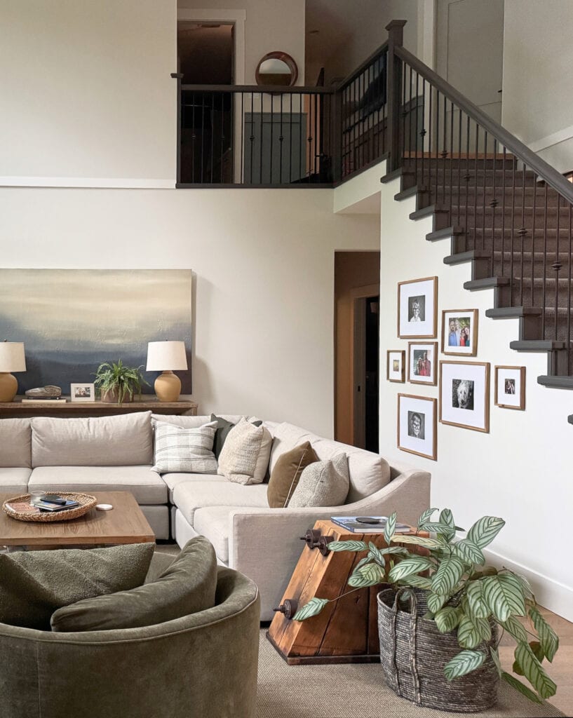
Instead, Aesthetic White is an off-white beige with a subtle dusting of gray, taking away any overt golden edge. However, there’s still enough passive warmth to stop your room from looking cold and uninviting.
Aesthetic White needs good natural light for its passive warmth to settle best – I wouldn’t use it in a dark, north-facing room.

FULL Paint Color Review of Sherwin Williams Aesthetic White
- If you LOVE beige and want its warmth on your walls, Aesthetic White might not be warm enough. You might then jump back to the likes of Sherwin Williams Natural Linen and Kilim Beige.
- If warm colors make you nervous, but grays are too cool for your room, Aesthetic White could hit the spot.
11. SHERWIN WILLIAMS MODERATE WHITE 6140
Moderate White is a great color for those who want more visible warmth on their walls without the weight of a traditional beige. This is because Moderate White has an LRV of 74, making it an off-white paint color.
Moderate White is gorgeous in both light and dark north-facing rooms.
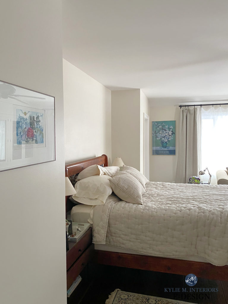
With its higher LRV, Moderate White will wash out in a well-lit north-facing room. However, in a room with low or moderate lighting, it offers a pretty, but passive warmth.
- Moderate White centers itself on an orange undertone but is flexible towards some orange-yellow and orange-pink surfaces.
- With its slightly gray base, Moderate White doesn’t look too peachy, like some beiges can (mind you, this is open to perception).
FULL Paint Color Review of Sherwin Williams Moderate White
12. BENJAMIN MOORE NATURAL WICKER 950
Also known as Bone White OC-143, Natural Wicker is a badass and beautiful shade of beige, brought to life by a slightly creamy backdrop.
Whether your room is dark or has a good amount of north-facing light, Natural Wicker is a gorgeous shade.

With an LRV of 72.13, Natural Wicker falls on the very low end of the off-white range, providing slightly more contrast with white trim than lighter shades. I love how it has a gorgeous warmth without being overwhelming with gold.
Paint Color Review: Benjamin Moore Natural Wicker
13. SHERWIN WILLIAMS EGRET WHITE 7570
For those of you who REALLY love gray, but understand how it can look too cold for your north-facing room, Egret White could save your bacon (or your tofu if you’re a vegetarian). However, your room needs to be reasonably bright to support a color like this, otherwise it can fall flatter than me in Grade 10.
Egret White is a soft, off-white/light taupe paint color with gentle undertones. Sure, it can look a bit flat in low light, but give it a little light to play with, and it offers a modest warmth to a cold space.
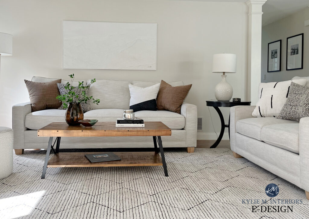
Sherwin Williams Egret White: IMAGES, Info, & More
Egret White has an LRV of 70, plunking its pretty little toosh between the buxom bosom of the off-white and light-depth worlds. That’s a weird visual. Anyway.
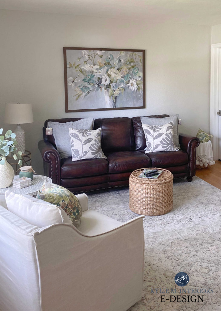
Egret White is one of the grayer, less warm options on this page – it’s quite passive.
COLORS TO COMPARE WITH EGRET WHITE
- I’d definitely take a look at Sherwin Williams City Loft
- Benjamin Moore Classic Gray is a great alternative, offering a similar passive warmth in a lighter base.
- Sherwin Williams Modern Gray is a beauty, but be careful if your room isn’t well lit.
14. BENJAMIN MOORE MUSLIN OC-12
When it comes to warm neutral paint colors, it doesn’t get more classic or timeless than Muslin (although Benjamin Moore Navajo White #1 gives it a good run for its money).
I also love Sherwin Williams Kilim Beige (below), but it can be a bit much for modern tastes…
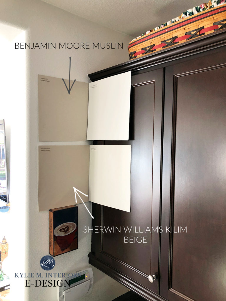
Notice how Muslin has a soft warmth, but is gentler than Kilim Beige (really, both are gorgeous, Muslin is just more modern).

The Best Paint Colors with Golden Oak Wood Finishes
Muslin is a light beige. If you like Sherwin Williams Natural Linen but it falls a bit flat in your northern light, a color like Muslin can be the solution as it offers a bit more intensity without kickin’ it too old-school/golden.
COLORS TO COMPARE WITH MUSLIN
- Sherwin Williams Natural Linen…obviously.
- Benjamin Moore Maritime White is a gorgeous, off-white beige
- Sherwin Williams River’s Edge is a beautiful gentle beige
- Sherwin Williams Canvas Tan offers a tweak in undertones
15. BENJAMIN MOORE SOFT FERN 2144-40
While some greens can be warm, others cool, I love Soft Fern because it settles more in the middle, as the late Great Goldilocks once said, ‘Not too hot, not too cold, but juuuuuust right‘ (and sorry to be the one to let you know that she’s passed).
Soft Fern is a light-depth green that picks up some cues from the previously mentioned Guilford Green, but with a more muted, grayed-out base.
Here’s your Peel & Stick of Soft Fern…

The Best Green Paint Colors for Bedrooms
16. SHERWIN WILLIAMS CREAMY 7012
If you want to wink at the white range, but have a bit more depth on your walls, Creamy is a gorgeous shade.
Creamy is between off-white and white with a gentle yellow warmth (as cream is a yellow paint color at heart).

Will it save a dark north-facing room?
Heck no, the only thing that will save a dark room is LIGHTING. However, it’s a great way to add some subtle warmth without committing hard to yellow (which a lot of people are nervous about).
Sherwin Williams Creamy Color Review
FREQUENTLY ASKED QUESTIONS?
For any lingering quandaries and queries…
WHAT PAINT COLOR WILL MAKE A NORTH-FACING ROOM LOOK BRIGHTER?
This topic is interesting because it can be applied to any room, regardless of exposure. If a room is dark because the windows are small or are blocked for some reason, you could try a color with a higher LRV – a lighter paint color, with a reasonable amount of color (chroma). If it’s light and dirty, it won’t thrive in a dark, north-facing room. But specifically, you might explore warm, creamy white paint colors for a dark room with northern light., you might look at light paint colors with more color (chroma) like some shades of warm green.
WHAT ARE THE BEST PAINT COLORS FOR NORTH-FACING ROOMS?
While you have a list (above) of some of my favorite recommendations, here are some considerations…
- If your north-facing room is dark, consider lighter, brighter colors with a bit more color/chroma.
- For the average north-facing room, warm paint colors help balance out the cooler vibe. More muted warm colors will work, but the warmer your color is, the more it will add to the visuals of a cooler-looking room.
WHAT ARE THE BEST WHITE PAINT COLORS FOR NORTHERN EXPOSURE
If you want to paint your north-facing room white, just as with darker shades, you’ll want to pay attention to temperature. Also, if your north-facing room is a bit darker, you might explore whites that are a touch warmer, brighter, and cleaner to help your walls come to life a bit more.
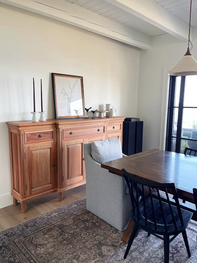
Here’s Benjamin Moore Simply White, a bright, warm shade of white, looking glorious in its natural light…
The Best White Paint Colors for North-Facing Rooms
WHAT ABOUT ROOMS WITH NORTHEAST, NORTHWEST, OR NORTH-SOUTH EXPOSURES?
Having a room with more than one exposure can be tricky. However, once you understand which exposure matters the most, it’s easier to focus on the best paint colors for your space.
That said, at some point, your natural light might be so mixed and complicated that you might choose to focus your energy on what suits your interior finishes the most, and let your exposure go a bit.
Check out this blog post on ‘how to pick paint colors when you have two exposures.’
SUMMARY
- North-facing rooms have a naturally gray, cool-appearing look.
- Even if you have large windows that aren’t blocked, the light is still gray and cool – it just means your room is brighter.
- Check out brighter, warmer paint colors. If your room is darker, make sure your paint colors have a higher LRV and/or have a good degree of color (chroma).
READ MORE
North, East, South, West – Which Paint Color is Best?
The 8 Best Blue-Green Paint Colors
Can I Paint My North-Facing Room White?
Can I Paint My North-Facing Room Gray
Let me choose your colors for you with my E-Design/Online Paint Color Consulting Services!



Love your blog! SO helpful and inspiring. My house is mostly cool colors (repose gray, silver strand, sea salt, white trim). I’m looking to repaint my office with West and North exposures. It’s relatively shady/dark until 4pm, then BAM, super bright. Will the above creams work with that lighting and the rest of the house? Or would Woodlawn Blue or Mount Saint Anne work better? Thanks so much!
Did you really mean to write ‘So schlong story short’? 😂😂😂
You bet your booty I did ;). Welcome to my brain!