Subway Tile FAQs: Your Most Common Tile Questions, Answered
When choosing a subway tile (or any tile) for your backsplash or shower – white, neutral, or colored, it’s not just about finding the best tile for the job; there’s a lot more to it.
Is white the best choice? What size tile is best? Is subway tile the best choice – is it in style or outdated? What color grout should you use? And so on.
Along with helpful links on paint colors and update ideas, I’ve answered 8 of the most common questions homeowners ask when installing any type or color of tile in their kitchen or bathroom (with a focus on subway tile, as it’s the most popular).

HOW DO I KNOW WHAT’S BEST?
While I am the Patron Saint of Paint, I also know a thing or two (or a million) about home updates, decorating, and design.
How?
I used to do in-home consulting, helping homeowners with affordable home updates, renovations, and new construction. I currently work ONLY online, consulting on paint colors and home update ideas. Between the two, I’ve been in over 11,000 homes.
So, saddle up, Sparkle Farts, we’re in for some fun.
1. WHAT SIZE TILE IS BEST?
It depends on the look you want…
- 3 x 6 – Timeless
- 3 x 9 | 4 x 10 – These can look a bit more modern, especially when stacked. Unless your space is modern and you have flat-panel cabinets, I lean into a staggered/brick layout.
- 2 x 4 – Can look a bit more traditional, but also suits some cottage-style homes
Anything bigger or smaller than those is a risk I wouldn’t take – but you do you, boo.
2. WHAT LAYOUT SHOULD YOU CHOOSE?
I was going to talk about tile size first, but it makes the most sense to hit layout – then size makes more sense! 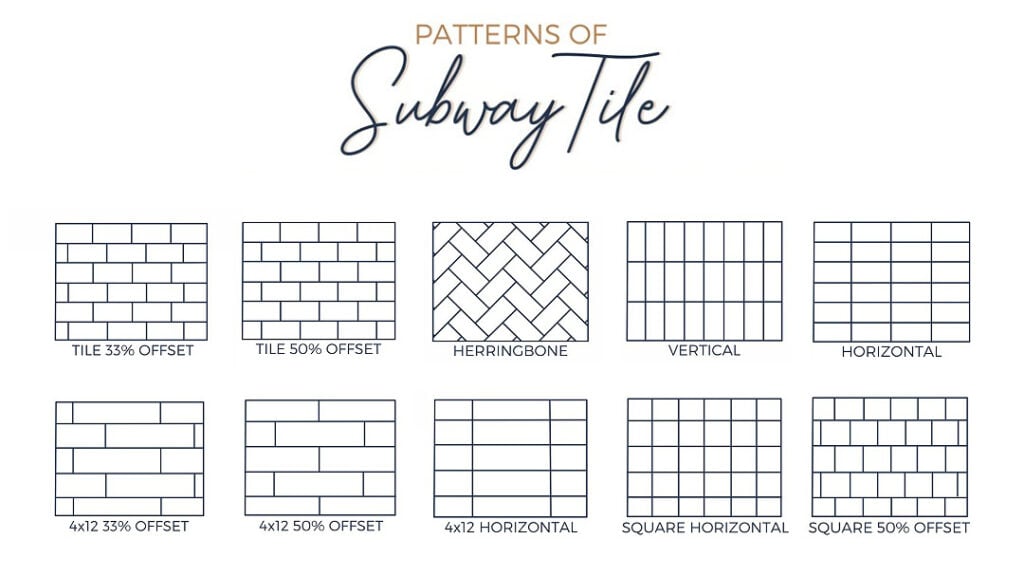 BRICK/OFF-SET LAYOUT: The most popular layout, by far, is a staggered or ‘brick’ layout. For the most timeless, classic look, this is your best choice.
Combine a brick layout with marble tile, and you have one badass and beautiful, timeless backsplash…

HORIZONTAL STACKED LAYOUT: If your home is a bit more modern or contemporary, you might choose a stacked layout.
This next bathroom’s green-gray tile looks a bit less busy in a stacked horizontal layout…

VERTICAL STACKED LAYOUT: You could hardly pay me enough to do this in a kitchen. You do you, but in my opinion, it’s ass backwards for how a subway tile should be laid out, based on the shape of the backsplash area.
As for the bathroom, while it’s not my personal favorite (that’s an opinion, not a decorative fact), so you do you!
SQUARE TILES: While they’re a bit in style now via the Zellige tile trend, be cautious, as square tiles aren’t timeless, whether you stack ’em or stagger ’em.
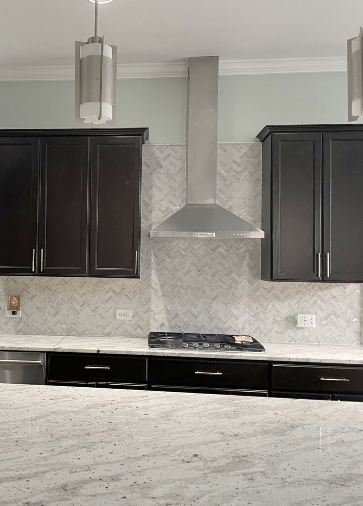
CHEVRON OR HERRINGBONE: I have mixed feelings on these tile layouts – it depends on the surrounding finishes and tile product (marble vs. glass mosaic blend vs. porcelain).
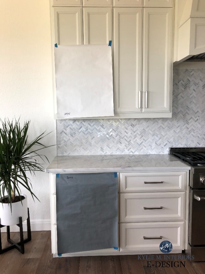
My Online Consulting client hired me to change the cabinet color. The existing shade was too warm for the herringbone marble backsplash.
While the odd home pulls them a herringbone or chevron pattern off, others look a bit too ‘try-hard’. They can also look too busy if paired with a busier, patterned countertop.
With this granite countertop (below), a simple white subway tile would’ve been a better option…
![]()
How to Update Older Granite Without Replacing It
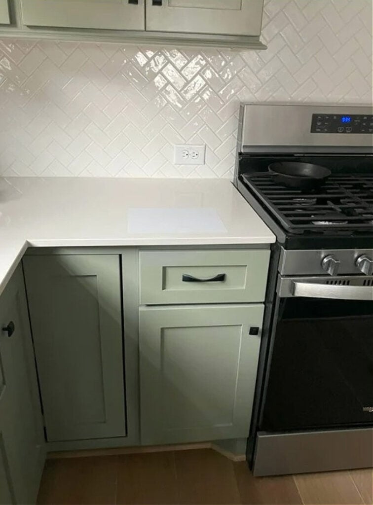
This herringbone-patterned subway tile backsplash is perfection with the green cabinet color…
Sherwin Williams Evergreen Fog Color Review
In the herringbone pattern, tiles overlap; in a chevron pattern, the tiles butt up to each other cleanly.
In this next kitchen, the chevron-patterned tile offers a classic, simple backdrop without looking dated or in-your-face…
![]()
The Best Blue Cabinet Paint Colors
3. WHAT GROUT COLOR SHOULD YOU USE?
To keep things orderly, I’ll baby bird it to you, one section at a time…
GROUT COLORS FOR WHITE TILES (SUBWAY OR OTHERWISE)
Before you choose your grout color, decide whether you…
- want to blend your tiles and tile pattern in
- want to add a touch of contrast to your backsplash to ‘lightly’ accent the pattern
- crave a high-contrast combo that accents your tile and its pattern.
NO CONTRAST: If you want to blend the pattern of your white tile (the most common choice), match your grout to your tile.
LOW-MEDIUM CONTRAST: If you have white cabinets and a white quartz countertop (with or without veining), you could choose an off-white/light grout color to add a bit of charm. Just don’t go too dark!
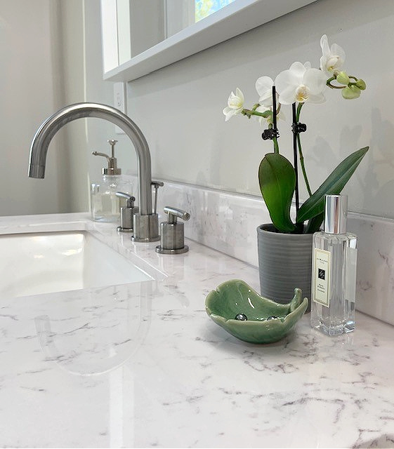
This next image is my Online Color Consulting client’s BEFORE photo. Notice how the light gray grout ties into the older granite countertop…

Also notice how SMALL the grout lines are – perfect. You don’t want chubby grout lines on a backsplash. These are likely 1/8″, maybe even 1/16th.
If you’re updating your wood cabinets with a tile backsplash, adding a soft gray grout can be a gorgeous approach…

While it’s hard to see in this image, the countertop is Cambria Torquay, which has light gray flecks (find it in this blog post).
Here’s another wood kitchen that’s been updated with a new backsplash with an off-white grout…

You can also use this approach if you have light gray walls, as shown in this bathroom…
However, I wouldn’t do the above in a kitchen with white cabinets and a mostly white countertop. The grout would need a bit more than the wall color to grab (e.g., more veining in the countertop).
The Best White Subway Tiles (That You Can Order!)
MEDIUM TO HIGH CONTRAST: If you have a white tile (subway or other shape/pattern), these suggestions can vary depending on your surrounding finishes, but you’ll get the idea.
If you have darker gray, greige, taupe, or brownish cabinets, you might consider matching your grout to them. The darkness of your cabinet color will dictate how dark your grout should be.
If you have colored cabinets (not white or neutral), the best option is to match your tile or maybe pick up on a light shade in your countertop…maybe (matching your tile is often the best choice).

The Best Green Paint Colors for Cabinets
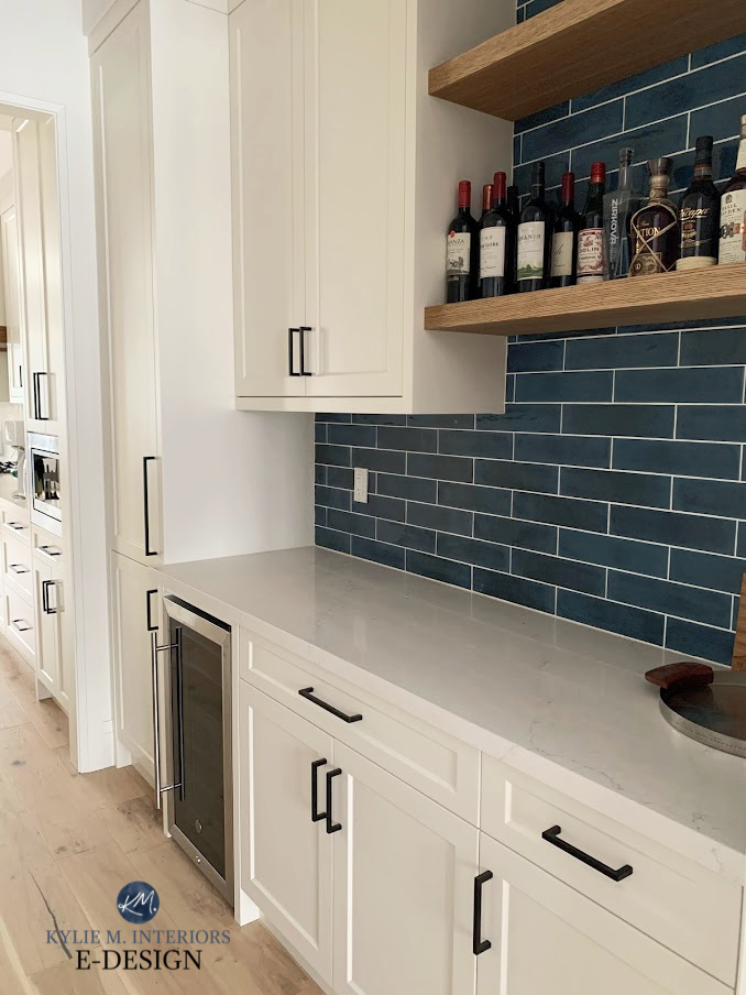
GROUT COLORS FOR COLORED TILES: GRAY, TAUPE, GREIGE, ETC.
This can include off-white, cream, gray, taupe, beige, blue, green – you name it. It can also include tiles with varying shades or colors!
NO CONTRAST: For a no-contrast look that blends with the tile pattern (since a glossy tile adds interest on its own), match your grout to your tile.
This next palette includes off-white taupe cabinets, white quartz countertops, and a soft taupe backsplash. Notice how the tile, grout, and cabinets blend for a simple, seamless look…

The Best Off-White & Light Cabinet Paint Colors
LOW-CONTRAST: If your cabinets and tile match, you could add a bit of variation in the grout. To do this, choose a grout that’s a bit lighter, not darker (although there are exceptions).
This section is SUPER LONG. Once you get past it, there are 5 more great questions, including gloss vs. matte, trends, and coordinating cabinet colors.
In this next laundry room, the green tile has two main depths. The grout matches the lighter one…

I love the subtle tone-on-tone of this next tile-and-grout combo, it speaks my love language loud and clear…

With this next solid-colored taupe-greige shower tile, the grout is a good tone or two lighter. This offers a modest contrast – not too busy, but not boring either…

This next kitchen has beautiful wood cabinets and a low-contrast tile-grout combo…

I love how the off-white, almost creamy backsplash tile sits with the wood cabinets, vs a stark white tile / How to Update Wood Cabinets – 6-Part Series
MEDIUM TO HIGH-CONTRAST: If you have white cabinets and non-white subway tile (gray/taupe/green, etc), you might choose white grout that matches your cabinet color (remember, no chubby grout lines). Obviously, the darker your tiles are, the higher the contrast will be.
Here’s a classic, high contrast look with Benjamin Moore White Dove cabinets…
In this next badass bathroom, the medium-contrast tile-grout combo works awesome…
Why? The gray grout ties into the gray in the countertop, as well as matching the grout around the floor tile. White would be too stark for a space like this.
Get the best paint color & home update advice with Kylie M’s Online Color Consulting!
In this next kitchen, while the grout seems too dark for the countertop…

…it instantly connects to the dark kitchen island (below)…
Benjamin Moore Revere Pewter (darkened, which looks a bit like Sherwin Williams Mindful Gray)
If the above grout matched the tile, the overall look would be too bland/blending. Instead, the dark grout adds interest and a touch of drama.
I try to cover as many situations and combos as I can – I’M ONLY ONE WOMAN!
TILES WITH MULTIPLE TINTS & TONES
While it can depend on the tile, most people lean into the LIGHTEST part of the tile or the medium-depth. It’s not as common to lean into the darkest color in the tile.

The Best Green-Gray Paint Colors
With the above green-gray tile, choosing a grout color that leans into the LIGHTEST part of the tile was a smart move; if they’d chosen a medium-depth grout, the gradations would blend in too much.
If your tile has various tones, the best option is ‘usually’ to match the lightest or the middle of the road depth – not the darkest shade in your tile.
With the next tile having a slightly dark border around each tile, it made sense to lean into the tile’s BODY (the lightest color), not the border…

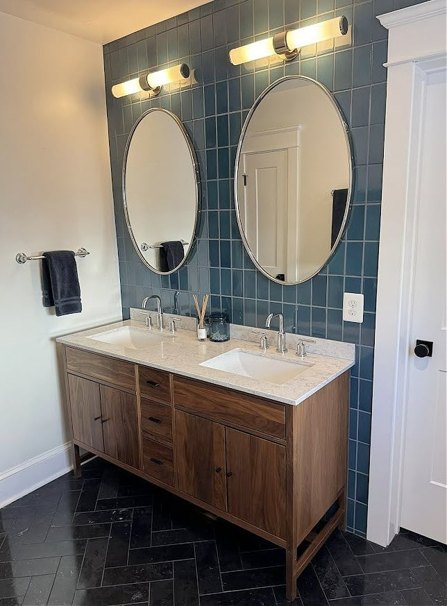
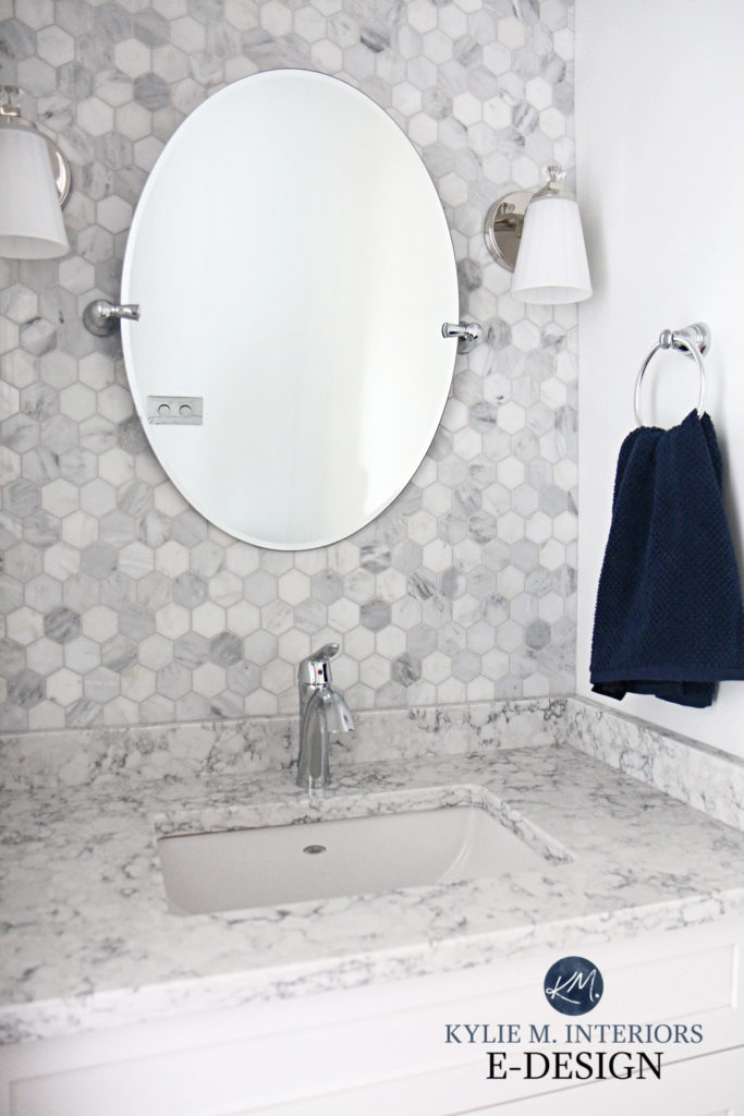
GROUT COLOR FOR MARBLE TILES…
If you’re using marble on your backsplash or in your shower (or even on your floor), you need to know which grout is best.
Assuming your marble has a mostly white background (I’d say 60% white or more), white is your best grout color. Marble is so friggin’ glorious, it doesn’t need an ‘interesting or contrasting’ grout to bring it life – K.I.S.S. – Keep It Simple…Sweetie.
The Best White Color For Every Surface
However, if your marble has more gray than white, or an even blend, you could consider a soft gray that matches the lightest, or at most, the medium-depth gray in your tile – NOT the darkest shade…
Affordable Ways to Design With Marble
4. WHAT’S BEST, GLOSSY SUBWAY TILE OR MATTE?
A lot of it comes down to the look you want.
GLOSSY: Most people prefer glossy tile as it adds energy and life to a kitchen. It’s the most popular, ‘standard’ choice.

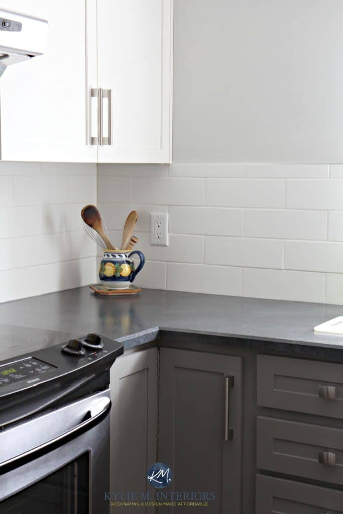
I also love how the soft white grout matches the cabinets, adding a bit of interest to this taupe/warm gray backsplash.
MATTE: Some prefer the look of what when they want to slow the energy down in their space. It’s a low-key, flatter look (flat isn’t a bad thing unless you’re me in Grade 11).
These creamy cabinets look great with a matte creamy subway tile and blended grout. Glossy tile would look a bit out of character for this kitchen’s approach…

Modern Paint Colors to Update Cream Cabinets & Trims
5. WHERE SHOULD MY BACKSPLASH STOP – HOW HIGH, HOW WIDE?
Ahhh, this is always an interesting one. And while there are exceptions, here are some good guidelines to follow…
INSIDE CORNER: If your cabinet and countertop end in an inside corner, and you have a wall at a 90-degree angle to it, your backsplash ends on the BACK wall (not the side).
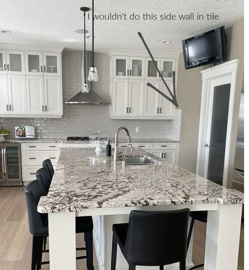
This (below) is never a good idea (3 slaps with a wet noodle)…

How to Update Your 2000s Kitchen
The kitchen below shows the best way to end a backsplash tile at a 90-degree corner where tile meets drywall (with no sink or window/countertop on the drywall area)…

The Best Earth-Toned Neutral Paint Colors
IN A BATHTUB/SHOWER COMBO
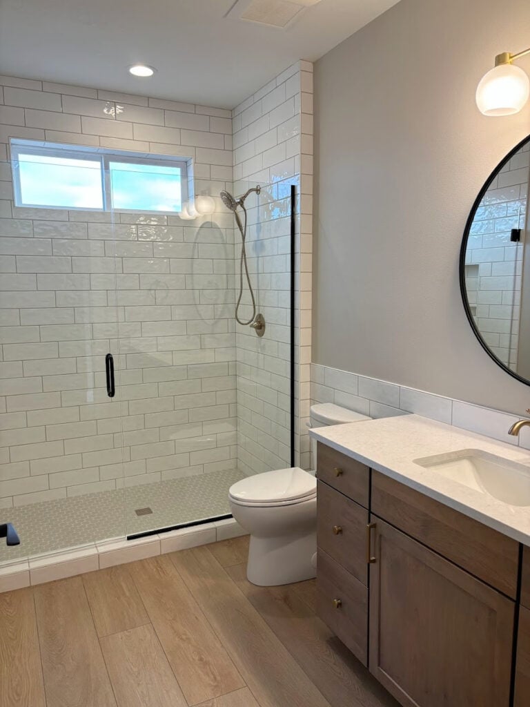
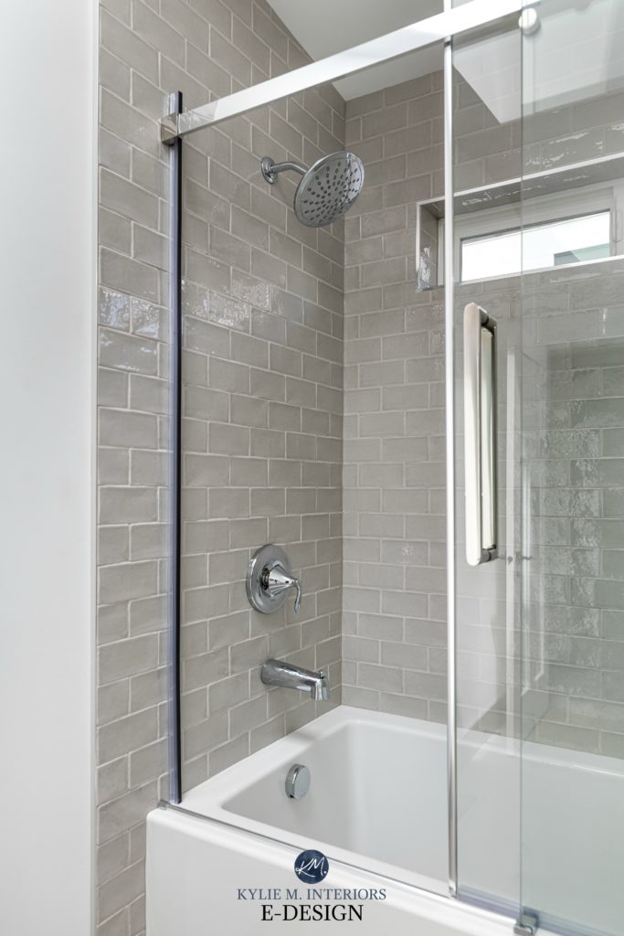
When it comes to bathtubs, knowing that the inner edge of the baseboard can get saturated with water, I recommend taking the tile down to the floor…
COUNTERTOP EXTENDS FURTHER: Assuming there’s wallspace above your countertop extension (it’s not a peninsula overhang or something), your backsplash ends where your countertop ends.
While this next image is blurry (I take what I can get from clients and am so grateful!), notice how the upper cabinets look set-in to the tile. This height is then continued until the counter ends on both the far left and the far right…

In this next kitchen ‘ideally’, there would be another cabinet in the blank space, or at least some floating shelves.
The Best Paint Colors with Red-Stained Woods
Regardless, I like what they chose to do, considering the cabinets aren’t full-height (and will be painted so they don’t contrast with the tile so drastically.
Again, if your countertop extends further than your upper cabinets, your backsplash tile should follow the COUNTERTOP.
SHOULD THE TILE GO ABOVE THE BOTTOM OF THE CABINETS?
Most of the time, yes, but there’s a fine line of where to stop.
EXAMPLE 1: In this kitchen below, there should be a full subway tile on top, so the cabinet doesn’t look like it’s sitting on the tile. Instead, it would look more set-in or integrated…
You could line it up with the top edge of the lower framing on the cabinet door (approx 2″ higher than it currently is).
EXAMPLE 2: This is a better way to integrate your backsplash tile with your cabinets. Notice how the subway tile lines up with the valance’s top line…
EXAMPLE 3: Because the valance is so narrow on these next cabinets, they lined up the tile with the top of the bottom rail (the horizontal part of the door frame) – amazeballs…

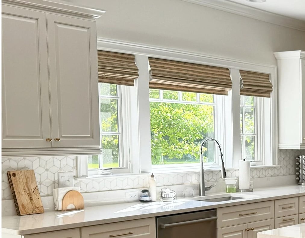
AROUND A WINDOW: You have a few fun choices…
- If your cabinets are full-height, install your subway tile on the entire drywall area – above, below, and beside the window.
- This is a harder one to explain… if you have cabinets on either side of your window, make your tile go a bit higher than the bottom of the cabinets. This way, it looks like your cabinet is set INTO the backsplash rather than sitting on top of it. It’s a nice way to blend worlds.
- If your upper cabinets butt up against your window trim and you have a subway tile backsplash underneath the window, I’d do the upper wall space, too.
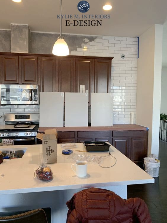
In this next kitchen (my client’s BEFORE image), I would install the tile around the window.
![]()
As-is, it looks a bit too patchy, and the flow is interrupted by the drywall. The cabinet color also needs to be adjusted to be less warm-toned, but that’s a topic for another day.
The Best Fool-Proof White Paint Colors
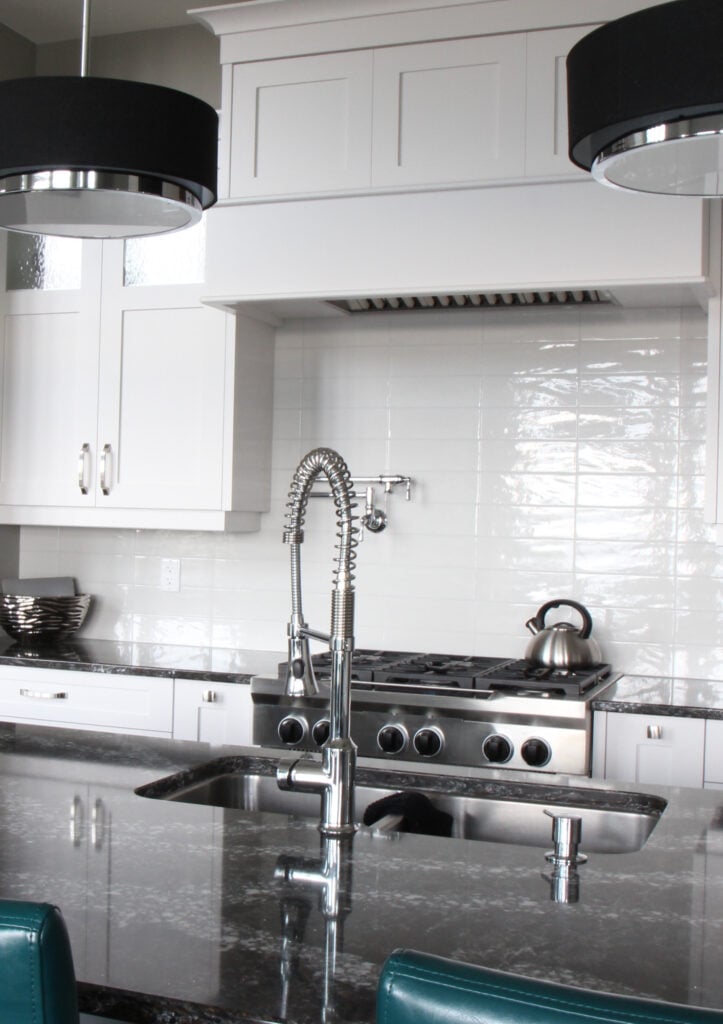
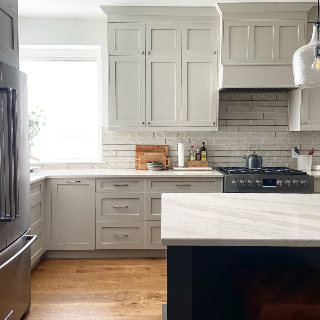
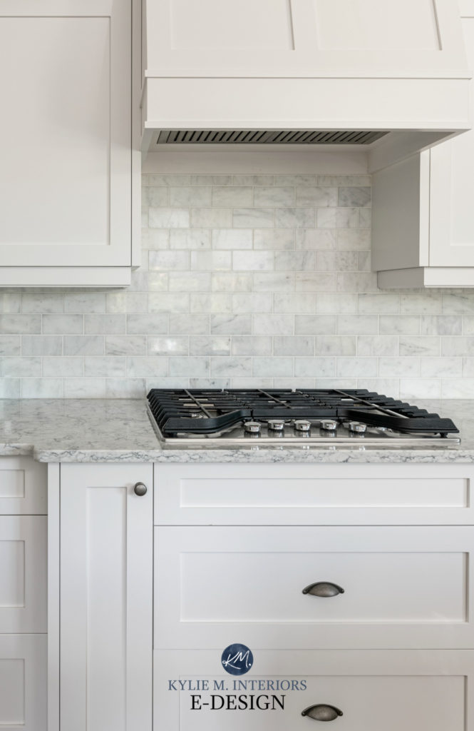
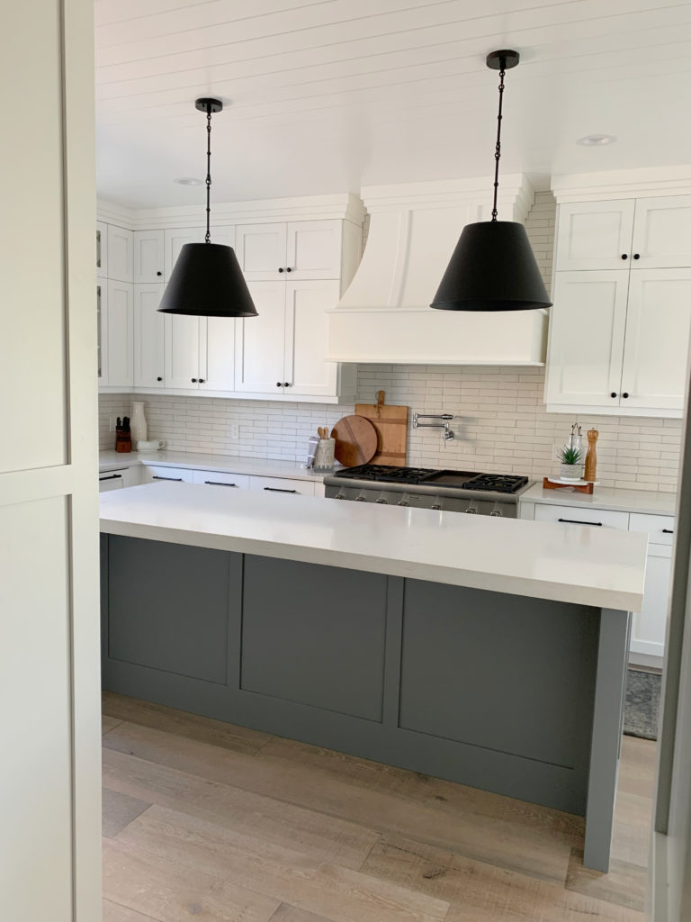
6. HOW HIGH FOR TILE AROUND A RANGE HOOD: CHIMNEY, STAINLESS, OR PLASTER?
If you have a range hood with no cabinets above it, you need to know where to stop your darn tile (or slab backsplash/quartz).
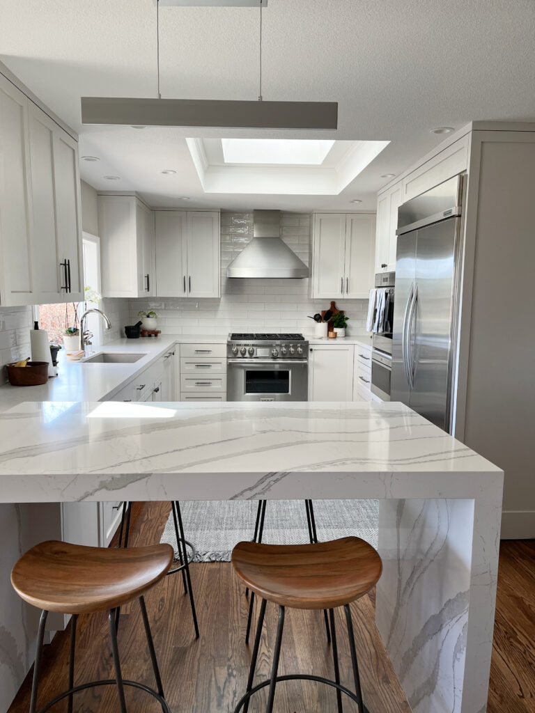
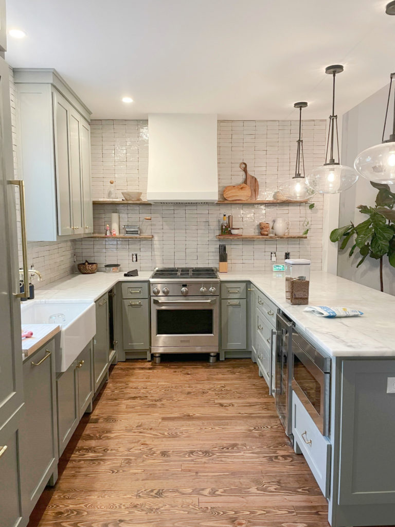
WITH FULL-HEIGHT CABINETS (CEILING-HEIGHT): Most of the time, I recommend taking your tile (or slab backsplash) to the ceiling as well.
This next kitchen’s tile layout is perfect with the stainless steel chimney hood…
The Best Warm Quartz Countertops
With the bulkhead acting as the ceiling (below), this is the perfect installation for the chimney-style range hood…

Backsplash Tile Trends: Zellige, Subway, Herringbone & More
This next beautiful kitchen pairs well with its plaster range hood, and the full-wall tile installation was a smart choice…
The Best Sage Green Cabinet Colors
STANDARD-HEIGHT CABINETS
While I don’t mind this next one, I might’ve stopped the backsplash with the top of the cabinets – not the crown molding on them, but the cabinet boxes themselves…

Again, this tile isn’t the best choice for this kitchen (below), the layout is great considering the chimney-style range hood – I would do the above kitchen a bit more like this…
How to Update Dark Wood Finishes
RANGE HOOD WITH A SLAB BACKSPLASH: QUARTZ, GRANITE, QUARTZITE…
While this first kitchen shows a non-traditional slab-style backsplash (it’s a sheet of laminate – LOVE IT!), I like that they didn’t line it up with the top of the cabinets (it would’ve looked too structured). Instead, the drop of 6-8″ gives this back wall more flow…
With a slab backsplash, it can look especially nice, bringing the quartz or granite to the ceiling (with full, ceiling-height cabinets)…

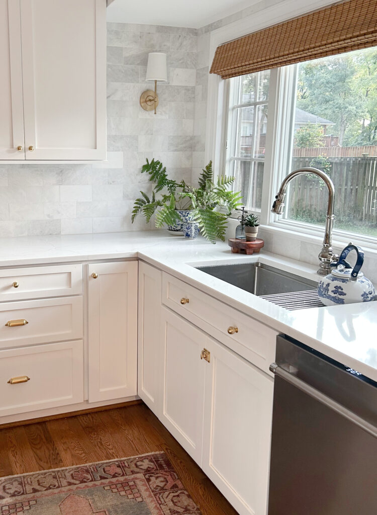
7. HOW DO I CHOOSE A WHITE TILE THAT MATCHES MY CABINETS & COUNTERTOP?
Thank you for asking this question – you’re officially my favorite.
MATCHING WHITE SUBWAY TILE TO WHITE CABINETS
Many homeowners rush off to their local hardware store, grab the standard ‘white subway tile’ and slap it on their walls, only to find that it doesn’t actually go with their ‘white cabinets’.
In-stock subway tiles are whiter than my pasty little butt cheeks in the dead of winter (or summer, really). There just aren’t many cabinets that are THAT WHITE – even in-stock/manufacturer’s white cabinets can be softer.
- When choosing a white paint color for your cabinets, your backsplash calls more shots than your countertop.
- If you’re choosing a white tile backsplash to go with your white cabinets, your cabinets call more shots than your countertop.
Why?
Because the cabinets and backsplash are on the same vertical sightline. Because the countertop is horizontal, there’s a bit more room for forgiveness.
What about the wall color?
It’s the least important because it’s the most affordable to change if needed.
Now, if your kitchen is perfectly coordinated, all of your finishes will suit the same white tile or cabinet color. However, of the kitchens that show up on my daily to-do list (consulting), approximately 75% aren’t 100% coordinated.
Here’s a quick step-by-step…
- If you haven’t chosen ANYTHING, choose your countertop first.
- If you already have your countertop, choose the best white cabinet paint color to go with it. This is important, as this white will also be used on your trims/doors (and probably ceiling), so it’s no one-trick pony.
- Then, start tile shopping.
- Your goal is to find a white tile that’s as close as humanly possible to your cabinet color.
- Don’t order one tile and cross your fingers and your eyes. Order 4-6 tiles so you have variations to choose from.
MATCHING WHITE SUBWAY TILE TO YOUR COUNTERTOP
If you have wood cabinets or colored/non-white cabinets, your countertop finally calls some shots.

IS YOUR COUNTERTOP A WHITE QUARTZ WITH VEINING? Most white quartz countertops aren’t as white as you think. While a piece of white paper is cool and shocking, placing it on your counter will show you what I mean.
This is about as bright/white as cabinets get.
Bring home a range of tiles and see which ones blend with the body of your countertop.
DOES YOUR COUNTEROP HAVE WHITE IN ITS PATTERN? Figure out what TYPE of white that is by bringing home a range of white subway tiles. Again, not as many quartz or granite countertops contain ‘actual bright, true white’.

This is what happens when you put a bright white subway tile with a countertop that doesn’t contain ‘bright white’…
DOES YOUR COUNTERTOP HAVE NO WHITE? Again, assuming your cabinets aren’t white (as otherwise, they call the shots), look around your room for another main finish.
- Does your overall kitchen palette lean warm? If so, consider a warm white subway tile.
- Does your kitchen palette lean more ‘neutral/cool’? Consider a standard white tile.
- If you have another white feature in your room (e.g., white tile flooring), lean into it. If you have a trim color that’s a stark or warm white, consider that as well (assuming it’s the best trim color for your space; if not, that might need a shift).
8. IS SUBWAY TILE TIMELESS, TRENDY, OR OUTDATED?
Did you know that something can be timeless and trendy at the same time? It’s true, both can exist.
Just like white t-shirts and blue jeans – white subway tiles never go away, it just depends on what you pair them with!

While subway tile isn’t necessarily at the height of its game right now, it’s still super popular.
Why?
Because it’s timeless. More so than Zellige, penny tiles, mosaic, or travertine, subway tile is a timeless tile choice. This means that whether it’s currently ‘trending or instyle’ is beside the point – because it’s timeless, it’s usually a good idea.
QUICK SUMMARY (TL;DR)
- Subway tile is the most timeless backsplash choice, especially in the 3 x 6 size
- A brick or staggered layout is the most popular backsplash pattern. Horizontal, stacked layout shows up a bit more in bathrooms.
- If you have white cabinets, your white subway tile should match them as closely as possible.
- Glossy is the most popular tile finish and the easiest to clean.
Do you have any questions not covered here? Let me know in the comments!
READ MORE
How to Add Personality to a Subway Tile Backsplash
Tile Trends: Zellige, Slab, Subway Tile & More
Get the best paint color & home update advice with Kylie M’s Online Color Consulting!