
Posted on May 15, 2022 by KylieMawdsley
TREND-PROOF Neutral Paint Colours? Only Time Will Tell!
With the ever-changing winds in the colour world, it’s hard to know what’s blowing in next. Beige, tan, greige, cream – seriously, WHERE’S MY WINE!? And whereas trends used to last a good decade, with Pinterest and Houzz inundating us with good ideas, it seems trends are changing at a faster rate; like 5-7 years, if we’re lucky.
This post may contain affiliate links. If you make a purchase through links on our site, we may earn a commission.
So, how do you pick a paint colour that will last longer than a popsicle on a hot driveway? You do your research, which is why I’m glad you’re here – you’ve arrived at RESEARCH CENTRAL!
And today we’re talking about the THREE most trend-proof paint colours. Of course, this comes with NO guarantee that they will be 100% trend-proof; who even KNOWS what’s coming in the next 10-20 years. However, there are good reasons why these colours have a good shot at the title.
What makes these colours more trend-proof?
When it comes to trends (as it relates to paint colours), it’s often about a specific colour family (ie. white, gray or beige) and it’s often used EVERYWHERE – white walls and cabinets, gray walls and cabinets, beige EVERYTHING and so on. So, if we jump on one of these trends and choose a colour that’s COMMITTED to a particular trend, we risk limiting our home’s decorative potential in the coming years. HOWEVER, if we choose a colour that’s a bit more NON-COMMITTAL, we’re going to have more flexibility.
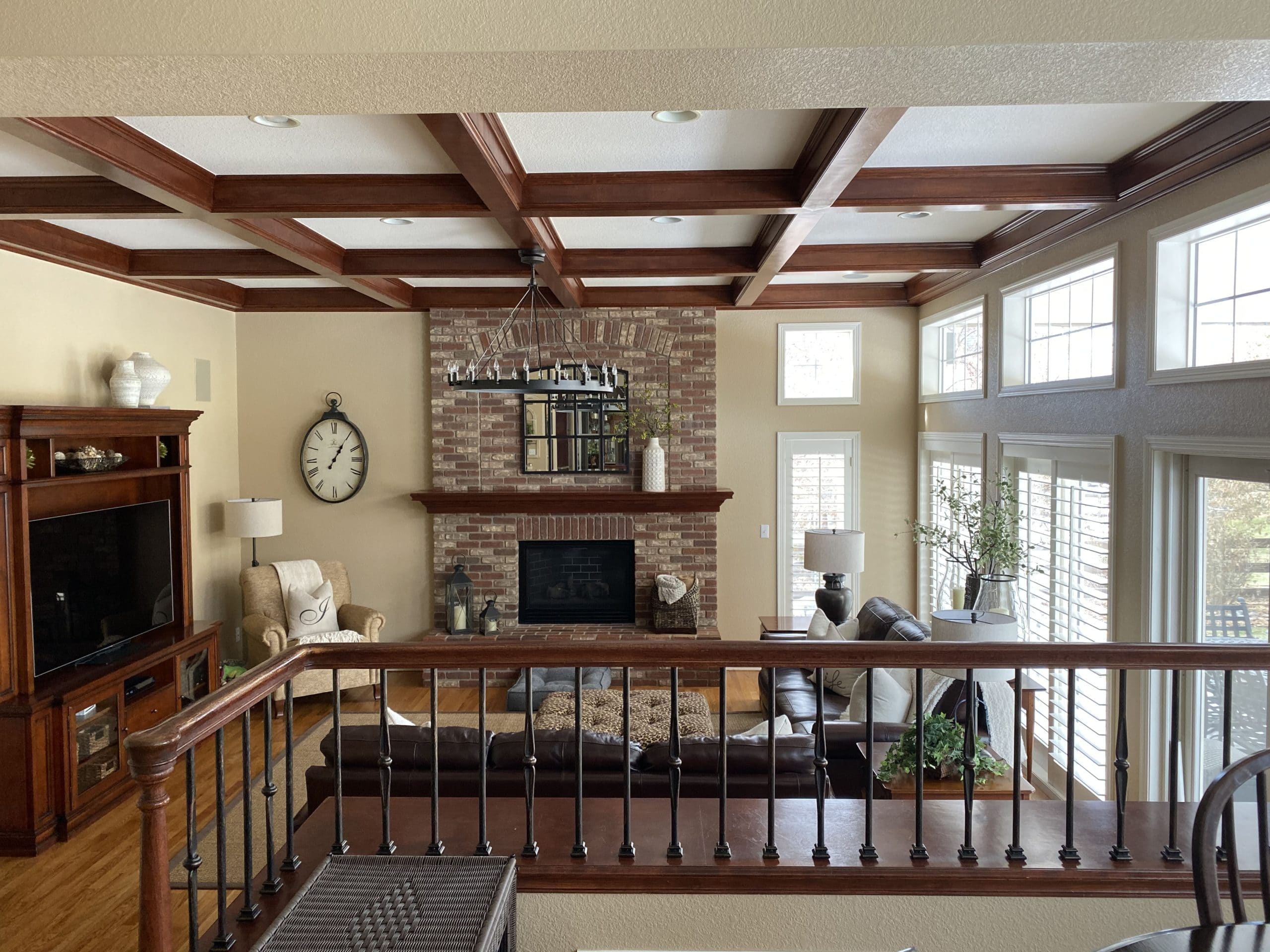
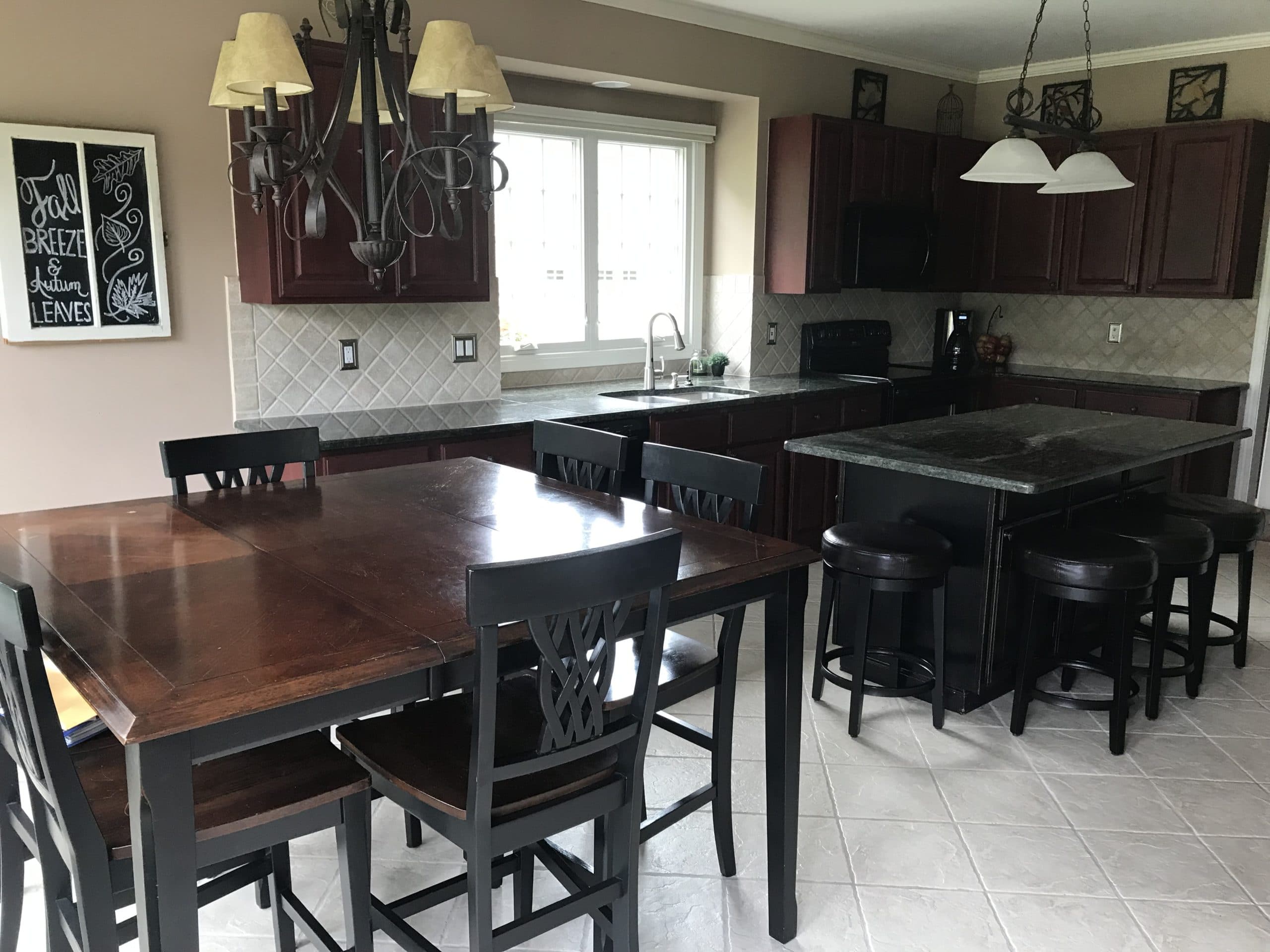
In this next photo, you can DEFINITELY tell which decade this home was last renovated in…
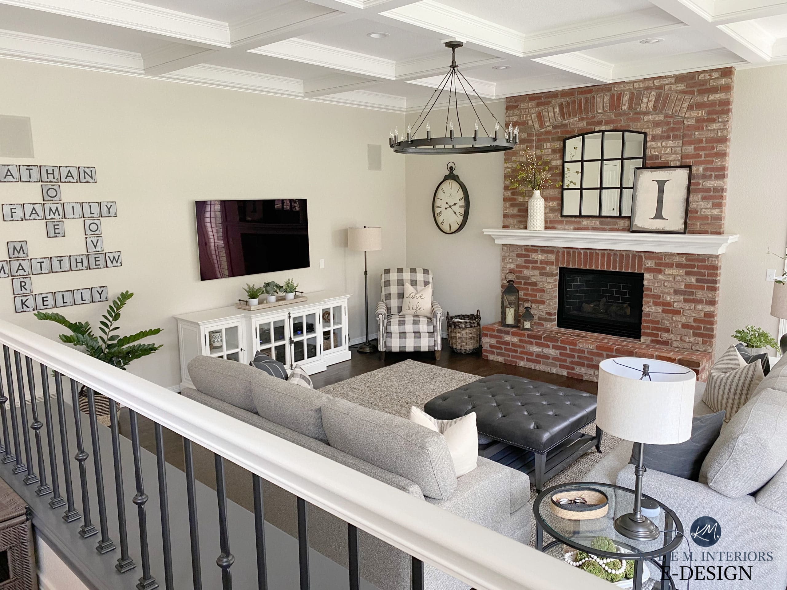
Whereas after, we kept some of the original charm but updated the finishes with more timeless choices…
Does this mean these colours will work with pretty much anything?
No, just as there’s no fail-proof wine that goes with both a Steak dinner and Kraft Dinner (I’ve tried), there’s also no fail-proof paint colour (not even white).
However, these colours will have the FLEXIBILITY to humour a variety of trends, ranging from whites, grays, beige and even some creams and colours. Now, this doesn’t mean they’ll suit EVERY type of white countertop, gray tile or beige sofa, but compared to a more COMMITTED colour, you’ll have a much better chance of makin’ it fly.
Does this mean these colours are trend-proof no matter what surface we paint them on?
HECK NO! We’re talking about walls, however, the same thought process could also be applied to…
- carpet
- tile
- sofas and chairs
But what about CABINETS?
Cabinets are one of the FIRST places we look to see what the trend of the year/half-decade is.
The current trend of painting cabinets a soft greige/taupe/cream is enough to make me want to curl up in a ball, sobbing and twitching in the corner with a mild nod at hyperventilation. Why? Because they’re TRENDY (although admittedly, very pretty). And while I’m cool with committing to trends on a smaller scale, as it relates to surfaces like CABINETS, I just know these kitchens will be showing up in my inbox in 5-10 years with owners (including NEW homeowners who inherit the last owner’s style) who don’t know how to integrate that particular trend into the NEXT trend that they want to take advantage of – they effectively DATE the home.
Schlong story short, when it comes to timeless colours on cabinets, you’re looking at white and ONLY white.
Kylie, what do you mean when you say UNCOMMITTED or COMMITTED?
When I refer to a colour as being UNCOMMITTED, it’s because it doesn’t want to marry any particular colour; it prefers to practice polygamy; having several girlfriends/boyfriends on the side. So, whereas one colour might COMMIT to a certain colour by looking legit gray, beige, tan, cream, etc… uncommitted colours have the potential to WINK at many of these colours, without 100% committing to any one of them.
So, now that we’ve established the WHY and the WHERE, let’s look at the WHAT.

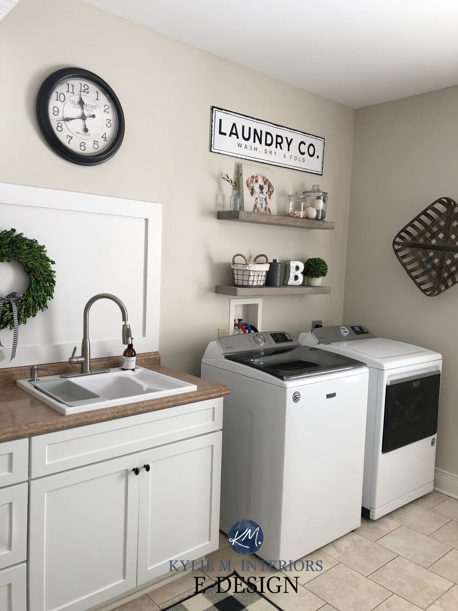
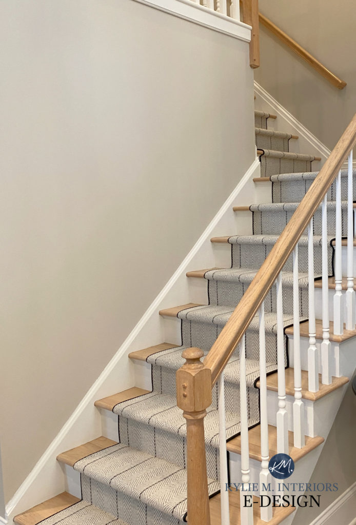
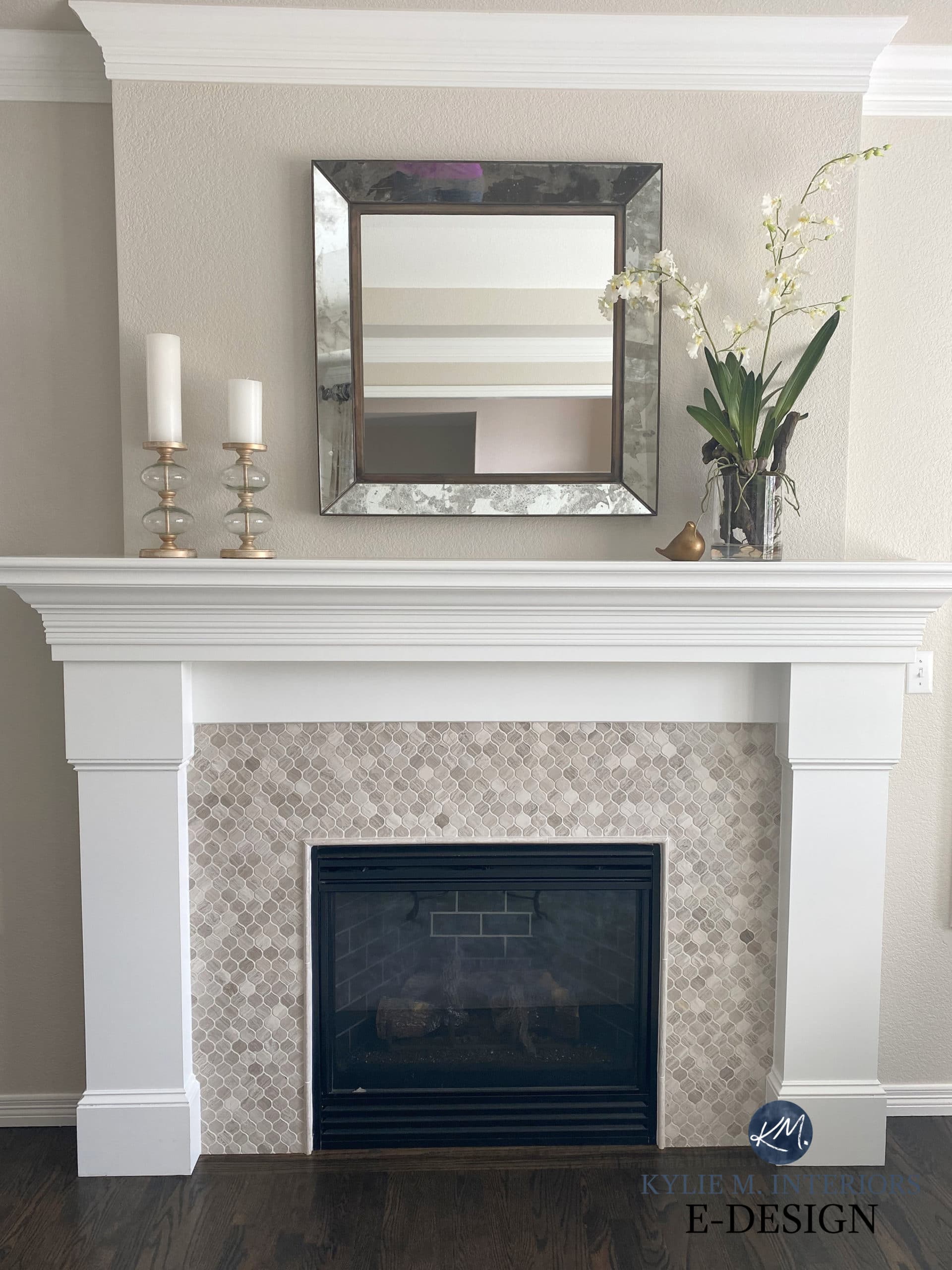
1. BENJAMIN MOORE EDGECOMB GRAY HC-173
There are FEW colours as non-committal as Edgecomb Gray. As we slowly edge out of the gray range and lean into the warmer end of things, Edgecomb Gray is a glorious pit stop between gray and beige. It’s like when you transition from white wine to red but aren’t ready to go all the way, you drink rose; Edgecomb Gray is the rose of the paint world.
While this next stone fireplace could handle a WINK more pink undertone, this particular undertone doesn’t always appeal to homeowners, making Edgecomb Gray a great, flexible choice…
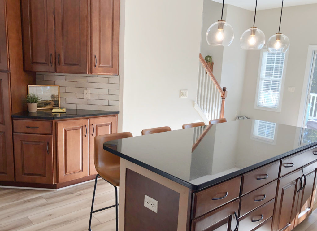
I also love how the subtle taupe approach of Edgecomb Gray sits with these cherry cabinets, black granite countertop and taupe-inspired Zellige-style backsplash…
FULL Paint Colour Review: Benjamin Moore Edgecomb Gray
(I’ll also include a link at the end of this blog post)
As we slowly but surely enter the beige and tan world in the coming years (which I believe we will), Edgecomb Gray will transition us effortlessly. This means that once beige and tan are IN and gray is OUT, Edgecomb Gray will still be sittin’ pretty in the middle – literally.
Why? You ask a lot of questions. I like that about you.
Edgecomb Gray is not as cool as gray (a trend that’s peaked and is on the downhill slide) and not as warm as beige or tan, a trend that’s (slowly) coming back. It’s a HAPPY MEDIUM. Don’t want to date your home with gray, yet aren’t ready for beige or tan? EDGECOMB GRAY! Not sure whether to go warm or cool? EDGECOMB GRAY!

Just look at how that beige/taupe carpet is handling Edgecomb Gray!
For those of you panicking that you have a gray-on-gray home, don’t worry, if you LOVE gray and always will, you can fill your lil boots. HOWEVER, if you’re a person who likes to a) change things up every few years; or, b) plan to sell in 5-10 years, you’ll want to consider HOW MUCH you commit to one particular type of colour.
Now, of course, your home’s finishes need to actually SUIT Edgecomb Gray. And while not every home can handle it, Edgecomb Gray is reasonably flexible, another reason it could be the next great go-to neutral paint colour. Trend-proof? For a reasonably long time, yes. Fool-proof? HELLS NO, there’s no such thing as a fool-proof neutral.
Sherwin Williams Urbane Bronze front door/Cloud White trim
BTW, Edgecomb Gray is also known as Baby Fawn. Thank you, Benjamin Moore, for confusing everybody.
And instead of baby-birding you what you already know re: Edgecomb Gray’s LRV and undertones (and if you don’t know, read this), I want to share a GORGEOUS Online Paint Colour Consultations where Edgecomb Gray is the feature colour!
Are Gray Paint Colours Still Trendy on Walls, Cabinets & Exteriors?
2. BENJAMIN MOORE BALLET WHITE OC-9 / SHERWIN WILLIAMS WHITE DUCK SW 7010
Ballet White and White Duck are similar enough that we can kill two birds with one stone (get it? White Duck…birds? Anyways).
Whereas Edgecomb Gray pinched the bum cheeks of both the gray and beige worlds, Ballet White and White Duck sit a bit closer to the CREAM end of things; they’re like the superheroes of the cream/tan world, hovering between the two in their neutral spandex suits.
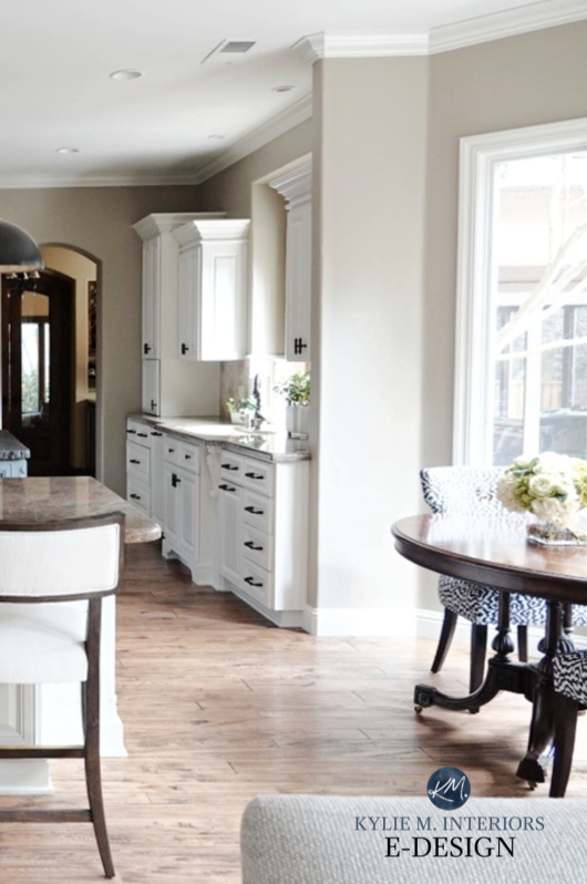
In this next photo, White Duck was a great choice, acting as a moderator between a more modern gray/greige approach and the WARMER preferences of the backsplash tile and countertop…
FULL Paint Colour Review: Benjamin Moore Ballet White
FULL Paint Colour Review: Sherwin Williams White Duck
Could we hit the walls with a bit more warmth? Sure, but sometimes it’s about finding that happy place between a home’s needs and a homeowner’s wants, and White Duck satisfies both!
Click HERE or on the above photo to view my Online Consulting Packages!
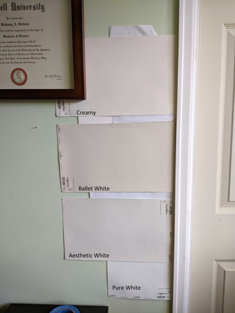
Let’s take a quick break to talk about paint samples…
Undoubtedly, you’ll be heading out in the near future to grab paint samples – stop right there! I want you to check out SAMPLIZE. Samplize offers peel and stick paint samples that are more AFFORDABLE, EASIER and more ENVIRONMENTALLY FRIENDLY than traditional paint pots. Here are just a FEW reasons why I recommend Samplize to my clients…
- samples arrive ON YOUR DOORSTEP in 1-3 business days, depending on location
- they’re more affordable than the samples pots/rollers/foam boards that are needed for traditional paint sampling
- if you keep the samples on their white paper, you can move them around the room
Save money on paint samples by visiting the SAMPLIZE website HERE
3. SHERWIN WILLIAMS AESTHETIC WHITE SW 7035
While Aesthetic White doesn’t have the flexibility of Edgecomb Gray and Ballet White/White Duck, it’s considerably more versatile than the average, more committed neutral paint colour.
Aesthetic White is a beige at heart, but ohhhhh, it does love to wink at gray when beige isn’t looking. This doesn’t mean it will LOOK gray, but it’s also a far cry from the more committed beige world. This trait gives it more flexibility to humour a wider range of colours.
The Colours of the Year – According to Kylie
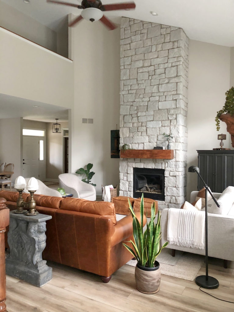
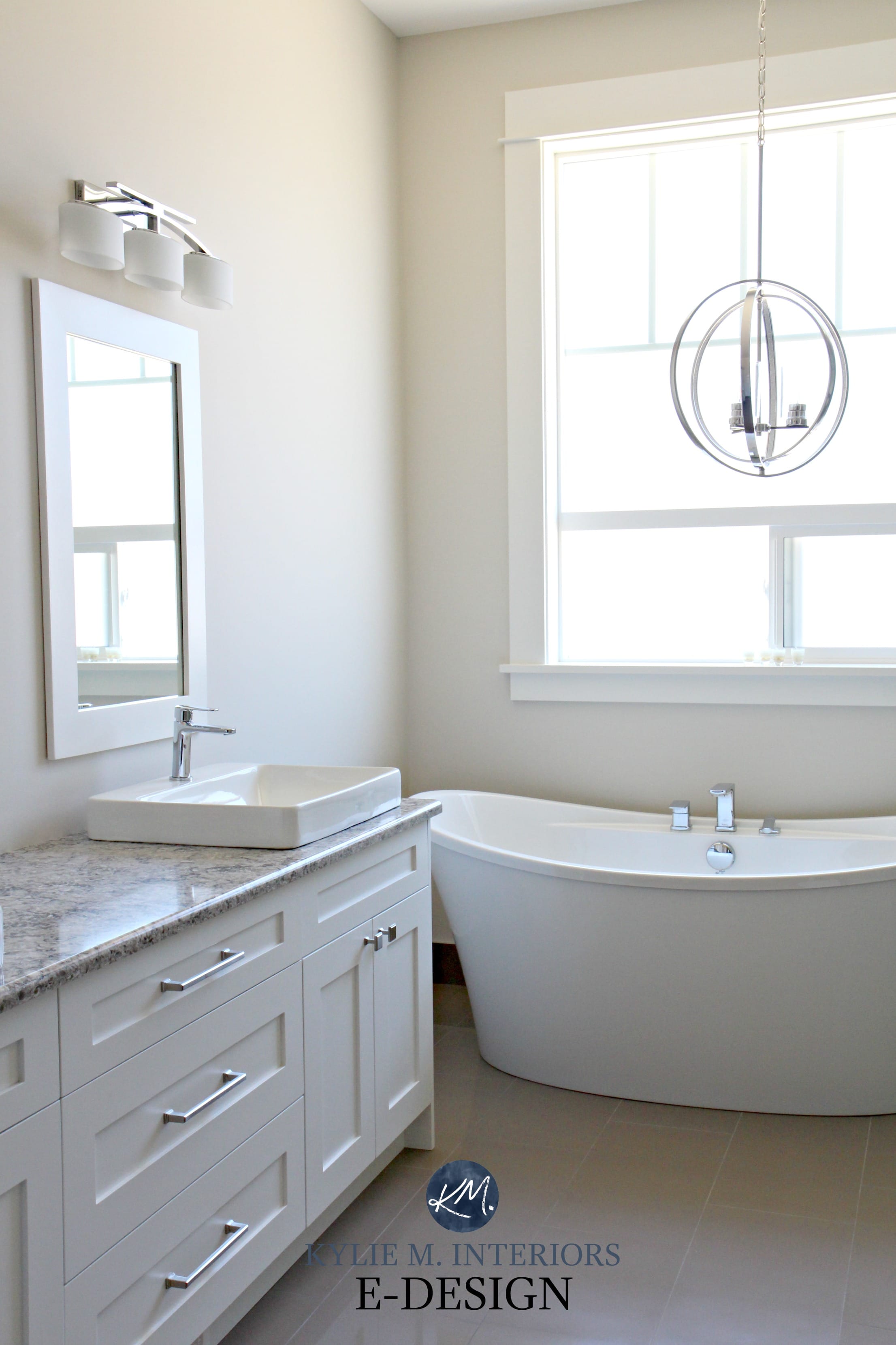
On the other hand, look at how WARM it looks in this next bathroom with south-facing light and warmer finishes…
Aesthetic White is one of my TOP 5 off-white paint colours, and generally, the lighter a colour is, the better chance it has of nodding towards a variety of surfaces (compared to a darker more committed colour).
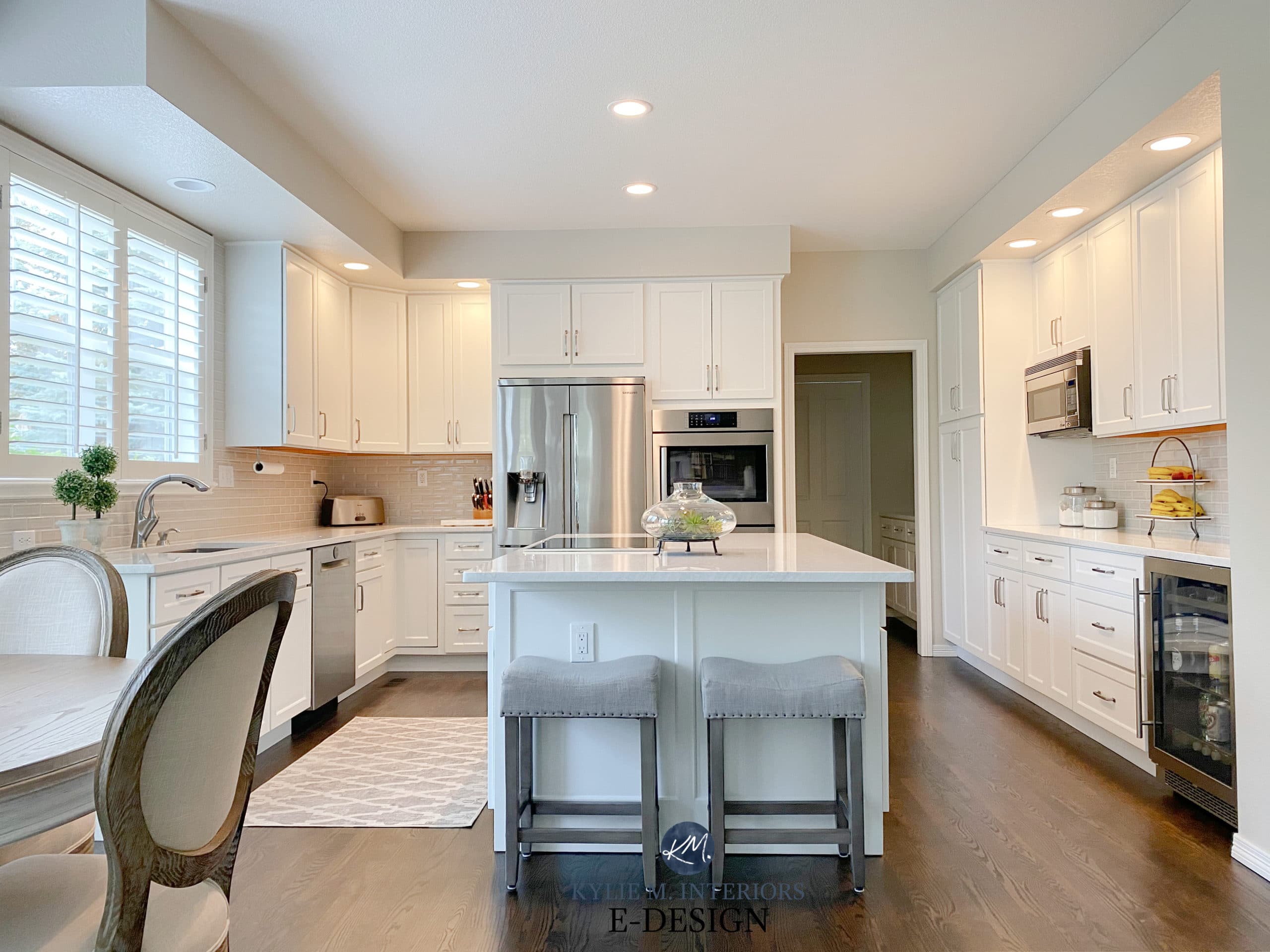
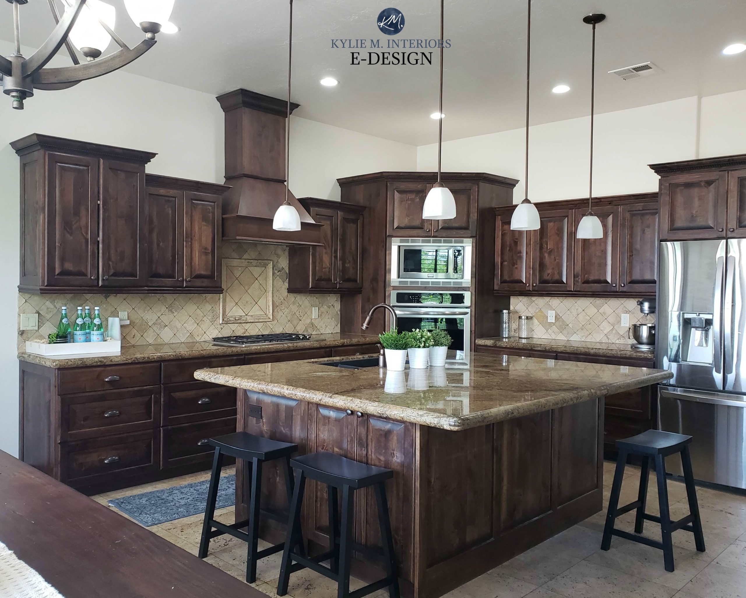
And while I’m always cautious to nod towards trends on kitchen cabinets (as white is usually best for longevity), sometimes a trend just HAPPENS to coincide with the specific needs of a room, as shown in this next kitchen with Aesthetic White cabinets…

How to Update Your Older Granite Countertops
The BEST Ways to Decorate Using Trends and Save MONEY!
The slightly darker versions of Aesthetic White are Accessible Beige and Balanced Beige. And while they ARE quite flexible, it’s the DEPTH of Aesthetic White that gives it the extra edge.
READ MORE IN THIS SERIES
The TOP 11 Warm Neutral Paint Colours That AREN’T BEIGE!
How to Create a Timeless Home with Personality!
The Best Way to Decorate With Trends & Save Money
The TOP 10 Most Timeless Interior Finishes
Are Gray Paint Colours Still Trendy on Walls, Cabinets & Exteriors?
6 Affordable Home Update Ideas
The 8 Best WHOLE HOME Warm Neutral Paint Colours
The 12 Best Gray and Greige WHOLE HOME Paint Colours
NEED HELP?
CHECK OUT MY ONLINE PAINT COLOUR CONSULTING / E-DESIGN
Chat soon,

Comments
Leave a Reply
More Posts

The 5 Best Creamy White or Off-White Paint Colors
THE ELUSIVE ‘CREAMY WHITE NEUTRAL’ When it comes to light, warm neutrals, it’s all in the undertones. And other than pink and green, yellow is the undertone many of my
Read More

The 8 Best Warm Neutral Paint Colors With NO Yellow Undertones!
The Top Light Depth, Warm Colors That Aren’t Cream! When choosing the best warm neutral paint color for your home, whether creamy white, beige, taupe, or greige, your choices are
Read More

The 12 Best Farmhouse Sinks of 2024
FIND YOUR DREAM SINK HERE… While traditional farmhouse design was all the rage in previous years, the embers have definitely cooled. As for MODERN farmhouse, it’s still kickin’ its cowgirl
Read More


I love your color review videos. You clearly demonstrate how to look at paint colors in a new light. While researching Balboa Mist, I notice there are two numbers OC-27 and 1549. What’s the difference between them?
Thank you so much!
Michelle S
Author
Well, funny enough, there is NO DIFFERENCE! They just feature them in different collections and change the number – which is confusing for SO MANY PEOPLE! Any variation you might see is just in the printing :).
Thanks for proving paint color description based on exterior lightening as it totally change what we exactly want that color to look like. Love your tips.keep posting:)
Author
Thank you for the comment Mandeep! It’s this kind of info that makes you feel you AREN’T going crazy, that lighting really does change how things look!