
The 4 Best Warm Gray Hybrid Paint Colors: Sherwin Williams
The Top 4 Warm Gray Paint Colors that are ALMOST Greige
Warm gray. The two words are opposite, meaning that when they’re mixed, they should create the perfect happy medium—but they don’t. Gray is not a traditionally warm color, and I don’t want you to confuse the word ‘warm’ with the look and feel of actual warmth. A warm gray is still gray, even if it has warm roots.
I often have online clients who request a ‘warm gray,’ hoping for something softer and cozier than the average shade of gray. Sure, there are warm grays, but it’s important not to confuse warm gray with the look of ACTUAL warmth.
And if you’re cool with that, so am I. However, if you want actual warmth, you’re reading the wrong blog post.
Now, if this understanding of warm gray is right up your alley, I’ve got some wicked pretty shades to share. So, let’s chat.
Gray is traditionally a cool or stormy color. Once we enter the warm gray range, some brown or beige muddies the waters.
- Lean warm enough and have a green undertone, warm gray = greige.
- Lean warm enough and have a purple or purple-pink undertone, warm gray = taupe.
The colors we’re looking at are hybrids and open to interpretation as to which group they belong to.
What makes these colors so tricksy is that they might be warm gray or greige-taupe. However, they change their tune depending on your room’s exposure. For example, many warm grays look as they should in north-facing rooms. However, put these same colors in a south-facing room, and that glorious sunshine makes them look like greige or taupe!
So, without further ado, let’s find the best warm…ish hue for you!
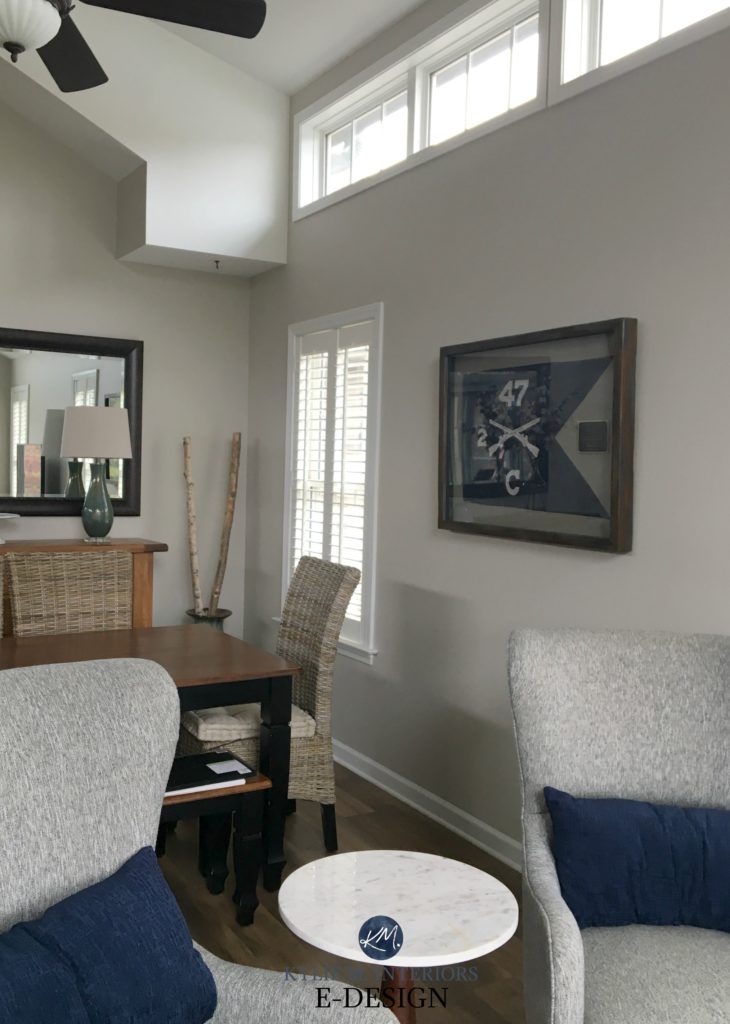
1. SHERWIN WILLIAMS AGREEABLE GRAY SW 7029
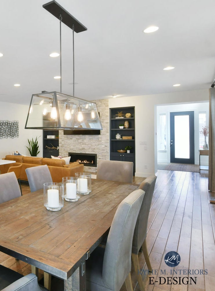
Agreeable Gray is one of my favorite warmish neutrals because it’s a greige that can act like a gray. In northern light, Agreeable Gray looks like a warm shade of gray. However, it softens up in non-northern light and picks up its greige-taupe warmth.
Check out Agreeable Gray in this next home…
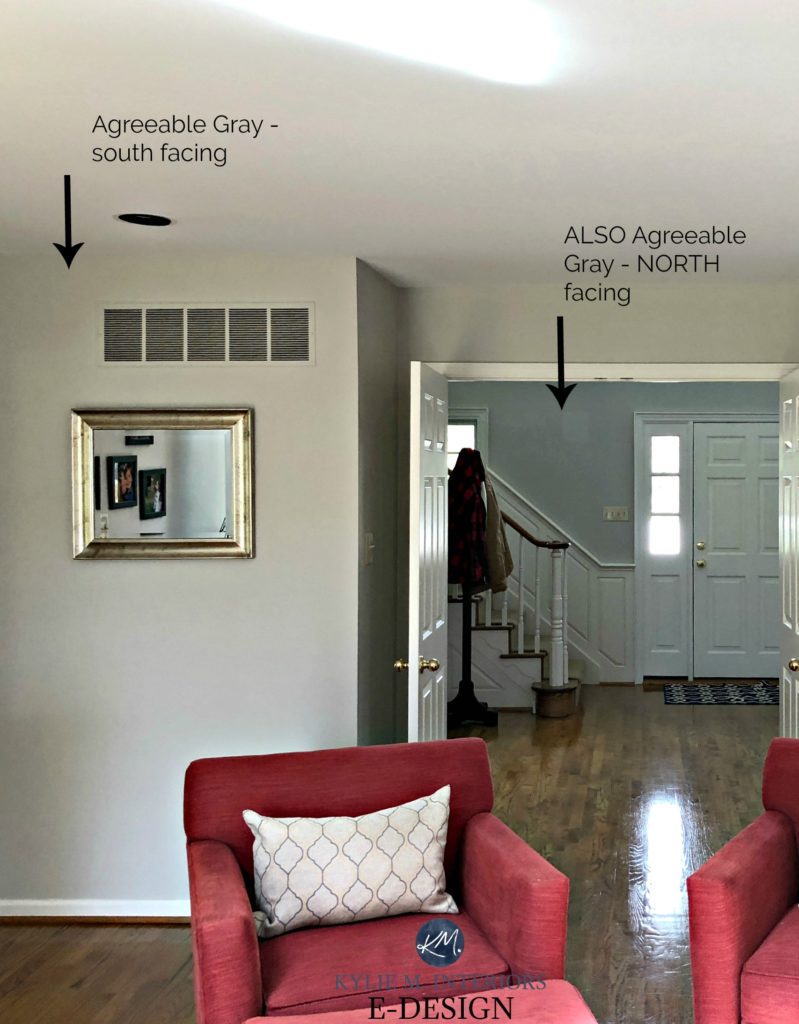
The entryway is infused with a cool northern light. The living room is south-facing (on what’s probably an overcast day from the looks of it).
Will your walls look warm painted Agreeable Gray? In comparison to a cool gray, yes.

- Agreeable Gray has an LRV of 60 which means it’s going to add decent energy and life to a room, but won’t make a dark space look brighter (read more about LRV here).
- Agreeable Gray can pick up any of the three cool undertones, depending on the exposure, interior lighting and the finishes it’s partnered with, although MOST of the time it looks pretty darn neutral.
- Agreeable Gray has a subtle warm undertone – not enough to take over, but enough to stop it from flashing traditionally cool.
- I find that the deeper I go with Agreeable Gray (Anew Gray/Mega Greige/Warm Stone) the warmer it looks. Agreeable Gray is the only depth where it looks more like a warm gray than a greige.
- Does this colour have beige in it? Yes, that’s what’s warming it up, but I’ve never had it look legit beige in any space.
- In a north-facing room, Agreeable can pick up a slight gray/blue look or even a wink o’ green.
FULL Paint Colour Review of Sherwin Williams Agreeable Gray
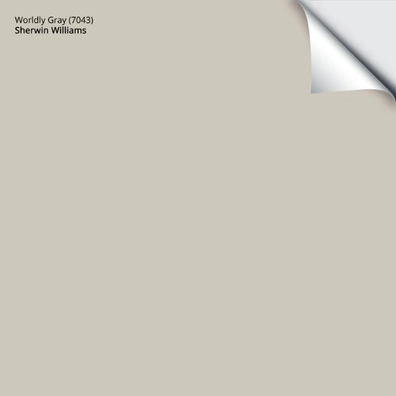
2. SHERWIN WILLIAMS WORLDLY GRAY SW 7043
While it’s illegal in most States, Worldly Gray and Agreeable Gray are like kissin’ cousins.
Why?
Well, they have a similar foundation, but Worldly Gray can pick up a wee flash of green and a bit more warmth. Overall though, it has a simla approach to Agreeable Gray with its flexibility between gray and greige.
Kylie M Interiors E-Design
Worldly Gray has an LRV of 58, so it’s a smidge darker than Agreeable. If this bugs you, have it lightened by 25% to bring it back up a bit, but keep in mind that this can slightly affect the undertones.
- In a south-facing room, you may notice the green a bit more. It will also be slightly warmer.
- The greige/warm undertones may come slightly forward with no natural lighting or in the evenings.
- Like Agreeable Gray, Worldly Gray is stuck in between the warm gray and greige worlds.
FULL Paint Colour Review of Sherwin Williams Worldly Gray
Get your Peel & Stick sample of Worldly Gray…
3. SHERWIN WILLIAMS MINDFUL GRAY 7016
Mindful Gray is a fantastic shade of warm gray, but DAMN is it a chameleon! While it has gloriously warm gray roots, give it the right environment (especially exterior siding or stucco) and it can look surprisingly warm!
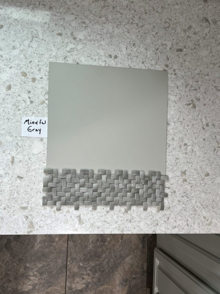
- The LRV of Mindful Gray is 48, so it’s well into the light-medium range and a bit darker than Agreeable Gray and Worldly Gray.
- While it can flex its undertones, expect a mild, slightly green hue (a muddy one at times).
- While Mindful Gray can read like a warm gray on exterior walls, give it southern light (or western afternoon light) OR exterior lighting, and it can look much warmer!
- Too warm for you? Take a look at Sherwin Williams Light French Gray and see if it hits the spot.

While it can look surprisingly warm, look at how gray it is ‘compared’ to warmer neutrals…
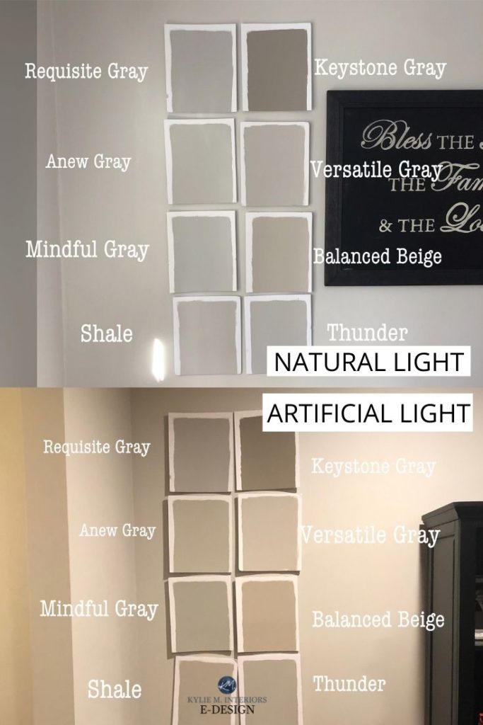
Check out my reviews of Keystone Gray | Versatile Gray | Requisite Gray | Anew Gray | Balanced Beige
My FULL Paint Color Review of Sherwin Williams Mindful Gray
4. SHERWIN WILLIAMS COLONNADE GRAY SW 7641
Colonnade Gray is very (very) similar to the ever-popular Benjamin Moore Revere Pewter. It has similar subtle warmth and depth. However, the subtle green you’ll find in both colors is way more passive in Colonnade Gray. When it shows up, you might have to convince yourself it’s there (whereas Revere Pewter is slightly more obvious).
- Colonnade Gray has an LRV of 52, which is great for a well-lit room but a touch dull for a darker one. It’s 3 points lower than Revere Pewter.
- There’s a good chance you’d never know this color had green in it unless I spilled the beans—which I love to do.
- If you are sensitive to green, don’t pick your nose, and don’t pick this color. I’ve found that folks like you can see it even when it’s not there, so let’s not encourage things.
- Want a bit more depth and undertone? Check out Sherwin Williams Amazing Gray. Looking for a lighter approach, bump on back to Worldly Gray.
- Colonnade Gray is SUPER comparable to Benjamin Moore Revere Pewter – minus the muddy green. To learn about the difference between these two colors, check out this post… Color Review: Colonade Gray vs Revere Pewter

So, there you have it. If those are too gray for your tastes, you probably need to start dabbling in the Wild World of Greige. And if you’re stuck? You know who can help!
READ MORE
The Two Types of Gray Paint Colours & The BEST of Them!
The 10 Best WHOLE HOME Gray and Greige Paint Colours
The 8 Best WHOLE HOME Warm Neutral Paint Colours
How to Transition from Beige to Gray or Greige
NEED HELP?
Check out my Online Color Consulting Services

ORIGINALLY WRITTEN IN 2018, UPDATED IN 2024


I love your blog!
I painted our kitchen walls agreeable gray at 70%. Looking for a coordinating darker gray color to paint our kitchen island. Upper cabinets are pure white .
What would you suggest ?
Hi Sandra, thank you for your note1 It absolutely depends on your flooring and countertops, otherwise I’m just guessing and it could be a hot mess regardless of your wall colour! If you’d like me to take a close look, I do have affordable and fun E-design packages so you can get it right the first time! https://www.kylieminteriors.ca/online-decorating-design-services/
~Kylie
Hi Kylie! I hope you can help as I’m having a hard time finding an open layout color because my light bulbs are all different making the color change from room to room. What type of bulb is best for these greige colors warm or cool? Would you happen to know the perfect Kelvin to get?
Kylie, curious to know if you ever wrote a color review on Gossamer Veil? I keep going back and forth between that Agreeable Gray and Repose Gray. Would love to read your thoughts on GV. Thanks!
Oooo Sarah, we’re just in the process of putting my Youtube video out on Gossamer Veil! I haven’t done a blog post on it yet, as I haven’t had ‘after’ photos returned from clients who’ve used it. So far, I’m LOVING what I see of it! The video should be out in the next day or 2 🙂
Hi I was wondering if you had a final verdict on Gossamer Veil? I was bummed to see that the video on it was never published, but I’m stuck deciding between Agreeable Gray and Gossamer Veil for the exterior of my home. Would love to hear what you have to say. Thanks!
Well aren’t you the patient one! I will be doing a video on this NEXT WEEK as we’ve totally changed my set-up since moving. Of the 2, Gossamer is more likely to pick up a wee wink of green, whereas Agreeable won’t, if that helps at this point 🙂
Hi Kylie! I love your blog it’s been a huge help! I have put agreeable gray on 3 of our upstairs bedrooms and loooove it! However I am trying to pick a paint color for my very open downstairs living/kitchen/dining and while I would love to use agreeable gray I am NOT seeing any brown undertones in any of my other rooms and the open downstairs has dark almost black cabinets and calico colored granite counters so I feel like I need a warmer gray. I would have thought based on your blog agreeable gray fit the bill but my experience in my other rooms it doesn’t seem warm at all. I have checked our existing agreeable gray paint cans 10 times to make sure I have it right and feel like I’m going crazy haha.
Yes, Agreeable Gray can be a tricky one – this could be in ‘comparison’ to some of the other colours in your room or due to your exposure (as north/east can really gray out Agreeable Gray! Perhaps you need to bump up to Accessible Beige!
Hi there. Can you advise what Worldly Gray undertones would be pronounced in a room with southeast exposure? I just painted a room Sedate Gray and it is overly green in this light. I have some dark green in an area rug so a little warm gray green works but Sedate Grays green is just overpowering and I don’t want to go totally beige.
Hi Grace! I love Worldly Gray as it’s a soft greige that leans a bit more gray. It does have a very (very) minor green undertone, but it’s fractional at best. This could come up just slightly in your room, in which case you might want to look at Agreeable Gray…
Discovered your blog today…extremely helpful as we are painting our interior as we speak. Thank you!
After what feels like MONTHS of swatches on every wall in my house, I think I’m going with agreeable gray! Hallelujah on that decision. I’m also painting my cabinets white-it will be next to agreeable gray-best suggestion for cabinet trim against agreeable? I read your post on trims but wasn’t sure which you recommended best for agreeable gray. LOVE your blog, it has saved my sanity 🙂
Hi,
I bought a house and I’m having the whole interior painted. I’m looking a Worldly Gray for the walls throughout the house because I want a uniform color with warmth. Is Worldly Gray safe for the whole house or should I go lighter?
Hi Matthew, Worldly Gray is lovely and a nice greige, just keep in mind that it can pick up a very (very) tiny green undertone. But the depth is great as long as your home isn’t overly dark!
Have you ever lightened agreeable gray by 25%? I want a light color and I like the “safety” of agreeable gray, but I’m concerned it won’t transform the room enough.
Hi Monica, I haven’t! Keep in mind that 25% sounds like a lot…but it’s not. Some people don’t notice the shift, others do – it can be that subtle! Make sure to do some big samples up and place them right next to your trim to see if the contrast feels like enough for you. If you have tons of natural light, whether it’s as-is or lightened by 25%, you can expect it to wash out considerably…
about seeing green in that gray: a few years ago, i painted most of my new house in revere pewter. the designer i worked with chose it, and i loved the way it looked in the living room. but then it seemed to change color everywhere else — and turn green!! the designer insisted i was insane (nicely, of course), and that there was absolutely no green anywhere in the color. HA! i beg to differ. i laughed out loud at your comment about people being “sensitive to green.”
Oh that is too funny – see you’re not crazy! Yes, it does love to do that. I’ve even had it look slightly blue and slightly taupe (rarely) but it’s main squeeze -is green!
I agree! Reverse Pewter pulls green. I was assured by the Designer at BM that there is no green undertone. However, I had our kitchen painted RP (from being a deeper green prior) and it 100% pulls a green cast. Stay Away from RP if you do not want green. Smokey Taupe is a beautiful BM color in a well lit area.
Oh Lori, I’m sorry they told you that! It is a tricky one, but I find that MOST of the time it does lean that wink green…
Hey Kylie,
I have an open floor plan home where I used Rever Pewter for its LRV 55 in the room with the skylights but found the same color looked too muddy in the adjacent room without as much natural light exposure. I went to Gossamer Veil LRV 62 for that room. The two colors look great together and you can barely tell where one color starts and the other begins at the corner of the wall. It’s amazing. RP is a bit warmer but they’re a nice compliment as I was having a hard time with just lightening RP without adjusting the undertones too much (green/beige).
Oooo Whitney, I love to hear stuff like this – and Gossamer Veil is a newer colour, so I’m SO HAPPY to hear some feedback on it – thank you very much!
Hi
We are first time home owners. Our living room is south facing with screen deck outside. We have accent wall SW silver mist. And other two walls are yellow ish. We want to get rid of yellow color. We tried sooo many paint samples and we can’t decide what to do. We have only one window in living room and one comperitivly smaller in breakfast nook area. We have dark flooring and cherry kitchen cabinets. Just confused between gray , beige or white. And latter on we want to extend the same color throughout our house.
Thanks
Hi Vicki! Due to the number of emails I get every day, I have to pick ‘n choose which questions to answer, focusing first on the ones that have mass appeal, more than the personal ones unfortunately! I do try to give as much complimentary info as I can on my blog and if that doesn’t help, it might be time for a closer look with my E-design. Otherwise, I’m just guessing as to the lighting in the room, exposure, colour of the dark flooring and all of the other things that matter when choosing a colour! https://www.kylieminteriors.ca/online-decorating-design-services/
I hope to hear from you!
~Kylie
Hi. My foyer, living room, kitchen and dining room are painted SW Garden Sage. It’s a deeper warm green. It looks amazing with oak wood work. I need a warm gray for my stairway going downstairs, and my stairway going upstairs, as well as the hallway upstairs. I’m thinking Accessible Beige or Anew Gray. Or maybe Anew Gray at 50%? Any thoughts? Thank you!
Hi Cheryl, when it comes to personal questions, I do refer to my E-design as I can get dozens of questions in a single day! I try to give as much helpful free info as I can on my blog and if that doesn’t help, it might be time for a closer look, otherwise, I’m totally just guessing as to what your room REALLY looks like. If you’re interested, the link is here, I’d love to help! https://www.kylieminteriors.ca/online-decorating-design-services/
~Kylie
Hi Kylie,
I have learned so much reading your informative and humorous posts over the last few months! My question is would painting areas with a warm gray color tone down all the warm woods and beige,warm flooring in my north/east facing kitchen and den? Or should I go Greige or even beige again? I was advised by a decorator, but in reading your posts I’m not sure that’s the way to go.
Thanks so much
Hi Ana! It can all depend on the tones of the wood (yellow/orange/red/etc…) but I’m inclined to say that something in the greige range would be a good happy medium, whereas a gray (Even a warm gray) might slightly contrast with the warmth of the floor, enhancing it a bit!
I am painting a small powder room with no windows, low ceiling (1970’s) having the popcorn ceiling removed if that gives you an idea! Wondering if agreeable grey will be too dark? I want a contrast with the white doors and woodwork so hate to go too light. Help! ????
Hi Chris! It’s ALL personal preference. Personally I wouldn’t find it too dark if I wanted to see some contrast with the trim. If you go lighter, you’ll be in the off-white range which won’t pop as much. But this is coming from a gal who just painted her super small bathroom SW Gauntlet Gray, so I’m not afraid of depth 🙂
Hi Kylie, I love reading your blog, you are so very helpful!!! We recently renovated our main level and in a panic, I had everything painted Pale Oak by BM. Overall, I love it. The front of the house is north facing and tends to be very dark so I wanted to freshen it up, the back part is south facing and the Pale Oak tends to wash out throughout the day. I wanted to add some depth to the south facing area and I like Agreeable Grey. Anything that starts to feel too grey makes me panic a bit. My question is, do you think Agreeable Grey and Pale Oak will work okay together? After reading this post, I’m also going to go get a sample of Collonade Grey (Revere Pewter was way too green).
Thank you so much!!
I just found this post and I love your color advice. I was just about to paint a bathroom that has a south facing window in the sky light either popular gray or versatile gray. To me they look similar to the agreeable gray and anew gray. What are your thoughts on the differences between these grays? They look so similar to me.
Hi Janice, the basic idea is that Popular Gray and Versatile Gray will have MORE undertone (taupe/purple) compared to Agreeable/Anew which will feel a bit more neutral in comparison 🙂
What is the name of the other white that does not have the yellow undertones. I am talking about the white you showed in the Agreeable Gray video that gives a more modern look. Thanks!
Hi Magda! I can’t remember what it was, but it could have been SW High Reflective White!
Hi, I seem to come across your blog for every paint question imaginable so that must be a sign! Picking a paint (whites and greys) gives me the worst anxiety EVER! I could almost cry.
I am going from a dark tan/brown in my living room to wanting a light grey. I have Repose in a couple of areas(it took me honestly months to find it).
My living room faces North and does not have a ton of natural light. Is there a color on the same scale that is one shade lighter than Repose that will not pull purple? I do not want dark anything anymore. I was going to go with Repose throughout but am now not sure? Any tips would be so very helpful!
Thank you tons in advance!
Hi April! That’s tough as most of the popular grays sway that wink purple! Now Repose is a bit of a ninja as it can also flash slightly green or blue, so it does have more flexibility than many and you could also consider having it lightened by 25%. That might not help the purple aspect, but it would shift it for you. If we go lighter and lose the purple we’re at Big Chill, but it is a cooler look. On the Rocks could be a happy medium for you but can still EASILY flash purple (or blue-purple especially with your northern light). Crushed Ice – picks up a bit of green and is LESS likely to flash purple – that’s all I’ve got off the top of my head!
Do you like repose gray or agreeable gray for kitchen if great room is painted sea salt? Love your advice?
Oh heck, you could easily get away with either, it’s more about which one best suits your countertops/backsplash! I PERSONALLY prefer Agreeable Gray, only because Repose can be a bit more unpredictable with its undertones.