
The 4 Best Warm Gray Hybrid Paint Colors: Sherwin Williams
The Top 4 Warm Gray Paint Colors that are ALMOST Greige
Warm gray. The two words are opposite, meaning that when they’re mixed, they should create the perfect happy medium—but they don’t. Gray is not a traditionally warm color, and I don’t want you to confuse the word ‘warm’ with the look and feel of actual warmth. A warm gray is still gray, even if it has warm roots.
I often have online clients who request a ‘warm gray,’ hoping for something softer and cozier than the average shade of gray. Sure, there are warm grays, but it’s important not to confuse warm gray with the look of ACTUAL warmth.
And if you’re cool with that, so am I. However, if you want actual warmth, you’re reading the wrong blog post.
Now, if this understanding of warm gray is right up your alley, I’ve got some wicked pretty shades to share. So, let’s chat.
Gray is traditionally a cool or stormy color. Once we enter the warm gray range, some brown or beige muddies the waters.
- Lean warm enough and have a green undertone, warm gray = greige.
- Lean warm enough and have a purple or purple-pink undertone, warm gray = taupe.
The colors we’re looking at are hybrids and open to interpretation as to which group they belong to.
What makes these colors so tricksy is that they might be warm gray or greige-taupe. However, they change their tune depending on your room’s exposure. For example, many warm grays look as they should in north-facing rooms. However, put these same colors in a south-facing room, and that glorious sunshine makes them look like greige or taupe!
So, without further ado, let’s find the best warm…ish hue for you!
1. SHERWIN WILLIAMS AGREEABLE GRAY SW 7029
Agreeable Gray is one of my favorite warmish neutrals because it’s a greige that can act like a gray. In northern light, Agreeable Gray looks like a warm shade of gray. However, it softens up in non-northern light and picks up its greige-taupe warmth.
Check out Agreeable Gray in this next home…
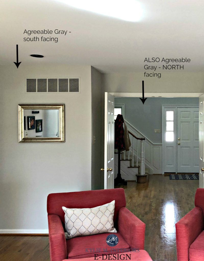
The entryway is infused with a cool northern light. The living room is south-facing (on what’s probably an overcast day from the looks of it).
Will your walls look warm painted Agreeable Gray? In comparison to a cool gray, yes.

- Agreeable Gray has an LRV of 60 which means it’s going to add decent energy and life to a room, but won’t make a dark space look brighter (read more about LRV here).
- Agreeable Gray can pick up any of the three cool undertones, depending on the exposure, interior lighting and the finishes it’s partnered with, although MOST of the time it looks pretty darn neutral.
- Agreeable Gray has a subtle warm undertone – not enough to take over, but enough to stop it from flashing traditionally cool.
- I find that the deeper I go with Agreeable Gray (Anew Gray/Mega Greige/Warm Stone) the warmer it looks. Agreeable Gray is the only depth where it looks more like a warm gray than a greige.
- Does this colour have beige in it? Yes, that’s what’s warming it up, but I’ve never had it look legit beige in any space.
- In a north-facing room, Agreeable can pick up a slight gray/blue look or even a wink o’ green.
FULL Paint Colour Review of Sherwin Williams Agreeable Gray
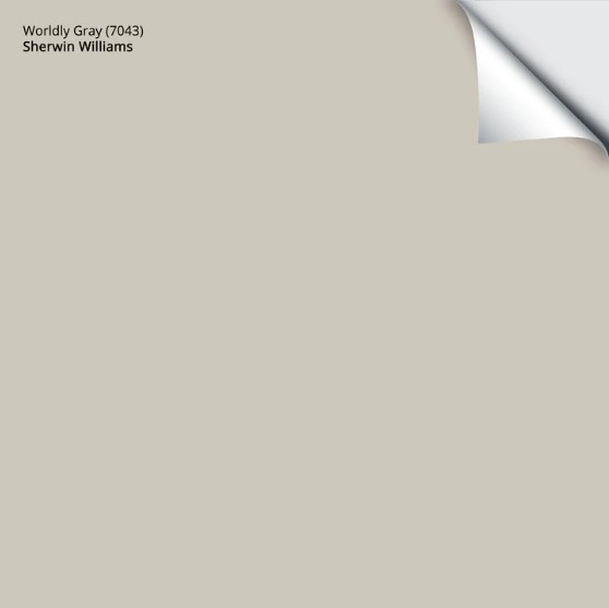
2. SHERWIN WILLIAMS WORLDLY GRAY SW 7043
While it’s illegal in most States, Worldly Gray and Agreeable Gray are like kissin’ cousins.
Why?
Well, they have a similar foundation, but Worldly Gray can pick up a wee flash of green and a bit more warmth. Overall though, it has a simla approach to Agreeable Gray with its flexibility between gray and greige.
Kylie M Interiors E-Design
Worldly Gray has an LRV of 58, so it’s a smidge darker than Agreeable. If this bugs you, have it lightened by 25% to bring it back up a bit, but keep in mind that this can slightly affect the undertones.
- In a south-facing room, you may notice the green a bit more. It will also be slightly warmer.
- The greige/warm undertones may come slightly forward with no natural lighting or in the evenings.
- Like Agreeable Gray, Worldly Gray is stuck in between the warm gray and greige worlds.
FULL Paint Colour Review of Sherwin Williams Worldly Gray
Get your Peel & Stick sample of Worldly Gray…
3. SHERWIN WILLIAMS MINDFUL GRAY 7016
Mindful Gray is a fantastic shade of warm gray, but DAMN is it a chameleon! While it has gloriously warm gray roots, give it the right environment (especially exterior siding or stucco) and it can look surprisingly warm!
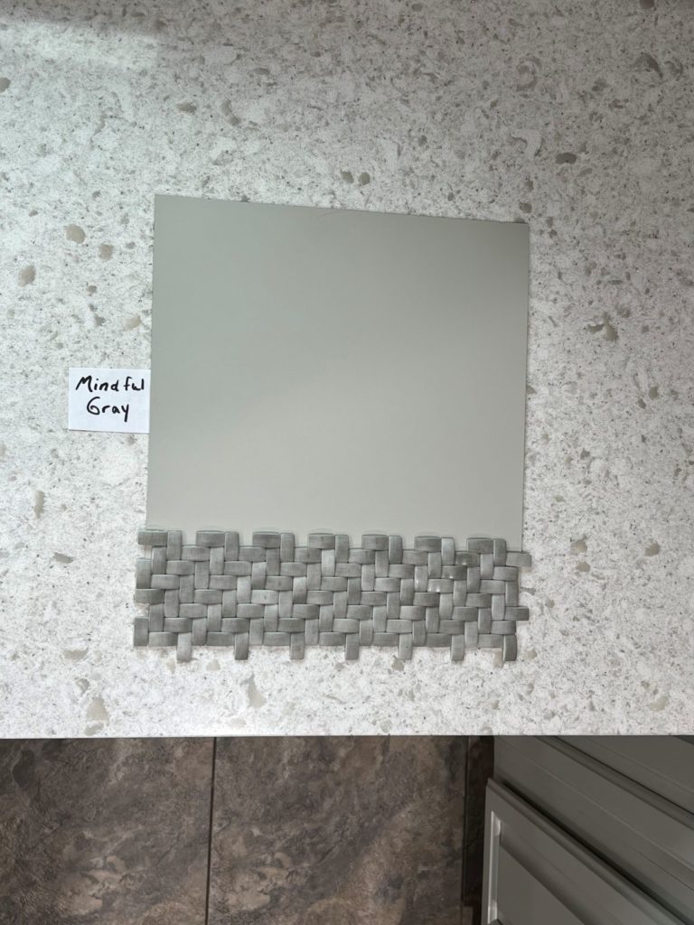
- The LRV of Mindful Gray is 48, so it’s well into the light-medium range and a bit darker than Agreeable Gray and Worldly Gray.
- While it can flex its undertones, expect a mild, slightly green hue (a muddy one at times).
- While Mindful Gray can read like a warm gray on exterior walls, give it southern light (or western afternoon light) OR exterior lighting, and it can look much warmer!
- Too warm for you? Take a look at Sherwin Williams Light French Gray and see if it hits the spot.

While it can look surprisingly warm, look at how gray it is ‘compared’ to warmer neutrals…
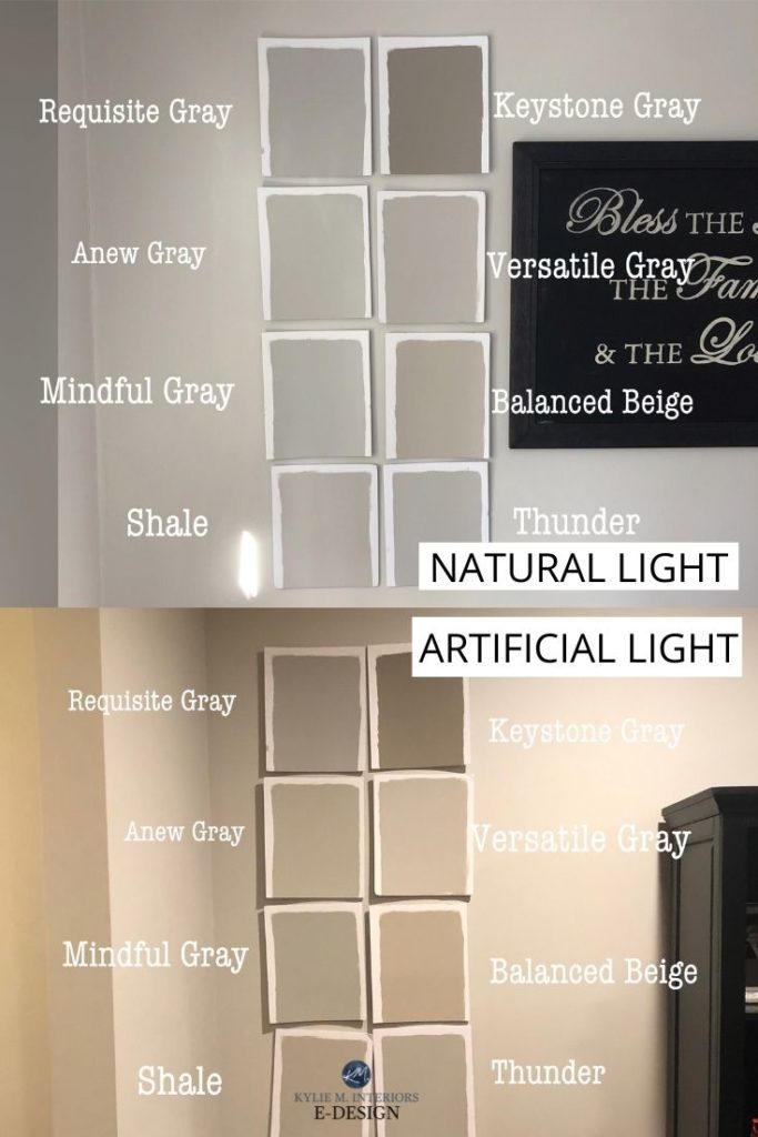
Check out my reviews of Keystone Gray | Versatile Gray | Requisite Gray | Anew Gray | Balanced Beige
My FULL Paint Color Review of Sherwin Williams Mindful Gray
4. SHERWIN WILLIAMS COLONNADE GRAY SW 7641
Colonnade Gray is very (very) similar to the ever-popular Benjamin Moore Revere Pewter. It has similar subtle warmth and depth. However, the subtle green you’ll find in both colors is way more passive in Colonnade Gray. When it shows up, you might have to convince yourself it’s there (whereas Revere Pewter is slightly more obvious).
- Colonnade Gray has an LRV of 52, which is great for a well-lit room but a touch dull for a darker one. It’s 3 points lower than Revere Pewter.
- There’s a good chance you’d never know this color had green in it unless I spilled the beans—which I love to do.
- If you are sensitive to green, don’t pick your nose, and don’t pick this color. I’ve found that folks like you can see it even when it’s not there, so let’s not encourage things.
- Want a bit more depth and undertone? Check out Sherwin Williams Amazing Gray. Looking for a lighter approach, bump on back to Worldly Gray.
- Colonnade Gray is SUPER comparable to Benjamin Moore Revere Pewter – minus the muddy green. To learn about the difference between these two colors, check out this post… Color Review: Colonade Gray vs Revere Pewter

So, there you have it. If those are too gray for your tastes, you probably need to start dabbling in the Wild World of Greige. And if you’re stuck? You know who can help!
READ MORE
The Two Types of Gray Paint Colours & The BEST of Them!
The 10 Best WHOLE HOME Gray and Greige Paint Colours
The 8 Best WHOLE HOME Warm Neutral Paint Colours
How to Transition from Beige to Gray or Greige
NEED HELP?
Check out my Online Color Consulting Services

ORIGINALLY WRITTEN IN 2018, UPDATED IN 2024


Hi Lisa, absolutely! Accessible Beige could look pretty as well, depending on the products in your home/personal tastes 🙂
Hi Maureen, check out SW Modern Gray – it hits it right on the money!
~Kylie
Hi Jordyn, yes, that flash of green in Worldly can surprise you! And Agreeable is SO close to it, it’s just about taking that green out, leaving more of a greige tone. BUT, having neutrals in it, it’s super susceptible to picking up reflection from the exposure/interior lighting/etc… I would be surprised if Agreeable was actually blue on the larger scale and with the accents you like, it should work!!
Hi Kylie. I am getting ready for a big undertaking, painting the “virgin ” exterior brick of my house. This has been a process talking my husband into and it has to be right, considering the cost, and that my husband thinks it’s a crazy idea . (The brick is that awful super dark purple/burgundy brick !) It is clear you have a great understanding of color and I would love to consider a consult (1930 colonial with original slate roof that leans toward taupe/Browns with a little bit of purple undertone that I am having trouble with) . I am just concerned that online the color from my pics may not come across accurately. Should I stick to a local resource for help or do you feel you would get an accurate read online. For an interior room, I would be totally willing to give it a shot, but this is a much bigger deal.
Hi Beth, thank you for your note! And yes that IS a big job – I totally get it! I’ve done dozens upon dozens of exterior consultations and often times it’s for clients who hired someone local, but weren’t entirely happy with the colour selection. I do my best to explain why colours may/may not work and can do a LOT with the photos you send as well as the questionnaire that you fill out.
I hope that helps ease your mind a bit!
~Kylie
Thank you for your valuable color tutorials, Kylie! We are going to be painting the interior of our house to sell. I like Revere Pewter, but want to use Sherwin Williams paint. What is your thought on color matching? I saw that you recommend Collonade Gray as the SW equivalent to Revere Pewter. After doing my research, I’m wondering why Worldly Gray isn’t your recommended SW equivalent to Revere Pewter? Thank you so much!
Hi Cathy! If you’re going with SW then it would be HARD to go wrong with Worldly Gray – it’s a beauty. I also love Agreeable Gray for staging (basically like Worldly Gray without the wee wink of green). Revere Pewter just has MORE green in it than Worldly. Worldly’s green is so passive you don’t even know it’s there!
~Kylie
Good morning Kylie,
Just found you yesterday in my search fir my “perfect” grey for my south facing yet not crazy bright living room. Can you please share with the readers which are the perfect whites for the ceilings and trims when picking warm or cool greys respectively.
P.s. i have offered ceilings with pot lights in them.
Thank you
Ron
Hi Ron, great idea! I’ve actually started a draft post on this topic exactly so hopefully I’ll have it published in the next little while! In the meantime you can check out the blog post I just did re: The 8 Best White Paint Colours as it might give you some great insights! https://www.kylieminteriors.ca/the-8-best-benjamin-moore-white-paint-colours-undertones-and-more/
~Kylie
Kylie,
I have manchester tan in my foyer -hall way and my kitchen is green. I want to paint the kitchen that has white cabinets, a gray color. My kitchen gets plenty of light. Do you have any suggestions?
Thanks,
Lezley
Hi Lezley, thank you for the note! When it comes to personal questions I do need to refer to my E-design as then I can spend some proper time with your home via the questionnaire/photos and come up with colours that actually make sense! It sounds like your question would fall into the ‘Random Questions’ package. If that interests you at all, you can check out the packages here… https://www.kylieminteriors.ca/online-decorating-design-services/
~Kylie
I currently have SW Worldly Gray, SW Accessible Beige and SW Agreeable Gray painted in two locations each in my closed off living room (1 standard window w/ afternoon sun and 1 patio sliding door w/morning sun). I temporarily have white light-filtering privacy curtains throughout. SW Agreeable Gray gives off a light blue hue in my living room – day and night. SW Accessible Beige looks a little dull and more brown (the interior of my local SW paint store is painted in Accessible Beige and it looks BEAUTIFUL with all of the natural light pouring in but not so much in my living room). Accessible Beige was my first choice before I even tried samples – GET SAMPLES. SW Worldly Gray doesn’t really change too much at all ( I haven’t noticed any undertones of green or purple like I have read in reviews). We’re getting ready to paint most of our first floor in SW Worldly Gray. In my opinion, of all three colors (with MY living room lighting) , Worldly Gray looked better with my cream/ ivory/gray decor & charcoal gray furniture.
What do you think of SW Comfort Gray? I love sagey grayish-greens. I keep saying I want warm-er colors but I keep coming back to greens, greys and greenish-greys. I have medium wood floor, brown leather furniture, a huge brown and orangeish field stone fireplace and black bookcases, TV stand and chandler. I was thinking Repose or Worldly Gray, but keep coming back to Comfort. I don’t get hardly any natural light, do you think it would be too dark?
P.S. Just found you & LOVE your blogs!!!
Hello hello! I love Comfort Gray. I have had a few clients find it a touch too blue for their personal tastes. Even though it IS a green/gray, it flexes blue SO easily (but that IS the main idea of sage anyway…) I don’t think it would be too dark and the bit more colour in it could help with the lack of natural light!
Hi Kylie,
I love reading your blogs and watching your your videos on YouTube! I am thinking of using agreeable gray and would like to use coordinating color in my open concept main floor. What colour goes well with agreeble gray?
Thanks!
Hi Beth, thank you for the note! When it comes to personal questions, it’s WAAAY better if I can look at photos of your room/furnishings/flooring/lighting so I can give you options that make sense, rather than just guessing. I do this via my E-design. I try to give as much complimentary info via my blog and if that doesn’t work, it might be time for a closer look! if that interest you, the link is here… https://www.kylieminteriors.ca/product-category/interior-paint-colors/
Chat soon!
~Kylie
Where can I join your blog so I get them, I love the way you present information .
Ooo Vivian, you totally reminded me that we need this! It’s a pop-up that comes up, but after that there’s no way to subscribe! So, I just had hubby add the subscribe section to the side bar – thank you!!!!
Hi Kylie ,
I just painted my living room and entry way Edgecomb Gray. I AM so upset it looks so cold almost white on some walls. I have a big wall that faces South so gets lots of light and it really appears almost white. What gray could I combine with Edgecomb Gray in entry way and on that big south facing wall to add some color ! I want a gray that is warm but that doesn’t pick up greens.
Thank you ,
Deana
Hi Deana! Well my first thought is that you can try changing your bulbs (doesn’t really help in the middle of the day) but it might help to offer some warmth when the sun is off of it. And yes, with a well lit big wall, it can lighten up considerably ESPECIALLY at the height of the day, and then you may find it is softer in the morning/afternoon.
Now I’m hesitant to do this without seeing photos as there is SO much more to consider, but I can tell your bummed, so rather than send you to my e-design, let me throw a few thoughts your way…
So a gray that is warm that doesn’t pick up greens, means it’s a gray with perhaps a more taupe base. Warm grays and greige’s really can go one way or the other. My first thought would be Plymouth Rock. My 2nd one, Briarwood.
Other than that, BM is limited with the warm grays and you may want to look at SW Mega Greige.
Now if you need any help beyond that, I would have to refer you to my e-design, but hopefully that gets you on the right track!
~Kylie
Hi, thank you for your excellent article. My kitchen is going to be remodeled and it will have white wood cabinets, medium to dark distressed wood floors, stainless steel appliances. I’m leaving towards Worldly Gray paint for the walls and would like your suggestion for a complimentary white trim and door color that won’t conflict with the white cabinetry…or maybe the truest ‘white’ that would match white cabinetry. I can’t seem to find just white…would Extra White work?
Hi Jane, I actually JUST wrote a blog post about this – published today! You can check it out here https://www.kylieminteriors.ca/the-4-best-white-paint-colours-sherwin-williams/ If that doesn’t work you may want to use my E-design, so I can give you some hands-on help! https://www.kylieminteriors.ca/online-decorating-design-services/
~Kylie
I like Repose Gray, but I have a north facing room with a lot of trees blocking the sky. I have seen several of your posts say that Repose Gray is not great in that scenario. Can you direct me to the post where you review a light gray color that IS good for that scenario, with a high LRV to brighten the room?
Hi Jessica! I might look toward some of BM’s Grays, like Gray Owl, Stonington Gray (lightened) or SW Big Chill. You might find that these sit a bit more nicely in a north facing room – a bit more fresh! Here’s a post with some goodies… https://www.kylieminteriors.ca/the-9-best-benjamin-moore-paint-colors-grays-including-undertones/
~Kylie
We painted our guest bedroom repose gray at 75% and it looks like cement 🙁 HELP!
Hi Raquel! What is your exposure, what is it you were hoping for with this colour? A soft gray/cool gray/greige/etc…?
~Kylie
How often do you see Worldy Gray go purple? I have samples painted on my open concept wall (northern exposure) that is currently SW basket beige (we just bought the house). I cant figure out if its the current paint color affecting the worldly gray or if its just not a good color for this space. Thanks!
Hi Jordan, in the wild world of undertones…it sure can! Really, you’ll find that’s pretty common in colours that have a decent amount of gray in them – even greige tones. And yes, in comparison to Basket Beige it might seem even MORE so – so I’m not surprised that it’s happening 🙂
Hi Kylie,
Can you please share your thoughts on Anew Gray by SW? I am looking for a warm gray/taupe color to paint throughout our new house (on a horse ranch). The feel of our house is rustic elegant with brown/grey earth tones in our wood accents, beams, stone work and our floors are dark porcelain tile planks. Our large lodge room has a Southern exposure with a cathedral ceiling so I’m looking for a color I can paint on the wall and ceiling alike in this room. I am drawn to anew gray but I am wondering if there are any surprises that come with it :)… is there anything I should be aware of with the undertones of this color.
Thank you so much! Love your posts!
Hi Kim, Anew Gray is lovely! With your southern exposure it should settle quite nicely as a light/medium greige that doesn’t go OVERLY gray or OVERLY beige. In north facing rooms it can lean a bit more gray, which isn’t everyone’s come up tea 😉
Between Pavestone and Gauntlet Gray, which would pair better as an accent wall with Collonade Gray?
Hi! Your blog is amazing and really informative. We are looking to paint the walls in our home and we are having a hard time visioning with gray works. We want the walls to look gray, no beige-yellow-blue-green-purple. Do you have any recomendations?
Well Elizabeth, I have bad news for you – grays have undertones! They are also SUPER susceptible to reflections from exposures. It’s about picking the gray that suits the exposure of the room – so if you have a north facing room, you might want to choose a slightly softer, almost warmer gray. In a south facing room, you might like something a touch cooler. If you’d like some one-on-one help, I have an awesome E-design service that is affordable and fun!
~Kylie https://www.kylieminteriors.ca/product-category/interior-paint-palettes/
Love your blog. Trying to choose a great color for my entire house! Would love a great that looks gray all around. Any recommendations?
Ahhh, the ever-elusive perfect gray! The thing is, it will change in each room with your exposure, so a gray that looks perfect in one room, could be too blue/too soft/etc… in another! Some of my faves are SW Big Chill, BM Classic Gray, SW Silverplate, SW Repose Gray and BM Nimbus, but you have to watch those exposures!