
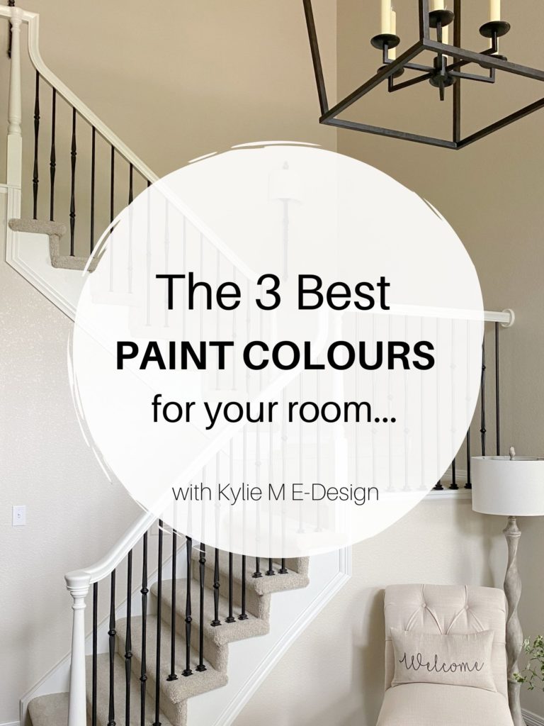
Are Beige & Tan Paint Colors Trendy for 2026?
Are your favorite warm neutrals in style? Let’s find out…
Guess who’s back…back again. Well, it ain’t Slim Shady (dating myself as a 90s child/Eminem lover). In fact, ‘shady’ is gone, with shades of gray almost entirely replaced by warmer paint colors.
That’s right – beige is BACK, baby! But don’t put on your beige granny panties and nude nylons quite yet, as not all beiges are created equal. And while we may not have many beige Colors of the Year (and probably won’t, as brands tend to get WAY too creative with their choices), beige and tan are still coming in hot.

But regardless of trends, you need to live in colors that you and your home are comfortable in. And if that happens to be gray, beige, cream, or smokin’ hot red, then I say you should fill your little boots with the color you love (while keeping resale in mind, if needed).
*Updated with new and relevant content and images for 2026

How do I know the trends are shifting away from gray and into the warmer end of things?
Heck, I’m no trendsetter unless you’re into Mom-bum jeans and boxed wine, but in keeping track of my thousands of Online Paint Color consultations, I’ve seen a big shift in the last few years.
Paint Color Review of Benjamin Moore Natural Wicker
DOES THIS MEAN BEIGE & TAN ARE POPULAR FOR 2026?
Yes, 1000% times, yes. Beige and tan paint colors are definitely trendy for 2026 – in a big way.
Are you nervous about the golden beige and builder beige of the early 2000s? Don’t be.
Not every gray was popular in the previous five to ten years, and not every type of beige will be popular either.
Today’s best beige paint colors are lighter and less rich than this.
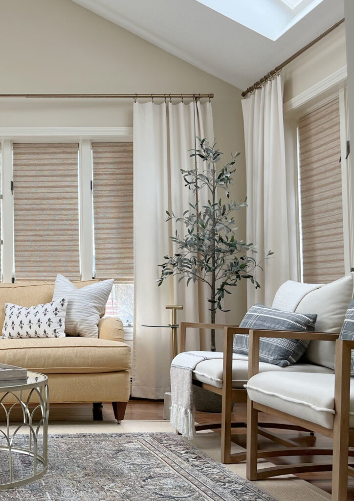
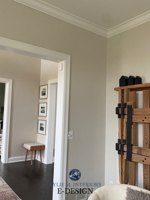
In the above photo, while the paint color is well-coordinated with the beige tile floor, notice how the homeowner’s personal tastes lean toward a more moderate, slightly more muted cream and tan vibe. The above beige isn’t trendy (yet).
The coming beige and tan-inspired trends will involve modern versions that suit your home’s finishes and UPdating them rather than BACKdating them (which is the fear of many Tuscan-style homeowners).
Paint Color Ideas to Update Your 2000s Home.

This said, even those who dabble in the slightly darker beige and tan world (which is trendy in some circles) surround them with more updated, modern finishes, separating them from the Mediterranean/Tuscan-vibe finishes of the early 2000s.
Don’t worry; sponge painting isn’t coming back anytime soon (hopefully never).

Ideas to Update Your Staircase
DOES THIS MEAN YOUR MEDITERRANEAN-STYLE/BEIGE HOME IS BACK IN STYLE?
Ermmmm, no.
All of you Tuscan homeowners who are desperately trying to get your homes out of the early 2000s, keep trying (check out this 6-PART UPDATE SERIES).
Why?
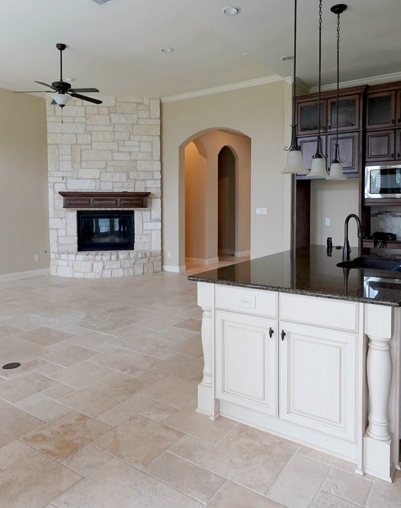
Remember, just because it isn’t TRENDY doesn’t mean you can’t personally love it! There are many parts of the above room that I love!
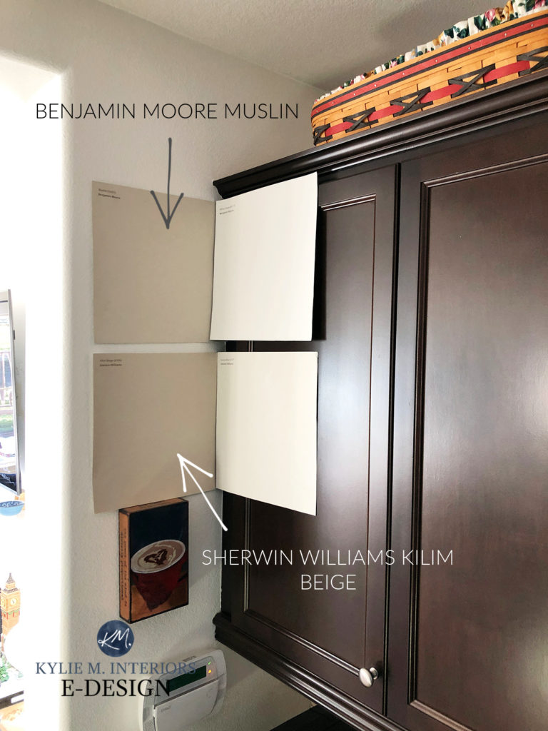
The beige and tan paint colors found in 2000s homes aren’t as popular. I’m talking about the rich, golden warmth of Sherwin Williams Nomadic Desert, Benjamin Moore Lenox Tan, and the likes – these aren’t the up-and-coming ‘modern beige and tan paint colors‘ (although Kilim Beige is winking at us pretty provocatively). Many new beige color trends are more moderate in their approach.
You’ll find it much easier to transition your 2000s, beige-inspired home into these MODERN beiges (or greige or taupe) than trying to squeeze it into gray.

People see how pretty beige can be when it’s done correctly. And what is the right way? Well, that’s subjective, but if you ask me (which is always a good idea), today’s beige is more versatile and flexible than its more golden counterparts of yesteryear.

The Best Off-White Paint Colors for Cabinets
So, let’s look at some of the beige and tan paint colors that will be in style in the coming years.
For a full report and review of these colors, check out this blog post.
POPULAR BEIGE & TAN PAINT COLORS FOR 2026
While a few more might pop up throughout the year, these are some of the best beige paint colors to sample and compare…
SHERWIN WILLIAMS ACCESSIBLE BEIGE 7036
While its popularity is waning, Accessible Beige is still showing up at the party with tassels on – and not just on walls and exteriors, but cabinets and doors/trims too.
Sherwin Williams Accessible Beige Review
SHERWIN WILLIAMS MODERATE WHITE 6140
Moderate White is a gorgeous, light, flexible beige. Its approach to warmth is great for the average home, as long as its finishes suit beige.

Sherwin Williams Moderate White Color Review
SHERWIN WILLIAMS NATURAL TAN 7567
As far as tan paint colors go, Natural Tan is my favorite. With the most subtle undertones and an uber-subdued approach to warmth, it’s a gooder.
Sherwin Williams Natural Tan Color Review
SHERWIN WILLIAMS NATURAL LINEN 9109
If you want a relatively ‘safe’ approach to beige, Natural Linen is a great place to start. With a muted, but present warmth, it’s a great color for a range of rooms.
Sherwin Williams Natural Linen Color Review
BENJAMIN MOORE MANCHESTER TAN HC-81
Manchester Tan is one of Benjamin Moore’s most classic, timeless shades of tan. While I don’t love it as much as Sherwin Williams Natural Tan, it could be JUST the color for you!
Benjamin Moore Manchester Tan Review
BENJAMIN MOORE MUSLIN OC-12
Along with Sherwin Williams Natural Linen, Muslin is one of the best light, flexible beige paint colors. With a reasonably well-balanced orange undertone, Muslin’s approach is easy to fall in love with.
Get the best paint color advice
Check out my ONLINE PAINT COLOR CONSULTING PACKAGES


I’ve always loved your blog, but beige? Omg, those walls look so outdated! When we bought our house last year, we couldn’t wait to get rid of the brown (beige) walls!
So happy to see a new blog posting from you! I am definitely not a beige fan but as always your posts are enlightening and entertaining. Last year I agonized over paint color but while in the throes of agony you taught me a lot about undertones and that dang LRV. I had to get rid of the yellowish antique white in my living room/halls/entry. After months and trial with that highly recommended griege that looked like mud in my rooms, I got brave and went with SW Sea Salt. I LOVE it, it looks great with my bold southwest artwork, furniture and it gives me so much pleasure. Just purchased an area rug called Alpine Multi and my living room is now my happy place.
Isn’t SW Sea Salt the best?!! So refreshing and crisp, delicious and comforting. It’s taken a while to find just the right accessories and decorations, but it’s so worth it.
I used it in my bedroom and loved it at first but now I’m feeling it a bit cold. I tend to gravitate towards warmer colours so I’m currently looking for the right cream that isn’t too yellow and has no green undertones. Samples Samples and more samples.
Sea Salt is like a breath of fresh air. I LOVE it in my dining, living and sunrooms. I do believe I will be with this color for life. I also love SW Rainwashed, it’s slightly bluer. I have it in one bedroom and bathroom.
YES, these are gorgeous cool colours and are so fantastic for bedrooms and bathrooms!
Great post, as always. How close is wool skein to Revere Pewter or maybe Edgecomb gray, which Younghouselove used to paint their entry and announced as a great beige!! Some of these seem like, you say tomato and I say tomato…well…pronounce one differently…haha.
My two favorite “greige” paints!
I have to agree Tanya. It maybe more about the change in undertones? That’s a question for Kylie. We went with a nice safe Edgcomb Gray with Revere Pewter (darkened 50%) scattered about and are very happy. We needed that green undertone with our cold northern exposure.
It’s so true! Sometimes it’s the tweak in undertones that takes you from ‘ummmm, something isn’t QUITE right here’ to ‘IT’S THE BEST COLOUR EVERRRRR’!
Hi Kylie! I did a color consultation with you last year for our new beach house. I wanted a beige (Wool Skein) for my open kitchen/living area. You advised against the color due to the green tint. I’m a hard head and used Wool Skein. Check out my blog post to see how it turned out. https://tammypstafford.blogspot.com/2018/07/our-beach-house-kitchen.html
I’m not too hard-headed to say “You were right!” though.
We moved into our house in Mexico Beach, FL in May 2018. Hurricane Michael arrived October 2018. Thankfully, our house had minor damage compared to everyone in our little beach town. Here’s the thing. After repairing the damage, I get a second chance at this beige color thing as the living/kitchen area got new sheet rock which means new paint. I’m leaning toward Canvas Tan. I want a true beige but light and airy without any undertones of green or gold or pink (you get the idea). Thanks for your yea or nay!
Porter Paint, “Grey Beige” ….. Very nice alternative. It’s a clean color without strong undertones.
I was selling my house and was quite firm that I needed the most neutral of neutral colors as I could find, (as little obvious undertone as possible). That’s because the house had some very conflicting lighting exposures on the south, west and north sides of the home.
After painting 12 shades of “light neutral” colors on the wall and letting them sit for about a month to see how they looked and felt in all kinds of weather & lighting (day and night), I finally selected Sherwin-Williams’ SW 7568, Neutral Ground.
I held my breath while the painter painted the entire interior in this color and I was not disappointed! This was an ideal paint color. I can tell you that every Realtor that walked through that house wanted to know what paint color it was because they were going to start recommending it to many of their sellers. It does not seem to reflect any other colors into the room. It is not a “white”, per se. I liked that it looked great regardless of whether it was viewed in artificial light, bright daylight, near windows or in corners. It was just perfect. I compared it to Canvas Tan, the paint color you liked, and they have a lot of similarities but I think I would enjoy Neutral Ground more because the LRV is higher. It felt more cheerful to me. But you might want a more cosy feel.
Canvas Tan has this combination of LVR/and R-G-B: R:220, G:209, B:191 with an LVR of 64.
Neutral Ground is: R:226, G:218, B:202 with an LRV of 70
Wahoo, I LOVE this type of feedback, Robbin, THANK YOU! Now I need to do a review of it!
I’ve used Wool Skein throughout my house and love it! It does not look dated at all and is a perfect backdrop to our interpretation of modern farmhouse style, especially when used with a crisp white trim color.
That’s what I love to hear, thank you Karla!
Hello & thank you for sharing your amazing knowledge.
How would you recommend for painting a kitchen/great room with bold flooring, such as terra cotta colored saltillo tiles? The previous homeowner used a yellowish tan, but I would like something more fresh and modern. Any suggestions?
The room faces NE but I live in Scottsdale AZ so we do have a lot of windows and a LOT of sun. The kitchen is modern with warm walnut cabinets, gray glass backsplash, tan quarts with gray specks.
Hi Elizabeth! When it comes to personal questions I DO have to refer to my E-design, otherwise I’m TOTALly guessing on the actual colour of your cabinets and the tan/gray of your quartz which will have it’s own undertones and needs aside from the flooring! https://www.kylieminteriors.ca/online-decorating-design-services/
~Kylie
Found you while I was trying to find a color to paint a rental home. After all of your reviews we choose canvas tan with alabaster trim and doors. I think it is very pretty and the home rented in 3 days so someone else liked it too. Thank you for sharing all of your knowledge. I had never thought about LRV before. Just painted my office in my home in Tradewind. Looks so beautiful with my white furniture and vintage accessories. Thank you again.
HI Kylie! Just watched your video on White Duck I think I really like this color. Would it look yellow in a South facing Living room, it only has 2 windows. I am so over yellow! I like soft but clean looks not dull and dingy. I also wanted to use complementary SW Natural Choice (which I think is a tad darker) in my kitchen which has off white creamy cabinets with a very faint glaze. thoughts???
thanks so much
I have several pieces of furniture that are gray. My open concept has a dining room with a huge china cabinet and the table and chairs all gray. The sofa and tv cabinet in the attached living room also gray. So naturally beige is a great contrast. I already used Revere Pewter in my open concept kitchen family room. So, going in the beige direction in the living/dining rooms makes more sense to me. I am so glad I found your blog. Thank you for sharing your insights. I hope I choose well. If not, I will be calling you. 😉
Hi Jennifer, thank you for the note! Yes, I hope you nailed it, but if not, I’m here!
Thanks Kylie—gray is not for every house or homeowner. Today’s greiges and beiges are leaps ahead of the pinky toned beige my parents had on their walls. My kitchen is stuck with golden oak cabinets for the time being and gray/greige really made them look more orange. The only way to lighten up my kitchen and get it out of the early 2000’s without making the cabinets stick out like a sore thumb was to use beige or off white (painting the cabinets would be like a band-aid on a head wound–insufficient and a waste of time and money). SW Macadamia lightened 50% (thank you Kylie!) did the trick–cream and off white just didn’t play well with the granite. This color has transformed the kitchen, works well with the perfect greige in the family room, and can buy us some time while we prepare (i.e. sell a kidney on the black market) for an entire kitchen remodel. It looks warm yet fresh. I even used this color on the top have of the adjoining dining room and love it.
Hi Kylie,
I am looking for a beige to use in the office room. It is a north facing room but with 2 windows. What would you recommend?
Best
Virginie
Oh my! I just covered up my Manchester Tan I have had a few years with a more “greige” Edgewood Grey. I wanted at add blues and the new paint looked best with the denim navy blues! Glad to see I am on trend! In my FL home it wax repose gray and I loved that too! But I ca. see where gray is going out.
You are SO all good with Edgecomb, right now, it’s one of the IT colours – and as long as YOU love it, that’s what really matters :).
I went kicking and screaming from a Linen or Antique White to a Greige. So glad I went with Edgecomb Gray vs. a cool grey for main living areas and hallway. I never did buy into the all gray house. It feels impersonal – perhaps a result of my decades working in offices painted cool tones. I think Edgecomb Gray has offered the best of both worlds and is easy to transition to other colors in adjacent rooms. I like it best in a sunny room where it looks more tan.
I’m SUCH a huge fan of Edgecomb too 🙂
In our most recent remodel I struggled with the gray blues (literally and figuratively). Eventually settled on Edgecomb Gray with Revere Pewter Doors with Urbane Bronze for stairway, fireplace, and front door/sidelights. We just listed our house, and we will not go back to the beige/cool gray era but greige will definitely stay in our color palette, specifically Edgecomb Gray, it is so versatile and simply beautiful. Kylie was awesome in helping us decide.
I just LOVE this palette and have the same one in my own home! I think Edgecomb Gray is such a GREAT place to start when you don’t know whether to land warm or cool! Thanks for the comment 😉
Love your style! Painting my whole house BM Stonehouse with BM Timid White trim. Looking to maybe kick things up a notch with a darker color tray ceiling in the family room and a moody color to compliment in the Powder room. Any ideas?
Painter coming in 5 days!!!
Hi Lisa, my Mom had Stone House in her last home and I LOOOOOVED it so much, I’m glad to hear you love it too! Having visited her home MANY TIMES and helping her decorate (she’s got great style) we discovered that a warm violet undertone is one of THE PRETTIEST complements to Stone House (and a darker green can be stunning too). Off the top of my head, check out colours like BM Sharkskin, Taos Taupe, CROMWELL GRAY, maaaybe BM Metropolis (compare them to BM Jet Black to get a better frame of reference for their ACTUAL depth, otherwise they can seem intimidating)- check those out and see how they feel :). At least they’re a place to start!
Hi Kylie, I love reading your blog. I have SW antique white trim EVERYWHERE and looking to update the walls (from SW Camelback). I love beige but want to tone down the gold and yellow undertones. Any suggestions? Debating Shiitake. I’d love Accessible Beige but it’ll fight with my trim. Thanks!
Okay Charlita, I’m actually writing a blog post about this exact thing RIGHT NOW, like I literally just took a break to check the comments. I’m HOPING to have it out by Friday!!!
Kylie, I assume the same trend away from gray applies to carpet too? Unfortunately I carpeted two rooms in gray earlier this year, oops. For best resale appeal, should I go more cream, off-white, or griege?
Hi Kathy, while I think carpet will have a bit more lifetime, yes, going forward, I would lean into something more flexible like a greige 🙂
Hi Kylie,
We just painted our master bedroom SW Natural Linen with SW Pure White trim after I saw one of your videos. I love it so much that I’m thinking about painting my whole house the same colors. Would SW Natural Linen be too light for the rest of my home? I am trying to lighten things up since we have golden beige walls that I despise. I know that the natural light in each room can change how the color looks so I am testing it out first. I just wasn’t sure if this color would be too light for a living room, kitchen, den, or office. Also, if I wanted to add some color in my laundry room and bathrooms, what colors go nicely with SW Natural Linen? I was thinking something blue, but would that be too cool? Thank you in advance!
Kylie,
I noticed that BM Manchester Tan is on your list of popular beige and tan paint colors, but BM Grant Beige is not. What are your thoughts on Grant Beige in 2022?
Thanks!
Hi, I was going to paint my almond bathroom grey as your blog on almond bathrooms suggested. Now that grey is going out, what beige, greige or taupe goes with almond fixtures. Are you updating blog on almond fixtures?