
The Best Paint Colors for West Facing Rooms
How to Choose the Best Color With Western Exposure
Just when you’ve finally picked your favorite paint color, you’re excited and ready to run to the paint store—the sun moves (well, technically, the earth moves, but let’s not get into those little details). Oh, the glory of exposure.
However, exposure is one of the most important considerations when picking a paint color. Not only do you need to consider the size of your room, your countertop, flooring, furnishings, and the color of your underwear, but you also need to figure out how the sun (or lack thereof) can affect your paint color.
By the way, the beginning of this blog post is INFO HEAVY. It’s no use looking at pretty colors if you don’t understand your room and its needs, so humor me on this little journey (in other words, break out the box o’ wine; we’re in this for the long haul).
And seeing as I’ve covered north, south, and east-facing rooms, I figure it only makes sense to talk about west-facing rooms as well—so here we go!
HOW WEST-FACING LIGHT AFFECTS PAINT COLORS
In the wee morning hours, when Kylie is just waking up, pouring a coffee with Baileys, and starting her day, west-facing rooms begin their day with pretty drab, flat natural light.
That’s right, in the morning, rooms with western exposure can look a little shady. However, there’s a difference between shadowed and shady. You get shadowed when the sun shines, cutting the light and creating sharper edges. Shady is when you pour me a 6oz instead of a 9oz. Oh, and when a room is a little bit more gray-toned and subdued because there isn’t a lot of light coming in.
Paint colors can look a little dull and flat in western morning light.

This said, if your room gets really good natural light, there are many neutrals (both warm and cold) that can look great.
At noon, the sun is at its peak and brightest/whitest. This light tends to wash out colors the most. It’s also when there’s a little light at the end of the tunnel (pun intended) for west-facing rooms as those sun rays start tickling their edges.
Around midday, west-facing light can wash paint colors out.

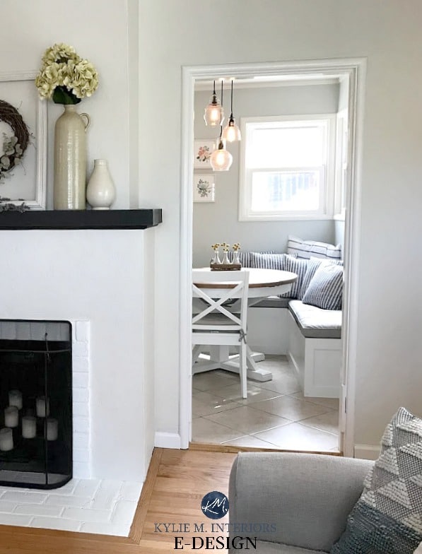
As the sun starts going down (Elton John style), it starts warming up a west-facing room – adding light and a warm, bright, golden glow. This is similar to what you get in south-facing rooms.
This is the same wall space as a previously shown photo. See how the afternoon light warms it up and brings it to life compared to the morning shot?
Once you hit the early afternoon hours, you’ll notice warm sunshine coming in your windows.
The sun is at its most red/warm in the late afternoon and casts the warmest light on a west-facing room. Not that your walls will be tinted pink (well, in a glorious sunset, they might be), but in general, it just casts a significantly warmer (think golden type of warm) light on a room.
A west-facing room can look positively TOASTY in the later afternoon if it’s not the right color.

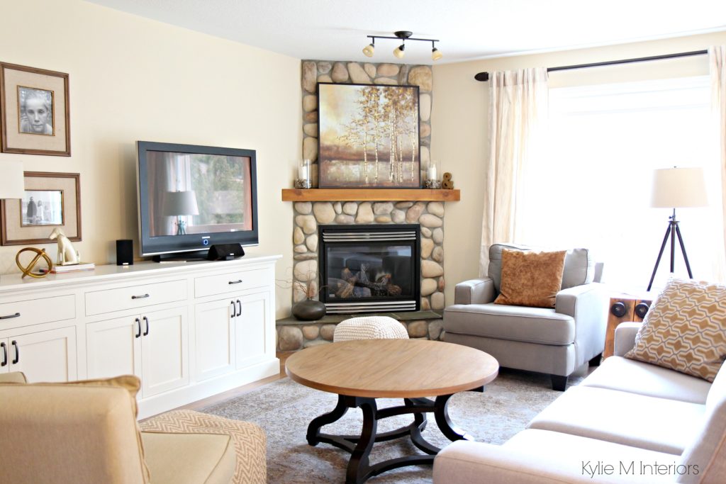
This room has the perfect balance of light and color.
WHEN THE SUN GOES DOWN…
It’s dark. Nuff said.
That covers the basics. Now you need to know what to do with that information, so let’s get into the guts n’ the glory.
IF YOU USE YOUR WEST-FACING ROOM MOSTLY IN THE MORNING
For you morning dwellers, you must humor your room’s flattest time of day. In this case…
- You may want to choose warmer-toned colors. These colors might resemble what you’d look at for a north-facing room, as they can help balance that flatter, grayer morning light.
- However, overly rich, warm colors become gloriously warm in the later afternoon light. If this your jam, fill yer’ little boots, but if you live in a really warm part of the world, this could be overwhelming as not only is the air warm, but so are the visuals of the room. On the other hand, if you live in areas that get a lil’ chilly (hellooooo Alaska!), you might appreciate the inviting warmth of a more saturated, rich, warm paint color.
- You can also look at cool colors if they have a bit more ‘color’ and less gray. The increased color can help balance out the gray light in the morning hours.
- If your room gets good natural light, don’t be afraid of neutral paint colors and supplement your flatter light with interior lighting and texture.

IF YOU USE YOUR WEST-FACING ROOM MOSTLY IN THE AFTERNOON
In the morning, you might have a more shaded, muted room. However, in the afternoon, HALLELUJAH, LET THE SUN SHINE IN! That’s right—seeing as the sun rises in the east and sets in the west, mid-afternoon and early evening are good times to be in a west-facing room.
- You may want to use cooler-toned colors, like blue, green, and purple (or neutrals with these undertones).
- If you prefer warm paint colors, consider ones with a grounded or grayed-out, neutral base that calms them.
Does this mean you completely ignore the other half of the day? No. You just don’t give it priority. And while you may love a color in the morning light, but not the afternoon, as long as it’s ‘okay’ and doesn’t look completely bugly, it might just be a good choice – sometimes you can’t satisfy every aspect with one magical color.
‘But Kylie, what if I’m in the room in the morning and the afternoon?’
Then, one particular time of day usually calls the shots, so let’s go to step 2.
STEP 2: LIGHTING IS YOUR FRIEND
Knowing that sometimes there isn’t a color you love 100% of the time, use lighting as a supplement. Because west-facing afternoon light is SO intense, it’s usually the best time to cater to this time of day (if you spend all day in this room). However, your walls might look flat or drab in the morning. To help things along, play with the Kelvins of your light bulbs to get the look you want in the morning hours (I’d try 2700-3000K). You might also make sure that your lamp shades (either glass or fabric) or offering the temperature/type of light you want.

While they say that ‘daylight’ bulbs best mimic natural daylight, I find they only mimic the sunlight at its peak (whitest). This isn’t always a ‘liveable light’ for what we’re used to with our old-school bulbs. I would opt for a warm bulb over a daylight bulb in a shaded space.
In the afternoon, light control via window coverings is key. Consider light-filtering blinds (e.g., cellular blinds) or drapes that allow light through while reducing intensity.
WE’RE ALMOST AT THE COLORS! But first…

When I’ve discussed the best paint colors for north—and south-facing rooms, it’s easier to identify good color options as the light is more predictable throughout the day. However, with west-facing rooms having a Dr. Jekyll and Mr. Hyde complex, it isn’t as clear-cut, and there is no exact recipe. However, I’ve come up with some pretty ideas.
And I know that is a ton of info – eight hours of specific research, three bottles of wine (and 22+ years of experience) on my end – it’s a lot to take in (wine included). So, you can take that all into consideration or take a deep breath, totally ignore me (Tim has an uncanny knack for this), and just check out the pretty colors shown below.
WARM PAINT COLOR IDEAS FOR WEST-FACING ROOMS
A few notes on these warmer shades…
- I’ve chosen them because they add visual warmth without too much gold or intensity. This means your room might still look soft and inviting in the morning (some colors moreso than others) without looking fluorescent in the late afternoon sunshine!
- West-facing rooms with additional north-facing windows will benefit from the warmth of these colors. And while the north-facing light will further enhance the gray morning light, it will also help to soften the warm afternoon light.
- If you have south-western light, most of these colors will hold up in the afternoon, but be aware – they’ll ONLY look warmer!
1. SHERWIN WILLIAMS NATURAL TAN 7567
Natural Tan is a natural beauty and is well-built for afternoon western sunshine. While your room won’t look toasty warm in the morning, Natural Tan has a passive warmth as long as you get enough natural light. If your room is west-facing and a bit dark, a color like Natural Tan will have a tough time (I might even recommend looking at the best colors for dark rooms rather than those for west-facing light).
My FULL Paint Color Review of Sherwin Williams Natural Tan
2. SHERWIN WILLIAMS NATURAL LINEN 9109
Natural Linen is one of my favorite choices for almost any room! If you want a noticeable but not remotely overwhelming beige, it’s a stunner. Natural Linen is warmer looking than Natural Tan and has a bit more of an orange backdrop. Again, it’ll warm up in the afternoon but shouldn’t go too far (knowing that the late afternoon western sun will add warmth to almost any well-intentioned color).

My FULL Paint Color Review of Sherwin Williams Natural Linen
3. BENJAMIN MOORE BALLET WHITE OC-9
While many lean toward the more muted look of Sherwin Williams White Duck and Shoji White (both of which are amazing), I often like Ballet White for a west-facing room.
Why?
Ballet White is warmer and more purposeful than the other two, offering a creamy backdrop without too much yellow or gold. White Duck and Shoji White can be gorgeous but might be a bit TOO flat in the morning.

Learn more about Ballet White & see more photos!
4. BENJAMIN MOORE GENTLE CREAM OC-96
I’ve been using Gentle Cream for many years in my homes with various exposures. Gentle Cream is a heavy cream that is a great way to add warmth to a room without entering the darker golden-beige end. If you love cream paint colors (which means you like yellow) but are nervous about too much warmth, Gentle Cream can be a great place to start. If it’s too warm, adjust from there to a more muted shade, perhaps an off-white.

This said, even though it’s a muted, darker shade of cream, it will pick up considerably more warmth in the later afternoon. Make sure you love what you see!
Paint Color Review of Benjamin Moore Gentle Cream
5. SHERWIN WILLIAMS ALABASTER
If you love white, Alabaster could be white up your alley. This soft, warm shade of white has a creamy backdrop that helps add softness to flat morning western light. While it will pick up more warmth in the late afternoon, so will ANY shade of well-intentioned white.

Learn about Alabaster and see its PHOTOS here!
6. BENJAMIN MOORE MUSLIN OC-12
Muslin is a well-balanced shade of beige that offers subtle warmth for the morning hours without too much gold in the later afternoon.

Muslin has a bit more meat on its bones than Sherwin Williams Natural Linen, but both are worth comparing. I’d also check out the colors in my CURATED BEIGE COLOR BUNDLE.
My FULL Paint Color Review of Muslin
THE BEST COOL OR NEUTRAL PAINT COLORS FOR WEST-FACING ROOMS
A few notes on these color ideas…
- West-facing rooms used mostly in the afternoon will suit these cooler tones (as long as you LIKE cool colors!). The coolness will help to balance off some of those warm rays. Pay attention to blue tones, as some can mix with the warm (yellowish) rays coming in and cast a vague green tint on the walls (but still be quite beautiful)!
- If you have west-facing rooms that also have south-facing windows. These rooms will be even warmer in the afternoon, and again, these cool colors can help to balance that light.
- In the morning, these colors might look a tit bit nipply and flat, in which case, adding a bit more ‘color’ vs more ‘gray’ is a great way to bring things back to life.

7. SHERWIN WILLIAMS SILVER STRAND 7057
Silver Strand is a subtle approach to color. It’s a blue-green-gray blend, but it’s heavy on the gray and more subtle on the blue-green while still leaving some decent color on the table (er, walls). It will look a bit flatter on the morning light but will balance the afternoon light out while keeping a more passive look.
Now, not everyone would put a color like Silver Strand with a wood stain like the one shown below. This wood is gray-washed and has a purple-pink hue. Silver Strand contrasts this wood. Others prefer to lean into a wood like this with a color like Abalone (coming up shortly).
Paint Color Review of Sherwin Williams Silver Strand
8. BENJAMIN MOORE WOODLAWN BLUE HC-147
Woodlawn Blue is touch-and-go as it might fall slightly cool in the morning, but man, is it pretty. It’s blue with a passive gray and a green touch to soften it. Some blue-purples can look a bit too cold in morning light, whereas blues with a touch of green often have a gentler, more inviting look (although that can be open to perception, for sure).
As shown in this next photo, Woodlawn Blue is a great choice for a charming guest bedroom…
The Best Blue Green Blend Paint Colors
9. SHERWIN WILLIAMS AUSTERE GRAY 6184
Austere Gray is awesome for all you green lovers. While it covers its bases with color, it’s super muted by a gray backdrop. As for depth, Austere Gray has an LRV of 51, so it’s a bit darker than most of the others on this page, but if you have adequate natural light it could be the perfect color choice.

Austere Gray is one of my favorite shades in my Best Sage Green-Inspired Paint Colors blog post. If you love this look, check that out (but finish reading this one first!).
10. SHERWIN WILLIAMS SEA SALT 6204
Sea Salt is a hugely popular green-gray. But don’t be fooled—while it has green-gray roots, it often grabs blue—it’s a sneaky hue!

My FULL Paint Color Review of Sherwin Williams Sea Salt
Sea Salt is definitely one of Sherwin Williams most popular paint colors (non-neutral), especially for bedrooms and bathrooms. While it’s a bit strong to paint in EVERY room in your home, it’s a great accent to other neutrals and subtle colors.
I’m also a huge fan of Sherwin Williams Comfort Gray, a light-medium (slightly darker) take on Sea Salt.
11. SHERWIN WILLIAMS RAINWASHED
Rainwashed is so stinkin’ gorgeous. While it’s related to Sea Salt, Rainwashed has less gray (it’s more color-forward) and a bit more of a solid blue-green blend. With its LRV of 59, Rainwashed is on the slightly darker end of the light range.
Aside from exposure, look at how beautiful Rainwashed looks on this shiplap accent wall—it’s a wicked pretty contrast to the pink-stained (whitewashed) wood ceiling.

See more photos of Rainwashed in action!
12. BENJAMIN MOORE ABALONE 2108-60
If you love purple undertones, Abalone is badass and beautiful. With its purple-mauve undertone, Abalone has enough undertone to show up at the party in the morning without giving you overly colorful walls at any time of day.
Abalone has an LRV of 61.99, so it’s in the light range, but has a bit more depth than a standard shade.
Learn more about Abalone HERE!
Abalone is especially beautiful with wood stains that have a red undertone. However, it can humor almost any wood stain you throw at it.
DOES YOUR ROOM HAVE BOTH SOUTH-WEST, NORTH-WEST, OR EAST-WEST FACING LIGHT?
While it might seem confusing, having dual exposures isn’t bad when you’re armed with the right information! Check out this blog post on ‘how to pick paint colors when you have two exposures‘.
INTERIOR FURNISHINGS & HARD FINISHES
As I’ve mentioned, you have to consider more than just your exposure (indecent or otherwise) when picking the best paint color. If this info doesn’t get you well on your way, check out my e-design—it’s pretty darn fun!
READ MORE
The Best Paint Colors for an East-Facing Room
The Best Colors for a North-Facing Room
The Best Colors for a South-Facing Room
The 8 Best Blue and Green Paint Colors
Need help?
Check out my Online Color Consulting Services


Initially written in 2017, AWESOMELY updated in 2024


Oh, mine is a saga about my (north) west facing Master bedroom…a room you want to look good morning and night, and if you are me who works at home and moves through the room during the day, you want it to look good then too! We painted it at one time Malted Milk by Behr or Sherwin Williams and the color was so beautiful in a room at my mom’s but I hated it immediately. It looked too antique-y yellow-ish cream for my tastes (I swear it was just a nice warm creamyat my mom’s!). It stayed too long and I agree, was hot hot hot in the afternoon! Then, I chose BM Wedgewood Gray. I have to say that color did the west facing feature justice (and could be on your list I think), but I realized immediately I’m not a blue person (except for more arts and craft type blues…or maybe navy). Anyway, I went back and bought Gray Owl as a sample, and yes, it was too cool. I tried everything!! And somewhere along the line ended up with Repose Gray (SW). I must have looked at my sample a lot during the day b/c I love the taupe-ish undertone it gets during the day. (And yes…I poured over and over your blog and your various pictures of different paint at different times.) The problem I have is that in the morning it’s too cool for my taste, it gets almost a black-ish brown undertone at night and a cool green undertone when the lights are out during the day and it isn’t midday. I think I went too intellectual to be honest…thought Repose Gray was a “cool” color…it’s on all the blogs! Lol!! Anyway, I’m trying to decorate around it with colors that work with Repose Gray but warm it up. Again, I sure wish I had read this sooner and picked from your colors, or could just hire you to choose!! Next time I promise!!
I’m happy to help – you just holler!!! Thanks for sharing your story 😉
I admit, Kylie, I would love to hire you to choose, but I get very controlling about these choices and I’m worried that if I hire someone, I’ll feel forced to choose something I don’t want. Maybe in a future blog post you could show us pictures of a consult and what you did to help the person. I do think I am enticed by the idea of a color consultation, but a bit intimidated, too. Maybe others feel this way, too.
Hi Tanya, I totally get it. One of the cool things that I say to clients is that I’m just giving them suggestions, they are actually CHOOSING the colour. I always give 3 (and sometimes 4-5) suggestions and I explain how they might work. From there, you get to choose which one is your fave. I think it’s far more empowering and can give you that sense of pride, knowing that you chose it. There are thousands upon thousands of paint colours out there, my job is to show you some that suit your room and tie those into your personal preferences, and you get to take it from there!
And you are right, I should show an ‘actual colour consult’ as I send it, it’s pretty cool and I hope you decide to give it a try some day!
~Kylie
Hi Kylie. I really find your posts informative and have been thinking about our colours. I am torn about the beautiful solid oak wood throughout my home. I have large vaulted rooms and expansive windows from north to west, so options are limitless.. I am trying to decide if I should paint my solid oak raised panel doors white or darken them with dark brown stain/paint? Currently they are medium brown and wood floors are honey oak. This will then drive the colour of my walls. What do u suggest?
Hi Cindy! When it comes to personal questions I REALLY REALLY need to see photos, otherwise I’m just guessing (which is I refer people to my e-design). My best guess is that you’ll want to paint them as staining them darker will make them even more high contrast with your wood flooring and could be a bit mix n’ match…
Hope that helps!
I have a west facing room that gets a ton of sun light in the afternoon, and is a bit drabish otherwise. I have picked
Lenox Tan to use as a wall color. I am having a hard time picking out a ceiling white. I don’t want a bright white, but I can’t decide on a hue of white to use. I use Benjamin Moore paint. Any tips for me? I like Simply White and White Dove, but what’s your thoughts? Thanks, Jody
Hi Jody! With Lenox Tan, I might lean the most toward Cloud White which has a bit more warmth than White Dove, but isn’t quite as clean/bright as Simply White…hope that helps!
Hey Kylie. I will be painting my kitchen cabinets Simply White instead of Alabaster. I am wanting to paint this room which have windows on the west side which gets more afternoon light. I would like a gray with no pink or purple undertone. I will be painting. My living room which is pretty much open except for one small petition. My living room gets morning light and has a window facing east. Do you have an opinion on a gray. I really would like to lighten these 2 rooms.
Thank You????
What about when you have a room that has windows on the West, South, and East?
Hi Johannah! I would be inclined to focus the most on the strong one, the southern one (which would be the same if it were North, West, East) as the East/West change so much through the day and can even balance each other out a bit depending on where the windows are/how much foliage there/how big the windows are, etc…
East and west facing combined room with more light in the west\afternoon (dining and small galley kitchen side. Agreeable grey, you’ve got me so hooked on the idea of this color to replace our current we latte (I also commented on another entry over this), would agreeable grey fall short or become washed out or muddy? I think I’ve read every post on paint brsides north\south. Facing rooms as we don’t have a single one of those (boooo).
I completely admire amd am thankful for your blog and your videos! Thank you!
What yellow neutral goes well with Wet Concrete?
Welll, not many. Yellow based neutrals and Wet Concrete can be a bit much together…
Wanting to paint my west facing living room a warm white, I have pecan wood ceiling and floor
Hi Debra, I do try to give as much complimentary info on my blog as possible and if that doesn’t work it might be time for a closer look! I have a fabulous E-design services that i created for questions like yours – its how I bring home the bacon! If you’re interested, the link is here… https://www.kylieminteriors.ca/online-decorating-design-services/
I also have several articles on my blog re: The Best White Paint Colours…
Hi Do you mean misted Green (Benjamin Moore 2138-50) or misted Fern (CC-668 / 482)?
thanks!
Oops, I mean Misted Green, thank you for catching that! It’s been fixed!
Hi! I’m waiting to see if you will post reply for a comment I submitted 1 week ago. Regarding your thoughts on sw white heron for wall color and Zurich white for trim? We are building a home and I picked this out with our designer. You seem to be an expert on lighting and I’ve been reading your blog for so long and wanted to get you insight on color. Have used it, ect?
Please see the previous email – it was more detailed.
Thank you!
Hi Shahla! Hi Jenny! Due to the number of emails I get every day, I have to pick ‘n choose which questions to answer, focusing first on the ones that have mass appeal! I do try to give as much complimentary info as I can on my blog and if that doesn’t help, it might be time for a closer look with my E-design. Otherwise, I’m just guessing as to the lighting in the room, exposure, flooring and all of the other things that matter when choosing a colour! https://www.kylieminteriors.ca/online-decorating-design-services/
AS you are a reader, I can take a QUICK look and let you know that…well, I’m glad I looked as personally, I wouldn’t put those 2 together. They aren’t terrible, but you might find that White Heron makes Zurich White look a touch purple/pink on comparison as the undertones don’t totally jibe with each other. I might hit SW Pure White with Zurich as while Pure White still has a weee tiny hit of warmth in it, it doesn’t react quite as much with Zurich 🙂
I hope that helps!
~Kylie
I have been seriously pouring over all your articles and links for nearly 3 days, trying to find the specific LRV range (i.e. between 50 – 60?) for a west facing bedroom. There are 3 small dormer windows in this room (which are darling!) but they do not contribute much in the way of any natural light pouring in. And although I’m well past the age of “I probably should know this by now”…….I’m clueless. ( Better late than never to the game right?) I’m looking for a neutral beige or greige or a subdued blue color (bleige?) for a fresh and clam “ahhh” feeling for my overnight guests. Right now it’s a deep brown-pink-purple color which looks like doo-doo. If you could suggest an LRV range it would be a good jumping off point to narrow things down a bit. If it helps, I currently bought the Pottery Barn Jacquard duvet in neutral. That alone will tell you that I don’t venture too far outside the lines!
BTW: I’m bummed you are no longer taking on clients due to your busy schedule. Bad for me …. but great for you!!
Keep up the good fight for those of us who are color challenged!
Hi Cindy! It’s true, I’m not taking on local clients (Nanaimo and area) but I do have my E-design open, it keeps me out of trouble! https://www.kylieminteriors.ca/online-decorating-design-services/
Hello. We have a west-facing living room and kitchen and are going to paint our oak trim. Would you recommend BM White Dove or SW Pure White for the trim? Will likely do a greige or a light color for the walls. Thank you.
Hi Shana! The trim colour can depend SOOO much on the backsplash/countertop as Pure White is almost ‘white’ and White Dove is warmer/softer. If you have clean whites in your backsplash/countertop you might choose Pure White. If you have soft warm whites/creams, you might find White Dove to be a better fit.
Hi Kylie,
I have been in love with SW Agreeable Gray for a few years now.
I have many clients that have it and I recommend it for people prepping to sell.
I just bought a sample and it looks like a pale lavender in my living room/kitchen/dining combo. 2 story great room.
West facing lots of windows and light.
I am disappointed because I thought it would be warmer and not purple/blue.
I now have BM Light Khaki and it is full on green all day and night.
I have never been happy with it because I thought it would be more neutral.
After looking at your videos I am going to try SW Accessible Beige.
What white color for trim and ceilings do you recommend if I go with this?
I was thinking Alabaster White but I am not sure.
Thanks for all your videos they are fantastic!
What about Neutral Ground or White Duck as neutrals?
What about for west facing exterior? My roof is gaf barkwood (nice neutral to warm brown depending on the time of day)
I have a West facing entryway and it was suggested that I paint it Linen White with Chantilly Lace for the trim. Will Linen White look too white or will the creaminess show through? Will there be enough contrast between the walls and the trim?
Oh, I do think the creaminess will show through! While it’s not a HIGH contrast combo by any means, there’s definitely a shift :). The only time you might miss it a bit is if your room is WAY overbright, in which case Linen White (and any lighter colour) will really wash out.
I have a hall bath that only has 1 small window facing West and I am struggling with the colors. Will Agreeable grey look too cool and too blue? Trim is extra white
Hi Rae, it’s hard for me to say without seeing the room and its finishes!
I’m wondering how you might handle using wall paint to help tone down or complement a feature in a room? I was lucky enough to get a custom built library in my home, but now regret my color choice of the shelves- SW Clary Sage. However, I’m determined to work with it because it would be too expensive and time consuming to re-paint.
It’s a western facing room and the bookcases consume half the room, with the rest of the room open wall ready to paint. I would like to choose a color that will make the green pop while toning down the yellow and blue of the Clary Sage. How can someone play with color to fix or complement a feature? Thanks!!
Hi Kylie. I would love to know the paint colour and brand for that beautiful yellow dining room. It looks like just what I’m looking for.
Hi Ellie, thank you for your note! Can you explain the photo a bit more, as I don’t see a yellow dining room :).
Kylie,
I rarely comment on blog posts, but I have spent SO MUCH TIME on your site and watching your videos so that this time when I repaint my house I won’t make the same mistakes I did last time (13 years ago) when I just went to the paint store and randomly picked out some “pretty colors” I liked. Many have actually worked well, but I messed up with white. NOW I know why!!! Thank you for teaching us:). And your sense of humor breaks up the geeky hard stuff that is slowly seeping into my brain. I hope in the future I can use you for a consult. We may be fixing up an Airbnb and I’m going for a more traditional look than I personally love, but it just goes with the house/neigborhood/etc. AGAIN-Thanks!!!!!
Oh, what a lovely comment to read this morning – thank you, Stacey!