
Benjamin Moore White Paint Colors: Which One is Right For Your Home?
If you’re looking for the best white paint color for your walls, trims, or kitchen cabinets, you’re likely overwhelmed at this point. If you’re not there yet, once you have 30 different shades of white slapped on your walls, are elbow-deep in a wine bottle, and are ready to toss said bottle at the wall, I’m sure you’ll jump on board the crazy train.
White doesn’t need to be hard. In fact, white paint colors are easy to choose once you narrow the hundreds down to a handful, which I’m doing with you today. That doesn’t guarantee you’ll know exactly which white is best for your room and its particular needs, but…
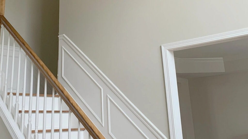
a) It’ll help you feel more confident when you sample and compare these whites in your home
b) It’ll also help you figure out which types of whites you DON’T want.
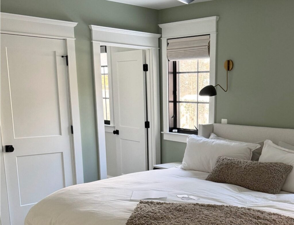
The Best Green-Gray Paint Colors
To get this party started, let’s take a quick look at the steps to choosing your best white paint color…
- Determine which white temperature best suits your space (warm, cool, or true). If you’re unsure, read this (later): The 5 Types of White Paint Colors.
- Decide whether you need a true, bright white, or soft white (based on LRV).
- Decide which undertone suits your home and its finishes.
- Choose 3-4 white options that meet the above needs, compare them, and then choose your favorite!
And if all else fails, you know where to find me.
STEP 1: CHOOSE YOUR TEMPERATURE
Once you decide on the temperature of white that suits your home, you narrow down your options.
DOES YOUR HOME SUIT COOL WHITE PAINT COLORS?
If your home suits cool whites, it might have…
- finishes in cool shades of blue, green, purple, or grays with those cool hues.
- white appliances
- standard white subway tile (as they come in true, cool, and warm)
- a finish with a cool white, not a warm one
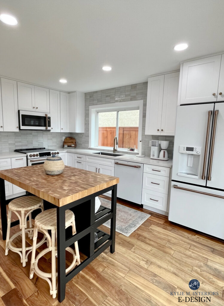
GE Cafe White Appliances definitely prefer cool whites
As you can see in this next kitchen, the modern farmhouse sink is a cool white and the cabinets are creamy and warm. Some are okay with this look; others aren’t – you do you!
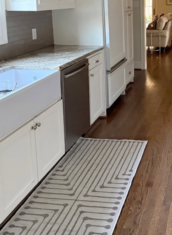
There’s more, of course, but that’s a tight lil’ shortlist.
DOES YOUR HOME SUIT WARM WHITE PAINT COLORS?
Most of today’s popular interior finishes look best with warm whites rather than true or cool whites. From there, it comes down to DEPTH, but we’ll get to that shortly.
If your home suits warm whites, it might have…
- finishes from the early 2000s
- beige, greige, taupe tiles, countertops, and carpets
- cream, and warm gray finishes
- a range of wall colors, varying in temperature and degree of color (chroma)
- warm woods like oak, maple, hickory, pine, and cherry (no graywashes)
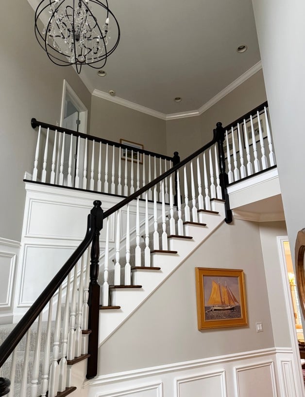
Oh, you might think this wall color is cool, but it’s a warm, stormy gray and it loves a warm white!
The best warm white paint colors, the ones that work in the average home, lean into a cream or yellow undertone.
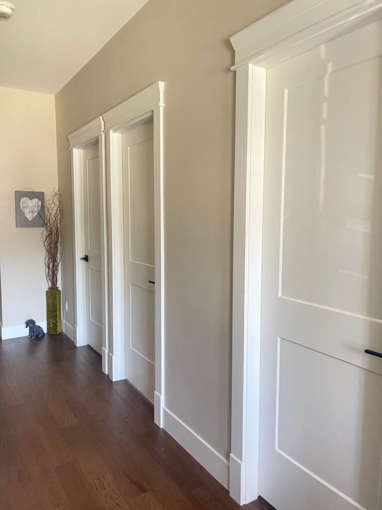
What if you want a warm white but don’t like yellow or cream?’
I hear this all the time from my Online Paint Color Consulting clients. If you don’t like yellow or cream but want a warm white, you’d better like pink, as that’s the only other option.
DOES YOUR HOME SUIT TRUE WHITE PAINT COLORS?
In between cool and warm whites are true whites. These whites are the brightest (highest LRV) and have little to no undertone. If your home suits these true, bright white paint colors, it might have…

Benjamin Moore Chantilly Lace Color Review
- standard white subway tile (as they come in many types of white – cool, true, and warm)
- a crisper, cleaner palette
- It can also have some cool tones like blue, green, purple, and grays with those cool hues
- a muted, warm palette – nothing overly rich, creamy, or beige

However, they often have poor coverage and are also super susceptible to picking up more color cues from their surroundings.
STEP 2: WHICH WHITE DEPTH DO YOU WANT?
There are 3 depths…
- True tighty-whitey’s (LRVs 91+). These are the brightest whites
- Bright whites (LRVs approx. 88-90). These are warm or can seem barely cool
- Soft whites (LRVs approx 82-87). Soft whites can be warm or cool/grayish
It’s important to know that all whites are super reflective (thanks to their high LRVs) and even a soft white can look DANG WHITE with a ton of natural light. However, it’s important to figure out where you might want to start your adventure and sample from there.
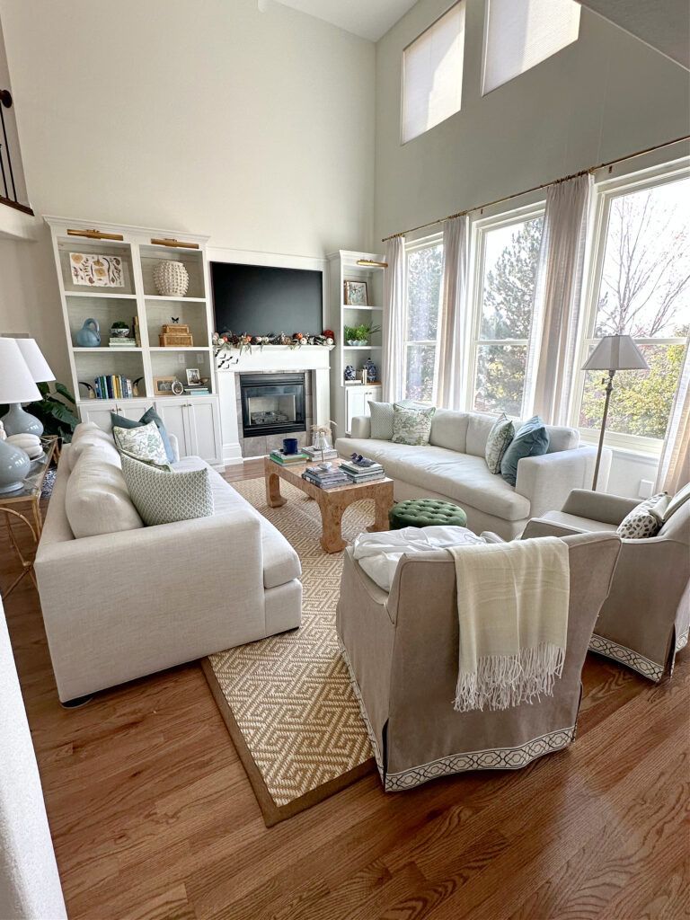
In my experience…
- 15-20% of homes and interiors suit true whites only
- 1-5% of homes and interiors suit cool whites
- The rest suit warm whites, either soft or bright.
- Some homes can pull off true or warm whites (often bright warm whites).
- Some homes can pull off bright or warm whites
- Fewer homes suit true OR soft, warm whites – it’s usually one or the other…clearly
Based on everything you’ve read above, there’s a darn good chance your home suits a SOFT or BRIGHT WARM white.
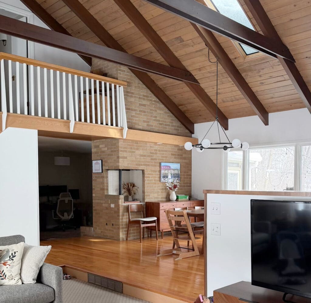
While this might look like a darn bright white, it’s a soft white with a fraction of warmth – Sherwin Williams Pure White
There’s a lower chance it suits a TRUE white-only. And a very little chance it suits a COLD white.
Now, if your home really does suit a cool white, you’ll find out, because as soon as you put a cool white next to your finishes, it’ll look stark, or even gray, blue, or purple in comparison.
And anyone who tells you exposure doesn’t matter, show them this image with Chantilly Lace on the left (south-facing on the wall) and on the right side (northern light cabinets)
So, right off the hop, we’ve eliminated dozens upon dozens of options.
IF YOUR HOME SUITS SOFT, WARM WHITES
Of course, there are more you can sample and compare, here’s what I recommend starting with…
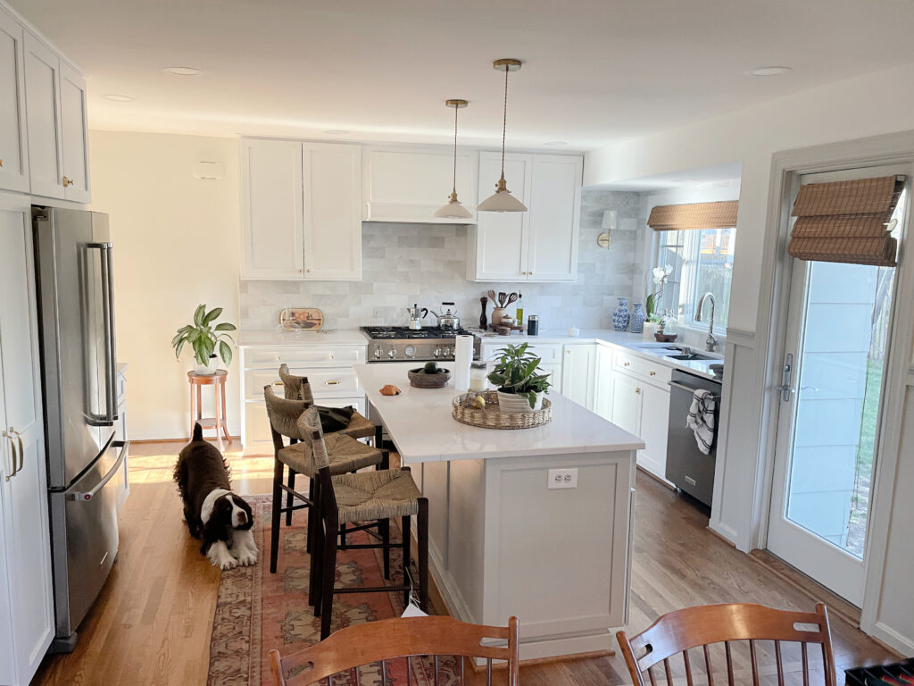
BENJAMIN MOORE WHITE DOVE OC-17
White Dove is a soft, warm white. It has a warm, creamy yellow undertone that’s WELL-grounded with a neutral gray base to calm it down. While some don’t love White Dove’s subtle warmth, compared to legit warm whites, it’s pretty darn passive.
White Dove is my most recommended Benjamin Moore White paint color.

White Dove is one of the most versatile shades of white, accommodating a buttload of interior finishes and varying paint colors. It doesn’t come off as creamy and warm as Cloud White (below), but also isn’t as clean as Chantilly Lace (below).
With an LRV of 83.16, White Dove is a soft white, so it won’t act like white but rather a softer, warmer version.

BEST ROOMS FOR WHITE DOVE (WITH EXCEPTIONS)
This is a ‘some’ but not all situation, as I can’t possibly cover every variation, depth, temperature, combo, etc.
- With gray tiles, so long as they aren’t super light gray. If they are, try a bright or cool white.
- White Dove can be a pretty partner to oak trims, cabinets, floors, etc.
- With many beige tiles, carpets, and countertops
- Generally speaking, if your home was built in the 1990s or the early 2000s, it can be a nice choice (also, I have some great update ideas for 2000s homes)
- It suits a range of white and warm off-white quartz countertops
- Great with some muted cream finishes.
- Good with the average greige, taupe, or warm gray.
- It’s often too warm for ‘standard’ white subway tile backsplashes.
- It’s also too warm for white appliances, unless you want the white-on-cream look.
Check out the other warm whites. If they aren’t warm enough for you, you might want a creamy warm white or off-white.
Here’s your Peel & Stick sample of White Dove…
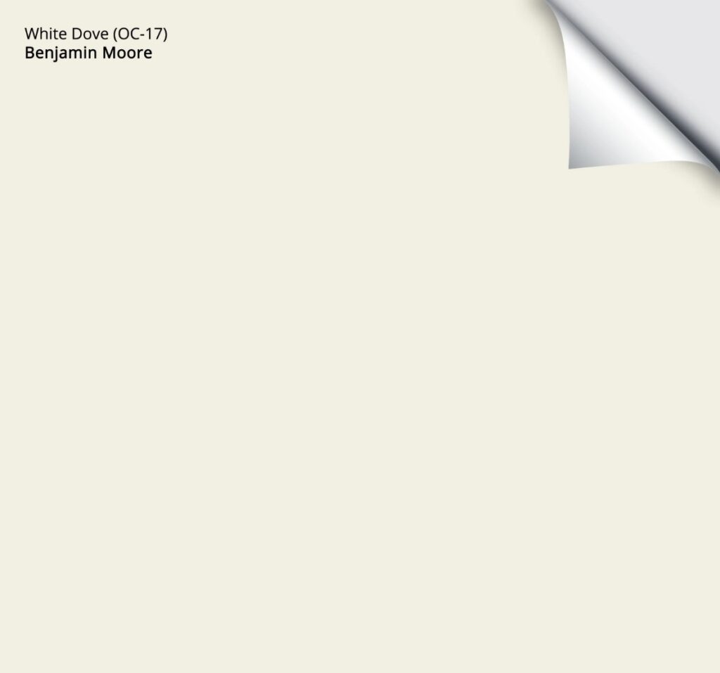
Benjamin Moore White Dove: IMAGES, Info, & More\
BENJAMIN MOORE CLOUD WHITE OC-130
Cloud White is one of Benjamin Moore’s best, most timeless warm white paint colors. With its soft cream (yellow) undertone, Cloud White offers warmth without being ‘overly colorful’, thanks to its neutral base.
Keep in mind that Cloud White won’t always look like white, thanks to its degree of warmth and LRV of 85.05, which makes it a SOFT white. However, for those wanting a soft, gentle shade of white, it can be the perfect choice.
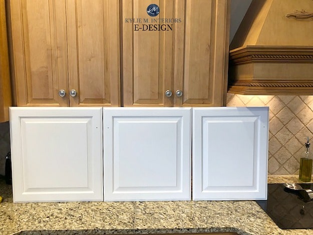
Cloud White on the left, compared to the slightly softer White Dove in the middle
Cloud White is my favorite CREAMY Benjamin Moore White paint color.
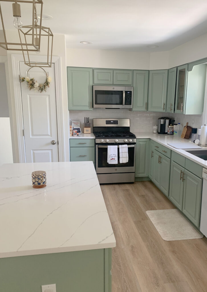
In this next photo, compare the Cloud White walls to the white trim around the door. This is a great way to see the creamy warmth in Cloud White compared to a more standard shade of white…
The Best Green Paint Colors for Cabinets
THE BEST ROOMS FOR CLOUD WHITE (with exceptions)
Again, ‘with exceptions’ as there are many variables; everything from the MIX of finishes, exposures, interior lighting, personal tastes, etc.
- Gray tiles, so long as they aren’t really light gray
- Most beige tiles, countertops, and carpet
- If your home was built in the 1990s or the early 2000s (also, I have some great 1990s home update ideas!) Cloud White often fits in well.
- Suits a range of wood tones, including golden and honey oak.
- Goes with many greige, taupe, and warm gray paint colors, so long as they aren’t in the off-white range.
- No matter what the exposure of your room is, Cloud White is a great option, knowing that it’ll look a bit warmer in southern light and REALLY warm up in late afternoon western sunshine.
- North-facing rooms and those with a flat, dull light do well with soft, warm whites like this.
- It will be too warm for random warm white subway tiles – you need to pick a softer, warmer white. It’s also too warm for white appliances, unless you want the white-on-cream look.
Here’s your Peel & Stick sample of Cloud White…
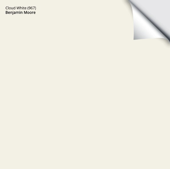
Benjamin Moore Cloud White: IMAGES, Info, & More
As for this next one, I’m not recommending it because I love it, but because MANY PEOPLE love it.
BENJAMIN MOORE SWISS COFFEE OC-45
Swiss Coffee is a popular white paint color, due in part to Studio McGee using it in their own home, but that doesn’t mean it’s best for YOURS.
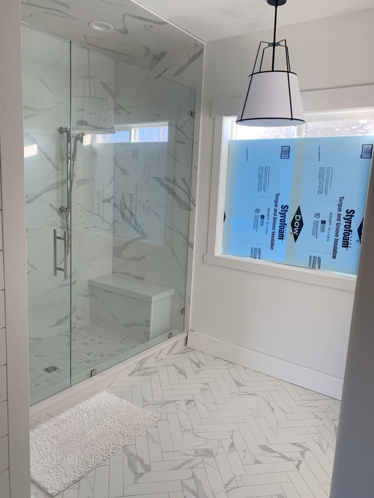
If it’s between Benjamin Moore White Dove and Swiss Coffee, I’m probably choosing White Dove.
Why?
- It’s a bit lighter
- It’s a bit less likely to grab green
- It’s more flexible toward a range of interior finishes and wall colors.
Since I rarely recommend Swiss Coffee (in my 12,000+ online consultations), I have only a few photos of it. I do have this one of it on the trim in this living room with Sherwin Williams Accessible Beige walls…

Here’s Swiss Coffee looking beautiful on the exterior of a home…

As for depth, Swiss Coffee has an LRV of 81.91, making it slightly darker and denser than White Dove. This puts it between the soft white range and the wild world of warm, OFF-WHITE paint colors.
THE BEST ROOMS FOR SWISS COFFEE (OR NOT)
Again, with exceptions, as there are allllllways exceptions in this wild, wonderful world of design.
- Homes from the 1990s and early 2000s often look good in Swiss Coffee
- If your finishes have a green undertone, they might love Swiss Coffee.
- It’s far too warm for most of the popular white and off-white quartz countertops.
- It can work if you have a lot of tan or muted cream finishes
- Pretty with a range of wood tones
- Many choose to lighten it by 25%, which maybe makes it a bit nicer (I am biased, as I like the other whites more).
- It can suit a range of warm grays and greiges and some taupes, so long as they aren’t in the off-white range.
- Cloud White does well in all exposures, knowing that like any white, it’ll warm right up in afternoon western sun.
- It will be too warm for random warm white subway tiles, for sure, as well as white appliances.
IF YOUR HOME SUITS A BRIGHTER WHITE THAT’S WARM
Bright warm whites offer a bit more crispness while still giving a nod towards warmth (either a little or a lot).
BENJAMIN MOORE SIMPLY WHITE OC-117
Simply White is a bright (but not true), warm white paint color with a yellow undertone. Unlike myself, this undertone can be subtle at times, acting more like a true white. On the other hand, partner it with a cool shade of white or even a true white, and it can show up at the party with yellow on (and not much else – also like myself).
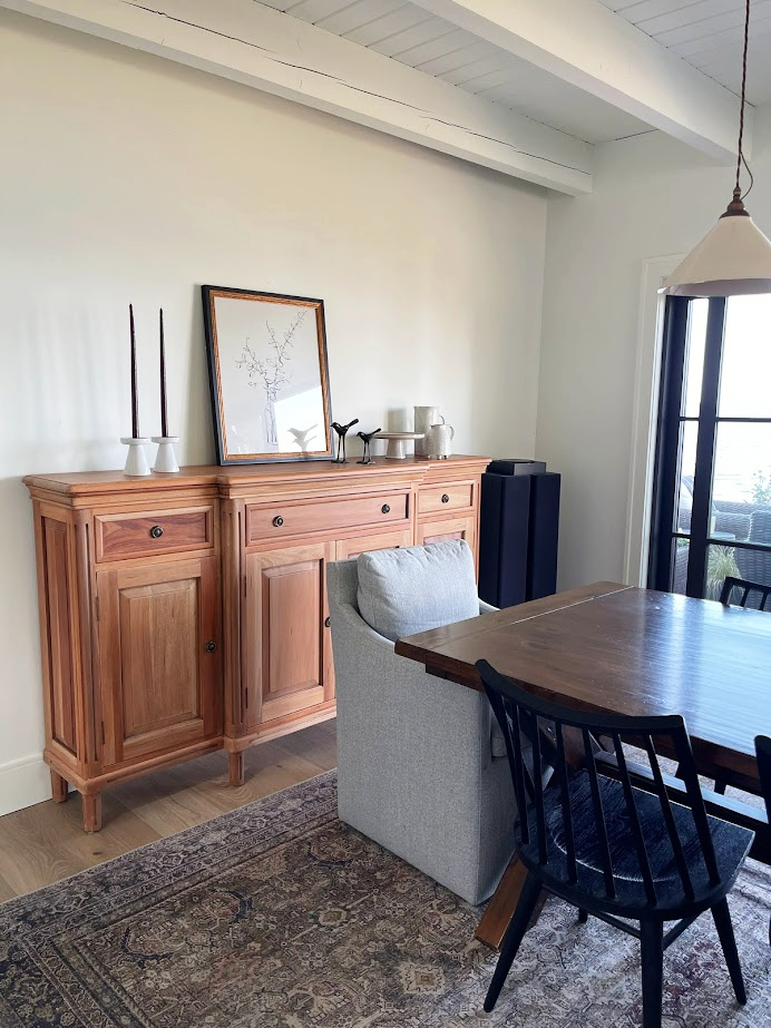
With its slightly higher LRV of 89.52, Simply White offers a great, fresh, and warm approach to white. Its yellow undertone is noticeable but isn’t always obnoxious, adding a touch of life without too much ‘color’.
Simply White is a popular choice for trims and kitchen cabinets if you want a bright, but not stark-white look. Just be careful, as its yellow hue can pop up. This means that Simply White can act like white (in the absence of a ‘real’ white), but watch out for its warmth if you aren’t a fan of yellow-whites.
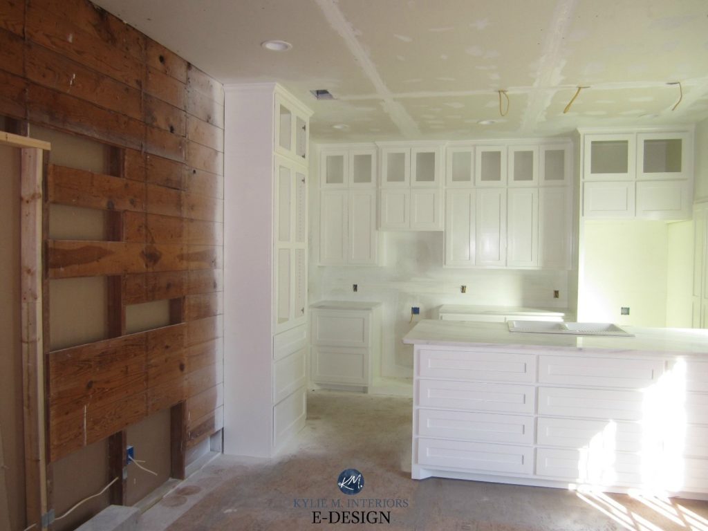
Here’s Simply White and a few other popular shades of white that I’ve covered in this blog post…

LEFT TO RIGHT: BM Cloud White | BM Simply White | BM Chantilly Lace | BM Atrium White | BM White Dove
THE BEST ROOMS FOR SIMPLY WHITE
- Great for older homes, and suits a range of granite countertops. However, it’s usually too warm/yellow for today’s quartz countertops.
- Traditional homes often look gorgeous with Simply White. That said, they suit others well, too.
- If you’re looking for a brighter white, not a soft white, and have northern light, it can be a fabulous choice, offering some balance to cool northern exposure.
- Simply White can add energy to flat east-facing afternoon light or west-facing morning light.
- It can work with some gray tiles, so long as they aren’t too light. Light gray tiles often prefer true or cool whites.
- Many slightly darker beige tiles work great with Simply White.
- Simply White does its best work when it’s the only white paint color in the room (whether you have it on one surface or 3+).
- It can be pretty with some light shades of blue, green paint colors, and even some purples. Make sure these aren’t TRUE colors and include a bit (or more) of gray. Whereas White Dove offers a slightly softer white contrast, Simply White has a bit more energy.
Here’s your Peel & Stick sample of Simply White…
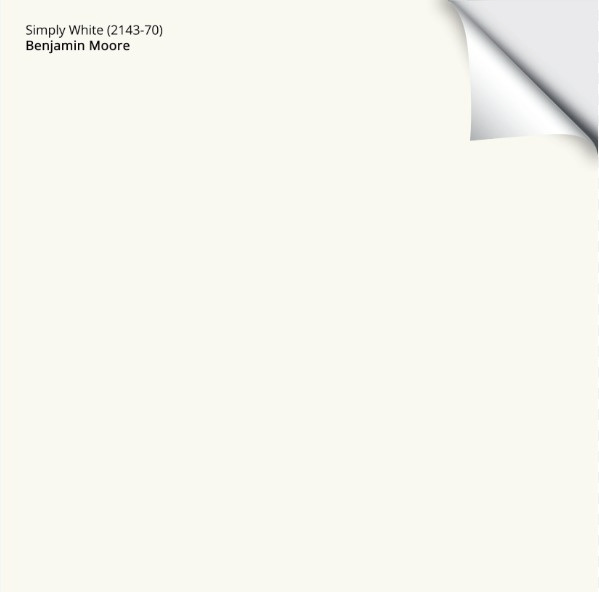
Benjamin Moore Simply White: IMAGES, Info, & More
BENJAMIN MOORE OXFORD WHITE
This is a weird one. Sometimes it leans a bit cool, other times it picks up a subtle, yellowish warmth. This is why sampling and comparing colors in your own home is so FRIGGIN’ important. I mean, any white will shift, but Oxford White…I just don’t trust it as much.
That said, it can look daaaaang gorgeous.
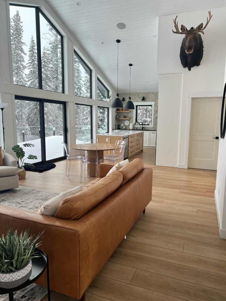
Oxford White has an LRV of 86.69, so it’s closer to the bright white range, which is why I chose it (it could be bright or soft, depending on how you see it).
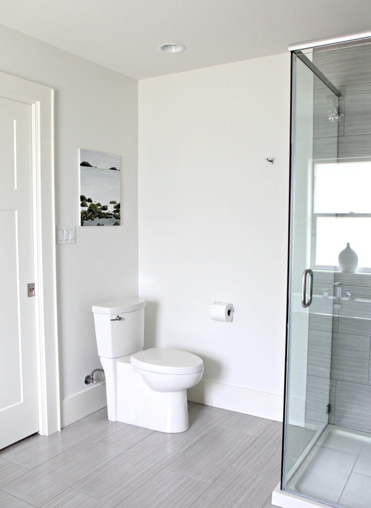
THE BEST ROOMS TO USE OXFORD WHITE
- I find Oxford White does some of its best work when it’s not being directly compared to another white – when it gets to be the boss.
- I’d hesitate to use it in north-facing rooms and would prefer a warmer white that’s either soft or bright.
Paint Color Review of Benjamin Moore Oxford White
IF YOUR HOME SUITS A COLD WHITE OR A TRUE-APPEARING WHITE
Cool whites are tricky, as sometimes a) they aren’t always ‘technically’ cold, they just appear that way in real homes with real lighting, and b) they can ‘act’ in place of true whites via their crisp, cool look. Confusing, I know, just sample some and see how they settle for you.
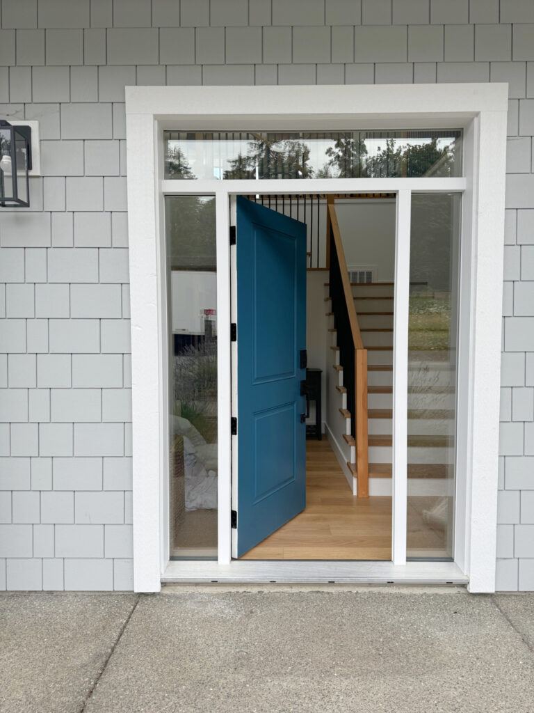
BENJAMIN MOORE SUPER WHITE OC-152
Super White appears as a subtly cool white. But even with this slightly cool vibe, the overall look is simple, clean, and great for modern spaces. Or if you’re Elsa – I hear she’s a big fan.
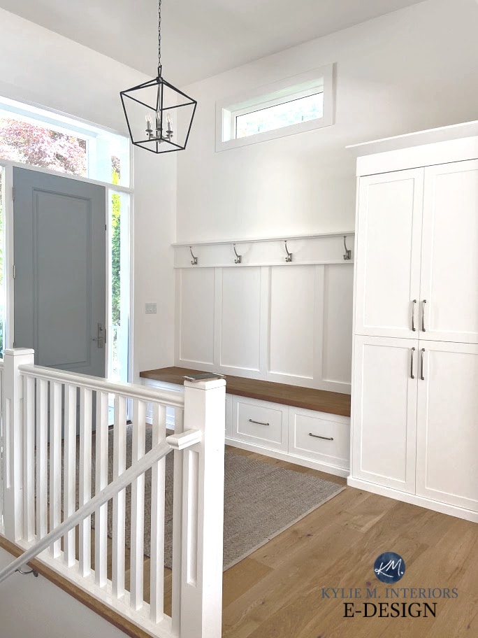
Above, BM Super White. Below, BM White OC-151

Super White has an LRV of 87.36, which means it’s between soft and bright (leaning a bit more toward bright).
Colors like this often look the most like a ‘true shade of white’, even though their slightly lower LRVs suggest otherwise!
THE BEST ROOMS FOR SUPER WHITE
- Gray tiles, countertops, and carpet
- Cool blue, green, or purple finishes
- It rarely suits the average home from the 2000s.
- It often suits finishes installed between 2010 and 2020.
- If you have a room with south-facing light, Super White is a great way to balance the warm light without tipping TOO yellow (as it will pick up some of the sun’s warmth).
- Rooms with warm western afternoon sunshine also suit the slightly cool approach of Super White, just make sure you like how it looks in the morning hours too!
- It’s a great color to sample with a range of marbles or white tiles.
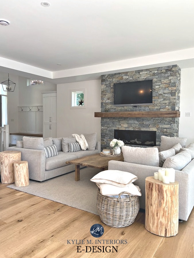
FULL Paint Colour Review of Benjamin Moore Super White
IF YOUR HOME SUITS A TRUE OR TRUE-APPEARING WHITE
It’s hard to get the real thing when it comes to whites. Benjamin Moore’s WHITEST white is Chantilly Lace. Even though its LRV is a wink lower than I’d like, it’s as good as we get.
And I say ‘true-appearing’ as TRUE whites will have LRVs up around 94 – within BM, that just doesn’t exist…yet.
BENJAMIN MOORE CHANTILLY LACE OC-65
Chantilly Lace is a lovely white that’s one of the WHITEST white paint colors (it’s BM’s best approach to ‘true white’). It has no noticeable undertone, though a wee willy wink of warmth is tucked deep inside. This means it’s SUPER sensitive to the colors in its environment.
Chantilly Lace is my favorite BRIGHT Benjamin Moore white paint color.

Chantilly Lace is a simple, clean choice if you’re looking to use white. While it can be a tit bit nipply for a cold, north-facing room, it can be pure magic in a south-facing room. It’s often referred to as the best ‘whitest white’ paint color, even though it’s not a true white (thanks to its LRV of 90.04).
While Chantilly Lace doesn’t have the highest LRV, it’s minimal color (chroma) definitely helps it APPEAR like a true white.
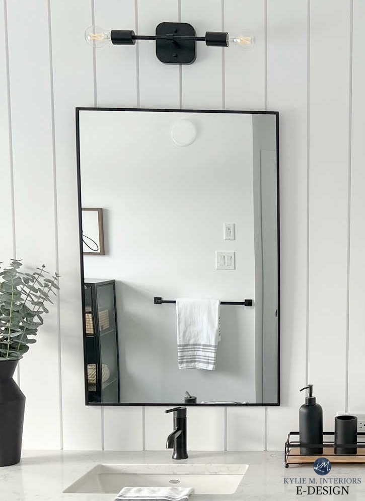
THE BEST ROOMS FOR CHANTILLY LACE
- It’s often a great match to white subway tile or any ‘white tile’.
- It can white appliances without being as stark as they are
- Most homes from the 2000s find it a bit too clean/crisp.
- Chantilly Lace finds often works well in homes built in 2010 and later.
- Rooms where you want a fresh white paint color that acts like white without being icy cold (although it could look this way in cold northern exposure).
- Chantilly Lace is an awesome choice for a ‘whole home’ trim, ceiling, and door paint color.
- It’s flexible with a wide range of paint colors.
- Its coverage isn’t great (common with whites). Make sure you prime first and ask the paint store to top off your gallon with Titanium White to help it cover a bit better.
Can I Paint My North-Facing Room White?
Stop guessing and start SAMPLING!
Get your Curated White Color Bundle for Peel & Stick sampling!
FREQUENTLY ASKED QUESTIONS
If your question isn’t covered here, please leave a comment – I do my best to answer as many as I can!
WHAT’S BENJAMIN MOORE’S MOST POPULAR WHITE PAINT COLOR?
Benjamin Moore White Dove is their best and most popular shade of white for walls, cabinets, trim, or exteriors.

White Dove is on the walls, Chantilly Lace is on the cabinets.
This is according to Samplize Peel & Stick – between them and me, we’re likely the two largest referrers (worldwide) to Benjamin Moore & Sherwin Williams).
WHICH BENJAMIN MOORE WHITE IS BEST FOR TRIMS & CABINETS
While it depends on your interior finishes, Benjamin Moore’s Chantilly Lace and White Dove are the most popular colors for trims and cabinets, and tend to work with a wide range of finishes and lighting conditions.
Here’s Chantilly Lace looking crisp and clean in a traditional kitchen…

Here’s White Dove offering a bit more softness and warmth…
WHICH BENJAMIN MOORE WHITES DOES KYLIE M. NEVER (OR RARELY) RECOMMEND
Just because a color is pretty or looks great in your neighbor’s home doesn’t mean it’s a good idea. Here are the whites I rarely suggest in my Online Color Consulting (for various reasons)…
- If it has ‘white’ in the name but has an LRV lower than 82, I wouldn’t use it, as it’s not a white, it’s an OFF-WHITE PAINT COLOR.
- Benjamin Moore Atrium White and Benjamin Moore Alabaster, as they both have pink undertones. BM Alabaster often gets confused with Sherwin Williams Alabaster, which is an awesome, soft, warm white paint color.
- Benjamin Moore Glacier White. Its LRV is a bit too low, and its undertones are murky.
- While it has a great LRV, Benjamin Moore Mayonnaise has too much yellow for the average home. Maybe for walls (with clean white trim), but not cabinets or trims.
SUMMARY
Based on your homes finishes, and whether they suit true, warm, or cool whites, narrow it down to your best white grouping.
- The best warm soft whites include White Dove, Cloud White, and Swiss Coffee
- The best bright warm white is Benjamin Moore Simply White
- Benjamin Moore’s whitest, most true white, is Chantilly Lace
- For a cool-appearing white, check out Super White. You might also explore BM White OC-151 and Brilliant White.
READ MORE
The Best White Trim Paint Colors
The Ultimate Guide to White Paint Colors
The 4 Best Sherwin Williams White Paint Colors
Get the best paint color advice with Kylie M’s Online Color Consulting Packages – I’d love to help!

Updated in 2026 with content and images




Does Valspar have the same colors as Benjamin Moore? I just put a Valspar swiss coffee on my walls and am totally seeing the greenish undertone. Thanks for these tips!
Hi Alissa, while they can definitely have similarities, they’re different colours at heart 🙂
You mentioned that one wouldn’t want to use some of these whites in association with a Tuscan finish. Any ideas for someone who has “Tuscan” walls-meaning that ALL the walls in the house are textured in a faux stucco finish. I’m wanting to paint my walls white but I’m afraid it will look horrible. Because I have really high ceilings and a lot of square footage, untexturing the walls would be costly and difficult. I may have to bite the bullet but I’m wondering if you think there is any color of white that wouldn’t look horrible with this kind of texture on the walls? Or would you recommend a color other than white? An off-white? Thank you for your thoughts.
Love your write up and analysis of all the BM Whites. We recently downsized to a smaller Cape house which boasts a lot of morning and afternoon sun. We are adding texture and interest to the house with Nickle Board and built-ins and redid the floors a darker color.
I have chosen Distant Gray OC-68 for all the trim, built-ins, Nickle Board and cabinets and initially went with a light tint grey 1611 for the walls. I now regret the wall colors: with the darker floors, a smaller space and pops of color in my paintings, the Gray Tint is too blue (thought I wanted blue initially).
I am ready for WHITE walls now! I am not a fan of the yellow tint/s in white but am very interested in your expert input on what white to match with my already “distant white” trim and concentration.
It is a smaller space with a lot of windows and wall interest…. any thoughts on whites to match with BM Distant Gray(OC-68) in a Cape House??
Thanks and Happy New Year,
April
Hi, my question is I have an open concept. My kitchen and family room I’ve painted Spring In Aspen. While I love the color the far wall of my family room has a tint of green. Is there a color a little lighter than Spring in Aspen. I love white Dove but looks very stark next to my cream cabinets.
You’re probably best getting Spring in Aspen lightened – ask the paint store to try 25% (very subtle) and 50% and see how those feel!
We tried doing walls and ceiling same color but the ceiling looks darker. I was looking at how to brighten the rooms because we only have two windows. Was looking at chantily lace for the ceiling and the super white for walls unless one color will look the same. Hoping either of these would go with olive green and browns.
Yup, ceilings are tough, as they can naturaly shade themselves! To help things along, make sure the white on your ceiling has the HIGHER LRV and that one isn’t noticeable warmer/cooler than the other!
Question – I have a very dark NE facing dark cornered kitchen with many trees blocking my sunlight most of the day and don’t receive sunlight until 2 in the afternoon and it’s minimal. I am frustrated in trying to find a white to paint cabinets. You mentioned White dove being a favorite but it looks very yellow in my kitchen, I have the sticky paint samples I am using. Any white below that color is very yellow/green even Pure white sample SW 7005 also looks light greenish. The walls are a Benjamin Moore Sandy Brown #1046. Should I paint the whole kitchen white? Any advice would help please? Thank you, debbie
Ooooo, it can be hard when there’s trees outside, especially with northern light as sometimes that green can be hard to avoid! But aside from that, it’s about your interior finishes, the countertop/backsplash/flooring to see which color is the best. Often, you need a color with some pink, orange, or sometimes even violet to off-set the green, but that has to suit the finishes AND be liveable in the evening! In all, it’s tough to say without seeing the entire space and ALL of its needs, but it sounds like white isn’t working for you :).
Hi Kylie,
If you use White Dove on cabinets, walls, trim, what wood floors would you use? With yellow undertones? Or pink undertones? The picture where you have the double door in White Dove and the other door that looks like Revere Peter in your other blog post about White Dove has floors that look like they have pink undertones. How is it that it looks so beautiful when the undertones are so different?
I have terra cotta floors a limestone fp in living and kitchen area and peppercorn sw cabinets (glass fronts on upper) and marble looking countertops. Living, dining and kitchen joined together. House is tuscan styled. Northern exposure. What wall color should i use i want cosy but needs togo with kitchen. I have now purchased 30 samples. Obviously I’ stuck. HELP