
The 5 Best White Paint Colors: Sherwin Williams
Warm, Cool, Bright, & Badass – All the Whites You Need…
When choosing the best white for your walls, trims, cabinets, or exterior, it’s hard to know where to start. Once you figure that out, you have to FIND that magical color!
Well, lucky for you, this previous blog post will teach you where to start regarding the 5 Types of White, while this one narrows it down to the BEST OF THE BUNCH.
Heck, you don’t even have to read that other blog post. If you’re feeling brave, order each of these samples and see which one(s) your interior finishes relate to. If that doesn’t work, Benjamin Moore also has amazing options (including one of my favorite shades of white).

Sherwin Williams has some wicked whites, so your chances of finding the perfect one for you and your home are pretty good—especially when you have me in your back pocket (by the way, I pinch).
As you’ve probably discovered, whites can be a real bugger. Not only do you have to think about which undertones are hiding in them, but they’re also susceptible to picking up reflections from the environment, such as:
- Green grass or landscaping outside the window
- Warm-toned woods (flooring/cabinets/ceiling)
- Feature walls
- Strong colored furniture or drapes
- Light bulb temperatures or the color of glass on light fixtures/shades
So, what is a girl (or guy) to DO? Check these out…
1. SHERWIN WILLIAMS PURE WHITE 7005
Pure White is one of my favorite go-to whites, but it’s not a STARK CLEAN white; it has a warm softness. I won’t say there’s enough warmth to make it overtly creamy or yellow, but it takes away that crips cool edge that some other whites have.
Looking at the tiny sample, Pure White can look a bit flat and even a touch dull. On a large scale, Pure White will act quite similar to a legit shade of white, just not as crisp/clean/icy as some others.
Pure White tends to look like a bright white without the starkness or sharpness of popular cooler and brighter whites.

FUN FACTS ABOUT PURE WHITE (FUN…IF YOU’RE A COLOR NERD)
- Pure White is beautiful for cabinets if you are going for a ‘white’ kitchen. However, if you’re looking for a white with a noticeable soft, almost creamy warmth, you may want to check out Alabaster, which is coming up shortly, or one of these warm white paint colors)
- If you’re using Pure White on your walls, I suggest painting the trims/ceilings/walls all the same color but in different sheens
- In a north-facing room, this color will lose its warmth. In a south-facing room, it will warm up, as its roots suggest and as the sun dictates.
- Pure White is a fabulous trim, door, and ceiling color and can be used with warm or cool wall colors.
- With an LRV of 84, Pure White is a SOFT white, not a stark or clean one (the more tint there is, the lower the LRV number goes – read more here)
FULL COLOR REVIEW of Sherwin Williams Pure White

2. SHERWIN WILLIAMS EXTRA WHITE SW 7006
Extra White is said to be Sherwin Williams’ whitest white, as it’s a bit cooler-looking in the fan deck (I might beg to differ; there’s a different one that wins in my books). However, in cabinet and trim paint, it often picks up a subtle warmth, which actually makes it a bit more appealing, if you ask me. However, this does make it finicky if you planned on doing your WALLS and trims/cabinets the same color, as there could be a slight shift in color between these surfaces.
On the small scale, especially in the fan deck, Extra White looks like it has a blue undertone. But you just wait, get that quart or gallon of paint – paint up a sample and see how you feel – it might not be as cool as you think!
Here’s Extra White on the fireplace surround and ceiling…

Here’s a great shot of Extra White with beige walls (Sherwin Williams Natural Linen)…

PROS & CONS OF EXTRA WHITE
- Extra White is great for cabinets if you want a slightly crisp, modern, contemporary look for your cabinets, doors, trims, and ceilings.
- In a north-facing room, Extra White could look a touch too cold for the average home or homeowner (on walls—it’s still great for trims and cabinets).
- In a south-facing room, the warm southern light will add some warmth to your walls and whatnot.
- Extra White has a slightly higher LRV than Pure White – 86 (LRV blog post)
FULL COLOR REVIEW of Sherwin Williams Extra White

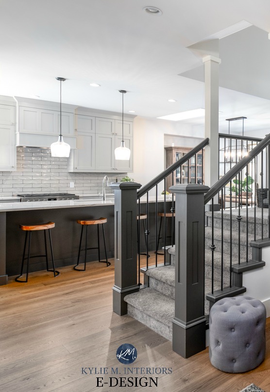
Click on the above image to see my E-DESIGN packages!
3. SHERWIN WILLIAMS ALABASTER SW 7008
Alabaster is stunning, especially if you want a softer, warmer approach to white (which is SUPER popular these days)…

Remember the previously mentioned Pure White and how it generally ‘looks like a bright white’? Welllll, Alabaster doesn’t do this. Or, I guess it’s open to perception, but I can’t help but look at Alabaster and see its pretty warmth. Sure, it looks white, but it definitely looks like a soft, warm white.
Alabaster has a lovely creamy backdrop. Those who love white but are nervous about cream usually find it a bit too strong and shift to Pure White or my favorite Benjamin Moore white. But for those who crave a gentle warmth, Alabaster can be the perfect choice for walls, trims, and cabinets.
And while I rarely recommend mixing and matching whites, Alabaster looks beautiful with Extra White trim and doors…
Alabaster is also beautiful on exterior trim if you want a softer, creamier look than traditional white.

Read more: FULL COLOR REVIEW of Sherwin Williams Alabaster
PROS & CONS OF ALABASTER
- Alabaster is one of the best warm whites, as long as you’re cool with a bit more noticeable warmth than average.
- In a south-facing room, the warmth will absolutely rise up. Sample carefully to make sure it doesn’t go too warm for you.
- If you have a north-facing room (or eastern afternoon/western morning) and want white walls, Alabaster can be a great choice. Its warmth adds a touch of balance.
- Alabaster has an LRV of 82, so it has the most tint/depth of the bunch, but it’s still soft and subtle.
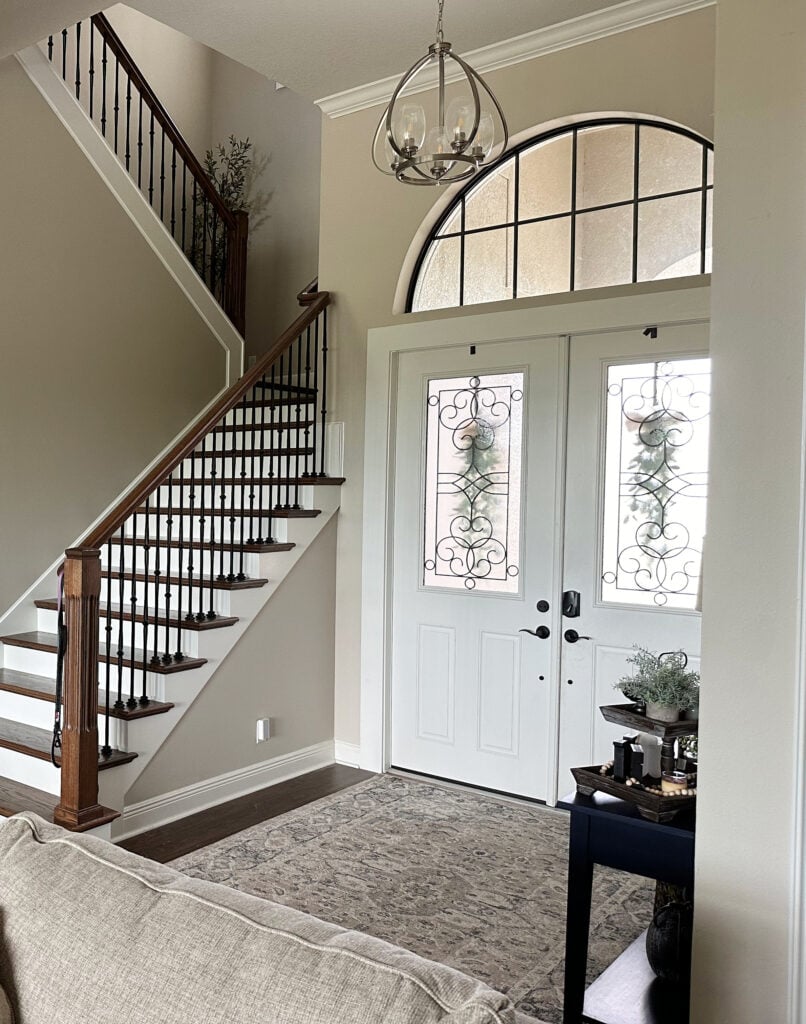
All images on my blog are REAL HOMES from my Online Color Consulting clients, readers, and friends. Thank you for sending your photos; you make my colorful world go round!
4. SHERWIN WILLIAMS WHITE SNOW
While I used to have mad love for High Reflective White, it’s so friggin’ hard to get that I had to put it aside. In its place is a newer shade of white from Sherwin Williams – White Snow.
- White Snow is one of Sherwin’s brighter shades of white with its LRV of 90. Sure, it ain’t 94 (High Reflective White, but good luck getting that), but as far as brighter whites go, it suits the average home.
- White Snow is similar to the popular Benjamin Moore Chantilly Lace – it’s just a wink warmer.
- If you really want to mix and match whites (I wouldn’t), this is one to play with, as long as the trim/cabinet color is a softer/darker white and the walls are a softer/darker white.
- White Snow could look a bit cool in northern light as it doesn’t have as much warmth as some of the more obvious warm shades like Alabaster and Benjamin Moore’s Simply White.
Here’s your Peel & Stick sample of White Snow

My FULL Paint Color Review of Sherwin Williams White Snow
5. SHERWIN WILLIAMS SNOWBOUND 7004
I’m next-level obsessed with this color. I mean, I love Ryan Reynolds and wine…and Starbucks and Cornuts, but Snowbound takes up a huge corner of my heart (snuggled right next to Ryan).
However, it’s at the bottom of the list because it’s not a no-brainer. I mean, not that any color is, but Snowbound is fussy, more so than the other whites.
But when it works – it’s pure magic.

It’s MUCH easier to find dark colors that suit Snowbound than light colors.
And I didn’t used to love it; in fact, it scared me a little because it’s unpredictable. However, as with so many colors…
It’s about the right color in the right space.

So, let’s hit some pros and cons right off the hop rather than me explaining everything and then repeating it…
My FULL Paint Color Review of Snowbound
PROS & CONS OF SNOWBOUND
- Snowbound is a great way to get passive warmth. If you have southern or afternoon western sun, it WILL be warmer and can easily grab a touch of pink and yellow (depending on the amount of light/surrounding finishes/etc.).
- These pink and yellow undertones sound scary and can be, but it’s about what’s surrounding Snowbound.
- Snowbound does best when it’s on every surface—cabinets, trims, ceilings, and walls. It is next-level stunning when used this way (as shown below).
- If you do Snowbound trim and cabinets, you will have a heck of a time coordinating wall colors with them—it’s fussy, which is why it’s often an ‘all or nothing’ choice.
- This could be your perfect shade if you want a more unique approach to white and aren’t afraid of slightly pink or creamy hues.

The lovely Bahama’s home of my friend, LeMel Jewlery owner, Jen.

Are there exceptions? Hellllls yeah, there are ALWAYS exceptions; I’m just trying to keep things meat n’ potatoes around here to get you started.
- If you have northern light, Snowbound won’t look cold, but it’s not overly warm—it’ll just have an interesting softness.
- Snowbound is lovely as an exterior trim color, but in alllll that natural light, I would worry about it on siding and stucco. I’d wonder if the pink would pop up too much.
By the way, did you know that Sherwin Williams has a whole different line of whites? Learn all about them HERE…
SHERWIN WILLIAMS DESIGNER EDITION WHITE PAINT COLORS
NEED HELP?
Check out my E-design and Online Color Consulting

Chat soon,

READ MORE
The 3 Whites I Would Never Paint My Trim or Cabinets
The 8 Best Benjamin Moore White Paint Colors
How to Choose the Best White for Your Kitchen Cabinets
ORIGINALLY WRITTEN IN 2019, UPDATED IN 2024


Appreciate the info! I had been debating between Pure White and Alabaster and narrowed it down to Pure White for my exterior trim. Great info, keep it up! Thanks 🙂
I’m glad it was handy- thank you for letting me know!
Hi –
Thanks you for all the information on SW Whites! If choosing a white for the walls, do you typically recommend using the same color – in a different sheen – for the trim and ceiling? I see from your posts that it may not be a great idea to mix the whites… Please advise… And thank you !!
Hi Christy, you BET, that is exactly what I’d do! I’m always hesitant to mix n’ match whites/undertones. This way you can let the sheen do the subtle shifting for you… 🙂
My daughter, who is a decorator, has convinced me to use SW pure white on everything, with flat for ceilings, eggshell for walls and semigloss for trims. My cabinets are also pure white. I use lots of blue and whites in my decor, but I’m afraid the house will seem too stark white. Paint just scares me.
Hi Sandy, if you want an all-white look, that is a GREAT way to do it, but if you DON’T – then you aren’t going to be happy. And there are soft white likes BM White Dove, which can sometimes be a bit more liveable, whereas Pure White has a wink of softness, but not much and could be cool if you have northern light. It all depends on countertops/flooring/tile/exposures, but maybe you want to look at a white with a BIT of colour in it???
What color would you suggest for a tiny bit of glowing but not yellow , white for walls?
Hmmm, we’ll as soon as I hear the word glowing, there needs to be at least a bit of yellow, so I’d probably hit BM Simply White, but really, it’s hard to avoid the yellow in any type of warm white!
I’m trying to choose an exterior soft white paint. I’ve narrowed it down to Alabaster and Shoji White. The home resembles a farm house. The guy at Sherwin Williams said that Alabaster will appear very white on the exterior so now I’m confused. I want a warm soft white. The main parts of the home face south and east.
Thank you,
Julie
Hi Julie, I have to say that Alabaster is the EPITOME of a warm soft white. If you go darker, you’ll be in the off-white range, not the ‘soft white’ range and the undertones can be a bit more noticeable. There is a local home done in SW Creamy and personally I find it too yellow (and it’s south facing). Maybe ask to see Alabaster darkened by 25%, adding just a touch more body to it…
We are changing our color scheme from warm colors to white. Our floors are dark hickory hardwood and or gold travertine would you suggest sw pure white or sw alabaster. I have rooms with all exposures. Thanks,
Hi Alicia, I would lean MORE towards Alabaster, but that is without seeing your home. Pure White might just be a wink too sharp for the gold travertine.
Hi , love your blog. We have painted repose gray in north facing kitchen eat in area and living room. I currently have alabaster trim & bookcases but want to go slightly more white without going too stark. We are repainting trim and kitchen cabinets and want a white backsplash. Would you suggest pure white for trim and cabinets or alabaster with 4 oz. White added?
Thanks you, painters come this week and I am paralyzed !!
Hi Jennifer, I’m a BIG fan of SW Pure White, I just did a blog post on it, you should check it out 🙂 It’s lovely with REpose too for a nice clean look and it will be MUCH easier to find a backsplash to coordinate with it compared to Alabaster which is softer/warmer 🙂
Thank you so much for the quick response!! Just finished post for. Pure White. It sounds like what I am looking for but because these are north facing rooms, I decided to change to repose to agreeable gray to avoid the blue undertones I noticed in some areas. I definitely want a change from the alabaster and think I like pure white quite a bit but haven’t seen it terribly large scale like it will be on my cabinets. I see you also love BM White Dove. Would this be a better white for cabinets and trim throughout? I will still have white backsplash. Basically I am deciding whether to go with pure white or white dove but dont know which would be better after reading your posts . Thx again!!
I’ve so enjoyed reading this thread, Kylie! Great insight! We are renovating our house and decided on Pure White for kitchen cabinets/trim/ceiling. The kitchen opens into a new great room build with vaulted ceiling with rafters and built-ins next to a shiplap fireplace. My question is . . .do I carry Pure White to the ceiling, built-ins, & shiplap so that the space is unified with the same white paint? Would you paint the rafters in semi since its an architectural detail? Thank you, thank you, thank you!!! 😉
Hi Jennifer – absolutely! I’m a big fan of consistency with white!
Hello! Just stumbled across your website… thank you! Our home has popular gray, versatile gray, and tempered gray (valspar color). We are painting our celings, doors, and trim white next week. After reading above, I am leaning toward pure white or extra white. The current trim looks like a cream color and some tends to look yellow… so I definitely do not want that. Any thoughts?
Hi Glenda, I would lean towards Pure White as it’s a wink softer…
Main house interior is Accessible Beige. Which white trim color will go best? Our options are extra or pure. Thanks.
Hi Laurel, I’d hit Pure White 🙂
Thinking of painting exterior of my house sw dovetail. Do you think eider white would look good for the trim? I’m trying to bring out more of the grays in dovetail. Thanks, Robin
Hi Robin, Eider White is beautiful. It is an off-white slightly warm gray with a vague purple undertone, so as long as you’re cool with that, you’re good. It can also depend on your window colours and any stone/brick as some people do prefer a white like Pure White with Dovetail.
We have a transitional style brick home and just bought GE Café Appliances in the new MATTE WHITE with Brushed Bronze handles for a total kitchen remodel project. The ovens also have some black glass and stainless on the range top, as well as the golden bronze toned handles.
By testing tons of paint chips against the appliances, I found the closest matching white color to use for our white cabinets was Sherwin Williams SW 7005 PURE WHITE. I was delighted to later find your article saying Pure White was able to go with either cool or warm tones, which is exactly what I wanted. We have medium tone red oak floors, and prefer the warmer tones, but noticed the preference trend of younger buyers is for the cooler tones. So we figured a basic palette that could go either way was safest for potential resale later.
We are getting a Vicostone quartz counter called MISTERIO (white marble look with subtle gray and brown veining, a Carrara style vein), to help tie in the warm oak floors with the white cabinets, black glass/grates (and a black Blanco under mount single sink), and the gray stainless on the cooktop beneath the black grates. That clearly puts us in your “low contrast” white kitchen palette– which I noticed in another interesting article you wrote on white kitchens.
The hardest part has been finding cabinet hardware to match the newer “Brushed Bronze” handles on the appliances, another warm tone. The only faucet we could find to match well was a DELTA TRINSIC in “Champagne Bronze”. The only cabinet hardware close to the appliance handles and faucet color found to date is ATLAS HOMEWARES “Champagne”, and the best matching style we liked was their “Sutton Place” design.
Do you know of any other cabinet hardware in a color that matches the GE Café Matte White brushed bronze handles & the Delta “Champagne Bronze” faucet that might look better in such a kitchen design, or possibly a better white paint to match the Matte White appliances and other items?
Thanks so much for your very informative site!
Hi Lee, I’m glad you found my site helpful and it sounds like you’re doing an AMAZING remodel! And I wish I had some good leads on the champagne style hardware for you, but I don’t!!
Great information on your website – Thank you! I am looking for a BM White that is the closest match to SW Pure White. Thanks so much!
Hi Deanna! I wish there was one that was bang-on! My best thought would be Oxford White… And I’ve tried to have BM match Pure White before, but they couldn’t hit it as the companies use different paint bases, which really throws things.
Hi Kylie, I love your blogs. Please help me decide ….. need to paint a bathroom that doesn’t have any windows, shiny almond/ivory tile with white tub and sink. Cabinet is oak right now but I am thinking of staining it a very dark expresso. For the walls…… do you like Alabaster, West Highland white…. or what would you suggest????
Thank you very much,
Nancy
I recently discovered your blog and I love it! I have already had a few questions that completely exhausted my brain answered, or at least made me feel better that I wasn’t the ONLY one. So, I have a west facing home and after 15 greys, yep, 15, finally chose Repose Grey. I needed a color that could go through from the westerly facing rooms straight through the middle to the easterly facing rooms and not completely change color like 20 times. It turned out to be the one we like the most in every room. It was bad! To the point that my husband suggested painting the rainbow of 15 stripes that I had painted in multiple areas of our house throughout. I am on the trim and doors. I found a color I love but I am stuck on whether it is too warm, so I thought I would ask your opinion since you have this color thing down to a science. The color is SW – Greek Villa. Do you have any experience with it before I paint every door, trim and piece of moulding in my house this color? I opted to steer away from the bright white color simply because the builder used High Gloss Extra White on everything and it made it look cheap. We are changing the hardware to oil rubbed bronze and eventually the floors to a darker hardwood or tile that looks like hardwood. The SW – Repose Grey is the entire middle of the house with 12 foot ceilings.
Hi Jen! So you’re thinking of Repose Gray with Greek Villa? DON’T DO IT!!!! Greek Villa is toooo warm. If it were me, I’d hit up SW Pure White which IS white, but not as stark as traditional builder whites 🙂
I am a new fan! Just read your blog and I love it. You are really good at explaining what we see in colors. I spent the past few years recommending colors in the Agreeable Gray to Accessible Beige range, but this year, I am loving white. Thanks for helping me see a bit deeper into a few of the choices. ????????????
Hi Rebecca, these are just the types of comments that I love to get – THANK you 🙂
Hi Kylie!
We are looking to repaint everything. Ceilings, trim, walls. I am leaning towards doing everything in Pure White and then adding an accent wall here or there after we settle in and buy furniture for all the spaces. The house does not get a lot of natural night and the formal living room has very tall ceilings. Do you think doing everything (ceilings, trim, walls) the same color (different sheens) throughout the house will work?
Thanks for your input!
Hi Sarah, you BET! I just did this exact thing in a local home -cabinets, walls, trims, doors, ceilings – all Pure White with some beautiful feature walls and feature cabinets – go for it!
Hi Kylie, I was thinking about painting my east facing kitchen, dining, and family room White Duck, but some of the online pictures I’ve seen of this color seem to lean towards a light peachy tan. Maybe just a computer translation issue, but I’m going for just a light cream (probably not as yellow a SW Creamy) that will slightly contrast with whiter trim. What are your thoughts on SW Greek Villa? I haven’t seen you write about it. Thanks for all your help, I love your posts!
Hi Kylie. Great information. I am getting ready to paint my small kitchen all white including ceiling, trim, walls, cabinets. The floor and backsplash is reddish toned brick with dark gray grout. What SW white would you recommend to go with the brick? The living room next to the kitchen has Eider white in it and I also love Alabaster. Also, what do you think about painting the brick backsplash white too? I appreciate your time.
Hi Kylie, Your site is amazing. Best I have found! We are moving into a condo on a high floor with a lot of windows and natural light. The floors are a medium honey walnut. I am planning on painting the walls SW sky high. Which SW white wold you suggest for the trim and ceilings. I do not like a yellow or cream tint to the white. I know someone else previously asked you about what white to sue with sky-high walls but I wanted to revisit since our condo has a lot of windows and natural light.
Thanks so much.
Hi Kylie, I am leaning toward Natural Choice for my North facing downstairs family room. One lighter red brick wall, dark beams on ceiling and same for mantle. Can’t decide on trim white, pure white or extra white.
Oooo, I’m loving Pure White…