
8 Best Sherwin Williams Greige Paint Colors: Light to Medium
With trends shifted firmly away from gray and into warmer shades, it’s easy to get lost in a world of beige. Which is why this lil’ Ginger is grateful for greige.
Not as cool as gray nor as warm as beige and cream, greige paint colors are awesome happy mediums, hovering in the ample bosom between gray and beige. This makes them a great option for those who are over gray but not fans of the overly warm end of things.
But before we dive in, let’s do a little clarification so we’re all speaking the same colorful language (of which I have plenty)…

GREIGE: Not as warm as beige-tan, not as cool as gray. Greiges tend to appear with a slight or obvious green hue.
TAUPE: Not as warm as beige-tan or as cool as gray. Taupes tend to appear with a slight or strong purple-pink undertone.
If you find a greige or taupe that doesn’t commit to a particular hue, it can flex either way more easily depending on the room’s exposure, lighting, etc. (commitment gives you a stronger chance of a particular hue popping up and NOT the other).
WARM GRAY: Warm grays are warmer than traditional grays. However, even with a green or purple-pink undertone, they aren’t warm enough to be greige or taupe.
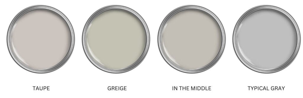
However, depending on how warm a gray is, it can wink at greige (or taupe), ESPECIALLY in a room with south-facing light or western afternoon sunshine. So, to cover the bases, a few of these colors might dabble in both worlds!
1. SHERWIN WILLIAMS ANALYTICAL GRAY 7051
Analytical Gray is one of my favorite greiges because it really commits to its job. Many greiges offer a more passive wink at green, not Analytical Gray. This gorgeous greige has the perfect muddy approach with a noticeable but not remotely overwhelming green hue.
BTW, the ‘y’ in Analytical Gray is super important, as without it, you’re in for a long night. And yes, that is my level of maturity.

Sherwin Williams Argos | Sensible Hue | Amazing Gray (coming up shortly) | Magnetic Gray | Wales Gray
Analytical Gray has an LRV of 47, making it a light-medium depth paint color. Compare it to a few of the lighter, muted shades on this page, including Worldly Gray, Anew Gray, and Agreeable Gray, to see which commitment to depth and undertone you prefer!
2. SHERWIN WILLIAMS WORLDLY GRAY 7043
Worldly Gray is a beautiful, warm, greige-taupe with vague undertones, at best. This organic, nature-inspired approach to warm neutrals offers flexibility with undertones.
If the previously mentioned, Analytical Gray is a bit too green, Worldly Gray (or the upcoming Agreeable Gray) could be the ticket.
Worldly Gray is like a lighter version of Amazing Gray (coming up shortly). Sure, both colors could flash a subtle green undertone in some environments. Crazy green? Nah. But if you’re REALLY worried about green, you might swing into the wild world of taupe paint colors instead.
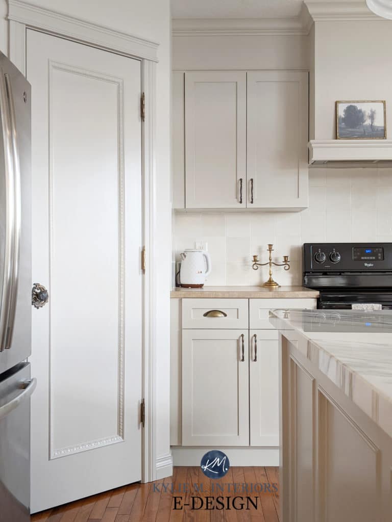
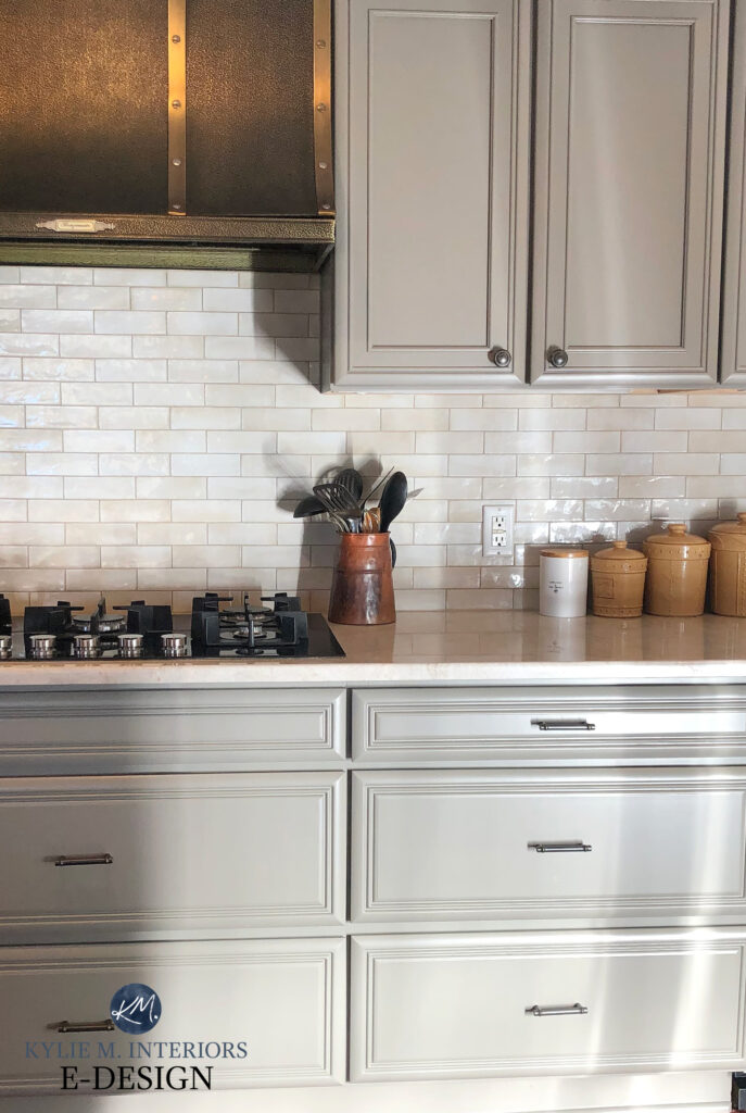
3. SHERWIN WILLIAMS AGREEABLE GRAY SW 7029
Agreeable Gray is well-known as a good ‘whole home’ color as it tends to humor a wide range of finishes and undertones, even if they aren’t a 100% match.
In fact, Agreeable Gray is one of Sherwin Williams top selling colors.


Agreeable Gray looks STUNNING on these painted kitchen cabinets (as far as light cabinet colors go, it’s one of my favorites)…
Paint Colour Review of Sherwin Williams Agreeable Gray
Check out my CURATED GREIGE MIX BUNDLE if you want the best comparables to Agreeable Gray!
If you’re seriously considering Agreeable Gray, comparing it to similar shades is the best way to find the perfect color for your home.
4. SHERWIN WILLIAMS ANEW GRAY 7030
Anew Gray is a light-medium depth greige-taupe. Unlike its lighter version, Agreeable Gray (which we’ll look at shortly), Anew Gray settles quite nicely between gray and beige, whereas Agreeable Gray often leans more obviously toward gray.
With its LRV of 47, Anew Gray will add depth and personality to a room without weighing it down, AS LONG AS your room has adequate natural or interior lighting. While Anew Gray isn’t as warm as beige and tan, its subtle warmth takes a more passive approach and adds a pretty softness to most rooms.
Paint Colour Review of Sherwin Williams Anew Gray
5. SHERWIN WILLIAMS AMAZING GRAY 7044
Amazing Gray is amazeballs. This glorious shade of greige can flash a wee green undertone at you, but it’s darn subtle. Just look at the earthy, organic goodness on these walls…

Color Review of Sherwin Williams Amazing Gray
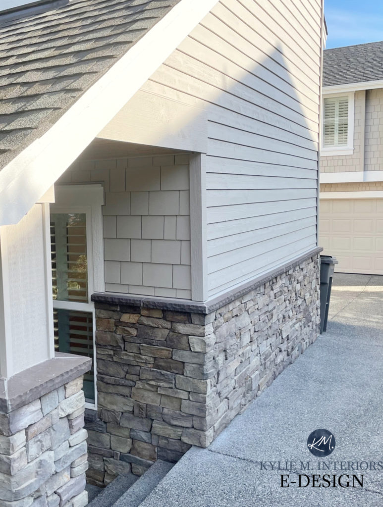
Amazing Gray can also be great for an exterior, particularly on homes with brick, as many mortars work well with this undertone and warmth. Amazing Gray is also great with a wide range of wood finishes, though I might be careful with lighter, pink-stained woods.
If Amazing Gray isn’t grabbing the green undertone you want (which won’t be surprising), check out the previously mentioned Analytical Gray or Sherwin Williams Jogging Path, shown below (the latter commits to more green, fo sho)…
6. SHERWIN WILLIAMS INTELLECTUAL GRAY 7045
Intellectual Gray has an LRV of 36, which makes it a medium-depth color. It’s not on the darker end of the scale – it still has some levity compared to darker shades, but compared to light colors, it has a great degree of body.
This depth makes it more popular on kitchen cabinets and even some accent walls.

I love to start with this range (LRV/depth) when painting cabinets, as it opens up a world of options for wall color partners. It’s also great on an exterior with a ton of natural light, as it won’t wash out as much as lighter shades.
If you’re dabbling in greige and are unsure about its undertone, compare Intellectual Gray to Sherwin Williams Mega Greige. It isn’t REALLY ‘mega’ as it’s not committed to its undertones; it hovers between the greige and taupe worlds.
Sherwin Williams Intellectual Gray Color Review
7. SHERWIN WILLIAMS FELTED WOOL 9171
If you’re looking for a greige with a bit more meat on its bones without going too far, Felted Wool is ready to wrap you up in its cozy arms! This particular greige has an LRV of 28, placing it smack dab in the middle of the medium depths.
Felted Wool isn’t just beautiful on walls; it’s gorgeous on kitchen cabinets. I love it because off-white and light-depth cabinets can be hard to find coordinating wall colors. Not Felted Wool. With its lower LRV, it’s much easier to integrate into a full, well-balanced palette.
If you’re unsure whether Felted Wool has too much undertone, compare it to the lovely Sherwin Williams Keystone Gray, which is more of a greige-taupe that doesn’t commit hard one way or the other (green or purple). It also picks up more warmth without dipping right into beige-brown.
Here’s your Peel & Stick sample of Felted Wool…

8. SHERWIN WILLIAMS FAWN BRINDLE 7640
Fawn Brindle could hit the spot if you want a greige that commits a bit more to warmth. This greige is warmer than the others, with a bit more beige-brown in its backdrop and that beautiful, but notable green hue.
Like many greiges, it can take on more gray with the right (or wrong) exposure and interior light, but don’t mind that too much, as its roots are still hardcore greige. Thanks to its LRV of 36, it’s also less likely to wash out on a well-lit exterior or interior wall.
If you want a more subtle, maybe even grayer look, compare Fawn Brindle to Sherwin Williams Graystone.
Color Review of Sherwin Williams Fawn Brindle
Wanna go even deeper (that’s what she said)?
Sherwin Williams Anonymous is badass and beautiful – gorgeous on cabinets, exteriors, accent walls, and more!
FREQUENTLY ASKED QUESTIONS…
Before we finish our time together, I want to touch on a few questions I get asked in my comment section, Kylie M YouTube, and Instagram…
DO GRAY & GREIGE GO TOGETHER?
Yes, gray and greige go together, but the gray shouldn’t be LIGHTER than the greige, or the combo can look off. Or, turning that around, the greige should be lighter than the gray.
WHAT’S THE MOST POPULAR GREIGE PAINT COLOR?
Sherwin Williams Agreeable Gray is one of the best greige-taupe paint colors. However, depending on your PERCEPTION of what a greige is, Benjamin Moore Edgecomb Gray also takes a run at the title. This said, Edgecomb Gray takes a FAR different approach to greige than any of the shades on this page…it’s a ninja.
ARE GREIGE & GRAY STILL POPULAR PAINT COLORS?
Every color has its place. Grays are no longer trendy (although a well-chosen gray that suits its space is always at home), and greiges and taupes are far more popular thanks to their warmth. However, paint color trends have tipped even further toward modern beiges and tan, which, according to my research, are beating out the greiges and taupes of last year.
IS GREIGE JUST A VERSION OF WARM GRAY?
Kind of, yes – a very, very warm gray. Some greiges can pass as warm grays, including top colors like Sherwin Williams Agreeable Gray and Worldly Gray. On the other hand, many grays can look greige, including Sherwin Williams Mindful Gray. However, we’re talking about two different groups – warm grays and greiges.
Greiges are warmer than warm grays and have their own category.
QUICK RECAP
- Greiges can look neutral, but many flash a green undertone.
- Greiges are always warm, even ones that seem cool compared to a warmer color like beige.
- The most popular greiges include Sherwin Williams Agreeable Gray, Anew Gray, and Worldly Gray.
- Greige undertones can vary depending on a room’s exposure, interior lighting, and surrounding finishes (as well as perception!)
READ MORE
The Best WHOLE HOME Taupe & Greige Paint Colors
The Best Light Taupe & Greige Paint Colors
Get the best paint color advice with Kylie M’s E-Design and Color Consultation

ORIGINALLY POSTED IN 2019, AWESOMELY UPDATED FOR FRESH CONTENT AND IMAGES IN 2026


Hello Kylie.
First off, I just gotta say I think you are pure genius. I love that there is someone else who is as OCD about color as I am. (Just joking.) I’ve been scouring your site for info on the ‘new neutrals’ and color theory … so incredibly helpful, thank you so much for sharing your knowledge.
I have a general question… what darker colors do you feel would complement Revere Pewter (or similar… Collingwood or Edgecomb) for a south-facing living room accent wall? I’m focused on Chelsea Gray but would like options in the navy to warm gray ranges.
Thanks, and please keep on being awesome!
Brenda
Love your blog/videos and expertise!
I’m building a small ranch, (1350 sq ft) South East facing and only get one color choice. I’d like a warm neutral with blue//green undertones. I like SW comfort gray, SW knitting needles and SW gossamer veil.
Any advice?
Thanks!!
Hi Kylie!
I love your site, and I used to live in your neck of the woods in Port Moody. I am tired of my beige walls, but scared of white. I like gray but can’t afford new flooring. Can you do gray walls with light beige carpet?
Thanks for your advice!
Kristi
Ooo Kristi, I have a blog post for you! Hopefully it will help 🙂 https://www.kylieminteriors.ca/how-to-change-from-beige-to-gray-greige/
~Kylie
Hi Kylie!
I’m having a hard time deciding which gray to paint my office it’s 9ft X 12ft with navy carpet, I’ve narrowed it down to Sherwin Williams Dorian Gray or Repose Gray, what are your thoughts??
Thanks for any advise,
Teri
Hi Teri, it all depends on your natural lighting and how much you have! Repose would be a softer, lighter look, Dorian can be a more moody look, but I’ll warn you that i HAVE seen Repose Gray pick up a vague green, which wouldn’t be as nice with your navy carpet (doesn’t mean it will, but it can). And even though Dorian Gray is a darker version, it doesn’t tend to do that. Hope that helps!
Thank you for responding, I have one window but the natural light is minimal. I have part of my kitchen painted in Dorian gray, which I love. But I’m stuck with the blue carpet and I don’t want and chance of it looking green so Dorian Gray it is!
Thanks again,
Teri
You are welcome, glad it helped!
I would love to get your take on Sherwin William’s Basalt Powder and Gracious Greige. They’re new HGTV colors, and there aren’t very many reviews out there.
Hi Kylie,
Do you have a video on modern gray by Sherwin Williams?
Nope, not yet, as it hasn’t been a very popular one with my e-design clients. In general it is a warm gray, trying to be a greige that can pick up a very (very) vague pinkish/taupe tone…if that helps 🙂
Need help picking interior color for whole house. I’m debating between Sherman Williams Wordly Gray & Agreeable Gray Which do you think? Also what color for trim, doors…white, off white?
Thanks in advance!!!
Hi Melissa, when it comes to personal questions, I do refer to my E-design! I try to give as much helpful free info as I can on my blog and if that doesn’t help, it might be time for a closer look. If you’re interested, the link is here, I’d love to help! https://www.kylieminteriors.ca/online-decorating-design-services/
~Kylie
I”m confused – the chart shows analytical gray in the 10 but then there is no description for it. I am strongly considering going with that one and found this page on a search about it. Did it get dropped off your top 10?
Hi Kimberly, it did! To give you some tips though, Analytical Gray is a light-medium greige that has a soft green undertone to it that is more noticeable than what you’d find in Amazing Gray. It has a lovely muddy look that would be that bit warmer in a southern room but a bit more greige looking in north. I hope that helps!
Hi Kylie,
I love your wealth of information on your website, and I find the information about LRV especially helpful. Thank you. In your opinion what is the difference between BM Edgecomb Gray and SW Agreeable gray. Both are warm grays, but I think that BM Edgecomb is a bit more greige. Would one work better in a combo light room (meaning an open room with a lot of light in one area and the other space a little darker?
I noticed that BM Edgecomb can read more beige in less light. How does Agreeable gray stand up to that?
On my sample board, Agreeable Gray is blue…anywhere I take it and Edgecomb Gray is a creamy warm gray with no weird undertones.
I have an open layout room. Kitchen, living room. It’s a large space . The opposite wall of the kitchen is an empty wall. We do not have windows or a fireplace. I copied the model home and found 2 mirror windows to place on wall- one on each side – a nice big wall click in between and I will be getting a nice white electrical fireplace for under the clock. I painted the wall a different color than the rest of the space. The house is new construction and is painted in Sherwin Williams Metro Shell color (wall & ceiling). Until I figure out a color the one wall does add warmth. I actually like the Metro Shell color as it is creamy and light. My question is- in an open layout
Does having the one wall a different color make sense?
Thanks and when ready I will consult with you on a perfect color!
Would Sherwin Williams Agreeable Gray coordinate with an accent wall in SW Fireweed in the living room?
Thanks!
Hi Kylie! I have a 1960’s house with wood trim everywhere I plan on painting all Cloud White from your suggestions, and I was thinking a darker grey for doors. My kitchen and dining has a lot of orange wood tone cabinets I can’t change now, so looking for a grey that will work with the new white trim. The room has a ton of light from two oversized windows directly opposite each other facing East and West. I haven’t seen those directions talked about more And I’m wondering what you would suggest for a nice grey for wall, and a darker grey for doors? And if you still think cloud white is good for trim? Also doing the front room was thinking a shade darker then kitchen. It also has a giant East facing window that covers most the wall. Thanks for any help! I just don’t want my grey to be too beige. -Jenny
Hi Jenny, thank you for your note! I actually have an E-design service just for this! I try to give as much complimentary as I can on my website, but if that doesn’t work you might want to think about sending me photos and filling out the questionnaire so that I can spend some time with your home! https://www.kylieminteriors.ca/online-decorating-design-services/
~Kylie
Hi Kylie! I enjoy reading your posts and watching your videos! I have been researching color.. and read that you should not use Mindful Gray and Dorian Gray in the same room that they will not go together .. I would like to know your opinion on this and why not? I was thinking of transitioning these colors from one wall to the next.
Thank you!
Hi Shelly! The funny thing is that they are okay together, but the contrast is so subtle that it’s there’s not a big shift – you’ll get more of a shift just with the walls shadows. Now this range of colours CAN pick up a very vague green undertone, particularly in the lighter range, so that could be what they are referring to because as it darkens that tendency goes away a bit. For me, it’s the lack of contrast, not the colours that throw me personally 🙂
Kylie,
Thank you for sharing your wonderful insights and experiences with the colors. I had a few of your top 10s in my top 5, and with your details on each color, I was able to narrow down my search. Funny how we don’t see the tricks the colors can play until we train our eyes to catch it. In a room of the home we just bought, there is something like sage green carpet, and I found that Repose Gray really pulled a blue tone (but did not pull that anywhere else in the house). Agreeable Gray, despite being so similar to Repose, did NOT pull anything funky from the green. I’m still unsure which color I will choose for that particular room (I know it won’t be Repose), but my point is that your information has really taught me how to catch the nuances. Thank you so much!
Yikes! Now I’m panicking about having chosen Modern Gray for my interior. I don’t want any pink! Would Mindful Gray be better? Snowbound is the trim color.
Hi Shelly. It’s nothing strong, but you might find that Mindful Gray sits a bit better for you – but that’s without seeing your space/lighting of course 🙂
Stunning photos! I think the grey pant goes really well with the hardwood flooring
Hi Kylie! I LOVE your blog and colour reviews!!! They have greatly helped me to understand the painting ERROR I made in my son’s room. I tried to purchase a one room colour consult to fix it but you are sold out? I will definitely your consultation business for other rooms in my house as I would greatly eliminate my stress! My husband has agreed to repaint and wants it done quickly so I’m on a time crunch.
Here are the details:
– My son’s room is SOUTH facing and I originally painted it Stonington Grey but it turned out completely light blue!
– The room has Warm Rustic Grey furniture and Navy Accents
– I tried Revere Pewter and I found it too muddy. I tried Collingwood and it appeared too white/washed out.
Based on your blog, I was thinking SW Agreeable Grey or SW Collonade? I would GREATLY appreciate any feedback you could offer!!
I am building a home and we are leaning towards Light French Gray for an interior color. We have had terrible issues in the past with grays tinting blue and purple in different lights. What are your thoughts on Light French Gray? Is it likely to taint another color?
Oooo, I actually just did a Youtube colour video on this that I’ll be posting soon! So, Light French Gray can pick up a subtle purple undertone or even a wink purple/blue with the right lighting (like northern). Every gray will pick up either blue, green or purple, so it’s about picking the undertones you can live with. It also has a bit more depth than the average ‘light gray’. I want you to also check out Big Chill, On the Rocks and Crushed Ice :).
I am thinking of painting my LR, DR, Kit. Worldly Gray, looking accent color for under my chair rail.
Hi Tonia! It would all depend on your flooring/countertops/decor etc…but my first thought is to continue with the vague green undertone that Worldly Gray has and go down the colour stripe to something like Felted Wool or Anonymous if you want more contrast!
Love your article! I’m currently building my first home and I chose the color Mindful Grey to paint my kitchen cabinets. The back splash will be white with white trimming. But now I’m having a hard time picking a color for the walls. I’m thinking a beige but I’m not sure what color to try? I love the greige colors but am scared it might be too much grey in the room since the cabinets are somewhat greige. Any advice would be so appreciated!! Thank you for your time.