
Posted on June 14, 2023 by KylieMawdsley
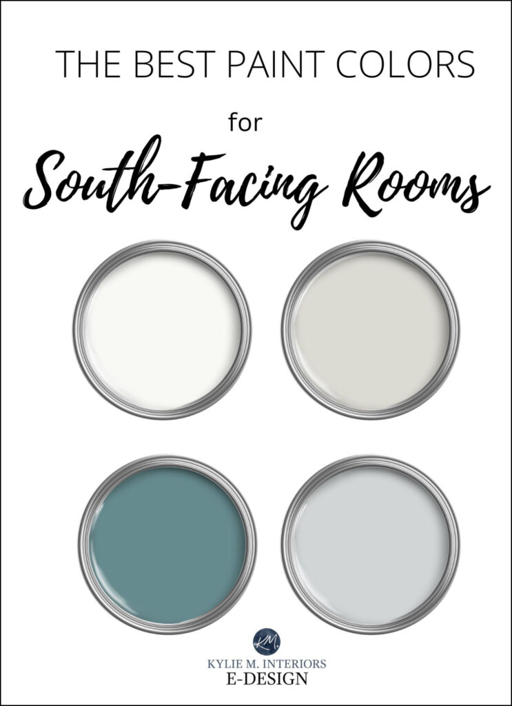
WHAT COLORS ARE BEST FOR SOUTHERN EXPOSURE?
A south-facing room can be one of the most satisfying rooms to choose paint colors for. Unlike a north-facing room, which relies heavily on paint color and lighting to feel lively, a south-facing room feels warm and inviting all on its own as it gets direct infusions of natural sunlight all day long.
The most important (and complicated) thing to remember about a south-facing room is that the quality of natural sunlight changes throughout the day. Overall, southern light is warm and yellow-toned, yet it can wash colors out when the sun is at its peak. So, a color that looks ‘just perfect’ in the morning and evening might appear washed out at noon. A color that looks perfect in the middle of the day might become too bright in the morning and over-the-top glowing in the late afternoon.
This post may contain affiliate links. If you make a purchase through links on our site, we may earn a commission.
So what do you do?
You must look at your paint color samples for a full day – or even several days! See which colors hold up over the hours and which wash out. Which colors make the room feel more balanced, and which make you feel overheated and off-balance?
Decorating is about balance, and it’s important to balance out your room’s warm & cool levels.
BTW: I rely 100% on photos from my E-Design clients (thank you all!). I do my best to include photos of south-facing rooms in the examples, but some photos are only for color viewing.
THE TWO TYPES OF SOUTH-FACING ROOMS
Not all rooms are created equal. Just because you have a room with southern exposure doesn’t mean it will act like EVERY OTHER ROOM with the same exposure. There are two basic types of south-facing rooms…
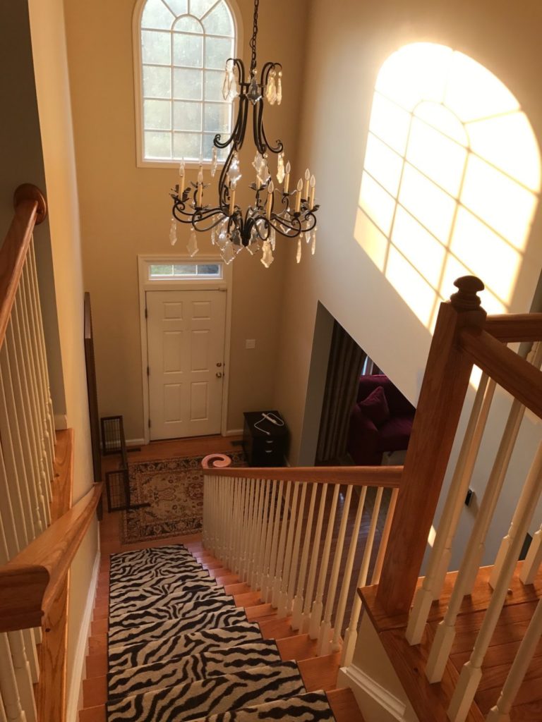
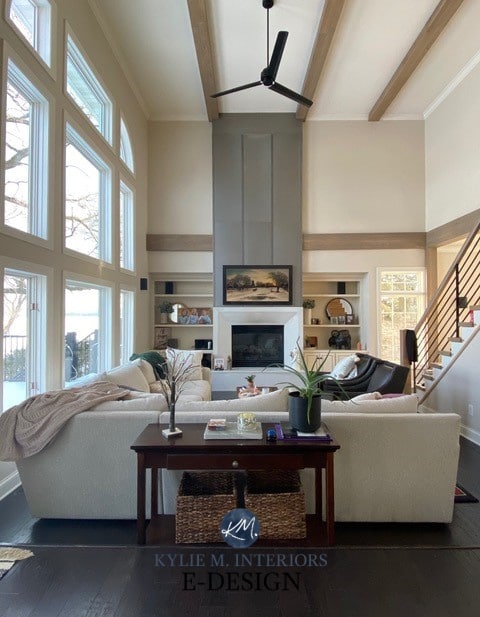
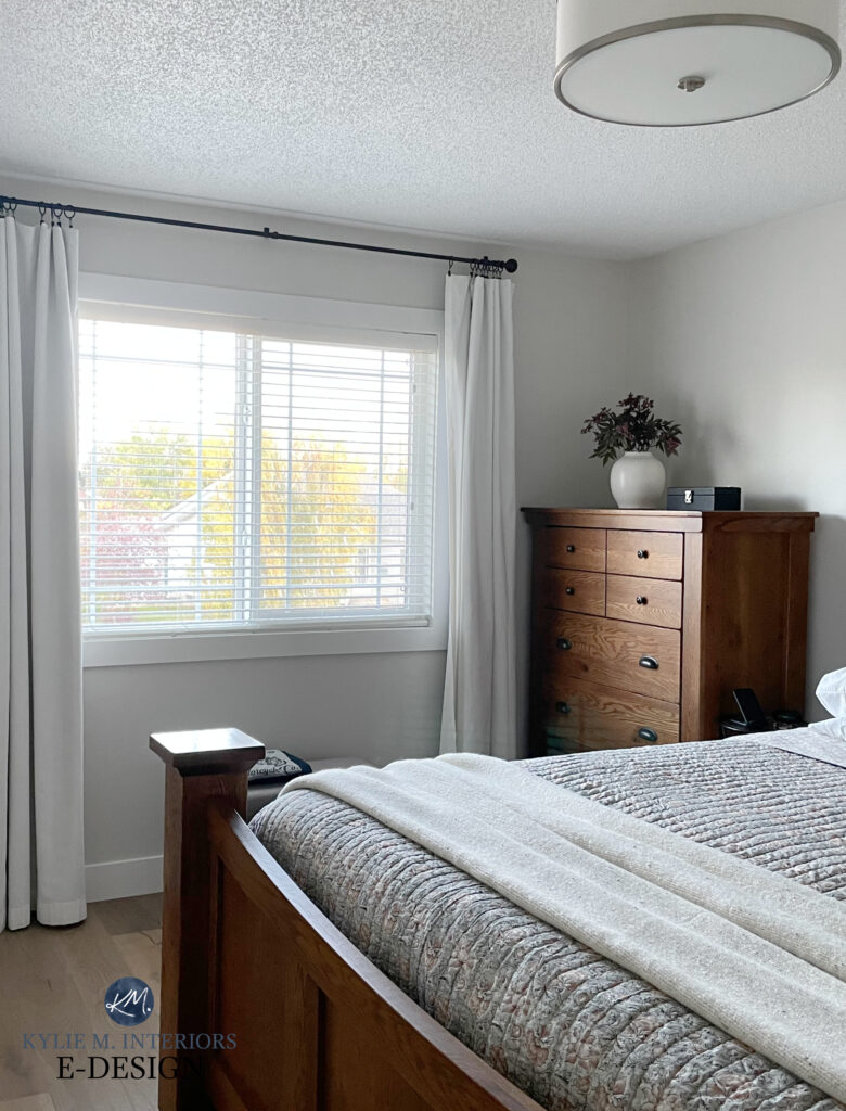
1. A SOUTH-FACING ROOM WITH A LOT OF WINDOWS
This type of south-facing room has TONS of natural sunlight due to the amount of window space. On hot days, these rooms not only look warm, but they ARE warm. Adding a cool color to a room like this is a great way to lower the visual heat, making it appear more comfortable and balanced.
This room might not look warm right now, but wait until summer!
LIGHT PAINT COLORS IN SOUTH-FACING LIGHT
A well-lit south-facing room can look great with a light paint color on the walls, but keep in mind, depending on HOW light the color is, it may appear washed out in the middle of the day when the sun is at its highest.
MEDIUM-DEPTH PAINT COLORS IN SOUTH-FACING LIGHT
A medium-depth paint color can also work well in a well-lit room and tends to balance intense light quite nicely.
DARK PAINT COLORS IN SOUTHERN LIGHT
A bright room can look awesome painted a dark color, especially in the cooler range, as it would help balance the warm rays coming in the window.
Learn About Light, Medium, & Dark Depth Paint Colors with LRV
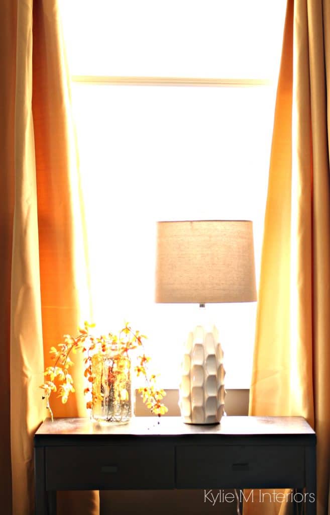
2. A DARK SOUTH-FACING ROOM
Without the ‘brightness’ you’d find in a well-lit south-facing room, these low-light rooms can feel more suffocating than the southern ones with a lot of natural light streaming in. This reduced natural light can be due to a few reasons:
- Small windows
- There are not enough windows for the size of the room
- A deck overhang blocking the light
- A lot of landscaping directly outside the window
- Trees block the majority of the sunlight from coming in
A south-facing room with reduced natural light can generally handle light, medium, and dark colors.
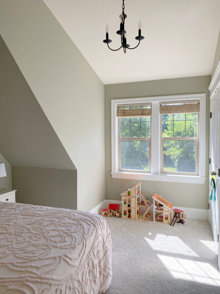
LIGHT PAINT COLORS IN LOW LIGHT
These work well to visually perk up a low-light room. I particularly like the ones in the softer, stormier cool range (as shown below) rather than the icy cold end of things. Light, cool colors add vitality and energy to a space that can sometimes feel a bit heavy with heat. Remember, if the room doesn’t have much light (exterior or interior), you might want to read this blog post on dark rooms.
MEDIUM-DEPTH PAINT COLORS IN LOW LIGHT
The medium-toned range can also work well in a south-facing room that doesn’t have a ton of light coming in. Like with well-lit rooms, I find that they balance the light quite nicely but will create a cozier, more intimate look.
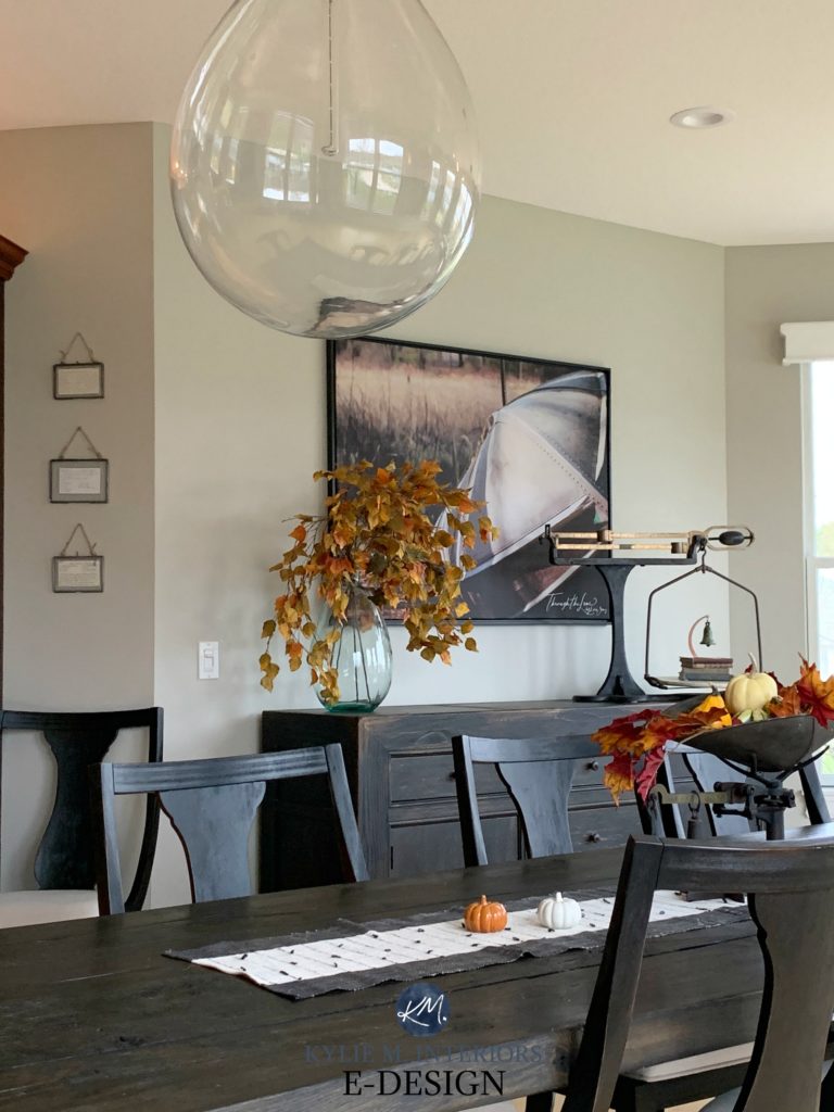
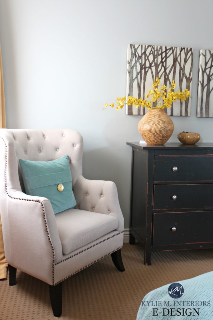
DARK PAINT COLORS IN LOW LIGHT
Dark colors can add personality and interest to a darker south-facing room – grounding the room and adding an intense balance to the effects of the sun’s rays – however limited they are. But be careful not to go too dark. If you truly have one wee tiny little window, you may not have enough natural light to balance out the weight of a dark color, especially if you don’t have adequate lighting.
THE TOP PAINT COLORS FOR SOUTHERN EXPOSURE ROOMS
These colors aren’t guaranteed to work in EVERY south-facing room, but they’re a great place to start. Remember to consider your interior finishes as well, as they take precedence over your room’s exposure.
1. BENJAMIN MOORE GRAY OWL OC 52
Gray Owl is a lovely soft shade of gray that leans to the cool side with its subtle green undertone. However, it’s a sneaky lil bugger and can easily pick up a blue undertone, either a committed one or blended with green. Gray Owl is softer and lighter than Stonington Gray (shown below) and has less of a cold blue undertone (because of the strong green in it).
The LRV of Gray Owl is 65.0, so it will reflect some decent light into the room – not tons, but some. It also means that at the peak of a sunny day, it could lose a lot of its beautiful color and depth, but once the sun shifts, it will come right on back. It can also be lovely in a low-light south-facing room, but it is definitely more muted and stormier.
Paint Color Review: Benjamin Moore Gray Owl
Kylie M’s YOUTUBE Color Review of Gray Owl!
2. BENJAMIN MOORE STONINGTON GRAY HC 170
Stonington Gray is a steady light depth gray (almost light-medium) with a slightly stormy blue, which at the odd time shows up a bit blue-green. And while it’s a LIGHT shade of gray, it’s storminess has it looking a bit heavier than others.
Benjamin Moore Stonington Gray and Gray Owl – What’s the Big Difference?
The LRV of Stonington Gray is 59.0, so it will add SOME, but not TONS, of light to your room. This also means that in a super bright room, it will hold its color a bit better than a color with a higher LRV. It also offers a nice, crisp contrast with the right white trim or cabinet color.
Paint Color Review of Stonington Gray
Kylie M’s YOUTUBE Paint Color Review of Stonington Gray
3. SHERWIN WILLIAMS NATURAL TAN
Natural Tan is undoubtedly one of the more neutral/warm colors on this page. However, it’s not a traditionally warm color that flashes yellow, orange, or red. It has a nice grounded base, which cuts back any golden tendencies and can even pick up a weee tiny wink o’ green (rare, but true). If you have a south-facing room and DON’T like cold paint colors, this could be a way to go warm without tipping the scales into the golden hues.
The LRV of Natural Tan is 65. This puts it in the middle of my suggested ‘best range for the average room.’ In a low-light south-facing room, it won’t make the room feel OVERLY heavy, nor any lighter, but you might find it a bit murky looking. In a reasonably well-lit room, it will be at its peak of perfection and offer a nice neutral backdrop to your furnishings.
Paint Color Review of Sherwin Williams Natural Tan
NEED HELP?
Check out my ONLINE PAINT COLOR PACKAGES – let me make it easy for you!
4. BENJAMIN MOORE BALLET WHITE OC 9
Ballet White is one of my FAVE warm neutrals (right up there with Edgecomb Gray, coming up next). It mixes tan and gray (so greige) with a strong creamy base. The cream and the tan are stronger than the gray, and this comes a bit more into play in a south-facing room without making things overheat.
Ballet White is one of the lighter neutrals on this page, with an LRV of almost 72. This is a GREAT color if you’re looking for a versatile, easy choice. However, it WILL wash out in a WELL-lit south-facing room.

If you want a color similar to Ballet White, Sherwin Williams White Duck and Shoji White are similar as they’re also cream hybrids. The BIG differences are that they have a bit less yellow cream than Ballet White and are a stitch lighter.
Paint Color Review: Benjamin Moore Ballet White
5. BENJAMIN MOORE EDGECOMB GRAY OC 173
Edgecomb Gray is a light-depth greige-taupe nicely balanced between gray and beige. In a south-facing room, it might lean a bit more toward the warmer side without becoming entirely beige.
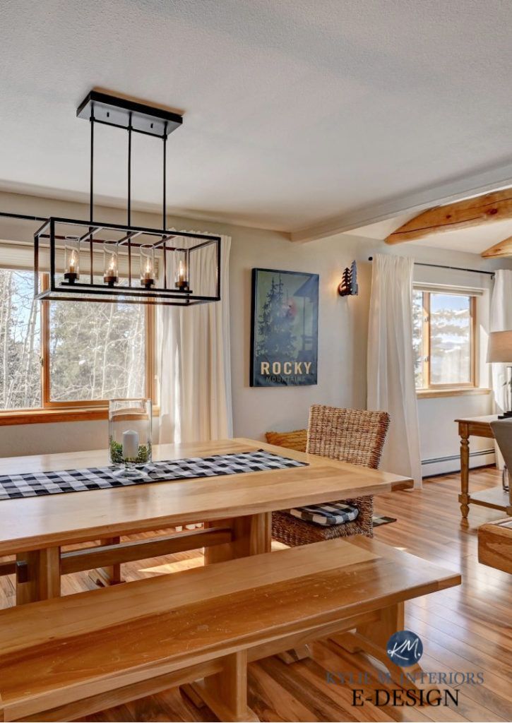
Photo via V1 Real Estate Photography
Edgecomb Gray has an LRV of 63. This depth is almost BANG on my happy place for the average room. In fact, Edgecomb Gray is so popular that I included it in my blog post about the three most timeless neutral paint colors.
There aren’t many colors that compare to Edgecomb Gray; it’s pretty darn special! While Sherwin Williams Modern Gray looks similar at first glance, it’s GRAYER than Edgecomb Gray (so it’s cooler). The same goes for Sherwin Williams Natural Tan. This popular shade of tan looks similar on a small scale, but get those Samplize peel-and-stick up on your wall, and you’ll see that Natural Tan is a muted tan paint color – not a greige-taupe.
Paint Color Review: Benjamin Moore Edgecomb Gray
Kylie M’s YOUTUBE Review of Edgecomb Gray
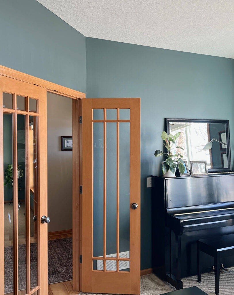
6. BENJAMIN MOORE KNOXVILLE GRAY HC 160
If you want more color and depth on your walls, Knoxville Gray is a beautiful blend of blue and green. Blue-greens are popular as they blend the two most calming colors – blue and green. With a soft gray backdrop to calm it down, Knoxville Gray adds a TON of cool balance to an overheated south-facing room.
In this next photo, notice how well Knoxville Gray plays with the warm wood on the trim and French doors…
7. BENJAMIN MOORE WHITE DOVE OC 17
If you’re looking for the perfect shade of white for your south-facing room, this could be it. White Dove is a soft, warm white that’s popular on walls, cabinets, trims, and even exteriors! White Dove is warm, but it’s not as cream-yellow as some, not as stark or cold as others. And while it will definitely pick up some of your southern sun’s warmth, it doesn’t go as creamy as many other whites.
Paint Color Review of Benjamin Moore White Dove
Did you know that SAMPLIZE PEEL & STICK paint samples are more affordable than sample pots and EASIER?
Plus, they get delivered to your doorstep in 1 DAY!
Visit the SAMPLIZE websiteHERE
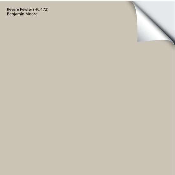
8. BENJAMIN MOORE REVERE PEWTER HC 172
Revere Pewter is one of the most popular warm grays with a lovely, earthy green undertone. And while it does lean slightly to the warm side, it rarely overreacts in a south-facing room and holds itself pretty well as a ‘warm gray-greige with interest.’ However, if your south-facing room has low light, Revere Pewter can look a bit murky and heavy, so sample carefully.
Benjamin Moore Revere Pewter painted door with White Dove trims and walls
The LRV of Revere Pewter is 55 and is a great depth for almost any reasonably well-lit room. If your room is SUPER bright, this depth will show up better than a lighter shade, which will really wash out in intense light. However, Revere Pewter’s green undertone CAN be slightly unpredictable, so be sure to read its color review.
Sherwin Williams Colonnade Gray is similar to Revere Pewter if you want a BIT less warmth and a touch more gray. If you want a LIGHTER look, check out Benjamin Moore Rodeo.
Paint Color Review: Benjamin Moore Revere Pewter
Kylie M’s YOUTUBE REVIEW of Revere Pewter
9. BENJAMIN MOORE WOODLAWN BLUE HC 147
Whether it’s a living room, kitchen, or bedroom, Woodlawn Blue is one of those colors that seems to please everyone! Woodlawn Blue is a cool color blending blue and green (much more blue than green) with a slightly gray base to calm it down. This blend makes it flexible and slightly susceptible to change throughout the daylight hours.
If you’re not ready to commit to a color like Hale Navy on a large scale, it also makes a great accent wall and easily partners with most of the neutrals on this page.
Being a classic shade of navy blue, Hale Navy can be a bit strong for some. If you want a slightly muted take, Sherwin Williams Cyberspace is wicked pretty. It’s similar to Hale Navy’s approach, but its gray base calms it down, so it’s a bit more of a blue-gray blend (heavier on the blue). If you like a slightly lighter take on Hale Navy, check out Van Deusen Blue, which is popular on cabinets and accent walls.
Benjamin Moore Hale Navy: Paint Color Review
The 12 Best Shades of Navy Blue
11. BENJAMIN MOORE CLASSIC GRAY OC 23
If you’re considering resale, stay away from cool grays (trends are leaning warmer). However, if you still want to add a touch of balance to your south-facing room, consider a warm gray like Classic Gray.
Classic Gray is a subtle, off-white shade of gray with vague violet-pink undertones. In south-facing light, it can lean MUCH warmer, looking more like taupe than gray. This being said, it will still look more balanced than any shade of beige or cream.
Classic Gray looks beautiful with most wood tones and suits various interior finishes, including popular tiles and countertops. Remember to be careful if you have overly warm trim/cabinets, as Classic Gray prefers a cleaner white in its trim partner.
If you like Classic Gray’s look but want slightly darker walls, Benjamin Moore Balboa Mist and Collingwood have similar warmth and undertones.
Paint Color Review of Benjamin Moore Classic Gray
11. BENJAMIN MOORE SPANISH OLIVE CC 606
If you’re looking for a subtle shade of green for your south-facing room, this could be your lucky day! Spanish Olive is a light, warm green – a green with greige. This neutral foundation gives Spanish Olive a grounded, earth-toned look without looking overly muddy or dingy (of course, this could be open to perception).
Spanish Olive has an LRV of 52.54, putting it in the light-medium range. Colors of this depth stand up better to intense natural light than lighter colors (higher LRVs), as they don’t wash out as much (but will look lighter with a lot of light on them, as will ANY color).
For a similar, slightly less warm approach, check out Benjamin Moore Mountain Air – a beautiful green shade muted with a warm gray base. If you prefer a green that isn’t quite so warm and you don’t mind a bit of depth, Benjamin Moore’s October Mist is SUPER popular.
The 8 Best Benjamin Moore Green Paint Colors
12. BENJAMIN MOORE QUIET MOMENTS 1563
If you’re looking for a calm, cool shade with some noticeable but not overwhelming color, check out Quiet Moments. This light blue-gray paint color is as gentle as it sounds. With an LRV of 60.73, Quiet Moments is a light depth, sitting right on the edge of my recommended LRV range.
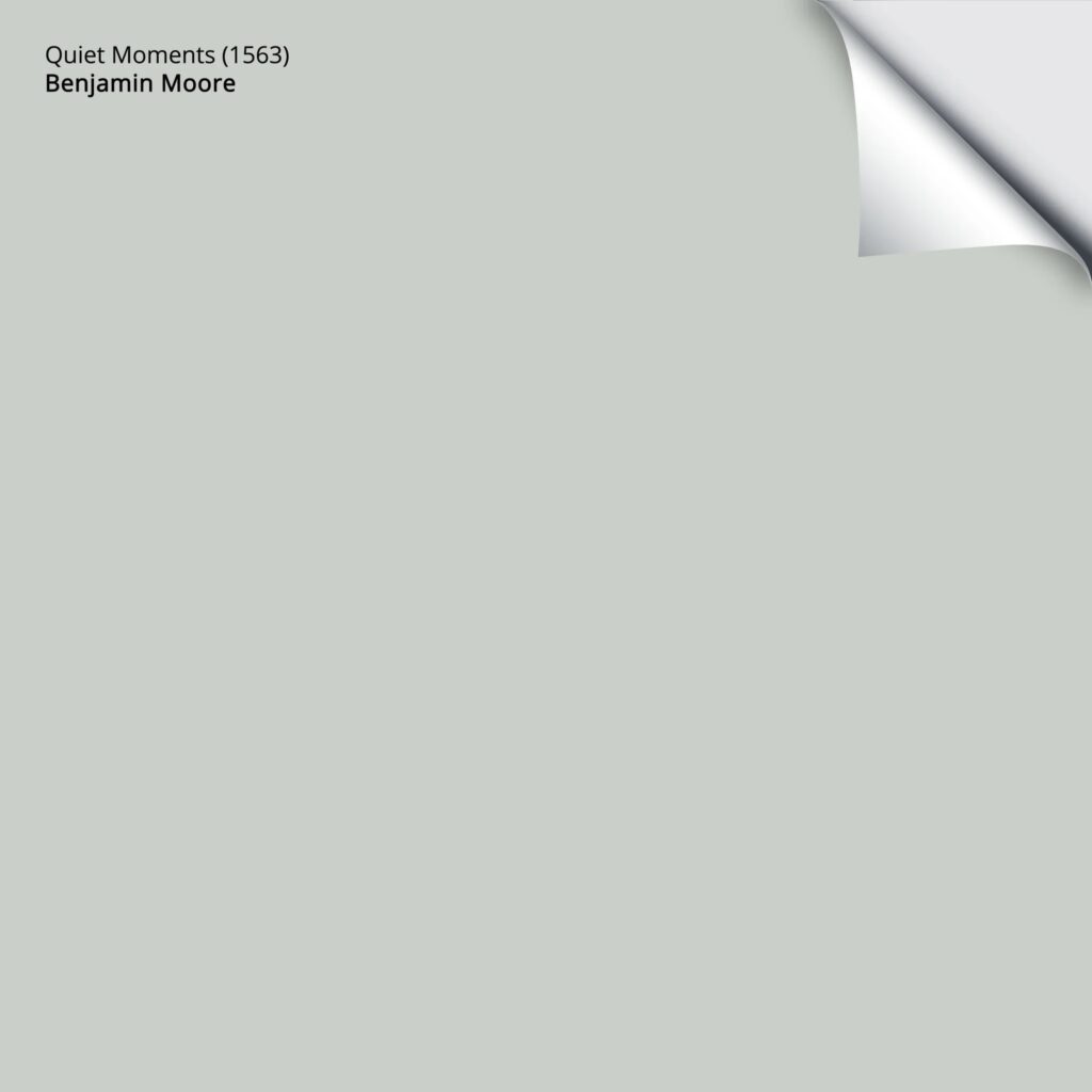
Get your PEEL & STICK SAMPLE OF QUIET MOMENTS HERE
Will Quiet Moments lose some of its color in the afternoon light? YOU BET YOUR BOOTY IT WILL! The more neutral your paint color is, the more muted it will look. However, give Quiet Moments just a LITTLE quality interior light to play with, and it could be the perfect color for you and your eastern room.
PEOPLE ALSO ASK
WHAT’S THE BEST LRV FOR A SOUTH-FACING ROOM?
This is a big question as it depends on whether it’s a dark or bright room. For example, how big are the windows, and how many are there? How big is the ROOM? Is the light filtered by trees or landscaping? Is there a patio or second floor that blocks the direct light from coming in?
And aside from this, what look and FEELING do you want?
- Light colors (LRV 65+) keep a room bright.
- Dark colors (LRV 30-) can ground a room, making it look a bit cozier.
- If this is a main living area, a higher LRV of approx 62+ looks good (it happens to be my magical number), knowing that a LOT of natural light will wash your color out a bit (especially in the HIGHER LRVs). The average person doesn’t love their main living area a dark color (I do, but that’s personal taste).
- If this is a smaller or secondary room, you can have a higher LRV or add some personality with a cool color with a lower LRV.
- Dark rooms often suit dark colors with more color/chroma, meaning they aren’t too grayed out. In the lighter range, dark rooms love colors with LRVs of 65+, and again, grayed-out and neutral colors have trouble coming to life, whereas COLORS add energy to a dark space.
As the previous color list mentioned, Knoxville Gray is beautiful for southern light!
WHAT COLORS ARE BEST FOR SOUTH-FACING ROOMS?
GENERALLY SPEAKING, south-facing rooms look best in shades of blue and green, as well as neutrals with these undertones. These cool paint colors and their temperature can balance a room with southern exposure.
Sherwin Williams Silver Strand
Do you have a southeast, southwest, or north-south-facing room?
While it might seem confusing, having multiple exposures isn’t bad when armed with the right information! Check out this blog post on ‘how to pick paint colors when you have TWO exposures.’
READ MORE
The Best Gray and Greige Paint Colors
East-Facing Rooms: What Are the Best Colors?
The Best Paint Colors for a West-Facing Room
The Best Paint Colors for a Dark Room
Do you want to know YOUR 3 best paint colors?
Check out my Online Color Consulting and E-Design packages!
KYLIE M INTERIORS E-DESIGN, E-DECOR, & VIRTUAL PAINT COLOR CONSULTING ADVICE SPECIALIZING IN DIY HOME UPDATE IDEAS AND BENJAMIN MOORE & SHERWIN WILLIAMS PAINT COLORS
Originally written in 2017, updated in 2023
Comments
Leave a Reply
More Posts

The 5 Best Creamy White or Off-White Paint Colors
THE ELUSIVE ‘CREAMY WHITE NEUTRAL’ When it comes to light, warm neutrals, it’s all in the undertones. And other than pink and green, yellow is the undertone many of my
Read More

The 8 Best Warm Neutral Paint Colors With NO Yellow Undertones!
The Top Light Depth, Warm Colors That Aren’t Cream! When choosing the best warm neutral paint color for your home, whether creamy white, beige, taupe, or greige, your choices are
Read More

The 12 Best Farmhouse Sinks of 2024
FIND YOUR DREAM SINK HERE… While traditional farmhouse design was all the rage in previous years, the embers have definitely cooled. As for MODERN farmhouse, it’s still kickin’ its cowgirl
Read More


This article is extremely helpful! Can I ask your advice? We have pine trim and crown moulding that is stained with yellow/orange/red tones (87′ home). In our south facing front room with golden oak/red wood floors I can’t seem to find a color that doesn’t turn either orange or pink or blue! I’ve tried BM Gentle Cream and it looks yellow. BM Muslin looks orange. BM Manchester Tan looks washed out and bland. SW Softer Tan looks orange/yellow. BM Natural Linen looks blue/gray. I’ve actually tried 10+ colors. Im embarrassed to say that and extremely frustrated. What other colors can I try? Our home is a colonial style so the front southern facing room has two windows facing south and a third window from the west. What would you use? Thank you very much!
Thank you Kylie for your great insight, so thankful to have stumbled on your website. We are in the middle of a major remodel and the contractor will need my paint choices soon. I’m severely struggling with the decisions (I have 12 paint samples on my wall right now, and I just read not to paint the sample on the wall but to use white paper!) Looking for paint selections for our combined Living/dining room with a large east facing window, this room connects into a great room which has a combined kitchen(south)/nook(south)/family(east) room. Kitchen: new LED lights, white cabinets, ‘pebble’ color quartz counters, marble herringbone backsplash, dark stained island with marble looking quartz. Rooms have medium oak hardwood. Some colors I sampled are: Hazey Skies: too green and dismal. BM Revere Pewter – certain times of the day I like it, certain times it feels heavy, muddy and too green. BM Swirling Smoke: too grey? – I haven’t heard you mention this color, not a fav? BM Edgecomb Grey? Overgrown by Miller? Some of these colors seem dark, especially in the evening, and I wonder how I would ever choose a sofa and chairs to go with them – dark walls, dark furniture? I actually wanted a warm fresh airy cream/tan/beige but the ones I tried were either too pink, too peachy or too yellow (sounds like Goldilocks!), so I started looking at greige colors, avoiding colors that are too grey.
Thanks for sharing your gift of color selection with everyone!
Author
Hi Julie, I know it can be overwhelming! If you’d like me to look at your home, you should check out my E-design so that I can look at photos and your questionnaire and come up with some options that REALLY work for you and your home! It’s affordable and fun if you’d like to check it out. I do try to give as much good info as I can on my blog and if that doesn’t work, it might be time for a closer look! https://www.kylieminteriors.ca/online-decorating-design-services/
~Kylie
Hy Kylie:
You are amazing!!!
I have never written a post but I fell on yours and it is incredible! All the details of the south facing and north facing light, I had no idea. Before I found this you are right, you stress out about paints (drink some wine) stress out some (drink some wine) . I moved 3 weeks again and I am have been trying to pick colors and losing my mind!!! But then you came along. I have most of my colors picked out for each room. My question is though, both bathrooms have adjoining bathrooms, do I need to paint that them the same color of the bedrooms? They have white tile floor/black grout and white cabinet with gray granite countertop (one is north facing and very dark and the other is south facing and gets some light just at the entrance.
Also I have an open floor plan from kitchen into living room. I chose one of your great colors my question is due I need to have an “accent wall” or can the paint just flow right though both rooms (kitchen on north facing and living room on south facing so I was leaning towards “Gentle Cream”
Thank you for any advise you can provide. You have quite the talent!
Karen
Author
Hi Karen, I’m so glad you found me – and cheers to that! So no, bathrooms definitely DON’T need to be the same as the bedroom and are often better in a softer, lighter version of the bedroom (depending on the bedroom colour of course).
As for the feature wall idea, EVERY home is different. I’ve been in open layouts that SCREAM for a feature wall, but more often than not they don’t…
If you want me to take a look at any of your rooms and advise colours, I do have an afforable e-design service, and then you don’t need to 2nd guess yourself! Either way, I’m glad you found me helpful 😉 https://www.kylieminteriors.ca/online-decorating-design-services/
~Kylie
I still don’t know what white paint colors are best for tiny, south-facing rooms. I’ve read several of your blogs more than once, but I’m not perfect, so maybe I missed it
Author
Hi Jude, I don’t have a blog post SPECIFIC to that, but I do have a good blog post re: BM’s best white paint colours. It can ALL depend on your interior finishes as well, but I also quite like Sherwin Williams Pure White (which I have a colour review on) as it’s warm, but not as yellow as some whites, given that the southern sun will warm it up for you. BM Oxford White is beautiful too. https://www.kylieminteriors.ca/the-8-best-benjamin-moore-white-paint-colours-undertones-and-more/
I hope that helps!
My house is open throughout so I need to paint the family room, kitchen and living room the same color. The problem is that one room is a dark north facing room and one is a very bright south facing room. We have been looking at light blue green colors that look washed
Your site is AMAZING. I’d sip wine with you any day. This is my first time building and I really have a hard time envisioning all of my choices. My kitchen cabinets will be white and the island navy blue. They come IN this color. I need to choose an everywhere paint color (just one) but I am nervous because 1. i don’t know what white exactly, the cabinets will be 2. we are southern facing 3. going for a coastal look. Suggestions? I originally chose edgecomb grey but now I am thinking of a softer white. PLUS the builder will be matching my choice as they use a smaller company for paints. Any help???
Author
Oooo, see the problem is, I don’t SIP very well – MOMMA LIKES HER WINE ;). But I’ll still drink it with you! So, that’s TOUGH. It really depends on the white (btw, as long as it’s not too warm/yellow, you’ll want them to colour match it AS CLOSE AS POSSIBLE for trim/ceilings/doors. My first thought was something like BM Collingwood, to balance a bit of that southern light or maybe SW AGreeable Gray. But, Collingwood will PROBABLY be easier to colour match. As for a white, without knowing what white the cabinets are, this would be VERY HARD and at the best, you’d want to use the colour match that you’ve got for the trim :).
I have a southern facing kitchen with a LARGE window. I just
had Cambria. Montgomery countertops put in which I love. I have white appliances and want to paint my orange oak cabinets white. I am afraid to paint a pure stark white. Which white would you recommend?
Thanks
Hi Kylie! In your LRV-lovin’ opinion, when does the LRV max out for south facing rooms with good light? I am trying to pick a cool color to balance a ton of medium brown wood with a red undertone in my south facing dining room with windows enough so that we rarely turn on the lights during the day. I want it to look light but not washed out most of the time. Is there an upper threshold for LRV to consider that would be too light for this case?
Author
Oooo, that’s a tough one. I mean, even DARK colours will lighten up. I would think somewhere around 55 makes sense to me, so that it doesn’t go too dark at night either, but even at 55 it will wash out a bit!
Do you have any posts about choosing paint colors based on your existing trim color? We recently bought a house, and the trim is white – but has very obvious red undertones. It actually looks pink in some lighting. We really don’t like it, but don’t have time to paint all the trim and doors in our house, or the money to pay someone else to do it. All the walls are very plain and neutral, and I want to paint – but I want to be sure I choose paint colors for the walls that WON’T bring out the red in the trim even more. If there are are paint colors that would diminish the red in the trim, that’d be ideal. Is that possible? Help!
I agree! Thanks Kylie!
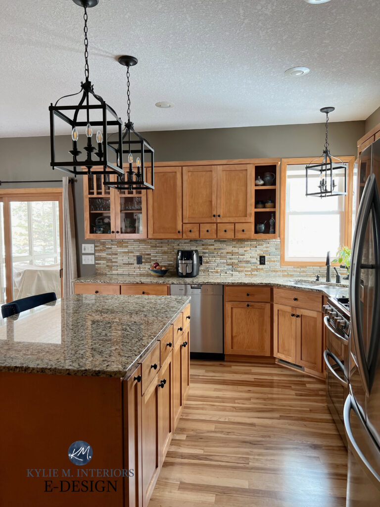
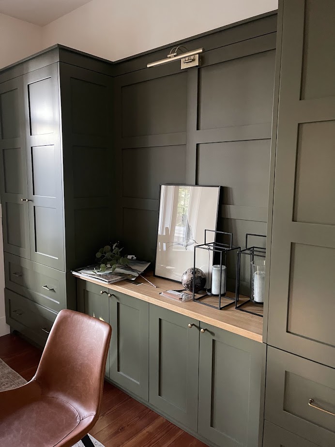
Hi, please post colours that are used in your pics.. what is on the cupboard under “DARK PAINT COLORS IN LOW LIGHT”? some sort of olive green… please tell..