
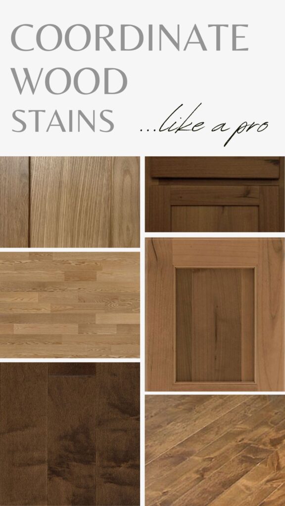
How to Coordinate Wood Stains Like a Pro: Oak, Maple, Cherry, Alder (& More)
Match & Coordinate Different Wood Tones
Have you always wanted to coordinate wood stains like a pro? Or maybe it’s just a one-time thing, and you want to get it right. Regardless, when updating a home (or building one), we often encounter two different wood surfaces that must be coordinated – sometimes cabinets and flooring, other times wood trims and furniture.
- But what makes one wood tone clash with another?
- What makes one stain look fabulous and another look fugly?
- And how do you coordinate or mix wood tones when you have an existing wood (that maybe isn’t your fave) and want to add a new one?
It all comes down to undertone.
However, not all wood undertones are obvious at first glance—some wood stains just look like wood. This is why I’ve created this guide to help you see examples that might enlighten you about your wood finish and what it might be hiding. We’ll also learn how to coordinate with it!
THE MOST POPULAR WOODS: CABINETS, TRIMS, & FLOORS
There are dozens of species of wood found in today’s home – exotic, natural, engineered, plastic products made to LOOK like wood. Whether it’s real or fake, this blog post has a heavy focus on the following woods…
- OAK
- MAPLE
- CHERRY
- HICKORY
- ALDER
- DARK/ESPRESSO STAINS (not a wood, but a category to itself)
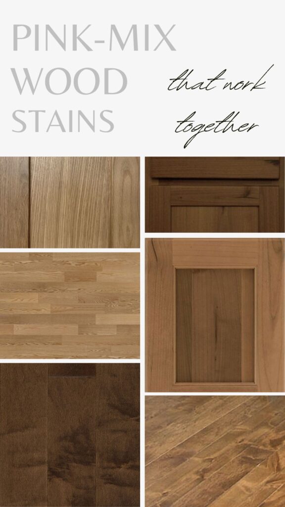
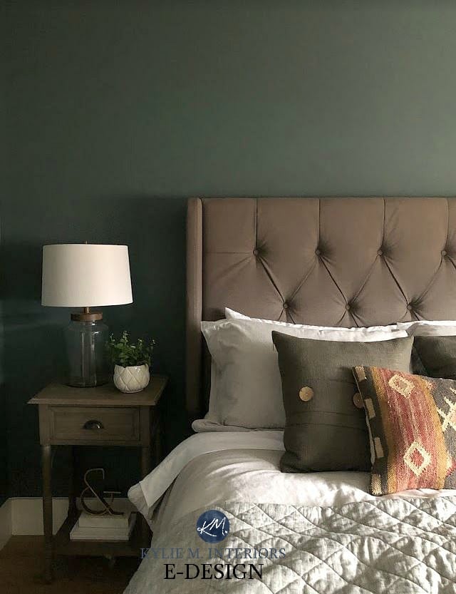
Notice how the subtle green hue on the wall enhances the pink undertone of this floor.
However, there are other woods out there. While they aren’t as common or popular, they do pop up in my clients’ homes.
- PINE
- BEECH
- WALNUT
- EXOTIC (tend to be heavy on the red and orange)
- MAHOGANY (especially on trim and furniture)
While I haven’t hit ALL the woods in this blog post—I’M ONLY ONE WOMAN—the same principles apply. You’ll find tons of tips below to help coordinate these woods, too. I don’t have as many images of these woods in action, so if you have photos of your own home, send them along! If I can get enough, I’ll make a blog post for you!
Today, we’re looking at the most popular woods used in the average home, including oak, maple, and cherry, and we’ll coordinate wood stains like pros.
1. FIGURE OUT WHICH WOOD SPECIES YOU HAVE
Whether you have wood cabinets, flooring, furniture, or trim, it’s ideal (but not vital) to determine which type of wood it is. If you don’t know, take pictures of it in a few areas, take it to a local flooring or wood supply store, and ask the professionals there (ask a few different ones to make sure the opinions are consistent).

Knowing which species of wood you’re dealing with can be one way to determine whether it has undertones, for example.
- ALDER: can have golden red tones (red can mean ‘pink’)
- ASH: warm-yellow-golden tone
- CHERRY: commonly has red/pink undertones
- MAHOGANY: caters to red undertones
- MAPLE: often has yellow or yellow-pink hues
- POPLAR: usually yellow, can grab a flash of green
- RED OAK: pink undertones
- WALNUT: often has red undertones, can grab a wink of violet
- WHITE OAK: has the most neutral undertones, more of a soft golden warmth – can become more golden over time
While the stains aren’t the same, they both share a pink undertone, so they work!
Of course, these are all subject to the STAIN color you choose. Remember, even with a well-intentioned stain, a wood with a strong undertone (i.e., red oak) can still flash some pink in the background!
2. FIGURE OUT THE MAIN UNDERTONE OF YOUR WOOD
This is tricky, as so many people see their wood as pretty darn neutral or brown. As with neutral paint colors and their undertones, sometimes you don’t know the undertone of your wood until you compare it to something different.
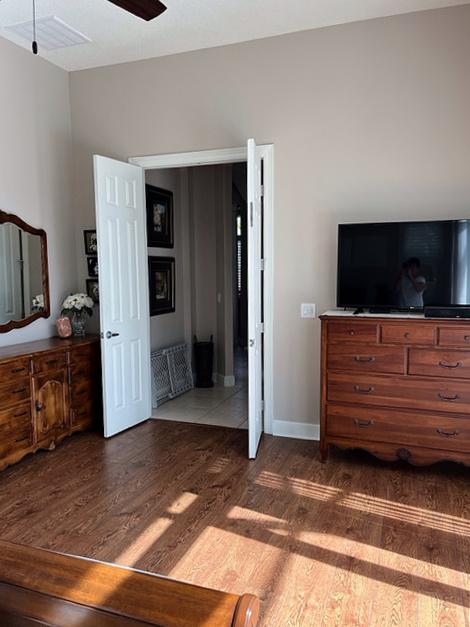
For example, in this next bedroom, the pink undertone of the oak floor flows well enough with the violet-red of the dresser. However, notice how the footboard pops up a touch of orange in comparison. It’s no biggie, just something to note…
3. DECIDE IF YOU WANT TO MATCH OR COORDINATE WOOD STAINS
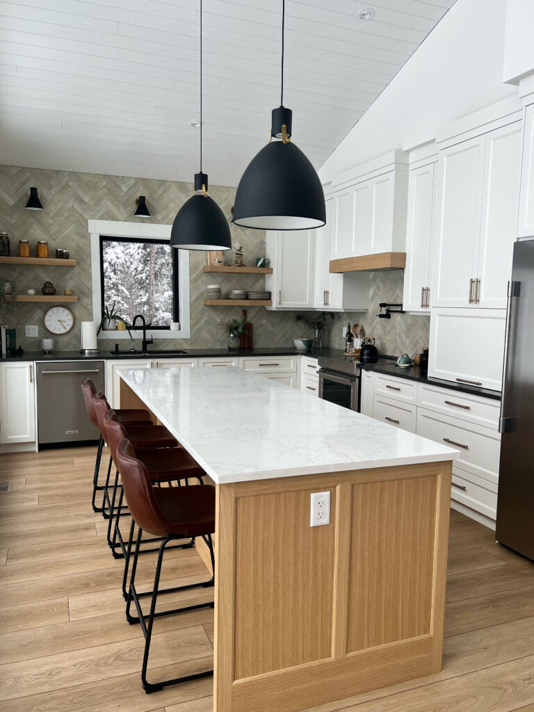
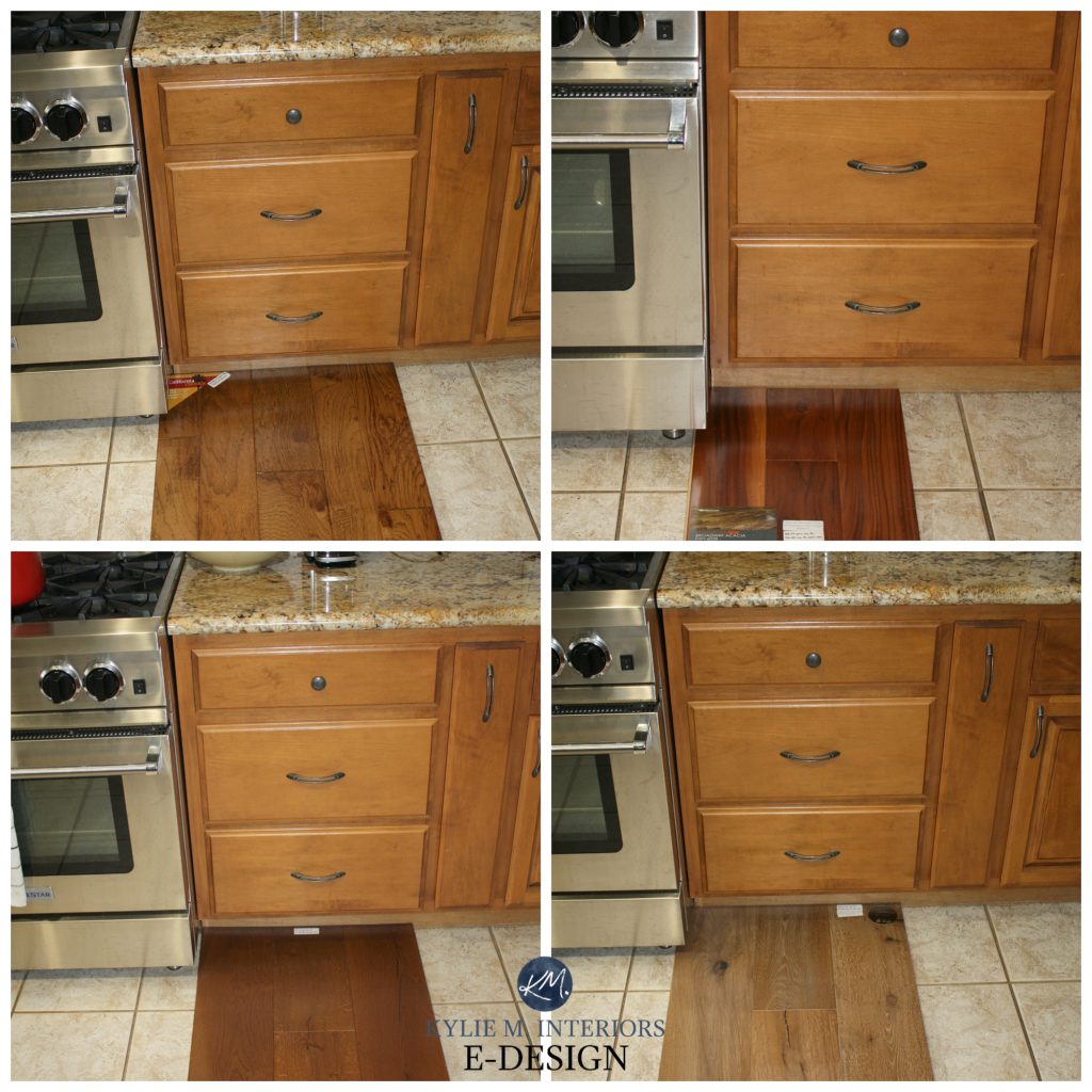
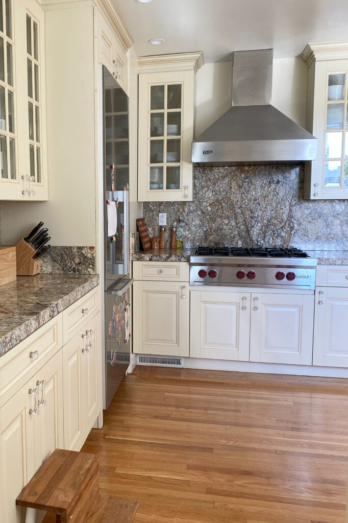
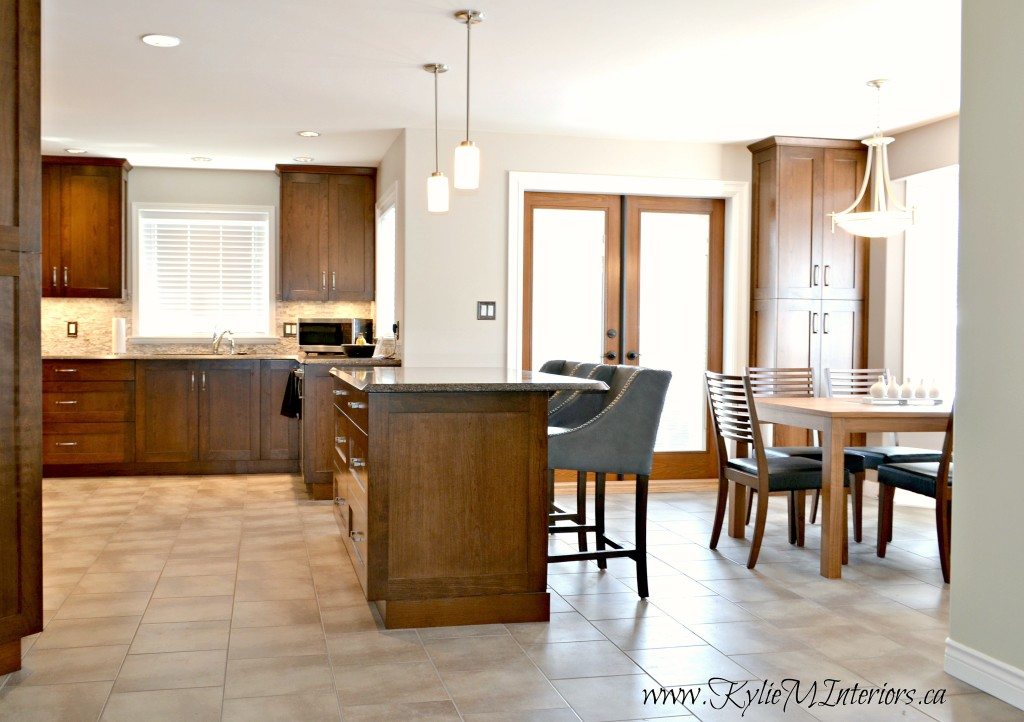
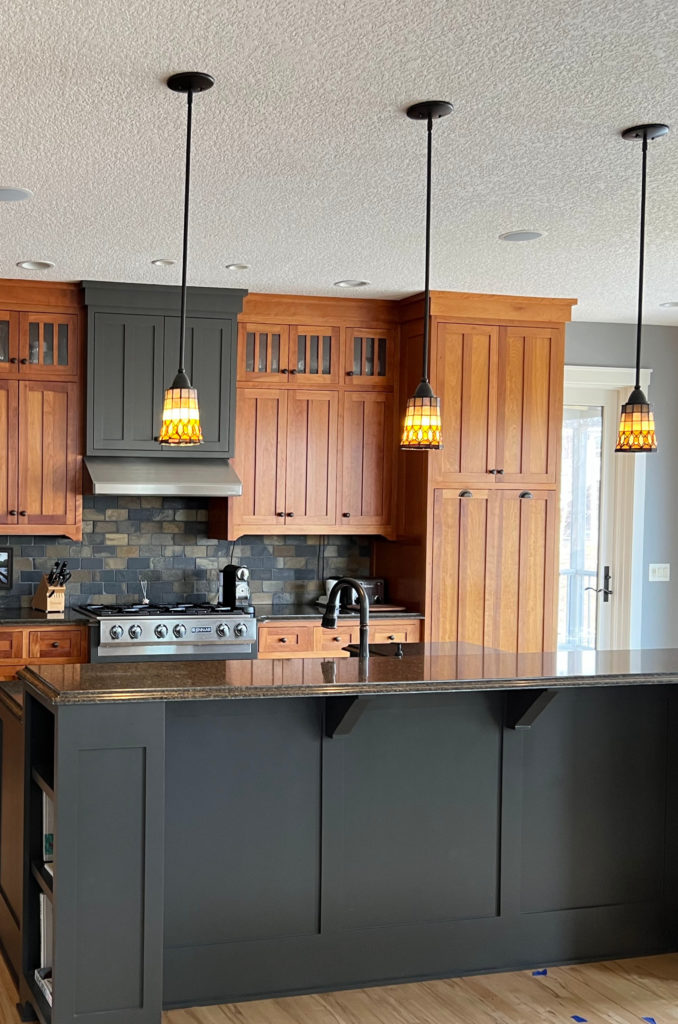
If you want to match your wood stain, you want the same depth and undertone. You can do this with the same wood species or, as shown in this next kitchen, two different ones.
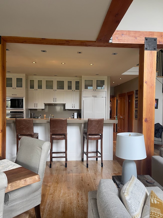
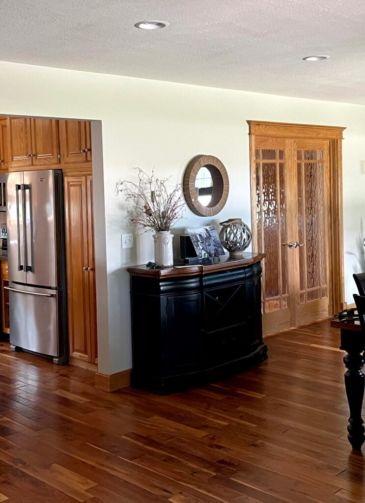
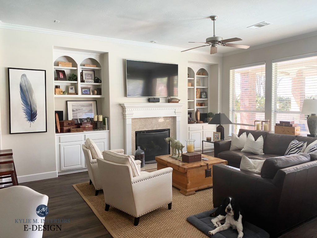
When coordinating wood cabinets with wood flooring, it’s often better to have the wood cabinets or island the darker of the two.
On the other hand, if you want to COORDINATE wood stains without matching, you’ll need one wood surface to be lighter or darker than the other…
The warm wood trims, dining room furniture, and flooring in the above dining room are very well-coordinated (I only wish the ceiling were a touch softer/less orange – but I’m just being picky).
4. CONSIDER THE DEGREE OF RUSTICNESS OR MODERNITY YOU WANT
Like Brangelina, not all wood grains were meant to be together; in fact, they can bring out the worst in each other. For example…
- If you have rustic, alder, hickory, or alder cabinets, you might need a wood floor with a less graphic pattern to tone down the party.
- An exotic wood floor with a ton of visual interest can be overwhelmed by equally striking cabinets. Take one of the colors from your floor and repeat that on the cabinets in a more muted wood and moderate grain pattern (or just do painted cabinets instead).
The grain of these next cabinets is reasonably strong. While the stain color is gorgeous and moderate (workable), the new LVP (Luxury Vinyl Plank) flooring clashes, not just in colors but also in grain pattern—something’s got to give.
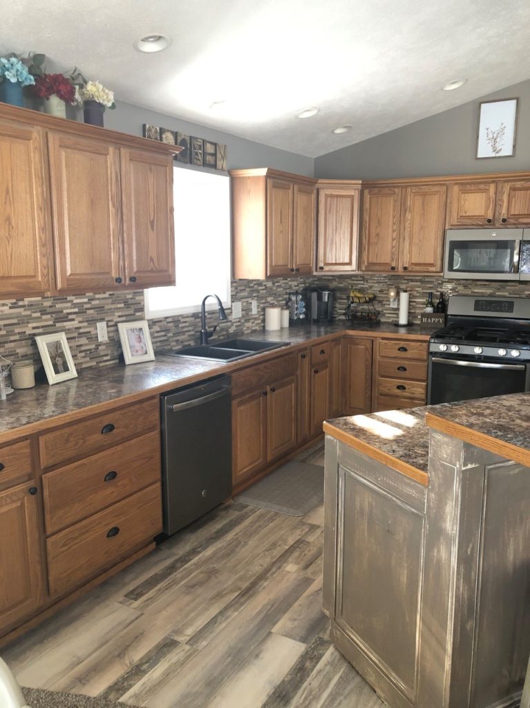
This next kitchen is an example of a kitchen with a lot of visual interest via its wood stains and grains. The combo would be great if the cabinets were just a bit less patterned (more like the panel above the stove).
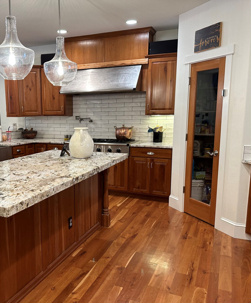
However, considering the intensity of the wood tone, it’s still a lot for many people (including this color cowgirl). In this case, my client was ready to calm things down with painted cabinets…
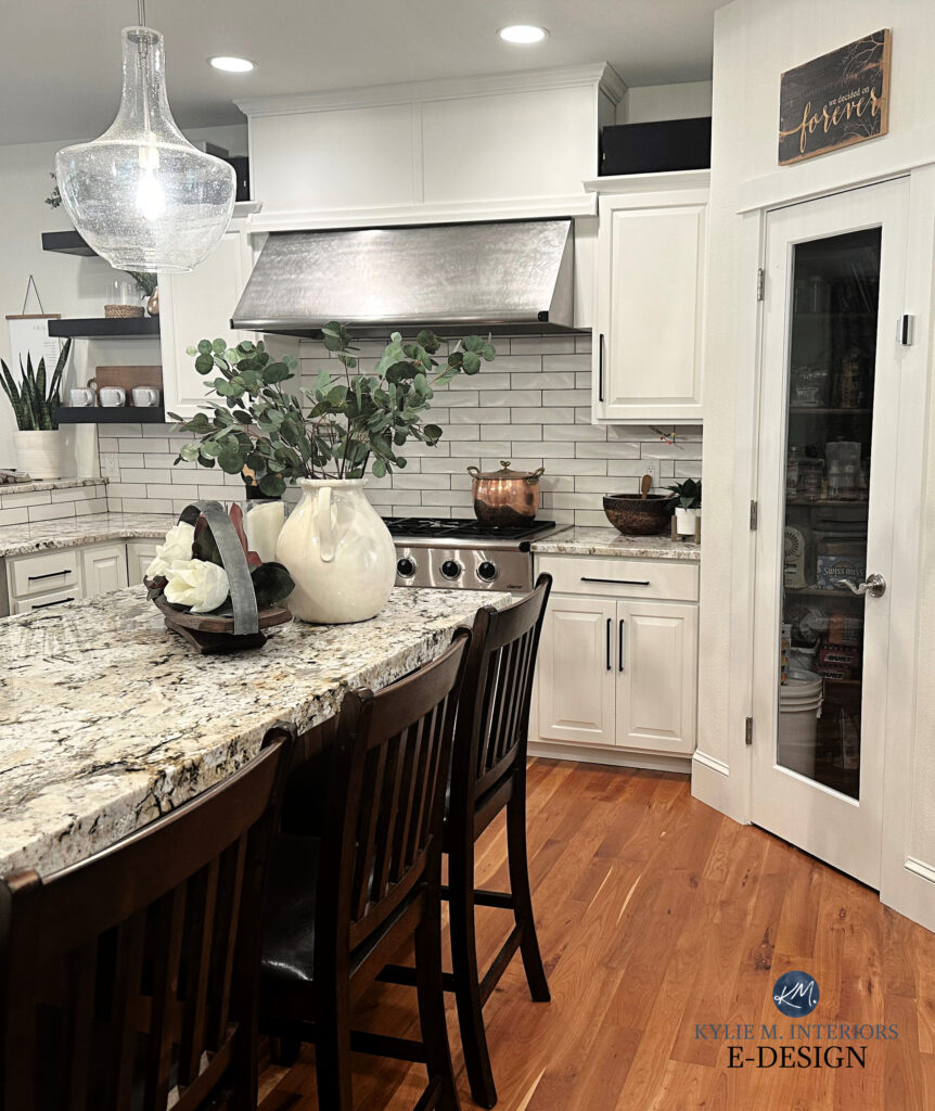
It’s 50/50 – some would keep the wood cabinets, and others would be slappin’ paint on them!
The floor is much happier because of it. Why? It has something to bounce off of and play with (like when I married Tim)!
And you KNOW I’ve been waiting patiently to say it…
Just because it’s wood doesn’t mean it’s good.
That’s right. At the end of the day, some wood surfaces look better without a nearby competing wood finish—no matter how well it’s coordinated. Think twice before you commit to wood-on-wood spaces. It’s not a hard no, and it’s more often a very strong yes. Consider what your home could look like if you didn’t add more wood and chose a paint color, tile, or contrasting product instead.
THE MOST COMMON WOOD UNDERTONES
The first color is the bossiest in the following combos…
- orange-red
- orange-yellow
- yellow-orange
- yellow-green
- yellow-pink
- red-violet
- red-orange
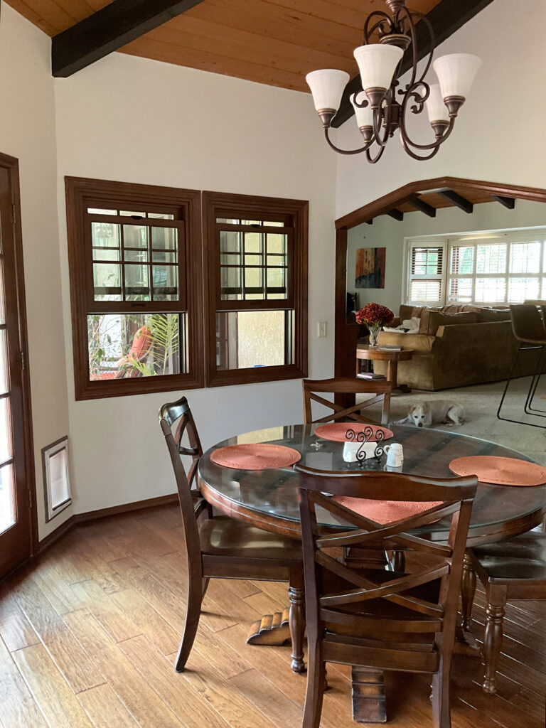
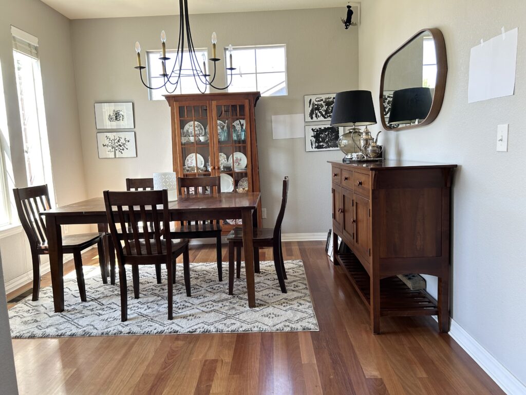
The wood furniture in this dining room is well coordinated with the floor. Between them all, the wood grains and stains jibe as they share a red hue…
And, of course, we have whitewashes and gray washes.
If your wood cabinets or flooring have a white or gray wash, they likely have purple or purple-pink undertones. I know they might ‘look gray – trust me, they aren’t.
The above wood-look tile floor is gray…with a strong violet undertone.
This wood floor has pink-violet tones.
I’ll write a separate blog post on gray wash and whitewashed wood finishes, as they’re creatures unto themselves! If you have one of these, you might find the info on ‘violet and pink’ wood stains helpful (in the info below).
The undertone of your wood will directly affect your choice of paint color, other wood finishes, furnishings, sanity, and more.
In the above images, which flooring would YOU pick with those kitchen cabinets?
- TOP RIGHT: too rich and red – notice how the cabinets look more orange in comparison
- BOTTOM LEFT: Again, too red, although it’s more red-orange than the previous combo
- BOTTOM RIGHT: Right idea, but too yellow and washed-out (and too rustic)
- TOP LEFT: Winner winner, chicken dinner – just LOOK at those undertones! While it would be great if it were a bit lighter, it’s the closest.
Now, before we get into the meat n’ potatoes (with a TON of homemade gravy), let’s cover a few tips…
WOOD STAIN COORDINATING TIPS
It’s not just about mixing and matching stain colors—there’s more to finding your wood’s tone and coordinating it with another.
1. AVOID TWO BUSY GRAINS
If you have two wood surfaces with a strong grain, they can compete. For example, choose a rift cut if you have oak cabinetry from the 90s and want oak flooring. Or, step into a different species like maple or alder with a smooth, less busy grain pattern.
In the above kitchen, this combo works for a few reasons…
- The undertones of the woods coordinate with each other (purple-brown).
- While the hardwood floor has a reasonably strong grain, the stain color is so dark that the pattern gets blended.
- The cabinets have a more moderate grain pattern.
In this next kitchen, the oak cabinet’s grain pattern is pretty darn strong, as is the floor…
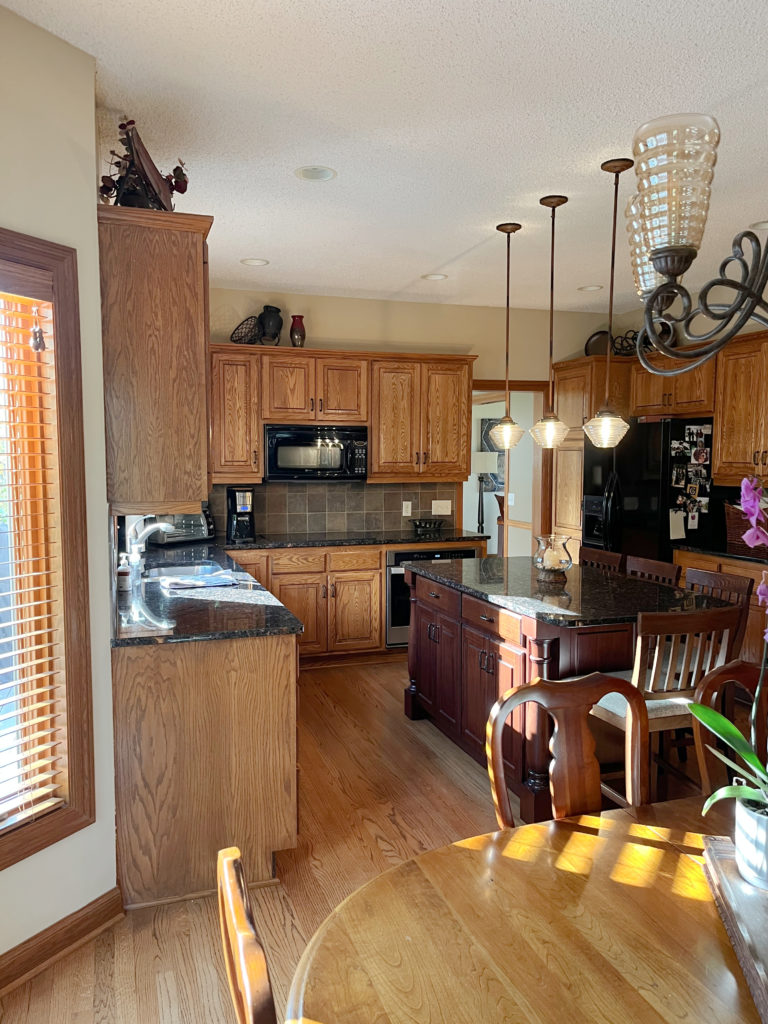
- While this isn’t a BAD combo, a) it would be nice to see a bit more difference in depth between the two stains, and b) overall, it is a busier look with the two stronger wood grains.
- Also, notice the red-stained island and how it’s too red for the orange of the cabinets.
- Ugh, I hate picking a room apart because nothing has to be perfect (it’s a HOME, not a HOUSE). But for learning, notice how the table picks up more yellow than the pink in the floor.
Remember, you can mix different wood species, so don’t feel limited to one particular tree.
2. COMPARE
Comparing different woods to each other can make the undertones easier to see (as shown earlier). If you’re choosing new wood flooring or cabinetry, lay a few ‘similar’ samples next to each other. You should see a shift from one color to another and can eliminate the undertones you want to avoid. You must do this in your own home, not in the store, as store lighting always skews things – as does a glass of wine, so have a drink after you’ve picked your fave.
3. ASK A PRO
Whether it’s a flooring store or the paint dept (or me!), a professional should be able to tell you the ‘basic underlying color or dominant wood tone’ in your stain. If you can’t bring a sample of your existing wood finish to them (i.e., a cabinet drawer), take a quality photograph, and they should be able to give you the general idea.
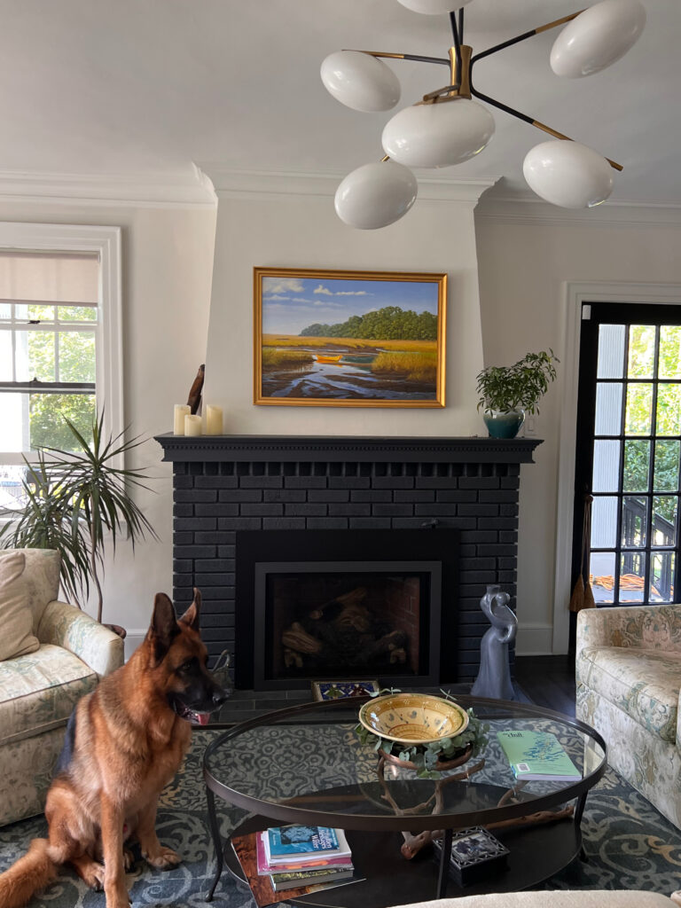
Note the consistency in wood undertones between the mantel, coffee table, and flooring—and they’re all different species!
Now, here’s where I blow your mind. Okay, maybe not, but at least you’ll be slightly entertained as you may have never known your wood has pink, purple, or even green tones (will wonders never cease!)
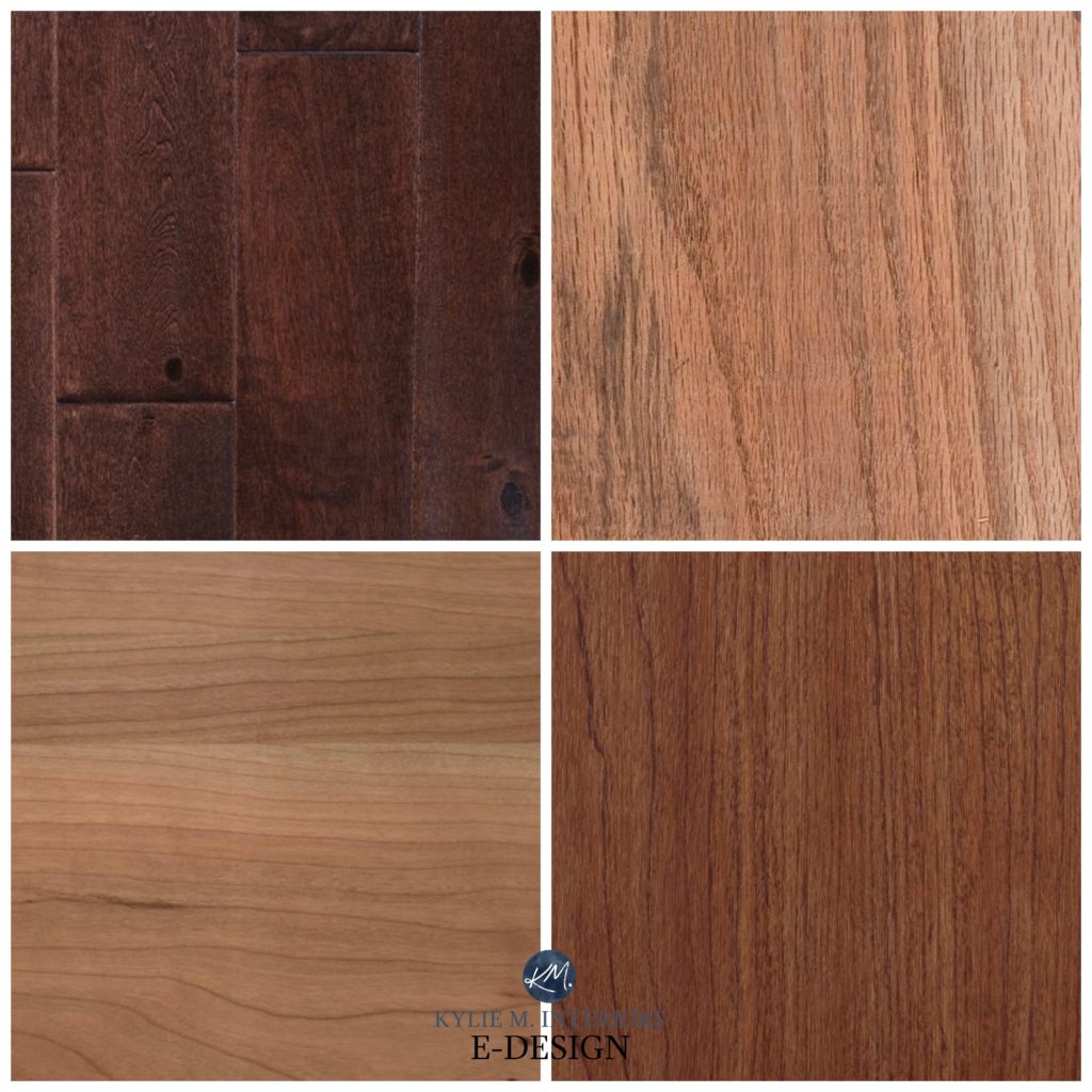
COMMON WOODS & THEIR UNDERTONES
This is where I come in handy (wink wink)—I am an expert on hard wood (wink wink). Just joking—I’m an Online Paint Color Expert—not a wood expert. However, I am pretty darn good at seeing colors and undertones.
I’ve put together some collages to show you the variations you can expect to see in the more popular wood species.
This wood flooring has a pink undertone.
Look for the one that looks the most like your wood’s COLOR, even if the species isn’t the same.
By the way, pink is a lighter version of red. In the descriptions below, I use pink or red, depending on how dark/strong it is.
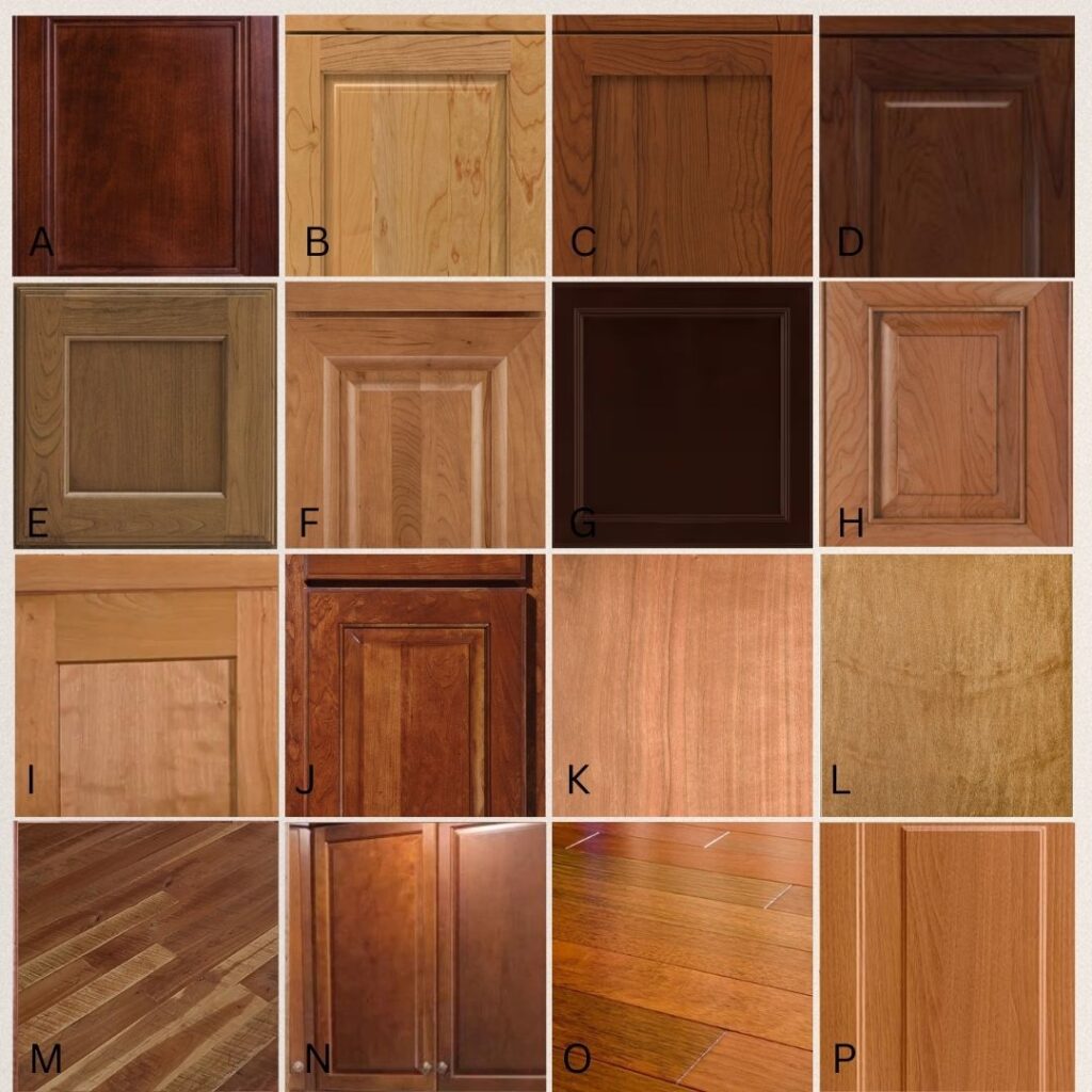
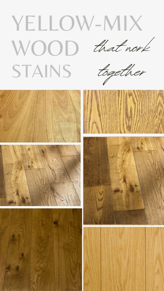
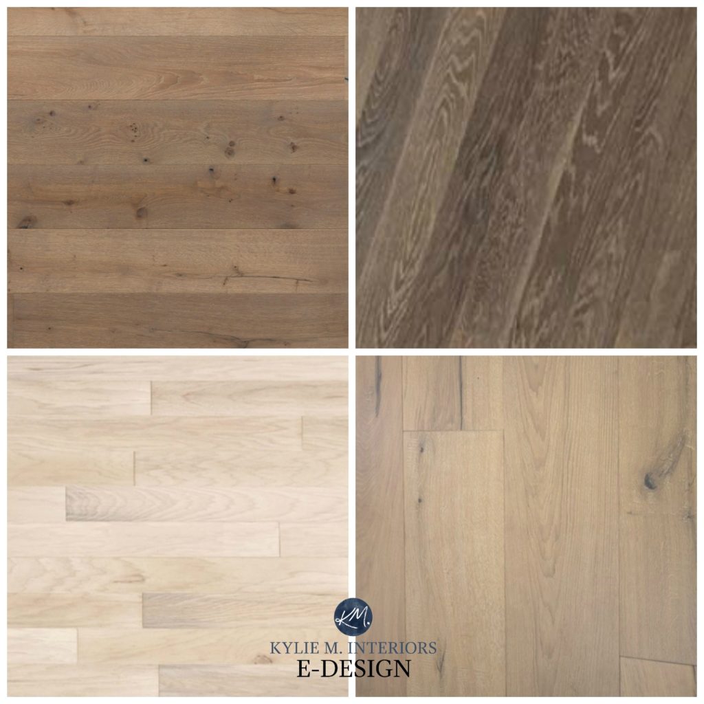
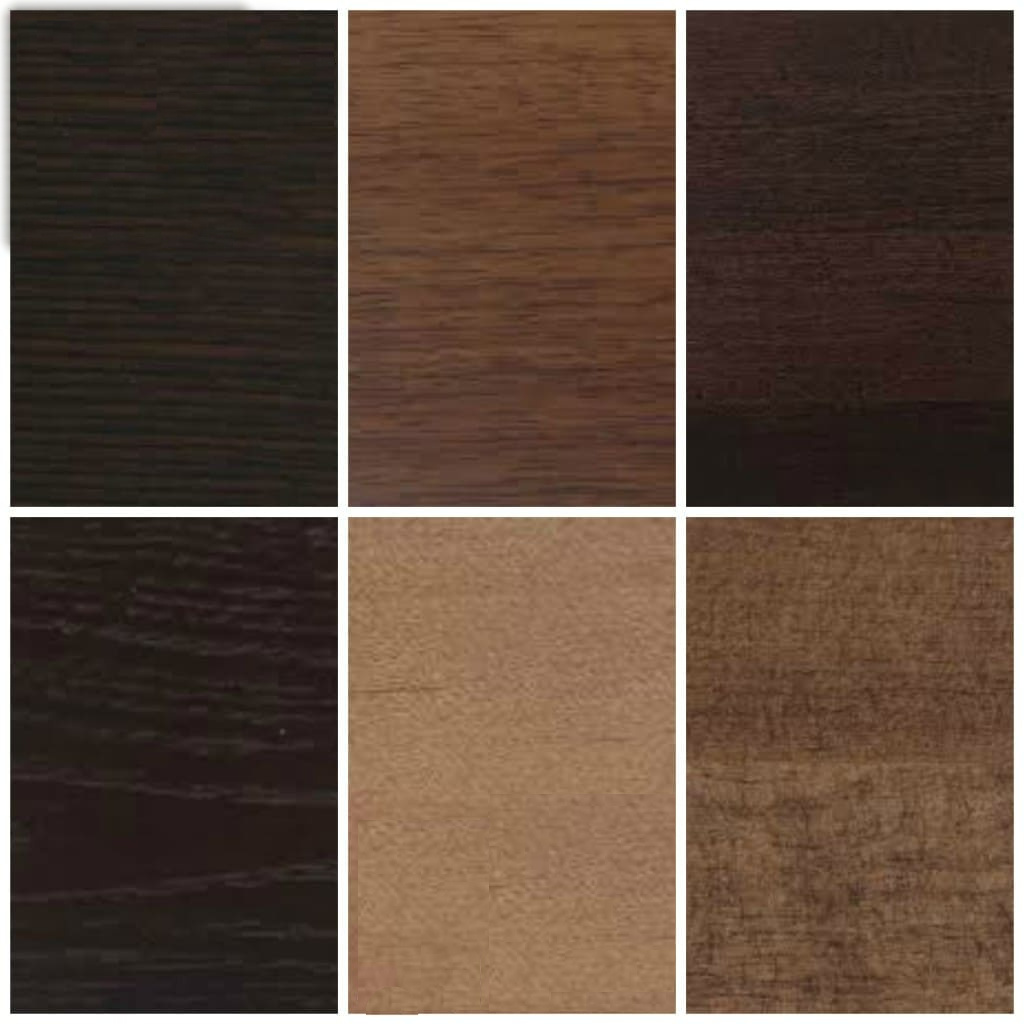
OAK & ITS UNDERTONES
Even though it’s taken a good 20 years for oak to become popular again on flooring and cabinets, I find it timeless. It all comes down to…
The grain and the stain.
This wood floor looks quite pink-violet with its undertones.
How to Update Golden or Honey Oak Cabinets
While some of these are blends, I’ve tried to capitalize on the main color. I’ll note any secondary undertone in brackets.
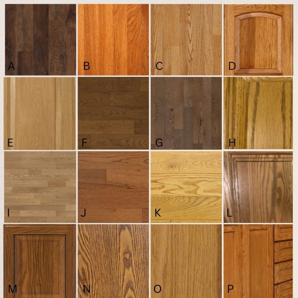
The most versatile oak stain will have some brown to calm down any yellow, orange, red, or green.
A: VIOLET (RED) B: ORANGE (RED) C: ORANGE-PINK D: ORANGE-PINK E: PINK F: RELATIVELY NEUTRAL, CATERING SLIGHTLY TO RED-BROWN G: VIOLET-PINK H: YELLOW-ORANGE (GREEN) I: PINK (VIOLET) J: PINK K: YELLOW-ORANGE (GREEN) L: PINK-VIOLET M: RED-ORANGE N: RED-ORANGE O: PINK-ORANGE P: ORANGE-RED
Of the above wood stains, the most common ones I see in my Online Paint Color Consulting are H, L, N, and P.
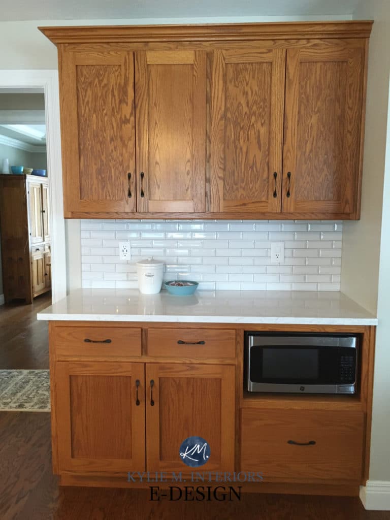
This next oak floor is a traditional oak, common from the ’90s (which is likely when this kitchen was updated). Notice its orange-pink tones and how the pink looks stronger on the right side…
How to Update Cream Cabinets & Trim
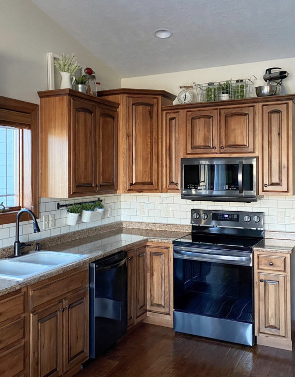
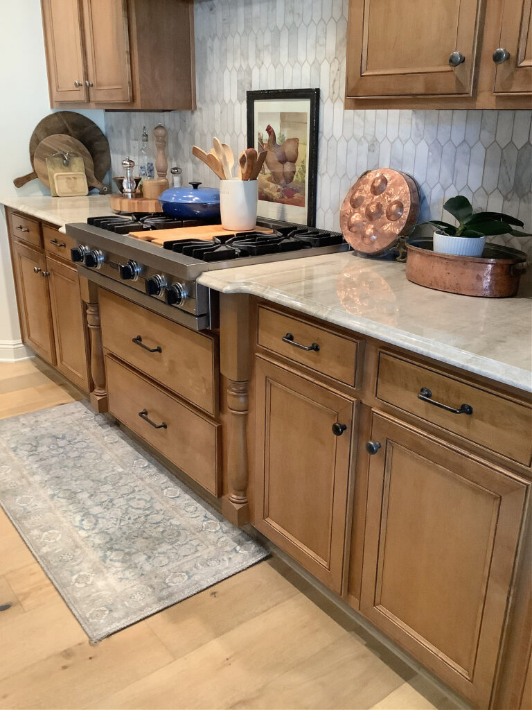
These next cabinets have a dominant orange tone with a good dose of red (common in kitchens from the 90s & early 2000s)…
Ideas to Update Oak Cabinets Without a Drop of Paint!
Now notice the degree of red in the floor compared to the orange of the cabinets. Ideally, the floor would be more orange and less red.
Don’t worry—we’ll get into coordinating tips shortly. First, I need to hit the other woods.
If you have questions, find answers here: Coordinating Wood Stains & Finishes: COMMON QUESTIONS
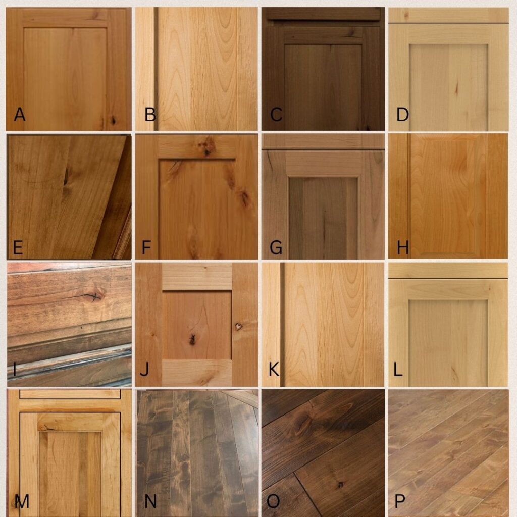
MAPLE WOOD CABINETS, FLOORS, & UNDERTONES
Maple is one of the most popular wood finishes for cabinets, but clearly, all maple stains are not created equal! Again, some of these are a blend, so I’ve tried to capitalize on the main color…
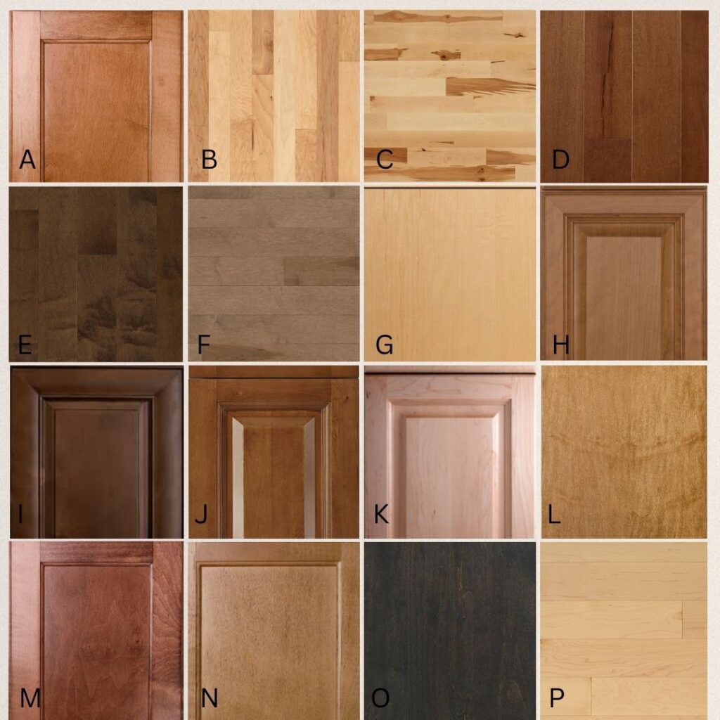
The most versatile maple stain will have some brown to neutralize its colors.
A: PINK (ORANGE) B: YELLOW-PINK C: YELLOW-PINK-ORANGE D: RED-ORANGE E: VIOLET-PINK F: PINK-VIOLET G: YELLOW-PINK H: PINK-VIOLET I: VIOLET-PINK J: RED-VIOLET (BROWN) K: PINK L: ORANGE (PINK) M: RED-PINK (VIOLET) N: PINK-VIOLET (BROWN) O: VIOLET P: YELLOW (PINK)
These maple cabinets are gorgeously brown with a subtle violet undertone. This type of brown is a great, versatile stain color.
These next maple cabinets have a strong pink hue (pink-orange or pink-peach). With this type of cabinet, it’s best to have a tile floor as no wood floor will look great UNLESS it’s a match in color/depth…
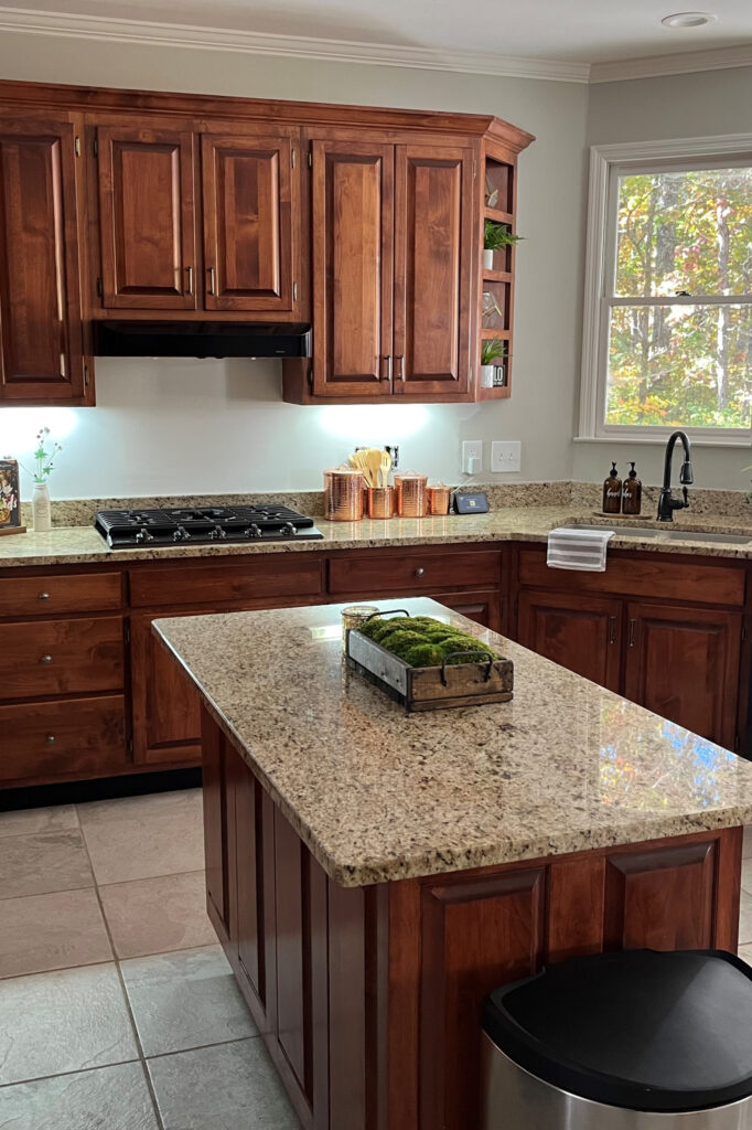
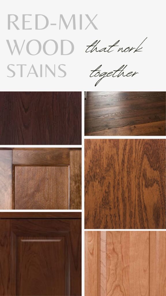
CHERRY WOOD FINISHES & THEIR UNDERTONES
While woods change color over time, naturally finished cherry is well-known for becoming richer and more orange-red as time goes on…
You’ll see a lot more consistency in the undertones of cherry wood finishes! Ultimately, expect SOME degree of pink in your cherry finish and varying degrees of orange, red (dark pink), and violet.
The most versatile cherry wood will have some brown to calm down the red-pink.
A: RED (PURPLE) B: ORANGE-PINK C: ORANGE (PINK-PURPLE) D: RED (PURPLE) E: PINK-VIOLET (BROWN) F: PINK (VIOLET) G: VIOLET (RED) H: PINK (VIOLET) I: PINK- (ORANGE) J: RED-ORANGE K: PINK-VIOLET L: ORANGE-PINK (BROWN) M: PINK-ORANGE (VIOLET) N: RED-ORANGE (VIOLET) O: ORANGE (PINK) P: PINK-ORANGE (VIOLET)
I don’t know if these are cherry or another wood with a red stain – either way, they’re strong!
These more natural cherry wood cabinets have a red (pink)-orange hue.
ALDER & ITS UNDERTONES
While alder isn’t nearly as common, it was popular in homes built in the early to mid-2000s. Even today, people are putting alder in their homes, more often on cabinets than floors.
Alder is another wood that caters lightly to pink over the other undertones, as shown in the above examples, so let’s see what we’ve got…
A: ORANGE (PINK) B: ORANGE (PINK) C: BROWN (PINK) D: YELLOW (PINK) E: ORANGE (PINK-VIOLET) F: ORANGE (pink) G: PINK-VIOLET H: ORANGE (VAGUE PINK) I: VIOLET-PINK J: PINK (ORANGE) K: ORANGE (PINK) L: YELLOW (PINK-GREEN) M: ORANGE (PINK) N: VIOLET-PINK O: RED (PINK-VIOLET) P: PINK-VIOLET (ORANGE)
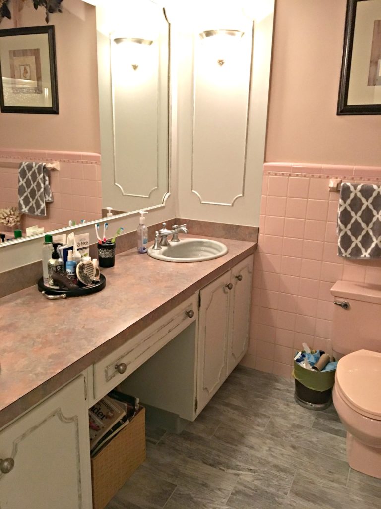
This next bathroom was our home when we first bought it (that’s my way of saying I didn’t choose this wall color or seashell decor). It’s still waiting for its facelift (hopefully this year) but has some reasonable bones to work with…
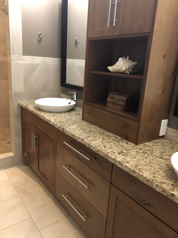
These alder cabinets are brown with a touch of pink undertone.
Ideas to Update Your 2000s Bathroom
HOW TO COORDINATE WOOD STAINS & UNDERTONES
While some of you are starting from scratch, others want to add a new wood finish and need it to coordinate with an existing one. This is MOST often the case with…
- original wood cabinets and new wood flooring
- old wood trim (and doors) and new wood flooring
Of course, the same tips apply if you’re coordinating furniture to floors or cabinets to trims, but the above two are the most common situations.
The challenge is that I can’t put together EVERY possible combination – I’m just here to give you tips and ideas on how to mix and match on your own!
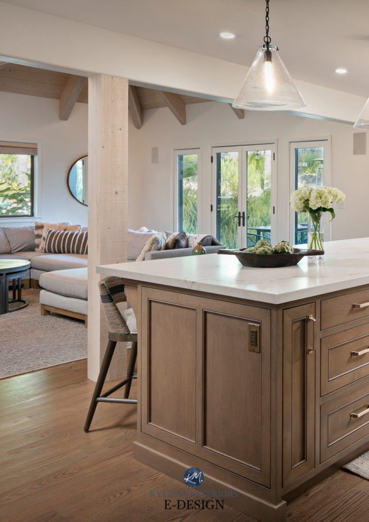
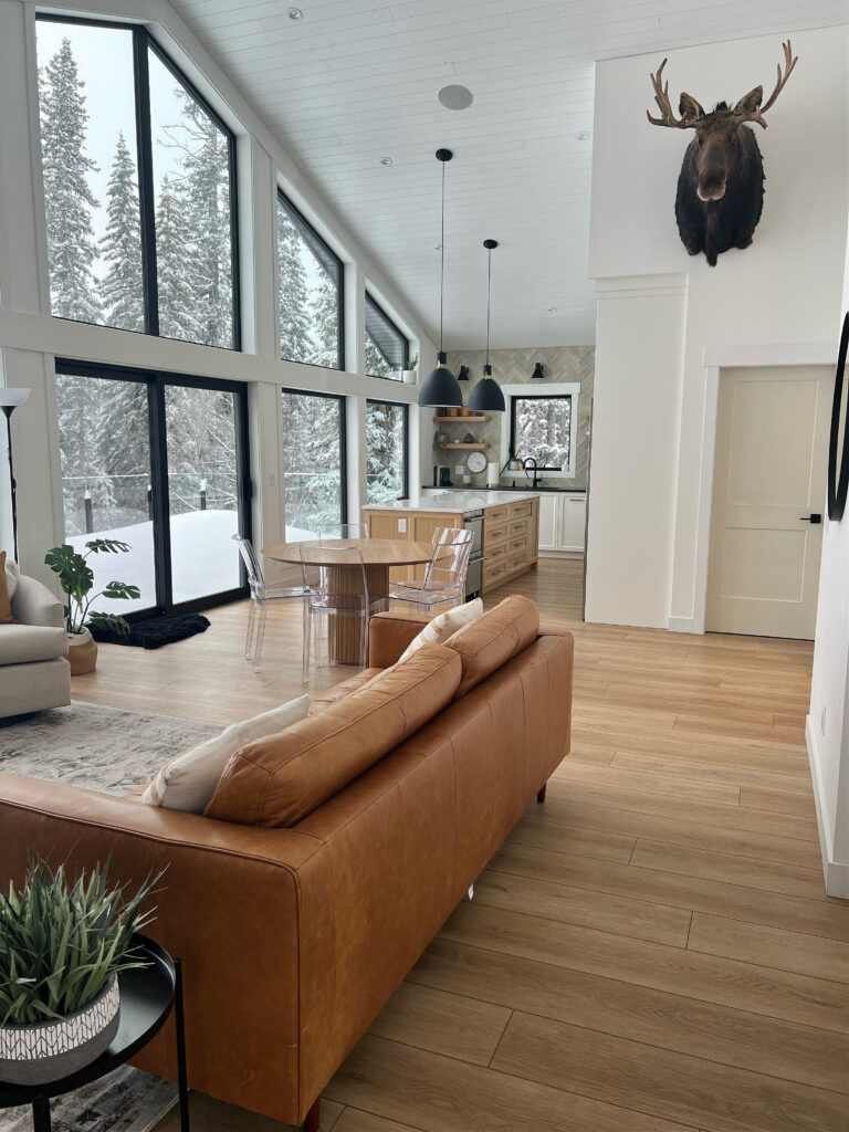
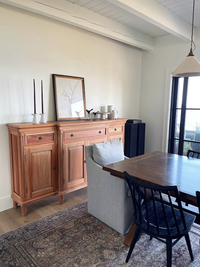
The wood floor and wood cabinets both share a subtle pink undertone.
COORDINATING WITH YELLOW-TONED WOOD CABINETS, FLOORS, TRIMS
As an undertone or bossy hue, yellow can flex between yellow-orange, yellow-pink, and even yellow-green. However, the key ingredient is that of ALL the undertones, yellow is the most dominant. Interestingly enough, you’ll find less of this as it relates to oak, maple, and cherry, but it’s good info all the same!
If you’re mixing two types of woods with similar undertones, make sure only ONE has a dominant grain (or neither). Both can’t have strong grains or they could compete.
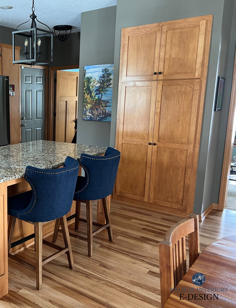
COORDINATING WITH ORANGE-TONED WOOD STAINS
Wood finishes with a dominant orange undertone can be orange-yellow (with the odd flash of green) or orange-pink (with the odd flash of violet). Of course, the odd wood stain looks more or less orange, but it’s not as common.

Of the finishes below, I haven’t paid as much attention to the type of wood or degree of grain—this is more about color.
Here’s a grouping of woods with an orange undertone that all look good together, as they all have orange in common…
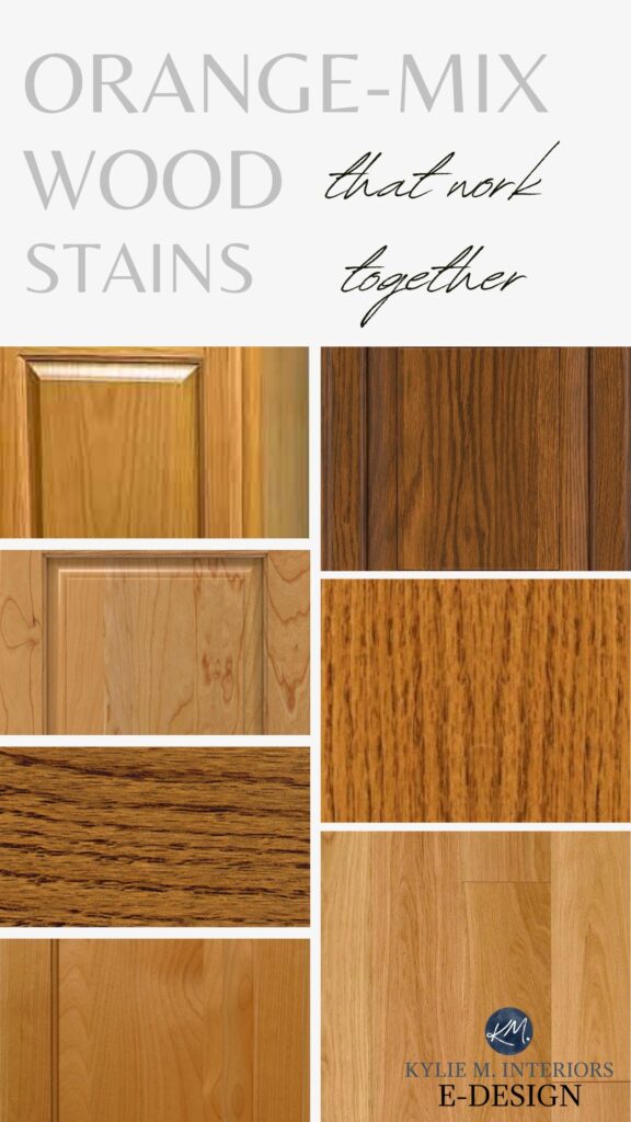
This next home’s wood doors and cabinets are gloriously rich and orange-toned. These woods are dominant orange with a minor red tone…
While the floor has more red, there’s enough orange that it grabs the doors and cabinets nicely.
The doors are ORANGE-red, the floors are RED-orange – and they love each other. They share the same colors, just in different proportions.
COORDINATING WITH PINK WOODS
Woods with a pink undertone or red tone are variations of each other, as pink is the lighter. The warmer the red-pink, the more likely it is to grab a bit of orange or yellow. Cooler pink tones will pick up more violet (and often gray).
These red tones can be red-orange, red-violet, pink-orange, pink-yellow, or pink-violet—as long as red or pink is the BOSSIEST color.
A few of these are cutting it close, but the general idea is here…
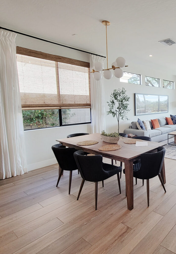
While this next floor has a tiny flash of pink, it’s really a great neutral, flexible wood stain…
This next floor is more committed to its pink undertone. Notice how well the red of the dining table flows with the pink (the light version of red) flooring…
COORDINATING WITH STAINS THAT ARE LESS PINK & MORE RED
Some cherry or red stains are more committed to red. However, these red foods coordinate well with stains with a lighter red stain (pink)…
And while I said it earlier, I’m sayin’ it again…
If you’re mixing two types of woods with similar undertones, make sure only ONE has a dominant grain (or neither). Both can’t have strong grains or they could compete.
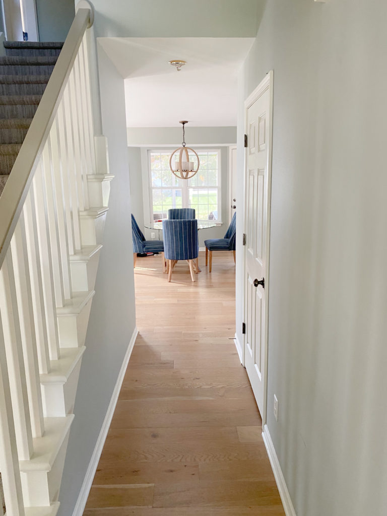
In this next hallway, notice the play of the wood trims versus the wood floor…
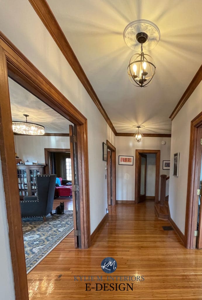
I would LOVE to have an older home like this – LOVE IT!
Overall, it looks great. However, let’s do a quick little exercise (Richard Simmons style)…
1. Look at the door trim closest to you on the LEFT. Notice how rich orange/auburn it is and how great it looks with the orange tones of the floor. A similar tone is found further back in the hallway as well, and it’s awesome.
2. Look at the door trim on the far right closest to you. Notice how it looks a touch more red-violet and is more disconnected from the floor.
It’s all a play on lighting (Kelvins and exposure) and light bulbs, as the trim color varies throughout this hallway. However, the overall look is great with the wood tones of the floor.

SAMPLIZE peel and stick paint samples are more affordable than traditional paint pots and…
They deliver to your doorstep in 1 DAY!
Check out SAMPLIZE HERE!
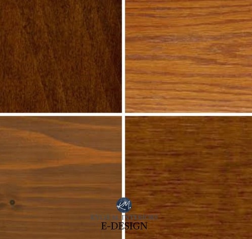
COORDINATING WITH VIOLET-TONED WOODS
Purple-toned wood floors and cabinets are often mistaken for gray, but they sure as heck aren’t. Try putting a color with a green undertone next to them, and you’ll see that violet pop up! The tones in these floors can lean pink or more violet, depending on the blend.
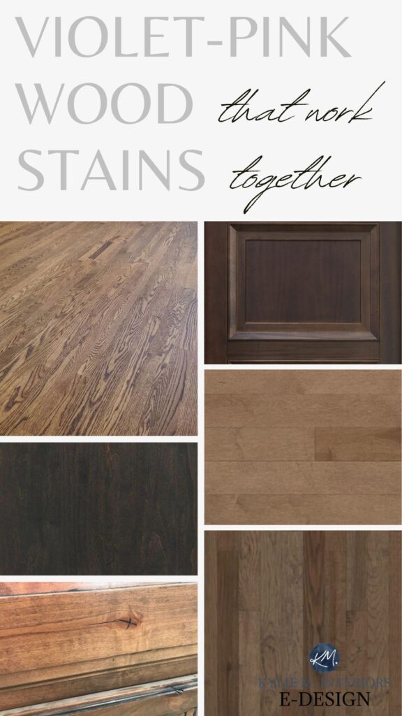
While the buffet in this dining room (below) is a bit strong (orange-pink) for the floor and table, the room still looks amazing, as all the woods share a pink undertone.
Also, notice the warm violet-pink hues in the area rug.
It doesn’t need to be perfect to be PRETTY!
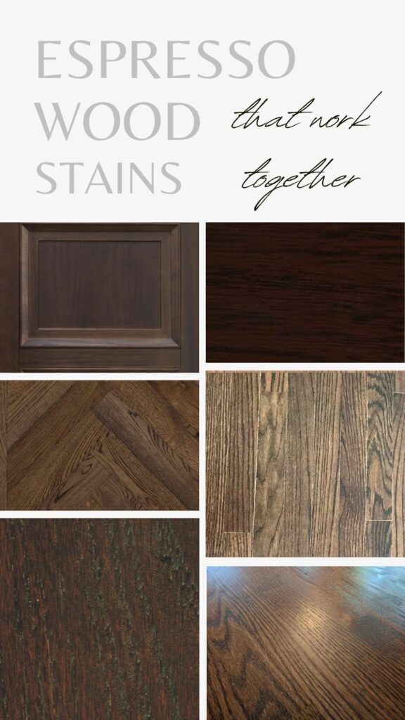
Some gorgeous, more purple-inspired stain colors…
Coordinating Wood Stains & Finishes: COMMON QUESTIONS
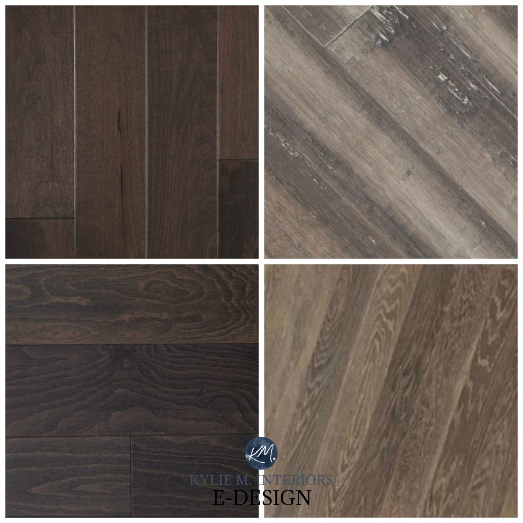
COORDINATING WITH ESPRESSO OR DARK-STAINED CABINETS
Espresso is one of the trickiest stain colors to coordinate with, as while the undertone can look neutral, it often leans toward the purple end of things.
This next built-in cabinet/wood floor combination is great, as they share a decent violet undertone…
IS THERE ANY WIGGLE ROOM WITH WOOD TONES? YES!
There are always exceptions, and sometimes, as long as it’s not BLATANTLY different, you can get away with a subtle shift in undertone and have a better chance of it working if neither wood is drastically lighter/darker than the other.
For example, in this next photo, although the cabinets have a wee tiny bit more orange than the floor because both are reasonably toned down, the flow is all right.

In this next example, although the cabinet has a slightly more washed-out neutral look, it does have some of the floor colors in its pattern, and that’s the tie that binds!
You’ll also find more flexibility if your home is full of treasures and furniture. The more there is going on, the less attention is paid to these details. And while PERSONALLY, less can be more, there’s nothing wrong with a layered look. If that’s what you really love, just try to hit those coordinating undertones!
Want to learn what to do when your wood stains DON’T match?
I’VE GOT THE ANSWERS to that question and more!
Coordinate Wood Stains & Finishes: COMMON QUESTIONS
READ MORE
How to Update Your Wood Cabinets Without a Drop of Paint
The 20 Best Paint Colors to Go With Wood Cabinets, Trims, Flooring, & Furniture
How to Update Golden or Honey Oak Cabinets
What Paint Colors Go With Dark Wood Cabinets & Trim
Painted Cabinets vs. Stained Cabinets: A Questionnaire
Get the Online Paint Color Expert that DESIGNERS hire…

ORIGINALLY WRITTEN IN 2017, COMPLETELY OVERHAULED IN 2025


Why can’t I see any of the pictures? There’s a question mark in them.
Hey Cindy! I found one photo that wasn’t loading properly, but the rest are all there! It could be your privacy settings?
whats your recamendation for staining knotty alder doors with red western cedar walls? The kitchen cabinetss are light oak color.
Hey Arlene! While I do my best to help with coordinating stains, for personal advice I stay away from it as it depends on the stain brand, application, etc, as well as the undertones of the oak, which can vary!
Do you think clear knotty alder doors would go with cedar walls and undertones
I writing to ask if I can sending some pictures to you, for help to coordinate wood stains and paint colors. I’m having to do all of the work myself. I’m 71, help please. I can send pictures if this is an option for me. Thank you.
Your work is awesome, I’ve never seen a site that shows so many options that coordinate. And giving many options with rooms, colors, and wood. I love everything you are doing with all styles.
What a great comment to read, thank you, Gladys!
hi Kylie, my husband and I are installing natural hickory cabinets in our cabin on the lake. I need help on picking floor colors please! My color palette for my walls are accessible beige, (trim is pure white) I love greens and earthy colors. please help.
Rather than cabinets/floors, we are looking to find two good coordinating colors for our hardwood stairs/hardwood floors. We had a water leak, so we will be having to refinish the hardwoods of our entire downstairs. Since our house was built almost 15 years ago, we have decided to go with a lighter, more modern stain color. HOWEVER, the staircase will remain the same darker stain (white oak, all). What is a good rule-of-thumb in finding a lighter shade of stain for our floors to complement the existing darker stain on our staircase (I am pretty sure we will end up painting the stair risers a cream or pale gray to break up the dark, when all is said and done)? Thank you…I’m overwhelmed, for-sure!
Wellll, I’ll be 100% honest and tell you that there’s no way I would do a two-tone stair/flooring combo. Even if I want lighter floors, I would be matching the flooring to the stairs. OR…I’d do the lighter flooring I love and restain the stairs to match. I know that’s probably not what you want to hear, but sometimes that’s the best advice of all!
Hi!! This post was super helpful!! We are moving into a home with cherry cabinets we are not changing but we will refinish the hardwoods. This is where I am stumped! I love your examples that you put together. Do you have the names of the stain colors you are recommending?
Thanks so much!
Hi Shelby, I’m sorry, but I don’t! But on a different topic, did you see this blog post? It might come in handy! https://www.kylieminteriors.ca/the-best-paint-colors-to-go-with-red-wood-stains-oak-cherry-maple/
Hi Kylie,
Thank you SO much for posting this incredible information about wood tones! The images are a great help. I’ve got Brazilian Cherry wood floors on the main floor and hope to switch out the upstairs and basement carpeting to LVP in the next few years, but have been wondering how to select wood tones so all the floors and stairwell trim coordinate. This has been so helpful! So, thank you!
Also, a couple years ago I was trying to find the best neutral wall color, and after trying several popular SW paint colors – and none of them working! – I found a great post of yours about selecting paint colors according to the wood tones in flooring. And the color SW Natural Linen now graces my entire first floor, and IT IS BEAUTIFUL! You’re very good at your craft, and I really appreciate you sharing your ideas with us!
Oh wow, what a great note to read, thank you! Usually I’m poring through questions and it was just so nice to read this type of note – thank you :).