
Posted on November 28, 2023 by KylieMawdsley
LOW CEILING IDEAS: PAINT COLORS, DECOR, & MORE
Decorating or painting a room with a low ceiling can be challenging when you feel creatively stunted and short on ideas (yes, I amuse myself).
And while I’m sure that we all dream of soaring ceilings or, at the very least, 9′ ceilings, we often work with what we have for the sake of budget and sanity. To get you started, I’ve created a list of ideas to help make your ceilings appear taller – without spending a fortune!
This post may contain affiliate links. If you make a purchase through links on our site, we may earn a commission.
1. AVOID HIGH, HARD HORIZONTAL LINES
As soon as you draw a hard horizontal line, your eye will be drawn to it. This can be via moldings and trims (i.e., a plate rail or dark crown molding) or a shift from a dark wall color to a white ceiling (or the reverse) if it’s not done carefully.
The beams in this next family room look striking in a dark colour. However, if the goal is to make the ceiling look higher, they’re too heavy-looking. Instead, the beams should be painted white to blend in with the walls/ceiling…
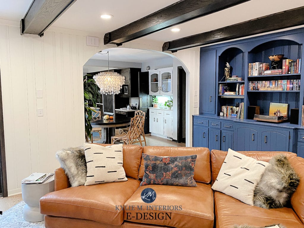
Benjamin Moore Simply White walls
However, blending them in would be a shame if the goal is to have a pretty room (and ceiling height isn’t a concern). In this case, I would stain them a lighter color.
Even though the ceiling is vaulted in this next space, the dark crown molding brings the energy down and makes the ceiling look low…
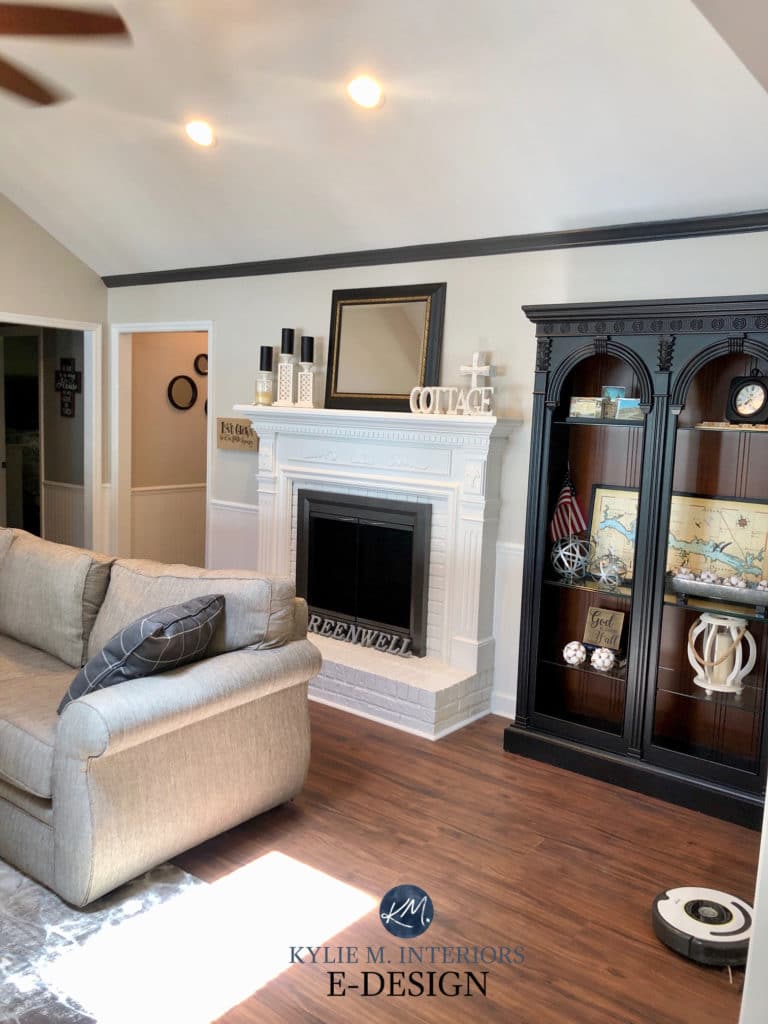
Sherwin Williams Modern Gray on the walls
Instead, the above trim should be painted the same color as the walls to blend it (as it’s not a traditional crown molding).
However, there’s one big exception – drapes. While curtains and drapes (with their rod) can create a strong horizontal line, the vertical nature of drapes balances things out AS LONG AS they’re hung high enough (which we’ll talk about shortly).
2. USE VERTICAL LINES TO MAKE A LOW CEILING LOOK HIGHER
Vertical architectural or decorative lines will encourage your eyes to travel upwards rather than sideways. When your eyes look sideways (left to right), a space will look more linear or horizontal. The walls and ceiling will seem higher when you look upwards via a vertical line.
Where Should I Do a Feature Wall & What Colour Should It Be?
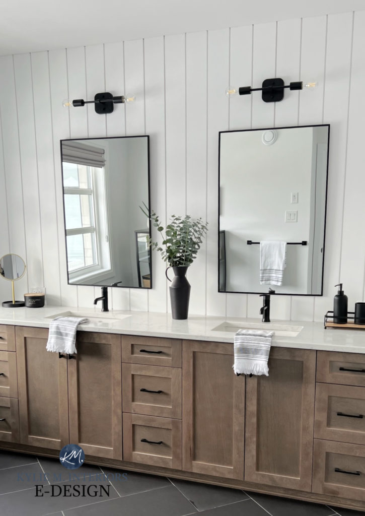
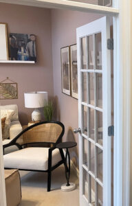
Let’s consider a few ways this next small bathroom looks great, even with its low ceiling…
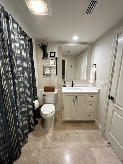
- The mirror is frameless, keeping the contrast between the walls, mirror, and ceiling low contrast.
- Benjamin Moore Classic Gray (an off-white paint color) is in low contrast with the white ceiling. A darker wall color would create a harsher horizontal line where it meets the ceiling.
- The shower curtain has vertical stripes on it.
- While you shouldn’t go overboard with ALL the details, the cabinet hardware and faucet encourage a vertical sight line.
As for this next lovely living room, the decor goes a long way toward making the ceiling look higher (although the ceiling line isn’t apparent in this photo)…
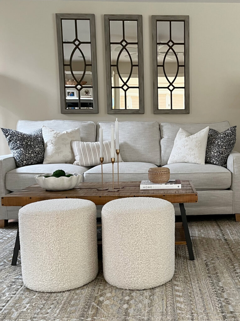
- The mirrors are proportional to the sofa’s width, and the display is more vertical than horizontal.
- Notice the one striped toss cushion with vertical stripes. Again, you don’t want to go overboard, but small details like this encourage your eyes upward!
- Even the two ottomans have a vertical stance vs a long, low, horizontal one.
- The candle holders create a soft vertical line.
Remember, your room has a short ceiling – it is what it is. Don’t sacrifice the large-scale style of your room to make your ceiling look taller. Sometimes, small, smart choices make a big difference!
VERTICAL FEATURES TO CONSIDER
- vertically-inclined patterned wallpaper
- drapes with vertical lines
- toss cushions and accent pieces
- vertical mirrors and artwork (which we’ll get into shortly)
- a vase with a taller floral/branch arrangement
- narrow, taller bookcases
- low profile furniture
The wallpaper in this dining room has a gorgeous vertical chevron pattern…
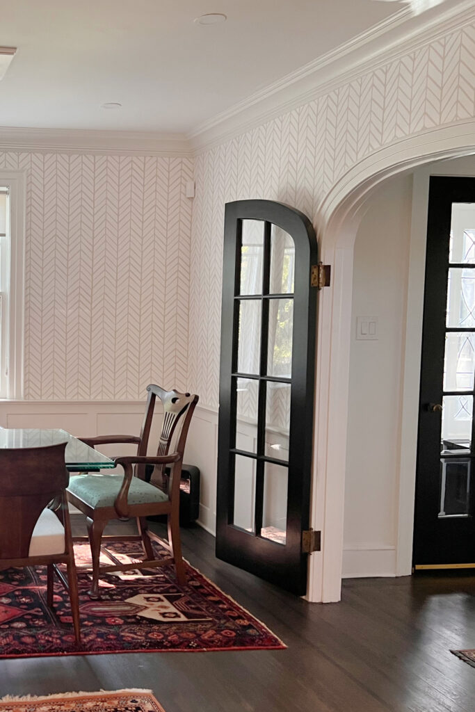
To make the ceiling look higher, the trim should blend with the ceiling/lightest color in the wallpaper. But if you ask me, it wouldn’t matter how low the ceiling is; this wallpaper/paint color combo is so darn pretty – you couldn’t pay me to blend it in!
3. CHOOSE THE RIGHT LIGHTING
Many lights that hang down from the ceiling can make a room feel squashed (i.e., ceiling fans, certain styles of pendant lights, chandeliers, and semi-flush fixtures).
While I LOVE these pendant lights, they cast light DOWN, which makes the ceiling look lower.
Chandeliers can provide general light to a room with minimal shadows and downlighting. However, these lights are often shaped horizontally and quite HEAVY looking. This elongated shape and visual weight can bring the height of the ceiling down.
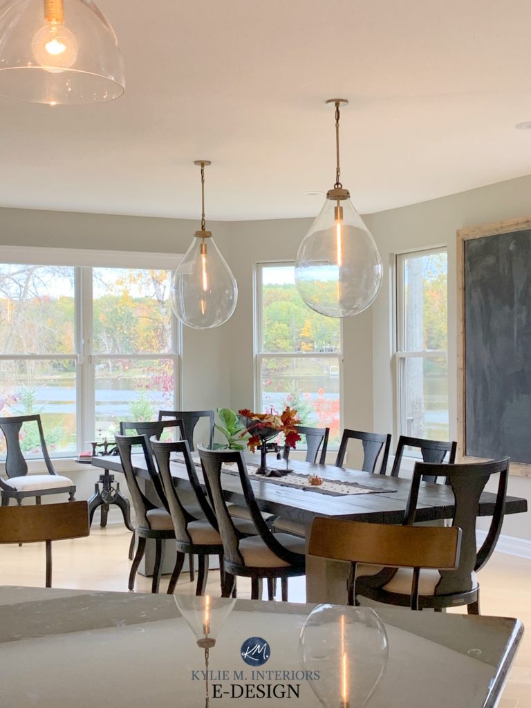
I love the chandelier in this family room (below) as it creates a cozy, intimate look. However, if the goal is to make the ceiling look higher, it needs to be replaced with something lighter looking and hung higher as well…
Really, a decorative semi-flush mount fixture might be better.
In this next photo, notice the light fixture and how it affects the PERCEIVED ceiling height (standard 8′, which looks EVEN LOWER)…
V1 Real Estate with Kylie M. / Benjamin Moore Edgecomb Gray
As you can see, the above light fixture has some pretty skookum horizontal lines. On the other hand, it does have some strong vertical lines to add balance – sometimes you do the best you can as you have to LOVE the light, too!
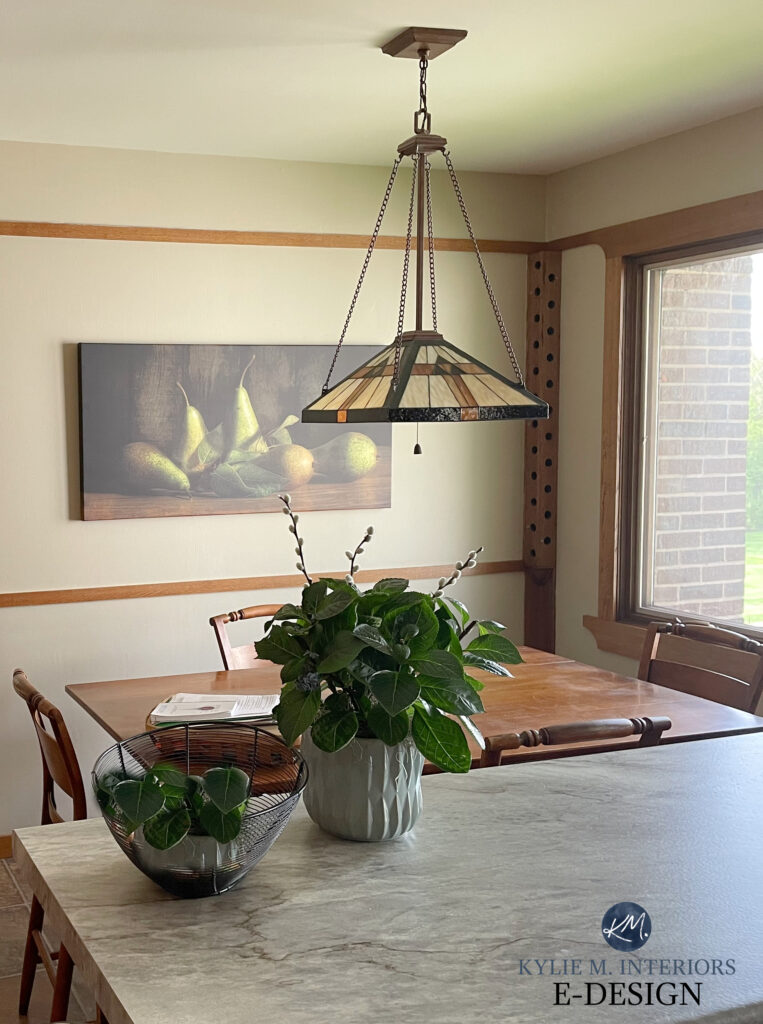
This next light is similar to the previous one, but the particular style, angles, and chain have it looking lighter…
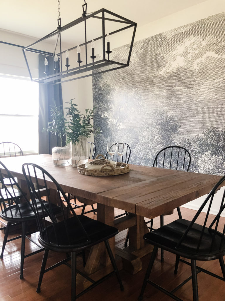
Even the vertical lines of the Windsor back chairs visually affect the space and its perceived height (Sherwin’s Alabaster)
But what would make the above light fixture look even LIGHTER while still keeping it proportional to the table?
A different finish…
CHOOSING THE RIGHT FINISH FOR YOUR LIGHT FIXTURE
Did you know you can use your light fixture’s FINISH to combat a low ceiling? In this next photo, we’re looking at the same type of light as in the previous room. And while this ceiling isn’t low, notice how the chrome finish LIFTS the look, as the sheen bounces light, whereas the previous black fixtures add visual weight and absorb light…
Benjamin Moore Super White
CONSIDER FLUSH OR SEMI-FLUSH MOUNT LIGHT FIXTURES WITH NO DARK RIM
For a room that doesn’t need a decorative light, consider a modern flush or semi-flush mount fixture (as discussed in the Booby Light article). To make the ceiling look higher, it’s best if this light has a minimal rim (or none) so that you see only glass or a fabric shade (boring, but it works).

The above light is a great blend of STYLE with a low contrast approach. Darker metal would’ve tipped the scales too far.
Sure, in the ideal world, a room with a low ceiling would have NO ceiling lights, or at the most, some simple recessed lighting. However, in the real world, we’re working with what we already have.
And if what you have is a low ceiling and you JUST DON’T CARE, let it go and have some FUN with it!
Benjamin Moore Revere Pewter
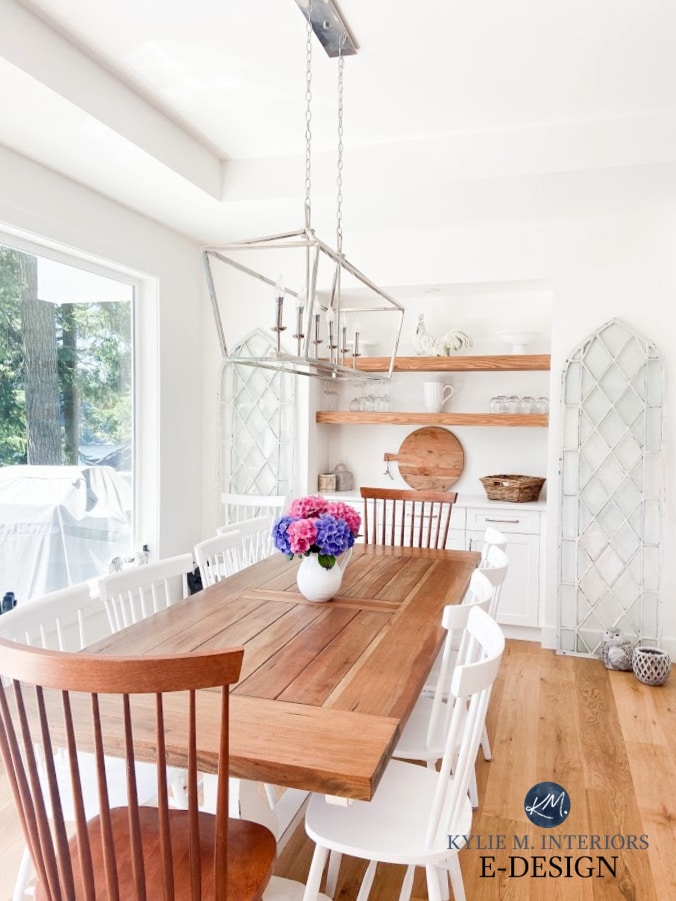
COMBINING SIZE, STYLE, & MATERIALS ON YOUR FIXTURES
If the stars align, you’ll find a light fixture with the right SIZE, FINISH, and SHAPE for your space. For example, check out this lovely dining room painted in Benjamin Moore Revere Pewter…
FULL Paint Color Review of Benjamin Moore Revere Pewter
- the glass shades let light out and let your eye pass through them rather than adding visual weight to the room
- minimal metal detail lowers the contrast between the fixtures, walls, table, and ceiling
- the teardrop shape of the light is more vertical than it is horizontal (even if the shape is downwards vs. upwards)
Sure, the ceiling would look higher with NO lights, but this isn’t an option for the average dining room. It’s about choosing the BEST light for the space and how you want it to be perceived.
Notice how the fixture in this next eating area has a downward, lower energy…
This isn’t to say it’s not pretty or very well-suited to the style of the space – it is.
These next fixtures have an upward vibe (and no, that’s definitely not a low ceiling, but you get the point)…
And while I prefer a room with a central light fixture in my OWN home, relying on only table lamps, floor lamps, and uplighting can make a ceiling look higher!
4. USE SHIPLAP & DECORATIVE MOULDING TO MAKE YOUR CEILING LOOK HIGHER
Where your short walls are lacking, make up for them with the ILLUSION of height using decorative moldings. This can include shiplap, board and batten, and other vertical, molding-based wall applications.
Check out this next room with low ceilings…
Sherwin Williams Pure White & Light French Gray
Here are a few more ways to make the above ceiling look higher (should the homeowner even care)…
- window coverings with vertical stripes
- a light fixture that doesn’t have a hard top horizontal line
- polished nickel or chrome fixtures vs. black
As for this next bathroom, the vertical shiplap makes the ceiling look taller. If the homeowner was concerned about the ceiling height (which they weren’t), they might also opt for light fixtures with a softer horizontal line…
The Ultimate Guide to Choosing White Paint Colors
Another interesting thing that makes the above ceiling look higher is the lack of crown molding. Notice how the vertical stripes of the shiplap run right into the ceiling without a horizontal molding to divide them.
As for this next bathroom, the horizontal shiplap keeps the ceiling looking lower…
Sure, the ceiling looks lower, but I wouldn’t have it any other way – it’s a gorgeous space!
LOW CEILINGS & CROWN MOLDING
While crown molding is a beautiful feature, when it matches the trim color rather than the wall color, it can make your ceiling look lower. Crown molding is meant to be a decorative feature; blending it in seems ass-backwards.
However, painting your crown molding to match the walls will make your ceilings look higher.
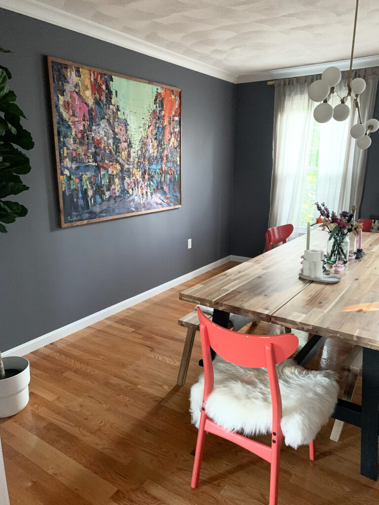
As for this next dining room, the ceiling would look higher without the crown, as it creates a horizontal break between the wall and ceiling…
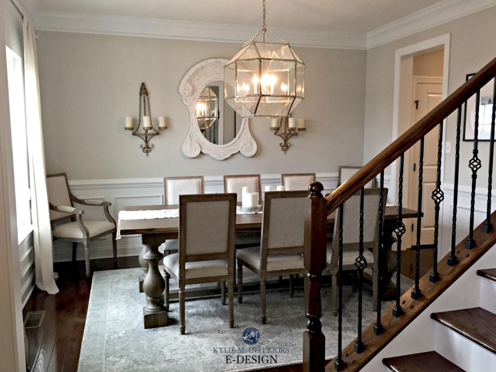
BUT (it’s a huge one, Kardashian-inspired) if your room has crown molding AND wainscoting, don’t do it – the crown molding belongs to the wainscoting, not the walls. Painting the crown molding only works if there are no lower moldings (other than the baseboard, which you can also paint to match the walls).
5. HANG YOUR DRAPES AT THE RIGHT HEIGHT
Drapes can be deal breakers regarding how high or low a ceiling can look. Many people base the height of their drapes on how long the drapes are. However, it’s better to decide how HIGH your drapes should hang and find drapes that fit (or have long ones hemmed).
Notice how these next drapes are closer to the ceiling than the top of the window trim…
Paint Color Review of Benjamin Moore Edgecomb Gray
You might hang your drapes even closer to the ceiling line than what’s shown above. The above homeowners found a great happy medium, as any higher, and there could be an awkward amount of wall space between the top of the trim and the ceiling (it varies per room).
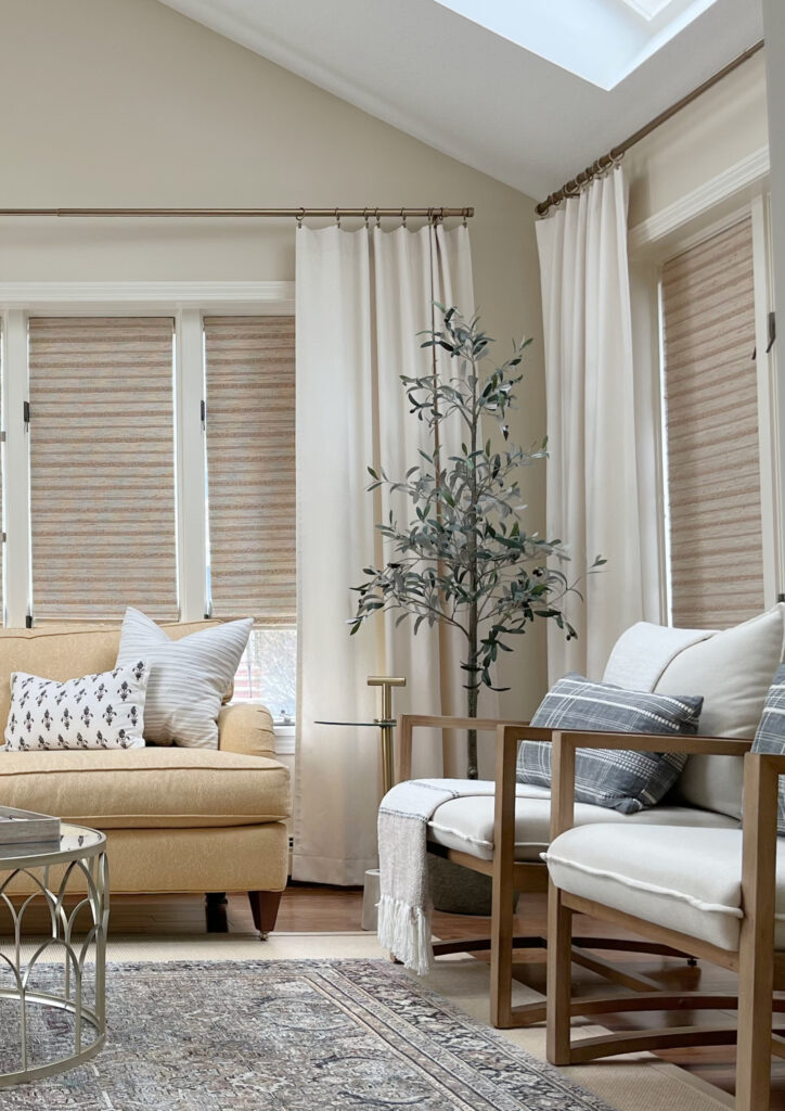
In this next living room (I love the coffered ceiling), I would raise the drapes about three to four inches to encourage the eyes higher (this would mean new drapes)…
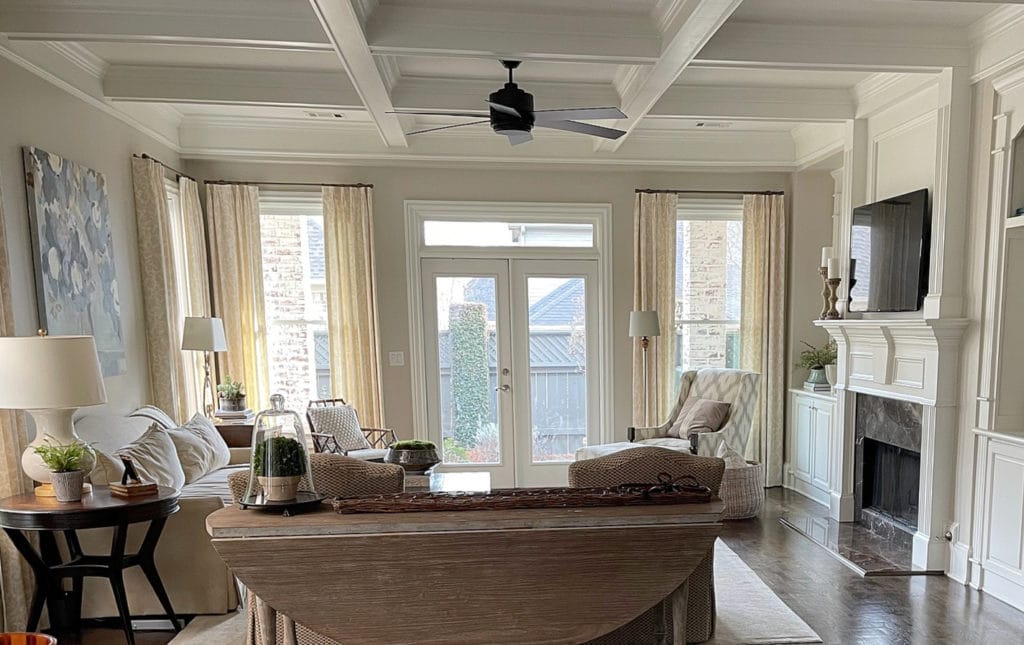
Hanging your drapes closer to the ceiling line rather than the window trim gives the illusion of higher ceilings.
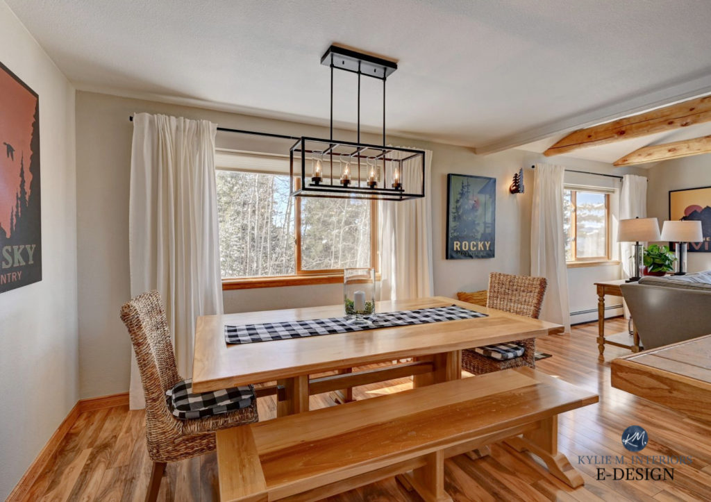
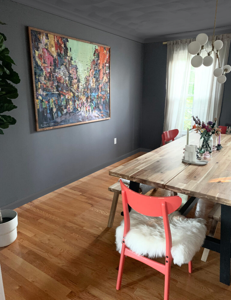
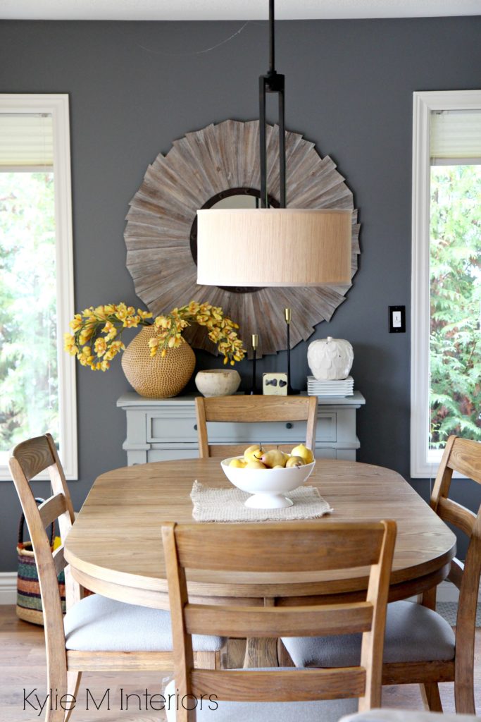
Here’s the dining room we looked at earlier (below). Had they hung the drapes three inches lower, rather than slightly closer to the ceiling line, the already low ceiling would look even lower…
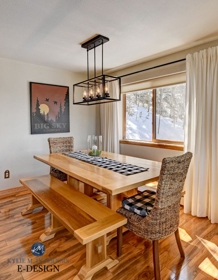
The Best Paint Colors with Wood Trim & Cabinets
This being said, if the drapes were longer, I’d bump them up an inch or two.
To help your low ceiling look higher, hang your drapes closer to the ceiling line or, at the very least, just over halfway between the top of your window trim and the ceiling line.
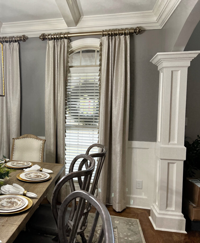
Because this next rod is so chonky, it looks better visually connecting with the extensive crown molding…
Sherwin Williams Dorian Gray and Alabaster
In this next photo, the drapes make the ceiling look higher than it is…
Sherwin Williams Pure White
While there should be more drapes to suit the scale of the above windows, for the sake of home staging, what’s there does the trick. I also love the scale of the rods; being narrower, they work well with the light fixtures. Thick rods would look too heavy in this space.
Here are a few more things to note…
- using a narrow rod vs. a thick one also helps the above ceiling look higher
- while the light fixture has horizontal lines, the metal itself is thin, not heavy-looking
If you wanted to make the ceiling look taller in this next room, hanging the drapes about three inches higher would help, as would a fan with less visual weight…

Sherwin Williams Network Gray
While the vaulted part of this next ceiling doesn’t need help looking higher, the shorter wall/ceiling line on the right DOES. If the drapes were hung lower on both walls, the effect would be off-balance.
Love the narrow drapery rod!
6. THE RIGHT PAINT COLORS TO MAKE YOUR CEILING LOOK HIGHER
Paint is not only the easiest way to change a space’s appearance, but it’s also one of the most AFFORDABLE ideas! Besides, if you don’t know which colors are best for your space, you know who does (wink wink).
IDEA 1: PAINT YOUR CEILING THE SAME COLOUR AS YOUR WALLS
Whether you have flat or textured/popcorn ceilings, consider a shade of white or off-white for your walls and paint your ceiling the same color. If you want to use darker colors, consider a) the vibe of the room (as it can look moodier) and b) the amount of light you get to ensure your room still has the look/energy you want.
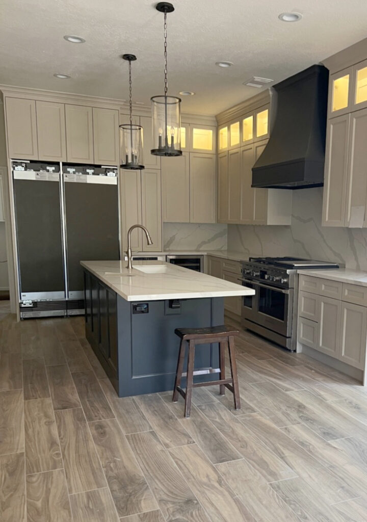
This next kitchen is clad in Sherwin Williams Moderate White (an off-white shade of beige) on the cabinets, walls, ceiling, and trim (lightened by 50% on the trim)…
HOWEVER, the whole ‘painted ceiling idea’ can be open to perception…
What YOU think makes a ceiling look lower could be the opposite of someone else.
This is especially true as it relates to considerably DARK paint colors. For example, if you have a room with a flat ceiling and paint the walls and ceiling the SAME DARK color, you might find that the corners disappear and the room seems larger/taller.
Why?
Some people find that the line between the dark color on the walls and the white/light ceiling is too jarring or high contrast. The separation of these two colors POINTS OUT the shorter ceiling, whereas the same dark colour BLURS the light between them.
For example, check out this friggin’ glorious wine room…

Benjamin Moore Charcoal Slate. You’ll find me hiding in that keg, waiting for the lights to go out.
The ceiling in the above room is 8 feet high. However, because the wall and ceiling are painted the same, moody dark shade of blue/charcoal, the line between the walls and ceiling is blurred, making the ceiling look HIGHER.
DARK CEILINGS & LIGHT WALLS
Light walls with a DARK ceiling is another ceiling application that can be open to perception. Some people find a dark ceiling weighs a room down (myself included), whereas others think it gives the ceiling the illusion of DEPTH and height – what do YOU think?
If you ask me (which you kind of are), it works best in a room with a tray ceiling, which doesn’t usually need help looking any higher than it already is.
It’s never straightforward; sometimes, MULTIPLE factors affect a space’s appearance. It’s about figuring out what you’re dealing with and how best to work with and balance it. And remember, your PERCEPTION might be different from someone else’s!
TEXTURED OR POPCORN LOW CEILINGS
Textured ceilings rarely suit anything other than white and can look abrasive and a touch garish painted darker. For this reason, you should treat textured ceilings in one of two ways…
- Paint them the same white as your trim.
- Paint them a SUBTLE off-white paint colour (either a coordinating colour or a lightened version of your wall colour). However, this should be a VERY subtle off-white, sitting on the higher end of the off-white LRV range.
The 10 Best Off-White Paint Colors
IDEA #2: COLOR WASH (COLOR DRENCH) YOUR ROOM
While it’s not for the faint of heart, you can color-wash your room to make a low ceiling look higher.
What is color washing or color drenching?
It’s where you paint EVERY surface the same color, only changing the paint finish as you go.
The Best Medium to Dark Green Paint Colors
IDEA #3: PAINT IT ALL WHITE
If you have a low ceiling, painting your entire room white (or a very gentle off-white) is a great way to blur the lines between wall and ceiling…
Benjamin Moore White Dove with gorgeous green cabinets
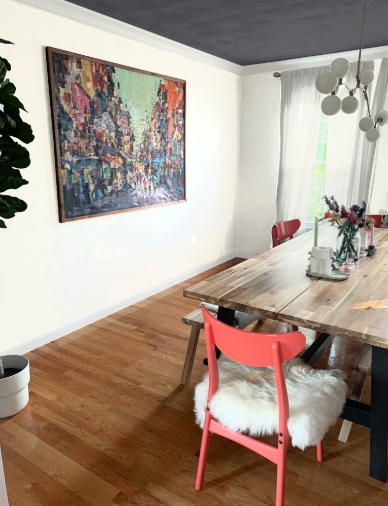
IDEA #4: PAINT YOUR TRIM THE SAME COLOR AS THE WALLS
Of all the options, this is one of my favorites, as the bang for buck is HUGE. And while it’s more commonly done with lighter colors, let’s have some fun by playing with a room.
Here’s the original photo of this dining room in a color similar to Benjamin Moore’s Cheating Heart…
Take note of how you feel about the ceiling in general – color, height, etc…
STEP 1: PAINT THE CEILING WHITE
Even a simple white ceiling paint color, rather than the previous off-white, makes a big difference.
Why?
Because your eyes aren’t drawn between the shift between the white crown molding and the off-white ceiling…
STEP 2: PAINT THE TRIMS THE SAME COLOR AS THE WALLS
Sure, you can stop at STEP 1, but look at what happens when you paint the walls and trims the same color…
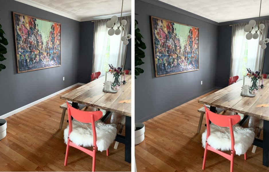
Notice how much higher the ceiling looks on the RIGHT than the LEFT. And while some might make the ceiling dark, I left it white because it’s textured.
Oh, what the heck; let’s look at it anyway…
I don’t hate it, I just don’t love how the textured ceiling looks – BUT YOU DO YOU, BOO!
And while we’re at it, I’ll throw a real monkey wrench at you…
My editing program doesn’t go from dark to white very well, but you get the idea. I might even go for it if the ceiling were FLAT, not textured! While not every room can handle a look like this, this dining room has an eccentric, curated look and can take some extra personality!
What Color Should You Paint Your Ceiling?
7. USE THE RIGHT ARTWORK & HOME DECOR
When choosing artwork, consider pieces with vertical lines – like trees or abstracts – if possible. Avoid pieces with dominant horizontal lines, like landscapes and seascapes. I say this all lightly because you also need to LOVE your artwork. Sometimes, it’s about finding a happy medium and adjusting where you can without losing the heart in your home.
If you have a set of pictures (two or more) and a wall space suits this application, hang them stacked vertically rather than horizontally. Vertical lines give the illusion of height (as us shorty-cakes folk would know…).
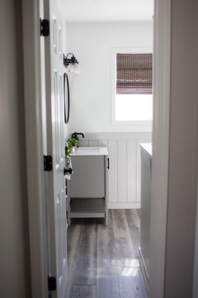
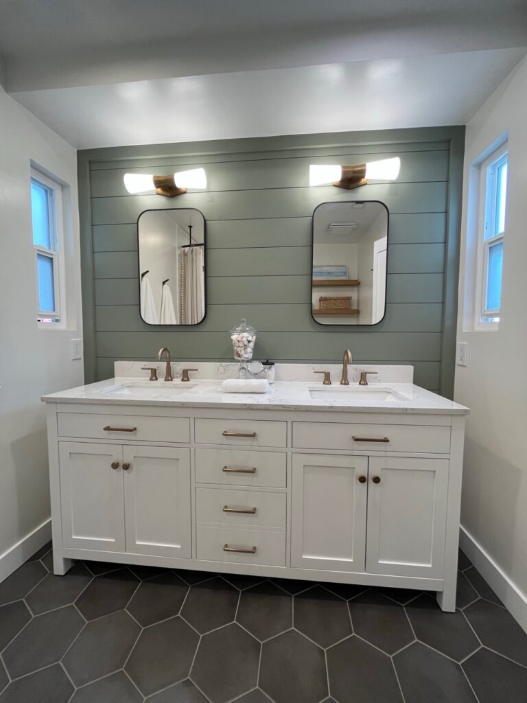
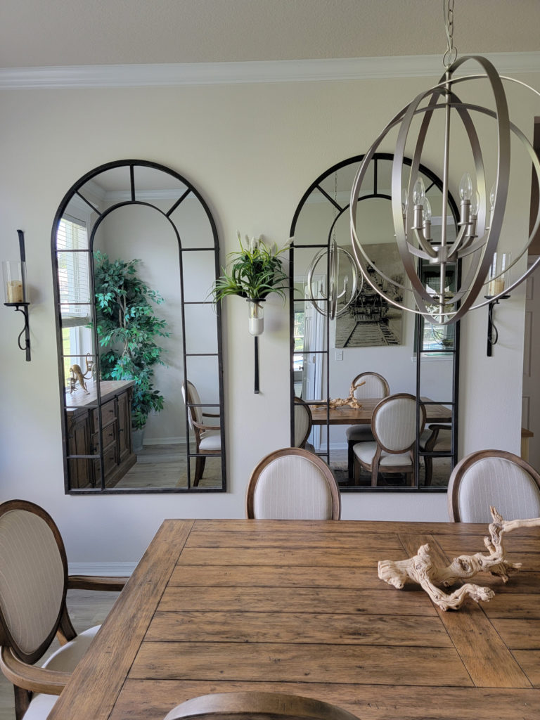
In this bathroom, they could’ve easily installed a single horizontal mirror. Instead, the two vertically-shaped mirrors draw your eyes up, as does the decor and light fixture…
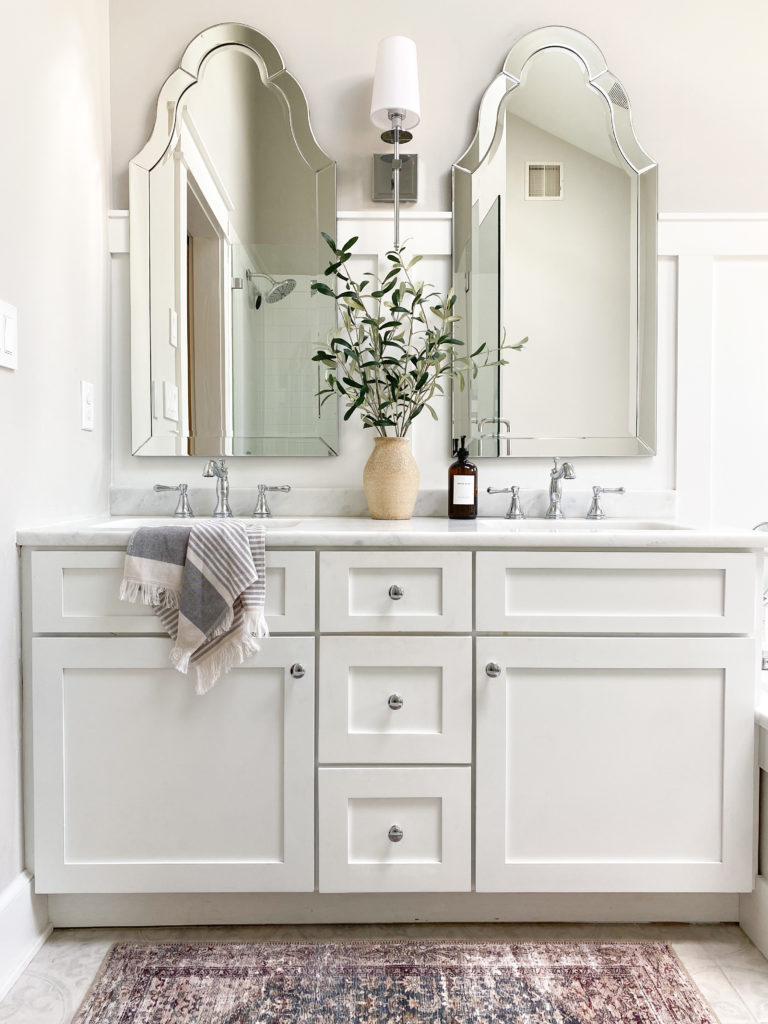
Jenna Christian created this gorgeous space with a bit of color help from you-know-who.
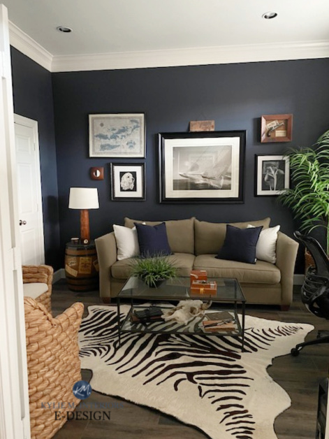
In this next living room, the furniture has great proportions for the size of the space. However, the gallery wall hugs the ceiling and is spread out horizontally. These two things combined make the ceiling look lower than it should…
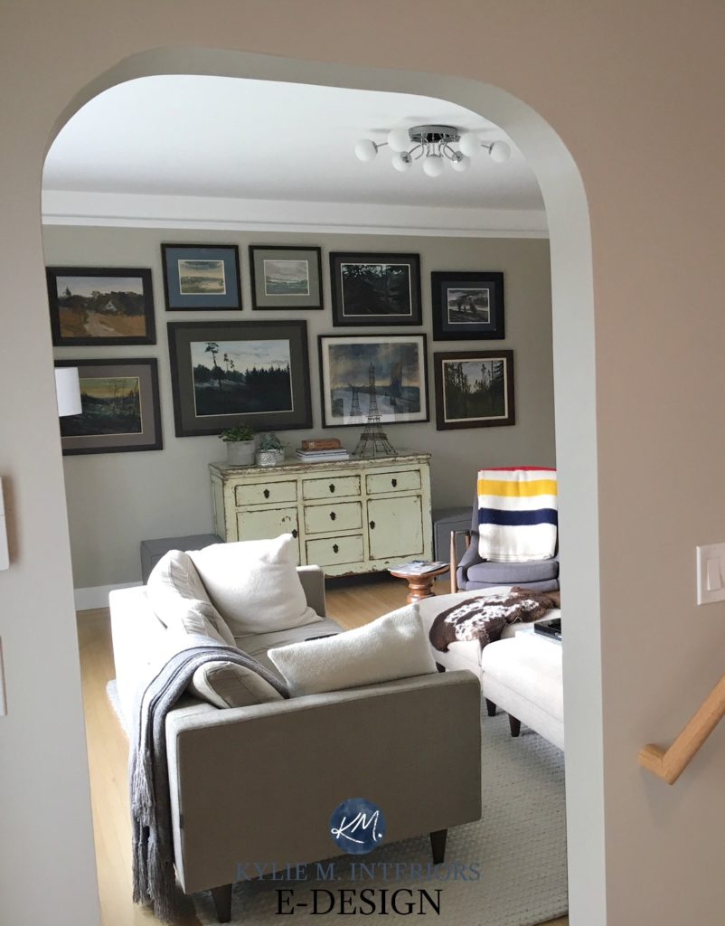
I’d LOVE to see the cabinet painted a non-yellow off-white. Walls – Benjamin Moore Grant Beige
In this next room, the gallery wall is hung lower, making the ceiling look higher. Although, I’d love to see one narrow linear piece above the center large piece to balance the display itself…
Benjamin Moore Hale Navy – HALE YES!
However, you can ALSO go too far. This next space has some great vertical decor elements (mirrors, plant holders), but as a whole, they have a solid horizontal presence and are too busy. This makes the ceiling look even lower…
INSTALLING ARTWORK AT THE RIGHT HEIGHT
When hanging artwork or mirrors, it’s SUPER important to hang them at the right height – especially when you have low ceilings. If you hang your piece too high, the ceiling will look lower. This is also an entire blog post unto itself – check it out HERE.
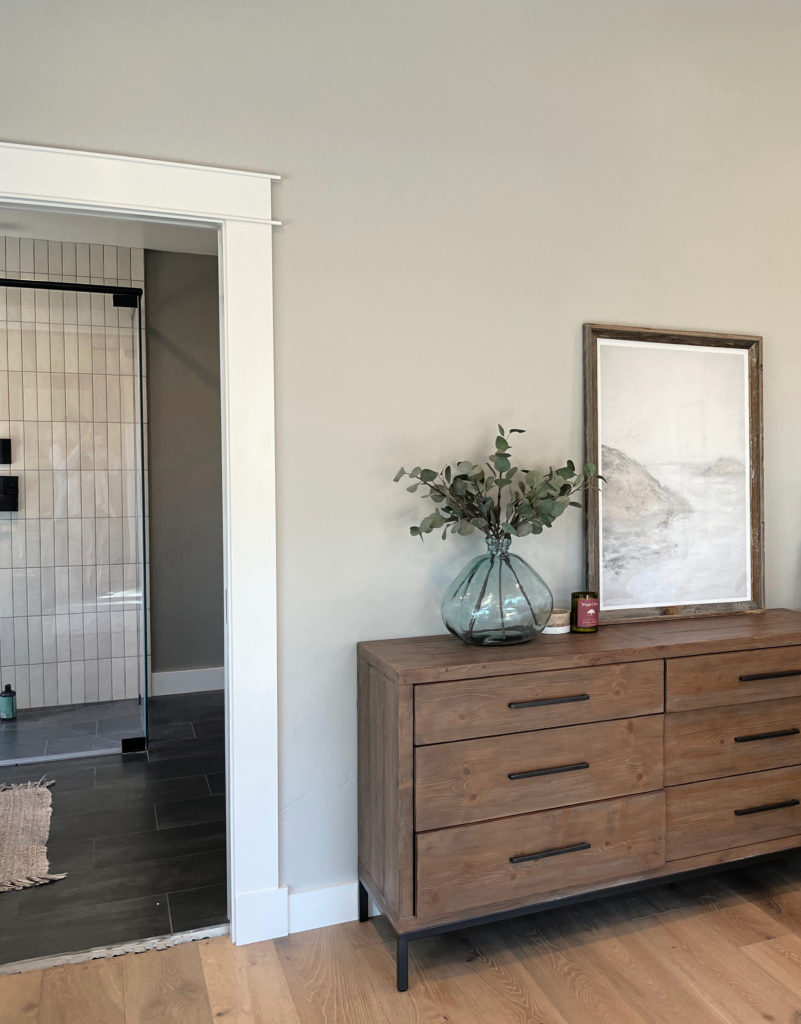
In this next room, the low-profile dresser and leaning artwork leave a great amount of wall space between them and the ceiling. This can make a ceiling look higher…
In this next lake house, the vertical lines of the decorative oars draw your eyes vertically, as do the lines of the chandelier…
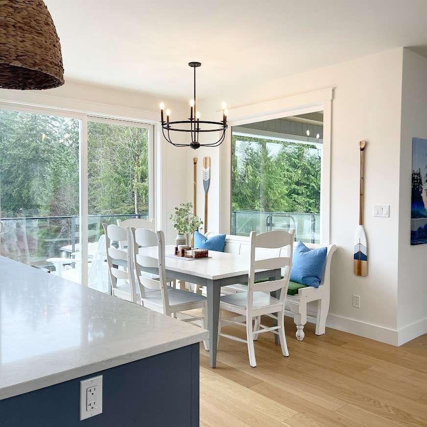
In the above space, the oars with the actual paddle at the bottom do a better job of visually raising the ceiling than the oar with the paddle at the top (it’s all in the optics).
8. KEEP IT PROPORTIONAL OR SLIGHTLY SMALLER
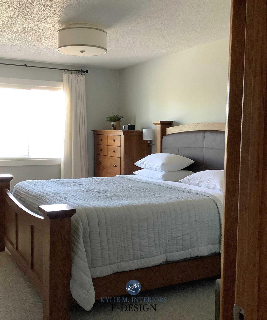
Crowding the upper portion of the air space in your room will make the ceiling seem shorter than it is. For this reason, smaller, more low-profile furnishings often suit a space with low ceilings.
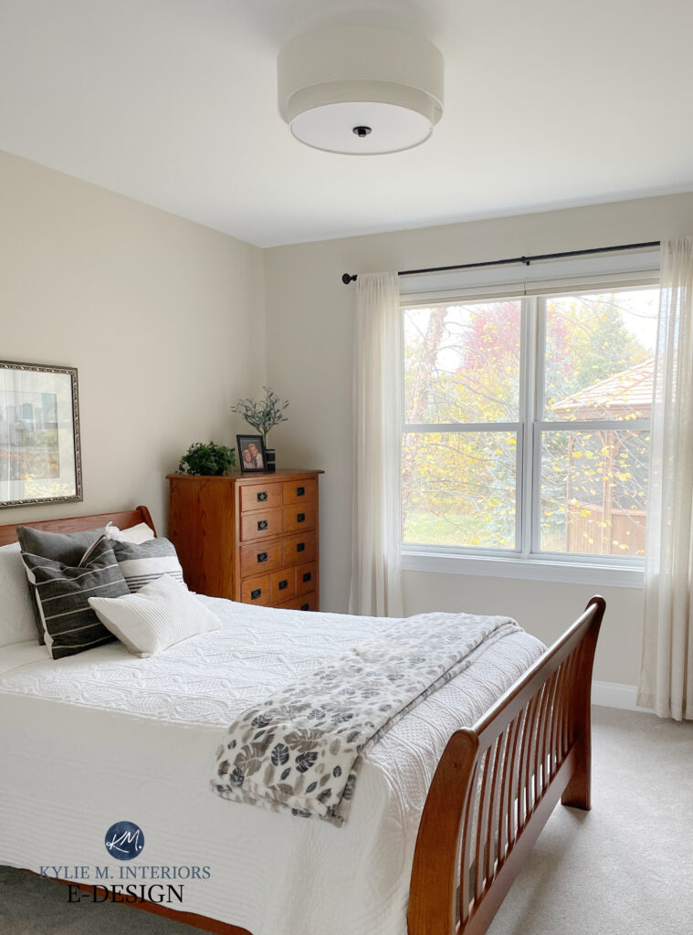
In the above bedroom, the dresser has a vertical shape, but it doesn’t crowd the upper wall space. While I’d love to see the curtain rod hung a bit higher, that would also require new drapes (sometimes, we do the best we can with what we have!) Things like this are more of a consideration if you’re buying something new/starting from scratch.
How to Turn Your House Into a Home: Kylie’s House!
LOW CEILINGS LOOKING HIGHER: CASE STUDIES
Now that we’ve covered the basics, let’s break down a few rooms to see why they work.
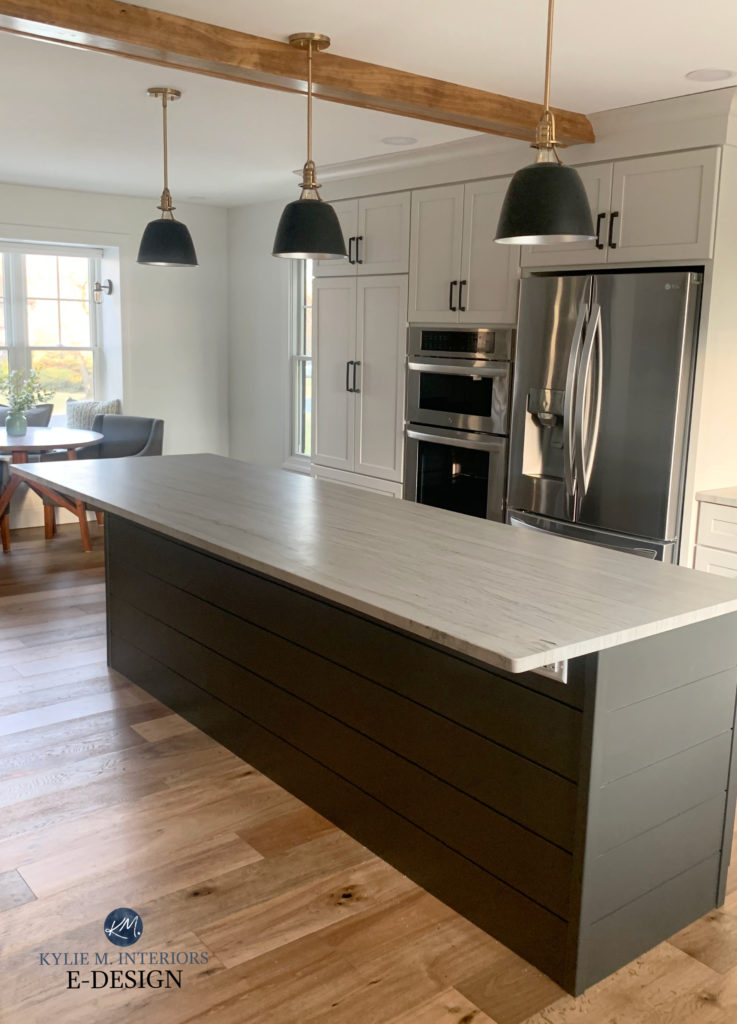
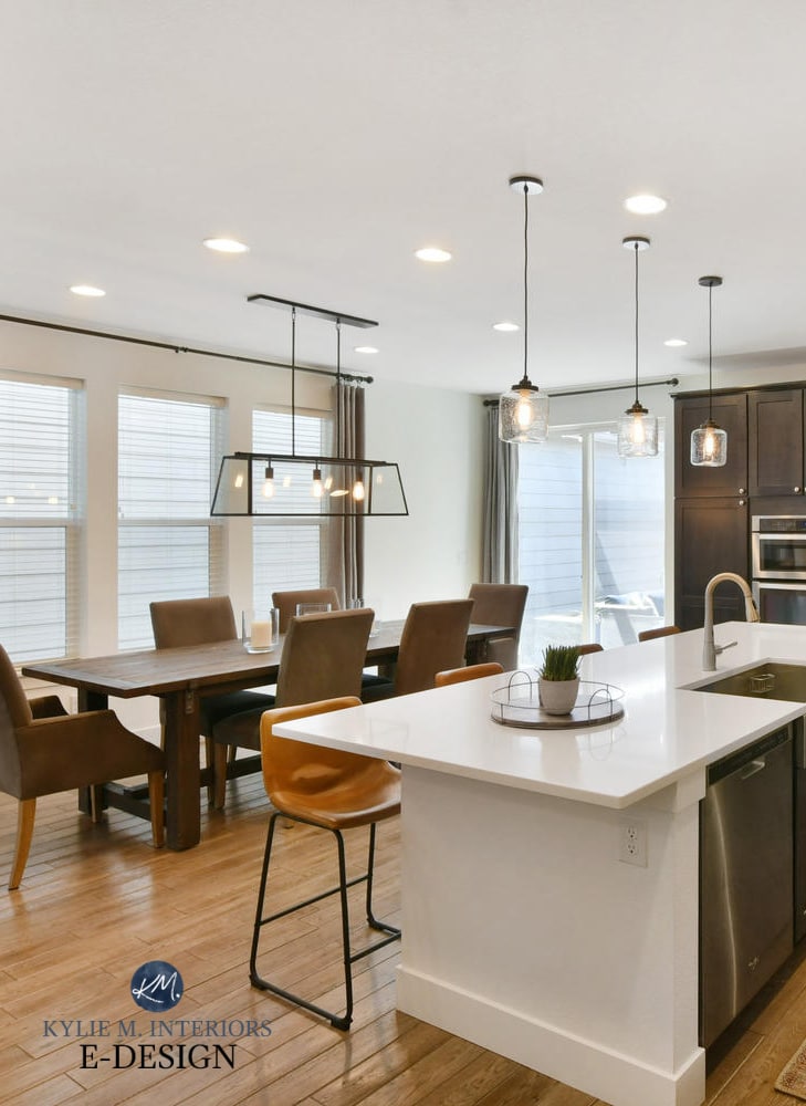
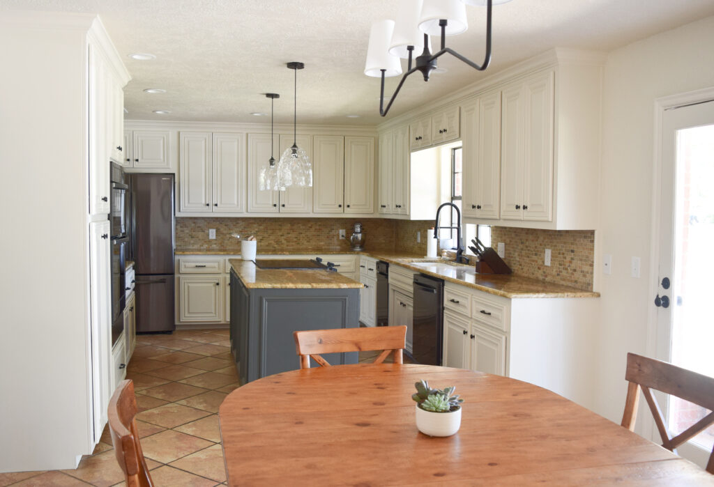
This kitchen below has some great bones…
- chair fabric has vertical stripes
- stools have strong vertical lines
- pendant lights are low contrast and clear
- glass table reflects light
- even the diagonal lines on the island offer more upward movement than horizontal ones would
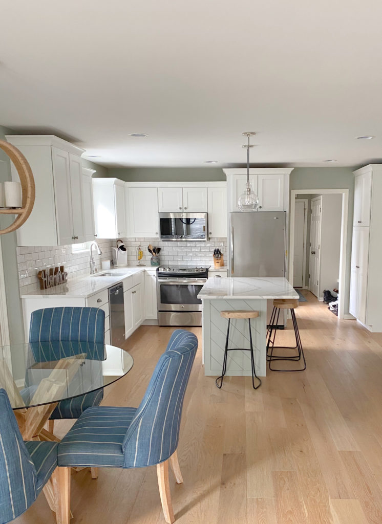
Sherwin Williams Aloof Gray
Now let’s talk about what we COULD do (if the goal were to make the ceiling look higher)…
- for a simple approach, painting the walls white would lower the contrast between the cabinets, walls, and ceiling (which the owner is planning on doing)
- full-height cabinets – this ELIMINATES the more noticeable cut-off between the different surfaces
- vertical shiplap on the island
- while some might say to install the subway tile vertically, it usually looks dumb
This next light fixture has some good and bad features (as far as raisin’ the roof goes)…
Benjamin Moore Steel Wool – the cobweb is complimentary
How could you improve on the above light fixture?
- choose a lighter metal finish (i.e., polished nickel or chrome)
- change to a whiter shade for MORE LIGHT
- you could even choose a glass shade over fabric
How could you improve the above ROOM regarding the ceiling height?
- choose chairs with vertical back detail vs. horizontal
- install drapes that are hung close to the ceiling line
- choose a fabric with vertical stripes
- while I’d say you could choose artwork with more vertical lines, I like how the round mirror picks up on the shape of the light fixture and breaks up all of the straight lines
- replace the drooping florals with more vertical branches
- add candles to the candle holders, adding a strong vertical presence (they’re pretty subtle right now)
Horizontal shiplap was added to this powder room for some subtle personality. Let’s talk about a few ways to improve it IF we want to make the ceilings look higher…

Benjamin Moore Super White (which isn’t ‘super’ white, btw)
- install vertical shiplap vs. horizontal
- choose light fixtures that cast light up, out, AND down rather than just down
- hang the shelf a bit lower so that the wall space above it looks higher
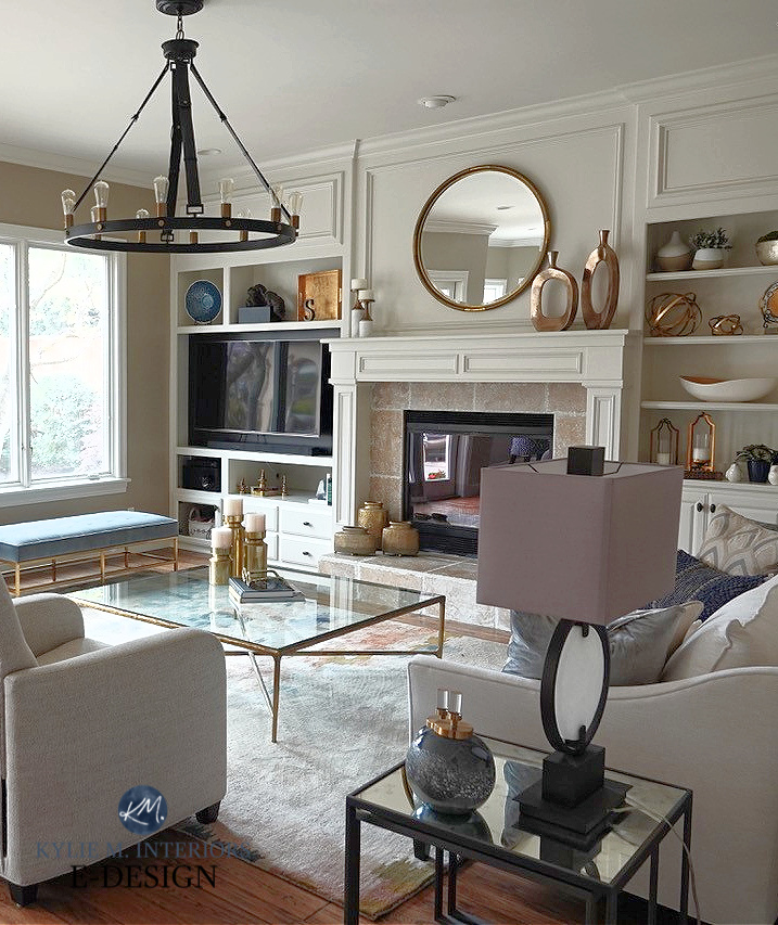
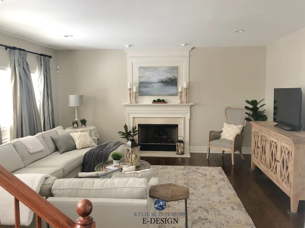
There are a WHOLE bunch of happy spots in this next living room…
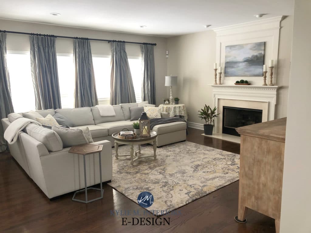
Benjamin Moore Edgecomb Gray
- The drapes are hung higher, and their repetition creates a strong vertical presence.
- Extra moldings above the fireplace create a more vertical presence. Without these, the fireplace is more horizontal in stature.
- The candle holders have a solid vertical look
- While the sectional is oversized, its HEIGHT isn’t.
Well, I think I’ve exhausted this idea and myself! I hope you learned some great ideas for making your ceiling feel higher!
READ MORE
What Colour Should You Paint Your Ceiling?
The 6 Best Budget-Friendly Kitchen Update Ideas
The Right Height to Hang Art or Mirrors Above ANYTHING
The 8 Best WHOLE HOME Warm Neutral Paint Colours
The Best Gray & Greige Paint Colours – Sherwin Williams
NEED HELP?
CHECK OUT MY ONLINE PAINT COLOUR CONSULTING PACKAGES!

Chat soon,

Comments
Leave a Reply
More Posts
The Best Pink & Blush Inspired Paint Colors: Muted, Dusky, & Soft
The Top Moody Shades of Pink Previously, I wrote about the best pink paint colors—those with a bit more color and intention. While those will satisfy some of you, others
Read More

The 5 Best Creamy White or Off-White Paint Colors
THE ELUSIVE ‘CREAMY WHITE NEUTRAL’ When it comes to light, warm neutrals, it’s all in the undertones. And other than pink and green, yellow is the undertone many of my
Read More

The 8 Best Warm Neutral Paint Colors With NO Yellow Undertones!
The Top Light Depth, Warm Colors That Aren’t Cream! When choosing the best warm neutral paint color for your home, whether creamy white, beige, taupe, or greige, your choices are
Read More


Great post Kylie, you are so skilled at explaining things and the photos are really helpful. I’d be curious to see another post that contrasts some options you’d explore for high or cathedral ceilings. Do you emphasize the height or try to ground it? Thanks for sharing your expertise!
Author
Hey Kristin, THANK YOU FOR THIS! Funny enough, I HAVE a high ceiling (that I don’t love) and can speak quite intimately to this topic. I’m off on a small trip, but I’m putting on my ‘next blog post’ list :). STAY TUNED! The only thing I have right now that’s even remotely related is this… https://www.kylieminteriors.ca/2-storey-tall-walls-the-best-painting-tip-youll-ever-get/
Absolutely love this post! My home has low ceilings in 2/3rds (around 7’8-7’10), as the original structure is a log farmhouse from the 1700’s. It’s funny, when we renovated my instinct was to do a 50% cut of the wall color, and no one seems to realize our ceilings are so low! It’s time to freshen up our style and we’ll be repainting. I want to do either a 50% or 75% cut of the wall color again for our ceiling paint. But as I’m going with slightly darker wall color, I’m wondering if it would help to have a higher sheen on the ceiling for better light reflection? What are your thoughts? I know generally it isn’t “done” but I like being a weirdo if the weirdness works. Ceilings are flat, not textured, but not the straightest wall heights.