
Posted on April 28, 2020 by KylieMawdsley
MODERN STYLE IN A FAMILY HOME
These days, it seems I’m spending more time at my computer than ever working with my Online Consulting clients all over the world! This means that while I love to be able to drink wine coffee while I work, I’m ALWAYS happy to get out of the house and talk to live people (rather than Doug…the dog).
My clients, Lisa and Brian Birnie were the dream team. They knew what they liked, and what they didn’t like, and were open to new ideas. Creating their home was all about blending their tastes with my knowledge, to come up with a design plan that suited them to a tee.
This post may contain affiliate links. If you make a purchase through links on our site, we may earn a commission.
Working with Alair Homes and my new BFF, Dan (who is like the Rainman of home building and renovation), this home exceeded all expectations in quality and appearance and I know the homeowners were thrilled with the final product – it even got its own magazine feature! I may have had to buy Dan’s love via Starbucks coffee, but hey, I’ve done way worse things for love (wink wink).
So without further ado, let’s check this bad boy out…
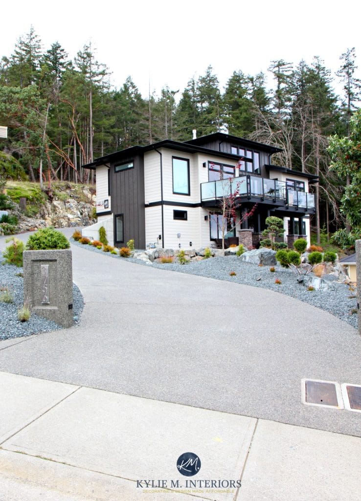
MODERN CONTEMPORARY WEST COAST STYLE EXTERIOR
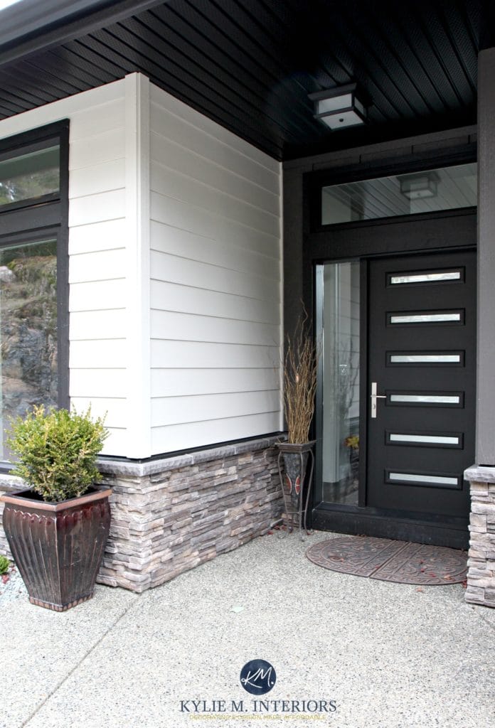
My client’s dream was to build a home that’s modern, but not cold. To get things started we needed to create a foundation palette with the exterior colors, including Hardi Board in Cobblestone with dark accent areas in Sherwin Williams Black Fox. Along with black windows and a bit of stone for texture, we got ‘er done…

The 8 Best Paint Colours for Your Front Door
MODERN FRONT DOOR & FOYER
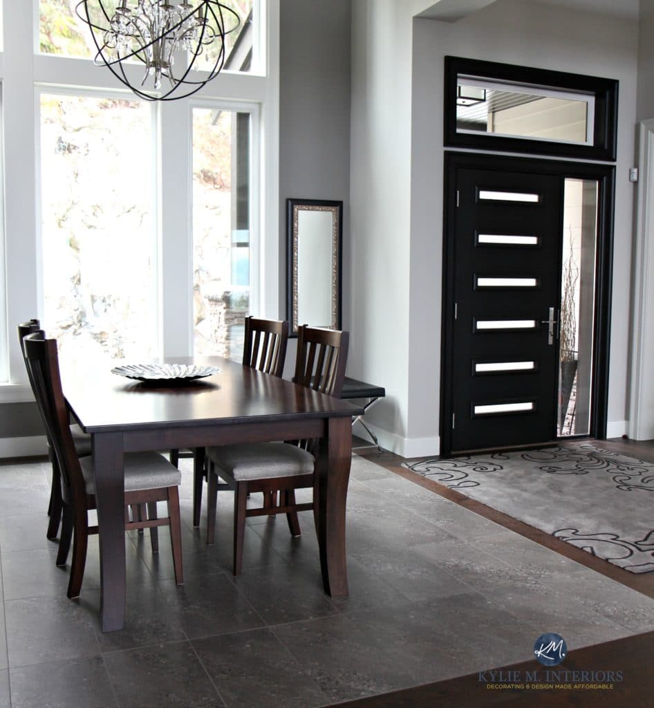
Lisa and Brian had a vision of an entryway and dining room that were separated by beams. And while the whole ‘cedar beam’ thing is on-trend, they wanted something a bit more contemporary. So, rather than hittin’ it West Coast Style, we went more modern with drywall and paint color and let the architecture speak for itself.
The home’s layout didn’t allow for a large entryway, plus the owners have a more extensive mudroom access off the garage.
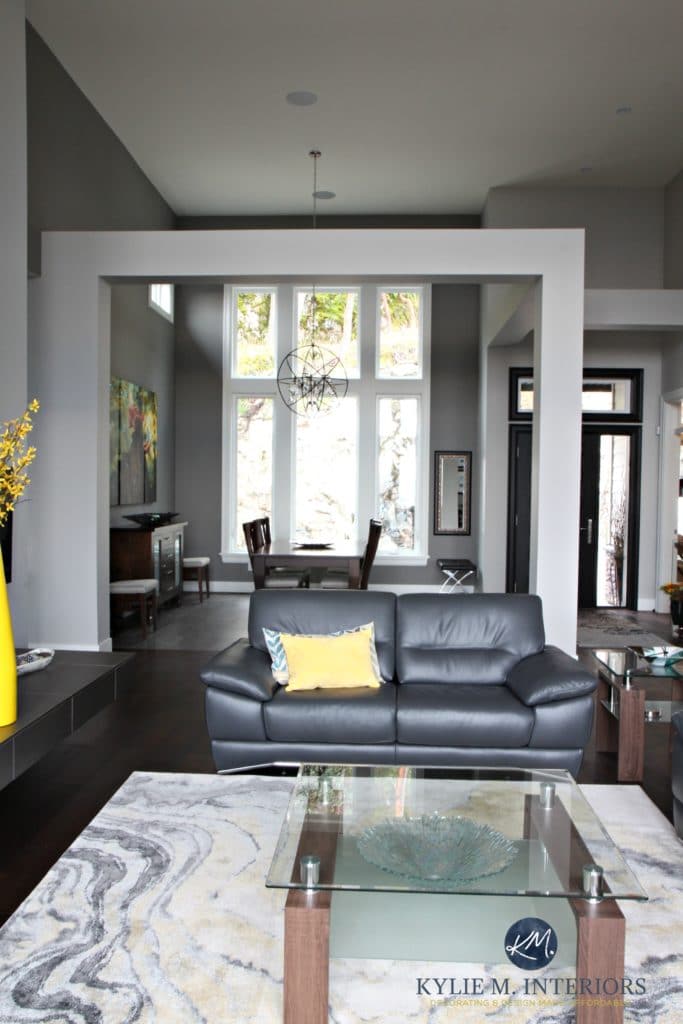
The dining room is a nice step off the entryway. The entire open layout palette consists of layered grays from the Sherwin-Williams palette with colorful accents.
THE DINING ROOM – LET THERE BE LIGHT!
With photography by their talented daughter, Jessie Robertson, the dining room makes a statement all of its own…
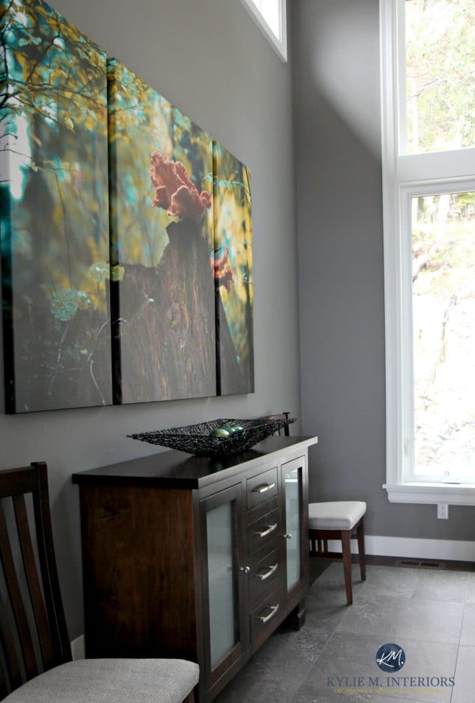
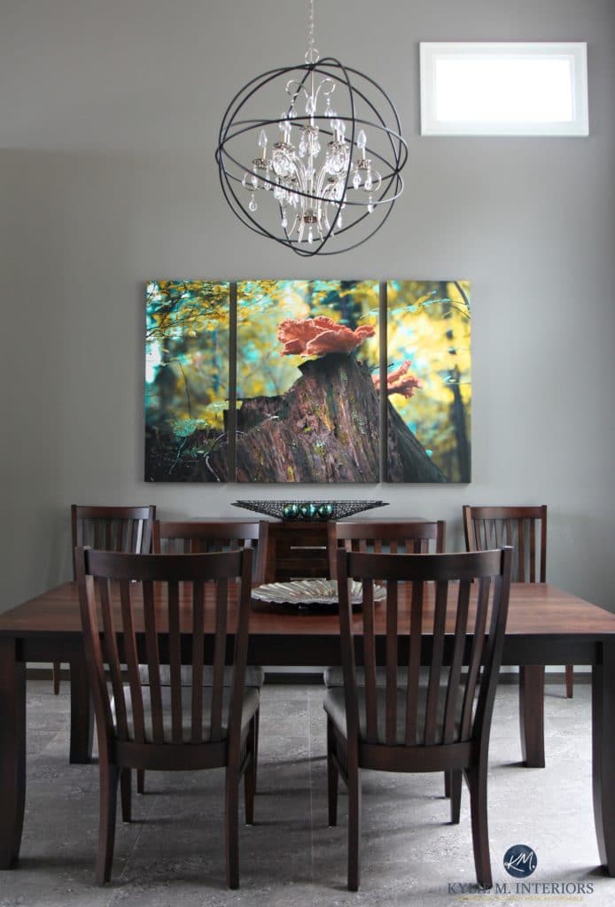
We chose Sherwin Williams Dovetail for the dining room to add some depth and drama, without weighing the room down. Now PERSONALLY, with all of the hard edges in here – tile, wood, furniture, light fixture, canvas, I would LOVE to see some upholstered chairs, but that can be a project for down the road!
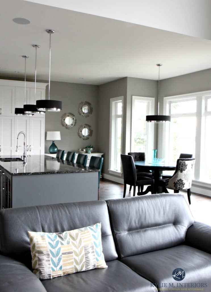
THE OPEN CONCEPT LIVING ROOM & KITCHEN
I DO love the layout of this home. It has just enough definition to create well-defined functions from space to space but is open enough to feel bright, spacious, and visually connected. We can thank Austin of Datum Point Studios for the fabulous home plan/architecture.
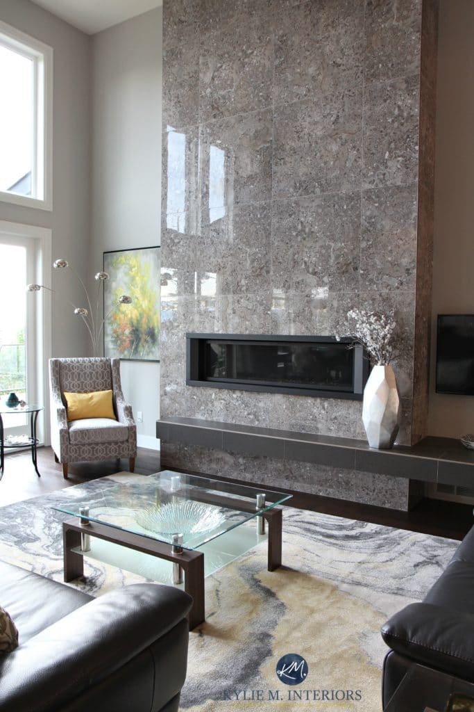
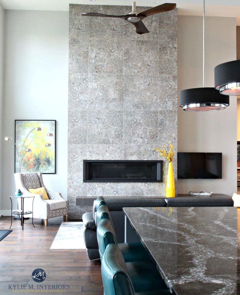
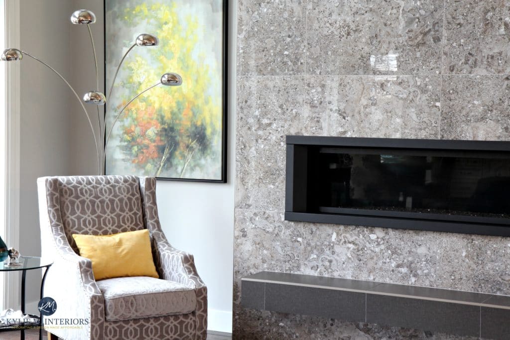
The living room is painted Sherwin Williams Repose Gray, a flexible but UNPREDICTABLE warm shade of gray. It’s a badass complement to the gorgeous ceiling-height tiled gas fireplace. The large, 24×24 tiles are more to scale with the size of this living room compared to a 12×12 or 24×24. The square shape also helps break up the linear lines of the fireplace and floating hearth.
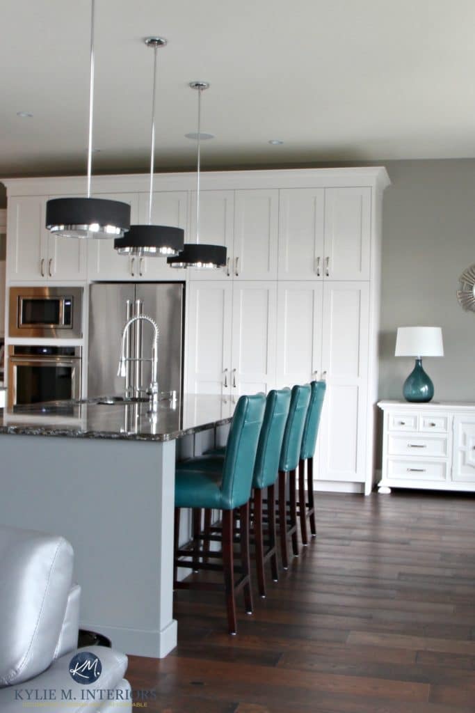
And here’s the kitchen as viewed between the dining and living rooms…
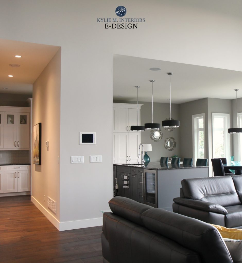
The outer wall areas are Repose Gray, with the kitchen walls painted the ever-lovely Sherwin Williams Dorian Gray. This is another muted, stormy shade of gray with flexible (yet slightly unpredictable) undertones.
The kitchen also offers a nice peek-a-boo view into the dining room…
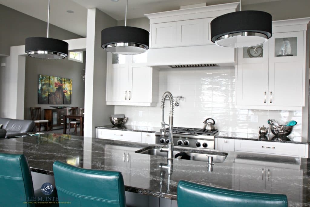
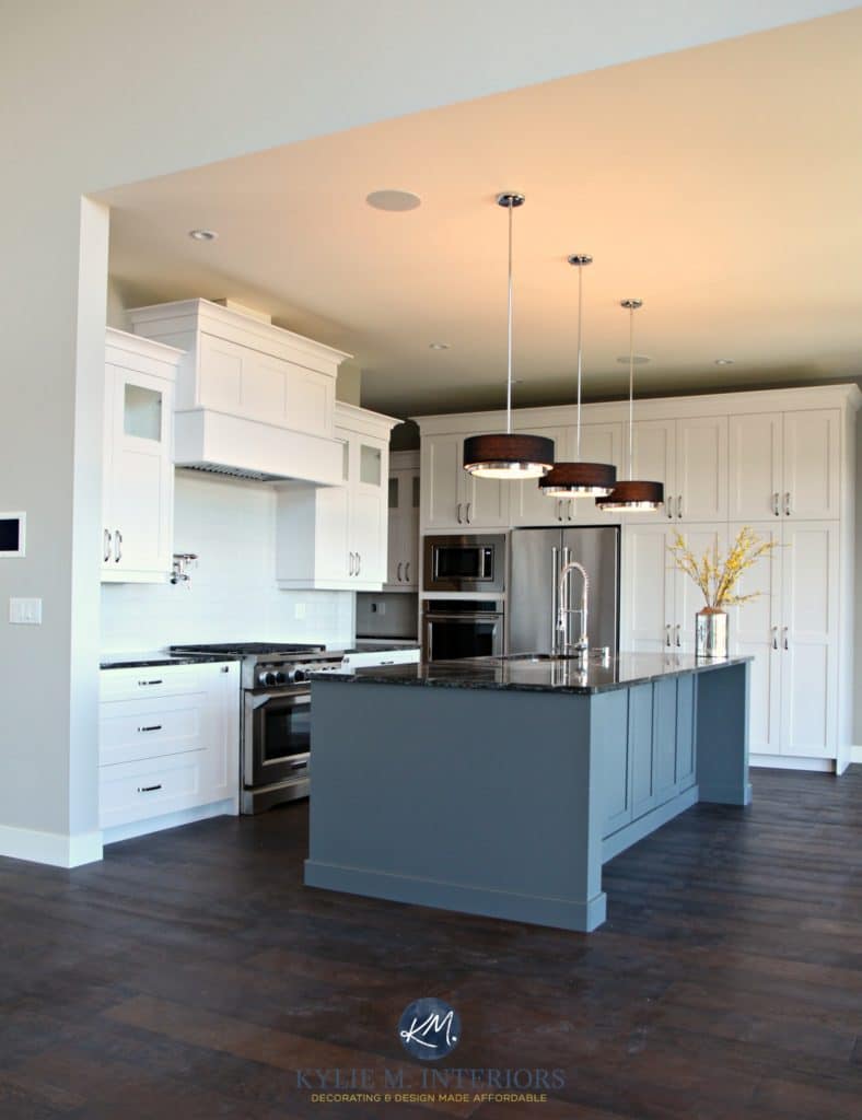
The white kitchen cabinets are a factory color, very similar to Sherwin Williams High Reflective White. The island, well, it’s a color unto itself. I would say Sherwin Williams Grizzle Gray is the closest match.
The 5 Best ALMOST Fool-Proof White Paint Colors
And don’t mind the dusty floors, this was obviously a ‘pre-move-in’ photo and I didn’t have my cleanin’ pants on.
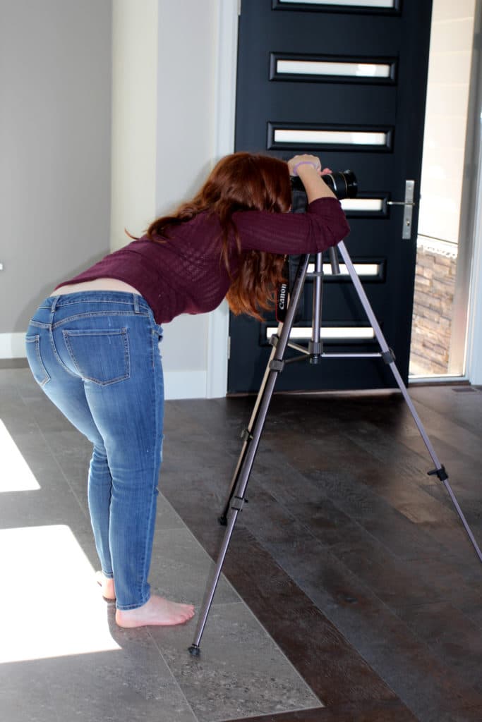
OH WAIT, MAYBE I DID! Look, Mom, my cleanin’ pants! (and yes, she is going to kill me for putting this photo in that SHE TOOK, but really, it IS my best side…)
Lisa wanted to incorporate her existing white buffet, but in its existing wood finish, it was too dated looking. HOWEVER, painting it the same shade of white as the cabinets helps it become part of the palette while adding a personal touch that means something to the homeowner.
Lisa also has a mad love for teal accents, which comes through in her furnishings and accessories!
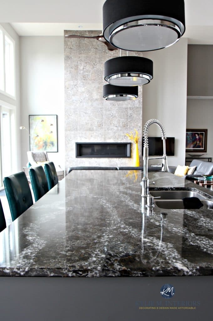
The kitchen countertop and island are topped with Cambria Ellesmere, a striking black, brown, gray, and white blend quartz countertop.
The 12 Best White & Off-White Quartz Countertops
The New Era of Laminate Countertops and Why They ROCK!
THE WINE ROOM UNDERNEATH THE STAIRS
Early on, we decided to open up the stairwell so that as you were walking down, you’d see down into the wine room/family room – it was an expensive, but smart choice!
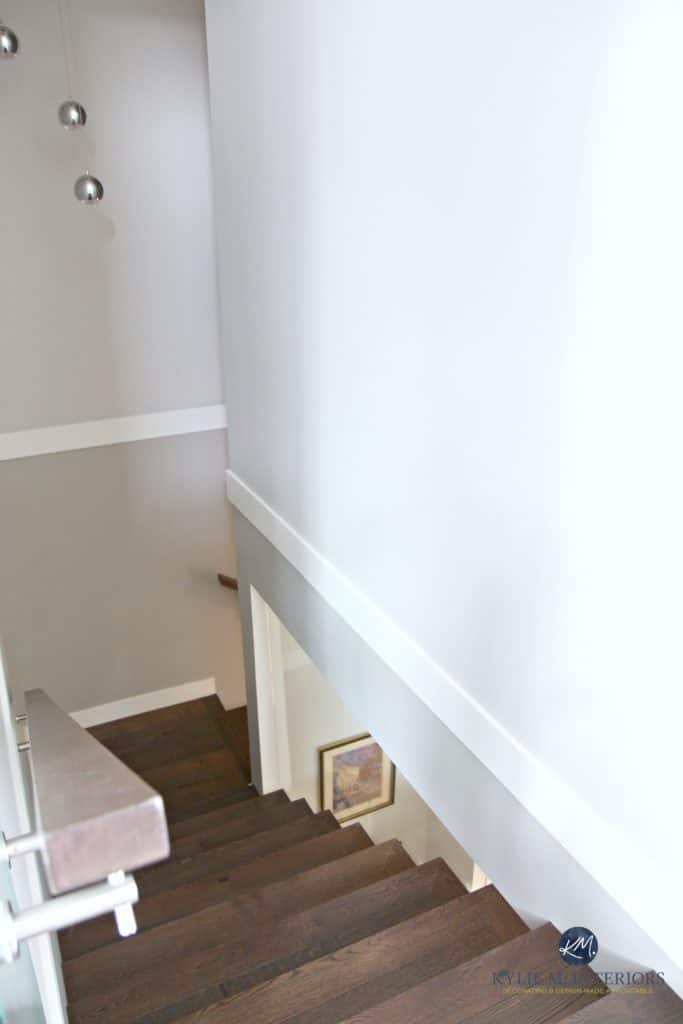
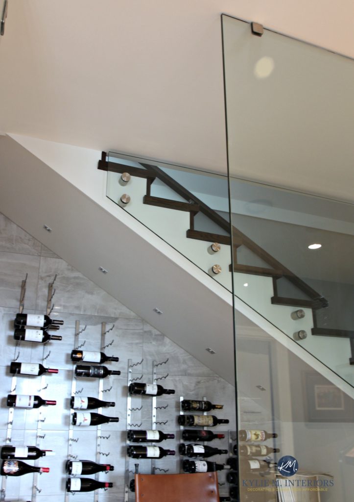
Opening up the wall makes for a graphic detail, which is WAY more fun to look at than plain old drywall! And if you look juuuust to the left, you can see the bed that they’ve made for me – I live in the wine room now.
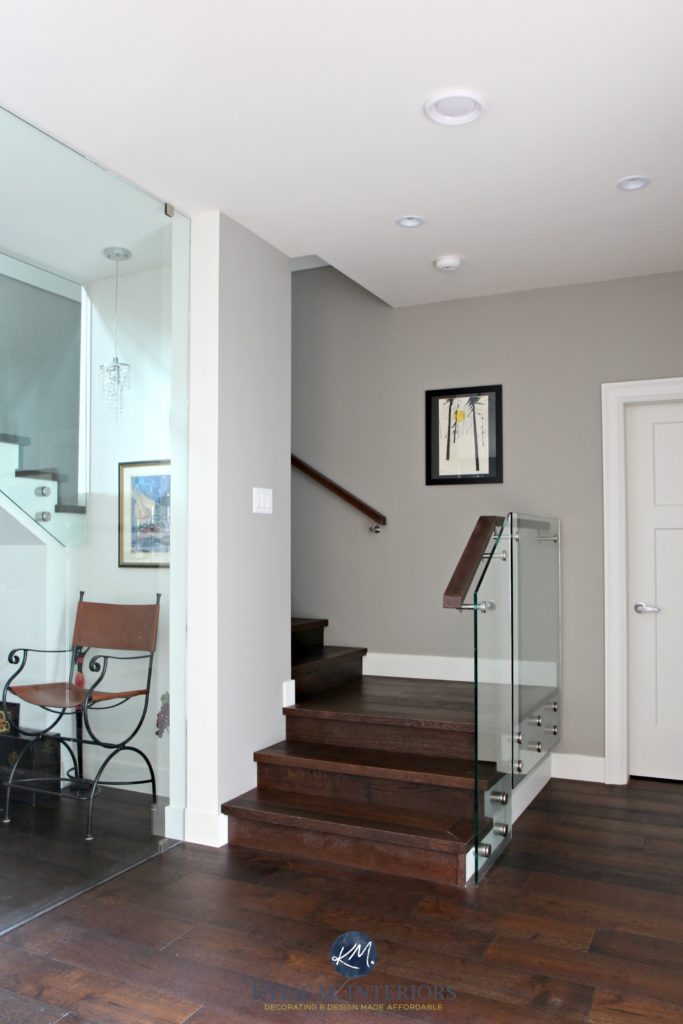
And in a world full of homes with light wood flooring, it’s SO nice to see some floors with a bit of meat on their bones!
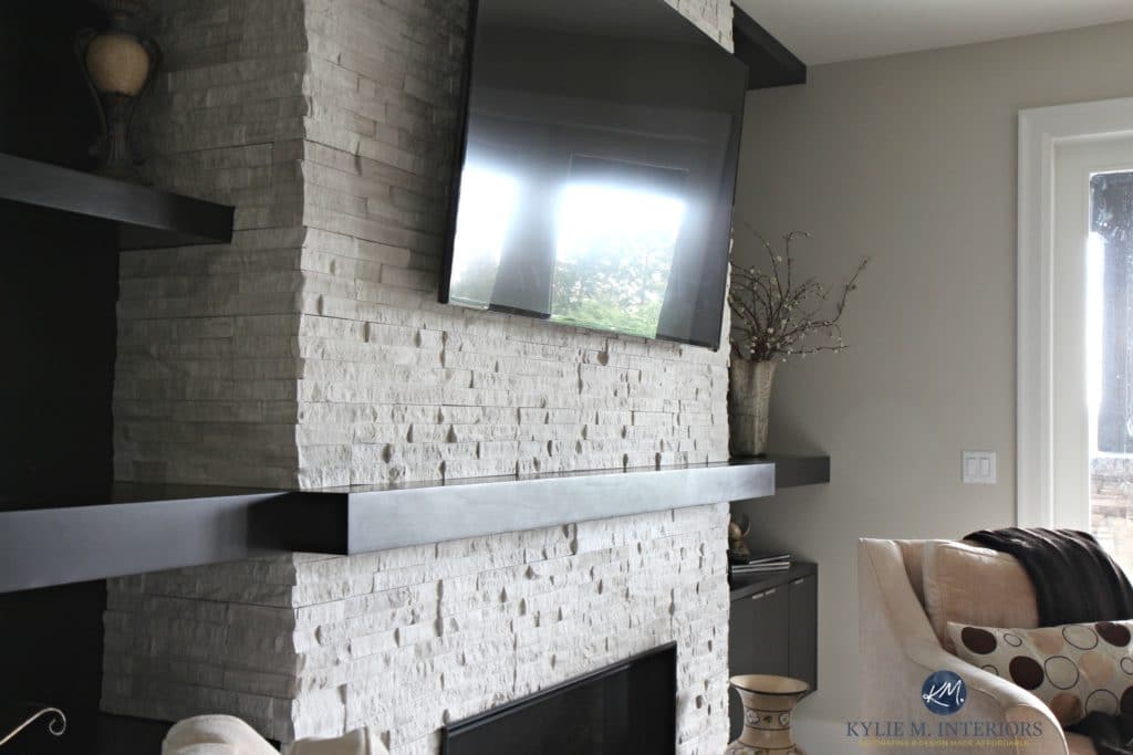
A CONTEMPORARY, COZY FAMILY ROOM
The stacked stone fireplace in the family room is a nice balance to the dark espresso built-in cabinets and floating shelves created by Krystalyne at Mid Island Cabinets (official creative genius).
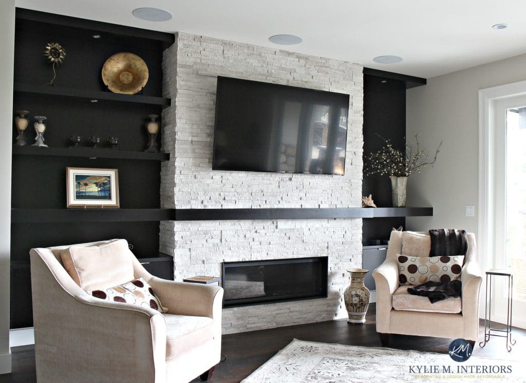
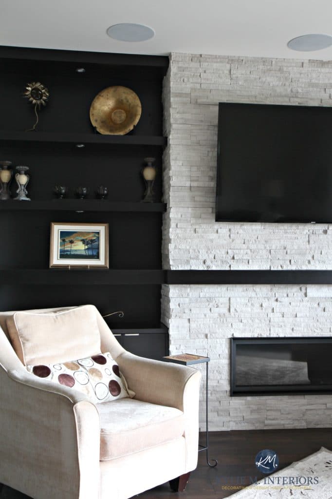
We used this same dark, espresso-stained wood for the bar area while repeating the countertop from the kitchen…

5 Budget-Friendly Ways to Update Your Fireplace
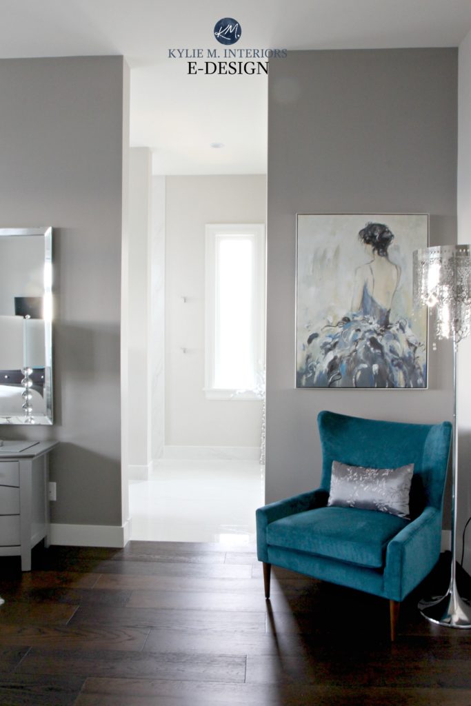
THE PRIMARY BEDROOM
With an ocean view, the master bedroom is a restful retreat, equipped with a walk-in closet, laundry room, and a beautiful ensuite bathroom.
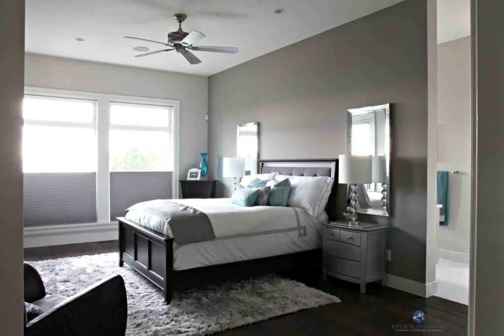
For the bedroom, we went with Benjamin Moore Balboa Mist on the main walls, with a shift to Escarpment on the headboard/accent wall (warm gray with a violet undertone). And being the glam gal that she is, Lisa opted for some shiny side tables, lamps, and mirrors to add some bling!
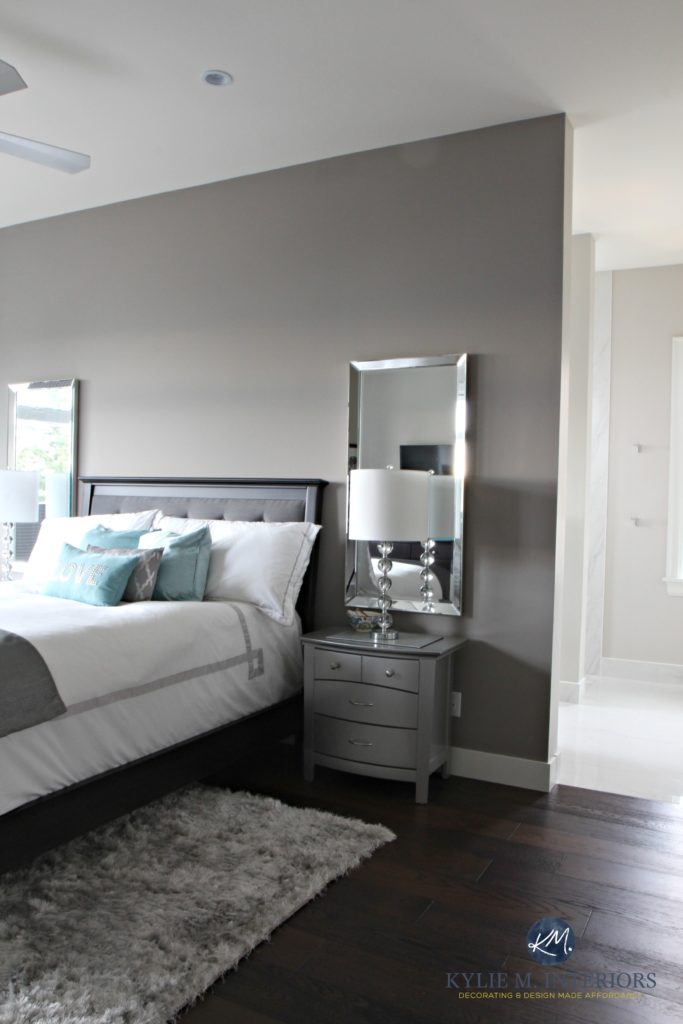

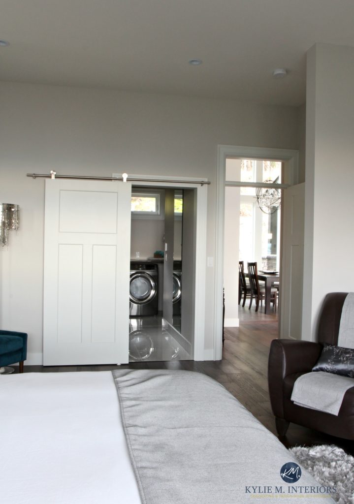
The primary bedroom palette is a range of soft, warm gray neutrals that flow seamlessly into the ensuite bathroom, as well as the laundry room, which is VERY HANDILY, right off the bedroom.
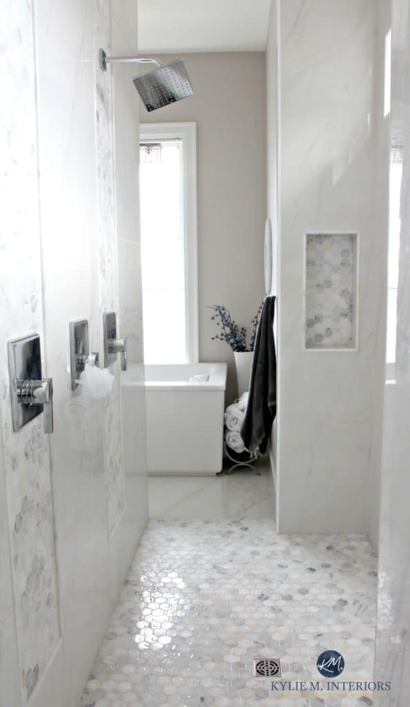
THE ENSUITE BATHROOM
I love this bathroom and always will…
Whether it’s the walk-thru shower, soaker tub, ocean view, or natural light, this bathroom hits all my happy places for a well-rounded loo…
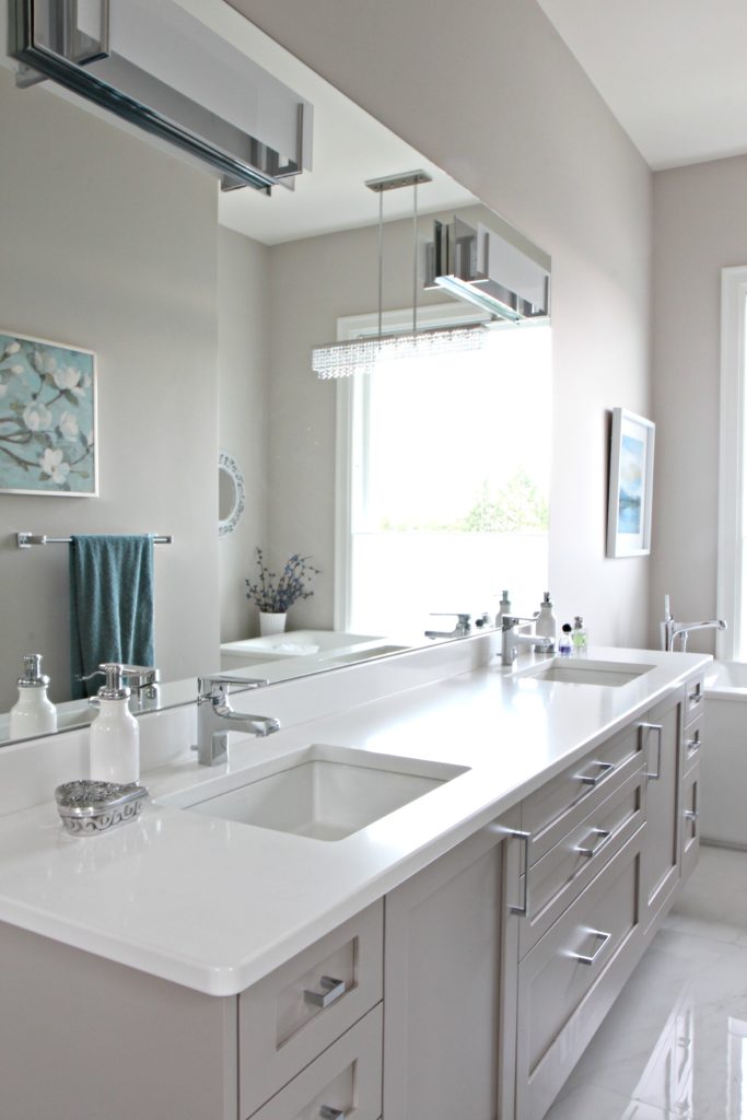
The bathroom palette consists of a soft warm gray on the walls, hexagon marble accent tile, and porcelain that looks like marble (a great way to save money AND maintenance).
To see more of the bathroom, check out this blog post…A Contemporary Marble Bathroom – Ultimate Luxury
THE OTHER BATHROOMS
This home boasts three other bathrooms – one for each guest room and a powder room upstairs.
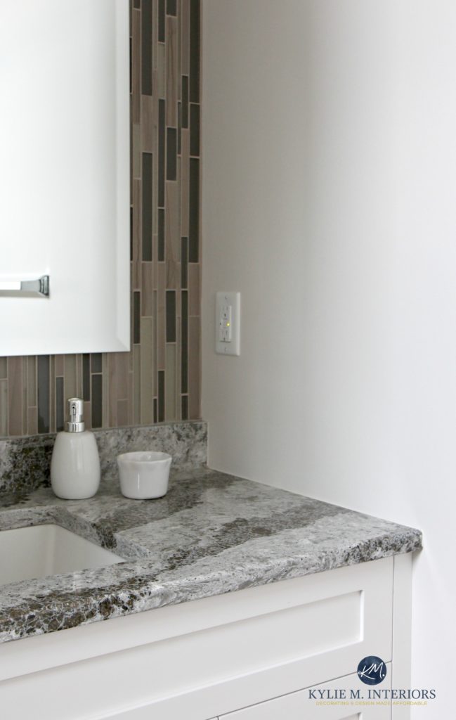
1. GUEST BATHROOM
Just look at that freakin’ countertop – so gorgeous! It’s Cambria Galloway, a beautiful blend of neutral colors, glitz, and earth-toned green.
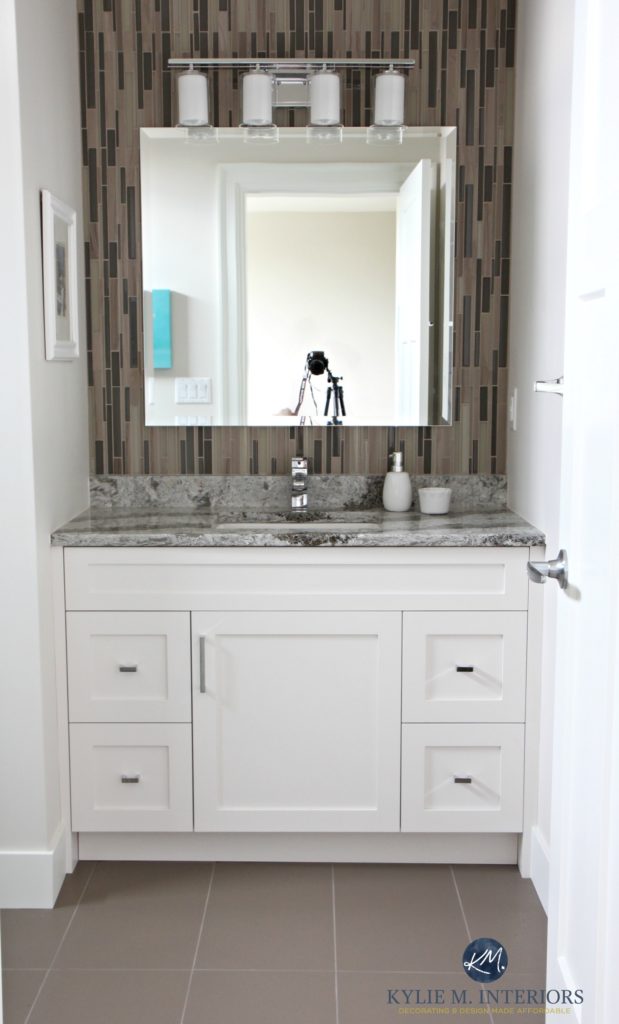
Now, in updating this blog post (I try to update posts every few years) it must be noted that trends have shifted FAR AWAY from this linear, glass mosaic tile look. Tile trends have shifted gears considerably and this look wouldn’t be installed in a new bathroom.
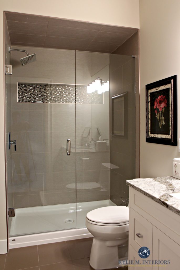
2. GUEST BATHROOM
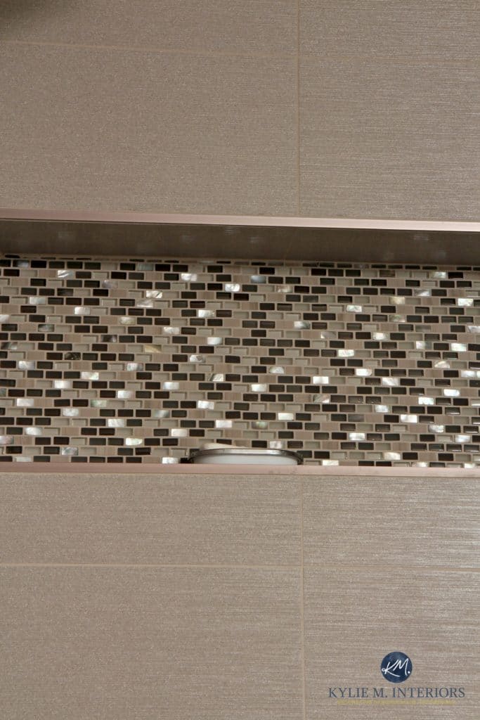
Now, whereas the above accent tile isn’t trendy anymore, this next accent tile is far more timeless. With a smaller scale pattern and a bit of mother of pearl, this tile has more longevity (but the only type of tile that will REALLY last for this type of application is subway tile or marble (for the average home).
AND THE POWDER ROOM…
Lisa and Brian wanted this bathroom to be a little jewel box with a bit of glitz, without going over the top.
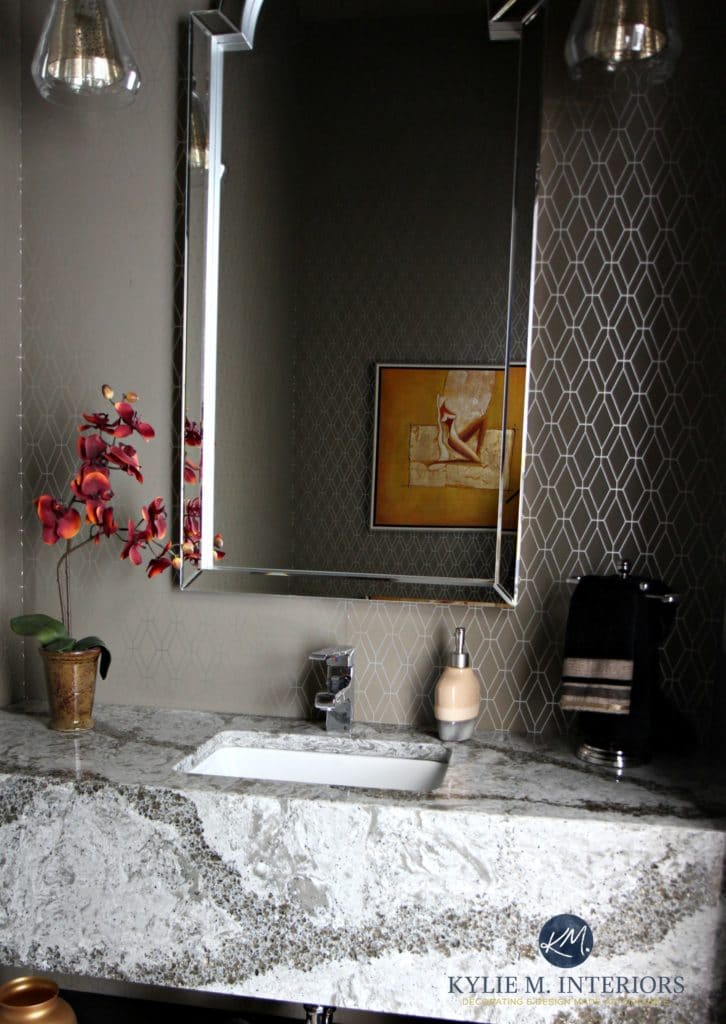
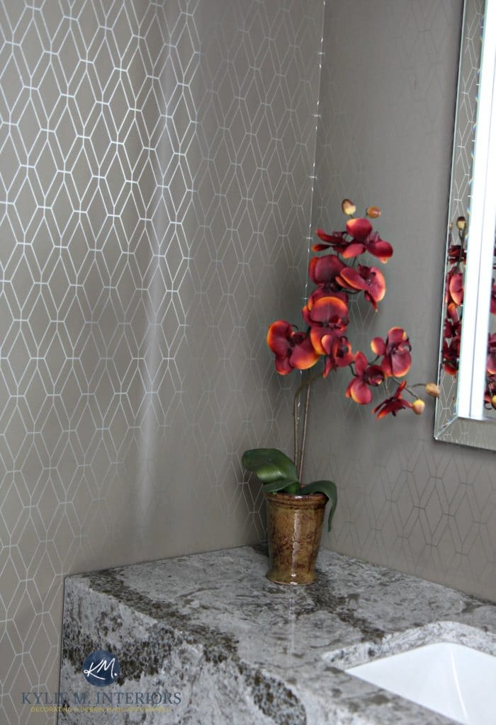
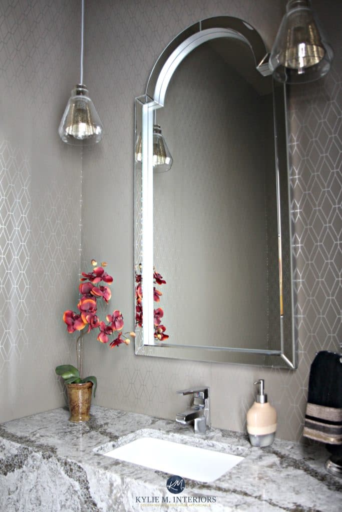
Again, Cambria Galloway looks STUNNING with the graphic wallpaper. While I’m more of a ‘muted countertop girl’ myself, I appreciate this countertop for its visual interest, and more importantly – my clients LOVE IT!
READ MORE
- The Ultimate Guide to Picking the Best White Paint Colors
- The Best WHOLE HOME Gray and Greige Paint Colours
- How to Choose the Best Exterior Paint Colour – 5 STEPS
Do you want help with YOUR dream home?
Check out my Online Consulting and E-Design Services…
Chat soon,

ORIGINALLY WRITTEN IN 2015, UPDATED IN 2024 FOR YOU.
Comments
Leave a Reply
More Posts

The 5 Best Creamy White or Off-White Paint Colors
THE ELUSIVE ‘CREAMY WHITE NEUTRAL’ When it comes to light, warm neutrals, it’s all in the undertones. And other than pink and green, yellow is the undertone many of my
Read More

The 8 Best Warm Neutral Paint Colors With NO Yellow Undertones!
The Top Light Depth, Warm Colors That Aren’t Cream! When choosing the best warm neutral paint color for your home, whether creamy white, beige, taupe, or greige, your choices are
Read More

The 12 Best Farmhouse Sinks of 2024
FIND YOUR DREAM SINK HERE… While traditional farmhouse design was all the rage in previous years, the embers have definitely cooled. As for MODERN farmhouse, it’s still kickin’ its cowgirl
Read More


Kylie, you did an awesome job!!! Breathtaking!!! so color coordinated, you nailed my taste.
Random question, Where was the rug purchased? or where can I find similar?
Thx in advance.
Author
Hi Michelle, thank you! You know, I think she scored on that and found it at Home Sense!
Looks amazing! So much to look at. Quick question, what is the color of the island? Thanks!
Author
Thank you Lauren, it was actually a brand supplied by the cabinet company. It would be somewhere in between BM Amherst Gray and SW Gauntlet Gray 🙂
Hi Kylie, What color is the exterior paint and trim? I’m thinking of doing SW Origami White with Extra White window trim and tricorn black facia. Possibly Greek Villa with the same trim colors. I’m going nuts comparing whites. Thanks in advance! Laura
Kylie,
Is the color of the cabinets in Guest Bathroom #1 Aesthetic White? Or is it the walls? Or both? I am considering Aesthetic White for my kitchen cabinets. It seems like a nice neutral but am fearful it may have pink undertones.
Author
Hi Cathy! It’s on the walls. You know, I want you to sample it. Do a nice big sample in the right finish (usually satin) and see how you feel. Admittedly, it can look WARMER in real-life than it does in that photo, but rarely flashes pink.
Hi Kylie, for the powder room was the ceiling lighter or the same color as the wallpaper? We’re planning to go dark in our powder room (dark walls with possibly lighter wainscoting) and are trying to decide if we want to paint the ceiling the same as the wallpaper. Thank you!
Author
Oooo, that’s a good question, it was several years ago, so I don’t remember. HOWEVER, I would suggest it being the same as the wallpaper normally, BUT, with lighter wainscoting I might hesitate. If the wainscoting is white and the wallpaper has some white in it, I might leave the ceiling white.