
Posted on July 24, 2022 by KylieMawdsley
TIPS ON PICKING PAINT COLOURS WHEN YOU HAVE ANXIETY (or overthink)
I’m obsessed with paint colors. Throw in a bit of decorating and design, and I’m one HAPPY lil Ginger. However, as many of you who subscribe to my blog or follow me on Instagram know, I have anxiety (and ADHD). This means that when all of the above are combined, you have someone who can give you first-hand KNOWLEDGEABLE advice on picking paint colors when you have anxiety OR are an overthinker.
And let me just say, being in the Design world, whether choosing paint colors, decorating, or just living everyday life, is a CHALLENGE when you have anxiety.
This post may contain affiliate links. If you make a purchase through links on our site, we may earn a commission.
Why?
I absolutely AGONIZE over my own home. My anxiety doesn’t just take a front seat; it hijacks the friggin’ car and starts running over curbs and innocent pedestrians while quickly stopping at the liquor store for a six-pack and a box o’ wine.
This being said, I’m doing a pretty bang-up job of managing it and want to share some paint tips with you today; tips that UNFORTUNATELY don’t include two bottles of wine and a tranquilizer dart (we’ll save those for another day).
HOW TO CHOOSE PAINT COLOURS WHEN YOU HAVE ANXIETY
While I can help YOU choose paint colors with a wink and a smile (because I don’t get EMOTIONAL about it and am confident in my knowledge), I know first-hand how HARD it is to choose paint colors for your own home.
Why is it so hard?
Well, if you’re like me, you might have…
- a tendency to overthink, which causes you to doubt yourself
- a habit of asking OTHERS for their opinion, which only adds to the muddle
- ALL the feels (emotions that we have in abundance)
- difficulty making a big decision as it relates to our home
Luckily, I’ve learned a few key tricks to make your paint-picking journey a bit less painful…
1. DON’T ASK FRIENDS FOR THEIR OPINIONS
We know what they say about opinions; they’re just like…well, let’s just say that ‘everybody has one.’ The more opinions you get, the harder it can be to decide. And MOST opinions are swayed by personal tastes and perceptions – not actual knowledge.
If your friend doesn’t like pink, they might not tell you that Pale Oak is the best colour for your room, even if it is.
Just like the great Britney Spears says, let’s hit that baby one more time…
MOST opinions are swayed by personal tastes and perceptions – not actual knowledge.
Choose one or two key people to throw your ideas at, but choose the people who you feel will have you and your home’s best interest at heart.
2. TAKE YOURSELF OUT OF THE EQUATION
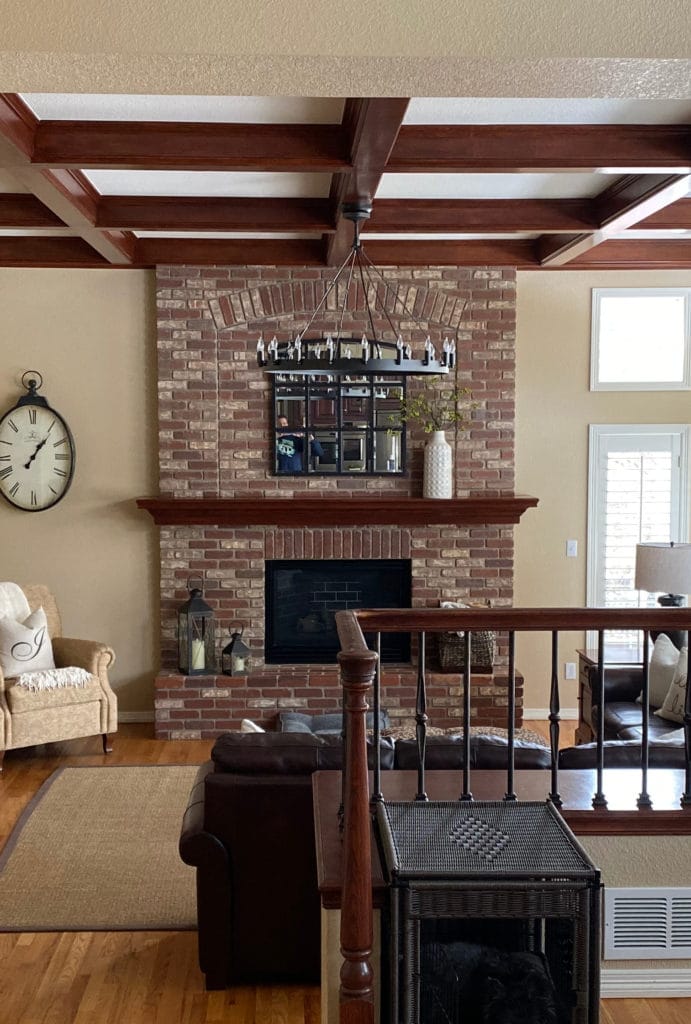
Sometimes, we get so caught up in what WE want to see that we forget to listen to our home. And when choosing paint colors, the needs of your home are pretty darn important. If you like bright whites and your home prefers off-whites, things could get a little fugly if you only cater to yourself. And let me tell you, NOTHING will cause you more anxiety than realizing you didn’t listen to your home and you painted it the wrong color.
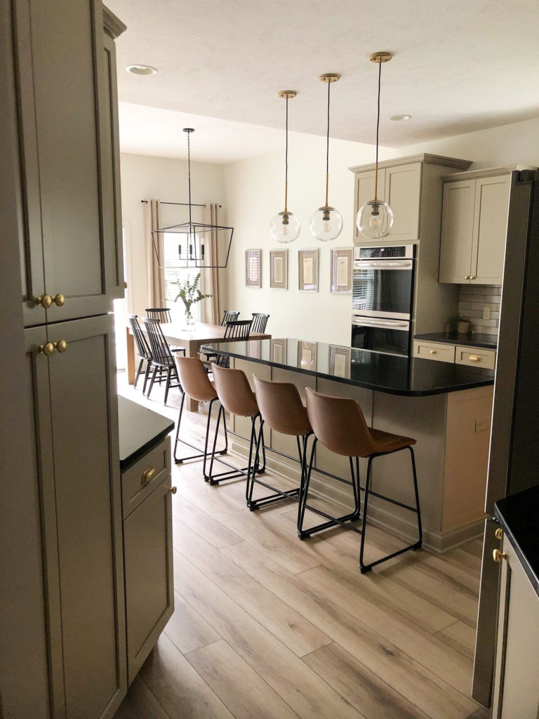
Damn, do my clients ever have good taste – I love this kitchen!
By the way, choosing the wrong colour HAPPENS; that’s life. HOWEVER, there are some ways to reduce the chance of this happening (other than hiring me, wink wink).
The 5 Types of White Paint Colours
3. PAY ATTENTION TO THE HIERARCHY
I’m not talking about Prince Andrew (although he’s not hard to pay attention to, and Megan’s a total babe); I’m talking about the hierarchy when choosing paint colors (in very particular order)…
- The needs of your home’s interior finishes (i.e., does your countertop better suit beige or gray?)
- An existing colour palette in nearby rooms
- Your room’s exposure
- You
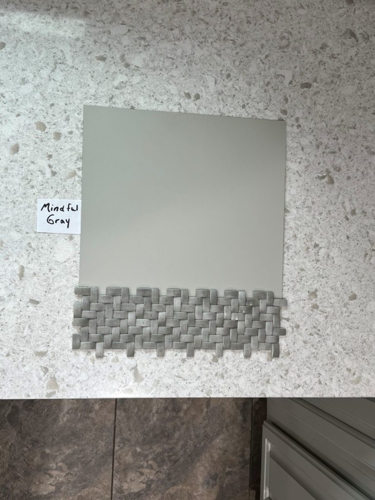
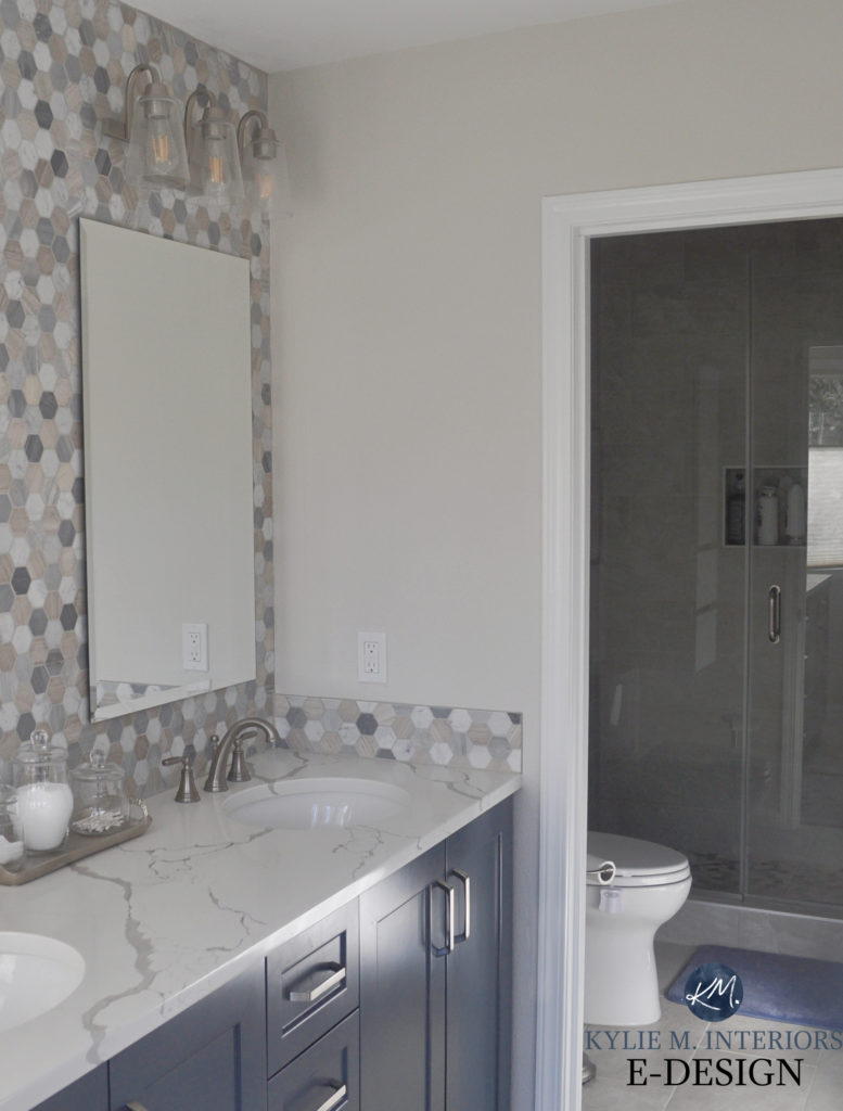
No matter how much a homeowner might love blue or violet hues, this backsplash and countertop TOTALLY DISAGREE!
While this hierarchy can shift depending on the situation (especially #3 and #4), considering your HOME FIRST is a great way to remove some of the EMOTION and add some LOGIC. I find my brain spins TEN TIMES SLOWER when I take my heart out of it and put my head back in.
This is one reason I’m so good at helping YOU (and I’m modest, too) – the emotions aren’t there (I mean, I love y’all, but you know what I mean). I can look at your space unemotionally, take my knowledge (which you can also find in my hundreds of blog posts), and apply it to what best suits your home. At the end of the day, I never want to ignore my client’s personal tastes, but often, there’s a GREAT happy medium between what they WANT and what their home NEEDS.
5 Reasons You Keep Picking the Wrong Paint Colours
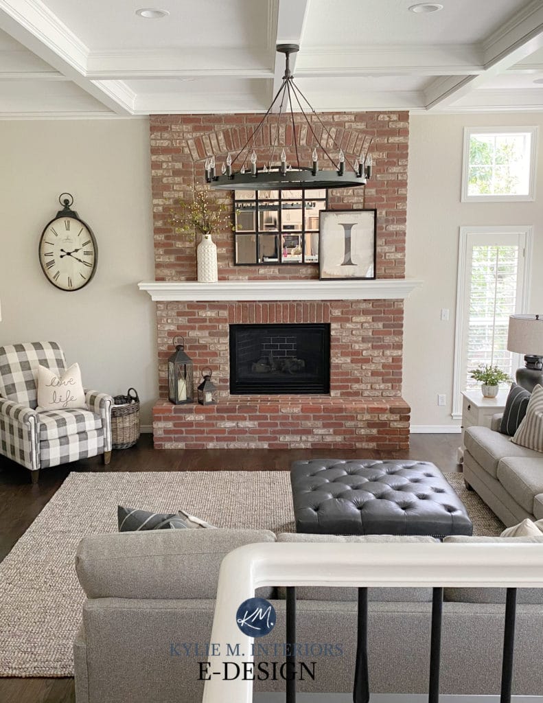
In this next photo, even if the homeowner doesn’t love violet-pink hues, the space tells them otherwise…
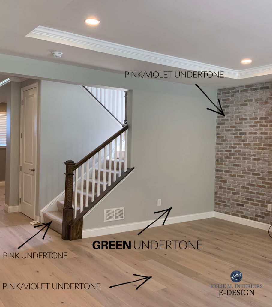
The result is that Sherwin Williams Agreeable Gray, which is a GREAT COLOUR for some spaces, actually clashes with the NEEDS of the finishes.
Of course, some would rather choose a colour they LOVE; even if it looks disconnected from the finishes in their home – you do you, boo (insert Kylie crying and twitching in a corner HERE). Really, though, the end goal is to be HAPPY in your space, whatever ‘happy’ looks like to you.
Stop fighting your home and start LISTENING to it.
4. DO YOUR RESEARCH BEFORE YOU START LOOKING AT PAINT COLOUR SWATCHES
Now that you’ve taken some of the emotion away, you’ll pay less attention to YOURSELF and more to your HOME. Trust ye ole Ginger, doing it this way makes it much easier to step back and view your space with more curiosity.
Curious, you’ll try to figure out what your home’s interior finishes are REALLY asking for. This will lead you to the types of colors you can be LOOKING for. Once you know what to look for, it’s easier to do your RESEARCH, using my blog as a great reference (the SEARCH function is awesome with 450+ articles. Seriously, type in any word and see where it takes you…except the word ‘nudes,’ that’s a WHOLE different blog).
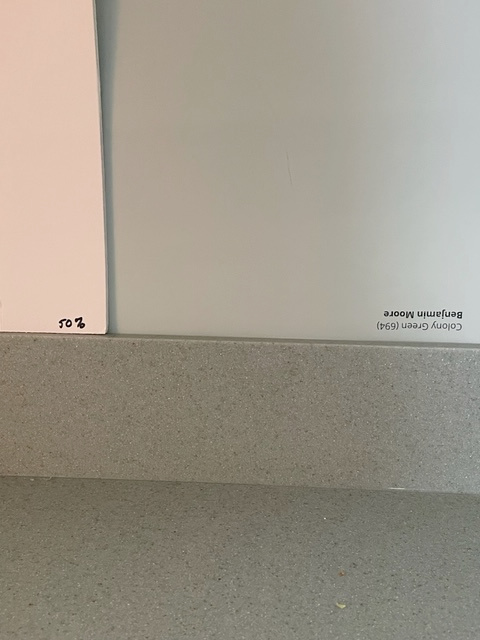
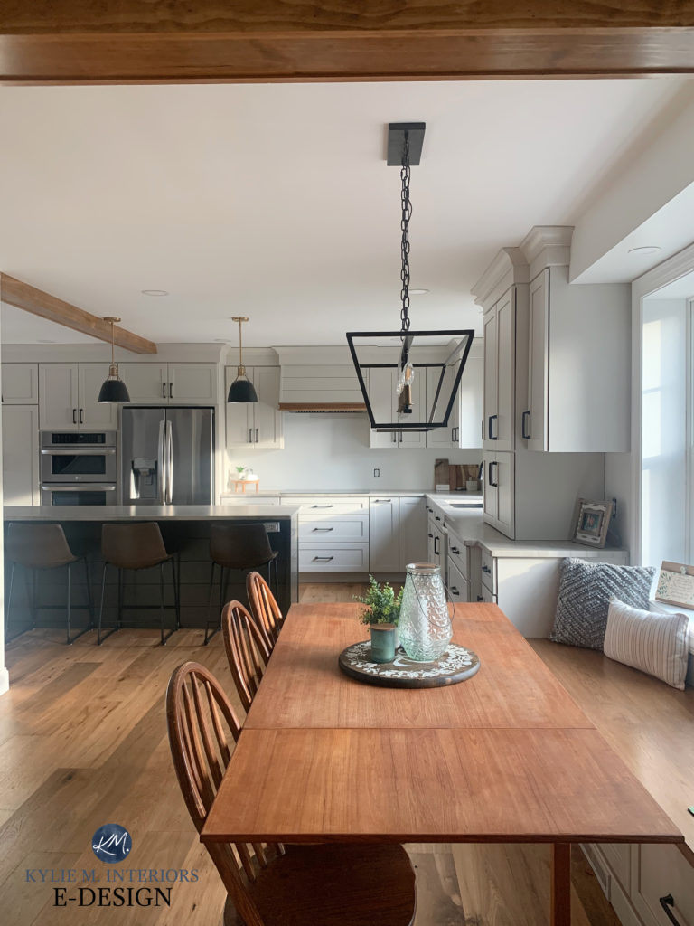
This homeowner did a GREAT job of listening to their countertop…and me (Benjamin Moore Colony Green)
5. TAKE IT EASY ON YOURSELF – YOU’RE NOT A COLOR EXPERT
If you were a paint colour expert, choosing paint colors would be easy for you. But you’re not, and it doesn’t HAVE to come easy to you (you’re only LUCKY or skilled if it does). While I might be able to fill my car’s tire with air, I sure as heck can’t change the tire – I’m not a mechanic. I can cook a mean Kraft Dinner, but don’t ask me for chicken and potatoes – I AIN’T NO CHEF (if you want to learn more: ‘Mom, What’s That Smell? Cooking with Kylie‘).
Take a deep breath, and if all else fails, hire someone to help, either myself or a local expert, and let yourself off the hook. Remember, you’re not saving lives here; you’re just picking a paint colour.
Benjamin Moore Edgecomb Gray
6. A FEW MORE HELPFUL DETAILS
Of course, it will finally come down to actually PICKING the paint colour that, HOPEFULLY, both you and your home can agree on…
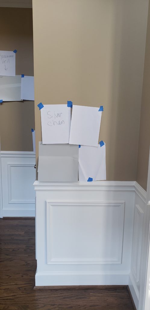
- ALWAYS surround your sample with white paper. Your existing paint colour WILL skew your perception of your samples. The only side that shouldn’t have white paper next to it is the side that buts up to your cabinet/trim.
- Once you know you don’t like a sample – GET RID OF IT. I don’t care if you recycle it, throw it in a box for later, or light it on fire singing ‘I Hate Everything About You’ by Three Days Grace – PURGE THE DEMONS and move along.
- Come heck or high water, narrow it down to your FAVE TWO OR THREE before you start asking for the limited opinions I suggest you get.
- If things seem OFF, shift your undertones. If the colors look too gray/cool, try some warmer ones. If they look too warm, try something in the middle. Remember, this isn’t ‘Do YOU find it too cool?‘ it’s ‘Do your INTERIOR FINISHES find it too cool?‘.
- Look at your samples throughout the day. Heck, buy a quart of paint and paint an important section of the wall that will really give you a feel for how things work. And don’t let that first coat scare you; it’s ALWAYS the worst, as it’s being directly compared to what’s currently on your walls.
Committing to painting ONE WALL/section that butts up DIRECTLY with the finishes you’re trying to coordinate is a great way to get the decision ball rolling.
Worst-case scenario? You hate it, buy another quart of paint and go at it again. BEST case? You made a great choice.
So there you have it. While you might not implement ALL of the above tips, hopefully, you picked up a few tidbits to help you along the way. And remember…BREATHE (meditation and Mojitos help as well).
Chat soon, 

READ MORE
The 10 Best LIGHT & Calming Paint Colors for Stress & Anxiety
The 3 MOST TIMELESS Paint Colours
The 12 Best WHOLE HOME Gray & Greige Paint Colours
The 8 Best WHOLE HOME Warm Neutral Paint Colours
NEED HELP?
CHECK OUT MY ONLINE PAINT COLOUR CONSULTING packages
Comments
Leave a Reply
More Posts

The 5 Best Creamy White or Off-White Paint Colors
THE ELUSIVE ‘CREAMY WHITE NEUTRAL’ When it comes to light, warm neutrals, it’s all in the undertones. And other than pink and green, yellow is the undertone many of my
Read More

The 8 Best Warm Neutral Paint Colors With NO Yellow Undertones!
The Top Light Depth, Warm Colors That Aren’t Cream! When choosing the best warm neutral paint color for your home, whether creamy white, beige, taupe, or greige, your choices are
Read More

The 12 Best Farmhouse Sinks of 2024
FIND YOUR DREAM SINK HERE… While traditional farmhouse design was all the rage in previous years, the embers have definitely cooled. As for MODERN farmhouse, it’s still kickin’ its cowgirl
Read More


Oh my word did I ever need to read this! We are picking paint colors for our forever home before we move in and it’s so hard! It was built in 2009 and is a well done Tuscan inspired home with an open floor plan. It has gorgeous high end oak woodwork, and I am on the struggle bus! Our current home is mostly White Dove and Sea Salt and totally my jam! I can use both calm and coastal colors and pull in fresh color too. My designer is not recommending the all white look in the new home, however, even though we are redoing the warmest surfaces (and taking down gorgeous wood plantation shutters). She is recommending a neutral like City Loft or Gray Mist so there is contrast with the painted white trim. The prob is I have a hard time with all neutrals and the the idea of the putty look over the whole space is making me twitch (and lose sleep). I have been reading your posts frantically searching for an answer to my paint color conundrum! I’ll admit I have seen some gorgeous photos of Gray Mist with Dove Wing though! I was conjuring up a muted, French palette vibe when my husband said, what about the SW Sea Serpant color for the island 😊!? I’m a boy mom and we all love blues! We’ll see what the space says it needs! Thank you for being so generous with your knowledge! Cheers!
Author
Sooooo, I haven’t seen your home, BUT being a white lover myself, if there were one white I would consider with the Tuscan style for EVERYWHERE, it would be Cloud White. YES, it’s likely a touch more yellow than your main finishes, but being so light, you’re given some good forgiveness.
Short of this, Moderate White (WAY prettier in real-life than Pinterest, it’s pretty fugly on Pinterest) is often a GREAT CHOICE. I wouldn’t do Gray Mist – no how no way, it will clash with travertine. City Loft is lovely – compare it to Egret White and see if you prefer one over the other.
I know what it’s like to HAVE a personal style and crave it. If I thought Cloud White were a hard-no, I’d tell you, but I think it’s worth exploring :).
Great post, thanks for putting color choices in perspective….Noone will die if it’s not right….Anxiety can be paralyzing for overthinkers.
Author
It really can be! I’ve made myself hyperventilate (proud moment ;). Sometimes it’s just taking that step back and a VERY deep breath.
Hello Kylie, I’ve spent hours rolling through your blog posts, thanks for sharing so much info!
I’m planning to paint our combined kitchen/living/dining in a few weeks time…
A self-confessed over-thinker, I’m going back and forth with my painted sample boards and am very worried about getting it wrong!
I can’t afford the time it will take to do this twice so I am determined to get it right…
My question is about changing the strength of the paint colour… full strength is too dark for what I’m after but if i take it down to 1/4, what happens with the known undertones?
Thanks in advance from an anxious overthinker 🤦🏻♀️
Author
Hey Kath! It’s always fun to play with paint colours, so yes, try 25% lighter. The undertones CAN shift, but most times the shift is so small you can’t even notice it :). I do this ALL THE TIME when I want to get just the look I’m going for. And while 25% can be quite subtle, it’s often just the thing I need.
Hello
The following is some information regarding my dilemma.
Room Type – Basement Bar Sports Room 12×12, Toronto Maple Leafs Hockey Theme with Memorabilia
Window – 93 Width x 18 Length with Light Grey Shade
Wall/Trim Colour – Soft Light Grey with White Trim
Lighting – Ceiling Light with Dimmer, Colour LED Strip Lighting under Bar Top and under Floating Shelves
Furniture – 74-inch Parota Wood Bar, Matching Bar Chairs with Black Iron
Wall to Paint – Back Bar Wall Facing Door Entryway. I would like this to be the accent wall in a different colour.
Items on Wall – 40-inch TV with 2 Acacia Wood Floating Shelves on either side of the TV
My thoughts – I was thinking Blue or Grey for this Accent Wall but unsure of shade. I am open to other colour suggestions also.
I am looking forward to your suggestions
Elaine
I’m going through this right now. We’ve been in our house 22 years, have painted the interior many times, and now are going from a super-dramatic gray to something lighter. I’ve always suffered from analysis paralysis but this time is hitting differently, prob because we’re doing several rooms and it will be very expensive. I want to get this right. After getting stuck repeatedly in the Repose Agreeable Light French Gray loop I hired a pro to help and am even more frustrated now. She criticized our current color choice (who does that?), ignored everything in my questionnaire and recommended colors a good two shades lighter than we wanted to go. Told her that and now she’s arguing with me about how what we want isn’t “the trend”. I feel like I’ve wasted money and now I’m even more anxious! lol
Author
Hey Stacy, my apologies on the HUGE DELY, I have a hard time keeping up with my comment section. But I was flipping through and yours caught me. I’m sorry you had this experience. If you’d like, I’m happy to do a consult for you – no charge. I know how it is to feel unsettled and I’d like to help if I can! I also feel like I know who you might have hired, as I’ve heard this before.
I’ll be away a few days this week, but if you’d like to send me an email, reminding me that you’re Stacy from my comment section, then when I’m back we can get the ball rolling. kylie@kylieminteriors.ca
Cool beans?
I needed this post. I definitely feel better about the rest of the house but still my biggest struggle is the kitchen. Northern exposure. Bright white cabinet. Creamy white quartz with cool dark gray/purplish veins. I want to go blue or green but from reading your page with the northern exposure its going to look cold. The color they have now is a gray but it doesn’t match at all. Its definitely mindboggling. Your pages have helped me so much with the rest of my house and learn more about paint in general. Thank you!
Author
Hey Sabrina! What’s interesting about blue and green, is that mixed together, they can look quite pretty in a north-facing room. OR, lean into the warm side of green, like Sherwin Williams Techno Gray, Grassland, Benjamin Moore Mountain Air. Blue-green mixes like Rainwashed or Benjamin Moore Gray Mist can also be pretty! It’s not that they add warmth, but when they have color, they have PERSONALITY!
I would so love some help. I just am moving into a rental that desperately needed some fresh paint. The kitchen, dining room, living room, and even the bathroom all flow into each other. I don’t want boring but I want clean and nice and versatile. It’s so overwhelming to try and pick colors from tiny squares from Home Depot lol. It’s an old farmhouse with uneven walls and even a shiny ceiling in the living room. Help!
Author
ooo, it’s just so tough without seeing photos! Personally, I love BM Classic Gray and SW Egret White as they’re a passive warmth and pretty versatile!
Ahhh the over thinkers! 🙂 I can relate. I’m getting my house ready to sell and I hired a designer to help because I was stuck!!!! And I continue to be in analysis paralysis. I thought – I’ll just do what she says and it’ll be great. The counter has been installed – awaken by Hanstone. The cabinets are decorators white, the paint color she picked is useful grey but sherwin Williams but it is reading so green to me. Looks fresh but like a light green almost. Bleh. I did the kitchen and it was my intention to paint the main floor and up the stairs the same color. It’s so much work to paint this area, I really want to get it right. I have red cherry floors (don’t love them but they’re what was there) in the living room and a pretty neutral grey tile throughout the kitchen/main floor – probably leans more warm than cool. Anyhow – your post was great. I am quite anxious and I get stuck with this stuff a lot so the encouragement is always reassuring!
Author
Oooooo boy, so there’s a really good reason why Useful Gray is looking green…because it is. I mean, it’s not a green color, but it has a MOST DEFINITIVE warm, earthy green undertone. Also, unfortunately, her partnering it with Decorator’s White is a hard no as DW has a gray-VIOLET undertone, so things are really bouncing off each other. You aren’t overthinking girl, what you’re seeing is REAL! I mean, you might be overthinking anyway, but you’re not going crazy and seeing things ;).
Check out…
SW On the Rocks / BM Nimbus / BM Collingwood. I bet these will feel SO much better :). LET ME KNOW HOW IT GOES!
You are me. You described me (us) perfectly. I went with repose grey based on the color consultant telling me to and I’ve hate it every single day. I’ve read basically article you’ve written, bought 16 paint samples, and unfortunately I’m still paralyzed 😅 I love sea salt but not in my home – it is in the woods and had very little sunlight but somehow seasalt is reading pale baby blue. Repose grey with dark wood floors feels like a gloomy prison to me- or is so grey, like duct tape almost. My husband refuses white. We have alabaster trim but it doesn’t look great on the walls. I just want a neutral color that brightens and warms up the space but isn’t too blue green but still is blue green leaning… or is whatever my house wants which I apparently don’t know still. Anyway thank you so much for your articles and feel free to tell me 1 perfect color and I’ll just go with it 😉
Author
Oh Virginia, I feel you, and I’m sorry you were misled with Repose Gray! Now, you want neutral grayish with some blue-green – not too much blue-green, but a wink is good – correct? Off the TOP, I worry it could feel heavy for the home you’re explaining, but all the same, you KNOW your home and you know what type of coolor your’e craving! Sea Salt is a little bugger and shifts its shape all the time. HOWEVER…I’ve had a ton of luck with the slightly darker, light-medium Comfort Gray. I mean, i’d still check it carefully, but it always settles SO nicely for me. I feel like it still has enough color for a home in the woods with little light without being TOO colorful. You might also check out BM Gray Wisp, which is a little tweak on things and a touch darker – see how that feels.
If you prefer the DEPTH of Sea Salt, just not it’s blue hue, BM Night Mist is different and interesting. I hope these help!!! Let me know :).