
The 13 Best Paint Colors for West Facing Rooms
Rooms with west-facing light or western exposure can be challenging. Just when you’ve finally chosen your paint color, you’re excited and ready to run to the paint store—the sun moves (well, technically, the earth moves, but let’s not get into those little details). Oh, the glory of exposure.
While exposure isn’t one of the most important factors when choosing a paint color, it’s worth understanding. So, not only do you need to consider the size of your room, your countertop, flooring, furnishings, and the color of your underwear, but also how the sun (or lack thereof) can affect your paint color.
By the way, the beginning of this blog post is INFO HEAVY. It’s no use looking at pretty colors if you don’t understand your room and its needs, so humor me on this little journey (in other words, break out the box o’ wine; we’re in this for the long haul).
WEST-FACING NATURAL LIGHT & PAINT COLORS
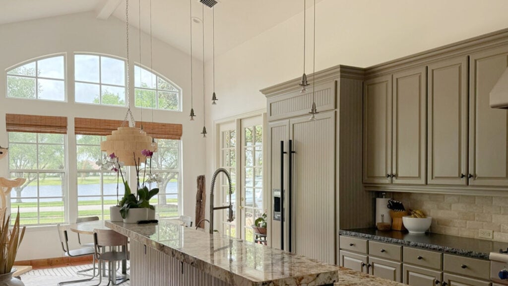
In the wee morning hours, when Kylie is just waking up, pouring a coffee with Baileys, and starting her day, west-facing rooms begin their day with pretty drab, flat natural light.

That’s right, in the morning, rooms with western exposure can look a little shady. However, there’s a difference between ‘shadowed’ and ‘shady’. You get shadows when the sun shines, cutting the light and creating sharper edges. Shady is when you pour me a 6oz instead of a 9oz. Oh, and when a room is a little bit more gray-toned and subdued because there isn’t much light coming in, or that light isn’t warm.
Paint colors can look a little dull and flat in western morning light.
Whether your room is bright or dark, west-facing morning light doesn’t have a lot of life.
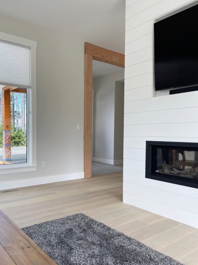
At noon, the sun is at its peak, at its brightest/whitest. This light tends to wash out colors the most. It’s also when there’s a little light at the end of the tunnel (pun intended) for west-facing rooms as those sun rays start tickling their edges.
Around midday, west-facing light can wash out paint colors.

As we enter the afternoon hours, right up until the sun goes down (Elton John style), a west-facing room stays warm. This can be similar to what you get in south-facing rooms (but can be warmer).
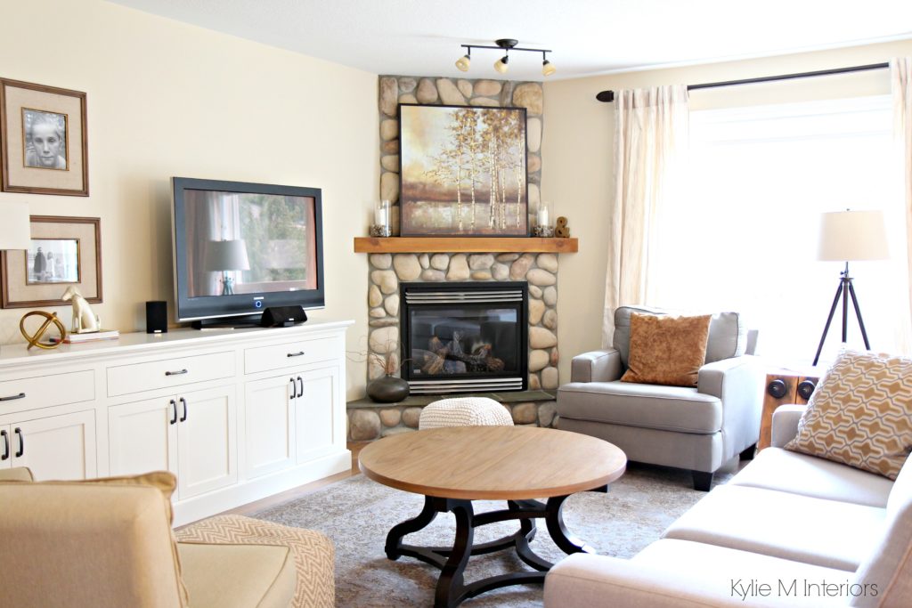
The sun is at its most red/warm in the late afternoon, casting the warmest light on a west-facing room. Not that your walls will be tinted pink (well, in a glorious sunset, they might be), but in general, it just casts a significantly warmer (think golden type of warm) light on a room.
WHAT ABOUT WHEN THE SUN GOES DOWN?
It’s dark – nuff said. Just remember…
YOU CAN’T PREDICT HOW A PAINT COLOR WILL LOOK IN ANY EXPOSURE
You’ll drive yourself crazy trying to predict how your natural light/exposure will affect your walls’ paint color. Here’s a shortlist of the many things that can affect how your paint color looks (related to exposure).

- How big your window is
- How tall your wall/high your ceiling is
- If you have landscaping outside the window that partially blocks light, or the light filters through it
- You live in a place that’s cloudy a lot of the time
- If your neighbor’s home or a tall building blocks some light.
- Whether you’re close to the equator or not
- If your windows have tint
That’s why when considering how your room’s exposure MIGHT affect your paint color, it’s about considering your room as a WHOLE and how its exposure might affect it. When looking into your room, does it APPEAR cool or warm? That could be your exposure?

This room has the perfect balance of light and color – it feels inviting and warm!
That covers the basics. Now you need to know what to do with that information, so let’s get into the guts n’ the glory.
With west-facing rooms changing their tune drastically from morning to afternoon, sometimes…you can’t find a paint color you love at all times. In this case, you might want to cater to the time of day you use the room most.
IF YOU USE YOUR WEST-FACING ROOM MOSTLY IN THE MORNING
For you morning dwellers, you must humor your room’s flattest time of day. In this case…
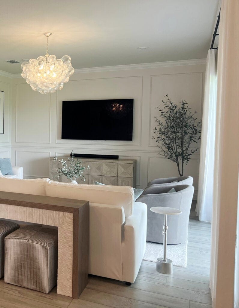
Benjamin Moore Dove Wing
- You may want to choose warmer-toned colors. These colors might resemble what you’d see in a north-facing room, as they can help balance that flatter, grayer morning light.
- However, overly rich, warm colors become gloriously warm in the later afternoon light. If this is your jam, fill yer’ little boots. But if you live in a really warm part of the world, this could be overwhelming, as not only is the air warm, but the room’s visuals are too. On the other hand, if you live in areas that get a lil’ chilly (hellooooo Alaska!), you might appreciate the inviting warmth of a more saturated, rich, warm paint color.
- You can also look at cool colors if they have a bit more ‘color’ and less gray. The increased color can help balance out the gray light in the morning hours.
- If your room gets good natural light, don’t be afraid of neutral paint colors and supplement your flatter time of day with interior lighting and texture.

IF YOU USE YOUR WEST-FACING ROOM MOSTLY IN THE AFTERNOON
In the morning, you might have a more shaded, muted room. However, in the afternoon, HALLELUJAH, LET THE SUN SHINE IN! That’s right—seeing as the sun rises in the east and sets in the west, mid-afternoon and early evening are good times to be in a west-facing room.
- If you prefer warm paint colors, consider ones with a grounded or grayed-out, neutral base that calms them. It can be about that balance between not too flat in the morning, but not too warm for the afternoon!
- West-facing rooms used mostly in the afternoon can look great with cooler tones (as long as you LIKE cool colors!). The coolness will help to balance off some of those warm rays.
- In the morning, cooler colors might look a tit bit nipply, in which case, adding a bit more ‘color’ vs more ‘gray’ is a great way to bring things back to life.
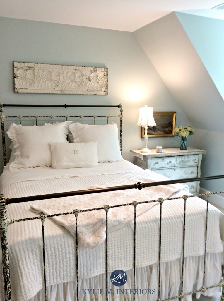
Benjamin Moore Woodlawn Blue (find it here)
Does this mean you completely ignore the other half of the day? No. You just don’t give it priority. And while you may love a color in the morning light, but not the afternoon, as long as it’s ‘okay’ and doesn’t look completely bugly, it might just be a good choice – sometimes you can’t satisfy every aspect with one magical color.
‘But Kylie, what if I’m in the room in the morning and the afternoon?’
INTERIOR LIGHTING IS YOUR FRIEND
Knowing that sometimes there isn’t a color you love 100% of the time, use lighting as a supplement. If your walls look flat and drab in the morning, help things along by playing with the Kelvins of your light bulbs to get the look you want (I’d try 2700-3000K).

Sherwin Williams Agreeable Gray often needs warm interior lighting, regardless of the room’s exposure.
Focus on ‘warm bulbs’, not daylight or cool bulbs.
WE’RE ALMOST AT THE COLORS! But first (or headfirst, if you prefer
)…

While the light in north and south-facing rooms can be a bit more predictable throughout the day, west-facing rooms have a Dr. Jekyll-and-Mr. Hyde complex. There is no ‘perfect paint color’ as there are too many variables. However, I’ve come up with some pretty gorgeous colors for you to sample.
And I know that all of this is a BUTTload of info. On my end, it’s 10 hours of specific research, 3 bottles of wine, and 24+ years of experience – it’s a lot to take in (wine included). So, without further ado, let’s look at some badass and beautiful paint colors for your west-facing room.
1. SHERWIN WILLIAMS NATURAL TAN 7567
Natural Tan is a natural beauty and well-suited to the afternoon western sunshine. While your room won’t look toasty warm in the morning, Natural Tan has a passive warmth as long as you get enough natural light. If your room is west-facing and a bit dark, a color like Natural Tan will have a tough time (I might even recommend looking at the best colors for dark rooms as well as these western ones).
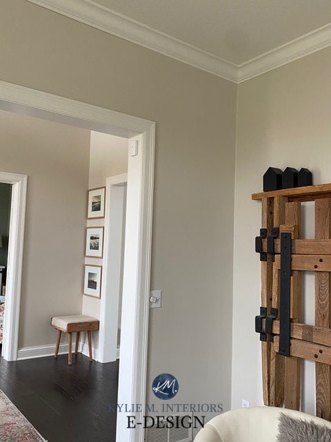
Paint Color Review of Sherwin Williams Natural Tan
Is it toasty warm? Heck no, but it’s a great happy medium between flat morning light and a positively glowing afternoon.
2. SHERWIN WILLIAMS NATURAL LINEN 9109
Natural Linen is one of my favorite choices for almost any room! If you want a noticeable beige that’s not remotely overwhelming, it’s a stunner.
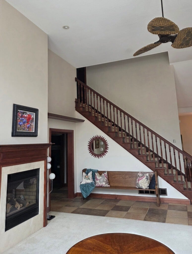
While it’s muted, it still holds a beautiful warmth and looks great with the dark wood trim
Natural Linen is warmer looking than Natural Tan and has a bit more of an orange backdrop. Again, it’ll warm up in the afternoon but shouldn’t go too far (knowing that the late afternoon western sun will add warmth to almost any well-intentioned color).

Paint Color Review of Sherwin Williams Natural Linen
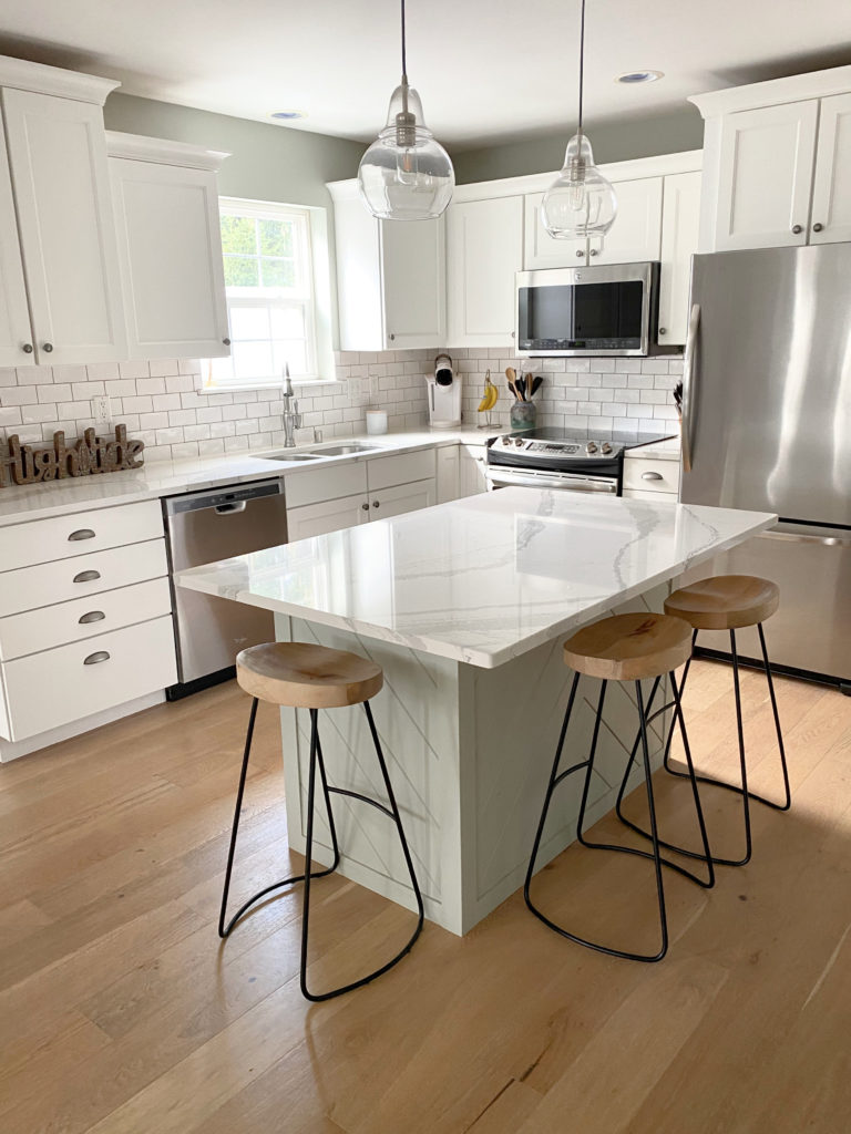
3. SHERWIN WILLIAMS AUSTERE GRAY 6184
Austere Gray is awesome for all you green lovers. While it covers its bases with color, it’s super muted by a gray backdrop. As for depth, Austere Gray has an LRV of 51, so it’s a bit darker than most of the others on this page. If you have adequate natural light, it could be the perfect color choice (I’d be nervous in darker rooms).

Austere Gray is one of my favorite shades in my Best Sage Green-Inspired Paint Colors blog post. If you love this look, check that out (but finish reading this one first!).
Here’s Austere Gray on the walls and kitchen island with Pure White cabinets…
4. BENJAMIN MOORE BALLET WHITE OC-9
While many lean toward the more muted look of Sherwin Williams White Duck and Shoji White (both of which are amazing), I often like Ballet White for a west-facing room.
Why?
Ballet White is warmer and more purposeful than the other two, offering a creamy backdrop without too much yellow or gold. White Duck and Shoji White can be gorgeous but might be a bit TOO flat in the morning.

Learn more about Ballet White & see more photos!
5. BENJAMIN MOORE GENTLE CREAM OC-96
I’ve been using Gentle Cream for many years in my homes with various exposures. Gentle Cream is a heavy cream that is a great way to add warmth to a room without entering the darker golden-beige end. If you love cream paint colors (which means you like yellow) but are nervous about too much warmth, Gentle Cream can be a great place to start. If it’s too warm, adjust from there to a more muted shade, perhaps an off-white.

This said, even though it’s a muted, darker shade of cream, it will pick up considerably more warmth in the later afternoon. Make sure you love what you see!
Paint Color Review of Benjamin Moore Gentle Cream
6. SHERWIN WILLIAMS ALABASTER 7008
If you love white, Alabaster could be white up your alley. This soft, warm shade of white has a creamy backdrop that helps add softness to flat morning western light. While it will pick up more warmth in the late afternoon, so will ANY shade of well-intentioned white.

Learn about Alabaster and see its PHOTOS here!
7. BENJAMIN MOORE ABALONE 2108-60
If you love purple undertones, Abalone is a stunner. With its lean towards purple-mauve, Abalone has enough undertone to show up at the party in the morning without giving you overly colorful walls at any time of day.
Abalone has an LRV of 61.99, so it’s in the light range, but has a bit more depth than a standard shade.
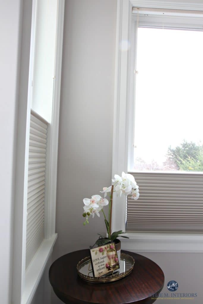
Learn more about Abalone HERE!
Abalone is especially beautiful with wood stains that have a red undertone. However, it can humor almost any wood stain you throw at it.
8. BENJAMIN MOORE MUSLIN OC-12
Muslin is a well-balanced shade of beige that offers subtle warmth for the morning hours without too much gold in the later afternoon.

Muslin has a bit more meat on its bones than Sherwin Williams Natural Linen, but both are worth comparing. I’d also check out the colors in my CURATED BEIGE COLOR BUNDLE.
Paint Color Review of Benjamin Moore Muslin
9. SHERWIN WILLIAMS OYSTER BAY 6206
If you want a bit more depth and a smoky green-gray look, check out Oyster Bay.
Oyster Bay has an LRV of 44, so it’s well into the light-medium range. With its cool-looking vibe, it’s a great way to balance warm western afternoon sunshine without being too drab or flat in the morning.
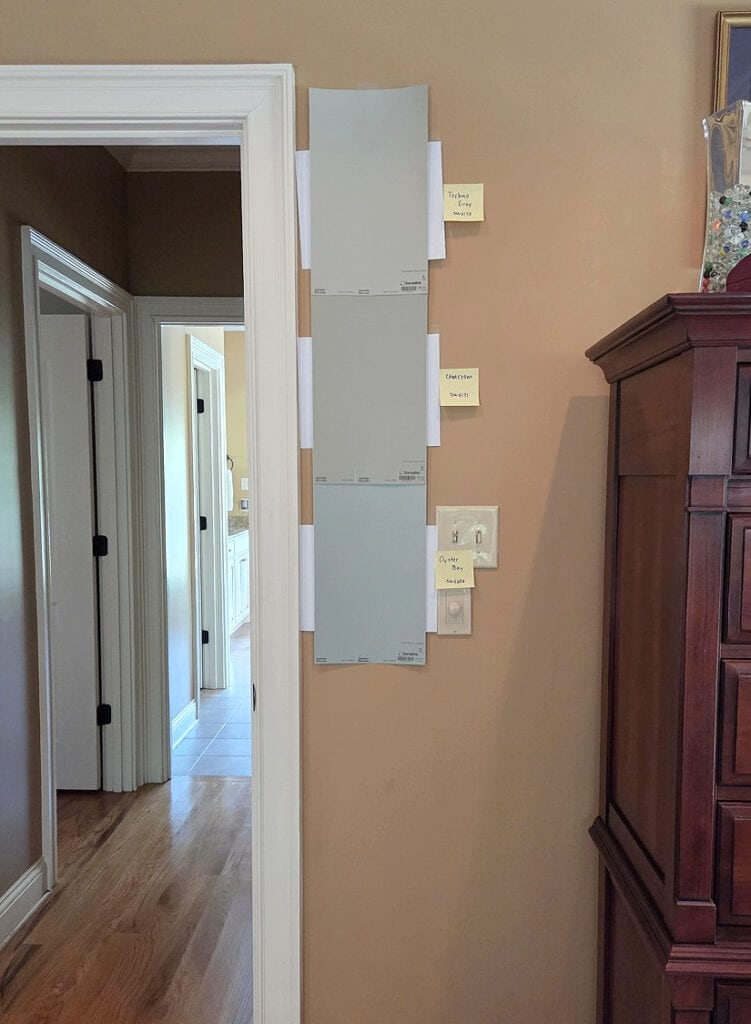
Oyster Bay is the bottom sample that appears more green-blue. The middle one is Sherwin Williams Chatroom, and the top sample is Sherwin Williams Techno Gray. Regardless of your room’s exposure, if it doesn’t have enough natural light, you might want to explore lighter OR more colorful options.
To see more COLORFUL green-blue-gray blends: The Best Light to Medium Blue-Green Blends
10. BENJAMIN MOORE MARITIME WHITE
Maritime White is a great neutral, as it’s between off-white and light and is pretty well-balanced. This means it doesn’t tend to lean overly orange-yellow or orange-pink.
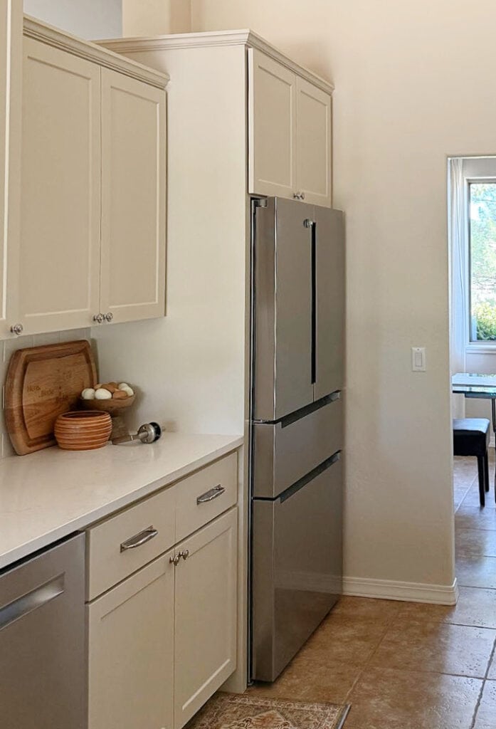
There are similar shades that are warmer and stronger, like Sherwin Williams Moderate White. These can be beautiful in the morning, but you just need to see how they settle in the warmer afternoon light.
Benjamin Moore Maritime White Paint Color Review
11. BENJAMIN MOORE CEDAR KEY 982
Cedar Key is a warm, taupe-toned beige that gives it a soft, organic look. So, whereas some beiges will warm up CONSIDERABLY in west-facing afternoon light, because Cedar Key has a bit more gray, it can look a bit calmer.
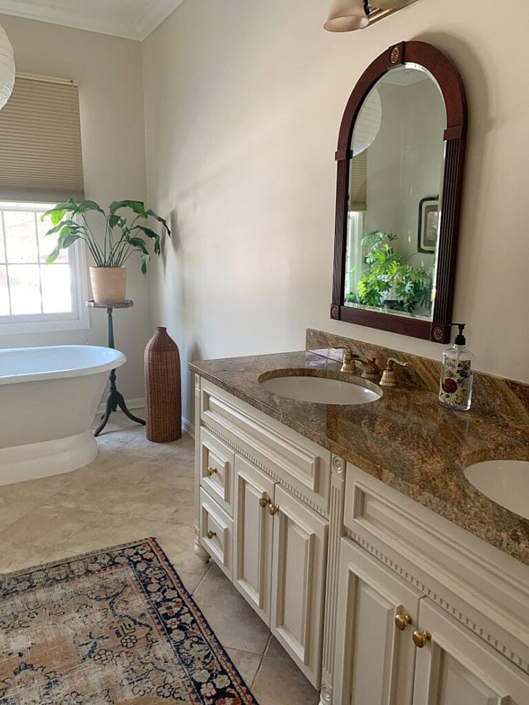
Being a muted neutral with an LRV of 61.05, make sure your room has decent natural light, so it doesn’t look too murky.
Benjamin Moore Cedar Key Paint Color Review
12. SHERWIN WILLIAMS RAINWASHED 6211
Rainwashed is so stinkin’ gorgeous. While it’s related to Sea Salt, Rainwashed has less gray (it’s more color-forward) and a bit more of a solid blue-green blend. With its LRV of 59, Rainwashed is on the slightly darker end of the light range.
Aside from exposure, look at how beautiful Rainwashed looks on this shiplap accent wall—it’s a wicked pretty contrast to the pink-stained (whitewashed) wood ceiling.

See more photos of Rainwashed in action!
13. BENJAMIN MOORE MOUNT SAINT ANNE 1565
For those who want a bit more depth without going too balls-out on color, Mount Saint Anne can be a gorgeous choice.
When supplemented with warm bulbs in the morning, this beautiful green-blue-gray is a great way to balance warm afternoon sunshine. With its LRV of 41.91, it has a bit more meat on its bones but can add a beautiful coastal calm to a room.
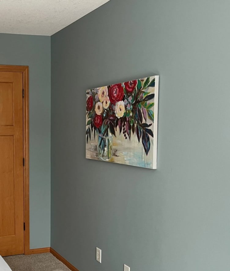
The Best Blue-Gray Paint Colors
FREQUENTLY ASKED QUESTIONS
A few more quandaries & queries…
WHAT IF YOUR ROOM HAVE SOUTH-WEST, NORTH-WEST, OR EAST-WEST FACING LIGHT?
While it might seem confusing, having dual exposures isn’t bad when you’re armed with the right information! Check out this blog post on ‘how to pick paint colors when you have two exposures‘.
That said, at some point, there are SO many variables that, unless the extreme end of your exposure is giving you a hard time, you might just take a deep breath and focus on your finishes’ needs.
HOW DOES WEST-FACING LIGHT AFFECT PAINT COLORS?
While we covered a lot earlier, the short n’ curly is that in the morning, western light will mute colors. Some cooler shades might seem a bit more ‘colorful’, but not any brighter or lighter.
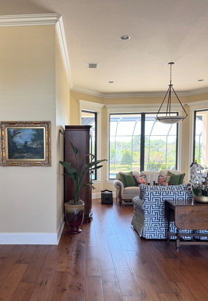
In the afternoon, warm shades will look even warmer, especially as the day progresses. Cooler shades can take on an altered appearance that isn’t as crisp and clean as it might’ve seemed in the western morning hours. But that’s not necessarily a bad thing – they can look super gorgeous!
WHAT COLORS SHOULD YOU AVOID IN A WEST-FACING ROOM?
Oh boy, there are so many variables, it’s hard to give a HARD no. The thing is, your exposure matters WAY less than the needs of your interior finishes.
The Best Warm Off-White Paint Colors
I suppose if exposure is the ONLY factor and it affects the room greatly, I would avoid grays, greiges, and taupes with minimal visible undertone. While they could be pretty in the afternoon, they would look flat/drab/muddy in the morning, IF you don’t have good interior lighting.
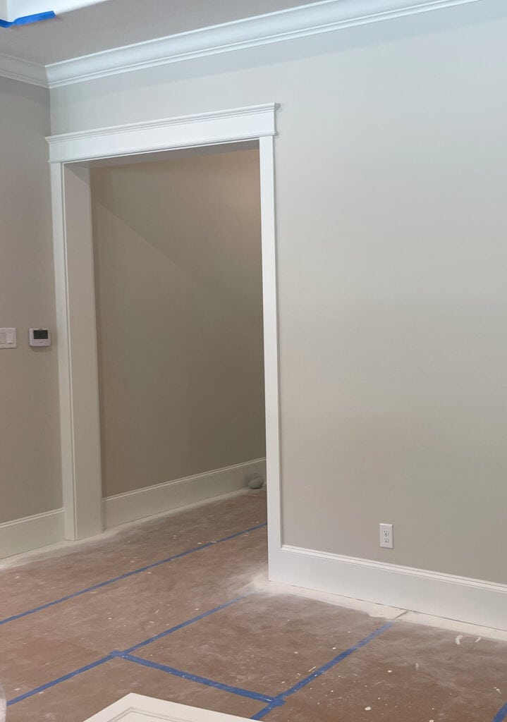
For example, if this room (below) were any darker, the walls would look pretty muddy.
SUMMARY
- West-facing light is flat and lifeless in the morning. Of course, if you get a lot of light in your windows, that helps, but it doesn’t contain the sun’s warmth or energy.
- In the afternoon, west-facing rooms can be considerably warmer-looking, increasing as the day goes on.
- Blue-green blends (with gray) are a great way to balance the warm western exposure in the afternoon, while having personality for the more drab morning hours.
- Warm paint colors work well to add intimacy to the western morning, so long as they aren’t overly warm, or they can overheat in the afternoon.
READ MORE
The Best Light Green Paint Colors
Need help?
Get the best paint color advice with Kylie M’s Online Color Consulting Services

Updated with fresh content and new images for 2026


Thank you for this! I feel like there is a lack of western-facing white/off-white information out there and it is so tricky! You laid it out very well.
Can I ask which paint color is in that living room with the cattycornered stone fireplace? You have a photo of it in the morning and then another in the afternoon when it’s more light filled. That’s my exact problem and I like the way that paint transitioned throughout the day. Thank you in advanced!
Hi Kylie,
For a west facing living room and dining room and SW aloof gray walls, would you recommend SW pure white or SW extra white on the ceilings and trims? Thank you so much! Lisa
Well, you can EASILY do both. I suppose, just because I love it in general, I’d lean into Pure White 🙂