
Posted on January 18, 2022 by KylieMawdsley
HOW TO CHOOSE A PAINT COLOUR BASED ON INSPIRATION
When it comes to choosing the best paint colour for a room, it’s about finding INSPIRATION. And inspiration isn’t always found in the most INSPIRING places, and in fact, we often find inspiration in our BOSSIEST finishes – finishes that we aren’t ALWAYS that thrilled with, to begin with.
HOWEVER, failure to find (or notice) inspiration is a GREAT way to choose the wrong paint colour. So, how do you find inspiration? READ MY BLOG! Just joking #notreallyjoking.
This post may contain affiliate links. If you make a purchase through links on our site, we may earn a commission.
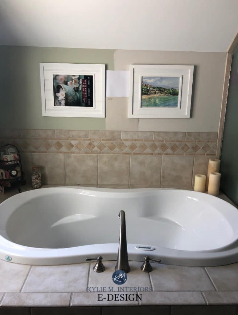
This backsplash tile is the BOSSIEST finish in the room, and because it’s so bossy, it’s where we have to pull our INSPIRATION from…
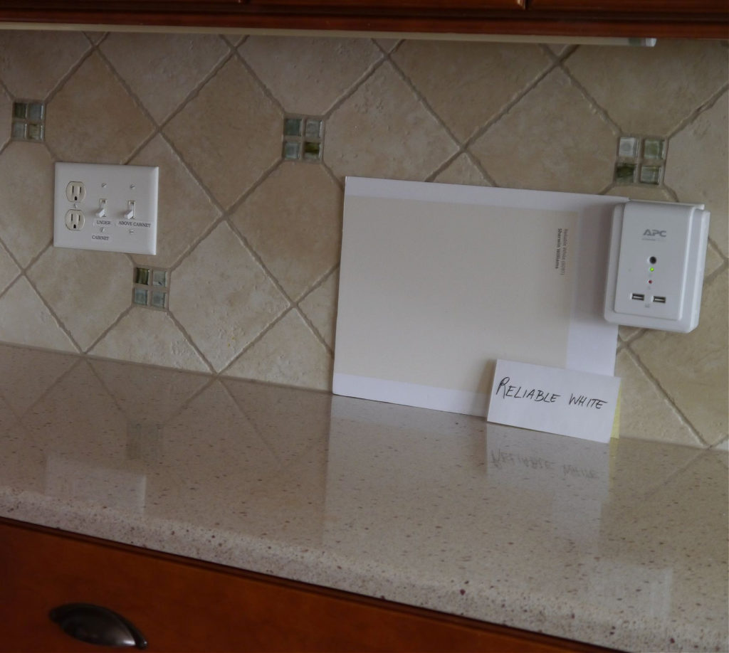
Why is it the BOSSIEST finish? Because it has the most limitations as to which paint colours will go well with it. It’s also VERTICAL and the majority of bossy or inspirational surfaces are vertical (with the exception of tile floor or a kitchen with a countertop and NO backsplash).
And even if your finishes aren’t well-coordinated, it’s the BOSS who’s calling the shots.
Here are a few bossy examples…
USING YOUR BACKSLASH AS INSPIRATION
As far as wall paint colours go, it’s USUALLY best to pick up on a colour that’s already existing in your space. While there are definitely exceptions, especially as it relates to contrast, this is an EASIER way to create a palette.
Using this next photo as an example, you would pick a popular shade of white or gray with similar undertones for your walls. You COULD venture into the blue-green range, but you HAVE to know what you’re doing to make it work!
And did you know that you can ALSO choose your wall colour based on the colour of the GROUT around your tile? That’s right! So if you’re having a hard time finding a paint colour that jibes, you could consider doing a little Polyblend Grout Renew to EASILY and affordably change the colour of your grout (and it’s available online in over 40 different colours)!
USING YOUR COUNTERTOP AS INSPIRATION
Whereas the backsplash is the FIRST place you should look for inspiration (being vertical), you can also check out your countertop. When might a countertop be BOSSIER than the backsplash?
- when there’s no backsplash
- when the backsplash is just white (ie. subway tile)
- when you’re choosing a paint colour for your kitchen island
- in a bathroom with a fibreglass shower surround and coordinated flooring
USING YOUR FIREPLACE AS INSPIRATION – BRICK, STONE OR TILE
Brick, stone or tile are AWESOME places to grab inspiration from…
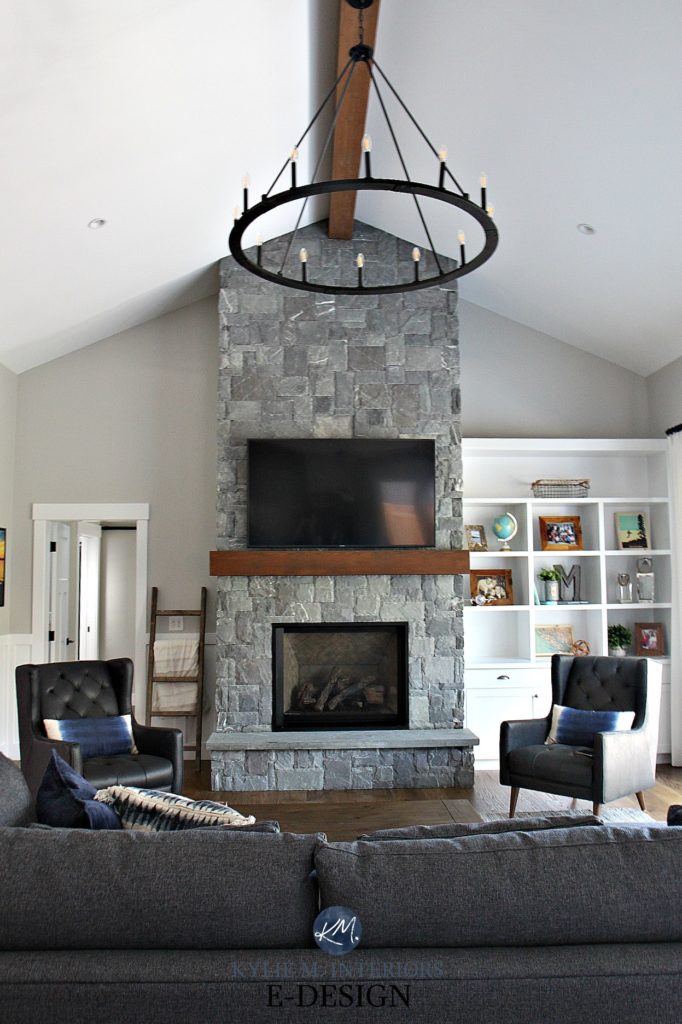
Why look elsewhere when a fireplace like the one above gives you ALL the inspiration you need? If you want to head down a different path, you better be prepared for things to look disconnected. Remember, just because YOU want a colour doesn’t mean your home agrees with you!
As shown in this next living room, sometimes flexing out of ONE style and into another can be next to impossible, ESPECIALLY when you have a home with particular Tuscan vibes…

Even if the above homeowner had wanted something different (ie. gray or white), it’s that big ole stone fireplace calling the shots! The key is to choose the most MODERN version of the type of colour your bossy surface demands.
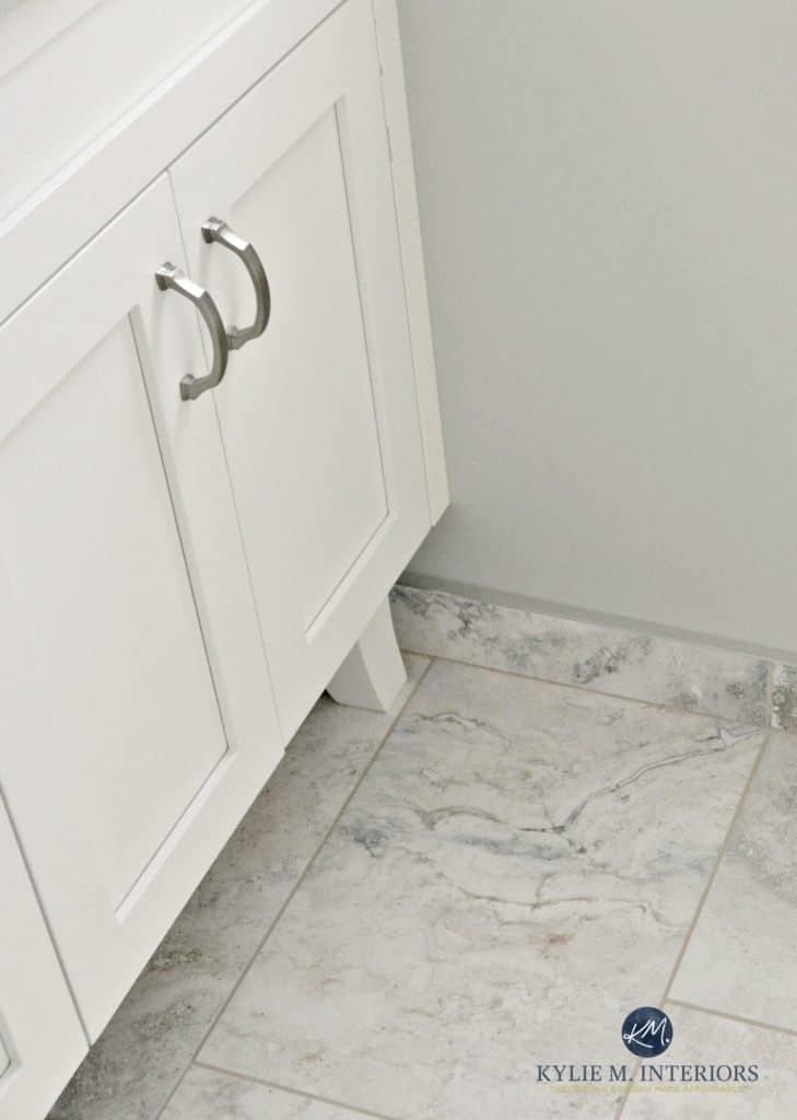
USING A TILE TILE OR LINOLEUM FLOOR AS INSPIRATION
Whether it’s in a kitchen, bathroom, laundry room or foyer, flooring can be a GREAT place to pick up visual clues AS LONG AS there isn’t a bossier VERTICAL SURFACE!
In this next example, you could paint the walls a soft white, a subtle warm gray/taupe or even a blue-gray or gray-blue-green blend! The more variation your finish has in it, the more OPTIONS you’ll have for your walls!
And if there’s ONE THING I want you to take away from this blog post, it’s this…
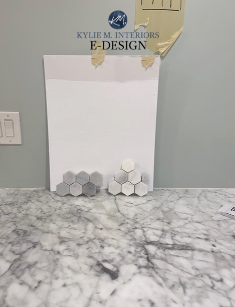
If your finish has 3+ colours in it, the key is to NOT introduce a colour that doesn’t ALREADY EXIST.
In this next example, notice how the old green colour introduces something that isn’t already in the tile and it doesn’t tie in very well. The NEW samples are the way to go, in which case, green could then be used as an ACCENT colour (for towels and decor), rather than a full-time commitment on the walls…
And even though the above tile isn’t traditionally INSPIRING, it’s definitely the bossiest surface in the room!
Why?
- because it has the most LIMITATIONS as to which paint colours will look good with it (due to its undertones)
- because it’s on a vertical surface
BTW, if you’re getting paint samples, you should check out SAMPLIZE. Samplize offers peel and stick paint samples that are more AFFORDABLE, EASIER and more ENVIRONMENTALLY FRIENDLY than traditional paint pots. Here are just a FEW reasons why I recommend Samplize to my clients…
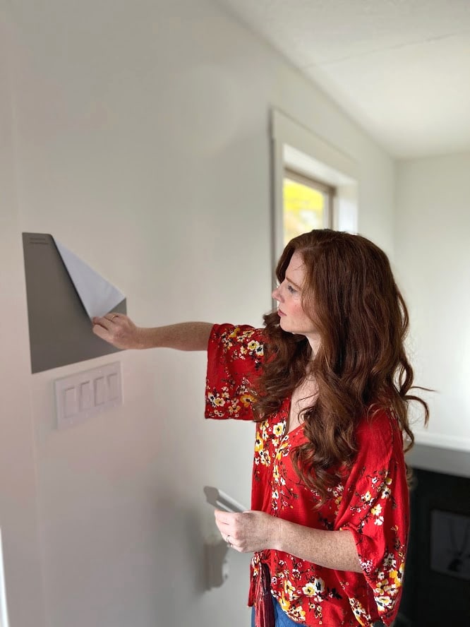
- samples arrive ON YOUR DOORSTEP in 1-3 business days, depending on location
- they’re more affordable than the samples pots/rollers/foam boards that are needed for traditional paint sampling
- if you keep the samples on their white paper, you can move them around the room
Visit the SAMPLIZE website HERE
USING A SENTIMENTAL ITEM AS INSPIRATION
If you’re choosing a sentimental item (ie. artwork) as inspiration, you better plan on having it for a LOOOOONG time.
Why?
If it’s a transient piece and you paint and decorate your room around it, your palette might not match the NEXT piece that comes in the front door.
If all else fails and all you have is wood floors with neutral/brownish stain or neutral carpet as your inspirational piece, look to these ‘secondary’ items…
-
sofa
-
artwork/decor
-
bedding
-
toss cushions or drapes
The reason why these are ‘secondary’ inspiration pieces is that they’re likely to be replaced over time and you may not want to pick your colour scheme based on them. The other items (tiles/countertops, etc…) tend to be higher cost items and are more ‘permanent’ – unless you’re like me and your home is a revolving door of products and colours – and husbands… 😉


NOW THAT YOU’VE FOUND YOUR INSPIRATION PIECE…
1. BREAK DOWN ITS COLOUR PALETTE
Figure out which colours exist in this piece, along with their UNDERTONES.
If you’re not sure what their undertones are, what should you do? Bring home a wide range of paint colours and see which ones blend/connect. From there, do your research on THOSE paint colours.
I’ve also got a GREAT blog post for you to read… What Are UNDERTONES & How to Find Them
2. DECIDE WHICH OF THESE COLOURS YOU WOULD LIKE ON YOUR WALLS
For a colour to be a contender, you should be able to clearly see it in your inspiration piece from EIGHT FEET AWAY.
If your piece only has ONE OR TWO COLOURS in it, it’s easier to add something NEW to the palette, which comes down to colour FAMILIES as well as CONTRASTING/COMPLEMENTING (which are entire blog posts unto themselves).
HOWEVER, if your inspiration surface has THREE+ COLOURS IN IT, it will be much harder to introduce a NEW colour to the palette.
In this next photo, there’s a WIDE range of colours to choose from in the stones…
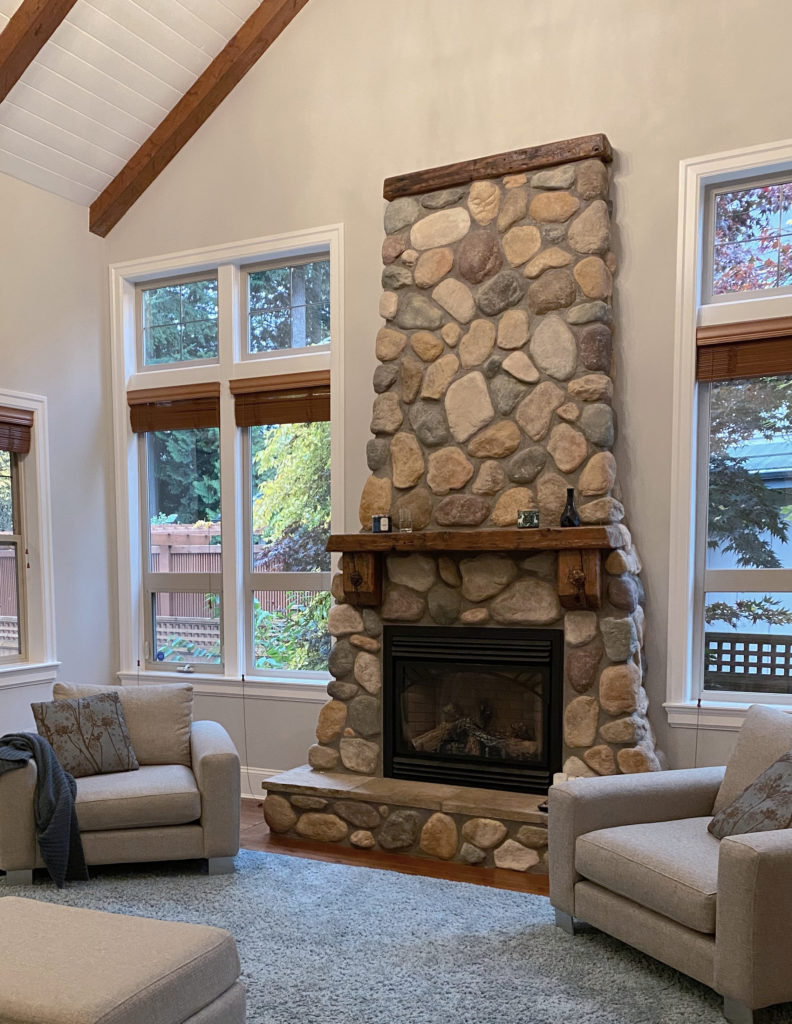
The key is to not add anything NEW to the colour palette as there’s plenty to work from there – adding a NEW colour wouldn’t make sense. Benjamin Moore Balboa Mist taps into the warmth of some of the stones and its warm violet undertone hit the mortar as well!
And while I could go on and on…and on (as usual), these tips and ideas should get you WELL on your way to finding the best paint colour for your home.
READ MORE
The 12 Best Whole Home Gray & Greige Paint Colours
How to Create a TIMELESS Home – 4 PART SERIES
The Best Warm Neutrals That AREN’T BEIGE!
What Are UNDERTONES & How To Find Them
The Ultimate Guide to Choosing Paint Colours With LRV!
NEED HELP?
CHECK OUT MY E-COLOUR SERVICES!

Chat soon,
Comments
More Posts

The 5 Best Creamy White or Off-White Paint Colors
THE ELUSIVE ‘CREAMY WHITE NEUTRAL’ When it comes to light, warm neutrals, it’s all in the undertones. And other than pink and green, yellow is the undertone many of my
Read More

The 8 Best Warm Neutral Paint Colors With NO Yellow Undertones!
The Top Light Depth, Warm Colors That Aren’t Cream! When choosing the best warm neutral paint color for your home, whether creamy white, beige, taupe, or greige, your choices are
Read More

The 12 Best Farmhouse Sinks of 2024
FIND YOUR DREAM SINK HERE… While traditional farmhouse design was all the rage in previous years, the embers have definitely cooled. As for MODERN farmhouse, it’s still kickin’ its cowgirl
Read More

