
Posted on April 14, 2023 by KylieMawdsley
THE BEST RAVISHING SHADE OF RED FOR DOORS, ACCENT WALLS, & MORE
HOT DAMN…literally. I did not see this one coming! It turns out that Benjamin Moore is throwing down the gauntlet with another ‘game-changing’ colour of the year. That’s right, we’re going RED!
And not just any red. Whereas some trendy reds lean on orange, giving an earthy, rusty appearance, this red is one blazing hot, glorious shade. Let me introduce you to…
This post may contain affiliate links. If you make a purchase through links on our site, we may earn a commission.
Not familiar with it? Well, if you haven’t visited Paris’ fashion shows (oh pshaw!), painted your front door, or wanted to add a little hot SPICE to the bedroom, you’ve probably skipped over this one.
But that doesn’t mean you should…
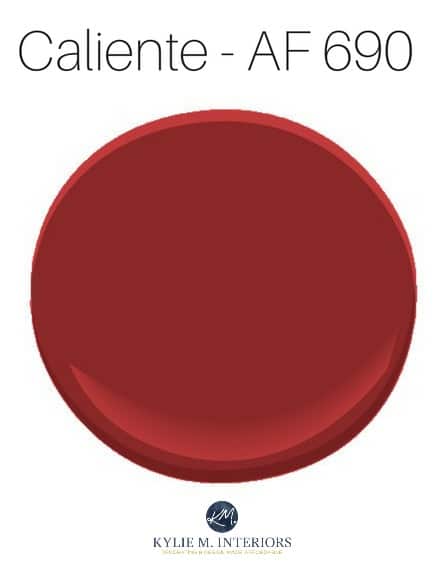
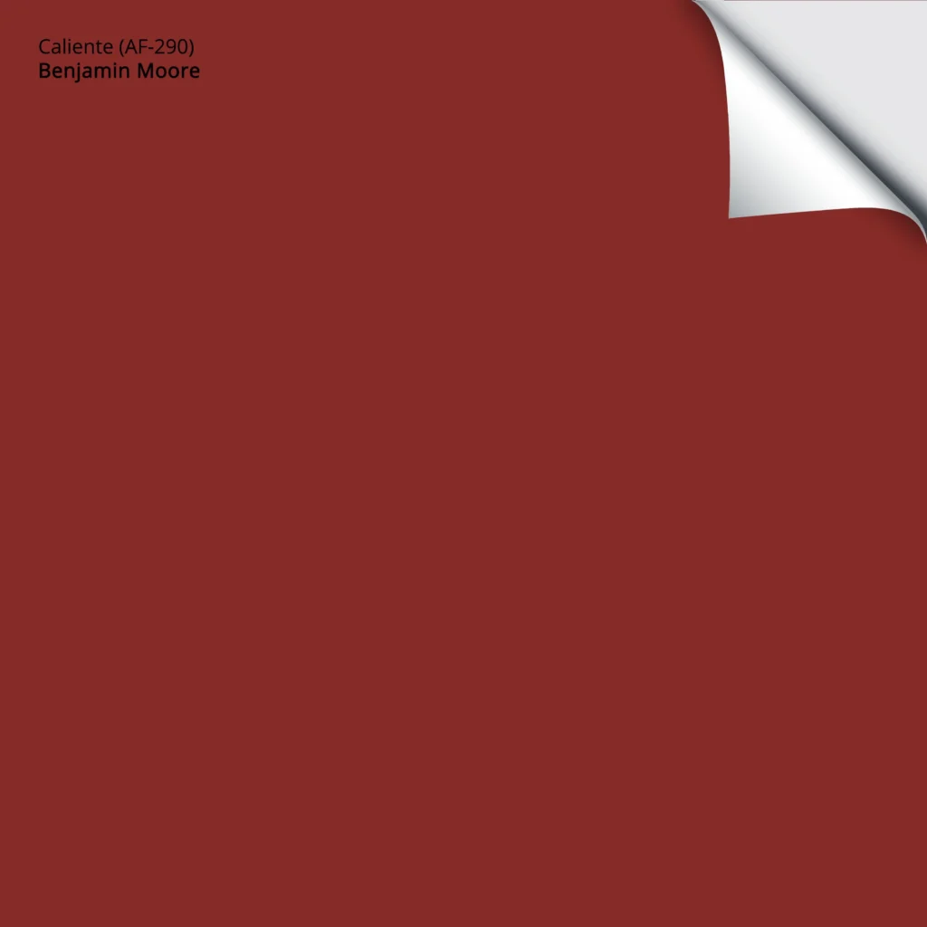
Caliente is part of the Affinity Colour Collection, which is well-known for having colors that are deeper and more involved than your ‘everyday’ paint colour. The average color is made up of, say, 3-4 tints. The Affinity colors can be made up of 7-8, making them hard to colour match and super versatile!
Caliente is a ravishing red (takes one to know one – wink wink), and unlike the reds of yesteryear, it doesn’t lean into the orange range, which means we’re avoiding the earthy-rusty effect. However, it’s not a terribly COLD red because it isn’t overly blue-toned. It really just sits nicely in a more intimate range, rather than being shocking or abrasive.
But that doesn’t mean you have to like it…
Any colour and where it looks good depends on a variety of things, such as the room, the exposure, and the products in the room. However, with the Caliente, in particular, it REALLY comes down to personal tastes.
I’ve found that people either LOVE red or hate it. Many people can handle it as an accent but would be hesitant to commit to it on a scale larger than an apple or underwear. And then there are others who wouldn’t HESITATE to paint their entire room a rip-roarin’ red or, at the very least, an accent wall! (Personally, the only red I’ll be splashing on my walls tastes an awful lot like wine, in which case I’ll be licking my walls shortly).
So, with that being said, let’s take a closer look at Caliente to see if it could work for you…
WHAT’S THE LRV OF CALIENTE?
Caliente DOES pack a punch with an LRV of 8.82! This means it’s in the darker range and will add a sultry, sexy look to your walls – but let’s keep things PG here, people.
However, whereas many colors with this low LRV can read flat or dark, thanks to Caliente’s intense color (chroma), there’s nothing drab about it.
The Ultimate Guide to LRV and Choosing Paint Colours
WHERE DOES CALIENTE (OR RED) WORK BEST?
There are a lot of places where Caliente will work. There are two good reasons why Caliente is a super flexible, versatile shade of red…
- while it’s a striking shade, it’s not obnoxious like a primary red
- it’s more fresh and striking than a more country, rustic red
A RED FRONT DOOR
SHUT THE FRONT DOOR – DO YOU WANT TO HEAT THE WHOLE NEIGHBOURHOOD – sorry, flashback to my childhood.
Really, though, I’m not a red fan, but this entryway TOTALLY does it for me. I think it’s the contrast with the white and gray and adequate natural lighting – it’s pretty striking!
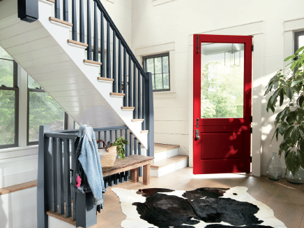
Because I haven’t had clients use Caliente, and I don’t ‘borrow’ from other Designers, I don’t have images of Caliente in action. These are photos from the Benjamin Moore site.
USING RED IN ACCESSORIES & ACCENTS
This might be where I’d land if adding red to my home. And while I prefer a more rustic red, I can see how this fresh red is TOTALLY appealing in a room like this!
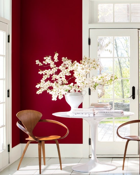
A RED ACCENT WALL
Accent or feature walls are a great way to add personality to a room without committing a) long term and b) large scale.
However, if you love all things red (including me), you might be RED-Y to commit to it in an entire room, in which case red can look SMASHING in…
A SMALL ROOM IN RED
Small rooms such as powder rooms are the BEST place to add personality and leave your guests with a lasting impression!
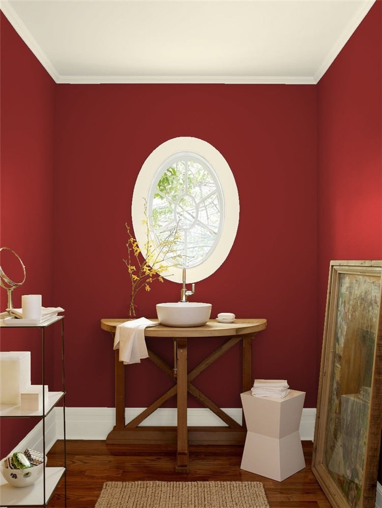
3 Ideas to Add Personality to a Small Bathroom
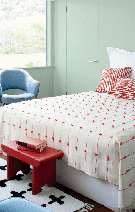
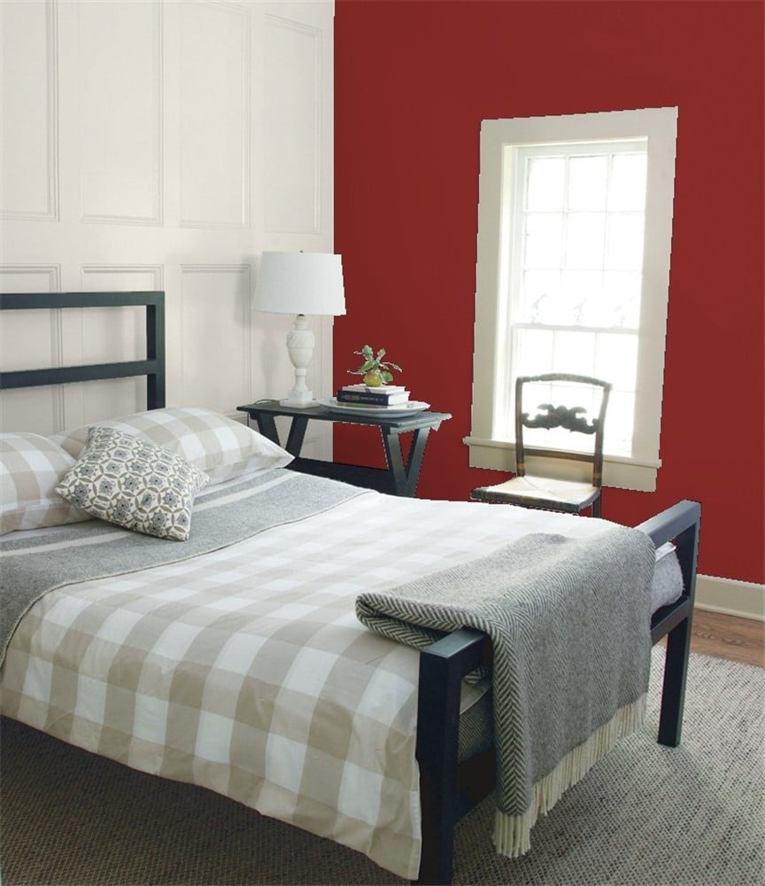
RED IN THE BEDROOM
Personally, I don’t need to add any more reason for Tim to get fired up for the pants-off-dance-off, so I’ll be avoiding this one for sure.
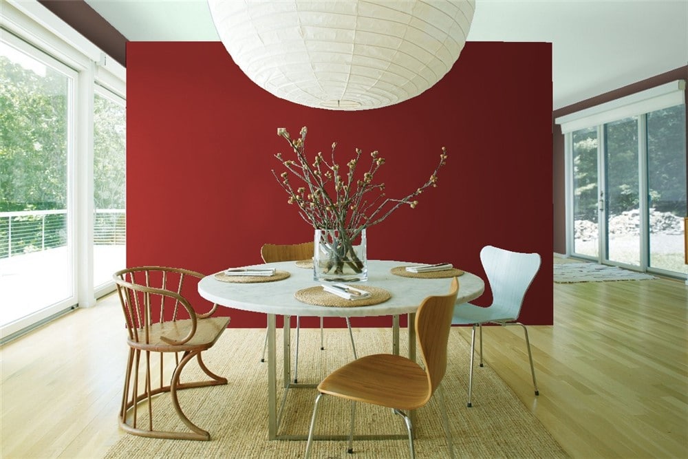
RED IN THE DINING ROOM
According to color psychology, a red like Caliente is great for the appetite!

So whatcha think – does it float ‘yer boat, or are you more comfortable with a daring shade of navy blue or a moody dark green?
Get your PEEL & STICK SAMPLE OF CALIENTE HERE!
CALIENTE (or almost any red) & HOW TO USE IT
- It can help to jazz up a cooler north-facing room or FURTHER enhance the warmth of a south-facing room
- It looks stunning with a lot of wood tones, but I might avoid overly orange-toned woods
- It will benefit from a good coat of primer before you jump into the real painting
- Consider a matte or, at the most, eggshell finish. Red can get a bit garish on walls if they’re too glossy
- On a door, satin is a beautiful, durable finish for a red like Caliente
CALIENTE vs. HERITAGE RED
No color should be chosen before comparing it to other similar shades. As for Heritage Red, it’s similar to Caliente in that they’re both reasonably powerful shades of red. However, they differ in that Heritage Red is lighter, with an LRV Of 10.26, to Caliente’s darker of 8.82. This isn’t a HUGE difference, but it’s noticeable when you compare the two colors. If I’m looking for a rockin’ red, I prefer Caliente to the slightly softer look of Heritage Red.
CALIENTE VS MILLION DOLLAR RED
Million Dollar Red is another popular shade of red thanks to its intensity – nodding towards the ‘primary red’ end. The great thing about comparing Caliente with Million Dollar Red is that MDR shows you how Caliente is powerful, but not SHOCKINGLY so. Million Dollar Red is awesome if you want a more genuine approach to red. However, Caliente is a great way to get red without getting slapped in the face with it.
Besides being a cleaner version of red, Million Dollar Red is a good shot lighter than Caliente, with its LRV of 12.58 (to Caliente’s 8.82).
READ MORE
The 9 Best Front Door Paint Colors
The 6 Best Paint Colors for Kitchen Islands & Bathroom Vanities
Kylie’s Colours of the Year: Real People Real Homes
Colour Review: Behr Quiet Moments
Not sure which colour to pick for YOUR room?
Check out my E-DESIGN packages – they’re affordable AND fun!
Chat soon,

ORIGINALLY WRITTEN IN 2017, UPDATED IN 2023
Comments
Leave a Reply
More Posts

The 5 Best Creamy White or Off-White Paint Colors
THE ELUSIVE ‘CREAMY WHITE NEUTRAL’ When it comes to light, warm neutrals, it’s all in the undertones. And other than pink and green, yellow is the undertone many of my
Read More

The 8 Best Warm Neutral Paint Colors With NO Yellow Undertones!
The Top Light Depth, Warm Colors That Aren’t Cream! When choosing the best warm neutral paint color for your home, whether creamy white, beige, taupe, or greige, your choices are
Read More

The 12 Best Farmhouse Sinks of 2024
FIND YOUR DREAM SINK HERE… While traditional farmhouse design was all the rage in previous years, the embers have definitely cooled. As for MODERN farmhouse, it’s still kickin’ its cowgirl
Read More


“Pants off dance off”? You are hilarious! And give great paint advice too. ????
Author
Thanks Karen! I 2nd guessed that one as my Mom said it was too over the top. But really, that is kind of my humour, especially after a glass of wine!
~Kylie
You are so freaking funny Kylie!
Stunning!!! I LOVE it. I think it will work in my powder room. The white trim looks amazing with it too. Oceanside was too cold for me and didn’t look nice with my maple cabinets. I diggity-dig it!
Author
Well THANK you, i try. Tim doesn’t find me quite as funny so I’m glad SOMEbody does! And yes, you know I love teal, but I feel like we’ve ‘been there done that’. Oceanside is pretty, but feels a bit 5 years ago maybe…
🙂 Kylie
Bright. Bold. Intense. Saturated lol. I had a feeling they would lean towards a color in this realm. Red is EVERYWHERE! (Well kinda sorta hehe). Cool name-Caliente. I personally prefer red as an accent color only as I’m a neutral kind of girl. But I can appreciate how striking it can look in someone else’s home. Love that red door. Not for me but still … The blues win out for me but it’d been boring if they had all picked the same color/colour story, right? Thanks for a lighthearted , funny and informative post. I always laugh out loud. ????
Hi Kylie,
As Donald Duck would say “You Quack me up!” But seriously, I love reading your blogs and your website! You are a wealth of expert decorating advise and your colour reviews are always dead-on fantastic! So thank you so much for that. BTW, I love red! I have accents of red throughout my house and it never feels like Christmas to me. Having said that, I was torn between accenting my white & grey kitchen with red or the popular teal blue that is also very pretty but in the end I went with the red. This review of yours just reminded me again of why I love red so much.
Cheers to you, Lori
Author
Wahoo, thanks Lori! I am a bit quackers…
As for the kitchen, you know what you CAN do? Use your red accents as 75% of your accent palette and then for the remaining 25% add the teal. They are SO dynamic together and really bounce off each other. It doesn’t take much to make some magic!
~Kylie
This is a gorgeous red! I love that powder room.
Do you have a source for the photo of the bed with the red bench and the red and white pillows? I love that pillow fabric and am wondering if its available for purchase somewhere. Thanks!
Author
Hi Diana! Those are actually BM’s photos, so I’m sorry I can’t help with that!
~Kylie
I really hope that red will make a comeback or at least no longer be considered “dated”. I prefer more country reds as they always make me think of the barns that I grew up with in the South. Kudos to Benjamin Moore!
Author
You’re like me, I can totally get into a country red, but I’m hard-pressed to fall for the more intense, vibrant ones….
This site is so fun and my absolute go to for all things paint as I renovate a 100 year old tudor house in New York. I am absolutely using this color for the front door and I think I’m going to use it for the foyer too. It’s a small space, 50 square feet maybe, and is separated from the rest of the house by a paneled glass door. The rest of my color palette is beige and gray but my style is eclectic and I’m happiest when nothing quite goes! Here’s hoping it’s not too much…
Author
Oh i bet it will be AHHHHmazing – you should send photos when it’s all done!
I had my bedroom Caliente in my last house and LOVED it. It was awesome. Dark enough to add mystery, and complex enough to let me stare at it for hours and still discover things about it. I moved and miss it. Caliente has my heart. Be bold. It’s worth it!
Author
Ooo, I bet it was amazing! I love it when people go for colour and be brave, those are some of the best spaces!