
Posted on January 3, 2017 by KylieMawdsley
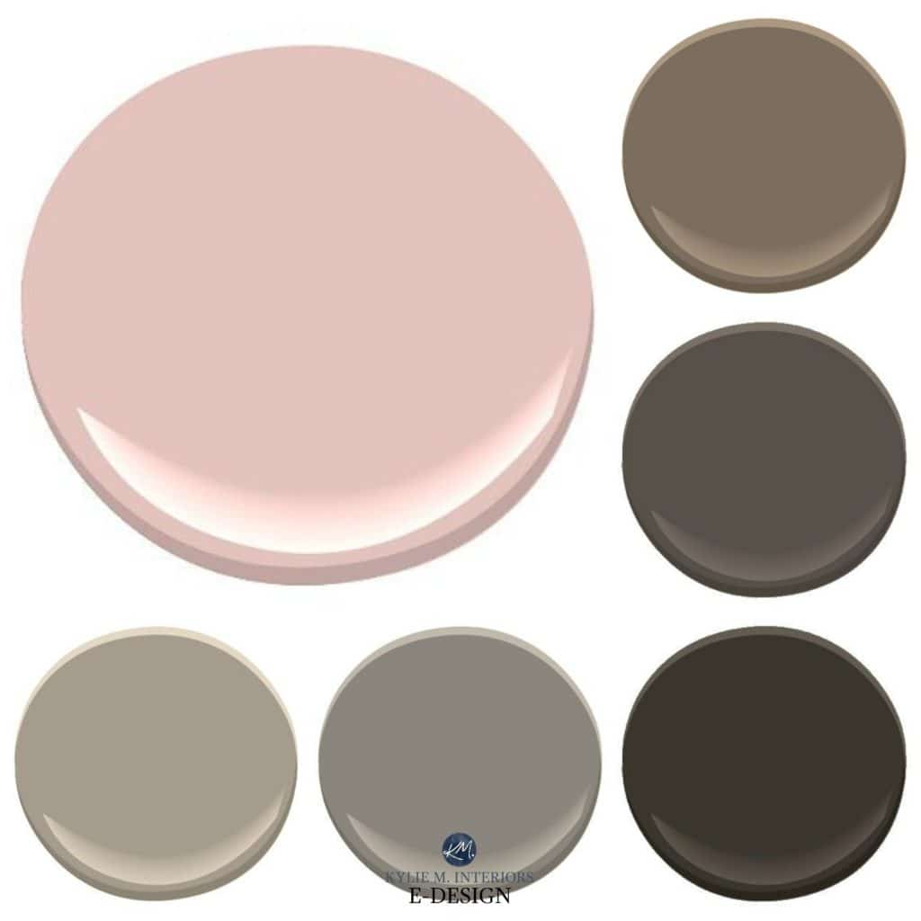
Paint Colours to Update Pink or Dusty Rose
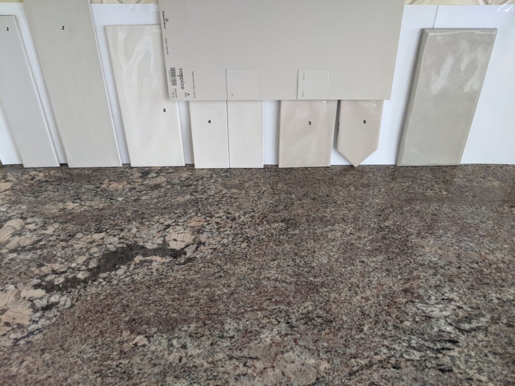
Carpet, countertop, tile, fixtures, toilet, tub, flooring, furniture
If you’re reading this blog post, then it’s quite likely that you have something pink in your home that you DESPERATELY want to update. Or maybe you just like to hang out with me. Either way, this is a HOT topic that you’ll want to stick around for!
This post may contain affiliate links. If you make a purchase through links on our site, we may earn a commission.
In a previous blog post, I discussed how you can update pink or dusty rose with decor and artwork. That was the fun stuff. Today, we’re gettin’ down and dirty and will be working on the foundation of your room—your walls.
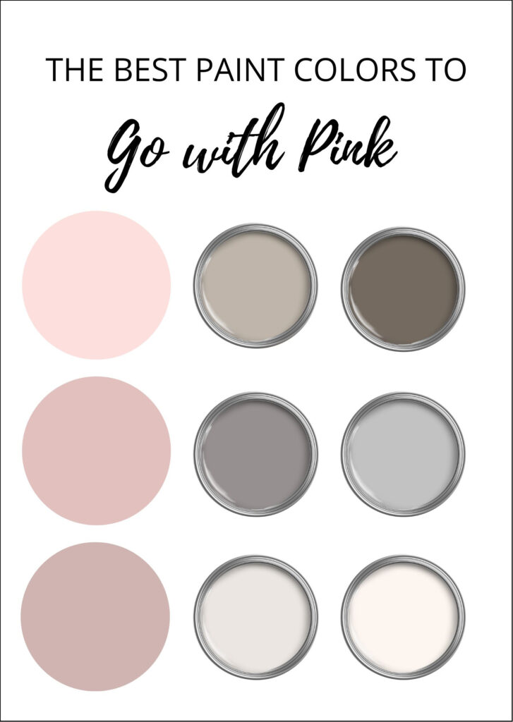
THE THREE DIFFERENT TYPES OF PINK PAINT COLORS
While I can’t cover EVERY depth and type of pink in this blog post, I’ve done my best to hit the main points.
Like blue, green, and violet, you’ll find a few different pinks in your adventures…
WARM PINK: Pink finishes or paint colors that lean into orange, giving them a warm look. Add enough orange, and you create coral.
COOL PINK: Pink finishes or paint colors that lean into violet, making them ‘cool pinks.’
NEUTRAL PINKS: Those shades of pink that don’t come off warm or cool.
In a room like this, it’s best to lean INTO the pink rather than away!
DO YOU WANT TO ACCENT OR BLEND YOUR PINK FINISH?
While most of my Online Color Consult clients want to get rid of their pink finishes or at least camouflage them, I’ve had others who LOVE their precious pink and want to play with it! Whatever you like, you gotta do you, boo, and I’ve got the colors you need.
This is one DARN PINK driveway. While there’s a dash of violet, the bones are warm pink (pink-orange)…

For the above exterior, we decided to accent the home ‘overall,’ including the driveway, beige-pink-toned brick, taupe (violet-pink) roof, and orange cedar shakes. I gave my client three shades of darker green to choose from for her trims, metal roofs, and garage doors, and she chose Sherwin Williams Thunder Gray—MAD LOVE! The thing to remember is that the pink driveway won’t be going away, and there’s absolutely nothing that will camouflage it—you may as well work with it rather than against it!
The Best Dark Greige Paint Colors
COLORS THAT SOFTEN THE LOOK OF PINK FINISHES
When choosing a paint colour to calm your ‘pink thing,’ whether it’s carpet, tile, countertop, or something else, you must think neutral. Neutrals are colors such as black, white, gray, charcoal, and brown. Notice that I didn’t include beige in the mix. Beige is a tough one as it can look a bit unhealthy with pink as it’s often too warm-toned (yellow/orange) to complement the specific needs of pink; the same goes for cream (yellow).
Check out this next living room…
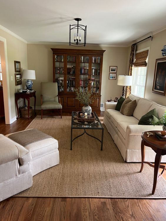
Sure, the carpet isn’t pink, nor is the red oak wood floor, but both have a pink undertone, as does the accent chair to the lower left. Now, notice how the tan paint color on the walls clashes with these undertones. This is because tan has a yellow-green undertone, and it hits the wrong note in this lovely room.
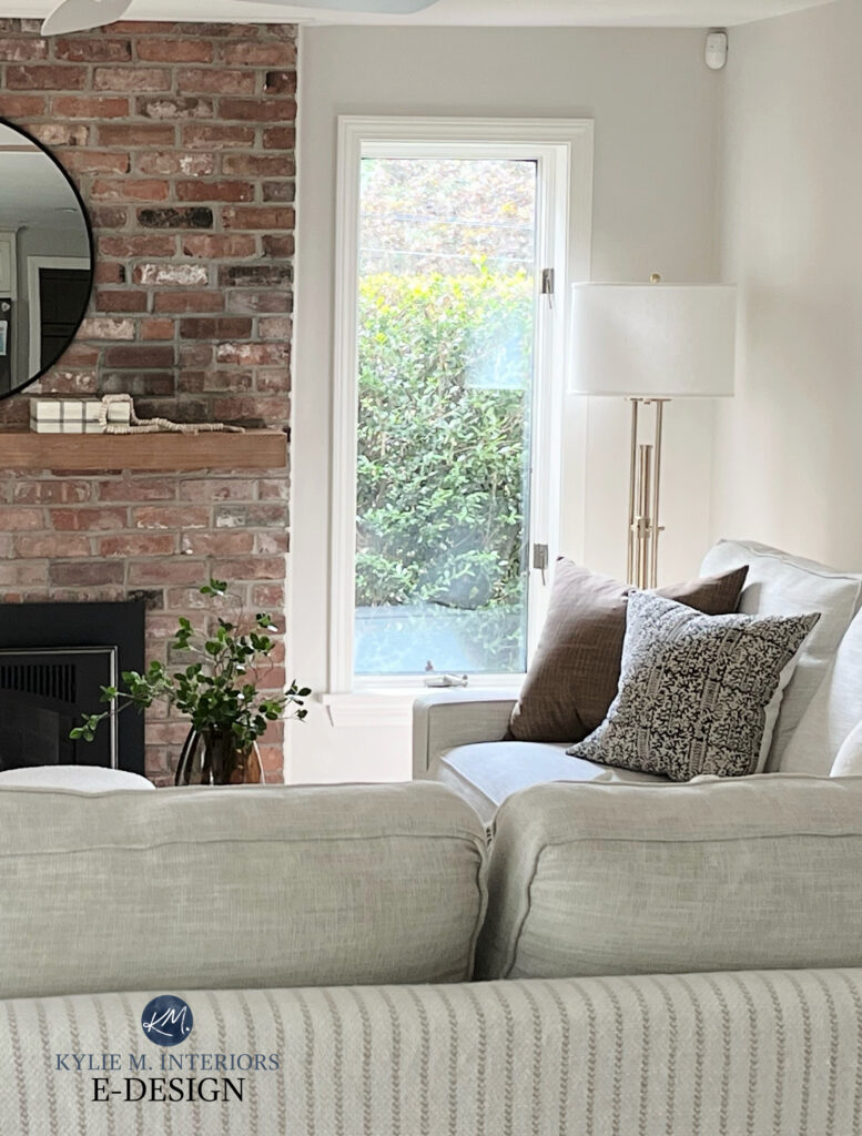
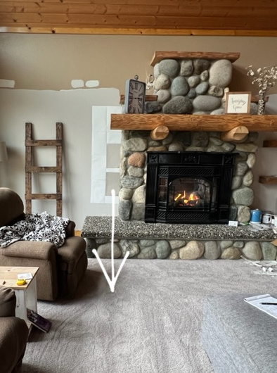
The brick in this next family room has a reasonably strong pink foundation…
Again, I can’t cover every shade of pink, which means you’ll want to sample these colors carefully to make sure they work with YOURS! And if all else fails, you know who to call (wink wink).
Just remember, nothing will make your pink go away unless you replace it. These colors are meant to politely nod toward your finish while adding an updated, neutral edge.
1. BENJAMIN MOORE PALE OAK
Pale Oak is one of the BEST COLORS for a home with pink finishes. Not only is Pale Oak neutral (which is often the goal), but it shares the same undertones as many pinks without being obvious about it. That’s right; Pale Oak is a light-depth taupe with a soft pink-violet undercurrent.
Will these undertones show up to the party in a big way? No, they won’t be shakin’ their tassels, but they will be cutting a pretty good rug on the dance floor.
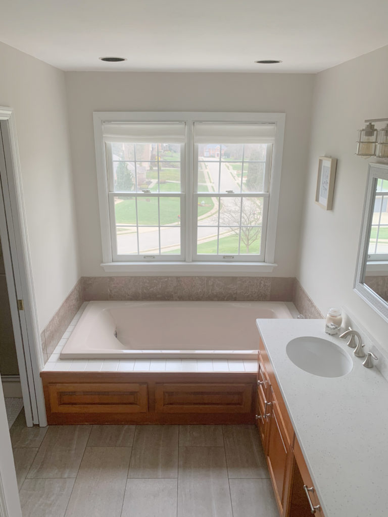
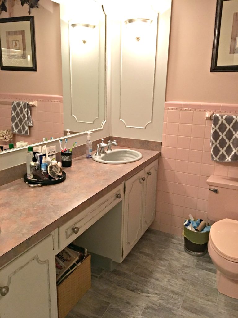
The soft pink bathtub and pink-toned tile in this bathroom look more natural with a paint color like Pale Oak that leans INTO them rather than contrasting.
2. BENJAMIN MOORE CLASSIC GRAY
Classic Gray takes cues from Pale Oak, but a) it’s a bit grayer/cooler (while still being quite warm), and b) its undertones are more subtle. Sometimes, a pink or rose finish NEEDS more undertone, and Classic Gray doesn’t fit the bill. In this case, Pale Oak is often next in line.
Classic Gray is an off-white shade of warm gray-taupe. While it has soft violet-pink hues, it’s very subtle.
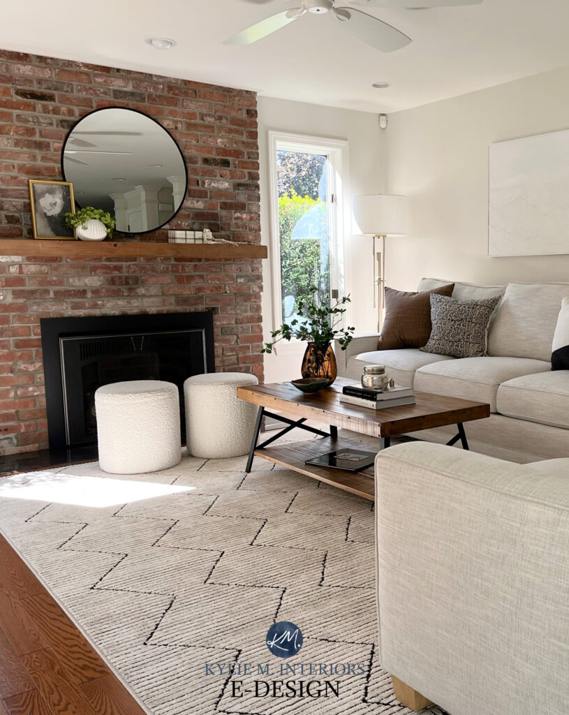
3. SHERWIN WILLIAMS EGRET WHITE
Egret White is a light-depth warm neutral but on the lighter end of the range. Like Classic Gray, it’s referred to as a warm gray or a taupe, depending on how it settles in a room and a person’s perception. The beauty of Egret White is that of this type of color; it has the least noticeable undertone. This being said, more obvious pink finishes sometimes need a bit more commitment to pink than Egret White offers.
As shown with this pink-toned brick fireplace, because the pink in the brick and mortar isn’t strong, Egret White is a great wall color for it…
4. BENJAMIN MOORE ATRIUM WHITE OC-145
If you have pink countertops, tiles, or carpet, you might find that the more popular shades of white are either too stark or too warm and creamy for your finishes. This is where Atrium White comes in handy. While the above colors are in the off-white and light depths
Atrium White is a gentle shade of white with a feather-lite pink undertone and an LRV of 85.05. This makes Atrium White a soft white, not a bright one, and is great for walls, trims, cabinets, and ceilings.
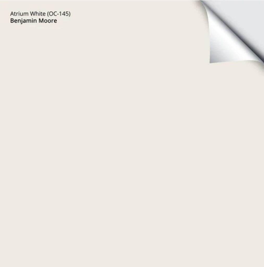
Get your Peel & Stick Sample of Atrium White HERE
5. SHERWIN WILLIAMS VERSATILE GRAY SW 6072
As mentioned earlier, I can’t cover all of the pinks, and not ALL of these colors will work with every pink finish. My goal is to give you a great place to start – and that includes sampling colors like Versatile Gray!
Versatile Gray is a light-medium depth warm shade of taupe (LRV of 48). While some might see it as a warm gray, it’s definitely in the taupe family due to its increased warmth (its kissin’ cousin Requisite Gray is more of a warm gray and is also worth exploring).
The carpet in this next living room isn’t entirely pink; it’s more of a gray-taupe-violet-pink blend, which is why Versatile Gray is a great option to sample…
Paint Color Review of Sherwin Williams Versatile Gray
In the above photo, the top sample is Benjamin Moore London Fog, and the bottom sample is Versatile Gray. The carpet could handle the slightly grayer look of Requisite Gray, but often, it’s about finding that happy medium between what suits a room’s finishes and what a homeowner can live in!
6. BENJAMIN MOORE SMOKEY TAUPE
Smokey Taupe is as lovely and subdued as it sounds! This particular shade is warmer than the above colors, without dipping into the beige pool. This makes it a popular choice for countertops and tiles that have a mix of pink and beige tones, like this countertop…
Now, colors like Smokey Taupe and London Fog can be tricky, as while they often lean into a soft taupe-pink hue, the odd time they grab a wink o’ green. Sample carefully to see how they settle in your space!
If these colors don’t hit the spot with YOUR particular shade of pink, I’m happy to help via my Online Paint Color Consulting packages!
COLORS THAT ACCENT OR GO WITH PINK FINISHES
If you want to play up your pink, one of the best ways to do it is with shades of green! Pink and green love each other and can give off a slightly vintage vibe if done well.
While some people love a pink and cream combo, I’m always leery, as many creams are a hot mess with pink. I’ll see if I can grab a few for you, but am feeling skeptical. As for blue, the best shades tend to be darker blues, especially when partnered with pink and white.
Of course, I rely 100% on my readers and Online Paint Color clients to send in their after photos, so I don’t always have the exact images I need. However, I still have the color info you’ve been looking for.
1. BENJAMIN MOORE
The terra cotta tile in this next home definitely has a preference for pink…
Let’s look at a few of my favorite colors when updating a pink surface while HIGHLIGHTING it.
Again, I can’t cover every shade of pink, so you’ll want to sample these colors carefully to make sure they work with yours!
- Benjamin Moore October Mist – a gorgeous, grayed-out, slightly warm shade of green (COLOR REVIEW HERE)
- Benjamin Moore Revere Pewter – a more subtle contrast, as long as it flashes its green undertone (COLOR REVIEW HERE)
- Sherwin Williams Contented – a beautiful, light-medium depth shade of slightly cool green
- Sherwin Williams Softened Green – notice how these greens have a bit more depth, as some of the lighter ones can be a bit iffy with the average pink finish
By the way, I’m doing a big fat update of this blog post, so if things seem off or disjointed, they probably are.
Pink & Brown Paint Colors
Brown can look gorgeous with pink or dusty rose, but it has to be the RIGHT brown. Warm-toned browns, in other words, browns that have a strong yellow or orange undertone, can look pretty darned fugly when paired with pink – I call these ‘fudgy browns,’ which is super technical. I mean, I suppose these warm browns can give a slightly more vintage vibe, but we’re trying to UPDATE things here, people, not back-date them.
- Benjamin Moore Ashley Gray HC 87. A soft taupe-beige-gray blend.
- Benjamin Moore Willow CC 542. A super-rich dark (supa dark) chocolate brown with an almost grayish cast.
- Middlebury Brown HC 68. Dark brown that isn’t too warm.
- Whitall Brown HC 69. A beautiful brown with a soft gray undertone, so it’s not too ‘fudgy.’
Pink & Taupe (or some grays)
Taupe is undoubtedly THE best paint colours to update pink. However, you have to be careful with gray and taupe/greige colours as they often have sneaky undertones like green, blue, and yellow, which can be pretty bad when paired with pink.
The key is to find a nice WARM gray or taupe that’s a bit more subtle in its approach and if anything, has a slightly noticeable violet-pink undertone, such as Benjamin Moore Pale Oak. If you go AGAINST your pink-toned item and opt for an opposite like green or blue (undertones or actual COLOURS) you risk highlighting your pink, making it look stronger.
A few good light grays and taupes
- Benjamin Moore Pale Oak
- Benjamin Moore Classic Gray
- Benjamin Moore Balboa Mist
- Sherwin Williams Popular Gray
Pink & Black or Dark Charcoal Gray
Black or DARK gray looks amazing with pink when used as an accent. It would be too overwhelming to use as a majority colour in your room (like the walls), so consider it in smaller touches like picture frames, trim, doors, and other decorative details (or maybe a feature wall!).
A few good blacks and grays
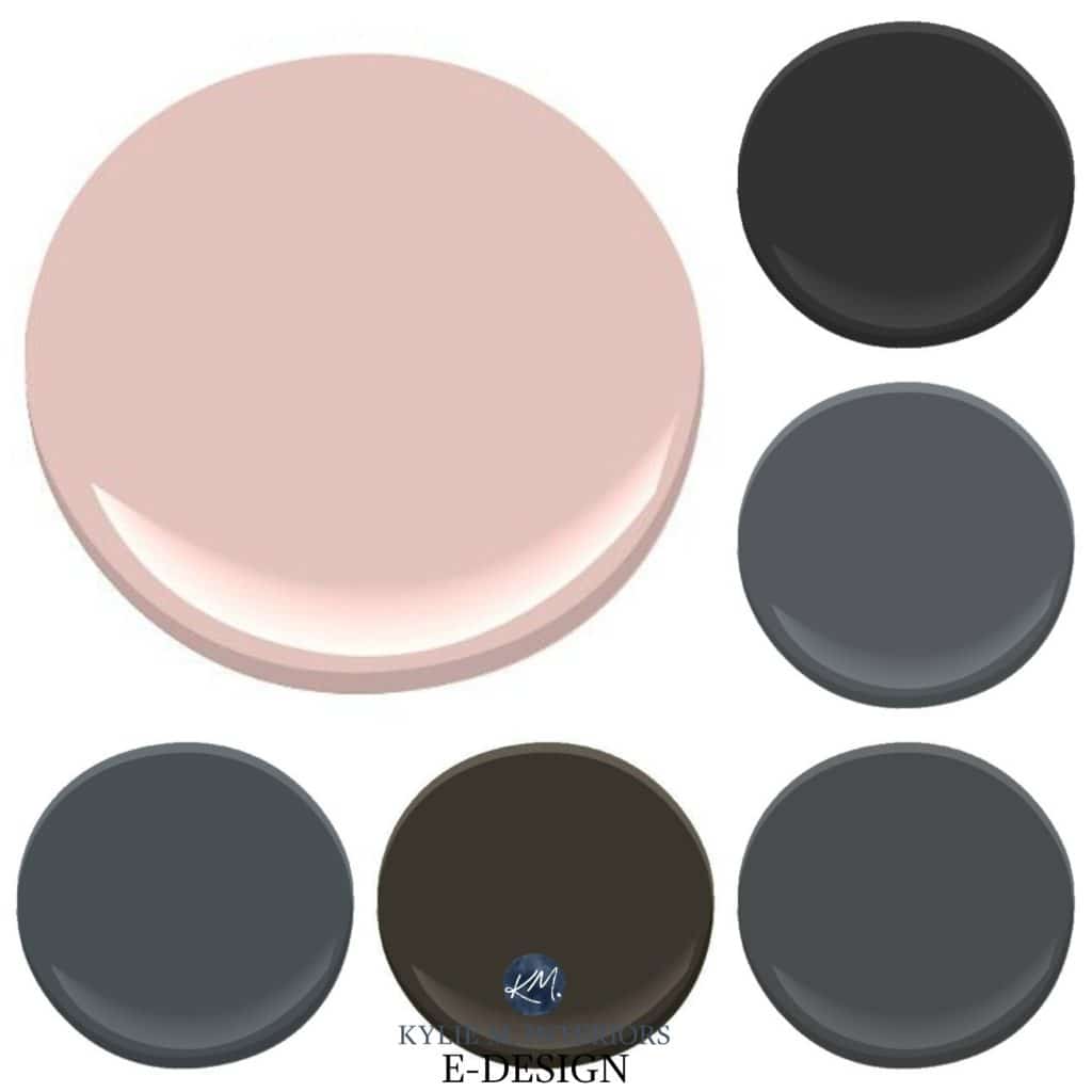
Starting bottom left
- SW Cyberspace SW 7076. Really, this is like a charcoal with a stunning navy blue undercurrent
- SW Black Fox SW 7020. This is like a brown/gray blend, super wicked
- Benjamin Moore Kendall Charcoal HC 166. A dark charcoal with very little undertone
- Benjamin Moore Gray 2121-10. Along the same lines as Cyberspace, a dark charcoal with a navy blue undertone
- Sherwin Williams Tricorn Black SW 6258 / Benjamin Moore Black 2132-10
Of the above, I have to say that navy, either natural or softened with gray, is one of my FAVOURITE ways to work with pink. There’s something classic and crisp about it that makes it appear more modern, timeless and dare I say – cool!
Now, of course, there’s a lot more to consider other than pink, things like exposure, flooring, furnishings and personal tastes, but hopefully, these ideas get you well on your way to YOUR perfect paint colour!
Need HELP?
Check out my affordable E-design and Online Color Consulting Packages – stop guessing and start painting!

Chat soon,

Read more
The Best Decor to Update Pink Countertops, Carpet or Tile
Comments
Leave a Reply
More Posts

The 5 Best Creamy White or Off-White Paint Colors
THE ELUSIVE ‘CREAMY WHITE NEUTRAL’ When it comes to light, warm neutrals, it’s all in the undertones. And other than pink and green, yellow is the undertone many of my
Read More

The 8 Best Warm Neutral Paint Colors With NO Yellow Undertones!
The Top Light Depth, Warm Colors That Aren’t Cream! When choosing the best warm neutral paint color for your home, whether creamy white, beige, taupe, or greige, your choices are
Read More

The 12 Best Farmhouse Sinks of 2024
FIND YOUR DREAM SINK HERE… While traditional farmhouse design was all the rage in previous years, the embers have definitely cooled. As for MODERN farmhouse, it’s still kickin’ its cowgirl
Read More


I have Chelsea Gray in my master BR, and pinky/taupe accent tile and Oak cabinets in my bathroom. What paint color would work best with both elements? Tranquil greens look a little muddy, should I be looking for periwinkle/violet undertones? Thanks!
Author
Hi Hope, thank you for asking! I actually have an e-design business just for questions like yours – otherwise, I’m guessing as to what your home REALLY looks like – how pink is the taupe, what’s the lighting like, etc… I do try to give as much complimentary, helpful info on my blog as possible, and if that doesn’t work, it just might be time for me to take a look! https://www.kylieminteriors.ca/online-decorating-design-services/
~Kylie
What a ridiculous article. This did not help at all. And I have pink tile, lots of it. I don’t want it to look MORE pink, I want it to be less dramatic. Good grief, these colors will have it looking like a pastel nightmare. And using that stupid term “fugly” or whatever it was is just insulting.
Author
Thanks for your comment, duly noted :).
I wonder if Whitall brown would look good with travertine with a pink essence to it. Love your blog by the way!
P.S. One would assume the commenter before me may have a fugly personality and one should ignore that said comment completely.
Thanks for the suggestions of a few different colours to check out; glad you tipped us off to avoid beiges. I actually despise the dusty rose carpeting but only because it brings up memories of my childhood room . . . lol. Sadly, this new-to-us house needs a tonne of work and the carpet is probably the only thing in like-new condition: darnit.
Thank you for the article, Kylie! This article helped me narrow my paint selections for a small windowless guest bath that has brown, gray and peachy/terracotta granite. House built in 2010. I’m going to try Pale Oak.