
Posted on September 1, 2022 by KylieMawdsley
A FRESH COLOR PALETTE FOR A 90s RANCHER
When it comes to picking paint colors for brick houses, there are SO many things to consider: brick, roof, stone, driveway, exposure, landscaping, and sometimes there’s stone too! Throw personal tastes into the mix and it’s no WONDER it’s a stressful process!
Remember, the curb appeal of your home is the first thing YOU and your visitors see!
This post may contain affiliate links. If you make a purchase through links on our site, we may earn a commission.
This cute 90s brick home is the PERFECT example of ‘high needs’ as there are a lot of fussy finishes to accommodate. Luckily, it has the right bones to be a beauty, she just needs a lil’ KLC…
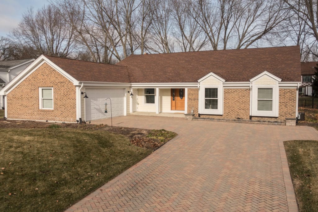
But first, we have to prioritize which finishes matter the most. Priorities can change depending on how much brick you have or how much roof you see, but this home has a LOT of everything…
1. the brick and its undertones (orange, violet, pink) followed closely by…
2. the colors in the asphalt orange-toned roof (orange and violet)
3. the brick driveway and its strong orange, pink, and violet hues
From their questionnaire, I know the owners want a color that’s NOT warm, NOT yellow, and that’s hopefully taupe or gray with a green undertone. I figure we can squeeze in gray, but I can’t accommodate the green undertone.
Why?
The exterior finishes on this home are warm-toned – orange to be specific. Sure, there’s some purple and pink in the driveway and purple on the roof, but the dominant hue is orange. Because opposites attract, if we choose a gray with a green undertone or greige (which naturally has a green undertone), there will be no visual connection to anything on the house.
While this can work on some homes with fewer features to accommodate, with ALL of this home’s features, we had to lean into it.
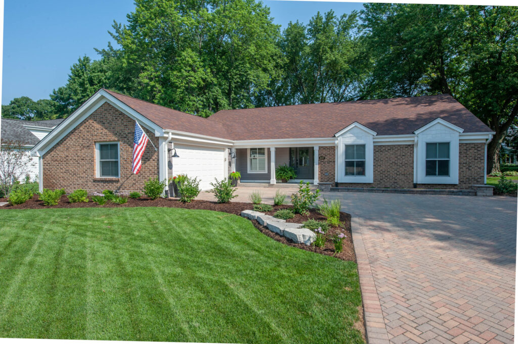
Instead, by listening to the homeowner’s wants and combining them with the needs of the home, I found the link – purple! All three of the above surfaces have purple or a purple undertone in them, making it a great color to link them with.
If you can’t see the purple, I recommend you drink a glass or two of wine, and then you will (helps every time).
And the results?
It’s like a different home! With a beautiful color palette, lush green grass, and landscaping, the value of this home (financially AND emotionally) just increased in a BIG way…
Neither myself nor the homeowner can decide whether we like the front windows surrounded by the siding color or with the trim color – it’s a tough call as neither is wrong.
In the above photo, notice how the garage door matches the white trimmings, as do the shakes around the window. Below, both of these are painted with the siding color…
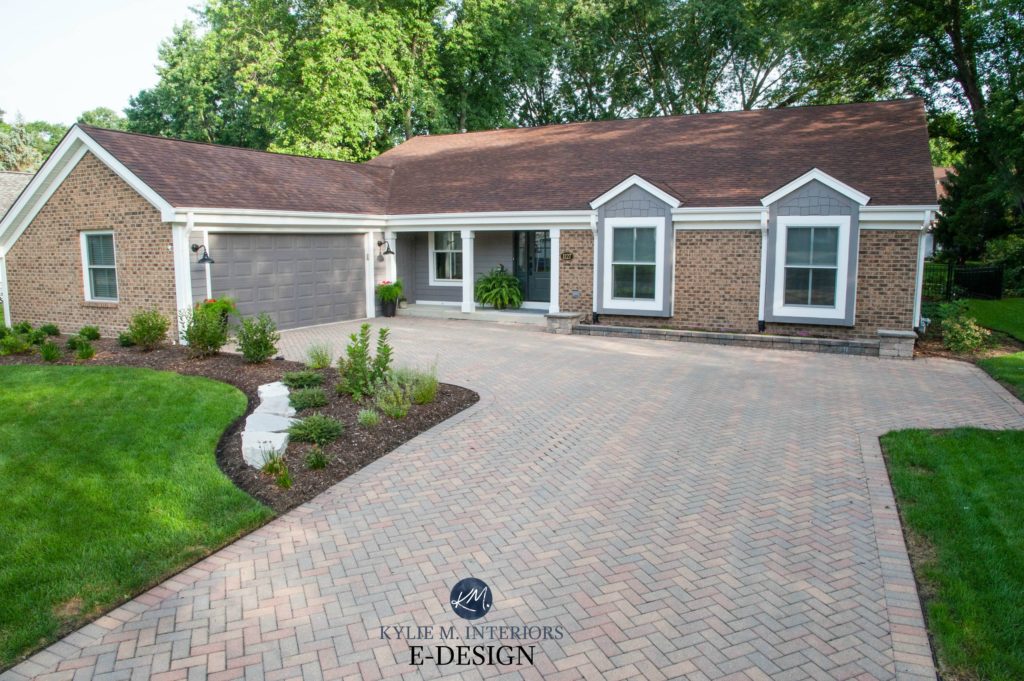
I kind of lean towards warm gray around the windows and a white garage door – the best of both worlds!
Now let’s take a closer look at the front door, where we can also see how the paint color closely coordinates with the brick…
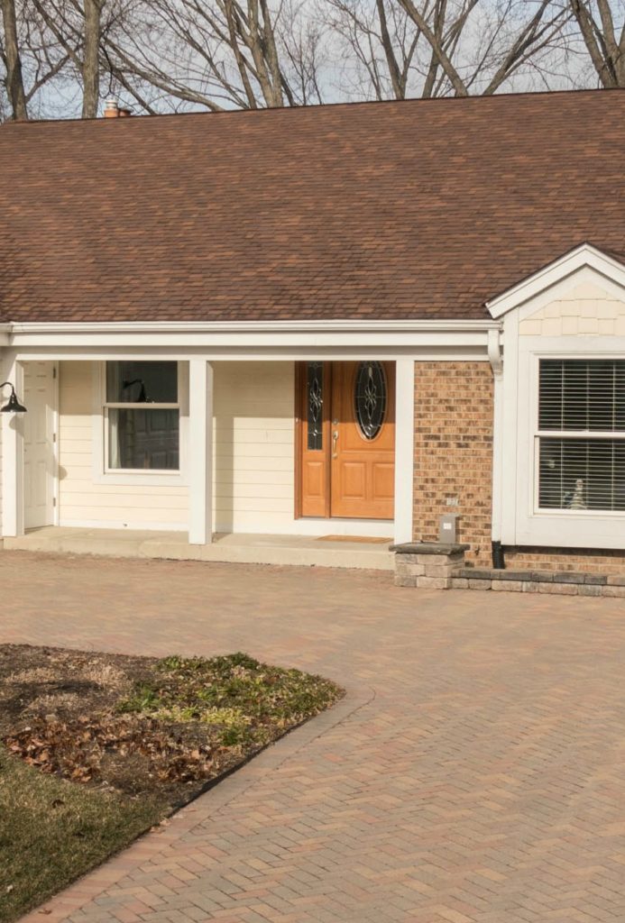

The new front door style and color are a WAY better choice for this gorgeous home. And while the white trim is bright, it has a softness thanks to a creamy undercurrent.
5 Steps to Choosing Your Home’s Best Exterior Paint Color
WHAT COLOR PALETTE DID WE CHOOSE?
Picking exterior colors to coordinate with a brick facade is tricky business and it’s important to sample a variety of shades of the same color, as well as any other options that seem like contenders. Brick exteriors often suit a wide range of colors and you don’t to miss out on your home’s best color by focusing on one that’s second best, or clashes.
For example, this home doesn’t just suit a darker warm gray or taupe with violet undertones, it also suits…
- some shades of lightish taupe
- gentle muted shades of beige
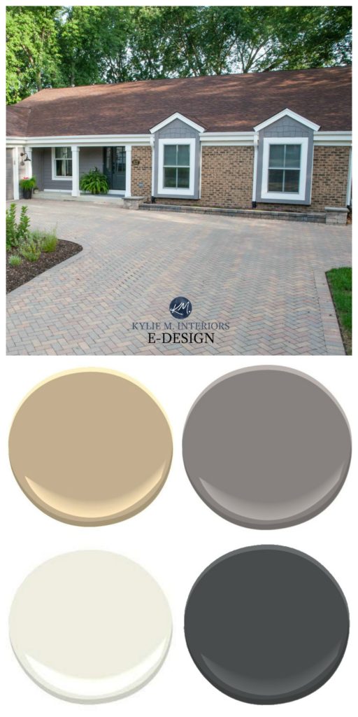
The orange/beige represents the basic neutral on the brick walls/driveway and roof. Of the 3 palettes that I suggested, they chose:
- Siding: Sherwin Williams Mink, which is a med-dark warm gray/taupe with a purple undertone – see more of those HERE
- Trim: Sherwin Williams Alabaster, a soft, warm white – see more of those HERE
- Front Door: One of my favorite, soft shades of blue, Sherwin Williams Iron Ore.
READ MORE
E-Design: A Stunning Exterior Makeover – Painted Brick and More
5 Steps to Choosing Your Home’s Best Exterior Paint Color
Does Exposure Really Matter When Choosing Exterior Paint Colors?
Let the top online paint color expert pick your colors for you…

Chat soon,

Comments
Leave a Reply
More Posts

The 5 Best Creamy White or Off-White Paint Colors
THE ELUSIVE ‘CREAMY WHITE NEUTRAL’ When it comes to light, warm neutrals, it’s all in the undertones. And other than pink and green, yellow is the undertone many of my
Read More

The 8 Best Warm Neutral Paint Colors With NO Yellow Undertones!
The Top Light Depth, Warm Colors That Aren’t Cream! When choosing the best warm neutral paint color for your home, whether creamy white, beige, taupe, or greige, your choices are
Read More

The 12 Best Farmhouse Sinks of 2024
FIND YOUR DREAM SINK HERE… While traditional farmhouse design was all the rage in previous years, the embers have definitely cooled. As for MODERN farmhouse, it’s still kickin’ its cowgirl
Read More


Gorgeous. Transformative. Props. ????
Brilliant! The windows look so much bigger not being dwarfed by the white surround anymore.
When you said purple, I thought you’d lost your damn mind. But wowwie, what a gorgoies colour. And even though it’s a cooler colour, it’s more inviting than the before pic. I must have been mistaken in thinking warmer colorus are more cozy and inviting while cooler colour are sort of …uncozy? Great job! And love the door!
Wow, what a difference, beautiful!
Wow – where did the yellow and orange go. Beautiful job.
Great job. As a Realtor I see a home that won’t sell -vs- a home that will sell quickly! I will definitely hare this with clients. So many could benefit from your help
What a transformation! The house is so well coordinated now and the purple in the gray gives it so much more life.
Curious which orange beige you used as a sample.
Wow! What a great lesson on color. I love your videos. Keep making more!
Impressive transformation! Where is the front entry door from?