

Benjamin Moore Constellation AF-450: Undertones, White Trim, & More
By Kylie
October 26, 2026
Have you been wishing on a star for the perfect, relaxing, light-blue, coastal-inspired paint color for your room? If so, you might be happy to see Constellation.
Constellation often gets overlooked in favor of more mainstream shades of blue. Is this a shame or a win? Is it the best light blue, or are there WAY better options? You’ll find out my opinion shortly, but first, let’s get into some details and facts.
WHAT TYPE OF COLOR IS CONSTELLATION?
Constellation is a blue (blue-green) paint color. While some other blends appear more dominantly gray or green, you should expect Constellation to look blue on your walls, unless lighting conditions/exposure/finish challenges tweak its appearance (more commonly into green).
THE LRV OF CONSTELLATION
With an LRV of 72.73, Constellation is between the off-white and light worlds. If it were any lighter, I would worry it would look too washed out (that said, it’s on the border now, especially in a light, bright room or with non-white trim). I think if Constellation were a bit darker (let’s say LRV of 65 or so), it would be more popular.
Never choose a color without understanding LRV!
THE POSSIBLE UNDERTONES OF CONSTELLATION
With the top blue paint colors, you’re always dealing with some degree of gray. The most popular blues for bedrooms, living rooms, bathrooms, etc. also tend to have a reasonable amount of gray. What I love about Constellation is that it has enough gray to calm it down, so it’s not overly colorful, but it’s still ‘blue-centric’.
From there, blue tends to favor purple or green. In my extensive color work, the most popular lighter blue paint colors lean into green, and Constellation definitely falls into that category.
See how Constellation looks in your room with a large peel-and-stick sample…

CONSTELLATION IN NORTH, SOUTH, EAST, & WEST-FACING LIGHT
There are sooooo many things that go into how a color might appear on your walls. So, while I can give you a general idea of what might happen, it comes down to a) how much your room’s exposure even affects your room, b) other factors like interior finishes, lighting, perception, etc, and c) proper sampling, so you can see how it looks in your space (never pick a color based on how it looks at the store – GAG ME WITH A SPOOOOON!).
North, East, South, West: Which Paint Color is The Best?
- NORTH-FACING LIGHT: Northern exposure is a cool, gray light. If you have a bright north-facing room, sure, Constellation could look its gorgeous blue self, maybe a bit washed-out in some areas (that get a ton of light) or a bit bluer in others. The same goes for east-facing afternoons, which can have a kind of dull, flat, grayish light.
- SOUTH-FACING OR WESTERN AFTERNOON LIGHT: These are warm lights, especially western late afternoon. Exposure like these can really tweak a color like Constellation, more commonly making it appear a touch more blue-green than it might normally look. Also, if these rooms are super bright, expect Constellation to WASH OUT.
THE BEST WHITE TRIM COLORS
If you’re looking for the perfect shade of white for your cabinets or trim, you want to be very careful, as Constellation can be fussy. Being lighter and not overly earth-toned, it can be fussy with whites that are creamy (yellow). Here are some of my favorites to recommend to my Online Color clients…
- BM Super White really suits Constellation’s cool look with a crisp, simple contrast. That said, BM Chantilly Lace is my favorite, as it’s a good happy medium.
- If you love the play of warm vs. cool, you might try BM Simply White. Just watch how the yellow in Simply White activates Constellation’s blue (and likewise).
- I’d avoid soft, warm whites like BM White Dove and SW Alabaster as they don’t bring out the best in Constellation if you ask this color cowgirl.
COLORS THAT COORDINATE WITH CONSTELLATION
If you’re looking for colors that go well in a palette with this badass, beautiful shade of blue, here’s what I’ve got…
- WHITES: As mentioned earlier, stick with brighter whites that aren’t overly creamy.
- LIGHT, SUBTLE CREAM: Cream paint colors that aren’t too rich or heavy can be pretty in rooms adjoining Constellation (I just wouldn’t use them in the same room).
- OTHER BLUES: Darker blue-greens with similar undertone profiles can be pretty partners
- DARK GREENS: Medium and darker shades of green can be really interesting, creative partners with a Constellation’s more blue-leaning look
COLORS THAT ARE SIMILAR
Many of my clients come in my virtual door liking Constellation, but then find it a bit too baby blue, light, green or just not quite right. As for it looking ‘baby blue’, while it has a bit more gray-green than baby blue, I totally see where they’re coming from. Here are a few I recommend sampling and comparing in your room’s lighting…
BENJAMIN MOORE ICEBERG VS. CONSTELLATION
If Constellation is just a touch too blue-green for your tastes, I recommend sampling Iceberg. Iceberg is a touch darker, and can appear a bit smoker and grounded.
The Best Light Blue Paint Colors
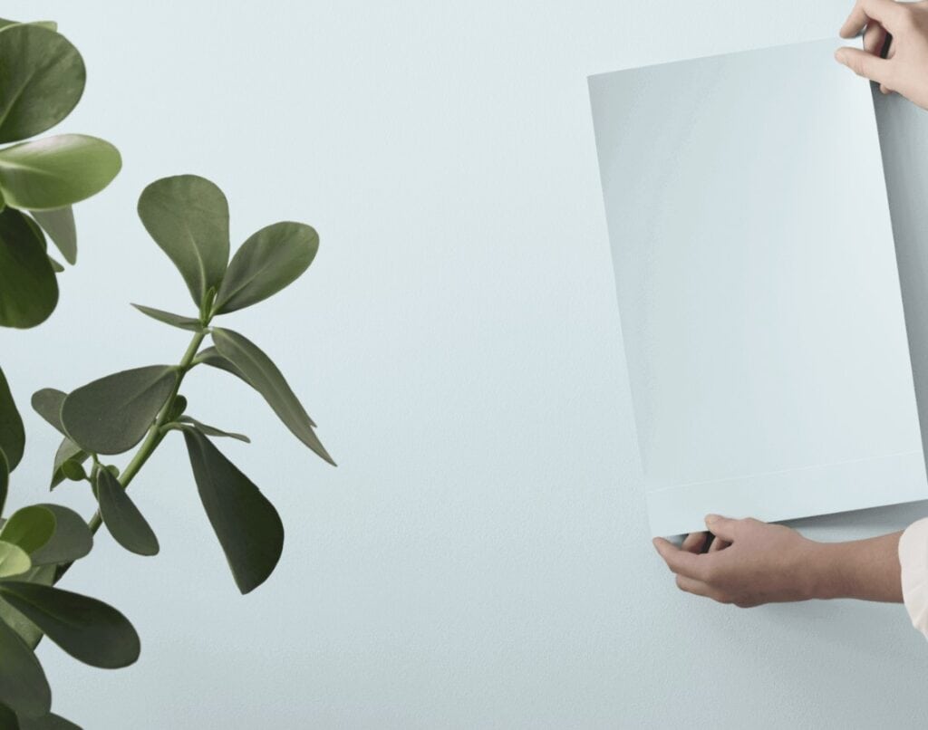
Compare Constellation to Iceberg on your walls to see which is best. Here’s a peel and stick…
SW MOUNTAIN AIR VS. CONSTELLATION
I LOVE Mountain Air, it’s just sad that I have to hike to experience it. Seriously, though, I like Mountain Air more than Constellation. Why? Well, if you ask this color cowgirl, Constellation feels a bit baby blue for me, and makes me a little twitchy (with definite exceptions). Muntain Air is super similar, with a comparable LRV (depth), but it has a bit more gray. This gray takes a touch of the baby blue hues out and calms it down. That said, it could be too grayed-out for some people, so you do you, boo.
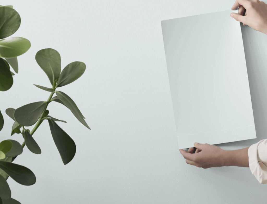
Compare Mountain Air to Constellation in your own lighting…
Topsail is another light blue Sherwin Williams color I like to compare with Constellation and Mountain Air. Colors like these are super popular for haint blue ceilings.

If you’re looking for a color that’s bluer than Constellation, check out Sherwin Williams Blue Horizon.
WHERE CONSTELLATION DOES (& DEFINITELY DOESN’T) WORK BEST
Constellation is a fussy color and doesn’t fit in as many situations as many other colors. Let’s look at a shortlist…
- BRIGHT ROOMS: While it can be pretty, expect it to wash out quite a bit.
- DARK ROOMS: It can be interesting, but really needs light for its color to come to life.
- WITH WOOD FINISHES: It really best suits stained white woods and lighter, gentler, natural woods. It could look a bit dated against cherry or golden oak.
- WITH CREAM CABINETS/TRIM: Helllllls no. Nuff said.
- CEILING: Whether you want a version of haint blue or just like a soft, sky blue hue, it could be a great choice.
DOES KYLIE M RECOMMEND CONSTELLATION?
To be honest? No. When my clients want light blue, they more often want blues with a bit more depth and more gray. Not to say that it hasn’t come up in the odd consultation, as it has, but it’s not common. Here’s when I might recommend a color like Constellation…
- In a beachy home for a bedroom (I’ve got some other stunners in this blog post)
- With crisp white trim, for a fresh, airy look
- In the odd heritage home
- For a nursery, but even then – meh
Actually, let’s do a little ‘pro and con’ list…
- PRO: It’s soft, airy and gentle. It’s a great way to get blue without being punchy or overly colorful.
- CON: It could seem a bit baby blue for some people.
- CON: It’s not super flexible toward a wide range of colors.
- PRO: It’s beautiful for a beachy, coastal look with crisp whites.
- CON: It risks washing out and losing some of its beautiful blue hue in a super bright room
- PRO: While it won’t be perfect, it could do alright in a dark room.
FREQUENTLY ASKED QUESTIONS
For any random questions, queries, and quandaries…
COULD CONSTELLATION LOOK TOO BLUE IN SOME ROOMS?
That totally comes down to perception – what’s too blue for some is ‘not blue enough’ for others. That said, there are a few things that can affect how blue it appears, including your room’s exposure (northern light can enhance cool colors), creamy trim or cabinets, pairing it with colors that are dirtier than it, etc.
COULD YOU PAINT A WHOLE HOME CONSTELLATION?
I suppose. If you have a beachy home with clean, white, airy finishes, sure. However, there’s such thing as ‘too much of a good thing’ and many colors do their best work when they have other colors to PLAY with!
READ MORE
The Best Light Gray-Blue Paint Colors
The Best Light, Calming Paint Colors for Stress and Anxiety
Bedroom Paint Colors: Soft Shades of Blue and Green

Share this!

Tagged with:

Meet Kylie
Do you need help, but aren’t quite sure what ‘help’ looks like? Are you drowning in paint samples and decision fatigue?
Does every color you like at the paint store look terrible in your lighting or pick up a funky undertone? I’d love to help.

Hi, I’m Kylie
For over 24 years I’ve helped 12,000+ homeowners and renters make more confident decisions on paint colors and affordable home updates using real home examples and practical, experience-based advice. My goal is simple: help you love the home you have.
Do-it-yourself, the smart way
Grab one of Kylie’s guides
Affordable, downloadable shortcuts to the colors and combos I’d pick for you. Yours to keep, forever.

Homeowner’s Guide: White Kitchen Cabinets
This isn’t another ’10 Best Cabinet Colors’ list, because there is no SINGLE best white for every home and every kitchen.
Learn how to choose a white cabinet paint color that works with your countertops, backsplash, flooring, trim, lighting, and home—so you can rule out the wrong whites, sample fewer colors, and choose with confidence.
158-page PDF – Instant Download
$34.95Accent Colors – And How to Use Them
This isn’t about plastering your home in the ‘Color of the Year’ or following the latest trends (unless you really want to).
It’s about finding accent colors that work with YOUR home, YOUR style, and YOUR comfort level.
Because the best accent color isn’t one you love on a paint chip, it’s one that makes everything around it look better.
118-Page PDF – Instant Download
$34.95
Homeowner’s Guide: Exterior Paint Colors
Painting your home’s exterior is a BIG investment and choosing a color based on a tiny paint chip, a trend or the house down the street can be an expensive mistake.
Learn how to look at YOUR roof, YOUR windows, YOUR brick (or stone) and YOUR home as a whole so you can understand what colors make sense.
The goal? Less guessing, fewer samples and a lot more confidence before gallons of paint go on your home.
206-page PDF – Digital Download
$44.95Exterior Trim Paint Colors
This isn’t a list of ‘the best trim colors’, although you’ll get a ton of links to great shades!
You’ll learn how to look at your home and understand whether it needs contrast, repetition, connection, or a little visual peacekeeping to pull it all together.
Because trim might seem like a small detail…but spread it around all four sides of your home on multiple surfaces and it suddenly has a pretty big job.
118-page PDF – Instant Download
$24.95



Leave a Reply