
The Best Yellow Paint Colors: Benjamin Moore & Sherwin Williams
By KylieMawdsley
November 20, 2026
In the words of the Great Jerry Maguire – you had me at yel-low. Seriously though, choosing yellow paint colors is hard. That soft, light, creamy yellow that looked perfect on the paint chip looks looks Fluorescent Banana on your walls (I wish they’d let me name colors). That rich, dark, golden yellow that was perfect in the store has you cranking the Smashing Pumpkins‘ album at full blast once the painting is done – if you catch my drift.
Between interior lighting, natural lighting, surrounding finishes, and the many types of yellow, it’s easy to get it wrong. So, we’re getting ahead of the game by learning which yellow you’re looking for and what you might expect along the way.
This post may contain affiliate links, which means I make a small commission (at no extra cost to you) on any purchases you make through clicking a link on this site. See my full disclosure here.
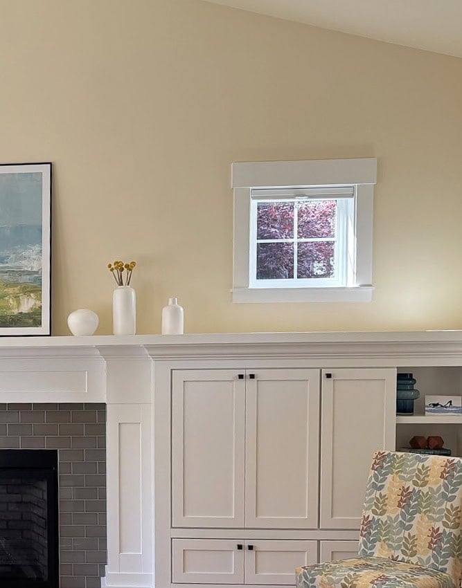
By the way, if you’re just here for some popular yellow paint colors, you might skip down to where I start talking about those.
On the other hand, if you like to learn a little along the way and are up for a little yellow yadda yadda, let’s get started.
THE 3 MAIN TYPES OF YELLOW
Isn’t white, white? Isn’t yellow, YELLOW? Heck no. When it comes to the wild world of yellow, there are 3 main types. Sure, there are more if you include degree of COLOR (chroma – e.g. bright yellow, creamy-yellow, etc.), but we’re not going there right now.
YELLOW-ORANGE: While you might not know it to see it, as most appear pretty darn yellow, yellow-orange paint colors are by far, the most popular versions. ‘Technically’ this is a yellow that leans toward red, but a wink (or more) at orange is the result.
YELLOW-GREEN: I rarely (#never) get requests for yellow-greens. Of the yellows, they’re by far, much harder to coordinate with the average interior finish. You’ll definitely have more luck with fabrics, but coordinating yellow-greens with tile, countertop, carpet, etc. can be tough. Technically, a yellow-green is yellow that leans toward blue, but what do yellow + blue =? You got it.
YELLOW: Of course, the rare yellow appears more or less true to its hue, but they can be be super susceptible to shifting with their environment (exposure, light bulbs, etc.).
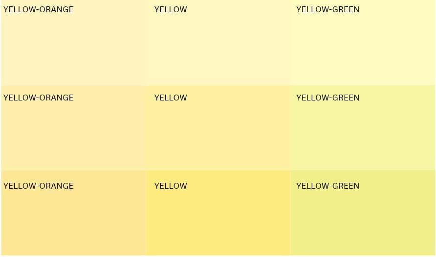
Just remember, different computer screens can show different results.
Use your hand to block the middle and right columns – this makes the left one seem more ‘legit’ yellow. However, compared to the center column, the left row’s yellow-orange shows up more.
A TRIP DOWN THE YELLOW-CHIP ROAD
There are many variations of yellow when it comes to color-commitment – some more livable than others. And we’re going to talk about them all, but we can’t cover yellow without talking about cream.
By the way, this is the YADDA YADDA – skip these pre-sections if you just want some colors.

WHAT’S THE DIFFERENCE BETWEEN YELLOW & CREAM?
Cream is 1000 times (or more) more popular than yellow when it comes to my Online Color Consulting requests. However, some get confused between the two, as like conjoined twins, there isn’t a clear line where one stops and the other starts.
YELLOW: We all know it. Yellow is a color, not a neutral. It has a higher chroma (degree of color). Some are so obviously colorful that there’s no doubt about their hue and intentions.

This is DEFINITELY yellow-orange.
CREAM: Cream is a neutral…that contains yellow. You can’t get cream without yellow, even though many have tried (truly). Even the most muted, mildest cream contains yellow.
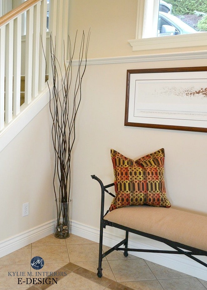
The challenge is that there’s no clear line where cream gets ENOUGH YELLOW that it stops being a neutral and starts being a COLOR. In fact, it’s open to perception. What’s perfectly cream to me, could be way too yellow for you. What’s the perfect yellow to you, could actually be a cream others.
It doesn’t matter what you call it, as long as you love it. However, understanding that shift can help you choose your best version.
LIGHT, BRIGHT YELLOW PAINT COLORS
By the way, this is still…the yadda yadda. And yes, I talk this much in real life, too.
Light, bright, sunshine-inspired shades of yellow might seem like a good idea, but there’s something about yellow that GROWS on your walls on the large scale. For that reason, when suggesting yellows, I often err on the side of ‘slightly muted’ vs. ‘more intense’.
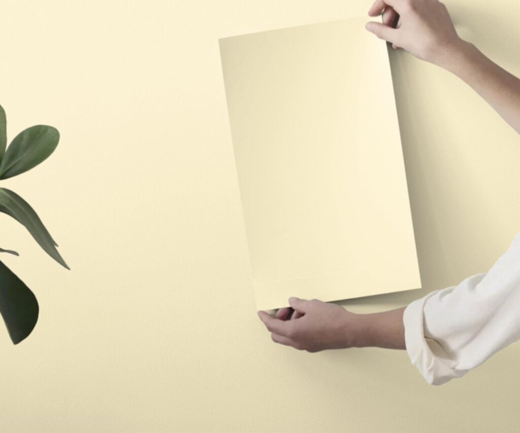
Peel & Stick sample of BM Old Straw Hat
But for those of you with a hankerin’ for some serious hue, these light, bright yellows have LRVs around 75-85 or so. Once you’re above 85, you could easily mistake your light yellow for a considerably warm shade of yellow-white. Not only do these light yellow have higher LRVs, they have much more color (chroma) than the mainstream, more popular choices. Here are a few…
- BM Old Straw Hat (LRV 84), BM Lighting Bolt (LRV 82.82), SW Fun Yellow (LRV 78), and BM Early Dawn (82.53)
Of course, there’s a range of yellows around the 70 LRV range, give or take, but I’M ONLY ONE WOMAN – we’re here to hit the basics.
If the term LRV is new to you, read this: A Homeowner’s Guide to LRV.
‘DARK’, BRIGHT YELLOW PAINT COLORS
When people think of ‘dark’ colors, they think of real skookum hues with a lot of meat on their bones. As far as yellow goes, it goes down to approximately 60 (LRV). Traditionally ‘dark’ yellows don’t exist.

- The darkest, most genuine, bright yellow, looks something like Sherwin Williams Cheerful (LRV 63) or Forsythia (LRV 63) which is gloriously, shockingly bright yellow. Considering LRV goes down to 0 (black) – that ain’t very dark.
- From there, if we add in a bit of orange to our bright, dark yellow, we get a color like Sherwin Williams Goldfinch with its LRV of 55. Sure, on its own it might seem yellow and ‘darker’, but compare it to the previous 2 shades and you’ll see that shift from a more committed yellow, to yellow-orange.
Remember, a little yellow goes a looooooong way. When a color covers a larger area (like a wall vs. a small paint chip), it can appear stronger and more colorful.
Now, are the above yellows livable for the average person? Helllllls no, it’s like the sun knocked you upside the head with a bolt of lightning. Maybe fun for a front door or 2, but not super mainstream. To make these yellows more livable, we need to tone them down. So, let’s do that.
THE MOST POPULAR, MORE MELLOW YELLOWS
If you’re hoping for a vibrant, bright approach to yellow, this ain’t that blog post (refer to the few previous suggestions). Instead, I’m focusing on the most popular yellows, and those happen to tip their sunhats towards cream – sometimes a litte…sometimes a lot.
Rather than painting your walls, exterior, cabinets, or front door a color that glows at night, might I suggest a yellow that brings energy, warmth, and life to a room – in a more classic, timeless way?
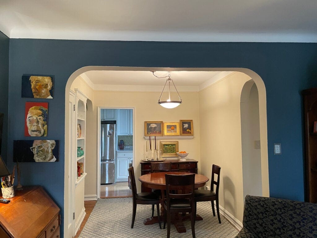
OTHER WORDS FOR THESE YELLOW HUES: Vanilla, buttermilk, butter yellow, creamy yellow, golden yellow (and much more).
1. BENJAMIN MOORE BUTTERMILK CC-216
If you ask me to choose between butt or milk, I’m choosing milk – but hey, if you want both, I’m cool with that. Also known as Old World Romance AND Soft Biscuit (seriously, BM?), Buttermilk is one of my favorite yellows to recommend to my Online Color Consulting clients. With the perfect blend of color vs. neutral, Buttermilk shows up on your walls in a purposeful, but not absolutely possessed way.

SIMILAR COLORS TO SAMPLE & COMPARE WITH BUTTERMILK
Because you should nevah, EVAH, choose a color without comparing it to similar shades, here are a few of my faves…
- For a touch less yellow while still having a gorgeous, candlelit warmth, I recommend Sherwin Williams Tea Light.
- For a more cream-inspired look but a similar intention, the more muted approach of Benjamin Moore Hepplewhite Ivory is an absolute beauty.
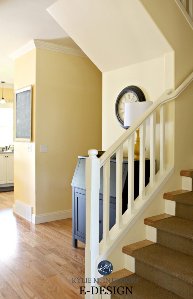
Also…
Did you know that 99.5% of the photos in my blog are from my Online Color Consulting clients, readers, talented photographers, my files, & friend’s homes? Real homes, real budgets, real people. Maybe they aren’t magazine-perfect, but they’re packed with ideas & proven color choices to help you create a home you love.
2. SHERWIN WILLIAMS VANILLIN SW 6371
I thought I’d offer you a little hybrid. Earlier, we talked about the line between yellow and cream, and how sometimes, like my eyes after a few glasses of wine, that line is a weeee bit blurry. That blurry line makes me think of a color that snuggles up tightly in the ample bosom between cream and yellow – that color is Vanillin.
The funny thing is that some clients come in my inbox wanting yellow, but after seeing their home and its finishes, I show them how a more MODERATE, creamier approach to yellow can give a gorgeous warmth, without the punch.
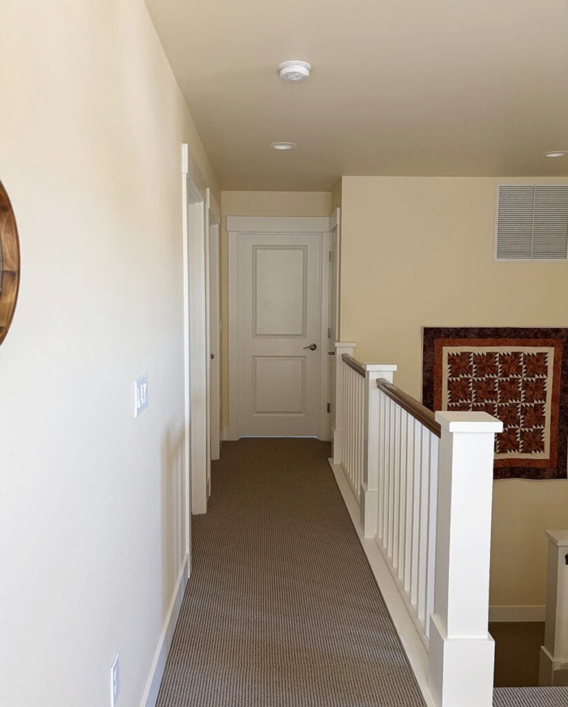
Vanillin is a light cream-yellow paint color with an LRV of 78. I mean, if you ask me, it’s a bit more ‘cream’ than yellow, but it doesn’t matter what I think (for these 2 seconds, then I’m the boss again – capiche?).
LIGHT YELLOWS TO COMPARE WITH VANILLIN
- Sherwin Williams Decor White is an awesome comparable.
- Want a yellow that leans a bit less yellow-orange? Check out Benjamin Moore Cashmere and Royal Linen.
- If you go a bit darker, THIS type of yellow-cream turns into a more cream-beige, like Sherwin Williams Eaglet Beige.
3. BENJAMIN MOORE DA VINCI 208
If you’re idea of the perfect yellow is a bit more rustic, and almost… like a work of art, let me show you Da Vinci’s Canvas…
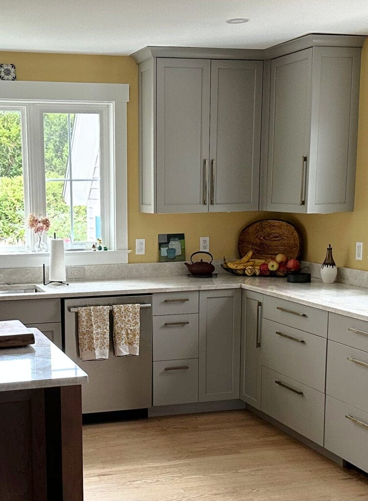
With a wink at mustard, but a wink less… tardy, Da Vinci’s Canvas is a muted, organic, hue with a wink at ochre, but a softer, lighter approach.
4. BENJAMIN MOORE WINDHAM CREAM HC-6
Windham Cream is one of my favorite yellow paint colors. Just enough color to be interesting, and most definitely yellow, but not so much that it’s overwhelming.
With its LRV of almost 80, I’ve suggested this color many times to my clients who want a warm, inviting look, but not a ton of color on their walls (and exteriors, too!).
Get a peel and stick sample of Windham Cream to see how it settles in your room’s lighting…
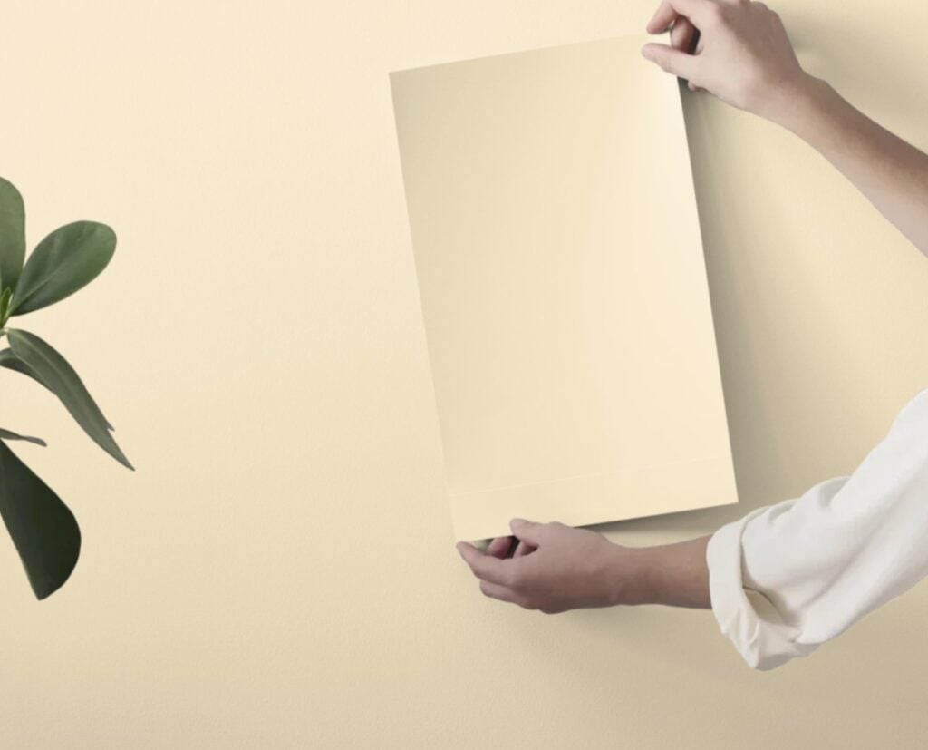
With a buttermilk inspired warmth, Windham Cream coooould be considered cream by some, especially those who love more dominant yellows. However, most will see it has a gentle, classic, timeless shade of yellow.
SIMILAR COLORS TO SAMPLE & COMPARE
- For a slightly more yellow hue, compare Windham Cream to Benjamin Moore Antiquity.
- If you like a more muted, creamier approach to warmth, Sherwin Williams Creme is gorgeous (#5). Definitely more passive, but if you have a room with south-facing sun, a more subtle approach could be best.
I’ll admit it, many of these colors hug the line between yellow and cream – that’s why they’re the most POPULAR yellows. Those with more intensity just aren’t as popular.
While I’m happy to offer brighter shades on a personal basis, my blog intends to hit as many birds with one stone as possible. OR if you didn’t wake up and choose violence…feed as many birds with one scone.
5. SHERWIN WILLIAMS CREME 7556
Creme is a beauty. With an LRV of 82, it offers a touch of light butter without too much creamy white. Admittedly, it could be considered cream or yellow, as shown in this next image. HOWEVER…
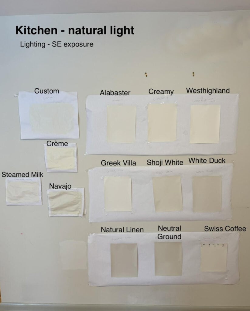
It looks this way in THIS natural light. You have to sample it to see how it looks in YOURS.
While none of the others would be considered yellow, a few might have caught your eye. While I have color reviews for most (linked below), please note that…
- SW Alabaster is a soft, warm shade of WHITE, as is SW Greek Villa and BM Swiss Coffee – these rarely look this strong.
- SW Creamy is a subtle, warm shade of off-white and rarely looks that yellow.
- SW Westhighland White is gorgeous, but really is more of a super warm, creamy white.
- SW Steamed Milk is a cream, fo sho.
- Don’t let Shoji White’s wink at warmth fool you. If you’re looking for yellow, this an’t it.
Back to Creme. Rather than yellow, it more often lands more like a ‘slightly more colorful approach to cream‘. Now, when you look at the above image (and below) you might think ‘I don’t know what the crazy lil’ Ginger’s talking about – THAT’S YELLOW!‘ And I get it, however…
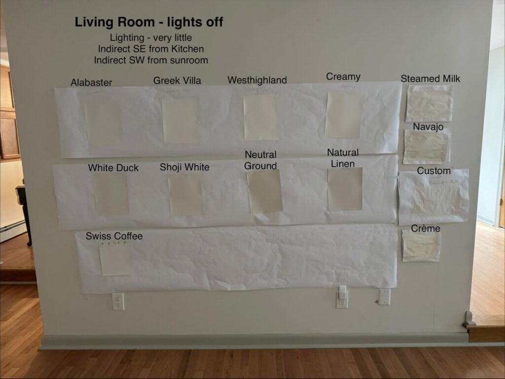
a) when compared to white paper, the yellow will be slightly enhanced, and…
b) the natural lighting is different in this image than the previous one – compare the 2. Creme looks more yellow in the kitchen image.
This is why sampling a range of colors in your own lighting is so FRIGGIN’ important. If I wasn’t afraid of needles, I’d get it tattooed on my breasticles. SAMPLE SAMPLE SAMPLE!
Here’s a peel and stick sample of Creme to look at in your OWN lighting…
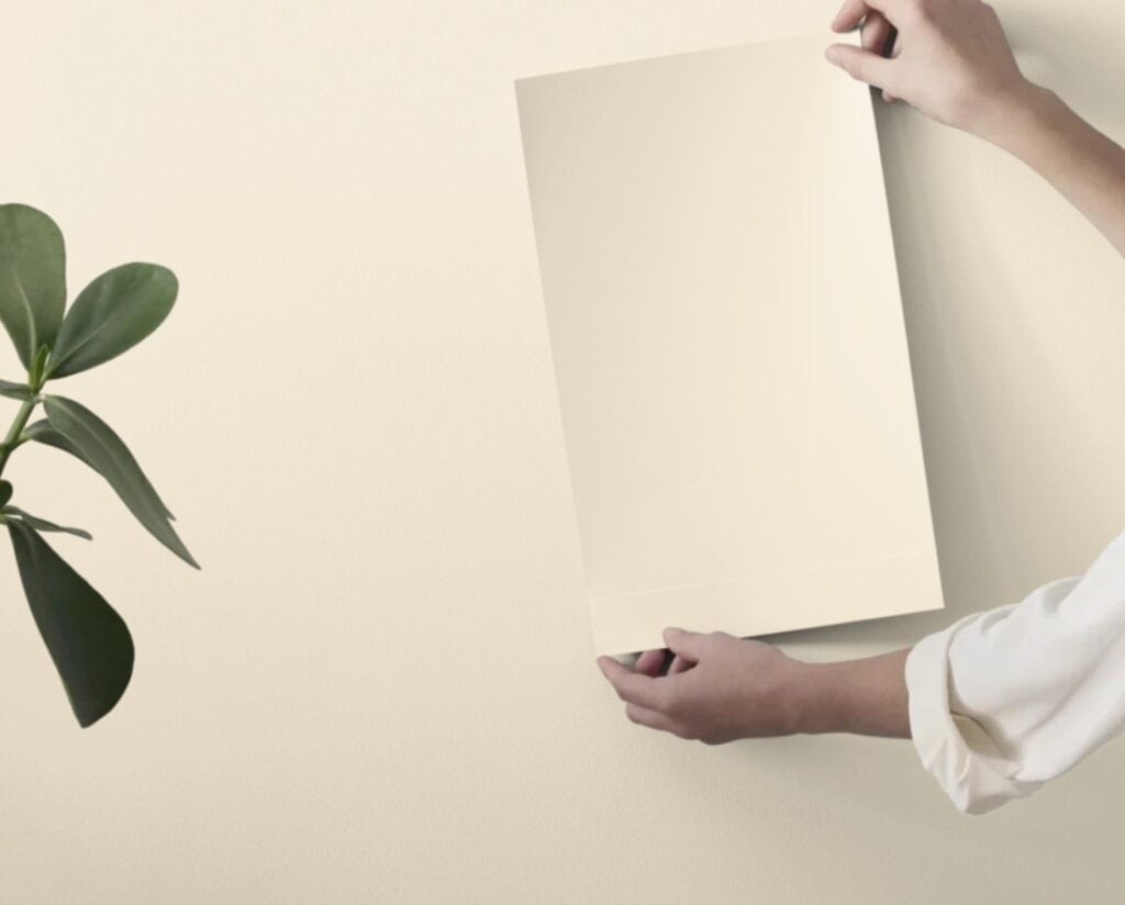
6. BENJAMIN MOORE ANTIQUITY OC-107
Antiquity steps us back into the legit ‘yellow’ range without overwhelming a room with color. Also known as Ambience, Antiquity suggest a classic, timeless shade of yellow.
Get a peel and stick sample of Antiquity to see how it looks in your lighting…
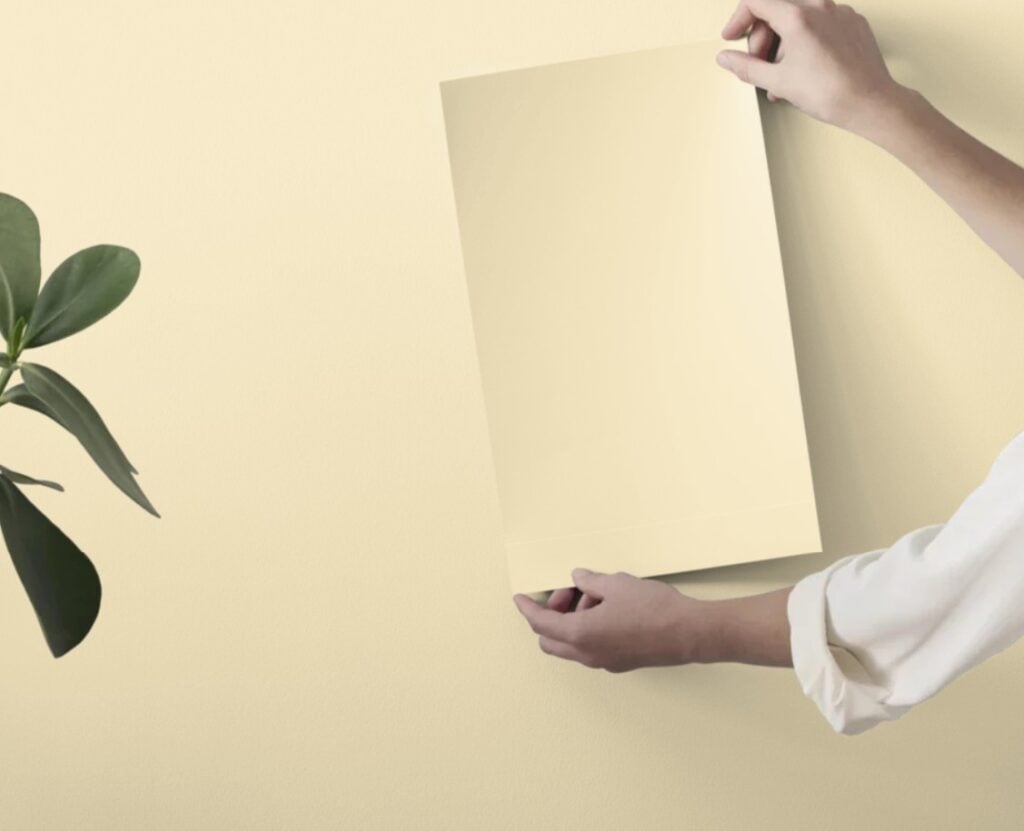
THE BEST LIGHT YELLOWS TO COMPARE WITH ANTIQUITY
- For a bit more depth and body, check out Benjamin Moore Pale Moon.
- Sherwin Williams Lemon Meringue is as sumptuous as it sounds. It can appear slightly cooler, as weird as that sounds when talking about yellow.
When coordinating wood tones with yellow, pay attention to the TYPE of yellow you choose. Many wood tones have a lot of pink or red and can struggle with yellow-greens.
7. BENJAMIN MOORE FEATHERBED 928
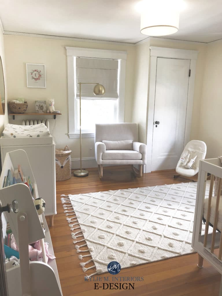
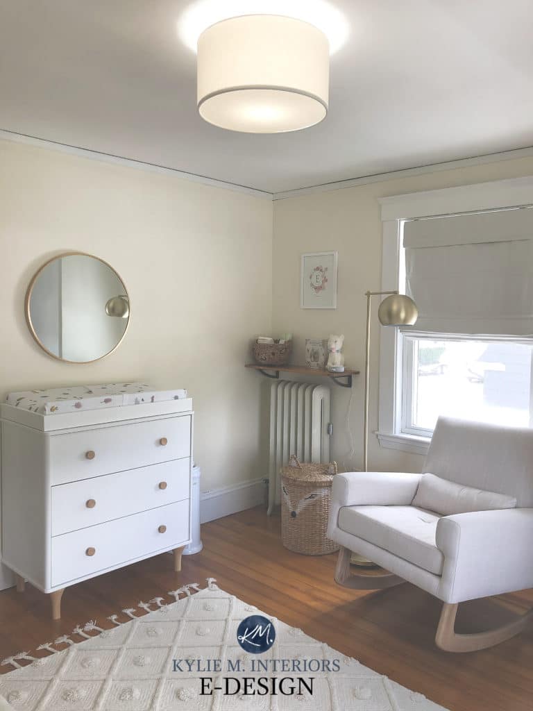
If you’re looking for a light shade of yellow that’s as inviting as it sounds, Featherbed should do the trick. While its LRV of 83 suggests whiteness, there’s no doubt that this is a yellow-cream paint color. As shown in this nursery (apologies for the blurriness, I’m just grateful for any photos I get!), it’s a gentle approach…
COLORS TO COMPARE WITH FEATHERBED
- Get a yellow with a bit more meat on its bones with BM Angel’s Gate (also known as Man on the Moon).
- If you prefer a yellow that leans more yellow-orange, I’m a huge fan of BM White Rock, which can grab a slightly creamier vibe, too (it’s also known as Calming Cream). Thank you, BM, for giving many of your colors 2 to 3 names…(insert eyeroll HERE).
8. BENJAMIN MOORE WINTER SUNSHINE 345
While I could use a little of that where I live, it looks like painting my walls is the only way to get it (I live on the wet, west coast).
Winter Sunshine is a gorgeously cheerful color. Its LRV is 81.71 and it’s commitment to yellow is solid. Overbearing? It all comes down to the type of yellow you love to live in.
Get a peel and stick sample of Winter Sunshine to see how it looks in your room’s natural lighting/interior lighting, etc.
OTHER LIGHT TO DARK YELLOWS WORTH NOTING…
Not that you have any shortage of colors to check out already, there are a few others that made the shortlist…
LIGHTER WHITE-YELLOWS
- Sherwin Williams Honied White is as sweet as it sounds. Its LRV of 86 makes it bright, but you should still see a gorgeous yellow shining through.
- For a TOUCH higher LRV with a beautiful yellow-white warmth, Sherwin Williams Paperwhite is gorg.
- Benjamin Moore Milkway offers a cleaner look compared to the previous 2, which can make its hue seem a bit stronger.
LEGIT LIGHT, LIVABLE YELLOWS
- Lemon Souffle by Benjamin Moore goes a touch too far for this color cowgirl, but it could be just what you’re looking for.
- Benjamin Moore Counting Stars will have you wishing you’d used this yellow sooner.
MORE TO READ
The Best Modern Cream Paint Colors
Share this!

Tagged with:

Hire Kylie
Do you need help, but aren’t quite sure what ‘help’ looks like? Are you drowning in paint samples and decision fatigue?
Does every color you like at the paint store look terrible in your lighting or pick up a funky undertone? I’d love to help.

Hi, I’m Kylie
For over 24 years I’ve helped 12,000+ homeowners and renters make more confident decisions on paint colors and affordable home updates using real home examples and practical, experience-based advice. My goal is simple: help you love the home you have.
Do-it-yourself, the smart way
I wrote these for you!
A collection of e-books I’ve written to help with everything from paint colors to home decor.

Collection – White Paint Colors
Learn everything you need to know about white paint colors…and then some.
3 PDFs | Instant Download
This post may contain affiliate links, which means I make a small commission (at no extra cost to you) on any purchases you make through clicking a link on this site. See my full disclosure here.
Original price was: $129.99.$99.99Current price is: $99.99.
Home Staging for Beginners
Simple steps to prepare your home to sell
124 Page PDF | Instant Download
This post may contain affiliate links, which means I make a small commission (at no extra cost to you) on any purchases you make through clicking a link on this site. See my full disclosure here.
$24.99It’ll Be All White: 3-Part Series
The absolute ultimate guide to white paint colors.
3 Part Series – 279 Total Pages | Instant Downloads
This post may contain affiliate links, which means I make a small commission (at no extra cost to you) on any purchases you make through clicking a link on this site. See my full disclosure here.
$49.99Complete Home Color & Decorating Library
Paint colors, decorating, design, and so much more. Have fun with your own personal library of practical and budget-friendly home updates!
$199.99

Leave a Reply