
Posted on October 17, 2022 by KylieMawdsley
ACCENT & FEATURE WALLS: Which Wall & What Colors?
I never thought I liked feature walls. However, looking at every home we’ve lived in – I’ve always had them (and let’s not start counting how many homes we’ve lived in…). What I’ve realized is that I DO love feature walls; I CRAVE feature walls. What I dislike are misused and abused feature walls. And in my decorative travels, I’ve seen way too many of them.
This post may contain affiliate links. If you make a purchase through links on our site, we may earn a commission.
Benjamin Moore Polo Blue feature wall (I have some awesome clients!)
So, what’s the difference between a bad feature wall and a good feature wall? Excuse me while I twitch a bit here…
FEATURE WALL IDEAS GONE BAD
- on the wrong wall
- on too MANY walls
- has the wrong finish on it (too shiny)
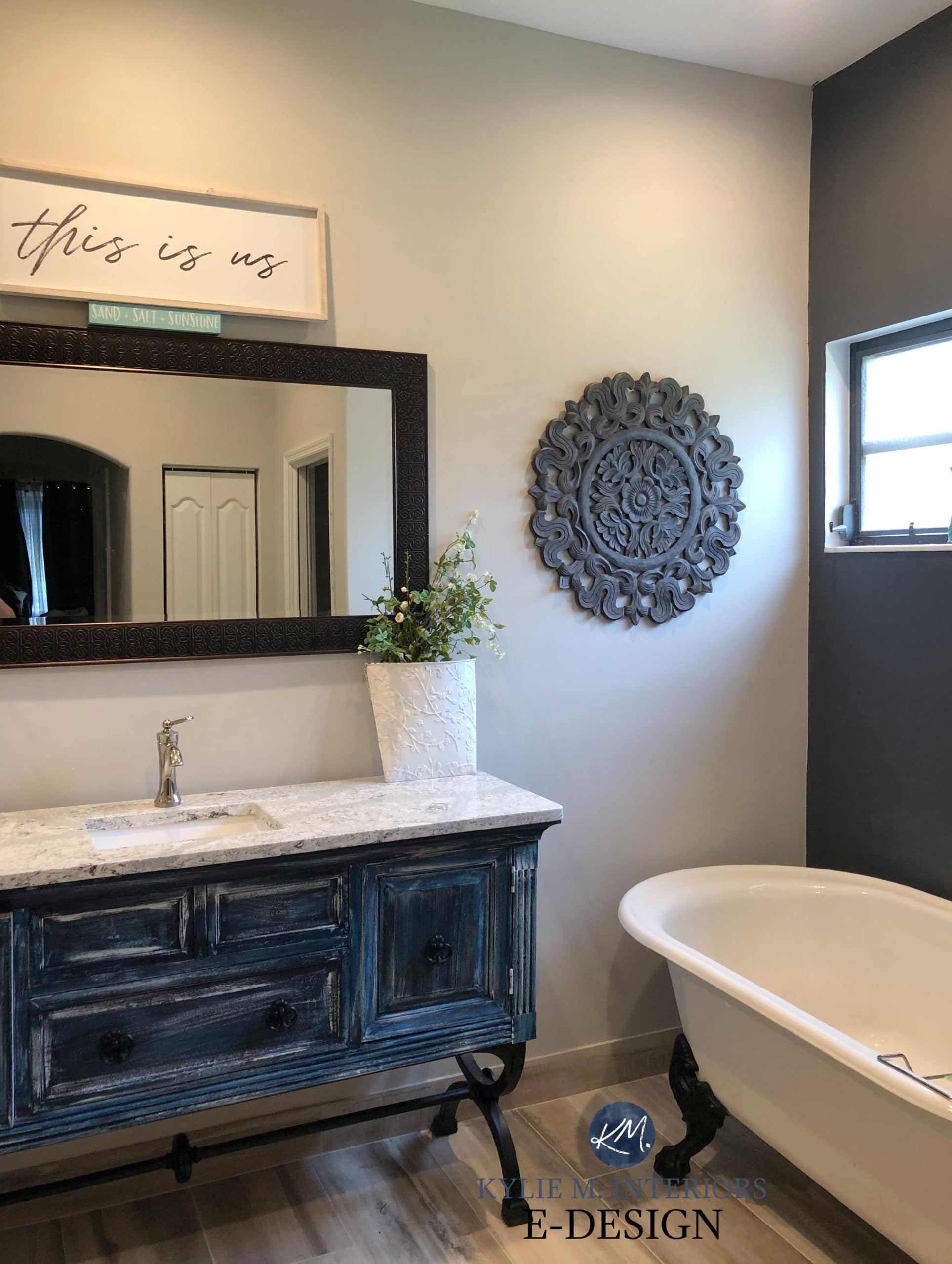
- in the bathroom (with a few exceptions, most can’t)
- doesn’t relate to anything in the room
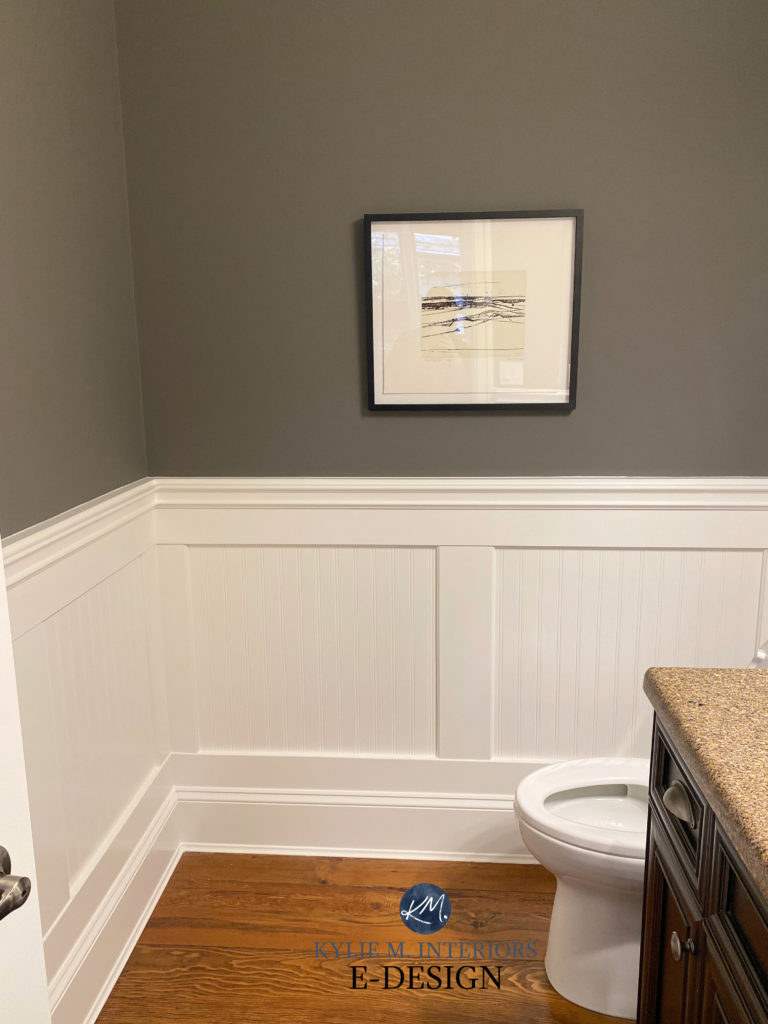
This bathroom (next) is one of the FEW bathrooms that can support a feature wall. This is because the tub area acts as a feature in itself and suits having a backdrop…
CHOOSING A GOOD FEATURE WALL
- highlights a room’s natural architecture
- adds fake architecture or personality to a room that’s lacking interest
- picks up/repeats a colour that already exists in the room, either on hard surfaces or on linens/artwork/dominant decor
- nicely contrasts a colour that already exists in the room
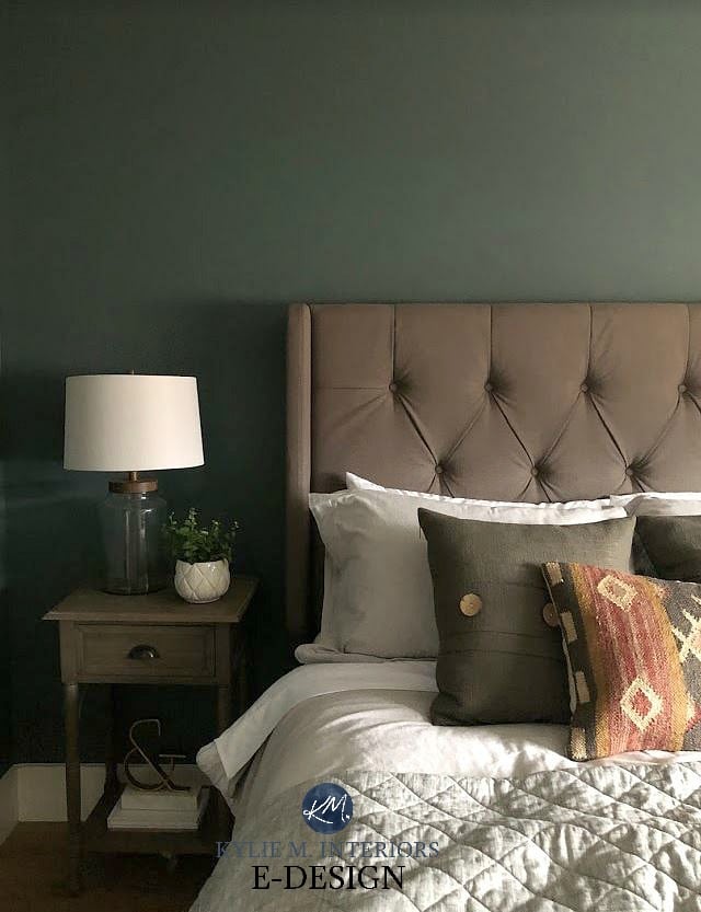
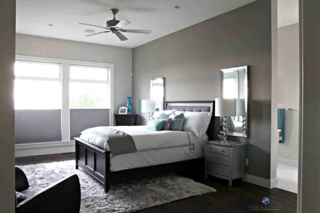
Benjamin Moore Knoxville Gray
And you might be surprised to hear that I have five feature walls in my home – that’s right, five. Although, you wouldn’t know it because they work off the home’s natural flow and suit the rooms they’re in. It’s like I know what I’m doing or something – wink wink.
Before we get into the best feature room COLOURS, let’s talk about placement.
THE 7 BEST PLACES TO PAINT AN ACCENT WALL
While you might be tempted to throw a feature wall on any wall that strikes your fancy, there should be some serious method to the madness.
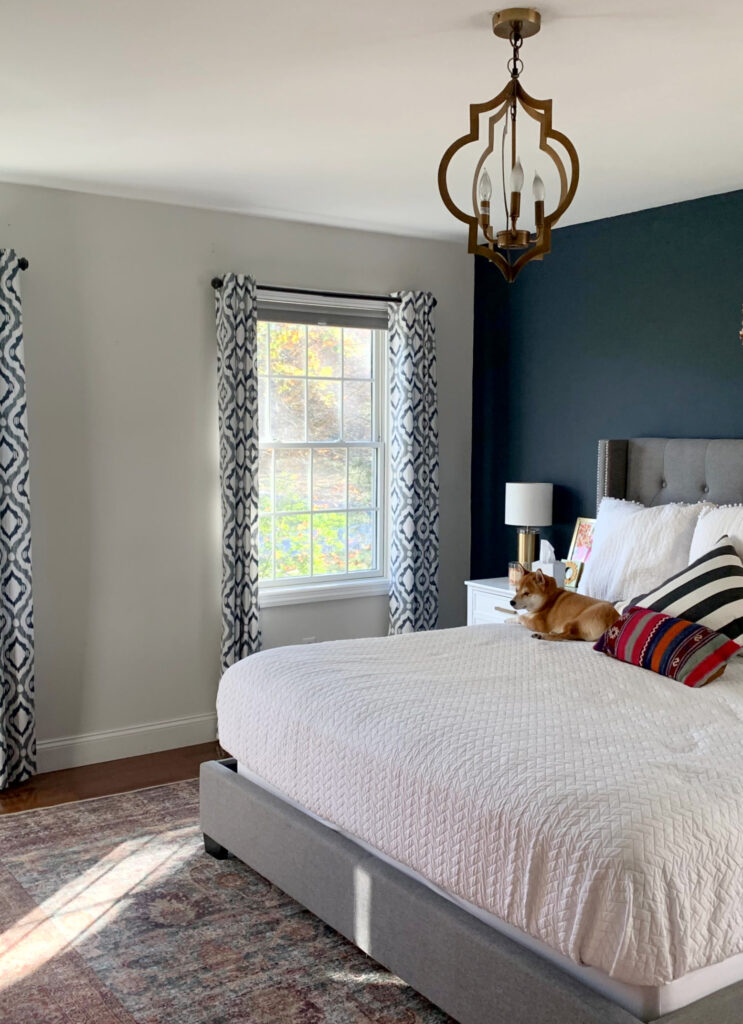
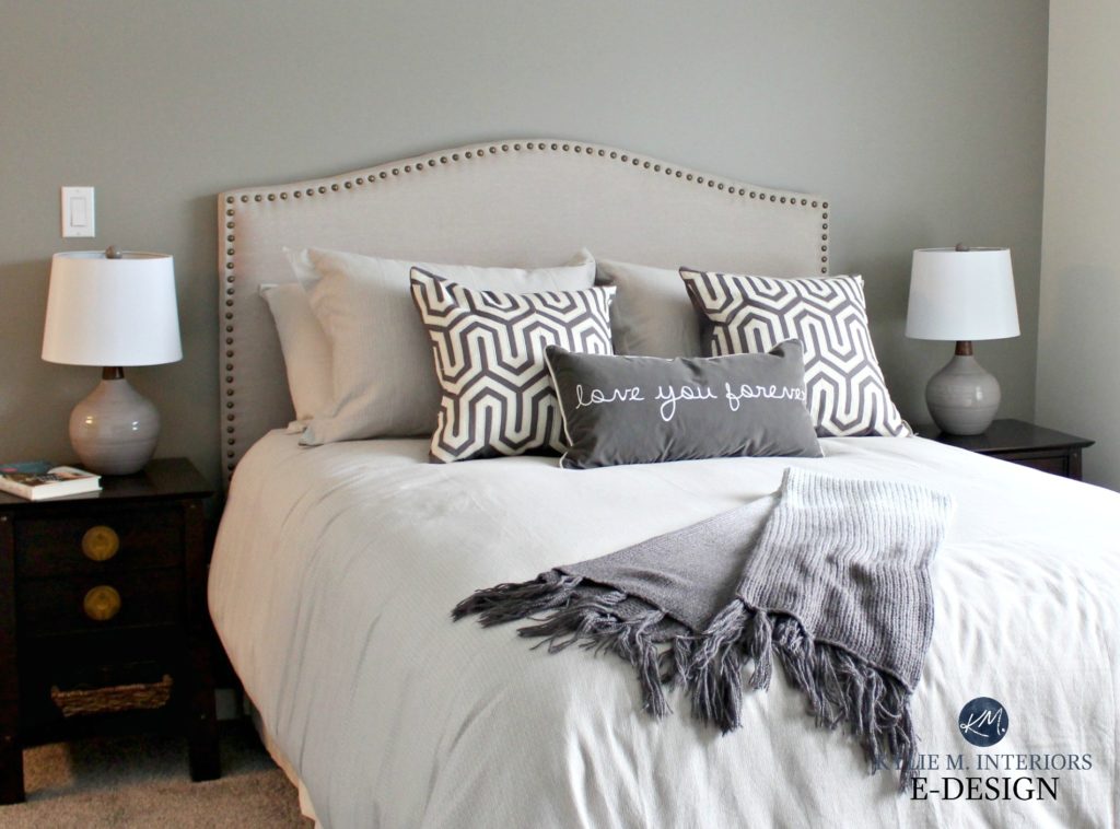
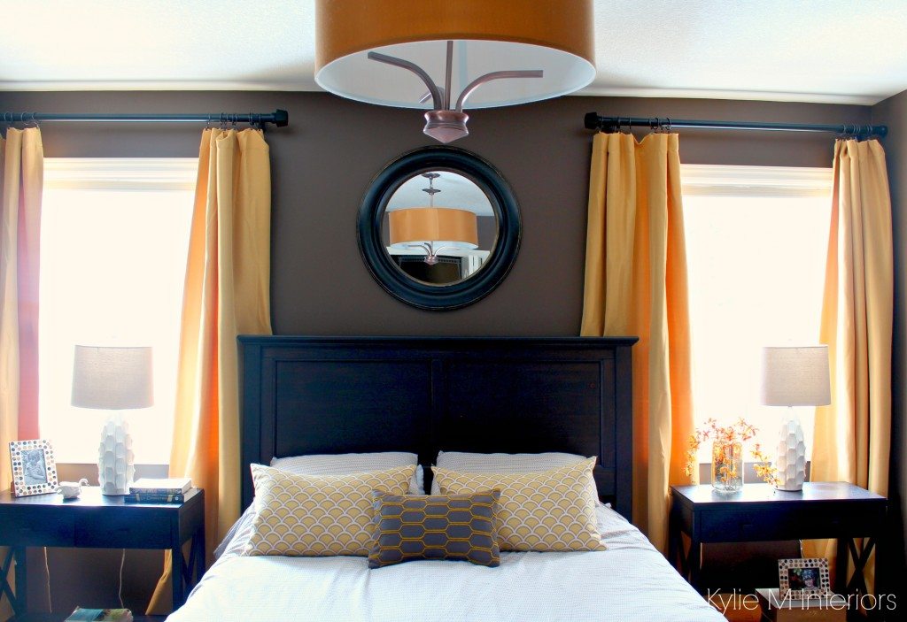
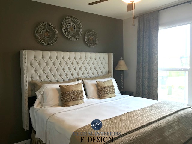
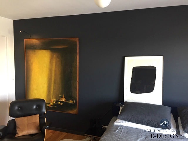
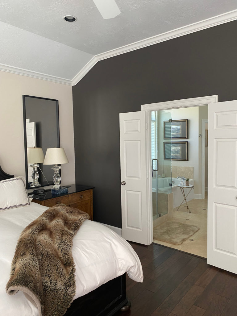
1. THE HEADBOARD WALL IN A BEDROOM
Generally, the headboard wall is usually the main one you first see when you walk into a room; you usually walk UP to it. It’s rarely the closet/door wall and isn’t the window wall very often (contrary to a few of my photos). Also, it’s not ideal if you have to walk into the room and have to turn around to see the headboard/feature wall, but again, a particular layout might dictate otherwise!
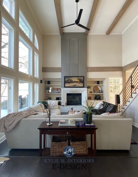
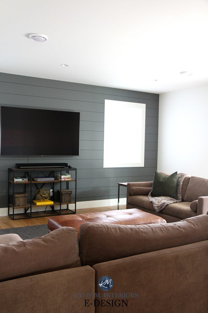
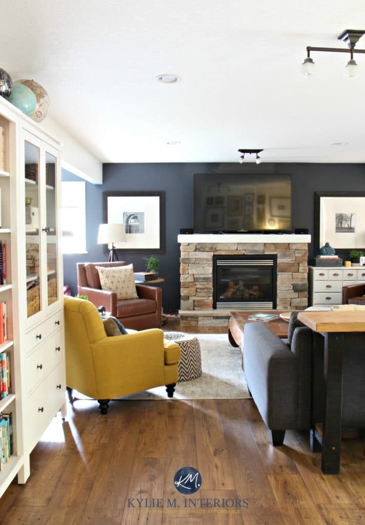
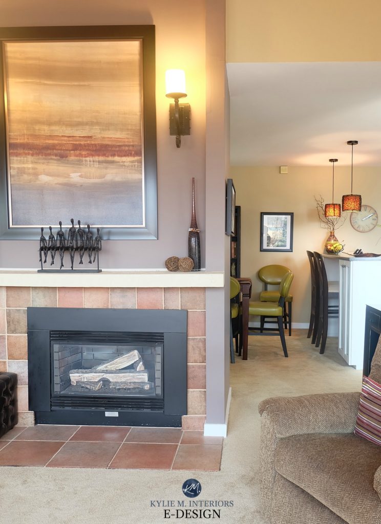
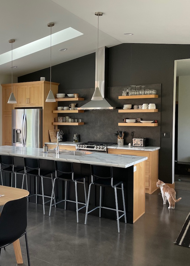
2. THE FIREPLACE OR TV WALL MAKES A GREAT FEATURE WALL
When painting around a fireplace, this can be the area above it OR the walls on either side of it. As for a TV wall, it would be the ENTIRE WALL around it. You won’t often find the feature wall colour on the walls beside AND above the fireplace – only when the drywall is one continuous piece rather than having a bump-out above the fireplace.
If the above isn’t totally clear, this next photo shows how only the BUMP-OUT is painted the feature colour, and the walls on either side stay the main colour.
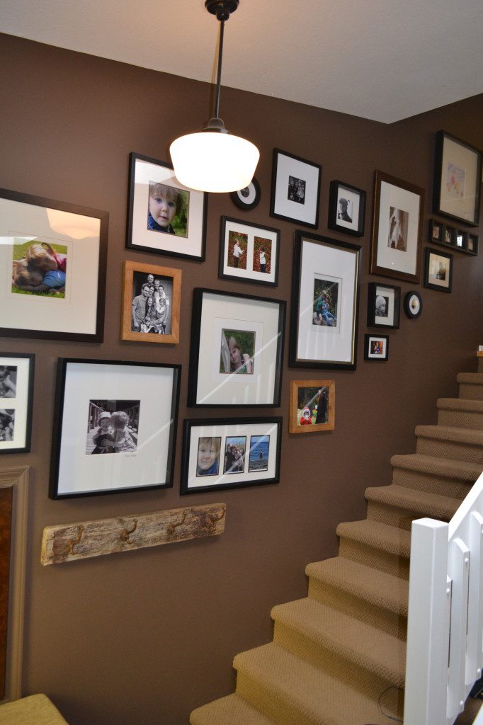
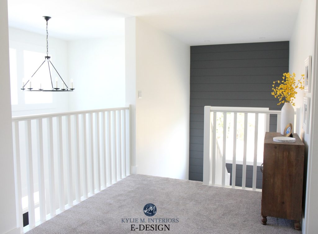
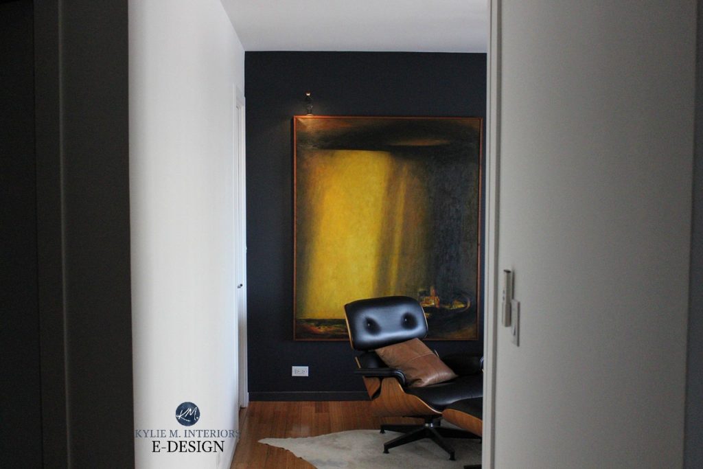
3. AN ACCENT WALL ON THE BACK WALL OF A HALLWAY OR STAIR LANDING
Sure, it won’t brighten the hallway, but it WILL add personality and depth!

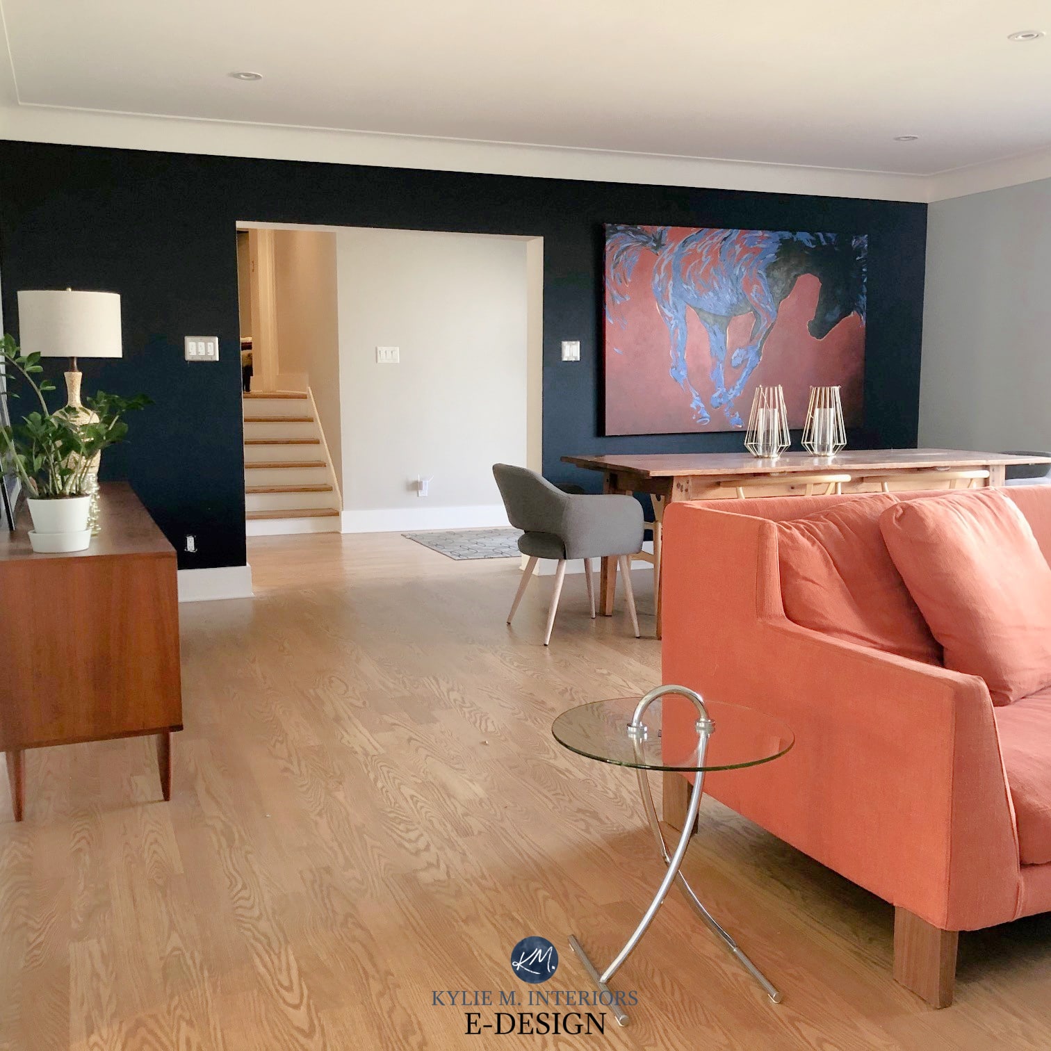
4. ACCENT THE MAIN WALL IN A LIVING ROOM OR FAMILY ROOM
The main wall is usually the wall that the longest piece of furniture is on.
5. ACCENT A UNIQUE OR INTERESTING PART OF YOUR ARCHITECTURE
What’s unique can vary depending on the home and the layout. In fact, some features are better left the same colour as the main walls.
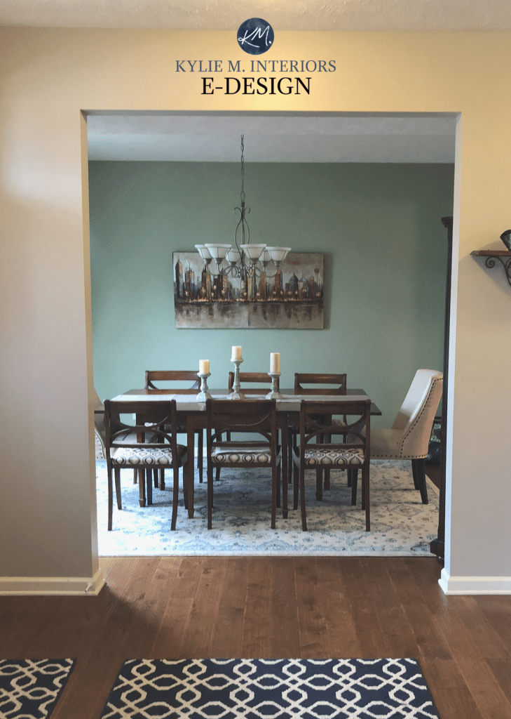
6. ACCENT WALL ON THE MAIN BACK WALL IN THE DINING ROOM
This often works best when the remaining dining room walls are painted the same colour as the adjoining rooms, just so the palette doesn’t get too busy.
7. A FEATURE WALL IN A STAIRCASE IS A GREAT IDEA
This can be the back wall of the landing area (on a two-part staircase) OR the main wall that runs along one side of the staircase from top to bottom.
Now, are you ready to get into the juicy stuff? No, we’re not looking in my side table drawer; we’re looking at paint colours!
Not sure what to paint the other walls in your room? The Best Off-White Paint Colours
THE BEST NAVY BLUE & GRAY-BLUE PAINT COLOURS FOR FEATURE / ACCENT WALLS
Blue or gray with a blue undertone is one of my FAVE choices for a feature wall, as it can suit warm AND cool paint colors. Not only that but as far as ‘colors’ go, blue is one of the more timeless accent colors. However, while it may be timeless, it doesn’t suit EVERY home, so make sure your finishes crave it!
BENJAMIN MOORE HALE NAVY HC 154
Oh, Hale yes! Hale Navy is the King of the navy world.
Why?
 Hale Navy is a fine blend between committing to navy blue without going too primary OR too gray. However, this doesn’t mean it’s the best choice. Some find the blue of Hale Navy a bit too strong and dark and need a shade with a softer, gentler approach (with more gray).
Others want MORE blue, as Hale Navy is too tame, in which case I’ve got some great options tucked in here (but finish this blog post first, there’s way more coming up!).
The Best Navy Blue Paint Colours / Hale Navy shown with Benjamin Moore Silver Satin
BENJAMIN MOORE ANCHOR GRAY 2126-30
Anchor Gray is a beautiful dark navy blue with a STRONG grey in it, offering a blue but subdued approach compared to the strength of Hale Navy.

In the above photo, while this colour is wrapped around the room, the idea is to show you the colour beside the fireplace to accent the colours in the stone.
Anchor Gray is great for those who want to wink at blue without a full commitment (it’s like a Tinder date versus a marriage).
Benjamin Moore Anchor Gray: Paint Colour Review
SHERWIN WILLIAMS CYBERSPACE SW 7076 & WEB GRAY SW 7075
Cyberspace comes in a HOT second place to Hale Navy. Same idea, but a bit grayer while still leaving a great shot of navy on the wall. Web Gray is like a slightly lighter version of Cyberspace and can come across as just a touch grayer.
Sherwin Williams Cyberspace: Paint Colour Review
Sherwin Williams Web Gray: Paint Colour Review
BENJAMIN MOORE STEEL WOOL 2121-20
Steel Wool is a GRAY paint colour with a subtler, softer approach to blue. It’s more of a soft, medium depth and leans considerably grayer, with more of a blue-purple undertone to it.

Benjamin Moore Steel Wool: Paint Colour Review
THE BEST DARK GRAY & CHARCOAL PAINT COLOURS FOR ACCENT & FEATURE WALLS
While I might lean hard into the blues and gray blues, I have to say that the request I get the most often HAS to be gray – just good old gray. But, as you may or may not know, gray has undertones, so make sure you pick the RIGHT gray for your room!
BENJAMIN MOORE CHELSEA GRAY HC-168
Chelsea Gray is a VERY solid medium-toned charcoal gray with a softness to it, so it’s not an icy cold gray. It can pick up a vague green undertone.

Paint Colour Review of Benjamin Moore Chelsea Gray
SAMPLIZE peel-and-stick paint samples are more AFFORDABLE and made with each paint brand’s actual paint.
And they show up on your doorstep in 1 DAY!
Visit the SAMPLIZE website HERE
BENJAMIN MOORE AMHERST GRAY HC-167
Amherst Gray is a DARK gray paint colour similar to Chelsea Gray, but it has more depth (more in the med-dark range) and can also grab that wink o’ green.
Paint Colour Review of Benjamin Moore Amherst Gray
SHERWIN WILLIAMS DOVETAIL SW 7018 & DORIAN GRAY SW 7017
Dovetail is a medium-toned warm gray paint colour. It favours a vague purple undertone and can grab THE TINIEST touch of green, but it rarely shows up to the party. Dorian Gray is a lighter version and is slightly more likely to grab that wink o’ green.
Read more…
Paint Colour Review of Sherwin Williams Dovetail
Paint Colour Review of Sherwin Williams Dorian Gray
BENJAMIN MOORE ESCARPMENT CC 518
Escarpment is a beautiful, considerably warm gray paint colour with a decent, but not overwhelming purple undertone.
SHERWIN WILLIAMS GAUNTLET GRAY SW 7019
Gauntlet Gray is the med-dark version of Dovetail, so it has more body and visual weight.
Paint Colour Review of Sherwin Williams Gauntlet Gray
Thank you to all of my Colour Consulting clients for sending in your after photos – you make my colourful little world go round!
BENJAMIN MOORE KITTY GRAY 1589
This one is a personal fave, as shown in the hallway of our old home. Kitty Gray is a medium-dark charcoal with a GOOOORGEOUS green-blue hue. I can’t WAIT to get the chance to use this colour again somewhere in our new home.

Sherwin Williams 10 Best Gray and Greige Paint Colours
SHERWIN WILLIAMS GRIZZLE GRAY SW 7068
Grizzle Gray is a snuggled up nice blend between gray and green. It’s MOST definitely not a gray with a passive green undertone, but it’s also not a strong green – it’s right in the middle!
Sherwin Williams Grizzle Gray: Paint Colour Review
THE BEST GREIGE, TAUPE & BROWN COLOURS FOR A FEATURE OR ACCENT WALL
With trends leaning warmer, it’s no surprise to see more dark greige, taupe and brown on the scene. So, let’s see what we’ve got…
What’s the Difference Between Greige and Taupe?
SHERWIN WILLIAMS KEYSTONE GRAY SW 7054
Keystone Gray is a beautiful, soft, medium-toned greige that slightly favours beige warmth over gray, but not by much.
BENJAMIN MOORE BROWN HORSE 2108-30
Brown Horse is brown but not overly fudgy (a technical term) NOR grayed-out.
BENJAMIN MOORE KINGSPORT GRAY HC-86
Kingsport Gray is a classic neutral paint colour nestled nicely between gray and brown. It’s more likely to favour brown over gray, but not by a HUGE amount.
SHERWIN WILLIAMS ANONYMOUS SW 7046
If you aren’t afraid of green, Anonymous is WICKED gorgeous, showing up as a solid medium-toned greige with a gorgeous green undertone.
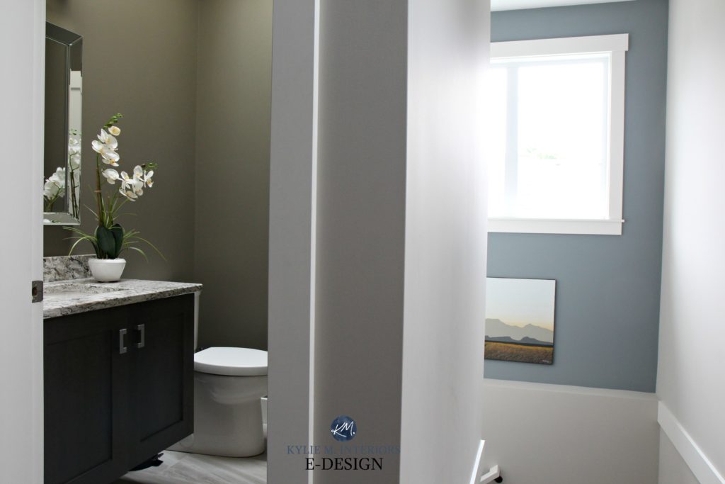
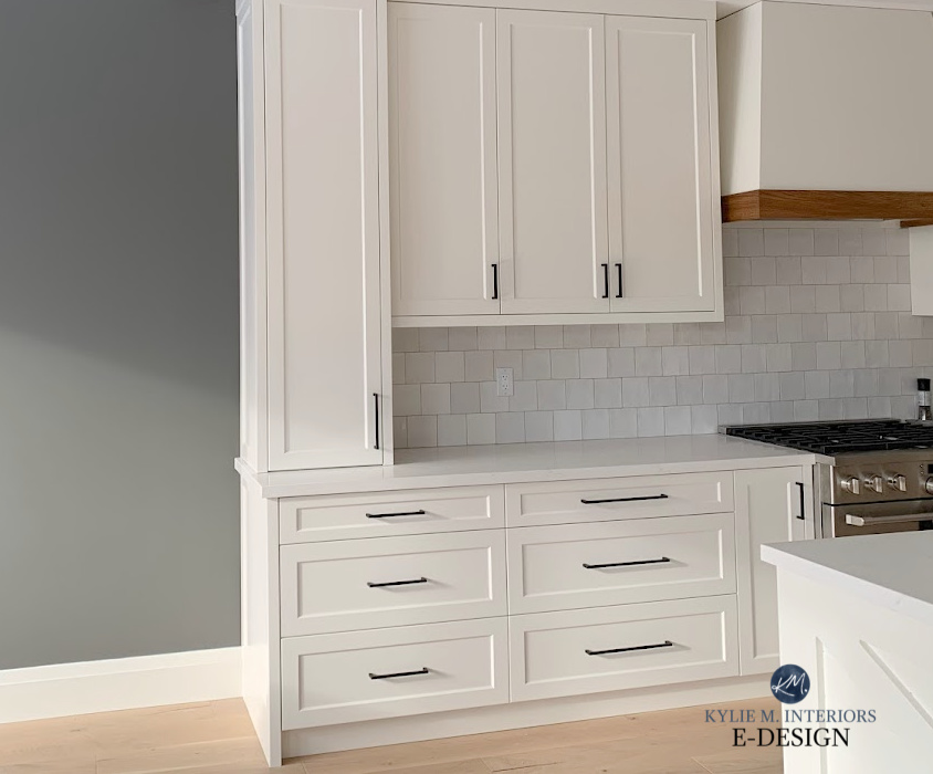
While the above photo doesn’t show a feature wall (in the powder room), it acts as a feature of sorts to the hallway, as the room was small enough to be wrapped up in it!
SHERWIN WILLIAMS BACKDROP SW 7025
Backdrop is a brown paint colour with a nice dose of grey in it, making it ALMOST taupe-grege in its approach.
BENJAMIN MOORE WHITTALL BROWN HC-69
Whitall Brown is a beautiful brown paint colour with a slightly mocha-inspired approach. It’s a softer approach compared to the depth and richness of Brown Horse.
THE BEST PAINT ‘COLOURS’ FOR A FEATURE OR ACCENT WALL
If you’re in the mood for MORE colour, I get it; I love colour too. But, for mass appeal, I focused most of my efforts on the most popular colours my clients asked for. If you need help picking your fave colour, I’d love to take a look at your home via my E-design! Otherwise, let’s take a quick boo at a few beauties…
BENJAMIN MOORE TAWNY ROSE 2173-20
Tawny Rose is a rich, rusty paint colour. Not red, not orange, not brown, just a beautiful blend of them all!
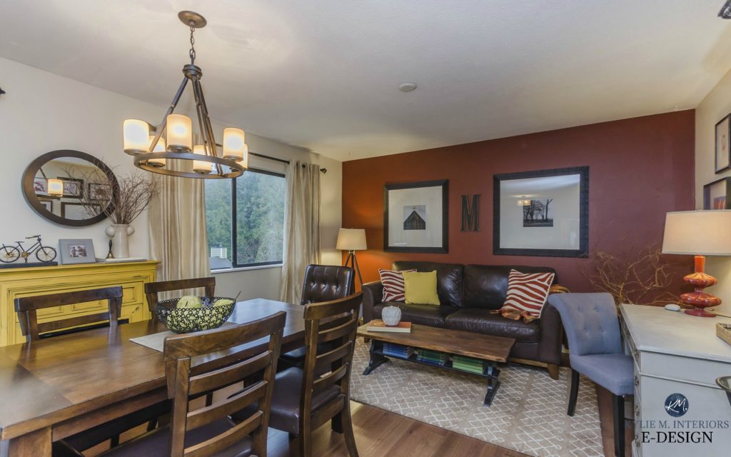
Photo by Artez Photography
Similar to Tawny Rose are Cinnamon, which is a bit more orange/bright and Sienna, which is a bit darker and more grounded.
BENJAMIN MOORE SMOKED OYSTER 2109-40
I love me some Smoked Oyster. Not only does it taste great on crackers, but it also looks beautiful on a feature wall! Just be sure not to mix the two up, or you could have some stanky walls and a terrible snack.
BENJAMIN MOORE AZURE WATER 677 or GULFSTREAM 670
Here’s a nice pop of colour for you! Azure Water and Gulf Stream or both gorgeous teal colours, so they’re blue-green blends. They both have a bit of gray to calm them down, but Azure Water has MUCH more, whereas Gulf Stream has very little. Azure Water is a bit calmer, and Gulf Stream is a bit more fun. Tim is Azure Water; I am Gulf Stream.
BENJAMIN MOORE STRATTON BLUE HC 142
Benjamin Moore Stratton Blue is a very soft, medium-depth blue-green blend with some gray to calm it down. And while it’s not as punchy as the previous shades, it offers a WICKED pretty contrast to white trim!
The 8 Best Blue-Green Blend Paint Colours
THE BEST DARK & BLACK PAINT COLOURS FOR AN ACCENT / FEATURE WALL
I love dark paint colours, either on a feature wall or in an entire room. But not EVERY room can pull them off. Sometimes colours with darker LRVs are just too much for a space and overwhelm it. Make sure you have the lighting and decor before you commit to one of these bad boys.
The Ultimate Guide to Paint Colours and LRV
BENJAMIN MOORE GRAY 2121-10
You’ll have NO luck finding Gray by its name alone, as Pinterest will show you ALL of Benjamin Moore’s gray paint colours! You need the number/code to find this bad boy – and he’s worth looking at! Gray 2121-10 is a damn dark charcoal with a passive blue-purple undertone. Remember, blue can swing a few different ways, so make sure you’re getting the type of blue you like the most!
SHERWIN WILLIAMS IRON ORE SW 7069
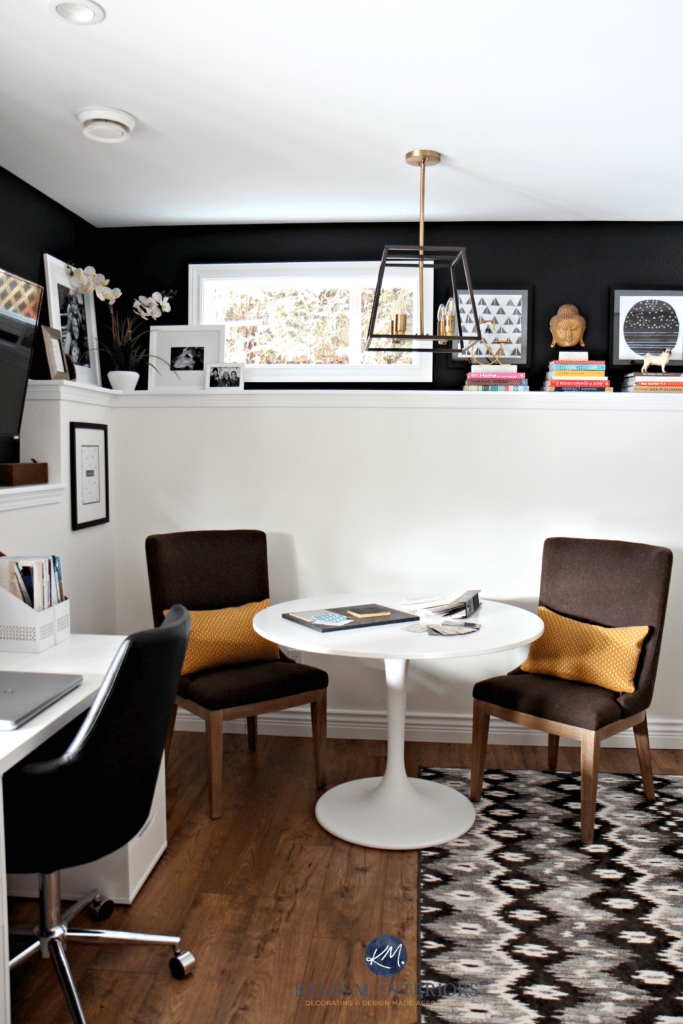
Iron Ore. He’s deep, he’s dark, he’s moody, and he’s a great way to get the contrast of a black without the stark/harsh look of it. Iron Ore can also pick up a vague, almost green undertone. I painted our home office this colour in our last home, fondly referred to as the home from Hell, our ‘summer home’, but didn’t get a good shot of it as I was too wrapped up in my wine-infused misery.
However, I DO have a great shot of it in my Colour Consulting client’s home; check it out…
BENJAMIN MOORE RACCOON FUR 2126-20 or WROUGHT IRON 2124-10
Raccoon Fur and Wrought Iron give me the warm fuzzies – but that’s because I love double-ds. Hey, not THOSE kinds of double-dd (a girl can dream) but the OTHER kind – paint colours that are deep and dark. Raccoon Fur and Wrought Iron are similar, being NOT quite black paint colours. They’re just a fine blend of black, blue (with a purple undertone) and dark gray.
I have Wrought Iron (not shown above) in our master bedroom, and it’s wicked gorgeous. However, Tim’s always leaving his undies around, so I haven’t been able to snap a great photo yet. Regardless, you’ll find that Wrought Iron is just a bit more blackish and slightly less colourful than Raccoon Fur.
The Best Steampunk & Industrial-Inspired Paint Colors
Paint Colour Review: Benjamin Moore Wrought Iron
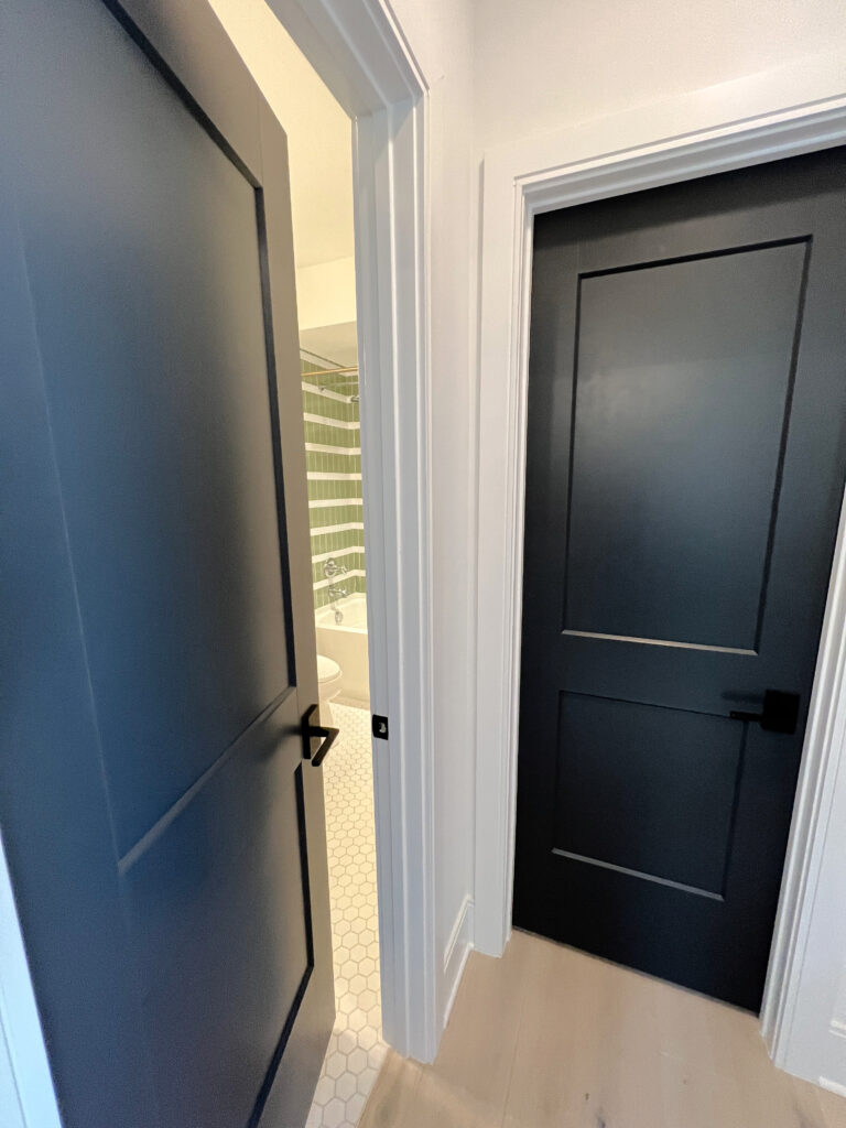
And don’t forget; DOORS make for awesome feature areas too! See if your interior doors or the inside of your front door can handle a little personality, like these GORGEOUS black doors in this next photo…
And to cover a few questions you might have…
SHOULD AN ACCENT WALL BE LIGHTER OR DARKER?
Feature walls are usually DARKER than their surrounding walls. If you want a subtle contrast, choose a feature colour approximately two shades darker than your main colour. On the other hand, If you want some serious drama and contrast, check out DARKER colours that are MANY shades darker or even entirely different COLOURS for your main walls!
Sherwin Williams Urbane Bronze offers a high-contrast look to Sherwin Williams Moderate White
WHAT’S THE BEST PAINT COLOUR FOR A FEATURE WALL?
These days, I’d say the two most POPULAR feature wall colours are Sherwin Williams Dovetail and Benjamin Moore Charcoal Slate – but ask me tomorrow as they change all the time!
ARE PAINTED ACCENT OR FEATURE WALLS STILL TRENDY?
While I wouldn’t say feature walls are POPULAR, how good they look is relative to the home they’re in. OVERALL, no, feature walls aren’t overly trendy, but this doesn’t mean your home won’t suit one.
CAN I PAINT MORE THAN ONE WALL AN ACCENT COLOUR IN A ROOM?
If you want to paint two walls an accent colour, you risk diluting its effect. Sure, some more UNIQUELY shaped rooms can handle this, but the average room is BEST with only ONE wall in a feature or accent colour.
So, there you have it, my funny friends!
RELATED BLOG POSTS
The Best Navy Blue Paint Colours for Cabinets, Feature Walls and More
The 6 Best Dark Greige & Taupe Paint Colour: Sherwin Williams
Vining Ivy: PPGs Colour of the Year (A Colour REVIEW)
The Best Off-White Paint Colours
Sherwin Williams: 5 of the Best Neutral Paint Colour
Not sure what to paint the OTHER walls in your room? Not sure what YOUR best feature wall colour is?
Check out my Online Paint Colour Consulting packages!
Chat soon,

Originally written in 2019, updated in 2022
Comments
Leave a Reply
More Posts

The 5 Best Creamy White or Off-White Paint Colors
THE ELUSIVE ‘CREAMY WHITE NEUTRAL’ When it comes to light, warm neutrals, it’s all in the undertones. And other than pink and green, yellow is the undertone many of my
Read More

The 8 Best Warm Neutral Paint Colors With NO Yellow Undertones!
The Top Light Depth, Warm Colors That Aren’t Cream! When choosing the best warm neutral paint color for your home, whether creamy white, beige, taupe, or greige, your choices are
Read More

The 12 Best Farmhouse Sinks of 2024
FIND YOUR DREAM SINK HERE… While traditional farmhouse design was all the rage in previous years, the embers have definitely cooled. As for MODERN farmhouse, it’s still kickin’ its cowgirl
Read More


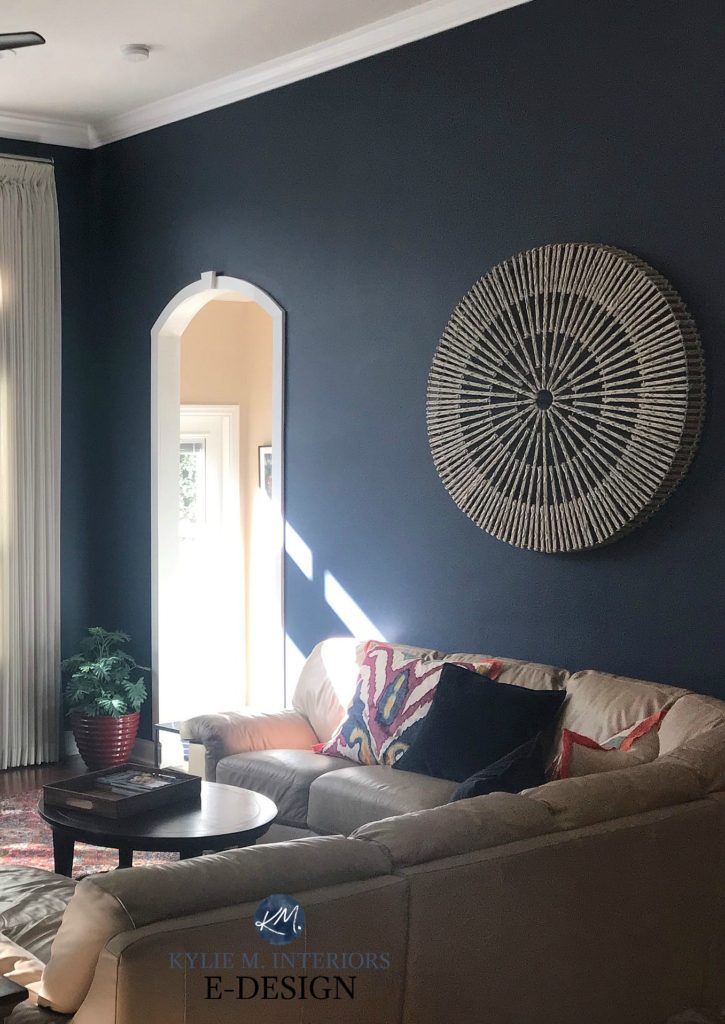
What color is the green that was the feature wall in your bedroom? It’s lovely!
Author
Thanks Rachel! That was actually BM Knoxville Gray – so stinkin’ gorgeous!
Ok girl, fess up – which pics above are of your current home? Just trying to get a sneak peak 🙂
Author
Oh you are too funny 😉 Seriously, I HAVE to do a blog post on that – thanks for the reminder! I get so excited about other ideas and get distracted!
Thanks for another awesome post, Kylie. Now I just need to buy a bigger house with more feature walls!
Author
I know, they can be addictive!
Great post, as always.
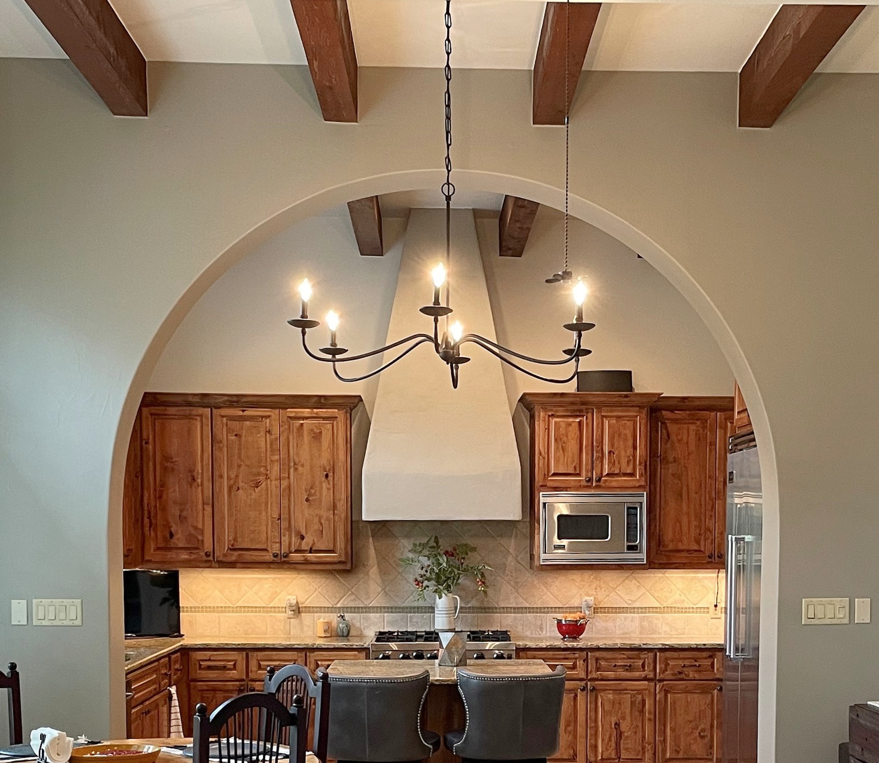
The chandelier in the first photo is gorgeous! Can I ask where I can possibly buy one?
Thanks so much!
I fell in love with SW Gauntlet Gray as soon as I saw it at our home improvement store and have been planning on using it for my cabinet painting project in a few weeks. My husband said it was too “moody” of a color to use in the kitchen, but I think it would contrast well with our light-colored floors and light green feature wall with bead boards. Do you think it would still be a good color to use on kitchen cabinets?
Author
Well, I think Gauntlet Gray is a STUNNER, as long as it suits the floor, countertops and backsplash. HOWEVER, I do worry about it with the light green feature wall, as light green isn’t a colour I would normally partner with Gauntlet Gray 🙂
Hi ! Great post! i have snowbound on my trim and fireplace and I want to do a feature wall on fireplace, we love blue/navy/charcoal (all of the above really) but they all seem so cold against the snowbound. (in our house it looks a very sharp white). I would love your recommendation for a colour that is dark but warm with snowbound? Even a green or green undertone ?
Hi Kylie! Loving all of your info! Wondering what wall would work best for a feature wall in our bedroom. We have a tall headboard that is at a diagonal in the corner between the North and West walls. Both walls have large windows on them almost the entire length of the wall. This is the only place our tall headboard fits. So I would almost have to paint both walls the feature color to make it not look awkward. I don’t want to make it feel boxy by having two feature walls and two neutral walls. Or should I paint the longest wall in our room which is the South Wall that you do not see as you walk in so you would have to turn to see it. The south wall has the door into the bedroom. It would have our tall armoire and I could dress that wall up with a feature picture Etc. The East wall is nothing special, it is our dresser with mirror and also closet door so I don’t think that would make the best feature wall either. I love the idea of creamy gray walls with a blue / Grey feature wall. Just not sure which wall is best!! Thanks for any info you send my way! Your blog posts have saved me from many mistakes already 🙂
Author
Hi Kim, it sounds like the LONG wall might just be the best choice!
Hi Kylie, My whole house is Alpaca, I want to do an accent wall in my bedroom. Thinking about Mink, Backdrop or Gibraltar. What are your thoughts?
Thanks.
How do you feel about BM Kendall Charcoal? I have many clients that use that for a feature wall. I personally love the drama!
Author
YES, I love Kendall Charcoal – definitely!
Would love to get Input on choosing paint colors for the adjoining walls of an Accent Wall. Like if accent wall in a bedroom with minimal light is Indigo batik torn on side walls. Trim and ceiling is alabaster. Trying to decide if walls should be alabaster too or do a light blue gray. Don’t want to take away from the focus wall though