
Posted on February 7, 2024 by KylieMawdsley
The Top 6 Warm Neutrals for Any Room
Are you blah’ed out by beiges and not-so-nutty about neutrals? Well, don’t be! There are some fan-tan-stic tans out there that act not only as backdrops to your home’s features but also help neutralize or camouflage unwanted elements.
But not all neutrals are created equal. These days, the top shades are in the off-white and light range, offering a fresher, warmer take on previous trends. However, not everyone loves these muted shades, craving a color with a bit more meat on its bones!
First, let’s talk about the difference between beige and tan.
This post may contain affiliate links. If you make a purchase through links on our site, we may earn a commission.
I’ll start this by saying, ‘You do you, boo‘ If it makes it easier for you to see beige and tan as the same thing, that’s cool with me. Or if you see things as opposite from what I’m explaining, that’s okay too. The key here is to understand the UNDERTONES you’re looking for in your paint color.
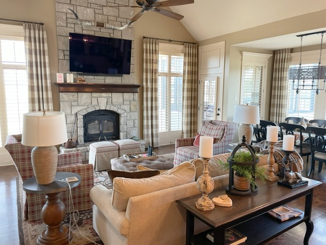
Paint Color Review of Benjamin Moore Lenox Tan
Never judge a color by its name—just because it says the word ‘beige’ or ‘tan’ doesn’t mean it is (the same goes for gray, white, etc.)
BEIGE PAINT COLORS
Shades of beige center themselves on an orange undertone. From there, they can lean orange-yellow or orange-pink, but orange is the boss. The most popular, useable beiges are orange-pink ones. There are also the odd beiges that flash a touch of green, but the base is still orange.
Benjamin Moore Bar Harbor Beige is a LEGIT beige as it has a strong orange-pink look…
TAN PAINT COLORS
Tan paint colors center themselves on a yellow undertone. From there, they can be yellow-orange or yellow-green, with the yellow being the stronger hue.
Benjamin Moore’s Manchester Tan is definitely a tan, as it has a yellow undertone and a tiny wink o’ green hiding in it…
BEIGE & TAN & LRV
LRV stands for Light Reflectance Value (learn more HERE; it’s amazeballs). It’s a number that EVERY SINGLE paint color has, and it lets you know how light or dark a color is on a scale of 0-100. Really, for homeowners, the scale is 2-95 (with 2 being the darkest black and 95 being the whitest white we can get), but you get the idea.
Many of today’s popular shades of beige and tan have LRVs between 60 and 75. These are beautiful shades, but some people find them lacking in body and warmth. Which is why I created this blog post!
Most of these buxom beiges and tantalizing tans have LRVs between 40-60.
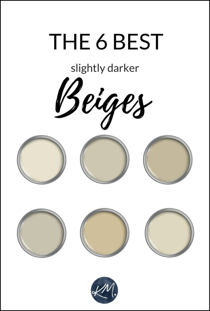
The above colored lids are just placeholders, not actual colors
1. BENJAMIN MOORE GRANT BEIGE HC 83
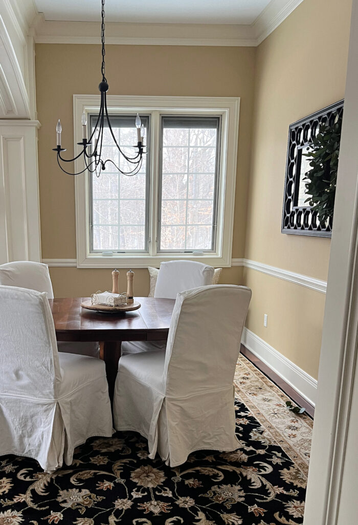
Grant Beige is a tan paint color that isn’t too light or too dark, thanks to its moderate LRV of 56.65 (learn more about LRV here). And regardless of what its name says, Grant Beige is pretty darned ‘tan’ as it doesn’t have that typical golden beige look. In fact, in a north-facing room, Grant Beige can even lean slightly greige.
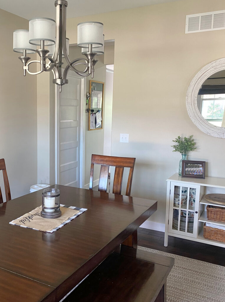
The above photo shows a dining room in Grant Beige with pretty ‘average natural light.’ In a room with more natural light, a color like Grant Beige (or lighter) will wash out more.
MORE ABOUT GRANT BEIGE
- The LRV of Grant Beige is 56.65, putting it on the darker side of the light range. It’s certainly not a heavy, dense color, but it’s not fresh and bright.
- While it can suit many rooms, it can be a bit heavy for dark hallways, in which case, check out Manchester Tan for a slightly lighter approach (listed below)
FULL Paint Color Review of Benjamin Moore Grant Beige
The Ultimate Guide to LRV and Picking Paint Colors
2. BENJAMIN MOORE BENNINGTON GRAY HC 82
Bennington Gray has more meat on its bones than a typical beige or tan paint color, but it sure as heck isn’t gray like its name suggests. You’ll also find Bennington Gray looking slightly warmer than Grant Beige without being too golden/yellow-toned.
MORE ABOUT BENNINGTON GRAY
- Even though it has gray in its name, it’s NOT remotely close to gray.
- It’s a great way to get a warm look without being golden for those of you with an aversion to yellow or orange.
- With an LRV of 46, it has good visual weight, so it will cozy up your room rather than lighten it.
- Bennington Gray CAN grab a subtle green undertone, so be careful what you partner it with.
Is Beige Back? Is Beige TRENDY?
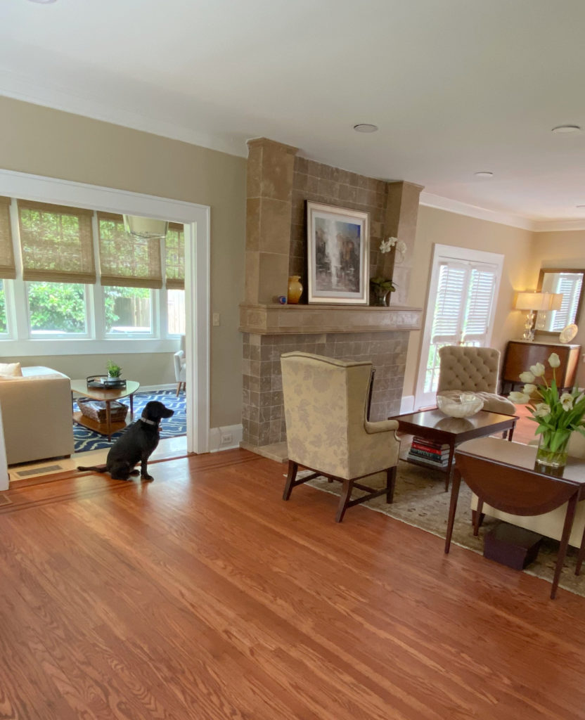
3. BENJAMIN MOORE MANCHESTER TAN HC 81
Manchester Tan is one of the lighter but not washed-out beige/tan colors. It’s flexible enough to accommodate those who prefer a more neutral tan as well as those who love the warmer end of things.
In this gorgeous open-concept home, notice how Manchester Tan (lightened by 25%) picks up a vague green hue on the left. Then, it levels out in the middle, only to pick up a more dusky, almost pinkish tone on the right – OH, THE GLORY OF NATURAL LIGHT!
Paint Color Review of Benjamin Moore Manchester Tan
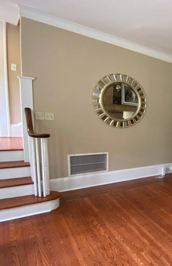
In this next image (my client’s before photo), the violet undertones in the oak floor don’t sit well with Manchester Tan. In return, Manchester Tan shows its muddy, slightly green backdrop. I know this can be hard to see when you’re not used to looking at undertones, but they’re a bit easier to see on the bottom left…
MORE ABOUT MANCHESTER TAN
- It will generally look like a neutral, light tan paint color.
- With an LRV of 64, it’s in a great range for the average room/lighting situation.
- Man. Tan has a vague yellow undertone and can nod towards green with a flirty wink, although it rarely does unless partnered with a finish with opposite (pinkish) undertones (or violet, as shown above).
Paint Color Review of Benjamin Moore Manchester Tan
Get a PEEL & STICK COLOR BUNDLE of Kylie M’s favorite beiges from BM & SW!
4. BENJAMIN MOORE STONE HOUSE 1039
Stone House is a beige paint color and sits quite neutral on the walls. It has an awesome blend of warm undertones and a denser, slightly heavier feeling than the above colors due to its lower LRV of 49.61.
Paint Color Review of Benjamin Moore Stone House
Is Beige Back? Is beige…dare I say, TRENDY?
MORE ABOUT STONE HOUSE
- Stone House has beautiful undertones centered on orange but can flex slightly towards red (pink).
- It handles itself well in any exposure – north, east, south, west.
Click HERE or on the above image to see affordable & fun package options!
5. BENJAMIN MOORE LENOX TAN HC 44
Lenox Tan is a beige paint color with an orange-yellow undertone and is undoubtedly the warmest color on this page. If you aren’t a fan of orange undertones, you’ll want to stay away from this one. However, if you want a slightly warm neutral without a strong yellow, then this could be your best shade!

MORE ABOUT LENOX TAN
- Compare it to Grant Beige to see the warmth that rises.
- The LRV of Lenox Tan is 43, making it a slightly richer choice.
- Once in a while, it picks up a wink of green, but it’s INCREDIBLY passive.
FULL Paint Color Review of Benjamin Moore Lenox Tan
The Best Tan Paint Colors from Sherwin Williams & Benjamin Moore
6. BENJAMIN MOORE SHAKER BEIGE HC-45
Shaker Beige is a gorgeous warm beige paint color with undertones that focus on orange (with an occasional wink of green).
This beautiful beige was popular for many homes built in the late 90s and early 2000s, as many of the finishes from these decades have similar undertones. HOWEVER, it’s a slight miss, as many of these finishes need a beige with NO chance of green. As shown in the image below, Shaker Beige looks a touch green compared to the beige of the travertine tile…
However, when not directly compared to a surface like travertine, Shaker Beige is a GORGEOUS shade!
MORE ABOUT SHAKER BEIGE
- Its depth creates a softer look compared to the slightly richer Lenox Tan, but it still has a decent body to it.
- It has an LRV of 54, so it’s light-ish, but it won’t work as well in a dark room.
- It’s soft, warm, and neutral. It’s not overly golden, but it’s not grayed out either.
And a bonus color!
7. BENJAMIN MOORE WILMINGTON TAN HC 34
While the previous colors have a beautiful warmth, you might be pining for something even more saturated. If this is the case, check out Wilmington Tan.
Found in Benjamin Moore’s Historical Collection, Wilmington Tan is a considerably strong shade of beige, has a beautiful orange base, a secondary yellow hue, and only a touch of green. This combo gives Wilmington a slightly ‘golden’ look without too much weight.
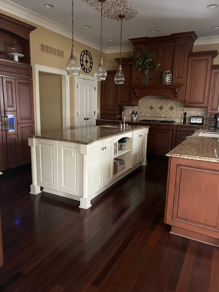
This next photo is the BEFORE photo of my client’s kitchen. Wilmington Tan is so darn close to hitting the spot, but with the typical early 2000s Tuscan-style finishes in this kitchen, the wall color needs a bit more orange-pink, not orange-yellow. The red-stained wood flooring and cabinets also agree…
Check out Kylie M’s favorite TAN paint colors in Peel & Stick Samples! (BM & SW)
Want some darker or lighter shades? Leave a comment, and I’ll be happy to send you the bundle link!
Sherwin Williams Best Beige & Tan With a Bit More DEPTH!
READ MORE
The 12 MOST POPULAR Beige and Tan Paint Colors
The 8 Best WHOLE HOME Warm Neutral Paint Colors
The 5 Best TAN Paint Colors: Benjamin and Sherwin
Is Beige Back? Is beige…dare I say, TRENDY?
Still not sure which is the best color for you?
Check out my Online Color Consulting Packages!

Chat soon,

Originally written in 2014, updated in 2024
Comments
Leave a Reply
More Posts

The 12 Best Farmhouse Sinks of 2024
FIND YOUR DREAM SINK HERE… While traditional farmhouse design was all the rage in previous years, the embers have definitely cooled. As for MODERN farmhouse, it’s still kickin’ its cowgirl
Read More

Trendy & Popular Paint Colors for Your Kitchen Island (Mixed Bag!)
Islands, Vanities, Lower Cabinets? These Colors Have Em’ Covered…Literally It’s hard to beat paint when it comes to affordable kitchen and bathroom updates. However, whether you have wood cabinets or
Read More
The Best Paint Colors to Go With Golden Oak (Cabinets, Flooring, & Trim)
Modernize Your Outdated Golden Oak Home With COLOR! I’ve written a lot of blog posts on updating wood cabinets, covering a wide range of wood stains and grains. This one
Read More


Thank you Kelly, I love to hear that!!!!
Okay, so you have to be careful with the orangey/yellowy bricks that you don’t go too tan/gray/neutral around it or else you risk it just not ‘visually connecting’ with your fireplace. I also LOVE Templeton but it could be too blue – really depends on your home and it’s accents. I love Chelsea Gray and as long as your entryway isn’t a dungeon it can be amazing! You can also consider having it lightened by 1/4 to take the edge off. You’ll find that it should tie in really nicely with your grout and won’t clash at all with your other colours as it really is quite a lovely neutral. I hope that helps you Kelly!!
~Kylie
Hi Jen, sorry for the delayed reply!
These days I try to refer questions to my Online Consulting as I’m so busy with my biz, but sometimes I simply ‘like’ a question and want to answer it because…well, because I want to – so here we go!!!
Okay, so I love that you want to go brave with your colour choice. Sometimes when you have a lot of warm neutrals in a space it’s nice to add some Balance – meaning a cool colour. Carolina Gull is a great way to do that. Some of the earth toned green/blues can go too gray in a lowlight space or in the evening, however Carolina Gull retains it’s ‘colour’ – which means it’s awesome! I had it in my stairwell for a while and loooved it, but as usual, I got bored!
Edgecomb Gray is a great colour but PLLLLLEEEEEEASE don’t put it with you current palette. It’s a gray, but it just barely slightly leans towards the soft end of things, meaning pink. Now I don’t mean it will look at all pink, but compared to some of the more neutral grays (like Gray Owl and Revere Pewter) it just leans that way. And it will lean that way if it’s paired with warm/yellow undertone colours as the undertone will clash for sure!
If you would like to add more grays to your palette, while keeping colours like Sandy Brown, you’ll want them to be dark enough that they aren’t typical ‘light grays’ – like Edgecomb, as they can just look dirty. You might want to lean into grays that have a wee bit of undertone (which means that they will shift colour throughout the day which is a cool thing).
If you took colours like Gray Horse and Sea Haze and had them darkened by 1/4, they would be nice partners with Sandy Brown and definitely lean towards the gray end of things. And Sandy Hook Gray…oh my goodness, Sandy Hook Gray is amazing and would look soooooo good with Sandy Brown. It’s kind of like a gray with a brown/green undertone….I love it….
Okay, so I hope that helps you out!!!
~Kylie
I’ve studied countless sites, have learned so much from you, but I’m stuck.
Upstairs has dark brown walnut floors…downstairs has cherry wood.
Downstairs living room has grand reddish-grey brick fireplace. House is a white and black colonial type. Lots of light downstairs. Big windows. Darker hall upstairs.
I want a light neutral hallway paint with either greige or creamy undertones. I’m torn. Upstairs I want greige undertones in my light paint and downstairs I want creamy warm undertones.
Problem- downstairs to upstairs is continuous…staircase, tall ceilings at entrance. I’m so stuck. What works for one floors doesn’t work for the other.
Is there any hope for a good paint colour? I’ve agonized for months. Paint samples, 100s of paint cards all over the house, detailed study of undertones….still stuck.
Is white my only option?
Sincerely,
Living in fear of white
Hi Kylie,
I’ve really enjoyed looking over your site, very helpful. I’m needing help with paint color. I have stone lion in my living room by Sherwin Williams ( that i feel is too dark for the space). The only natural light I have in the living room is coming from the back of my house which is south facing, as the front of the house is north facing. In my foyer (north facing) I have 50% stone lion ( not much nat. light there either). My living room connects to my dining area that is connected to my kitchen, so pretty much open floor plan. In my dining area I have believable buff, which looks like a soft yellow. I really love it BUT im willing to change it as I want to paint the living room and foyer a lighter color and want it to flow into the dining and kitchen, all one color. I feel the different colors I currently have are too busy on the eye. My color pallet that Im leaning toward is the creams/tans/brown earth tone colors. I love the living room photos that i see on the internet with the cream on creams in various shades. I have bright white trim and wainscoting throughout. The problem I’m having is mainly with my kitchen cabinets. I want a color that will work throughout PLUS compliment my kitchen cabinets. My cabinets are base cream/ distressed/ glazed. With the glazed cabinets im having a hard time finding a color to compliment instead of clashing. My back splash is crema marfil with a medallion of brown/tans/creams. My granite is a Giallo ( I cant recall the exact color, maybe the Verona). I have looked at Accessible beige ( pretty but i feel its too dark in certain light), Ive considered edgecomb gray but looks a little too gray at times. I think the colors look better in homes with taller ceilings and more nat. lighting. If you can sheare some ideas, Id greatly appreciate it. I have tried soooo many samples and they either have too much yellow, too much pink or too much gray undetones.
Thanks!
Author
Hi Melissa! When it comes to questions that are more detailed like yours, it’s really hard for me to give you great ideas without photos, this way I can spend some proper time with you and your home. I try to give as much complimentary info as I can on my blog and if that doesn’t help, then e-design just might! It’s affordable and it’s fun and I can give you some good answers, rather than just guessing at what you’ve explained. If that interest you, the link is here and i do hope to hear from you – I can help! https://www.kylieminteriors.ca/online-decorating-design-services/
`Kylie
Kylie, love love your blog! First time commenter, long time reader. I wanted to paint my house (we just moved) Gray Owl, the kitchen cabinets are wood (kind of sand colour) the tiles around the cabinets are also a sand type colour with some yellow-ish tones. Not a colour I would have picked but it’s not in the budget to replace it right now. Any recommendations? Is Gray Owl a no-no? Thank you!
Author
Hi Ciara, I’m glad you wrote! So, without knowing the sand colour it’s hard to say, but my INSTINCTS say no, that Gray Owl will be too cold and you might need something more along the lines of REvere Pewter perhaps…
If that doesn’t feel good, I do have an E-design service (it’s affordable and fun) and then I can look at your photos/personal tastes and come up with some on-point thoughts for you 🙂 https://www.kylieminteriors.ca/online-decorating-design-services/
~Kylie
Hi Kylie,
I’ve been reading you blogs for months and they are super helpful! I painted most of my house BM Revere Pewter thanks to your advice! Just a quick question – will Benjamin Moore Grant Beige work as an accent wall with BM Edgecomb Gray? I think they are both in the greige family with a greenish undertone, right?
Thanks so much!
Mel
Author
Hi Mel, I probably wouldn’t – Grant Beige should come up TOO beige for Edgecomb! You might want to try BM Pashmina… 🙂
Hi Kylie, thanks so much for responding. I should have explained my dilemma further. I’m looking for a neutral warmish beige colour to paint our north-facing living room. We have mid-tone reddish hardwood floor and a light gray/beigish stone fireplace. We have a chocolate brown couch. I want a slightly darker colour to accent the fireplace wall. Also we have Revere Pewter in the adjoining hallway so I didn’t want anything that would clash with that. Hoping you can suggest 2 colours for me! Thanks again!
Ugh! I just got done painting my family room in SW Accessible Beige (based upon your description of the color and its undertones) and I am seeing a light celery green – not the look I was going for at all! The room has an east facing patio door, a west facing window, golden oak wood trim and “Chicago old” brick fireplace that dominates the room. I’m ready to try a different neutral.Any suggestions? Home Depot mixed the color for me in PPG eggshell, would that account for the green that I am seeing?
Author
Ahhhh yes, colour matching CAN work, but not always. I had THE EXACT same thing happen to another client! You can also get some green if you have a lot of grass/trees reflecting in from outside.
Hi Kylie
I just purchased a pewter leather sofa with a tan accent chair and I was wondering what colour would look best in my living room facing South? I have glass tables with brass accents as well as lights. Oh Ya also oak trim unfortunately. I was swinging toward grant beige as I like paint with Lrv around 50. If you have a better suggestion I would love to hear.
Thanks
Author
Hi Cyndy! thank you for your note! I actually have an E-design service just for this! I try to give as much complimentary as I can on my website, but if that doesn’t work you may enjoy sending me photos and getting me to spend some time with your home! https://www.kylieminteriors.ca/online-decorating-design-services/
~Kylie
Hi Kylie!
After finding your website to guide us on colors to paint our townhome for sale, I’ve peen been pouring over your articles to learn as much as I can about colors for our new home! For our Master Bedroom, we have a mostly white bedding with small hints of beige (accent pillow, a throw) because the room has pretty good lighting. I’m trying to decide between Worldy Grey and Berkshire beige for our wall color? Anyt thoughts on which one would work best? Of course, if you have any other suggestions for a calming color, I would be open to looking into it.
Thank you so much!
Cee.
HI Kylie
I love your posts and have learned soooo much from you.
During this pandemic-stay- home-not vworking- time I’m painting through my house, one room at a time. Its been my sanity here in upstate NY. Sometimes Ive mixed paints together to get just the right color. So far, so good!.
. We recently bought a 1840s era home , Im stumped about choosing my living room with south facing windows. Oatmeal colored furniture and a area rug with cream and some soft blues. I would say furniture is a warm tone. The flooring is carpeted for now…oatmeal…but beneath are old plank floors which I hope to refinish. I waa starting to paint Manchester Tan…. but Im not loving it. Its a bit too warm I think… need a bit more grey /greige’ but too much grey woukd clash with my furniture. Any ideas for me? The LVR is perfectvin this range as i I like my woodwoork (Chantilly Lace) to stand out.
I woukd love your suggestions. I’d like to stay with Ben Moore paint. There is a store nearby and love the coverage on my walls.
Thank you!
KylieM Will any one of these beige paint colors pair well with White Dove ?
Would love to know the answer to this as well! 🙂