
Posted on February 1, 2023 by KylieMawdsley
The Top 9 Gray & Charcoal Paint Colors: Benjamin Moore
Gray is undoubtedly one of the most popular paint colors. And with various depths, shades, and undertones, it’s easy to see why gray has been a top choice for walls, cabinets, exteriors, and more.
This post may contain affiliate links. If you make a purchase through links on our site, we may earn a commission.
However, when choosing a gray paint color, you must pay EXTRA close attention to the undertones. Of course, you always have to pay close attention to undertones when picking a paint color, but they are far sneakier when tucked into gray.
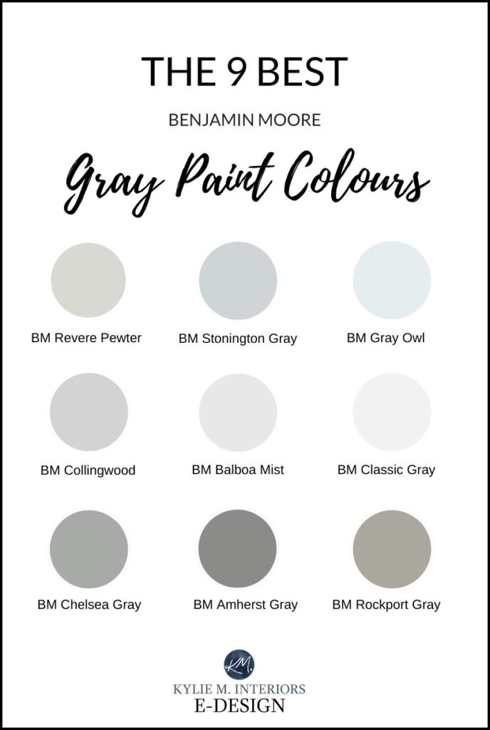
THE BEST GRAY PAINT COLORS
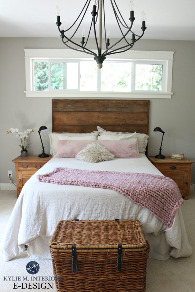
1. BENJAMIN MOORE REVERE PEWTER HC-172
Revere Pewter is a light (closer to light-medium) warm gray. Revere Pewter is slightly warmer than some other comparable grays and has an earth-toned look when up against fresh and cool grays. It’s also WELL-known for picking up a faint green undertone.
All About Benjamin Moore Revere Pewter
OR check out my wicked video here!
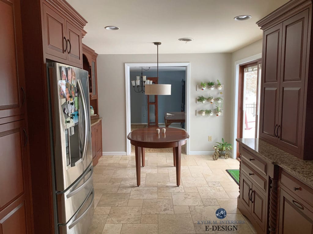
Revere Pewter is also gorgeous on kitchen cabinets and interior doors…

See more of this kitchen remodel here
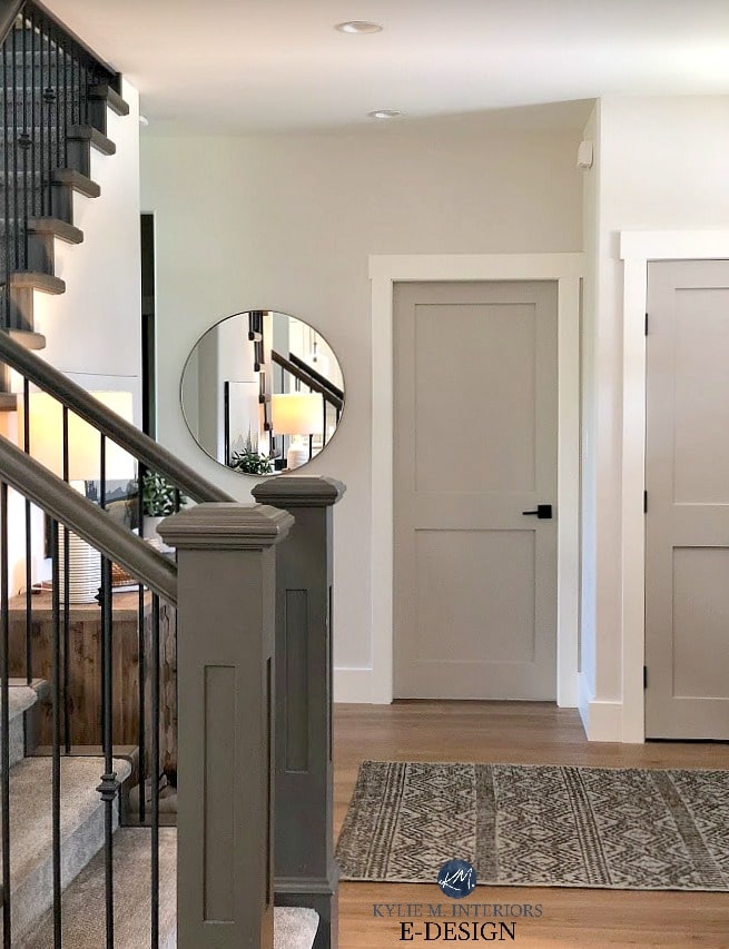
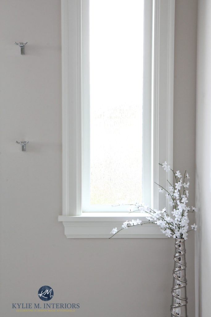
See more of this entryway here
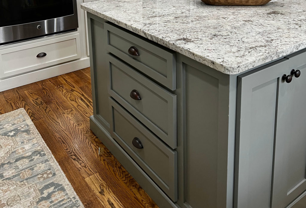
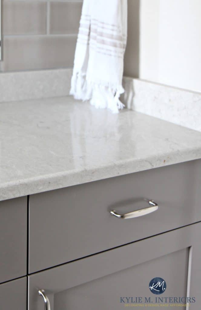
Revere Pewter was darkened by approx 25-50% for the above kitchen cabinets and doors. Why? Sheen affects how a paint color looks, and with the satin sheen (vs. the standard eggshell on walls), it would’ve looked too soft at regular strength.
WHY IS REVERE PEWTER A POPULAR WARM GRAY?
- While it’s in the light range, it borders on the light-medium range and can be heavy for a dark room or hallway.
- If it’s a bit darker than you want, try lightening it by 25% or check out Benjamin Moore Rodeo
- With an LRV of 55, it’s important to note that Revere Pewter will not be a fresh, bright gray. While it won’t absorb light, it’s not going to reflect a ton either if you don’t have great natural or artificial lighting (learn some AMAZING THINGS about lighting HERE).
It can also work on a home’s exterior (especially when paired with Cloud White) but can look warmer than you’d expect with natural light!
Pick the Best Paint Color with LRV
2. BENJAMIN MOORE STONINGTON GRAY HC-170
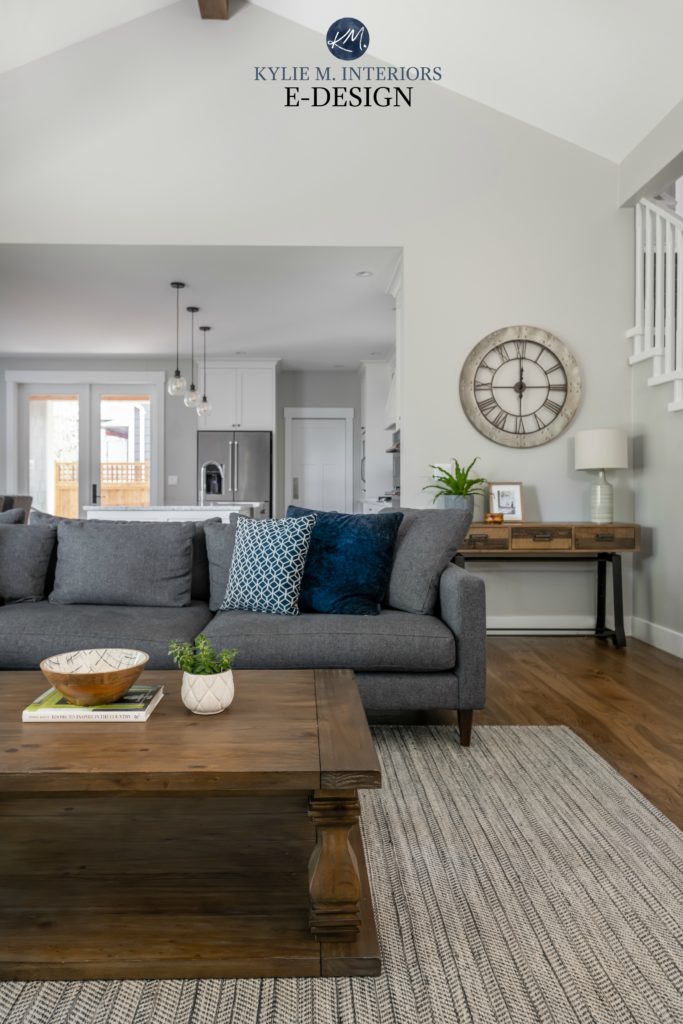
Stonington Gray is very comparable to Revere Pewter in depth; however, it’s on the cooler side with its passive stormy blue undertone. Compared to Revere Pewter, it will look like a cleaner, cool gray but can sometimes slide slightly blue or blue-green with its undertones.
WHY IS STONINGTON GRAY SO POPULAR?
-
The cool nature of Stonington Gray will help balance out the heat of a south-facing room.
- It can pick up a tiny (wee tiny) touch of green, but don’t expect it to – it heavily favors blue.
- It’s a light color; however, it’s more of a ‘heavy’ light as it’s not AS fresh as many other gray colors (like Gray Owl below…).
- The LRV of Stonington is 59, a bit better than Revere Pewter, but not HUGELY different. Overall, because Revere Pewter is a bit more muddy-looking, Stonington Gray will look fresh in comparison.
Color Review Comparing Stonington Gray & Gray Owl
3. BENJAMIN MOORE GRAY OWL OC-52
Gray Owl is a light gray paint color with super subtle undertones of blue and green.
Gray Owl CAN look good on a home’s exterior, but if it gets a good hit of natural light (south or west), it can wash out a LOT. It’s best suited to a home with frontal northern exposure.
5 Steps to Picking the Best EXTERIOR Paint Color
WHY IS GRAY OWL ONE OF THE MOST POPULAR GRAY PAINT COLORS?
- Gray Owl works well in south-facing rooms. While it can work in a north-facing room, it won’t look REMOTELY warm.
- It’s beautiful and fresh with white paint colors.
- Gray Owl has a green undertone (that also loves to flex over to blue), but overall, it often acts like a soft, light, fresh gray.
- With an LRV in the mid-60s, Gray Owl WILL freshen and brighten a room as it reflects natural/artificial light back into the space.
Color Review Of Benjamin Moore Gray Owl
4. BENJAMIN MOORE COLLINGWOOD OC-28
While Collingwood isn’t greige, it certainly wants to lean that way with its soft, pretty warmth. But just because it LOOKS gray doesn’t mean that it doesn’t have a sneaky undertone hiding inside – specifically, purple.
Paint Color Review of Benjamin Moore Collingwood
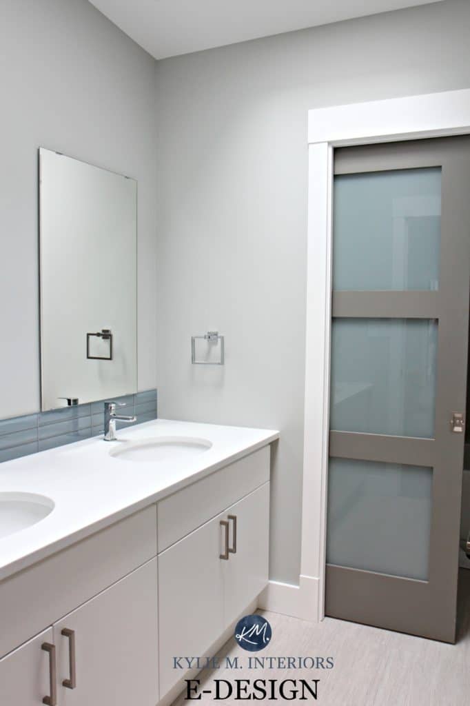
5. BENJAMIN MOORE BALBOA MIST OC-27
Balboa Mist is kind of like a lighter, softer version of Collingwood. It’s also slightly more likely to pick up a very weee wink o’ pink in its purple undertone.

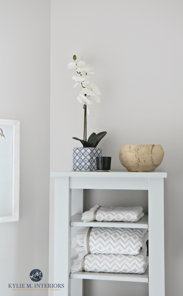
See more of this stunning bathroom here: A Marble Inspired Ensuite
Paint Color Review of Benjamin Moore Balboa Mist
WHY ARE COLLINGWOOD & BALBOA MIST POPULAR SHADES OF GRAY?
- with trends leaning warmer, warm grays like Balboa Mist and Collingwood are more likely to last
- Collingwood and Balboa Mist look great with cherry-toned cabinets
- they do well in north or south-facing rooms but thrive best in reasonably well-lit rooms
- the LRV of Balboa Mist (LRV 67) with Collingwood coming in at 62 – BANG on my magic number!
North, East, South, West: Which Paint Color is the Best?
6. BENJAMIN MOORE CLASSIC GRAY OC-23
Classic Gray is a beautiful off-white gray with subtle warmth to it. Unlike Revere Pewter, which can cast green, Classic Gray has a weeee drop of purple, which can sometimes lean just slightly purple-pink. I’m NOT a pink/purple fan at all and have this in my home and LOVE it.
Classic Gray walls, Sherwin Williams Pure White cabinets
See more of this project here
WHY IS CLASSIC GRAY A POPULAR WARM GRAY PAINT COLOR?
- Classic Gray is a warm gray, but it doesn’t have enough beige/warmth in it to be greige.
- It has an LRV of 74, so it’s pretty darned light while offering a bit of contrast with the right white trim.

Click HERE or on the above image to see available packages
SAMPLIZE peel-and-stick paint samples are more AFFORDABLE, EASIER, and ENVIRONMENTALLY FRIENDLY than traditional paint pots.
- samples arrive ON YOUR DOORSTEP in 1 business days; depending on the location
- they’re more affordable than the samples pots/rollers/foam boards that are needed for traditional paint sampling
Visit the SAMPLIZE website HERE
7. BENJAMIN MOORE CHELSEA GRAY HC-168
Chelsea Gray is an AWESOME medium-toned gray. Not too light, not too dark…juuuust right. Chelsea Gray contains only a wink of undertone – green, but it can be VERY vague. And believe it or not, it’s actually a WARM gray, but you’ll hardly know it unless you compare it directly to cooler gray paint colors.
Chelsea Gray is a beautiful choice for kitchen cabinets, as long as your countertop/flooring can humor that vague green undertone.
Stonington Gray walls / Chelsea Gray doors
WHY IS CHELSEA GRAY A POPULAR DARK GRAY PAINT COLOR?
-
Whether it’s a small or large bedroom, Chelsea Gray is neither overwhelming nor underwhelming as long as you are comfortable with some depth.
-
Chelsea Gray is fantastic as an exterior color, particularly on the body of the house.
-
Great for cabinets and furniture.
- Chelsea Gray has an LRV of 23 – it will absorb light and look quite heavy in a room without adequate lighting.
Full Paint Color Review of Benjamin Moore Chelsea Gray
How to Pick the Best Paint Color with LRV
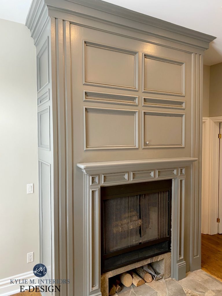
8. BENJAMIN MOORE AMHERST GRAY HC-167
Amherst Gray is like a darker version of Chelsea Gray that’s EQUALLY as beautiful on walls, cabinets, cupboards, furniture, and feature/accent walls. And like Chelsea Gray, it does love to grab a wink o’ green!
In this next photo, notice the gorgeous green undertone on the Amherst Gray accent wall…
Next, look how much warmer and brighter Amherst Gray looks on this fireplace surround via the paint finish (satin) and the artificial light shining on it…
IS AMHERST GRAY A POPULAR DARK GRAY PAINT COLOR?
- While Chelsea Gray is definitely MORE popular, Amherst Gray is top amongst those looking for a shade with more DEPTH.
-
Amherst Gray can be too strong for an entire room if you don’t have good natural and artificial lighting. However, it ALWAYS looks fab as a feature/accent wall or on cabinets.
-
Amherst Gray is a great shade of gray for the exterior body of your home if you’re looking for some drama and depth (it’s also a great accent/trim color).
- The LRV of this paint color is under 20…yup, it’s dark. If you want something a bit darker, check out Kendall Charcoal.
Benjamin Moore’s Best DARK Gray Paint Color
FULL Paint Color Review of Benjamin Moore Kendall Charcoal
9. BENJAMIN MOORE METROPOLIS CC-546
Compared with Chelsea Gray, Metropolis is very similar in depth (Chelsea Gray is only a tiny wink darker). Where you’ll see the BIG difference between these two dark shades of gray is in their undertones. Chelsea Gray caters to a very mild green; Metropolis caters to a violet undertone.
And while both are warm grays, Metropolis is likelier to pass as a taupe/warm gray, whereas Chelsea Gray is most definitely GRAY. Of the two, I suggest Metropolis 10x more than Chelsea Gray for my Online Paint Color Consulting as it tends to suit more projects.
WHY IS METROPOLIS A POPULAR SHADE OF GRAY
-
Putting green next to Metropolis will bring out the purple undertones, so be cautious if that isn’t the look you’re going for.
- While Metropolis is a warm gray at heart, it’s warm enough that, in some cases, it looks more like a dark taupe.
- Every gray has undertones, and it’s important to find the one that best suits your surfaces. The violet undertone of Metropolis tends to suit more interior finishes.
- ALL of the above photos are via my Online Color and Decorating Services!
Still not sure which color to pick?
Check out my E-Design and Online Color Consulting Services!
READ MORE
Benjamin Moore Graystone Paint Color Review
Sherwin Williams 12 Best Gray & Greige Paint Colors
The Best DARK Greige & Taupe Paint Colors – Benjamin Moore
The Best WHOLE HOME Gray & Greige Paint Colors
Chat soon,
2021, UPDATEDIN 2023
Comments
Leave a Reply
More Posts

The 5 Best Creamy White or Off-White Paint Colors
THE ELUSIVE ‘CREAMY WHITE NEUTRAL’ When it comes to light, warm neutrals, it’s all in the undertones. And other than pink and green, yellow is the undertone many of my
Read More

The 8 Best Warm Neutral Paint Colors With NO Yellow Undertones!
The Top Light Depth, Warm Colors That Aren’t Cream! When choosing the best warm neutral paint color for your home, whether creamy white, beige, taupe, or greige, your choices are
Read More

The 12 Best Farmhouse Sinks of 2024
FIND YOUR DREAM SINK HERE… While traditional farmhouse design was all the rage in previous years, the embers have definitely cooled. As for MODERN farmhouse, it’s still kickin’ its cowgirl
Read More


Help! Im on the hunt for a very light and bright greig paint color. I have revere pewter in my entryway and it is MUCH too dark. I’m wanting the same tone, but much lighter. I tried lightening RP by 50% but its still reading very dark in my house. Classic Gray is reading a little too purple for me but it has the “brightness” I am looking for. Any ideas?
Author
Hi Jamie! When it comes to personal questions, I do try to refer to my E-design, this way I can take a look at your room and come up with options based on your exposure, furnishings, floorings, etc…, otherwise I’m just guessing! I do have fun and affordable packages! https://www.kylieminteriors.ca/online-decorating-design-services/
~Kylie
You definitely have a talent that I don’t have. How does one see the undertones in a gray paint (or any neutral for that matter) without A. being told by an expert like you or B. painting the entire room and seeing in all types of lighting? I see color and the depth of the color (dark/light) and that’s it – until it’s all over the wall and I’m crying over a glass of wine.
What warm grey would you suggest for interior trim? I love Chelsea grey but it is a bit too light and not contrasty enough for our rustic grey wood flooring. I think Kendall is too dark. Is Amherst as warm a grey? How about Asphalt?
Author
Hi Ginny! With gray, there are SO many undertones to consider – in particular the type of gray that’s in your rustic wood flooring. I mean, off the top of my head ASphalt could work, but I can’t really say without seeing your home! If you’d like me to take a look, I do have an affordable E-design service. That question would fall under the ‘1 Room Package’ (using it for the trim, rather than the walls 🙂
Hope to chat soon! https://www.kylieminteriors.ca/online-decorating-design-services/ This way I can spend some quality time with your room, rather than just guessing.
~Kylie
Hi Kylie,
I have a manchester tan in my living room with a peacock blue accent wall.
I am wondering if you could please suggest what color would go well on connecting hallway walls and the walls on staircase leading up to the upper floor hallway?
Thanks,
Shifa
Author
Hi Shifa! When it comes to personal questions there is a lot more for me to consider, otherwise I’m just guessing! If you’d like to check out my E-design it is affordable and fun – this way I can look at photos of your space and spend some time with it! https://www.kylieminteriors.ca/online-decorating-design-services/
~Kylie
So glad I found this blog post on Pinterest! I am currently struggling and overwhelmed with picking a color to paint our house exterior. It’s currently a light tan and I want something darker and more “interesting” yet neutral in the gray/charcoal family. We also have a reddish brick that we need to keep in mind. Currently looking closely at Kendall Charcoal and Chelsea Gray… but fearing that Kendall might be pretty dark. I was glad to see you mention Chelsea Gray as a great exterior color!
Gray Owl has been my next front-runner
I am looking for a gray for my entire first floor and up the staircase to the second floor. I was thinking Gray Owl, because its neutral but not sure if its too light for the entire floor. My other thought was stonington gray. What do you mean when you say that they aren’t “warm” grays? Any thoughts would be much appreciated!
Thanks,
Laura
Author
Hi Laura! Warm grays tend to have a bit of beige or softness to them. Some people will say that Gray Owl is a slightly warm gray, but really – it’s gray and can pick up cool gray undertones, specifically blue and green. A warm gray would be something like Cumulus Cloud or Collingwood. Of the 2, I would lean toward Gray Owl. I’ve done many spaces and entire floors in this colour and it just settles really well. If you have TONS of natural light it will be pretty light, but then it levels it out in darker areas – I find it a slightly more safe bet than Stonington in that regard…
Hi Kylie
Loving your suggestions and knowledge of color undertones. I have a quick question, looking for a lighter hue that complements stonington gray for a room that faces south/east. So far I have classic gray , gray mist etc., am I on the right track? Fungi shui table of elements suggest white is the killing color for south/east facing rooms and there growth color is blue and green for the resource color (undertones I am assuming). Would love your opinion on my quest for color!
Love your blog and website, beautiful display of visual decorating tips and color. So glad that I found you on pinterest!
Thanks, Carole B from NB
Hi. I need help picking a color for my raised ranch, I did Revere Pewter for the accent walls in my dining room and living room and need to pick a color for the rest of the house. I did Stonington gray in the sunroom which is off the dining room and I did a edgewood gray in a spare room. I’m tryin to stay in the same family. IT’s so hard. I love revere pewter but just did the accent walls. Thanks
Author
Hi Cinzia, thank you for your note! I do try to give as much complimentary info on my blog as I can, and if that doesn’t work it might be time for me to check out your home via my E-design, this way I can look at your exposure/flooring/decor, etc…, otherwise I’m just guessing! It’s affordable and fun!~ https://www.kylieminteriors.ca/online-decorating-design-services/
~Kylie
Hi Kylie,
I am painting my dining room. I have wainscoting which i prefer to paint white. The furniture is mostly a cremish linen white. I would like a light contrast between the wainscot and gray wall above. I plan on adding colors of rich light to medium blues for carpet, cloths etc.
Do you have a favorite for a light gray for Wall and favorite wainscot white contrast that looks nice with creamy white furniture for a dining room area?
Author
Hi Viktoria! When it comes to personal questions, I do refer to my E-design! I try to give as much helpful complimentary info as I can on my blog and if that doesn’t help, it might be time for a closer look, otherwise I’m totally just guessing as to what your room REALLY looks like. If you’re interested, the link is here, I’d love to help! https://www.kylieminteriors.ca/online-decorating-design-services/
~Kylie
Thank you i will definitely use your e design once i have more specifics for my decorating.
But i was wondering if you had a go to wainscott White that is crisp and bright and a true go to light gray that does not have a lot of undertone ?
Author
Hi Viktoria, that actually is what my E-design is for, talking about specific colours for your home! It can depend on your exposure as even the most timid gray can flash blue/green/purple given the right/wrong exposure!
Hi Kylie,
I don’t know if I ever got a response to my question about whether you can select other finishes as well as paint color. Please advise.
My style is minimalist, Italian modern. I have white leather and light hardwood floors with a bit of an orange or pinkish hue. Can you recommend a light more neutral gray. I plan on using blue accessories for a pop of color.
Thanks for your anticipated response.
Author
Hi C.C.! I can’t seem to find your other response anywhere, but generally I focus on paint colours and it keeps me pretty darned busy! I do have my E-design so that I can take a look at photos of your home, otherwise, I’m just guessing as to what your room really needs with its exposure/finishings/furniture/quality of light/etc… If you’re interested, here’s the link! I will be on vacation for the next few weeks though. https://www.kylieminteriors.ca/online-decorating-design-services/
~Kylie
Have you ever used BM Bone Black? It looks like it’s comparable to SW Mindful Gray which is my favorite but BM paint goes on so much better and looks prettier in my opinion. I can’t find many reviews about Bone Black online….Thanks!
Author
Hi Leslie! It looks like that’s in the special Williamsburg Collection, so it’s not as well known – I’ve never used it! That’s good to know, I’m going to check it out more!
Ok thanks for the reply! I haven’t had a chance to get a sample but when I do, I’ll let you know how it compares to the sample of Mindful Gray on my walls. 🙂
Any advice on pairing Rockport Gray with Jet/Virginia Mist granite? It is a dark black/charcoal granite. I love the warmth/brown undertones of the Rockport which pairs nicely with black counters. Since the Jet Mist can sometimes look gray, just wondered your thoughts on that pairing.
Oh my gosh,. I’m two days into owning my first home and am officially overwhelmed. I have a purple undertone white in the house and it’s killing me. Your posts on Gray, LRV, and which direction the room is facing have been so helpful!!
Thank you so much!
Author
AWESOME, I mean, not the purple undertoned white, but the part about my blog helping – that’s what I love to hear!
Hi,
We have one room in our house that is not Benjamin Moore, but are looking to convert it over. It’s Sherwin Williams Light French Gray. Looking to stay on the lighter side of the grays as an adjacent room has BM Willow Creek and just get a more rich look from aBM gray as the SW Light French Gray leaves a lot to desire. Hallway is revere pewter. Any suggestions ? Thanks!
HELP! I don’t know where to turn. We are redoing out 1950’s ranch house and just redid our backsplash with a light gray subway tile. Our cabnets are a warm wood color and our tile is a beige browinsh color with some grey in it. I can’t pick a wall color. Our kitchen is small so I don’t want to go dark to make the room smaller. Any suggestions would be greatly appreciated. -Lisa
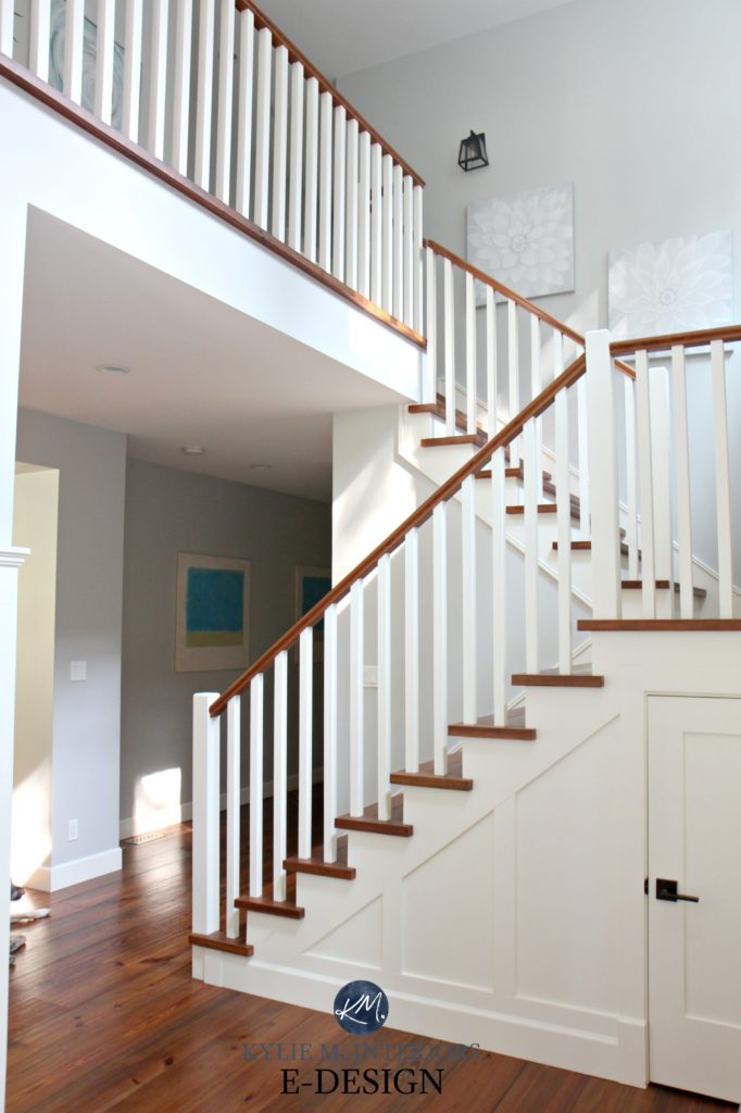
Hi Kylie, I am so glad I stumbled upon your blog when searching for info on the various Benjamin Moore grays. I’m redoing my entry way, which is basically a two story room with staircase. The room is technically north facing, although the staircase landing also is included and has a large east facing wall.
If standing in the front door, there is a large, north facing wall which serves as an accent wall. It is Hale Navy, as is the front door.
I was planning on using Amherst gray on the walls in the staircase (although quite enclosed, the upstairs came room and the front windows 🪟 provide sufficient light to hold the weight of a medium-dark gray) and Stonington Gray in the actual entry way,
After reading your blog, I’m not as certain the two will work quite as well together as I’d originally hoped so it’s back to the drawing board. I think I’m totally committed to the Stonington Gray (for no other reason than we were married, and had our first home in Stonington, CT.lol ) so I’ll have to try out some of the other grays to compliment it