
Posted on February 18, 2024 by KylieMawdsley
GORGEOUS GRAY, BLACK & GREIGE COLORS FOR ISLANDS
I’ve talked a lot about oak cabinets, white cabinets, off-white cabinets, appliances, and wine—sometimes all in the same sentence. But this is my first blog post on the best paint colors for kitchen islands. And let me tell you, it’s a HUGE topic to cover.
Not only do these colors cover kitchen islands (literally), but they can also be used for…
- your bathroom vanity
- the lower cabinets in your kitchen (most likely paired with white or off-white upper cabinets)
- a feature area of cabinets in your kitchen like a built-in hutch or desk
- built-ins (e.g., in your living room, bedroom, etc…)
- mudroom benches and cabinets
This post may contain affiliate links. If you make a purchase through links on our site, we may earn a commission.
Or whatever gets you excited to get your paintin’ pants on (keeping in mind, these aren’t ‘pants required‘ projects).
Now, if you go onto Pinterest or Houzz, you’ll find no shortage of ideas for what color to paint your island or cabinets – we’ll touch on a few of my favorites below. But (a BBL-sized one)…
Just because you CAN paint your island a different color doesn’t mean you SHOULD.
This is why today, we’re not just chatting about some of the best paint colors for your islands, vanities, and lower cabinets; we’re also going to look at some pros and cons to see if it’s even a good idea.
Follow me on INSTAGRAM
PROS TO PAINTING YOUR ISLAND OR LOWER CABINETS A DIFFERENT COLOR
While you might like to think your personal tastes play a big part in color selection, it doesn’t. Oh sure, you want to humor yourself, but it’s more important that a) your space suits a painted island (or other cabinet), b) you choose a color that suits the surrounding finishes, and b) you consider resale if that’s a factor in the coming years.
Let’s briefly explore a few of these topics…
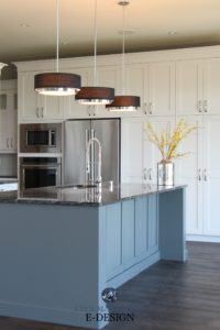
1. A PAINTED ISLAND CREATES A FOCAL POINT & A FOUNDATION
Painting your island a different color from the main cabinets can be a great way to ground your space and create a striking focal point, especially if you have light-colored tile/vinyl and white cabinets.
The same goes for a two-color palette, where the lower cabinets are painted a different color from the upper cabinets. If you have a home that’s a bit monotonous, this can break things up and add interest. It’s also a great choice if your home is more eclectic or ‘homey.’
However, it’s not as popular of choice for homes that are more traditional, modern, or transitional in style. While there are exceptions, kitchens with a two-color upper-lower palette often have more ‘character’ than the average kitchen.
2. A PAINTED ISLAND CAN BREAK UP A WOOD-ON-WOOD LOOK
While some kitchens and X-rated movies can pull off the wood-on-wood look, it can be a bit much if the floor and cabinets more or less blend with each other. Even if they don’t…
Wood on wood isn’t always good.
Breaking things up with a colored island or lower cabinets offers some balance and allows the countertop and backsplash to be pulled into the palette. It also gives the remaining wood surfaces a chance to SHINE, whereas they might have otherwise been hiding amongst all of the grains and stains.
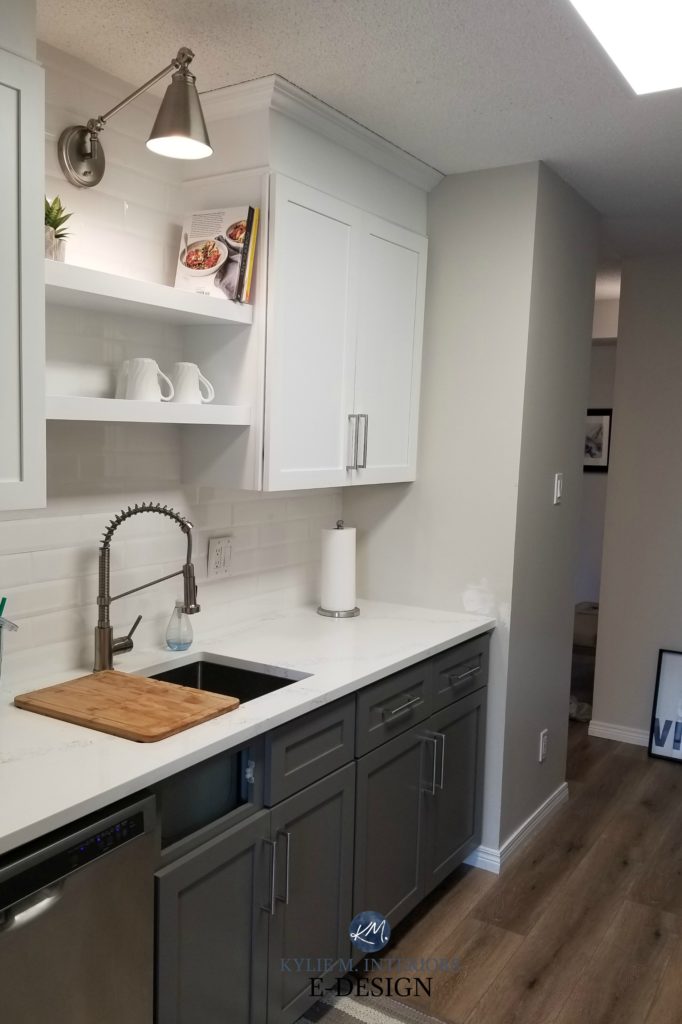
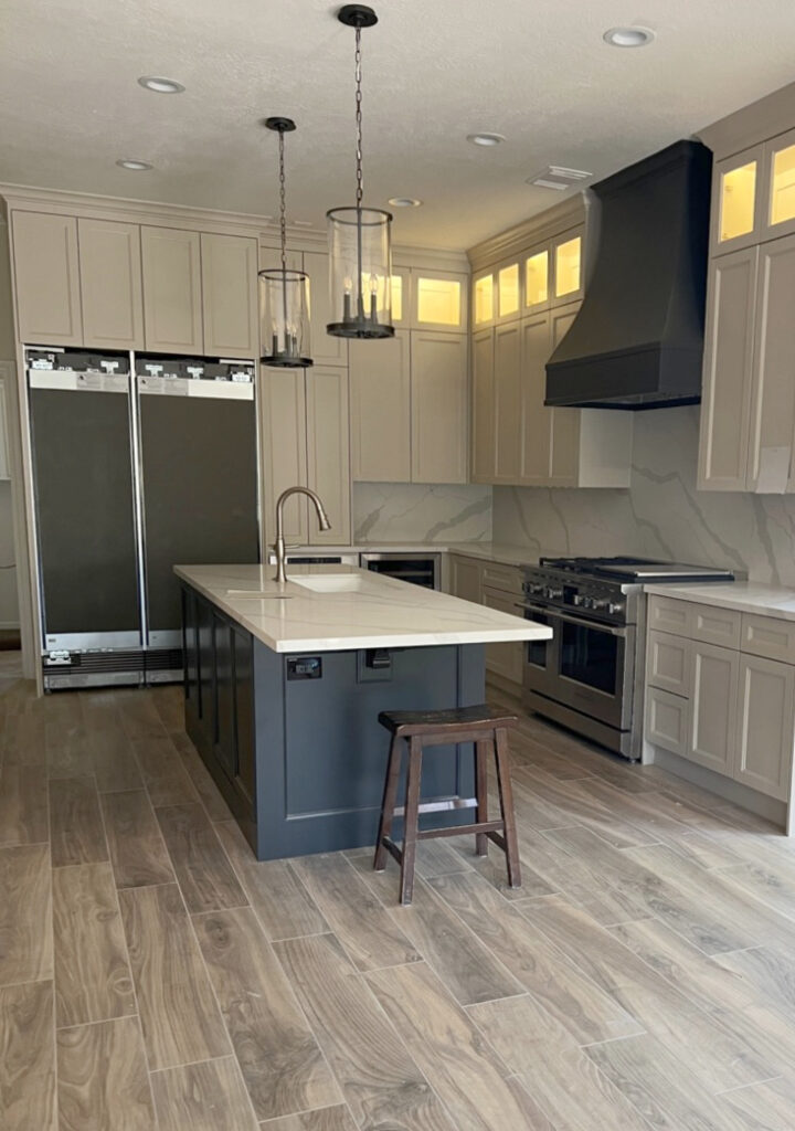
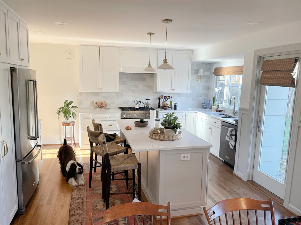
In the above kitchen, there was a heck of a lot of wood grain going on. Painting the huge island a dark, grounding color (Sherwin Williams Cyberspace) slows things down and gives the space a solid foundation for the remaining wood to really dance (and you all know how I love to make wood dance—wink, wink)!
3. MAKE A POLITE NOD TOWARD CURRENT TRENDS
Painting ALL of your kitchen cabinets a trendy paint color can be a risky choice. However, nodding towards a cabinet trend (like dark green, currently the top shade) by painting ONLY the island is a great happy medium without a 100% commitment to color on a large scale.
This is also an important consideration if you want to sell in the next 5-10 years. Chances are, whatever trend you commit to will be gone or on its way out, and it could affect your resale value.
4. IT’S MORE AFFORDABLE TO CHANGE IF YOU GET BORED OR TRENDS CHANGE
Painting kitchen cabinets is an expensive project, and not every budget can accommodate this kind of investment. Painting the ISLAND is not only more affordable now, but it’s also affordable to change down the road if you get bored (or on a monthly basis like me).
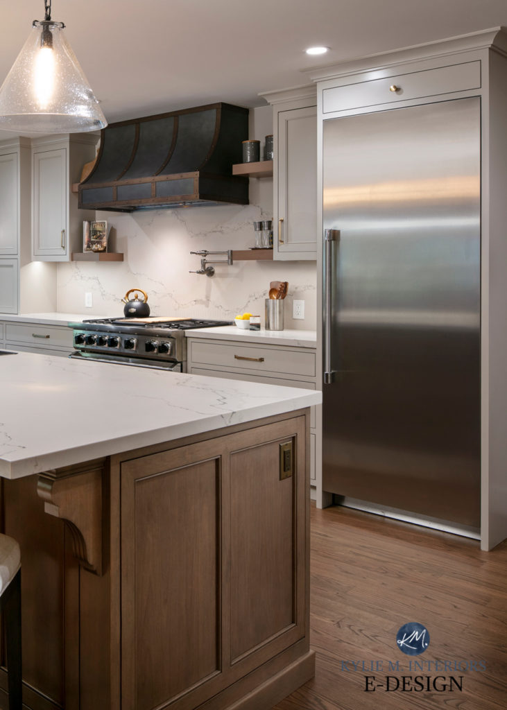
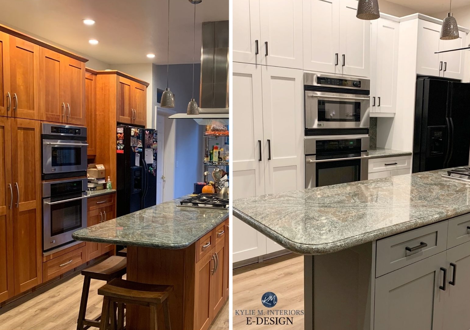
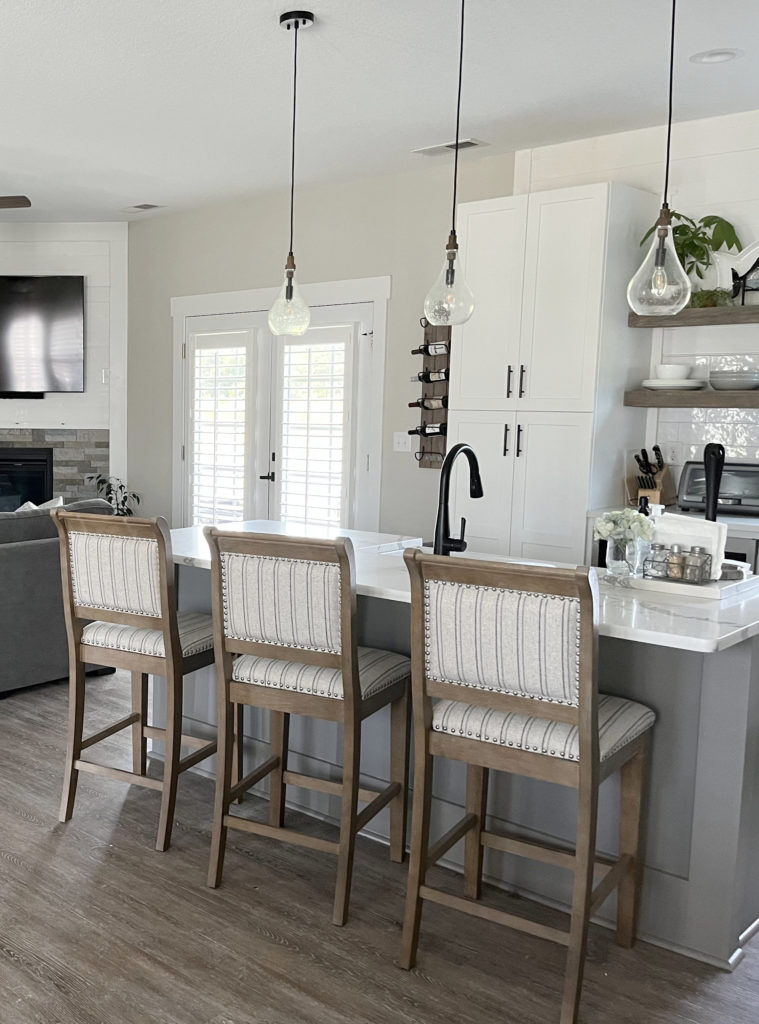
It’s not just about paint colors, either! Painting the main cabinets white (for example) and pairing them up with an island or lower cabinets in a wood stain is a popular, on-trend look, as shown in this next photo. These kitchens were created from scratch, so painting the island a different color/stain was easier to incorporate than remodeling using existing products.

CONS TO PAINTING YOUR ISLAND OR LOWER CABINETS A DIFFERENT COLOR
Just because you WANT to do something doesn’t mean your home or current trends agree with you (if you’re worried about resale).
1. A PAINTED ISLAND/LOWER CABINETS CAN MAKE A KITCHEN LOOK TOO BUSY
If you have two different countertops, painting your island a different color from the main cabinets can add to the busyness unless things are very carefully coordinated. It’s a bit easier if your island has a butcher-block countertop and wood flooring, as this eliminates a few products that need to be cross-coordinated. Still, if you have tile/vinyl flooring and two different countertops, things can look really cluttered really fast.
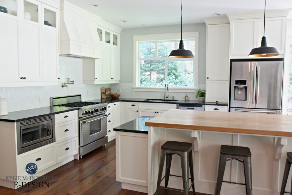
Even though the above kitchen had some great bones in place, painting the island a different color wouldn’t have added to the look; it would’ve cluttered it.
The same goes for the island in this next kitchen. It doesn’t need to be its own color to be perfectly balanced and beautiful.
2. IF YOU DON’T PICK THE RIGHT PAINT COLOR, IT WILL BE A HOT MESS
Picking the best paint color for your kitchen island isn’t just about picking the color you WANT to paint; it’s about picking a color that ties into your existing finishes, including the floor, countertop, backsplash, and main kitchen cabinets.
3. YOU COULD SET THE ROOM OFF-BALANCE
Not every kitchen was designed to have an island in a different color. Some spaces need the consistency of ONE cabinet color due to the depth of the walls, backsplash, countertop, and main cabinets.
For example, in this next space, while a darker island would’ve looked ‘okay,’ the balance down the center of the room, considering the stately stone fireplace and dark sectional, would’ve been pretty strong, whereas the white island adds balance.
The Best Sherwin Williams White Paint Colors
4. IT’S TRENDY
It’s as simple as that. Right now, painted islands are popular, as are different colored lowers…but so are crop tops and shorts that show off your bum cheeks (hey, I would if I could). Like any trend, it’s only a matter of time before painted islands or lower cabinets aren’t as popular, and when it comes time to sell, your choice could devalue your home.
4 PART SERIES: How to Create a Timeless Home
But why does this blog post focus on neutrals only?
I can’t cover everything in one blog post – or I could, but it would be 20,000 words, and we’d both be exhausted (insert wine and funnel here). Instead, you can peruse these neutral paint colors to see if one lights you up. If not, you can head over to the more COLORFUL end of things and get your paintin’ party started!
And a huge thank you to my E-design and local clients for sending me their ‘after’ photos—I couldn’t do this without you!
Colors are just example blobs, not direct references to actual colors
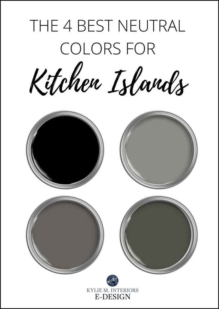
THE 5 BEST GRAY ISLAND/CABINET PAINT COLORS
Choosing a neutral is almost ALWAYS a better choice than a color if you’re worried about resale value, as you’re more likely to appeal to a wider range of buyers. And gray is HANDS-DOWN the most popular neutral choice for a kitchen island/lower cabinets (followed closely by black), but that’s not to say it’s the easiest…
Benjamin Moore Chantilly Lace and Amherst Gray
It’s important that the undertones in your countertop, flooring, and backsplash (if they are gray) jibe with the undertones of the gray of your cabinets (every gray has undertones). Some of the more popular quartz and marble countertops lean towards a soft purple or blue-purple undertone, so you’d want to pick a gray with those same undertones. If you choose the wrong undertones, you’ll have a hot mess on your hands that can only be fixed by repainting.

When painting your island or lower cabinets gray, there is a LOT of room to move, but there are a few limitations…
- if you have warm-toned countertops, there aren’t many gray paint colors that are going to look good
- if you have beige tiled flooring, again, there are a few grays that will work
- gray cabinets look good with MANY of the most popular white paint colors, but they are NOT always as good with overly warm or creamy ones
The Best Paint Colors for a Bathroom Vanity (or any cabinets)
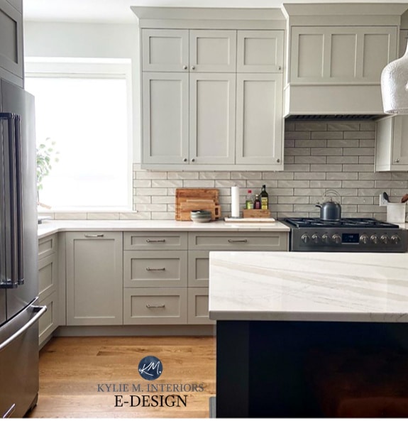
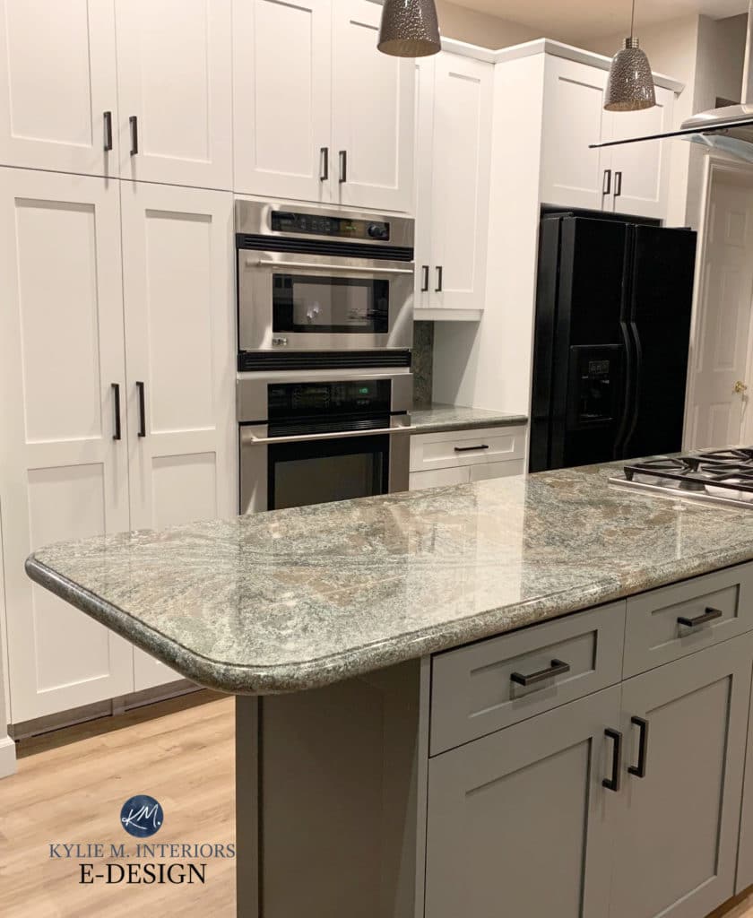
1. BENJAMIN MOORE CHELSEA GRAY HC-168
Chelsea Gray is a solid, medium-toned gray that has been a fan fave for years. While it’s FRACTIONALLY warm (you’d hardly know it), it acts more like standard charcoal and can sometimes pick up a super vague green undertone.
FULL Paint Color Review of Benjamin Moore Chelsea Gray
BTW, the kitchen island is almost ALWAYS darker than the main cabinets. While there are exceptions, it’s a combo that has to be done carefully!
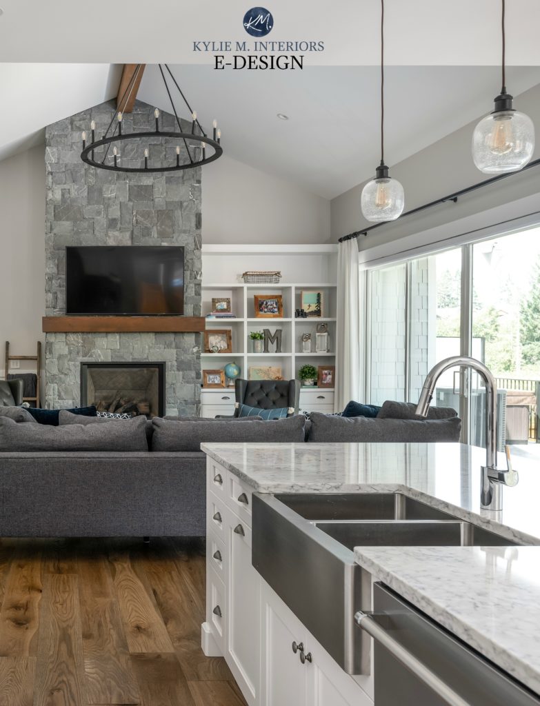
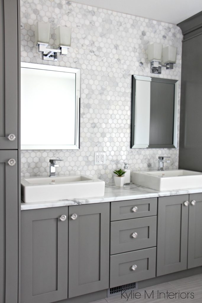
2. BENJAMIN MOORE METROPOLIS CC-546
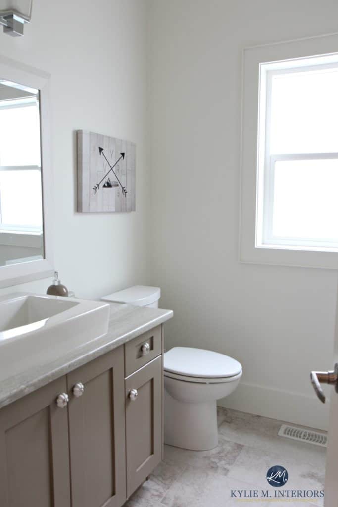
Metropolis is a beautiful medium-toned WARM gray (almost taupe) with a subtle purple undertone – that’s right, there’s not a wink o’ green to be found in this bad boy! When it comes to homes built in the early 2000s, particularly those with granite countertops, Metropolis is a popular choice as it often suits the TYPE of gray found in these finishes.
See the AWESOME before and after of the above bathroom HERE
FULL Paint Color Review of Benjamin Moore Metropolis
3. BENJAMIN MOORE AMHERST GRAY HC-167
Amherst Gray is similar to Chelsea Gray but darker. The green undertone in Amherst Gray can sometimes show up just a wink more (depending on the products you partner it with and your lighting/exposure).
FULL Paint Color Review of Benjamin Moore Amherst Gray
4. SHERWIN WILLIAMS GAUNTLET GRAY 7019
Gauntlet Gray is one of the darkest, warmest grays available. As some warm grays darken, they pick up too much brown—not Gauntlet Gray. While it has some warmth, you’re still left with an overwhelmingly gray paint color.
As for undertones, Gauntlet Gray is flexible between green and purple, meaning it doesn’t commit to either. If you’re nervous of ANY undertone and hope for that ever-elusive ‘gray with no undertones,’ Gauntlet Gray (and Dovetail, listed next) could be as close as you get.
This next kitchen is still being completed but is a great shot of Gauntlet Gray…
The 9 Best Benjamin Moore Gray Paint Colors
FULL REVIEW OF SHERWIN WILLIAMS GAUNTLET GRAY HERE
And remember, when you’re choosing the best gray paint color for your vanity, you need to pay CLOSE attention to the needs of your tiles and countertop. Find out which undertones you’re working with and coordinate your gray paint color from there! Every gray will have undertones, and you’ll want to ensure they partner up!
5. SHERWIN WILLIAMS DOVETAIL 7018
Dovetail is like a lighter version of Gauntlet Gray. This means that it’s also a warm gray with flexible and non-committal undertones. As for LRV, Gauntlet Gray sits at 17, whereas Dovetail is a good dose lighter at 26, putting it in the medium depths.
Sherwin Williams Dovetail Paint Color Review

Shown above, Sherwin Williams Dovetail
The Best Paint Colors to Update Your Golden Oak Cabinets, Flooring, or Trim
Trendy & Popular Paint Colors for Your Kitchen Island (MIXED BAG!)
THE 3 BEST BLACK PAINT COLORS FOR KITCHEN ISLANDS/VANITIES
Black islands can look classic when they suit the kitchen or bathroom they’re in. I say this because not every room can pull off a color as striking as black. It all comes down to the combination of the countertop, backsplash, and flooring. Sure, the main cabinet color plays a part, but assuming that MOST of the time it’s white, it’s the least of our concerns.
Here’s a gorgeous kitchen with painted cabinets and a striking darker island. However, because a traditional black would come off a bit stark for the softness of this countertop, we chose Iron Ore, which is a softer shade…

While there are ALWAYS exceptions, in order to paint your island or cabinets black, your kitchen would ideally have the following:
- black or gray in it
- a butcher block countertop
- white or wood cabinets
- wood flooring or tile/lino that can easily accommodate a sharp color like black
1. SHERWIN WILLIAMS TRICORN BLACK SW 6258
With hundreds of blacks to choose from, it can be hard to narrow things down. But sometimes, it’s best to just start (and often end) with Tricorn Black. So many blacks pick up blue, violet, or green—not Tricorn Black. This gorgeous shade is Sherwin William’s most popular black paint color because it’s just…black. No secret undercurrents, no ulterior motives, just an uber-sexy, sultry shade of black.
Now, how I don’t have a photo of this on a kitchen island is BEYOND me, but since I only use photos from my readers and Online clients, I’ll show you this pretty laundry room instead…
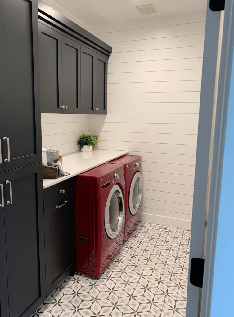
FULL Paint Color Review of Sherwin Williams Tricorn Black
2. BENJAMIN MOORE BLACK 2132-10
While sometimes I wonder how Benjamin Moore came up with their color names, this one is right to the point as black; in fact, the name says it all.
Black 2132-10 (you need the number to order/find it) is a classic shade. Similar to Tricorn Black with its intentions, Black is a great choice when you don’t want any surprises. This killer dark shade has an LRV of 4.56 – it ain’t messin’ around. And while it’s a touch lighter than Tricorn Black’s LRV of 3, they’re pretty much kissin’ cousins (isn’t that illegal in most States?)
Now, because I only use photos from my readers and Online Color Consulting clients, I don’t always have the perfect image. However, this one gives the right idea…
Sample & compare my FAVORITE shades of black with this CURATED COLOR BUNDLE
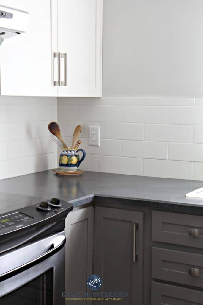
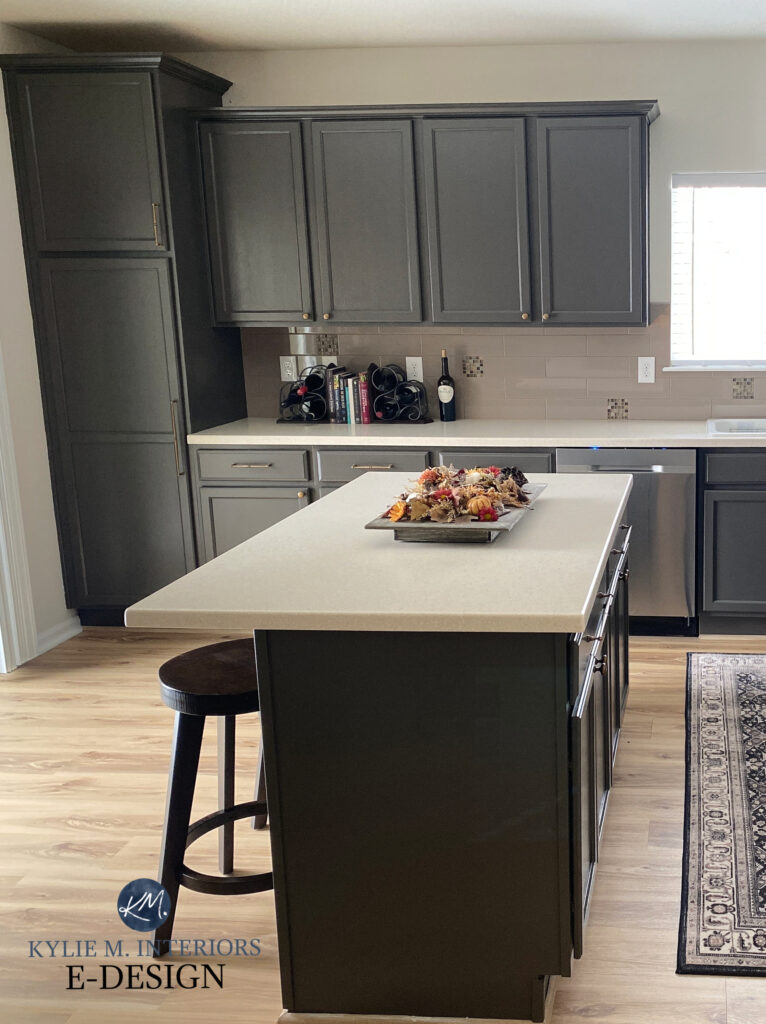
3. SHERWIN WILLIAMS IRON ORE SW 7069
While Tricorn Black and Black 2132-10 have their place, Iron Ore is more popular in today’s homes. This is because, unlike the other two shades, which are BLACK, Iron Ore is a soft black, so it’s not quite as striking. Oh, don’t get me wrong—she’s darn purdy; she just isn’t as…black.
In the above image, the softness of Iron Ore is easy to see compared to the black outlet on the end of the island.
Iron Ore has a beautiful but subtle green undertone, making it an interestingly thoughtful choice for an island, vanity, or lower cabinets.
FULL Paint Color Review of Sherwin Williams Iron Ore
THE 5 BEST GREIGE COLORS FOR CABINETS, ISLANDS, & VANITIES
Greige is another great choice and can sometimes work better than gray if you’re trying to transition out of the beige end of things. I say ‘sometimes’ as some kitchens and bathrooms just CAN’T pull off gray or greige – it all depends on the existing finishes and what they can tolerate!
1. SHERWIN WILLIAMS URBANE BRONZE 7048
Urbane Bronze is a WICKED gorgeous, super dark, greige paint color. Some of my Online Paint Color clients see the green undertones and love them; others don’t see them at all – it just depends on the surrounding environment and your perception.
While this next photo shows an entire kitchen, it gives you a great eyeball on the color and depth of Urbane Bronze…
FULL Paint Color Review of Sherwin Williams Urbane Bronze
2. SHERWIN WILLIAMS PORPOISE SW 7047
Porpoise is more or less the lighter version of Urbane Bronze, making it a greige with a little less ooomph. Compared to Urbane Bronze’s LRV of 8, Porpoise’s LRV of 13 makes it a more moderate, medium-dark color.
Paint Color Review of Sherwin Williams Porpoise
3. BENJAMIN MOORE KINGSPORT GRAY HC-86
Kingsport Gray is an awesome, medium-toned, greige paint color. While it’s planted between gray and beige, it does have a decent allegiance to brown over gray. But don’t let that sway you; I know not everyone gets excited over the ‘b’ word. A color like Kingsport Gray can be a gorgeous landing place between the gray and the beige world while humoring the needs of MANY popular granites from the 1990s and early 2000s.
However, while some greiges commit hard to their green undertone, Kingsport Gray comes in way more muted, so the green isn’t noticeable unless you partner it with finishes with an opposite (purple-pink) undertone.
FULL Paint Color Review of Benjamin Moore Kingsport Gray
4. SHERWIN WILLIAMS KEYSTONE GRAY SW 7504
Keystone Gray is one of my top greige paint colors for cabinets. While it’s similar to Kingsport Gray, it’s a bit lighter and less warm. It also has SUPER passive undertones that are hard-pressed to flash any green at all.
If you’re nervous about the world of gray (as it’s not as trendy as it used to be) but not quite ready for BROWN (join the club), Keystone Gray could be a great happy medium!
FULL Paint Color Review of Sherwin Williams Keystone Gray
5. SHERWIN WILLIAMS AGREEABLE GRAY SW 7029
Not everyone wants a dark-colored island. In fact, current trends call for a lighter approach in some kitchens! In that case, the subtle greige look of Agreeable Gray could be just the color you’re looking for.
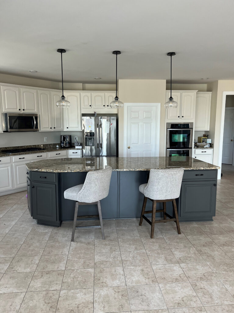
For this approach, it’s best if you have white cabinets so there’s a reasonable degree of contrast between your island and your cabinets, as shown in this next kitchen…If you want light or off-white depth cabinets and love the subtle greige look, it’s hard to beat Sherwin Williams Agreeable Gray. IN FACT, I wrote an entire blog post on it!
Agreeable Gray is a light depth greige with an LRV of 60. And while this might be a bit darker than you had in mind, remember that the sheen of cabinet paint (satin) can make a color look a bit lighter than expected. Check out Agreeable Gray in this beautiful kitchen…
Funny enough, this shows Agreeable Gray on the main cabinets and the previously mentioned Iron Ore on the island!
Agreeable Gray has flexible undertones. While there’s a touch of green in it, it’s so subtle that it rarely shows up at the party in a big way. On the other hand, it also doesn’t flash overly green or violet, either!
FULL Paint Color Review of Sherwin Williams Agreeable Gray
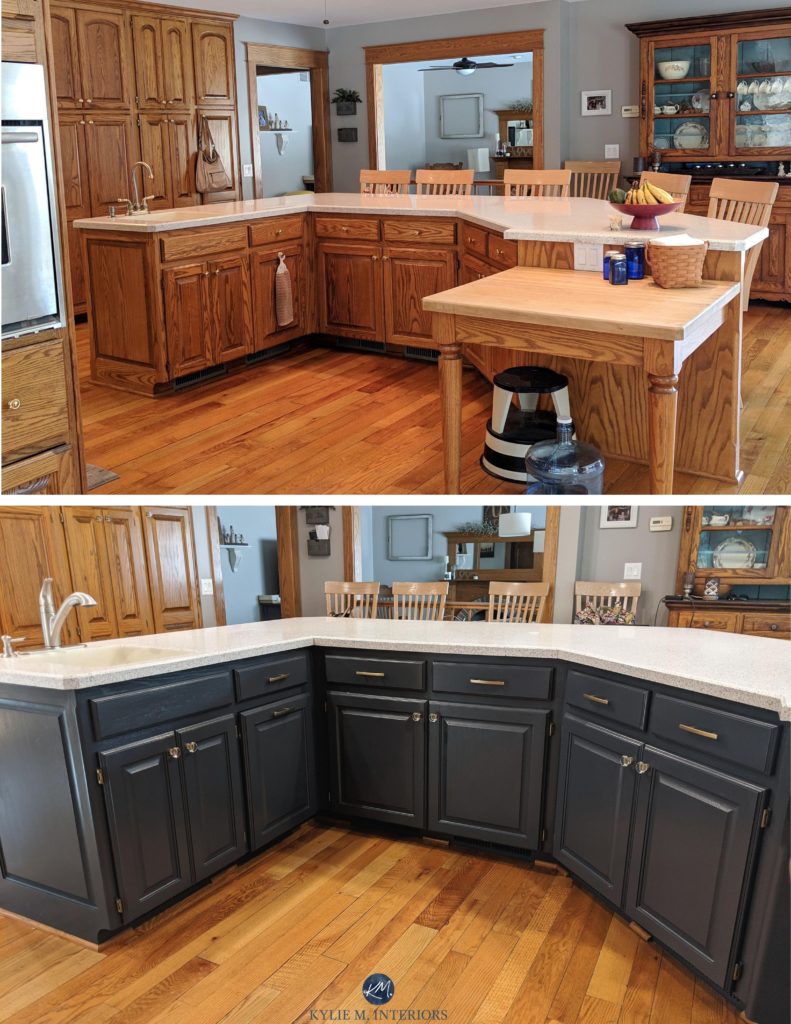
We did Agreeable Gray in this budget-friendly kitchen remodel…
THE 2 BEST DARK TAUPE PAINT COLORS FOR CABINETS & ISLANDS
A lot of people confuse greige and taupe as, according to some, the terms are interchangeable – they’re one and the same ‘type of color.’ To make our lives easier, I classify greige and taupe as the following…
- Greige paint colors have a green undertone (which is easy to remember as they both start with ‘gre’, but that’s not the reason they’re called that).
- Taupe paint colors have a violet (violet-pink) undertone
Now, you do you boo, but for the sake of my blog, you might find these explanations helpful!
While taupe is well into fourth place compared to the previous colors, it still has its place, depending on the countertop it’s partnered with. If you happen to have granite countertops from the 1990s and 2000s, there’s a chance Spalding Gray could be a great color for your cabinets. The same goes for several laminate countertops. And while it’s less likely to find a home with today’s more modern white quartz countertops, it all depends on what you’ve got!
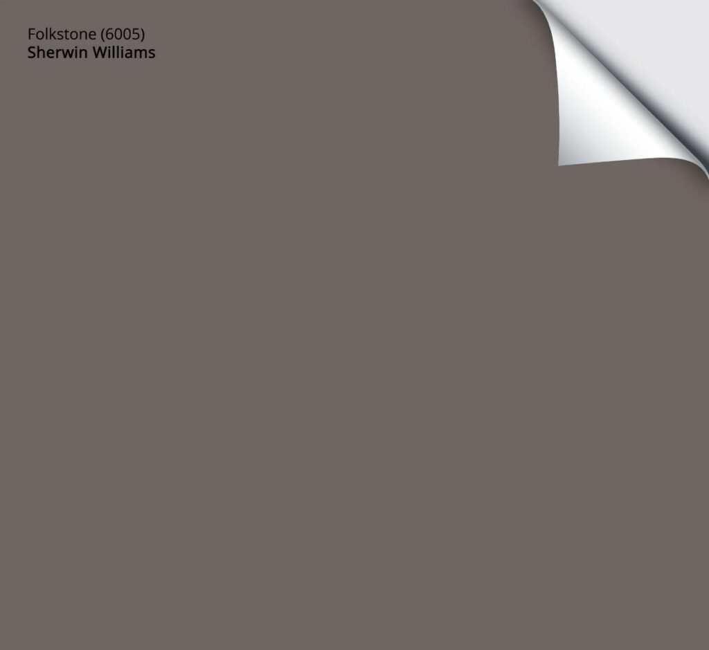
1. SHERWIN WILLIAMS FOLKSTONE SW 6005
Folkstone is one of my favorite shades of taupe (there are few, as there aren’t many great darker taupes). With an LRV of 14, Folkstone is a medium-dark color that’s a great blend of brown, gray, and, you guessed it – violet. The violet is certainly noticeable but not overwhelming, which is why it’s often a great choice with countertops with flecks in this range.
Get a Peel & Stick sample of Folkstone HERE
The 8 Best DARKER Shades of Taupe & Greige
2. SHERWIN WILLIAMS SPALDING GRAY SW 6074
Compared to Fokstone, Spalding Gray will seem SO neutral. However, like Folkstone, it harbors a violet hue, but this time, it’s very…very subtle.
I chose Spalding Gray, not just because it’s subtle but because it’s a slightly lighter option. Its LRV of 22 puts it closer to the medium-depth range, offering a softer approach compared to most of the previous shades (black, gray, and otherwise).
While I don’t have a photo of it in action on an island (yet), here’s Spalding Gray on the left side of these cabinets…
Well, that’s it for neutrals. If you want to see more great color ideas, keep reading!
READ MORE
Ideas to Update Your Older Style Granite Countertops
The Best Dark Blue & Green Paint Colors for Kitchen Islands
Trendy & Popular Paint Colors for Your Kitchen Island (MIXED BAG!)
The 3 Whites I Would Never Paint My Kitchen Cabinets
Should You Paint Your Wood Kitchen Cabinets? A Questionnaire
Painting Kitchen Cabinets: How to Pick the Best Paint Color
Not sure what the best paint color for your island or cabinets is?
Check out my Online Paint Color Consulting packages; I’d love to help!
Chat soon,

ORIGINALLY WRITTEN IN 2020, UPDATED IN 2024
Comments
Leave a Reply
More Posts

The 12 Best Farmhouse Sinks of 2024
FIND YOUR DREAM SINK HERE… While traditional farmhouse design was all the rage in previous years, the embers have definitely cooled. As for MODERN farmhouse, it’s still kickin’ its cowgirl
Read More
Trendy & Popular Paint Colors for Your Kitchen Island (Mixed Bag!)
Islands, Vanities, Lower Cabinets? These Colors Have Em’ Covered…Literally It’s hard to beat paint when it comes to affordable kitchen and bathroom updates. However, whether you have wood cabinets or
Read More
The Best Paint Colors to Go With Golden Oak (Cabinets, Flooring, & Trim)
Modernize Your Outdated Golden Oak Home With COLOR! I’ve written a lot of blog posts on updating wood cabinets, covering a wide range of wood stains and grains. This one
Read More


Hi Kylie!!
I’m a major fan and have been following your blog for years! Currently painting my new house based on recommendations from your blog (will send pics soon) and basically I can’t go wrong if I follow your recommendations. I was just wondering about the teal/blue-green recommendations here. Maybe I’m not color savvy enough but grizzle gray and urbane bronze don’t seem to be blue green blends to me. I would say they’re gray and gray brown. Can you shed some light on these choices? Also Gulfstream seems to be a very strong color for a kitchen island comparing to your other posts on blue-greens but maybe you need something more punchy for islands? I’m eager for your response too because I am thinking of painting our kitchen island and lo and behold you just wrote an article on it! Also if you need another article suggestion, I loved all your home decor articles and it would be awesome if you could do something about wall art. I’m mostly interested in balancing textures and how much of the wall space in a room should be used. For instance my dining room and living room both have two giant empty wall spaces facing each other (the other ends are windows and entrances) so I’ve been a little puzzled about how, what, where to hang anything. Anywho, thanks for all your advice – you’re awesome! Your humor is too 😉
Author
Hi Megan!
You’re right! Urbane Bronze and Grizzle Gray definitely aren’t blue-greens! Urbane is a greige with a green undertone and Grizzle is a green-gray blend. I just don’t have photos of ‘true greens or teals’ that are clear enough for ye ole blog, so I went with colours that have a green undertone (Urbane) or a bit more of a commitment to green, while still having some gray in there (Grizzle Gray) :). I HOPE I’ll get some good ones soon though!
As for Gulfstream, you know, it’s too bright for me, but I’m surprised at how many times my clients have requested a stronger teal approach for their island – when they want to have some FUN! I’m still awaiting those after photos though ;). I’m going to adjust that section though, to make it more clear and see if I can add a bit more, so thank you!
That makes sense! Thanks, Kylie! You’re the best! 🙂
Hello!
Your blog has been so helpful in deciding the colors for our overhaul! We’re redoing the upstairs of our split level ranch home. Currently I’m leaning towards Colonnade Gray for the walls, Pure White for trim,ceilings and cabinets, and maybe the wrought iron for the island. The living area gets a lot of southern light while kitchen and dining aren’t as exposed. Would these colors work? I’m so overwhelmed!
We’re still working out the floors but I think the paint colors would help narrow that down and we currently have black appliances.
Thanks you for all of the detailed articles! I wish I would have found you before we did our basement, it turned out to be a very cold blue-gray that I hate! 😒😭😂
Author
Shian, that sounds GORGEOUS, I have NO ISSUES at all with that (of course, I haven’t seen your home ;). Seriously, sounds beautiful!
Hi Kylie! I found your site while doing some research for some updating we’re doing in our home. Your advice on paint has been spot on so far! I’m curious about our cabinets though. Ours are a darker stained wood, and we have an island that is stained slightly darker, so we were thinking of painting that an accent color. (previous owners installed it and it drives me nuts that they don’t completely match!) What advice would you give for colors that may coordinate with dark cabinets? Everything I see is always lighter cabinets with a dark accent island.
Author
Well, it actually TOTALLY depends on your countertop and flooring for things to flow! Sometimes a lighter island can work, something with an LRV approx 30-40, but it also depends on HOW DARK the cabinets are. I’ve also seen a cream work, as long as it was GLAZED, to help it tie into the cabinets more. So, I can’t say for sure, but I DO lean darker vs lighter. If you have lighter countertops and wood floor, you have a better chance of having a lighter island.
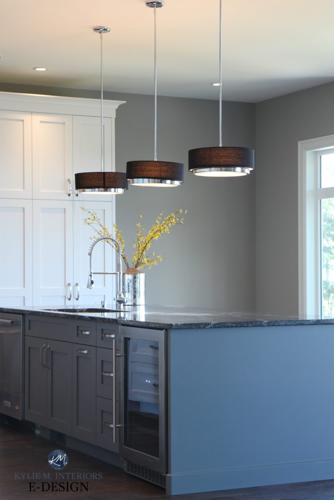
Hi Kylie – I have been following your blog for a long time, and my biggest wins have been following your suggestion to use White Duck, and also Cyberspace! I am looking to paint my island Water’s edge BM Paint with White upper cabinets. Could you tell me the island color you used in the picture you posted above with White upper cab, and a blue gray color for the island ? There are bright yellow flowers on it. That is what I am looking for. I think you also have a second picture in this blog with different lighting.
Thanks!
Author
Ahhhh yes, that one’s tricky as it was a manufacturer’s colour, so nothing in the BM or SW fan deck!
Hi Kylie,
I am new to your site and have found all of your color advice to be spot on! Can you please tell me where you purchased the brown (trimmed in silver) drum pendant lights over the island shown above. These would be perfect for my kitchen renovation.
Thanks!
Author
HIya! I’m assuming you’re talking about the ones that look a bit more modern? They are SO PRETTY! They’re actually BLACK, it’s the warmth of the bulb shining through making them look brown. Now, the thing is, this project was 5+ years ago and we got them from a store called Illuminations (Vancouver Island), so I’m not sure that will be much help!
Hi there! I just found your site and I wanted to ask you what you think about colors for built-ins for a home office. We want to do the whole back wall as Shelves/cabinets. The floors are white oak, and the walls/trim are just Delicate White. I’m afraid to go too dark and create a shadow behind me (lots of zoom calls). I am considering Cheating Heart but afraid it will look too Blue during the day when the light is pouring in. I want a dark gray, sort of black, color. Do you think Cheating Heart would work or should I think about something else?
Author
Hi Fatima! Cheating Heart does have a reasonable blue to it on the large scale. Wrought Iron is more muted, but that bit closer to black. Have you thought about bumping up a bit to the likes of BM Trout Gray perhaps?
Hi Kylie
I have cabinets in simply white and room trim with agreeable gray walls, plan to paint my front door iron ore. the living room is open to the kitchen and floors are currently golden oak with a plan to strip and refinish them in a flat satin. My question is, I’d like to paint the island that is currently accessible beige, is there a charcoal paint that I could do that you would suggest to compliment these colors such as peppercorn or iron ore? or do I go a bit lighter with the charcoal, thank you
Author
Hi Lori, I would love to help you, but it would be GREATLY DICTATED by your countertop. if I were to throw something out now, it could EASILY look terrible depending on your countertop! If you’d like to check out my Online packages, I’m happy to take a look! https://www.kylieminteriors.ca/hire-kylie/
Thanks Kylie, I will check that out! My counters are creamy white with very subtle gray swirl and a charcoal tinted concrete island counter, not sure if this helps but I also look at your online pkgs
Hello! Are you able to share where the squared pendent lights are from in the photo with the “gorgeous kitchen with painted cabinets and a striking darker island?” Thank you!
Author
Oh Donna, I’d LOVE to, but my client purchased them!
Hi! We are painting our entire home SW Pure White. I was planning on doing the kitchen cabinets Pure White as well, and the island Cyberspace. And then I saw some photos, of a navy island with very, very light grey cabinets. Do you think that would be ideal, or stick with the original plan of all Pure White with just Cyberspace island? Thanks a lot! Your site has been super helpful so far!
Author
Hi Courtney! If you’re worried about trends, I would stay away from gray as it’s slowly going out the door – white will be FAR more timeless and easier to decorate and design around too 🙂
Good morning Kylie Putting a new apartment in my daughters house and was planning to put my Island a Heritage Red but not sure what color to put my cabinets I am not a grey lover and did not want to put them white my flooring to put down is Richmond Omega Honey Oak I had Edgecombe Gray mentioned to me which doesnt look Grey to me but at this point I feel so confused I guess you can say I am a warm color person and then what color of counter top to go with the color you feel is the best and what color for the main walls of the apartment. The most lighting for the apt. comes from the patio door and a window over the sink which is sort of in the corner I would appreciate what ever help you could suggest for me Thank You
e
Pingback: Your 21 Best Paint Colors For Selling A House (Interior And Exterior!)
I’ve been on a lot of sites the past few weeks and yours is one of the best! My issue…finding a darker navy paint color for my island. My wall cabinets are painted Dover White, so a little yellow undertone is to be expected but they are way too yellow! My cabinet maker color matched and used a different brand paint. I’ve been looking at Naval, Anchors Aweigh, Indigo Batik, Cyberspace, In the Navy, and others and I’m lost. I want a navy that might downplay or at the least not accentuate the yellow. I’ve changed out the light bulbs trying to lessen the yellow and that helped a little. I’ve read so many articles that contradict each other as to having cool and warm both, or that I should have all warm colors in a room, or that the navy should be a violet and blue undertone not a green undertone to accomplish this. Please help. Note: The island is getting repainted because the cabinet installer had an accident, and they have to be repainted. Currently the are Blue Peacock, another color mistake.
Author
Hmmmm, it sounds to me like you might need the likes of Cyberspace over the others. One thought is that a stronger navy and its striking blue can contrast more with Dover White, whereas a more muted navy keeps things a bit quieter. This being said, any blue will contrast with yellow. Another great thing about Cyberspace is that it doesn’t cater hard to blue-violet or blue-green, which is definitely Dover White’s preference – just a nice SIMPLE approach to navy. However, part of me wonders if you might just do the island the same Dover White to keep things even more simple and not offer any overt contrast 🙂
LOVE your ideas, sense of style and humor! Live in a home filled with wood, wood, wood…which is gorgeous but too much! Your golden honey oak “wood on wood isn’t always good” gives a sense of the need…but I’m wondering…I am wanting to paint the island a grey (for grounding as you note; and to potentially not redo countertops which are a busier than I like quartz) and redo the backsplash with a lovely lighter gray shiny subway type tile…but you mention the HOT MESS of picking the paint color for the island. Do you have any recommendations for the golden honey oak I could try with different lights through my lovely kitchen window? Any suggestions appreciated by this retired teacher…
Author
Hey Dixie! While your wood matters, in a kitchen, the countertop matters the MOST, so you’ll want to hit a gray that coordinates with it FIRST and then work out from there :).