
Posted on November 2, 2023 by KylieMawdsley
The Top 9 LIGHT-MEDIUM Depth Beige & Tan Paint Colors
Gone are the days of boring old beige! Beige and tan paint colors have reached new heights in the last few years as builders, painters, and homeowners have embraced the versatility of what was once considered a basic ‘builders’ color.
One of the front runners in the Battle of the Beige is Sherwin Williams, as they’ve created a range of dark neutral colors that will satisfy even the pickiest connoisseur (like me…). And while I’ve written several articles on the lighter end of the beige and tan worlds (links posted throughout), this one focuses on shades with just a WINK more depth.
This post may contain affiliate links. If you make a purchase through links on our site, we may earn a commission.
But how do you know which beige or tan is best for you and your home?
- Look at your finishes – do they have an orange undertone that’s orange-yellow or orange-pink? Or maybe your home suits TAN with a yellow-orange or yellow-green hue! If you don’t know, order a variety of samples and see which flows the best.
- What LRV range do you like your paint colors in? The average home suits an LRV between 60-70. Do you like colors that are lighter than this or darker? Most of the colors listed here are a bit darker!
While lighter shades of beige are trending, if you want more depth and warmth, I’ve got you covered!
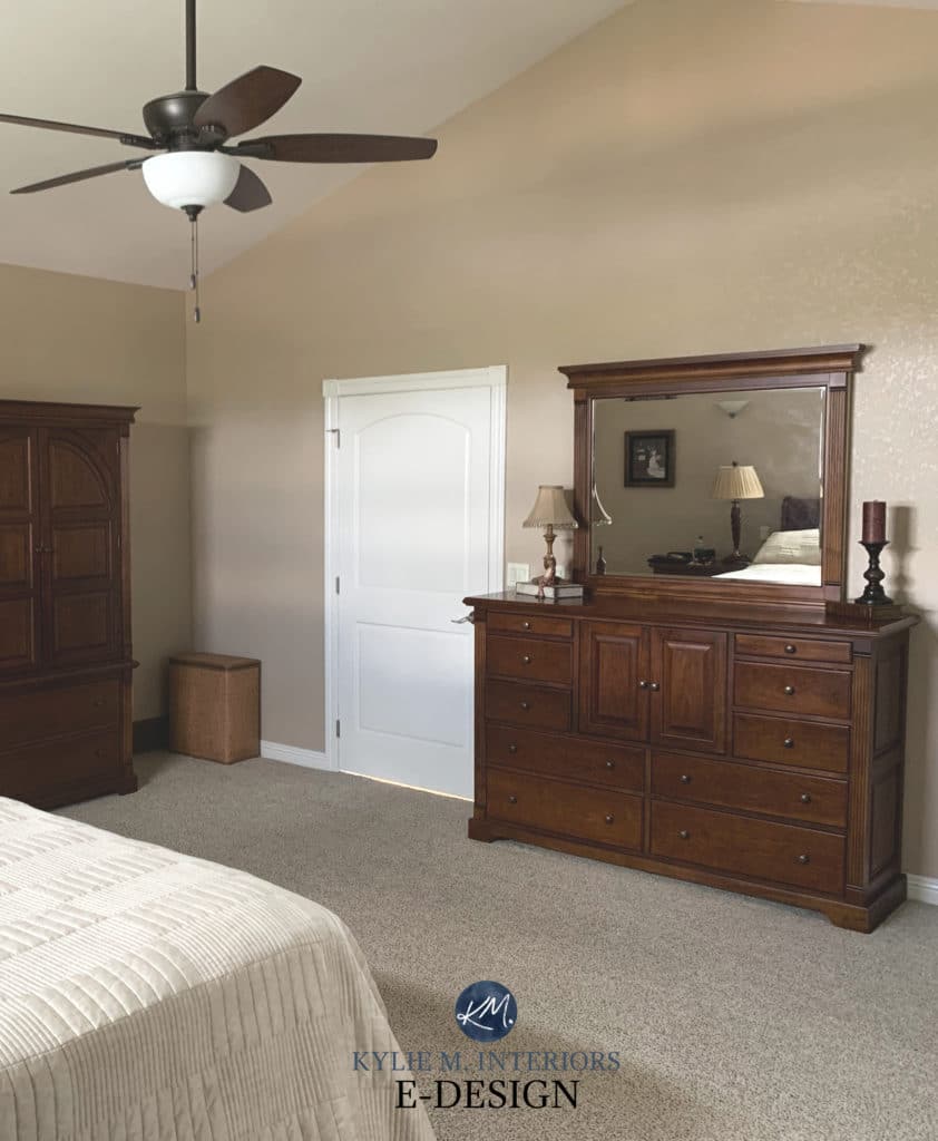
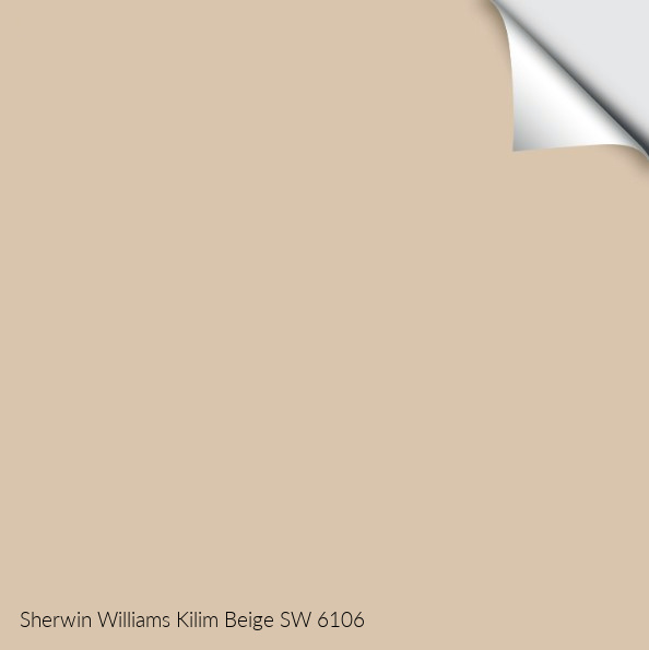
1. SHERWIN WILLIAMS KILIM BEIGE 6106
Kilim Beige is warmer and darker than most popular beige paint colors without fully committing to yellow, orange, or pink. However, of the undertones found in beige, Kilim Beige leans more to the orange end of things, not the yellow end, without becoming obnoxiously peach-toned. If this is too orange for your finishes, there’s a chance they need a bit more yellow in the mix. Compare it to Sherwin Williams Macadamia to see the difference.
TIPS FOR USING KILIM BEIGE
- Kilim Beige loves north-facing rooms as its warmth helps balance the cool light but can look OVERLY warm in southern or western afternoon sun.
- It can be friendly to many of the beige finishes that were popular in the early to mid-2000s.
- Kilim Beige looks good with many wood tones, but avoid OVERLY yellow ones.
- The LRV of Kilim is 60, so while it will reflect some light into the room, don’t expect it to work ANY great wonders in a dark room.
Is Beige Back? You Might Be Surprised!
Sherwin Williams Kilim Beige Paint Color Review
2. SHERWIN WILLIAMS NOMADIC DESERT 6107
Nomadic Desert is a beige with a bit more meat on its bones. With an LRV of 50, Nomadic Desert adds decent visual weight to a room and a stronger contrast with white trim, especially compared to some of the popular lighter shades of beige. Really, Nomadic Desert is like a darker version of Kilim Beige, having similar features (and an orange undertone).
When thinking of ‘beige,’ Nomadic Desert is likely a little bit darker than the average person traditionally thinks of but isn’t so heavy that it will weigh down a well-lit room.
Nomadic Desert was popular in the early 2000s. And while current beige trends don’t go this dark, this doesn’t mean YOU can’t love a color with a bit more meat on its bones!
The Best Tan Paint Colours: Benjamin Moore and Sherwin Williams
TIPS FOR USING NOMADIC DESERT
- Nomadic Desert LOVES most wood tones but can fight a bit with OVERLY yellow or red ones.
- Nomadic suits both north or south-facing rooms, as long as they’re well-lit. With an LRV of 50, Nomadic Desert won’t add nor absorb light in a room, meaning it could feel a bit heavy in a low-light or dark room.
If you’re game for a BIT more depth, check out the delicious warmth of…
3. SHERWIN WILLIAMS LATTE 6108
Latte is a lovely, rich shade of beige with more depth and orange undertone than the average shade. While colors like this were popular in the early 2000s, many of my clients are still looking for these warmer shades when they want a color with a bit more personality than the average neutral.
Latte has an LRV of 38, making it a soft, medium-depth color. This depth means it can be used as an accent wall color when partnered with lighter beiges.
TIPS FOR USING LATTE
- It’s even better when it’s made with almond milk and you throw a little vanilla syrup in (wink wink)
- Latte suits many of the beige carpets and tiles from the early 2000s.
- Latte can be a beautiful exterior color, well-suited to various finishes.
- While some light beiges can be fussy with their trim colors, this depth can suit quite a few soft, warm whites and off-white beiges.
Get the best expert color advice…
4. SHERWIN WILLIAMS SANDBAR 7547
If you’re looking for a hot shade of tan, look no further than Sandbar. If you’re unsure which type of warm neutral suits your space, comparing Sandbar (tan) with Kilim Beige (previously mentioned) will help you see the shift.
One thing I love about Sandbar is that while it’s a tan, it doesn’t commit hard (at all) to yellow-green. It’s SUPER subtle and more toned-down (grayer/muted) than some of the richer (not as popular) shades of tan.
The Best Paint Colors for Kitchen Islands & Bathroom Vanities
TIPS FOR USING SANDBAR
- Sandbar is a great moderate depth for a room with reasonable natural light.
- Sandbar is a contender for cabinets, based on some 2024 trends, although it’s a stitch darker than the most popular shades.
- If your finishes cater more to beige, not tan, be careful with Sandbar.
- Sandbar look great when partnered with some darker shades of greige.
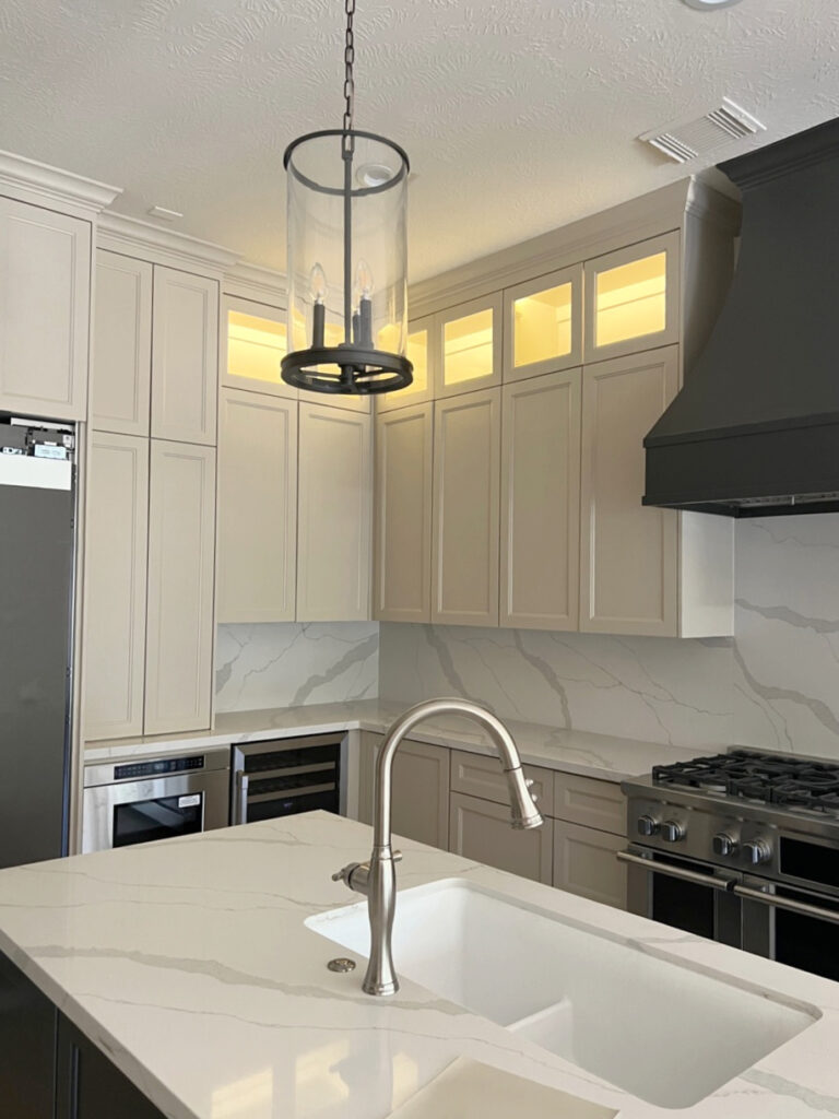
5. SHERWIN WILLIAMS ACCESSIBLE BEIGE 7036
Accessible Beige is gorgeous with its soft and subtle gray undertone, making it look the LEAST like a typical golden beige paint color. Accessible Beige is also the LIGHTEST and most popular shade on this page and is what I consider a relatively ‘neutral beige’!
A lot of people are nervous that their beige is going to look reminiscent of the early 2000s – and some do. If you’re in this group, Accessible Beige is a great way to get the warmth of beige, without a heavy or dated look. However, if you’re a traditional beige lover and want some serious warmth, Accessible Beige could be too gray and muted for you.
Paint Colour Review Sherwin Williams Accessible Beige
The Best Beige Paint Colours for Today’s MODERN Home
TIPS FOR USING ACCESSIBLE BEIGE
- Accessible Beige can be a bit fussy with wood stains that have a lot of red/pink in them, but humors many others (it told me so)
- It’s a great color for a north or south-facing room; neither too warm nor too cold (check out its FULL-colour review here). Keep in mind that it can look a bit less warm in a northern room.
- Accessible Beige doesn’t have a super high LRV, sitting above 55, but not by much. So, while it’s a lighter color, it might feel a bit flat and drab if you have a dark room.
- Of the colors on this page, Accessible Beige and Balanced Beige are the most popular.
- Want something a bit lighter? Sherwin Williams Natural Tan has a ‘similar’ look but is more gentle with its higher LRV.
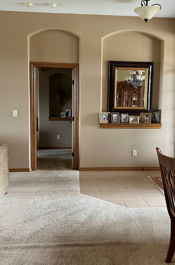
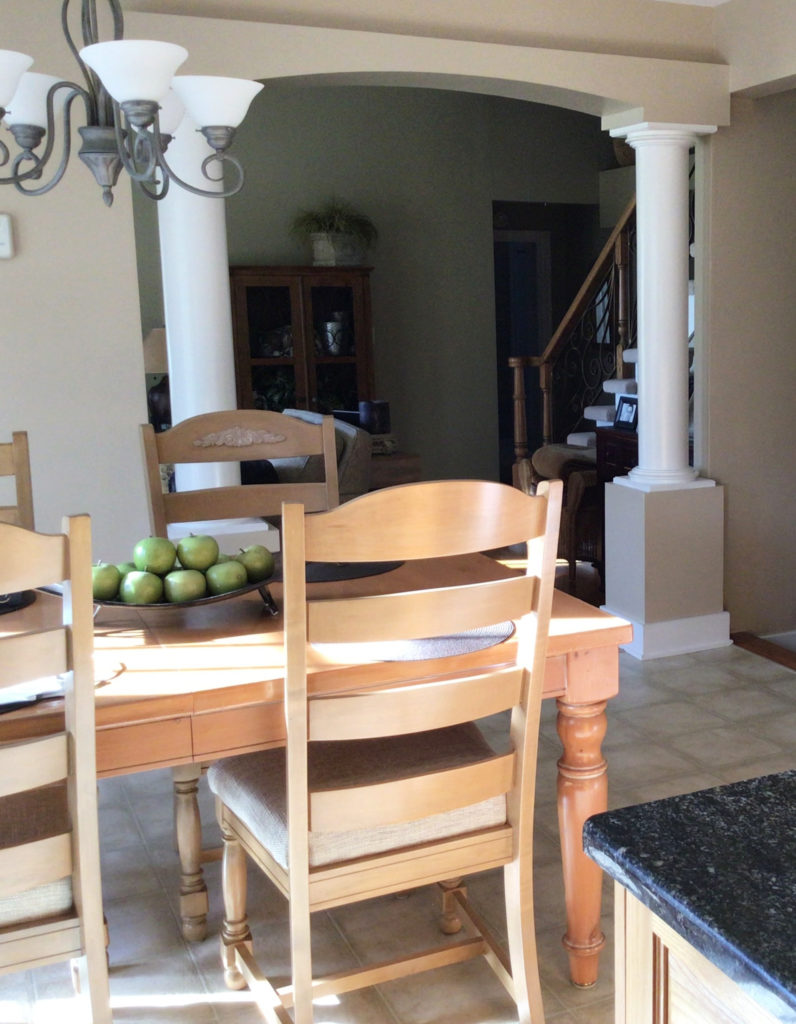
6. SHERWIN WILLIAMS MACADAMIA 6142
Macadamia is the kissin’ cousin Nomadic Desert (that’s still legal in some States, right?). If you’re not sure which is best for your home, order these two and a few others. Compare them and you’ll see how committed to beige Nomadic Desert is, and how tan Macadamia is, with its yellow-green undertones. Sure, there’s orange in there, but it’s not orange-pink, it’s orange-yellow.
This is one reason why Macadamia isn’t the best color for this next home’s walls…
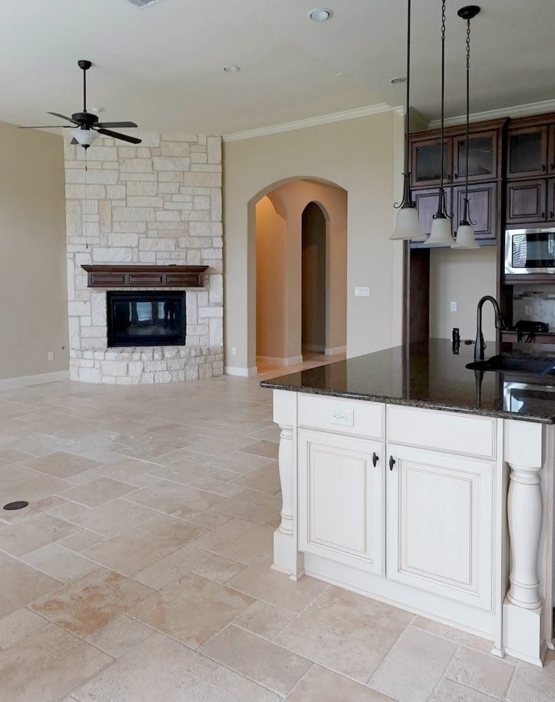
Why?
The travertine tile floor caters to beige, not tan. You see this best 0n the wall space above the arched doorway. Compare it to the floor and the fireplace and you’ll see it’s that bit too yellow. Cool, eh?
Macadamia has an LRV of 49, making it a light-medium depth color and a bit lighter than Nomadic Desert.
TIPS FOR USING MACADAMIA IN YOUR HOME
- Macadamia has a beautiful warmth. If your landscaping flashes a green light on your walls, you might want to lean into beige over tan – this color will pick up that green and RUN WITH IT!
- Macadamia is a cozy, warm color without being oppressively warm and rich (although that could be open to perception).
- The lighter version of Macadamia is Softer Tan which has similar tendencies.
- A darker shade similar to Macadamia is Basket Beige, which we’re looking at shortly!
7. SHERWIN WILLIAMS BALANCED BEIGE 7037
Balanced Beige is like a slightly darker, light-medium version of Accessible Beige. And while Balanced Beige has a nice warmth to it, it’s subdued by a subtle gray base, making it one of the more MODERN beige paint colors in this range.

The 12 Most Popular LIGHT Beige & Tan Paint Colours
TIPS FOR USING BALANCED BEIGE IN YOUR HOME
- Make sure it’s warm enough if you have traditional beige finishes. Balanced Beige doesn’t always have the warmth these finishes crave.
- If you want more depth, check out Tony Taupe, which can pick up a WINK of green in its travels, but has a similarly muted warmth.
- Balanced Beige can be a stunner on kitchen cabinets and nods at current off-white and light-depth cabinet trends. Personally, I find this depth a bit easier to coordinate with compared to lighter shades.
SAMPLIZE PEEL & STICK paint samples are more affordable and EASIER than traditional sample pots.
And you get them delivered to your doorstep in 1 DAY!
Visit the SAMPLIZE website HERE
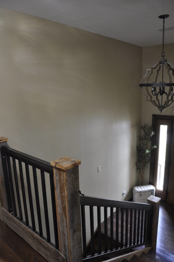
8. SHERWIN WILLIAMS BASKET BEIGE SW 6143
Seriously, if you want a warm neutral with some REAL warmth – without it turning brown, Basket Beige could hit the spot. This rich shade of tan has a yellow undertone and a reasonable, but not overwhelming green hue in its backdrop.
This next photo shows Basket Beige in a two-storey foyer with dark wood trim and stairs. Notice how the Kelvins of the light bulbs enhance the warmth of this wall color…
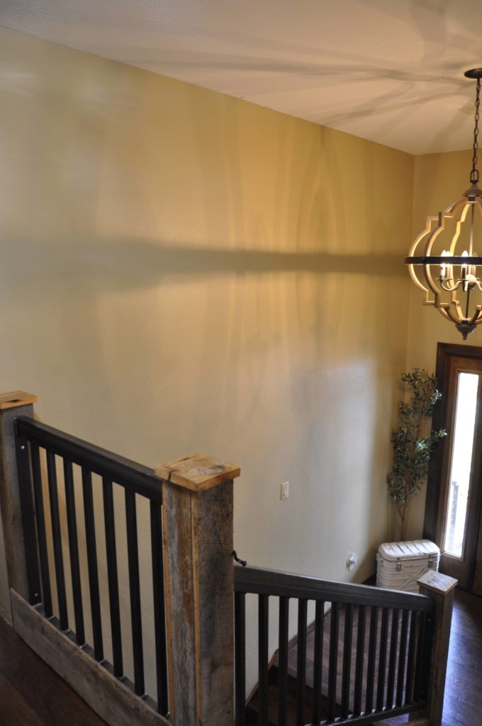
This is how Basket Beige most often looks.
NOW, check it out with NO interior lighting…
Notice that it ALMOST looks greige (which it most definitely isn’t). When you take a tan and add enough gray to it, it shifts into greige mode!
This is also why tan and greige paint colors often look good together!
What’s making it look more greige is the muted, likely north-facing light. Basket Beige RARELY looks this subdued and you should expect more golden warmth.
Check it out in this next hallway. Again, less yellow-green than expected and I BET it’s because these bulbs don’t have very low Kelvins…
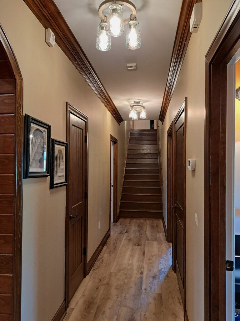
Notice a flash of the yellow-green in the top right corner of this photo.
9. SHERWIN WILLIAMS BUNGALOW BEIGE 7511 or PAVILION BEIGE 7512
If your home’s finishes suit a beige with a bit more commitment, Bungalow Beige or Pavilion Beige could be your colors! Like the MAJORITY of today’s beige finishes, these two beautiful shades nod just a bit more towards an orange-pink undertone – more so than the others.
Similar to Sherwin Williams Bungalow Beige, Dhurrie Beige, or Pavilion Beige
Sherwin Williams Pavillion Beige
TIPS FOR USING BUNGALOW BEIGE OR PAVILION BEIGE
- Bungalow Beige has an LRV of 53, parking it nicely in the higher end of the light-medium range.
- Pavilion Beige, which is very similar, has a lower LRV of 48 but is still considered a light-medium depth.
- For a lighter approach, check out Sherwin Williams River’s Edge.
- More so than MANY other popular beige and tan paint colors, these two shades suit various interior finishes.
WHAT COLORS GO BEST WITH BEIGE?
While it can depend on the depth of the beige you choose, here are some color combos to consider…
- BEIGE & GREIGE: Some greige paint colors (green undertone) that are the same depth or darker than your beige.
- BEIGE & GRAY: These gray paint colors should have green or blue-green undertones and be the same depth or (ideally) darker than your shade of beige.
- BEIGE & LIGHTER BEIGE: Choose a lighter version of your chosen beige for a tone-on-tone look.
- BEIGE & BLACK: Black is a great way to update a beige home, especially as it relates to hardware and light fixtures.
- BEIGE & BLUE: Beige can be fussy about its blue partner, but a darker shade of blue, including navy blue, can look classic.
- BEIGE & GREEN: When it comes to colors, beige is happiest with green, including warm and cool shades.
READ MORE
Benjamin Moore Natural Wicker Paint Color Review
The Best Benjamin Moore Beige & Tan Paint Colors
Is Beige Back? You Might Be Surprised!
The Top 11 Paint Colors that AREN’T Beige!
The 8 Best WHOLE HOME Warm Neutral Paint Colors
Want a beige that’s custom-tailored to your personal tastes?
Check out my E-Design / Color Consulting and Decorating Services!
Chat soon,

ORIGINALLY WRITTEN IN 2019, FULLY UPDATED FOR YOU IN 2023!
Comments
Leave a Reply
More Posts

The 5 Best Creamy White or Off-White Paint Colors
THE ELUSIVE ‘CREAMY WHITE NEUTRAL’ When it comes to light, warm neutrals, it’s all in the undertones. And other than pink and green, yellow is the undertone many of my
Read More

The 8 Best Warm Neutral Paint Colors With NO Yellow Undertones!
The Top Light Depth, Warm Colors That Aren’t Cream! When choosing the best warm neutral paint color for your home, whether creamy white, beige, taupe, or greige, your choices are
Read More

The 12 Best Farmhouse Sinks of 2024
FIND YOUR DREAM SINK HERE… While traditional farmhouse design was all the rage in previous years, the embers have definitely cooled. As for MODERN farmhouse, it’s still kickin’ its cowgirl
Read More


Hi kylie,
I’m actually lightning my open floor concept a little and I have north and south light coming in from both sides. My kitchen cabinets are white and my counter top is a light grey , my tile has a little bit of cream and beige. I was looking into accessible beige and modern gray. I really don’t want that cold feeling ,but ; I don’t want the yellow gold tone from accessible beige.. I’m looking for the cozy look with a bright feeling ..if that makes sense.. thank you!
Author
Hi Roxanna, when it comes to personal questions, I do refer to my E-design! I try to give as much helpful free info as I can on my blog and if that doesn’t help, it might be time for a closer look, otherwise, I’m totally just guessing as to what your room REALLY looks like. If you’re interested, the link is here, I’d love to help! https://www.kylieminteriors.ca/online-decorating-design-services/
~Kylie
Hi Kylie,
Thank you so much for your articles. I have never heard of LRV before you posted about it. We just picked out Neutral Ground for our new home … it has not been painted yet, and I was wondering if you knew the LRV for that color. Thank you!!
Author
Hi Janet! The LRV for Neutral Ground is 70, and I am a HUGE fan of Neutral Ground!
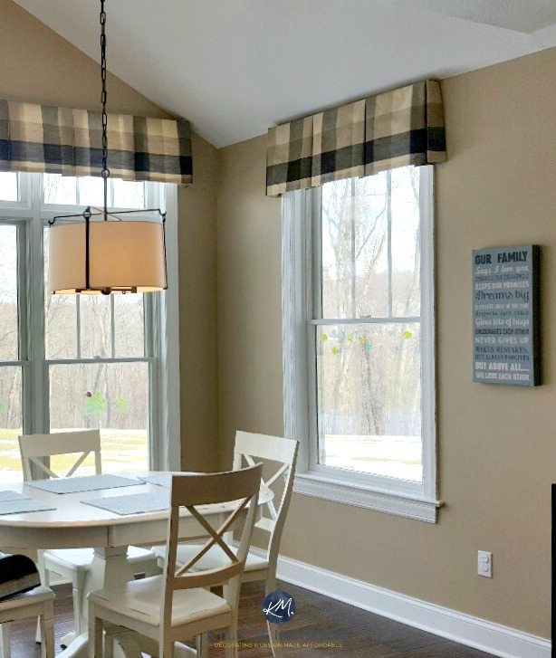
Thanks for all the helpful info you have provided! I love the look of SW Wool Skein in the picture above. On the wall in my north and east facing bathroom, it looks more yellow and loses that bit of gray feel to it. Perhaps it is the lighting and shades on the scones. What color would be very similar to SW Wool Skein, but with less yellow and more of a gray undertone/feel.
Thanks!
I am painting my kitchen walls and cabinets. The colors need to coordinate with dark emparodor marble. Floors are ivory. I was thinking of painting the walls accessible beige and the cabinets balanced beige. Trim is white and room is south facing. Would this work? I have spent hours looking at SW paint colors. It’s exhausting.
Hi Kylie,
Great article! I have the honey oak trim and hard wood floors and I’m going between agreeable grey and accessible beige. Which do you reccomend with honey oak? Thanks!
Author
Hi Cinty! I do lean a BIT more into Accessible Beige than Agreeable Gray as the warmth could sit just a bit better, however it can depend on exposure/furnishings and other things too!
I love Kilim Beige and this article really helped me make the. Decision. I’ve subscribed to you!
Thank you
Deb
Author
That’s what I love to hear, thank you Deb!
I am in the process of picking out paint for my great room which has a high valued ceiling. It is south facing. I like SW Nomadic Desert for the walls and SW Dover White for the trim. There is no trim at ceiling. Only at the floor, and around windows and doors. Should I paint the ceiling Dover White or consider SW Divine White or another color to make the room feel more cozy and not so lofty.?
*vaulted ceiling not valued
accessible beige not grey sorry.
Jackie- what did you end up going with? I’m struggling with my cherry wood!
Hi Kylie, great article! We have Kilim Beige in our main living spaces and it works great. We will soon be painting our (currently espresso brown) kitchen cabinets white and feel like our home and decor will really support the change! What are your favorite coordinating wall. colors for Kilim Beige that also go with white cabinets? (leaning towards alabaster on the cabinets!) thanks!
My living room is facing west and a little on the dark side and my dining area is east facing, I have oak trim and cabinets and hardwoods , Ive sampled so many paint colors , including agreeable gray and accessible beige, I can’t decide! What color would be best?
Author
Hi Marcie! Without seeing the room, but knowing the exposures/oak, I would lean much more into Accessible Beige just for its subtle warmth!
Hi Kylie!!
So I all of a sudden wanted to paint my walls beige and was searching for tips online and came across your wonderful article. Would love your opinion: I was thinking of neutral ground and/or wool skein.
For my living room which of these beige would you suggest, I have a velvet emerald green sectional, a blueish grey rug and glass and brass tone coffee table. I also have built in shelves by my fire place to u want to accent in matte black.
For my bedroom: I want it all cream and luxurious, the only color I’ll have is my crimson red upholstered headboard.
Cheers
Constance
Hello! We currently have Dover White trim in our south facing living room, and are looking to paint the walls Accessible Beige. We would prefer to not paint the trim, and agonized over wall colors before finding Accessible Beige. Do you think those colors will work together well?
Author
Hi Kris! Dover White is a tricky one because it has so much yellow in it – I can’t say it’s my fave with Accessible Beige as AB is so muted and subtle looking and you may need a beige/tan with a bit more ‘colour’ to it!
Any thoughts on SW natural tan or natural linen? Natural tan looks bluish grey. Any suggestions? Would SW canvas tan or kilim beige be better options?
Hello, I am needing help with choosing a paint color for my kitchen and White Oak cabinets, it is a challenge to find the right off white color. It is open concept with the grate room being Sands of Time so with the cabinets being in the beige family, should I go with the Reliable White. Any of the next step up Lightweight Beige would seem to close to the color of the cabinets. Any input is greatly appreciated!
What is the wall color behind the book case in the video on A New Gray?
Author
That’s Benjamin Moore Classic Gray 🙂
Hi Kylie!
I have SW macadamia throughout the entire interior including ceilings. I’m wanting to lighten up the secondary bedrooms…think little cardboard box! One day I’ll get to repaint throughout but right now I just want something a good bit lighter that will flow with the macadamia. It looks fine in the larger open areas. House was built in 2011 and has the tans- cabinetry, granite etc. Thanks so much!
Hi Kylie! Just found your site and LOVE it! Does ANYTHING exist that coordinates with a reddish brick fireplace w/ slate mantle and oak corner units (curio and TV cabinet)? So far, all my research has said to paint the fireplace. NO! We love and want to highlight both. Nomadic Desert (from this blog!) is the best candidate so far, but I want something warm and comfy. Griege’s and trying to match the mortar come out either greenish or too cold.
I’m going to go binge read your blogs…! 🙂