
Posted on June 12, 2020 by KylieMawdsley
Beautiful Modern Farmhouse Paint Colour Palettes
Partner Blog Post to The Best Farmhouse Rustic Paint Colours – Benjamin Moore
Whether you call it rustic, country or modern, there’s no doubt that today’s homeowners are LOVING ‘farmhouse-inspired’ style! Soft creams, feather-light grays and moody greenish blues, these paint colours were made for country living – even if you’re in the city!
This post may contain affiliate links. If you make a purchase through links on our site, we may earn a commission.
But before we get into the guts and glory of paint colours, let’s chat about what MOST of these rooms have in common…
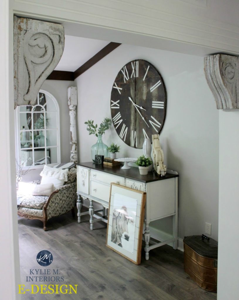
- Painted Wood. Painted wood is a BIG deal in the farmhouse/country world. Whether they’re minorly distressed or have the livin’ daylights beat out of them, painted wood furniture pieces are a GREAT way to infuse country style into your home.
- Texture. Painted or stained woods are often highly textured. You’ll also see a lot of textures with linens and accessories. In the more MODERN farmhouse style, you’ll see a lot of smooth white oak.
- Off-white. Whether it’s walls, trim work, cabinets or furniture, no country style home is complete without white or off-white SOMEwhere.
- Dark metals. When it comes to door hardware, cabinet pulls and light fixtures, most farmhouse style homes use a black or dark, tarnished metal finish. Sure, you’ll see the odd bit of brass or pewter pop up, but generally speaking, it’s black, oil rubbed bronze and aged brass that you’ll see the most of.
- Woven Woods. While it’s not shown in ALL of the photos below, most country-style décor involves some kind of woven wood (wicker or rattan). This can be in the form of baskets, chair seats, rugs, blinds or home décor.
Please note, that while not ALL of these photos show modern country-style rooms, I rely 100% on my E-design clients for their after photos and don’t source out – so I do the best I can with what I have!
See the before and after photos HERE
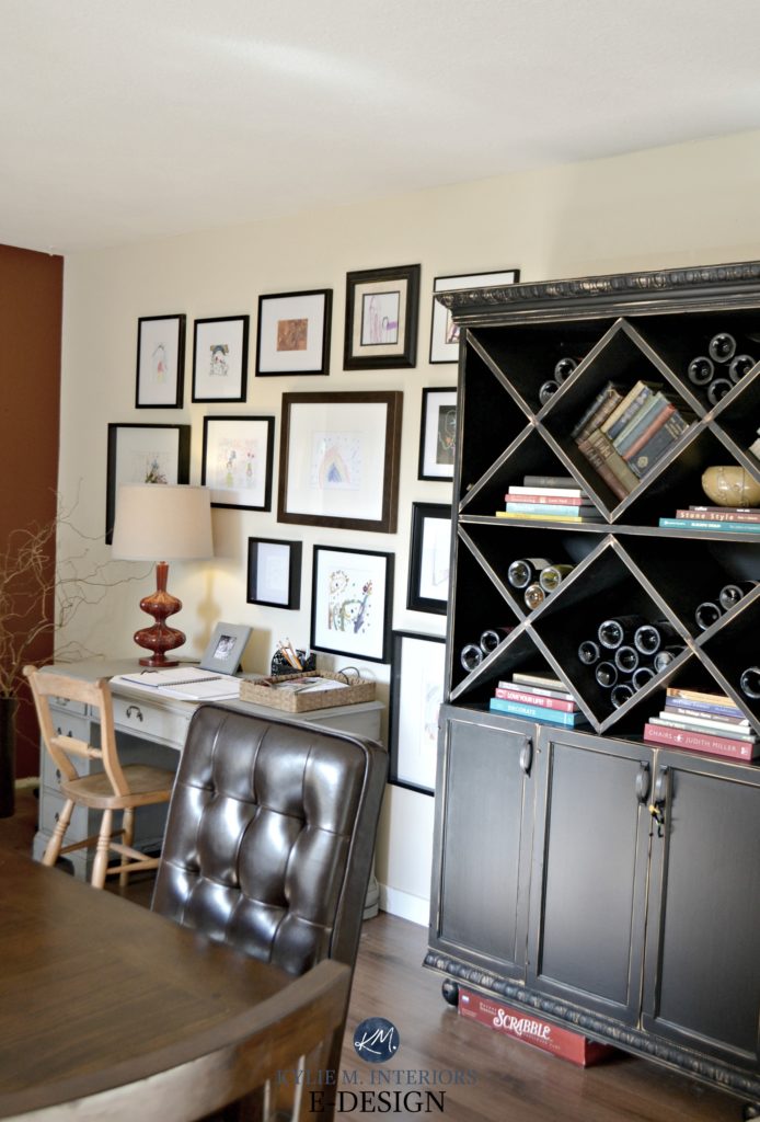
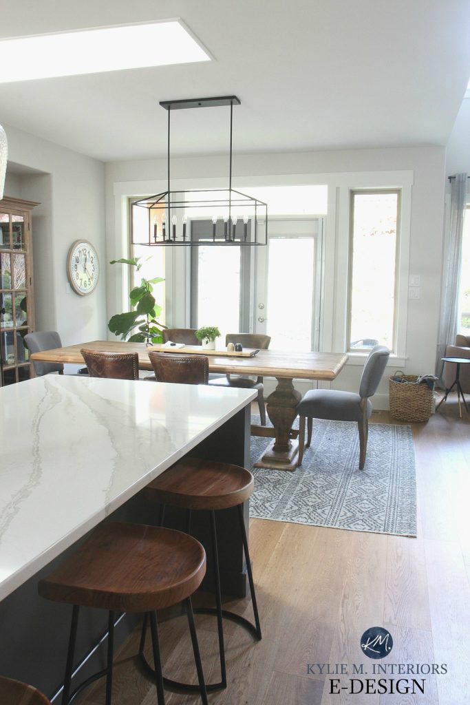
Palette 1: Warm & Simple Modern Country Style Colours
Today’s farmhouse style often revolves around gray, so it’s nice to see a room with a warmer touch!
Warm colours are also a consideration for north-facing rooms, to help balance out some of that gray light coming in the windows.
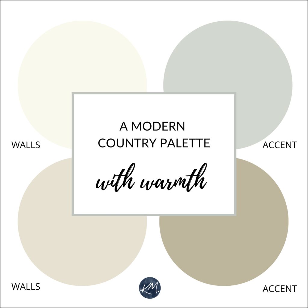
Approximations of SW Creamy/ BM Manchester Tan / BM Bennington Gray / SW Oyster Bay
Warm-toned paint colour ideas for your walls
BENJAMIN MOORE NAVAJO WHITE OC-95 or GENTLE CREAM OC-96
Navajo White is a warm, soft cream. Not overly yellow, but still leaving beautiful warmth on the table (especially if it’s a cooler north-facing room). Gentle Cream has a bit more body and weight to it.
Paint Colour Review: Benjamin Moore Gentle Cream
BENJAMIN MOORE MANCHESTER TAN HC-81
Manchester Tan has been kickin’ it for a LONG time – and for good reason! It’s a beautiful light tan paint colour. And while the odd time it can grab a wee wink o’ green, it generally stays pretty passive.
The Best Beige & Tan Paint Colours
SHERWIN WILLIAMS CREAMY SW 7012
For a bit more oomph (super technical term), Creamy adds a touch more depth, without committing to any set colour other than ‘cream’.
Read more: Paint Colour Review: Sherwin Williams Creamy
SHERWIN WILLIAMS ACCESSIBLE BEIGE SW 7036
Accessible Beige is a beautiful beige with a subtle gray undertone.
Read more: Colour Review: Sherwin Williams Accessible Beige
SHERWIN WILIAMS BALANCED BEIGE SW 7037
Balanced Beige is the light/medium version of Accessible Beige.
BENJAMIN MOORE BALLET WHITE OC-9
Ballet White gets me EVERY time – I’ve yet to see a room I don’t love it in! With its soft cream, beige, greige blend, it’s a great muted warm option.
Some Pretty Accent Colours: BM Wythe Blue / BM Wedgewood Gray / SW Keystone Gray / SW Classic French Gray / BM Tawny Rose
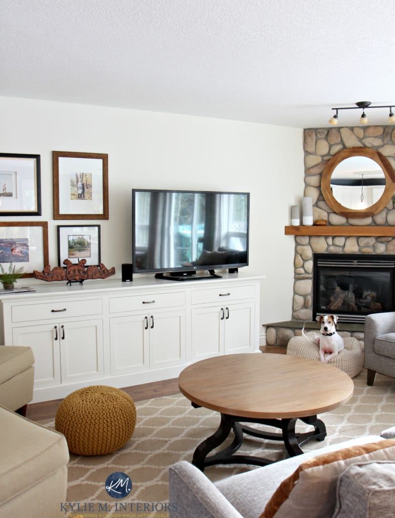
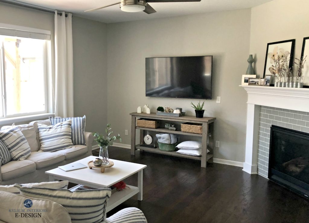
Palette 2: Modern Country Style Paint Colours – Gray & Greige
Oh, you knew I couldn’t stay away from gray for long! Gray is a cool looking colour, so you’ll want to layer it with tones and texture to visually warm things up.

An Agreeable Farmhouse Dining Room Makeover

Approximations of SW Repose Gray / SW Agreeable Gray / SW Cyberspace / SW Grizzle Gray
Neutral or gray paint colour ideas for your walls
This look keeps things pretty simple with a tone-on-tone, textured neutral palette. Minor accents might be found in the form of darker blue, green or caramel.
SHERWIN WILLIAMS REPOSE GRAY SW 7015
You won’t have to travel far to find a home painted in Repose Gray. This is a light depth warm gray. It favours a vague purple undertone, but can easily pick up a wink o’ green.
Paint Colour Review: Sherwin Williams Repose Gray
SHERWIN WILLIAMS AGREEABLE GRAY SW 7029
A soft warm gray that is ALMOST greige, Agreeable Gray is just a wink more than a ‘warm gray’.
Read more: A Country Dining Colour Review – Agreeable Gray
BENJAMIN MOORE REVERE PEWTER HC-172
With a bit more colour than today’s most popular gray paint colours, Revere Pewter is a beautiful colour with a subtle greige-green undertone that stops it from looking cold. Equally as gorgeous is Sherwin Williams Colonnade Gray, which easily gives Revere Pewter a run for its money!
Read more: Colonnade Gray vs Revere Pewter
SHERWIN WILLIAMS SILVERPLATE SW 7649
Silverplate is a light-medium depth stormy gray with a vague blue undertone. Kissin’ cousin to the ever-popular Benjamin Moore Stonington Gray. Remember, every gray has undertones, so be sure to pick the one that best jibes with the finishes in your room as WELL as your exposure!
Some Pretty Accent Colours: SW Cyberspace / SW Grizzle Gray / SW Night Owl / BM Stratton Blue / BM Chelsea Gray / SW Stamped Concrete
Click HERE or on the above image to see available packages
Let’s take a quick break to talk about paint samples…
Undoubtedly, you’ll be heading out in the near future to grab paint samples – stop right there! I want you to check out SAMPLIZE. Samplize offers peel and stick paint samples that are more AFFORDABLE, EASIER and more ENVIRONMENTALLY FRIENDLY than traditional paint pots. Here are just a FEW reasons why I recommend Samplize to my clients…
- Samples arrive ON YOUR DOORSTEP in 1-3 business days, depending on location
- At $6.99, they’re more affordable than the samples pots/rollers/foam boards that are needing for traditional paint sampling
- If you keep the samples on their white paper, you can move them around the room
Visit the SAMPLIZE website HERE
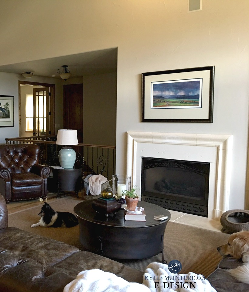
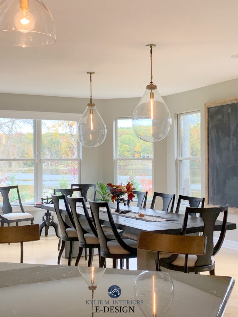
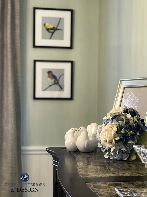
Palette #3: A Wee Splash of Colour in Modern Country Style
When I say splash, I mean in the shallow end of the pool! Nothing is dominant in this palette as the wall colour, wood tones and accent colours flow together in a soft and subtle way.
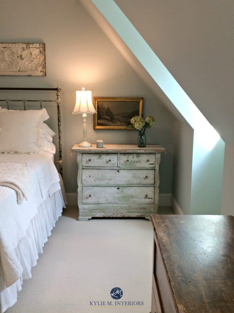
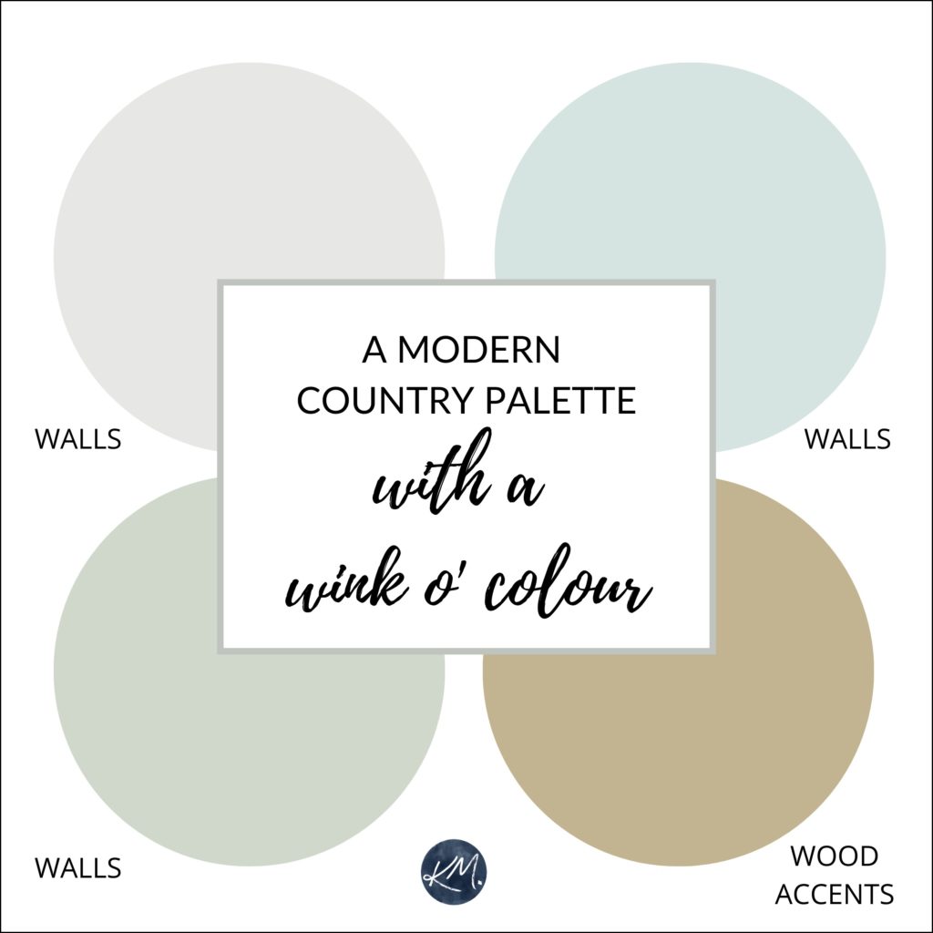
Approximations of SW Gossamer Veil / SW Liveable Green / SW Rainwashed
Slightly more colourful paint colour ideas for your walls
This look has a gentle vibe to it. Nothing jarring or surprisingly out of place – just soft and country!
SHERWIN WILLIAMS GOSSAMER VEIL SW 9165
While Gossamer Veil isn’t overly colourful, it’s a BEAUTIFUL complement to the others. It’s a soft warm gray, almost greige with a slight preference for green undertones, but can easily flash into the other cool undertones.
SHERWIN WILLIAMS LIVEABLE GREEN SW 6176
As its name suggests, Liveable Green is a very liveable green! While the gray is a bit more passive in it, it’s not so green that it’s overpowering.
Read more: The 7 Best Green Paint Colours
BENJAMIN MOORE WOODLAWN BLUE HC-147
Woodlawn Blue is a soft blue with a gray backdrop and a tiny wink of green to soften it up.

SHERWIN WILLIAMS RAINWASHED SW 6211 or SEA SALT 6204
Rainwashed is a well-balanced blend of blue and green with a subtle gray to calm it down.
Sea Salt is a gray/green that loves to pick up some blue as well!
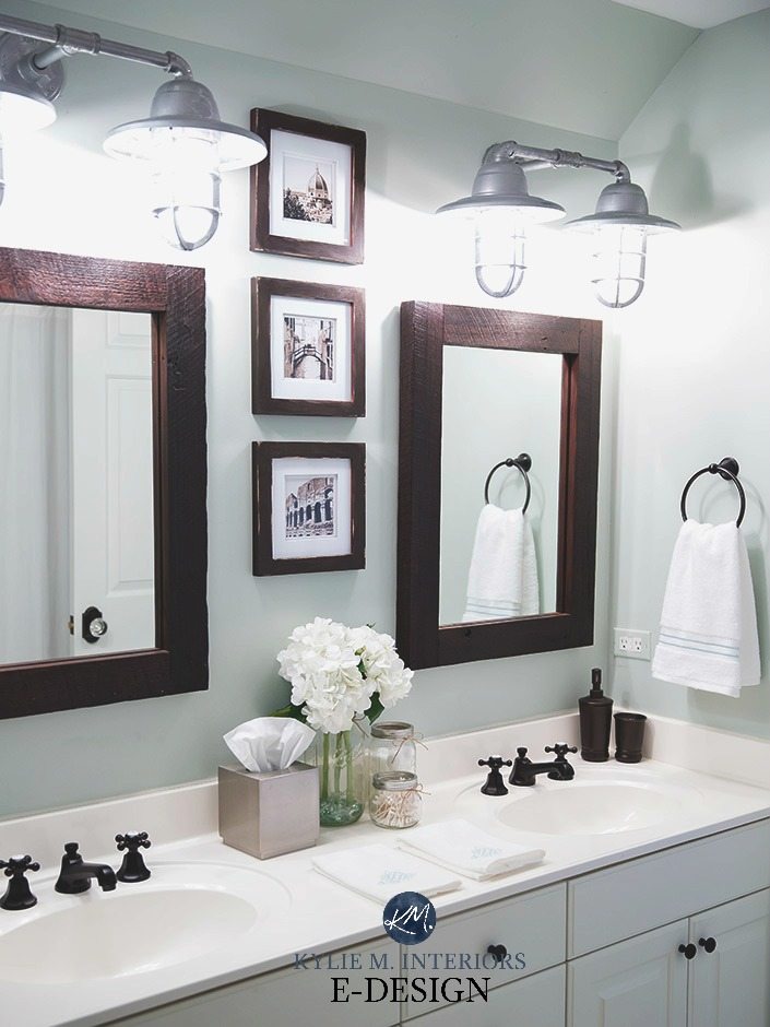
All About Sherwin Williams Sea Salt
Want your own customized paint palette?
Check out my affordable Online Consulting and Colour Services!
Chat soon,

READ MORE
A Modern Farmhouse Style Home – Colours & More!
LRV – The Ultimate Guide to Choosing the Best Paint Colour
An Autumn-Inspired Country Farmhouse Palette
A More Colourful Modern Farmhouse Palette: Real People/Real Homes
Originally written in 2016, updated in 2020
Comments
More Posts

The 5 Best Creamy White or Off-White Paint Colors
THE ELUSIVE ‘CREAMY WHITE NEUTRAL’ When it comes to light, warm neutrals, it’s all in the undertones. And other than pink and green, yellow is the undertone many of my
Read More

The 8 Best Warm Neutral Paint Colors With NO Yellow Undertones!
The Top Light Depth, Warm Colors That Aren’t Cream! When choosing the best warm neutral paint color for your home, whether creamy white, beige, taupe, or greige, your choices are
Read More

The 12 Best Farmhouse Sinks of 2024
FIND YOUR DREAM SINK HERE… While traditional farmhouse design was all the rage in previous years, the embers have definitely cooled. As for MODERN farmhouse, it’s still kickin’ its cowgirl
Read More

