
Posted on April 6, 2021 by KylieMawdsley
ONLINE COLOUR CONSULTING: OFF-WHITE KITCHEN CABINET MAKEOVER
When this kitchen showed up in my inbox, it had a LOT going for it…
This post may contain affiliate links. If you make a purchase through links on our site, we may earn a commission.
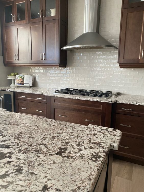
Gorgeous granite countertops, updated wood flooring, and a modern subway tile backsplash were just a few of the great features in this kitchen. However, my client was tired of the dark wood cabinets and wanted to give them a colour face-lift, which is where I came on the scene.
How to Update OLDER Granite Countertops
The granite countertops weren’t in a position to support WHITE cabinets and demanded a SOFTER approach.
There’s also that beautiful warm gray-taupe subway tile backsplash. And because the backsplash is the FIRST PLACE YOU LOOK when choosing a cabinet colour, these tiles, along with the warm base of the granite countertops, were the inspiration for this…
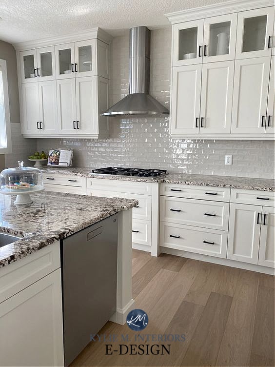
SHUT THE FRIGGIN’ FRONT DOOR (or the cabinet door, might be more the point)! I mean, I didn’t mind this kitchen before, even if the wood was a touch heavy and rich. But HOLY DINAH does it ever look good now!
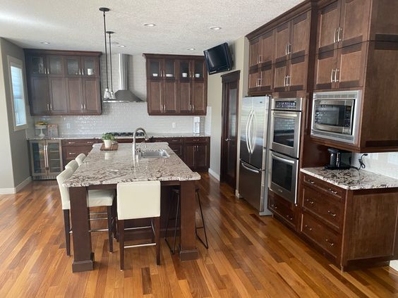
Let’s get a nice full shot of this bad boy. This is a great photo, as you can see the ORIGINAL floor…
The old flooring was way too orange for the cabinets, and even just changing this was a great move for this space. HOWEVER, painting the cabinets really took it to the next level…
There’s only one thing I’d suggest (and it’s not a big thing). The paint colour on the walls, Benjamin Moore Ranchwood, is just a TOUCH too heavy and warm. UGGGGH, I feel so mean when I do this, but I have a little radar go off in my head when I get near wine, crave Doritos, see Ryan Reynolds in a movie, AND when a colour is just a bit off.
Worth changing? For most of the world – HECK NO. But for me, who is a glutton for punishment, you know I’d change it. What colour would I sample first? Oh, Benjamin Moore Collingwood FOR SURE, with Balboa Mist in hot second. Again, I’m being particular, but that’s why you love me – also because I’m cute and witty…riiiight?
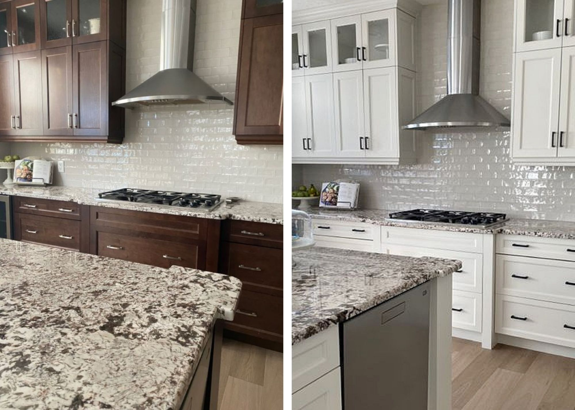
And I bet you’re wondering about this magical paint colour on the cabinets. It’s none other than Benjamin Moore Classic Gray. SURPRISED? You should be.
Classic Gray can look CONSIDERABLY grayer on walls with a more noticeable purple, sometimes purple-pink undertone (remember, EVERY gray has undertones). However, cabinet colours have different formulations AND the sheen affects the way a colour looks as well. Classic Gray was also lightened by 25% for this project which can account for a bit of that shift as well.

The 5 Best Off-White Paint Colours
Not sure if you should paint YOUR kitchen cabinets? I’ve got a fun QUESTIONNAIRE STYLE blog post for you to check out. Need some inspiration? I’ve got that too! Just scroll down to the READ MORE section at the bottom of this blog post.
NEED HELP?
CHECK OUT MY ONLINE PAINT COLOUR CONSULTING & E-BOOKS!
READ MORE
How to Update OLDER Granite Countertops
Budget-Friendly Kitchen Makeover with Benjamin Moore Cloud White
A Budget-Friendly FULL Kitchen Makeover with Benjamin Moore Collingwood and More!
Comments
Leave a Reply
More Posts

The 5 Best Creamy White or Off-White Paint Colors
THE ELUSIVE ‘CREAMY WHITE NEUTRAL’ When it comes to light, warm neutrals, it’s all in the undertones. And other than pink and green, yellow is the undertone many of my
Read More

The 8 Best Warm Neutral Paint Colors With NO Yellow Undertones!
The Top Light Depth, Warm Colors That Aren’t Cream! When choosing the best warm neutral paint color for your home, whether creamy white, beige, taupe, or greige, your choices are
Read More

The 12 Best Farmhouse Sinks of 2024
FIND YOUR DREAM SINK HERE… While traditional farmhouse design was all the rage in previous years, the embers have definitely cooled. As for MODERN farmhouse, it’s still kickin’ its cowgirl
Read More


Do you know what the trim color is? I have BM Edgecomb Gray walls and SW Pure White trim. I’m trying to determine if this color or lightened by 25% is an option for my cabinets. I know I have other factors to consider, but I’m trying to narrow down my options.
Author
Hi Meagan, from what I remember, the trim was already in place when I did this project! I would say it’s along similar lines to Pure White. HOWEVER, I wouldn’t do Classic Gray with Edgecomb Gray walls, it won’t work. If anything, play around with Edgecomb Gray, try it 50% lighter to see how that looks. Generally, when the walls are a light colour already, it’s hard to get another off-white/light colour on cabinets and it’s usually best to go with white or step into something with more depth :).
Hi Kylie –
What a gorgeous makeover. We’re planning a kitchen with similar floor and similar granite, and we’re now thinking we’ll actually use Classic Grey on our cabinets! (With dark gray stained maple on the island cabinetry).
Could you please tell me what the backsplash tile is in these photos? We’re currently looking at Ames Manhattan Gray 4X12, which appears darker than what I’m seeing here.
Author
Oh, Ramona, I would SO love to tell you, but I’m not sure what the brand is that she chose! My best advice is that whether your subway tile is lighter or darker than the cabinets, don’t order it until the cabinets are painted and done. I find that Classic Gray OFTEN looks warmer than expected. Once the cabinets are done, bring the tile samples home and make sure things flow – the tiles should literally be versions of the cabinet colour – just lighter or darker.
That’s great advice! Thanks so much, Kylie!
BTW, I LOVE your work and all the info you provide. I’ve learned so, so much!
Ramona