
Posted on August 11, 2020 by KylieMawdsley
BEIGE TILES, CARPETS, KITCHENS, BATHROOMS, & MORE…
If there’s one colour from the late ’90s and early 2000s that haunts MANY dreams, it has to be beige. Many are trying to step out of the warm, Tuscan-inspired vibe and into something a bit more updated, but those darn beige tiles and carpets put a hard stop to that every time! I love beige, but like with my inappropriate humor, it’s all about the ‘right place, right time,’ a concept that both beige and I struggle with.
The thing is, you have to listen to your home and its particular needs, even if those needs go against what you really want to do. But that doesn’t mean there isn’t a happy medium, and I’m here to help you find it.
This post may contain affiliate links. If you make a purchase through links on our site, we may earn a commission.
I’m not just here to tell you what to do; I’m gonna teach you how to do it.
To determine what your home’s needs are, you need to figure out what you’ve GOT first. Beige, whether tile, paint colour, furniture, or carpet, will have some combination of orange, pink, or yellow undertones (green sneaks in once in a while too).
While the scales can tip towards one undertone or another, the MOST COMMON undertone combination found in beige is orange-pink.
Once you figure out the particular blend of your beige, it’s much easier to move forward with confidence.

THE TWO MAIN TYPES OF BEIGE
A lot of time is spent trying to avoid the following undertones. When you fight a color or try to avoid it (i.e., paint your walls a beautiful shade of blue or green), you can make things worse if you’re hoping to downplay the orange or pink undertones, of which you’ll find two types…
- ORANGE-PINK: This is the most common blend by a lot shot. In my Online Color Consulting, if I do 100 consults in beige-based homes, 98 of them are orange-pink. You’ll find this particular undertone in many of the tiles from the Tuscan trend of the early 2000s (i.e., travertine tile, which I actually have mad love for, along with Ryan Reynolds, both of which I’d love to roll all over).
- ORANGE-YELLOW. Overall, this can be a slightly more ‘golden’ look, but it’s definitely NOT as common (more often in fabrics than hard surfaces). And because I like to hit mass appeal as much as possible, it’s not the focus of this blog post.
You probably HOPE you don’t have orange-pink tones in your finish…but if you have beige, I bet you do.
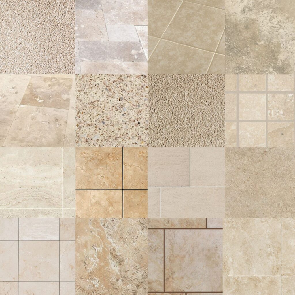
FINISHES THAT ARE MOST LIKELY TO HAVE PINK OR ORANGE-PINK UNDERTONES
- TILE – specifically travertine tile, which can nod HARD towards Tuscan-style
- CARPET – 1990s in particular (as well as mid-2015s funny enough #notfunny)
- FURNITURE – warm, neutral, micro-fiber sofas are the most common culprit
- GRANITE COUNTERTOPS – 1990s in particular. In the early 2000s, we started to see a nod towards gold (orange-yellow)
BEIGE SURFACES WITH OTHER COLORS/SHADES MIXED IN
A bit of variation in your beige surface could give you WAY more colour flexibility, as sometimes, you can lean into the ‘other color’ in your beige finish.
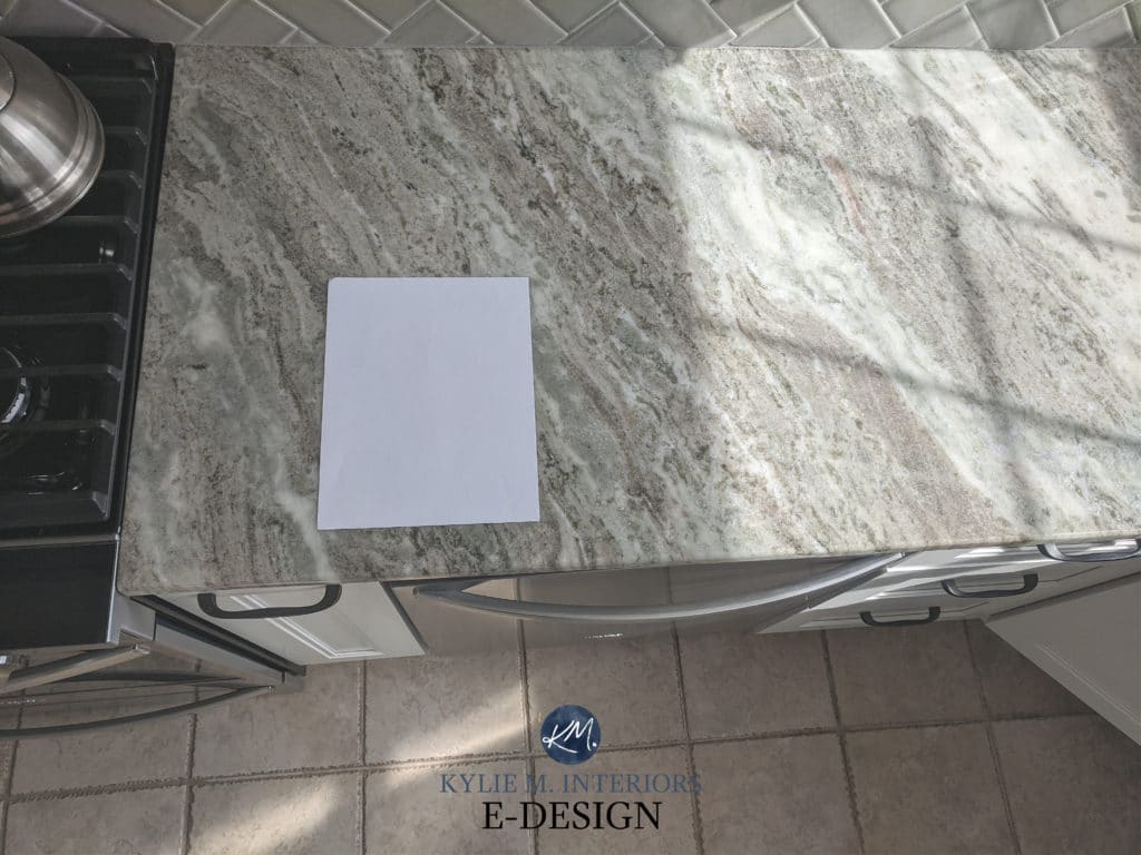
In this next photo, the beige tile and countertop have a wink of green, which we gladly grabbed onto, meaning we could use the GLORIOUS Benjamin Moore Arctic Shadows on the walls…
Photos via Tim Hanson Productions
FULL Paint Colour Review of Benjamin Moore Arctic Shadows
I love this next tile. While it has a beige base, just LOOK at the flexibility its other colors give us, making room for the warm taupe-greige approach of Benjamin Moore London Fog on the walls…
Now, before we get to the paint color ideas, let me answer one VERY important question…
IS BEIGE POPULAR IN 2024?
HECK YES, IT IS! But don’t get your dancin’ shoes on yet, as not every beige makes the cut. Beige is definitely making a comeback in the paint color world, which bodes well for many of the shades listed below. However, when it comes to surfaces like carpet, tile, and countertops, beige is dragging its toes a bit.
I’m seeing more beige countertops, especially certain quartzite ones (as there aren’t many other gorgeous beige countertops in the quartz world). As for tiles, beige hasn’t hit any kind of stride—the same goes for carpet.
This means that while beige colors are a hot topic, your 1990 to mid-2000s beige finish might not be at the height of fashion. This is likely due to its depth, commitment to undertones, and/or its surrounding finishes, as one beige often leads to another…and another.
Now, let’s see what I’ve got up my colorful little sleeves!
PAINT COLOUR IDEAS TO UPDATE BEIGE CARPET OR TILE
If your tile or carpet has a committed pink undertone and you don’t want beige walls, look for warm, neutral paint colors that have a tiny bit of pink in them (common in taupe). This doesn’t mean you’ll have pink walls, but you’ll have pink-friendly walls. While you can also entertain a green undertone, do so cautiously and ensure your beige surface is super subtle in its approach.
By the way, while these colors are a great place to start, they aren’t a ‘one size fits all’ (that doesn’t exist). Make sure to SAMPLE & COMPARE!
1. BENJAMIN MOORE PALE OAK OC-20
Pale Oak is a super popular taupe for coordinating with beige surfaces. This isn’t to say it always works (there is no ‘foolproof color,’ but it’s a great place to start.
FULL Paint Colour Review of Benjamin Moore Pale Oak
Some carpets and tiles have a pink or orange-pink undertone but also have a warm violet-pink (taupe) in them, making them a bit more flexible toward taupe paint colors. Taupe paint colors are warmer than gray but NOT as warm as beige.
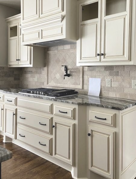
In this next photo, we’re dealing with a tile that is orange-pink with some taupe in it as well (the slightly grayer-looking color in the tile)…
If your surface has a mix of colors, it’s much easier to stretch outside of the beige box. Of the three paint colors in the above photo (the main wall color and two samples), which one do YOU think works the best?
If you guessed the right side, you’d be correct! Benjamin Moore Pale Oak is a soft, warm gray-taupe with passive purple-pink undertones hitting a real happy place with the tile.
Can we stretch the above tile into something grayer like Benjamin Moore Collingwood (old color), Classic Gray (left sample), or Balboa Mist (not shown)? It NEVER hurts to try, but my money’s on Pale Oak.
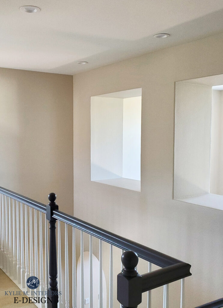
In this next example, the brick fireplace, carpet, and walls all have pink undertones, which means they’re well-coordinated. My client also chose furniture in a warm gray with a violet undertone, which sits MUCH better than a gray with a green undertone would.
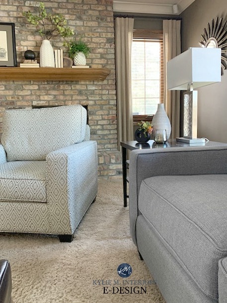
The awesome thing about a room like this is that the brick offers flexibility toward the beige end of things OR the warm gray/taupe range!
2. SHERWIN WILLIAMS POPULAR GRAY 6071
With its LRV of 61, Popular Gray has more depth than Pale Oak and a more obvious undertone (violet-pink). Popular Gray is warmer gray, meaning it’s a shade of taupe.
Paint Colour Review of Sherwin Williams Popular Gray
3. BENJAMIN MOORE CEDAR KEY OC-16
I’m sneaking Cedar Key here because it can be a GREAT moderator between beige and taupe.
Why?
Cedar Key is a shade of beige that gives a huge nod to taupe, making it a great option for updating a beige surface without 100% committing to beige! Want a bit more depth? Check out Smokey Taupe—MAD love (just make sure it doesn’t flash any green at all).
Benjamin Moore Cedar Key walls
Cedar Key’s LRV (Light Reflectance Value, which tells us how light/dark it is) is 61.05, making it a light depth warm neutral.
Paint Colour Review of Benjamin Moore Cedar Key
How to Update Cream Cabinets & Trim
4. SHERWIN WILLIAMS VERSATILE GRAY 6072
Versatile Gray is a stunning, light-medium depth taupe with an LRV of 48, which means it has a bit more meat on its bones and that GLORIOUS taupe vibe we’re looking for.
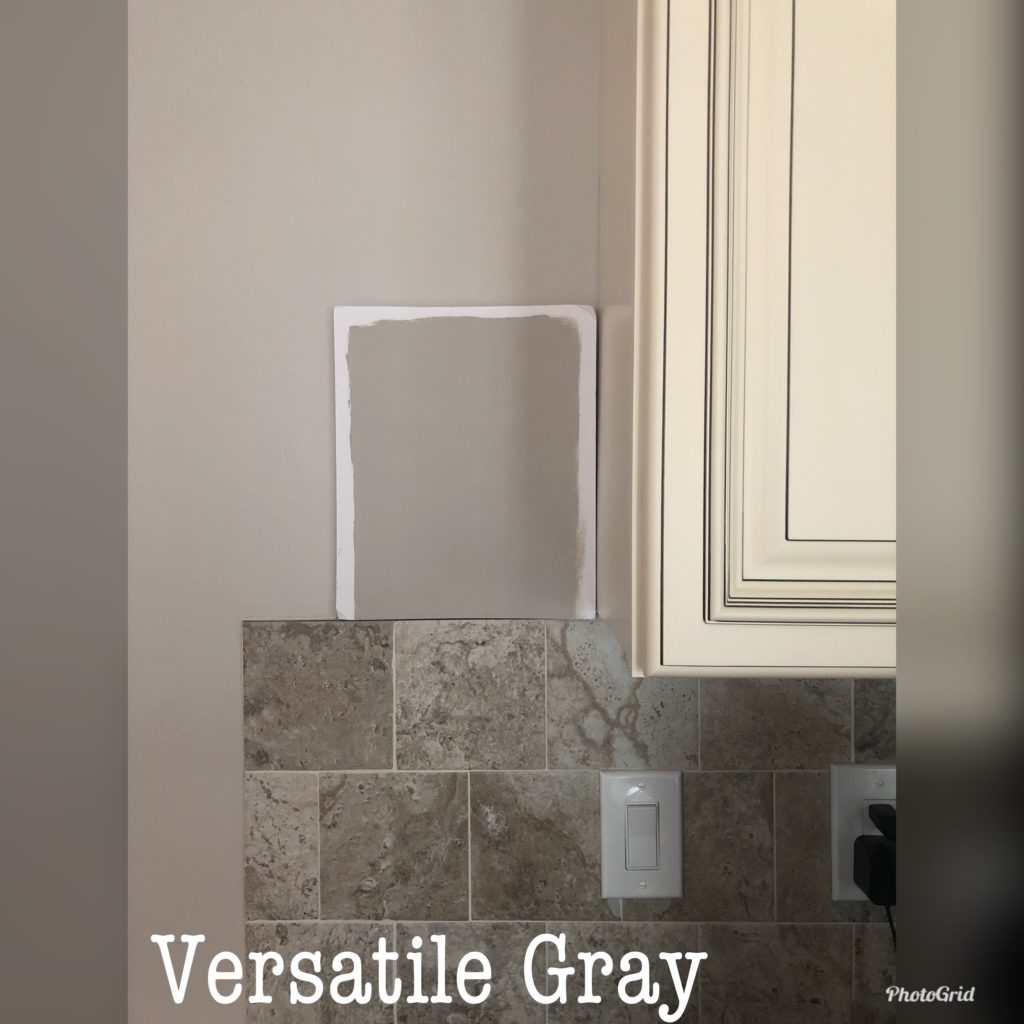
The tile in the above photo is like a hybrid of beige with a pink-orange undertone and a lot of taupe, making Versatile Gray a very interesting and flexible choice!
FULL Paint Colour Review of Versatile Gray
5. SHERWIN WILLIAMS EGRET WHITE 7570
Egret White is a gentle, subtle taupe with an LRV of 70, putting it on the high end of the light range. While it’s similar in depth to Pale Oak, it’s a bit grayer, so make sure your beige tile can support this added dose of gray!
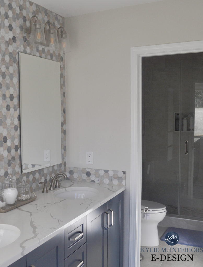
Paint Colour Review of Sherwin Williams Egret White
If you like Egret White, you might also check out Benjamin Moore Edgecomb Gray – it’s a beauty!
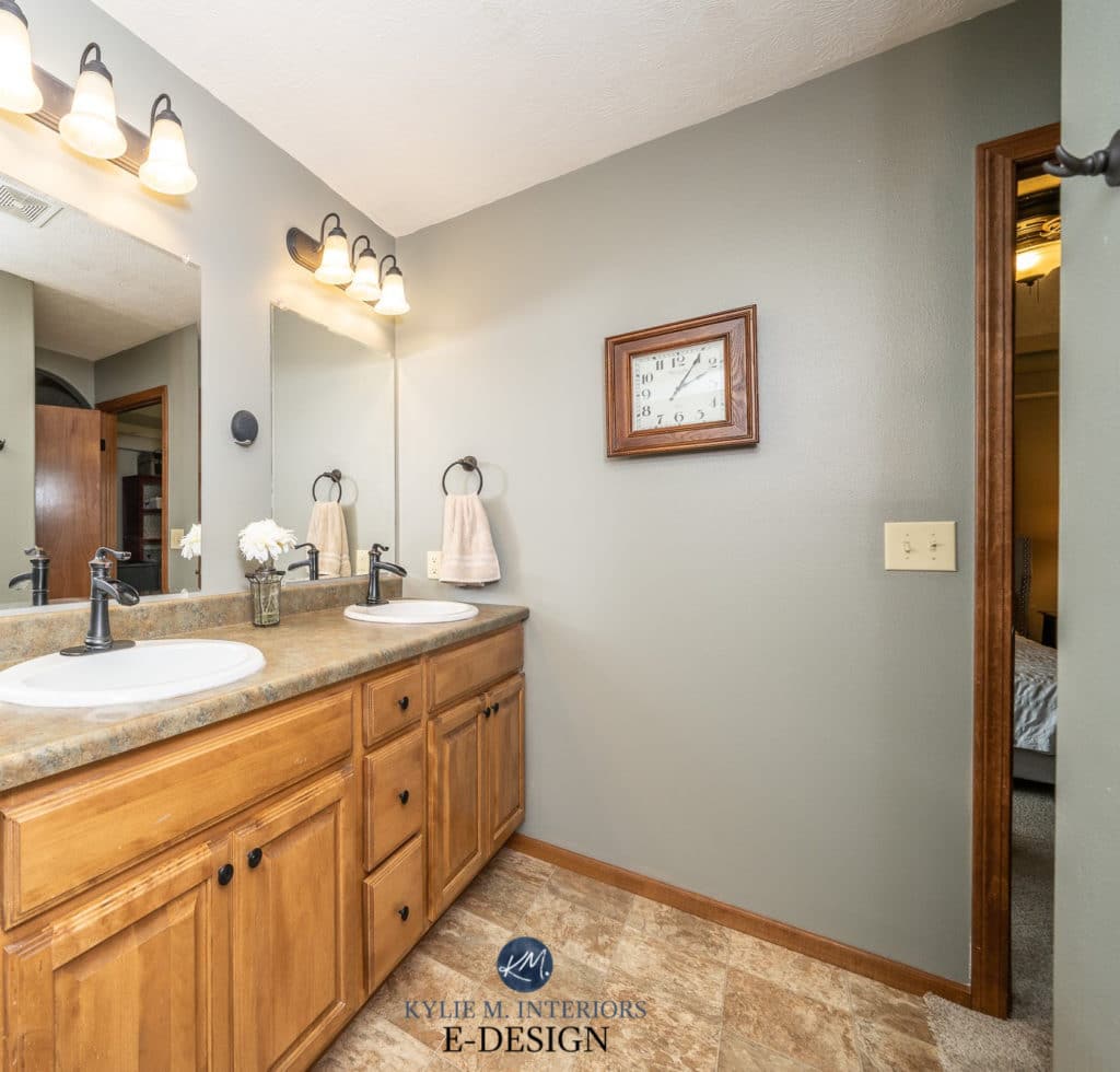
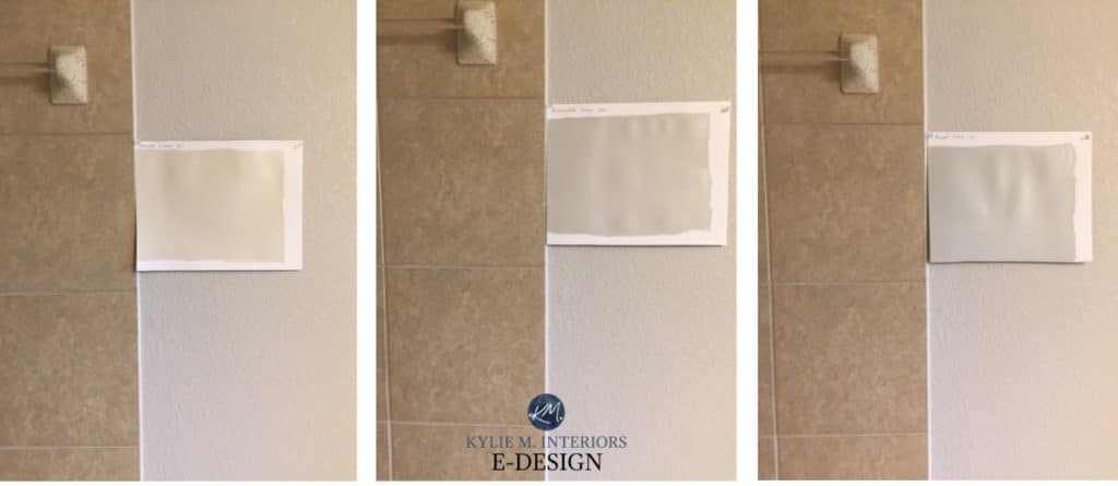
6. BENJAMIN MOORE CLASSIC GRAY
Classic Gray is right up there with Egret White as a valid choice, thanks to its soft, taupe-ish undertone. It’s up for debate whether Classic Gray is a warm gray or taupe, as, like many colors, it can really shift its look depending on your room’s exposure, lighting situation, and the surrounding finishes.
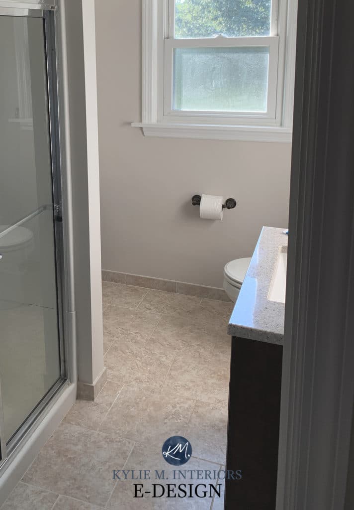
My client’s bathroom (below) has no natural light but a reasonable amount of interior lighting (likely 3000+ Kelvins). In this space, Classic Gray is a good fit and makes the beige travertine tile look MUCH more modern…
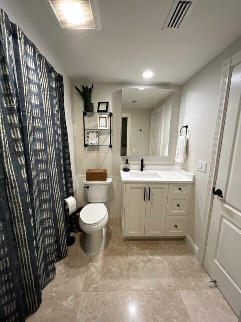
Classic Gray is a popular shade commonly used in new homes and home staging. Not only that, but it pops up on cabinets, too!
Paint Color Review of Benjamin Moore Classic Gray
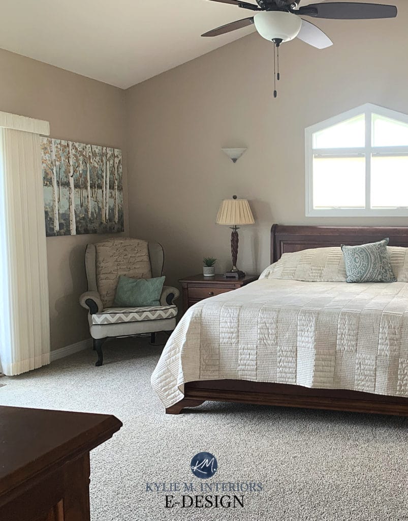
7. BENJAMIN MOORE REVERE PEWTER HC-172
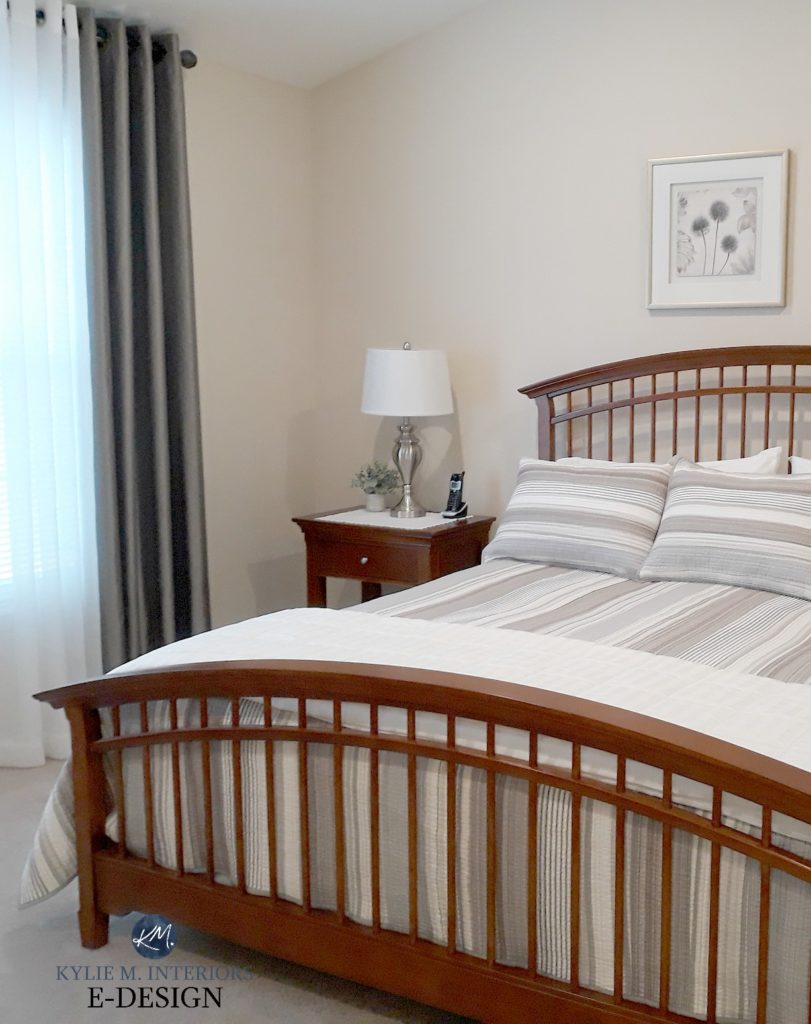
Revere Pewter can be hit and miss (all of them can be, depending on your exact beige finishes/lighting/etc.); however, when it works, it’s a BIG hit. Revere Pewter is a light (on the darker side of this range) warm gray (almost greige) with a lovely green undertone. This subtle green can be a pretty complement to an equally as subtle beige surface.
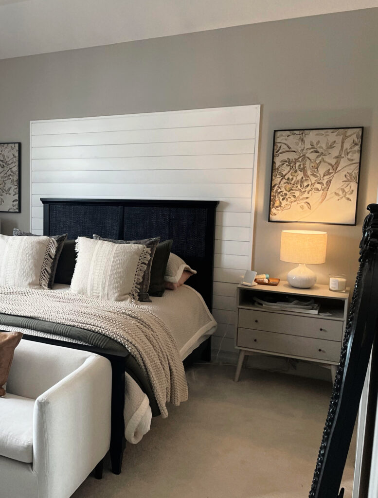
This bedroom carpet is a very slight, light shade of beige that’s more pink than orange. Notice how the Revere Pewter walls are a shade darker than the carpet (one reason this works), and the undertones are subtle (another reason this works).
FULL Paint Color Review of Benjamin Moore Revere Pewter
Get a CURATED BUNDLE OF MY FAVORITE TAUPE-INSPIRED PAINT COLORS HERE / HERE
Samplize Peel & Stick paint colors are more AFFORDABLE than sample pots and are delivered to your door in ONE DAY!
Remember, you might not be able to FULLY update your beige surface (based on your original paint colour hopes).
Sometimes, it is what it is, and the best you can do is make it look as ‘modern as possible‘ given its age, style, size, etc. While you can likely get out of the more rich golden colors commonly used 20 years ago, you might still need to paint your walls a warm colour for things to flow—you’ll just be looking at more modern, warm paint colours.
In this next example, look at the progression from a warm beige (left) to a more muted beige (center) to a warm gray (right). The COOLER we go, the more it clashes with the bones of the tile, with the sample on the right not connecting at all. And while the tile humors the center colour, the left sample is the best choice.
Generally speaking…
- Beige tiles often handle a warm violet undertone better than a blue or green undertone when contrasting with the beige.
- Carpet tends to have more flexibility as it’s often a solid colour. This means you can find some beige carpets that humor a gray or greige with blue, green, or violet undertones, but you still have to be careful as NOT ALL carpets can do this!
WARM PAINT COLORS THAT COORDINATE WITH BEIGE FINISHES
Depending on how beige your surface is, sometimes the best paint color for your walls IS…beige. But don’t worry, beige is NOTHING like it was back in the early 2000s. Today’s best beiges are subtle, soft, and super sexy.
However, you have to sample carefully. Some of these shades are on the border of being ‘orange-pink-beige enough’ for many beige finishes. The reason I chose them is that EXACT reason – they aren’t SUPER orange-pink-beige, but they have a great chance of hitting the spot. Sample and compare a range of shades to see which one connects best.
1. BENJAMIN MOORE MARITIME WHITE
Maritime White is a light, off-white approach to beige with a balanced orange undertone. While it’s often used on cabinets, it’s also a great shade for walls, as shown in my client’s eating area, which has travertine-look tile flooring.
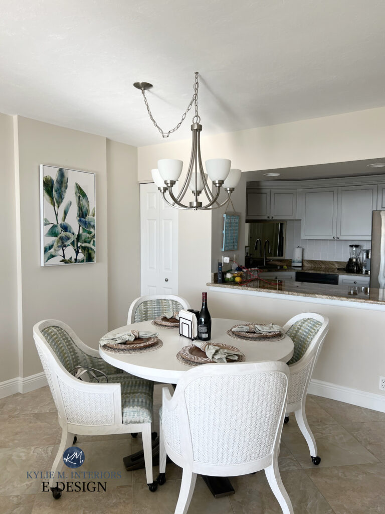
Paint Color Review of Benjamin Moore Maritime White
2. SHERWIN WILLIAMS DIVINE WHITE
If you’re looking for a Divine shade of beige (not white, as its name suggests), Divine White is a stunner. This is a soft, off-white beige with noticeable, but not overwhelming, undertones that are based on an orange base.
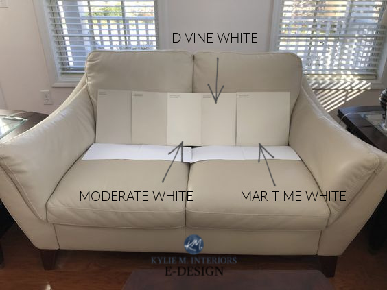
Paint Color Review of Sherwin Williams Divine White
3. BENJAMIN MOORE MUSLIN OC-12
Muslin has been kicking it a long time in the beige world for good reason. This moderate shade of beige is in the light range, thanks to its LRV of 66.54. It’s also super well-balanced—not too orange-pink or orange-yellow.
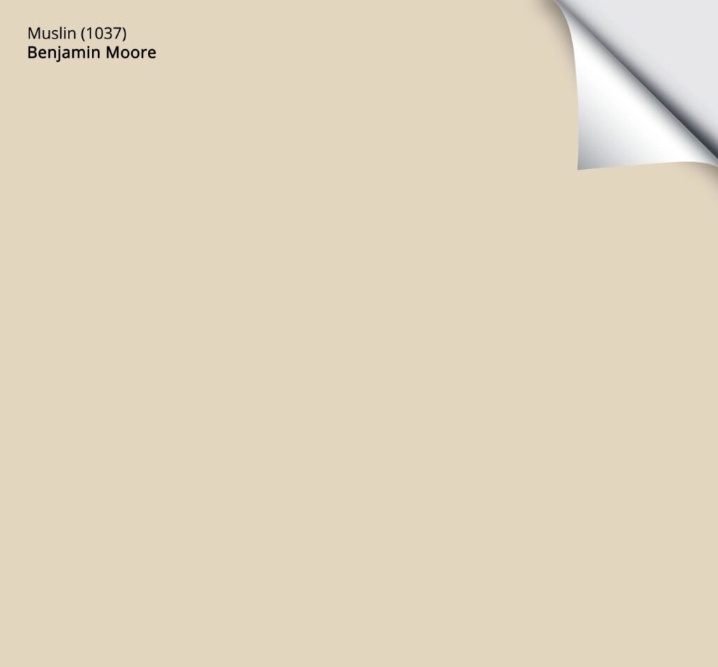
While Muslin is a bit too dark to be popular on kitchen cabinets, it’s HUGELY popular on interior walls; either single rooms or entire homes!
Get your PEEL & STICK SAMPLE OF MUSLIN HERE!
Paint Color Review of Benjamin Moore Muslin
4. SHERWIN WILLIAMS NATURAL LINEN
Natural Linen picks up where Muslin left off, but it comes across as a bit more subdued.
This gorgeous shade of beige has an LRV of 66, which hits my happy place (don’t tell Tim; he thinks he’s the only one who can).
FULL Paint Color Review of Sherwin Williams Natural Linen
5. SHERWIN WILLIAMS RIVER’S EDGE
Now, this is a beige that makes many tiles and carpets happy—but will YOU love it? It’s hard to say. I say this because while River’s Edge is beautiful, it’s a bit different from the others.
River’s Edge is a light-depth shade of beige with an LRV of 63. But while its depth is great, its undertones of orange-pink are a bit more pink than the average beige. This doesn’t mean it’s not the PERFECT beige for your home; it definitely could be. You just need to sample it and see how it settles for you.
Paint Color Review of Sherwin Williams River’s Edge
Get a CURATED BUNDLE OF MY FAVORITE TRENDY BEIGE PAINT COLORS!
Samplize Peel & Stick paint colors are more AFFORDABLE than sample pots and are delivered to your door in ONE DAY!
PAINT COLOURS TO AVOID IF YOU HAVE PINK OR ORANGE-PINK TONED TILE OR CARPET
If you don’t like your beige surface and don’t want to ACCENT it, generally speaking, you should avoid green or blue paint colours (or gray or greige with those undertones). Of course, there are ALWAYS exceptions, especially when the undertones in a carpet are super subtle, but be careful, as a cool paint colour might just ENHANCE your warm-toned products, which doesn’t always create an ‘updated look.’
Not every beige tile or carpet can visually support cool neutral paint colors, so sample carefully and listen to your home.
This next photo is a GREAT example of how some paint colors can really date products with pink undertones (this was one of our homes when we first moved in – woof. Thank God Tim and my Dad flooded the house, and we got new flooring).
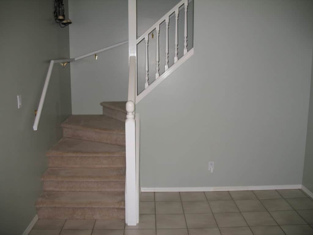
Compared to the green hue on the walls, the pink-beige carpet looks even more pink.
In this next example, the flooring and the table have a pink undertone. However, in this case, a very mild, earthy green undertone was a BEAUTIFUL complement to almost ALL of the hard surfaces in this room, including the dark wood trim – it helps when you have a cute lil Ginger tucked in your back pocket (I will pinch upon request).
How to Change From Beige to Greige, Taupe, or Gray

You should also avoid cream paint colors and beige or tan paint colors with a yellow undertone. Yellow and pink don’t have much love for each other, and you could have a HOT mess of undertones on your hands. In this next photo, my client doesn’t love the home she bought with its Sherwin Williams Antique White island and Macadamia walls.
Why not?
The Antique White island is just a bit too creamy-yellow for the more committed orange undertone (orange-pink) of the travertine tile on the floor, and just BARELY made the cut with the stone fireplace. Macadamia (walls) has a wink o’ green undertone tucked in it, so it’s a bit off with the tile floor.
Again, in this next photo, the previous owner used Antique White on the cabinets, which is just TOO yellow for most beige tiles (and is ALSO why it’s one of the whites I would never paint my cabinets or trim).

COORDINATING BEIGE TILES WITH COUNTERTOPS
Before we finish, I want to quickly touch on finding a countertop that goes with beige tiles.
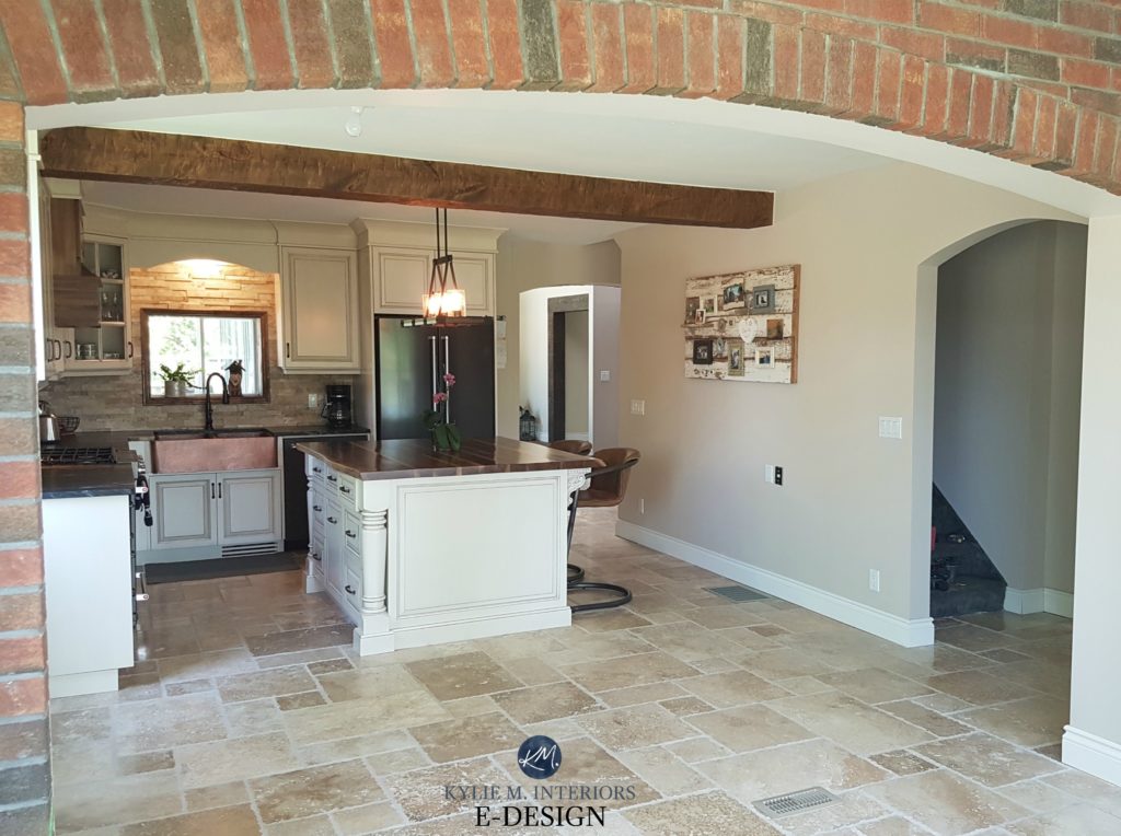
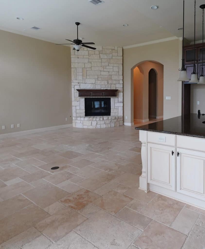
Many of my clients with beige tiles want marble countertops. No can do, Sue. The key is to PICK UP what your tile flooring is throwing down, like this here…
See how the beige of the tile is picked up on the countertop? I was SO happy to see this combo, as the floor and the countertop are working as a palette, with the countertop UPDATING the look of the floor. In a space like this, a marble countertop would make the floor look older. Don’t get me wrong, I think this countertop is a bit busy for the busyness of the floor tile (being a smaller tile size), but the COLORS are bangin’.
There are also the odd white quartz countertops that can flex towards beige tile floors. What are these magical countertops? While this could be a blog post unto itself, for now, look for white quartz countertops with WARM gray veining with a VIOLET or violet-pink undertone. Just as paint colors with these undertones can work with beige tile, this undertone in veining can help tie these two surfaces together. You can also look for a quartz countertop that has a bit of beige or gold in it!
How to Update Your OUTDATED Granite Countertops
The 13 Best White & Off-White Quartz Countertops
So there you have it. I hope these ideas and inspirations get you started on updating your beige home. If not, I’ve got 300+ other articles for you to check out; just type a keyword into my SEARCH area on the right side of my home page for more blog posts!
READ MORE
The Best MODERN BEIGE Paint Colours
The Best Warm Paint Colours – THAT AREN’T BEIGE!
How to Choose Carpet with Confidence
Is Beige Back? You Might be Surprised!
Not sure how to update your beige or Tuscan-inspired room?
Check out my Online Paint Colour Consulting, I’d love to help!
Chat soon,

Comments
Leave a Reply
More Posts

The 5 Best Creamy White or Off-White Paint Colors
THE ELUSIVE ‘CREAMY WHITE NEUTRAL’ When it comes to light, warm neutrals, it’s all in the undertones. And other than pink and green, yellow is the undertone many of my
Read More

The 8 Best Warm Neutral Paint Colors With NO Yellow Undertones!
The Top Light Depth, Warm Colors That Aren’t Cream! When choosing the best warm neutral paint color for your home, whether creamy white, beige, taupe, or greige, your choices are
Read More

The 12 Best Farmhouse Sinks of 2024
FIND YOUR DREAM SINK HERE… While traditional farmhouse design was all the rage in previous years, the embers have definitely cooled. As for MODERN farmhouse, it’s still kickin’ its cowgirl
Read More


Hi Kylie,
Wish I would have read this blog a couple of years ago before mixing some undertones in hard elements that aren’t playing well together.
House was build in 2005 in full blown Tuscan style!
Kitchen floors are Brazilian Cherry and cabinets are Maple with a glaze and medium tone stain (orangey undertones). Countertops are Uba Tuba. I replaced the beige travertine backsplash with an aqua glass tile backsplash . There are actually flecks of a smokey blue color in the Uba Tuba and I was trying to lighten things up!
Kitchen is open to large vaulted family room with pinkyish undertones in beige carpet. I recently purchased a new Transitional style couch in warm medium gray with some beige/sage undertones. Wood furniture is darker stain with red undertones. Carpet isn’t awful with the new couches, but wall color is. And they are huge vaulted walls!
Current wall paint throughout this open area is Sands of Time. Baseboard and door trim is Pacer White. These colors are just “off” with the cooler undertones in the backsplash and couch. Both are West facing with lots of windows.
I have been hoping to improve this hot mess by painting the walls throughout with an updated color that would go with both (the red/orange/pink undertones and the new cooler colors in the couch and backsplash). Considering Worldly Gray or Accessible Beige.
Other wall paint colors I should consider or other suggestions to fix my mess?
Thanks so much for your help!
I did not want to change out the toilet and bathtub in my spare bathroom plus the tile was gray/blue/beige. First I used SW Tradewind (ok but it just wasnt right), SW silverplate 50% (no), SW Gray Collonafe (no) and FINALLY finally!! painted it SW Natural Choice and voila! It was AWESOME. . I need a really neutral light paint all the others were just too Gray. I live in a town home said there was no natural light and the bathroom. And the walls are just a nice neutral blank canvas and the floor tile the vanity and vanity top and the fixtures the hard fixtures that toilet and tub just all go great together. BtW I’ll take days over the depressing Awfulness of drab Gray any day of the week. Page is at least warm but Gray no way depressing depressing depressing. To each their own I suppose.
Thanks Kylie, another great article with the photos to illustrate what you are talking about…and beige is definitely on its way back!
Oh, oh! I’ve got one that is an excellent companion for pink beige tile : Maritime White!!! (BM OC-5). It is light and fresh but does not look pink beige AT ALL. Plus it complements granite countertops with the same sneaky undertone. Check it out. Stay well, Kylie!
Author
You’re SO right, Maritime White is an EXCELLENT choice – absolutely!
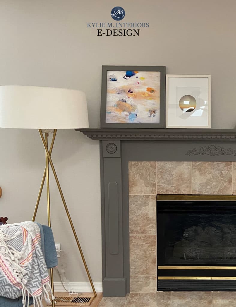
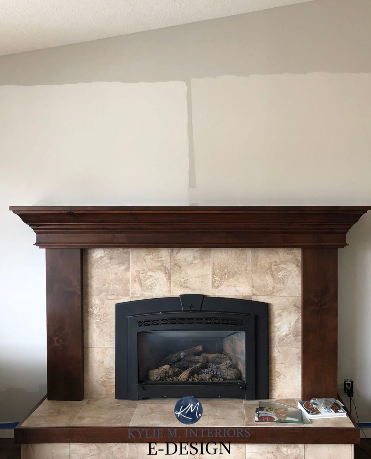
This is so helpful! Can you tell me what grey color you used on the mantle in one of the last pictures?
Author
Oooo, I’m thinking that MUST be the one with Sherwin Williams Gauntlet Gray (or it might be Dovetail).