
Posted on April 15, 2022 by KylieMawdsley
Our New House: Starting (& ending) with the entryway
Here it is, the FIRST blog post about our new house, and I figured there was no better place to start than the entryway!
UPDATED – THIS IS THE HOUSE THAT ALMOST BROKE ME. WE LIVED IN IT FOR 3 MONTHS AND MOVED, HENCE ONLY ONE POST ABOUT IT.
This post may contain affiliate links. If you make a purchase through links on our site, we may earn a commission.
Oh, this house. I love the view; we BOUGHT it for the view, however, I don’t love the house (note that I say house not home). And while I’m having fun adding my own personal touch to it, I already know that this will be a short-term adventure (well, shorter than the usual 4-year stint anyway). We all know that Tim is really the only thing I’ve kept for a long period of time anyway – lucky bugger.
But, OOOOOH that view…

Every day is completely different from the last! We can see everything from the eastern sunrise to the western sunset, it’s pretty stunning. However, the one thing we don’t see much of is the sun, and my pasty lil’ Ginger self has a BIG problem with that.

When we viewed this house, I was worried about its northern exposure and the COOL nature of the products that were in the house – products that wouldn’t accommodate my love of warmer colours. And I had a right to worry, these cool colours go against my nature! But I like a challenge and have never bought a new home. I’m trying to embrace it for the experience and for the sake of the view (which really is TO DIE FOR) and it ALL starts with a case of wine the entryway.
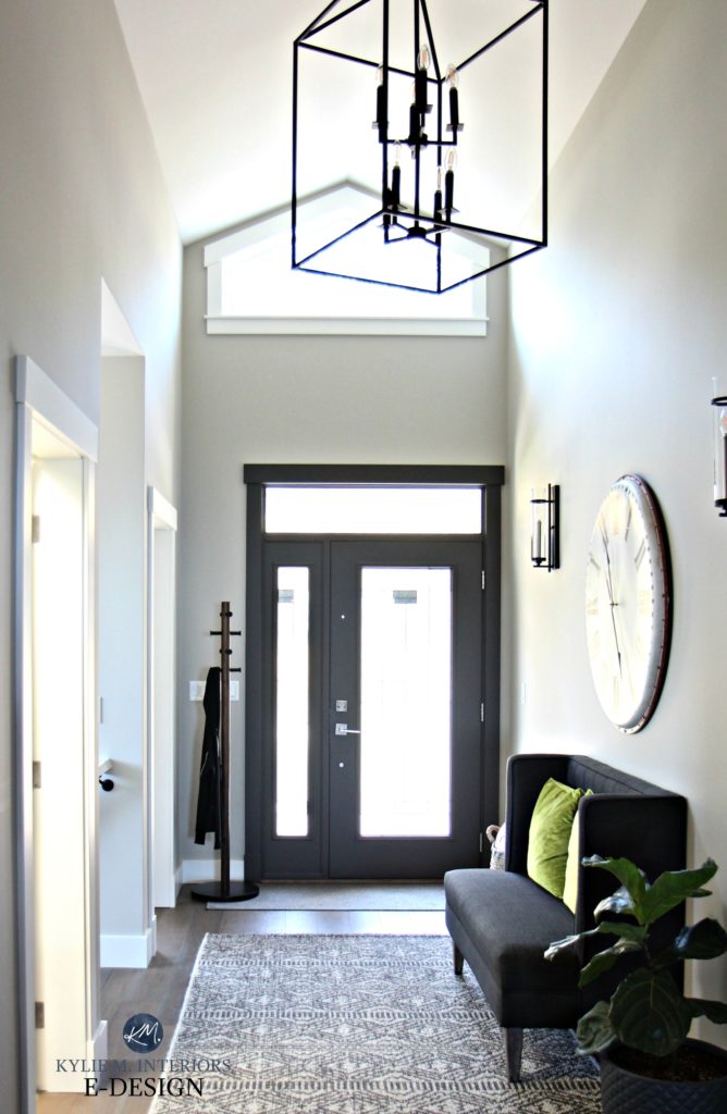
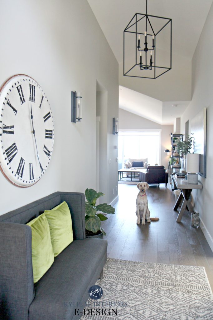
Before, it had great bones with beautiful light fixtures and flooring, but the cool paint colour just wasn’t ma jam.
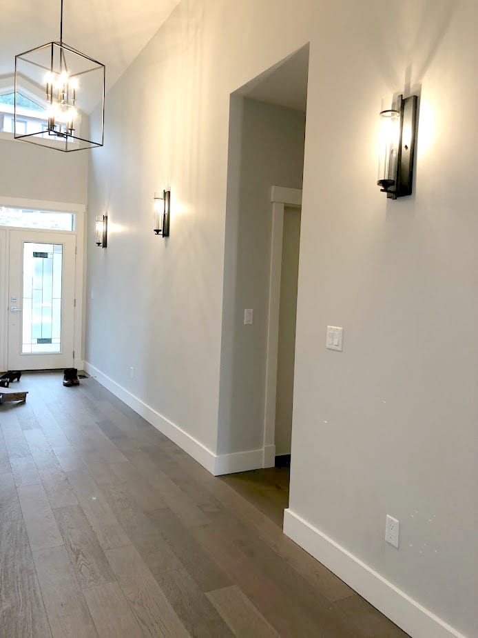
After, I’m loving the softness of the new paint colour, Sherwin Williams Colonnade Gray.
I would’ve naturally chosen a warmer paint colour for this north-facing home, but seeing as it’s open concept, I have other things to accommodate (TONS of gray carpet and quartz countertops). Colonnade Gray is as warm as I can go without alienating the needs of the house (because it’s not all about me ALL of the time…just joking, it is).
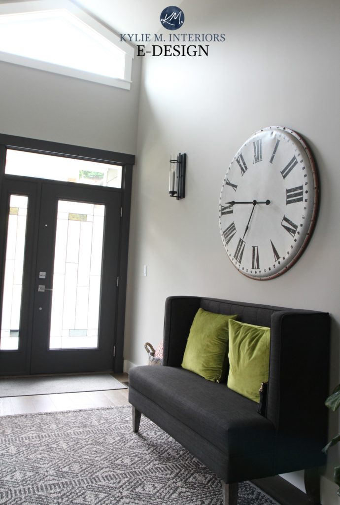
I wanted a dramatic front door colour, so I chose Urbane Bronze, which is a DEADLY dark greige with a green undertone. And rather than keeping the trim white, I painted the trim around the door, adding to the impact but simplifying it simultaneously.
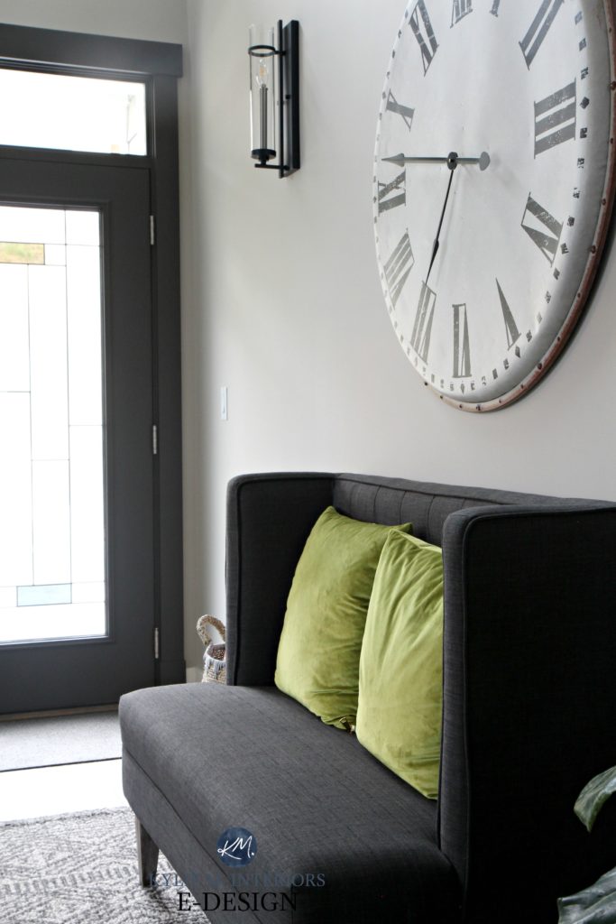
I loved the large clock in the entryway of our last home so much that I decided to buy a new one for this house (what can I say…I like big clocks and I cannot lie).
The original colour, Sherwin Williams Crushed Ice, was throughout much of the house and was too cool for my tastes when compounded by the (ahem) extreme northern exposure in the open layout area.
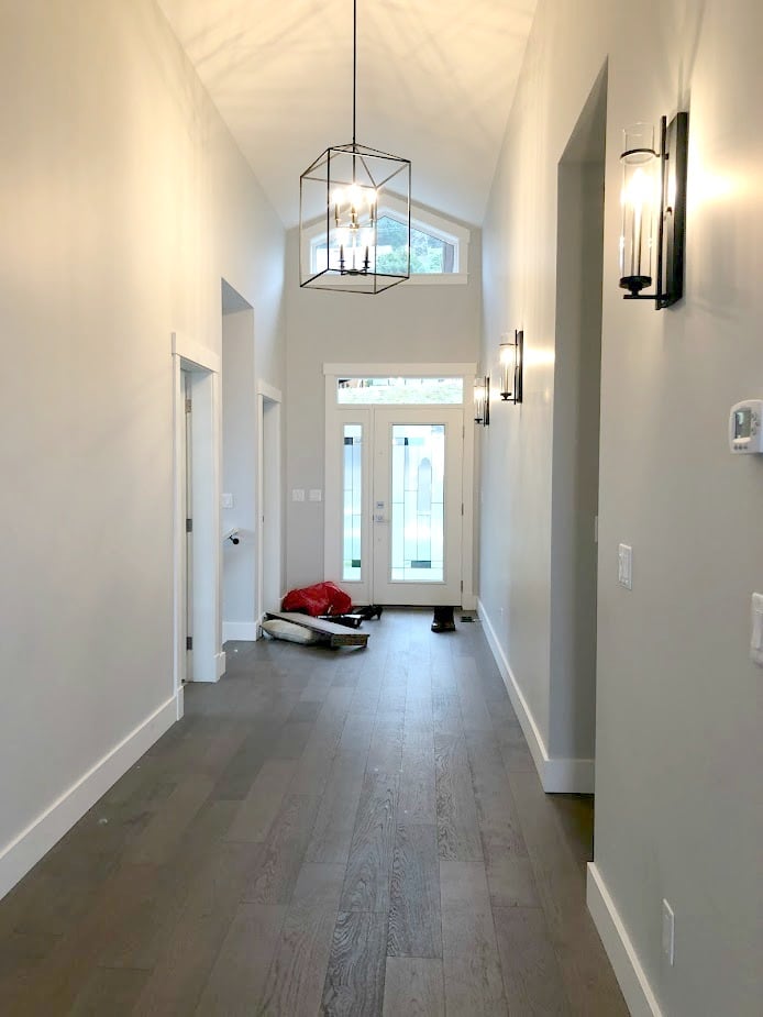
Colonnade Gray offers a softer approach and takes advantage of the little southern light that we get (only the entryway and my office, the rest is north).
Functional and pretty, what else could a girl ask for? SUNSHINE, SOME FRIGGIN’ SUNSHINE PEOPLE!
Anyway, I’m sure you can feel my excitement over this house (insert sarcasm HERE).
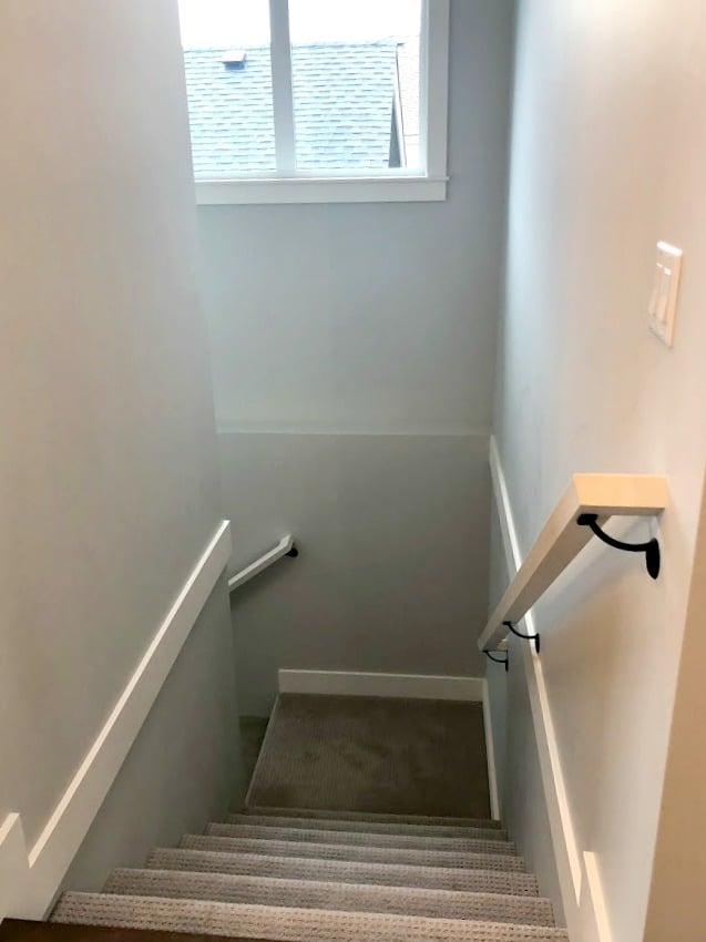
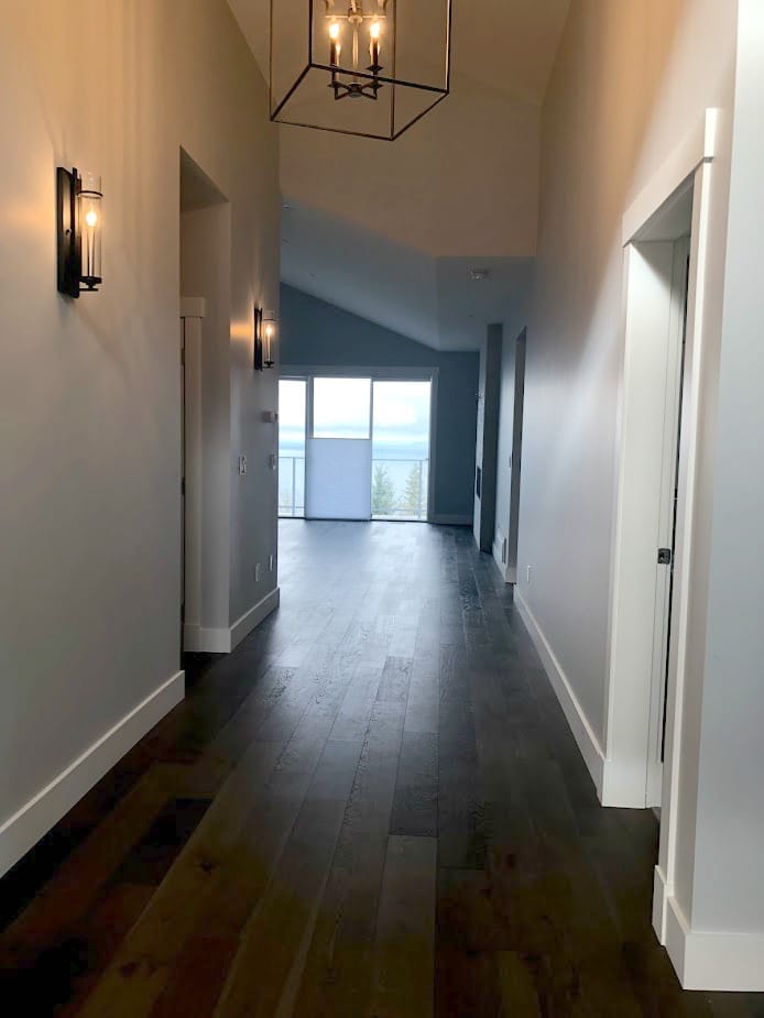
The stairwell was a stairwell. Thrilling, I know.
Again, Colonnade Gray to save the day! However, Colonnade CAN pick up a very vague green undertone, which makes me twitch a bit with the gray carpet (which leans to the violet side of gray). HOWEVER, being an open concept, this paint colour also has to suit the kitchen countertop, fireplace tile and OTHER features – I have to make it work. By lightening Colonnade Gray by 25%, I was able to cut back almost ALL of the green for the sake of the carpet, while still having a soft, subtle, warm gray and a seamless transition from the main living area.
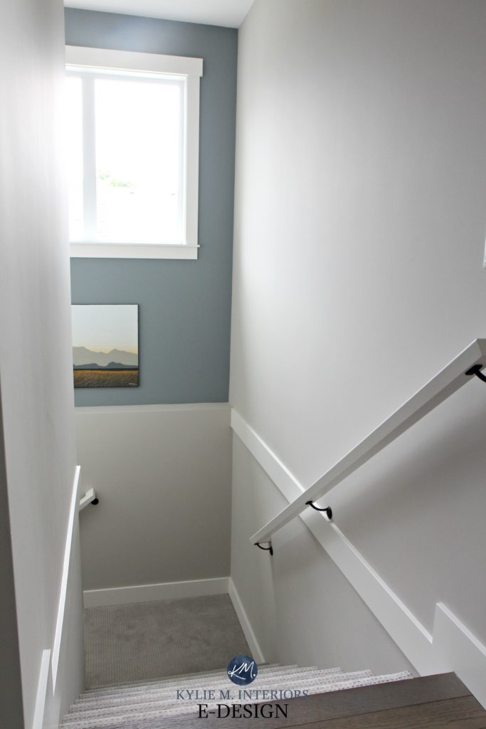
And the funny thing is that I used to despise feature walls. However, this is because I saw so many abused ones – wrong spot, wrong colour. I am, however, a HUGE fan of a well-placed, well-planned colour added to what would otherwise be a pretty booooring transition space. To make an impact without going TOO far, I went with Benjamin Moore Gibraltar Cliffs…MAD LOVE!
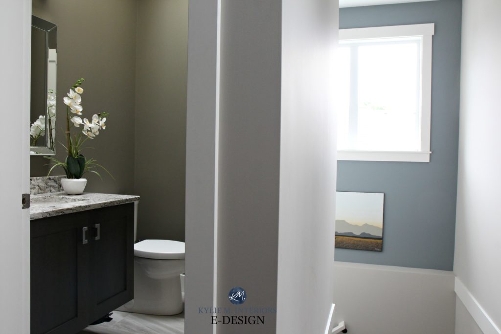
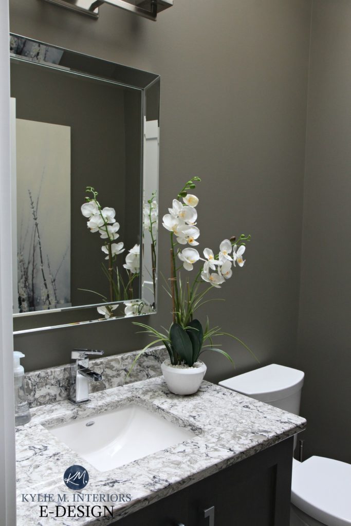
The small powder room is right off the entryway. It’s important that the flow between the staircase, hallway and powder room is BANG-on as they’re all in the same eyeball. The photo above shows how the layered colours create a GORGEOUS West Coast-inspired palette.
Before, the powder room was ‘just fine’, but you KNOW how I love my deeper colours…
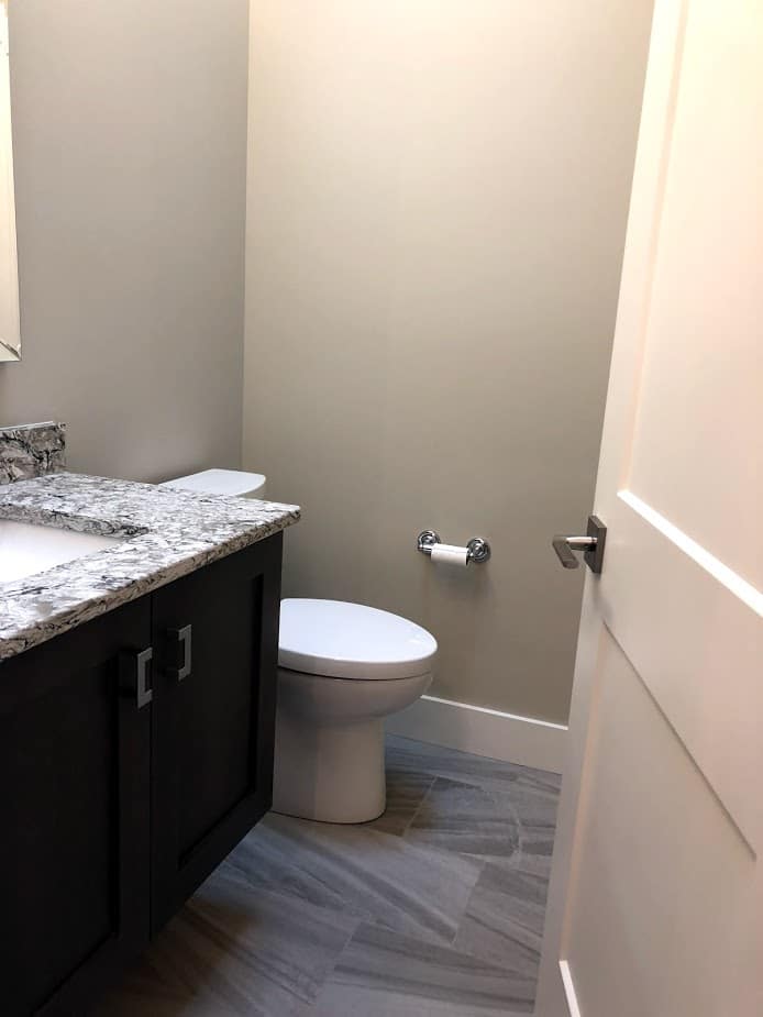
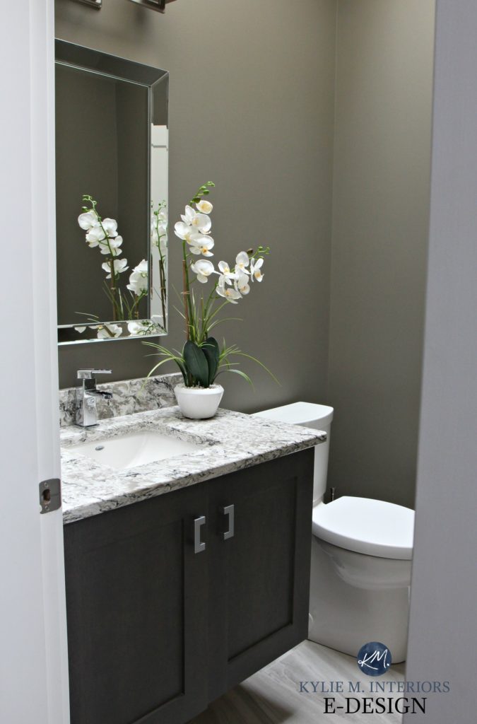
Sherwin Williams Anonymous adds depth and interest to the room and goes fab with my oversize artwork, which you can JUST see in the next photo.
So, whereas I’m not TOTALLY loving the gray nature of this home, by adding cooler colours with some DEPTH, I’m able to make things feel a bit cosier.
My office is ALSO off the entryway, but we’ll save that black beauty for another blog post (or not – hopefully, we’ll just sell this bad boy and move on). That’s right, a black office, just like last time!
Looking from the front door toward the living room is a tricky shot with the light coming in. Out that window is the ocean view, but I definitely don’t have the skills to get that AND the interior at the same time! The best I have is this before shot (with my phone).
In photos like these, it’s hard to see the shift in paint colour as the first photo wasn’t the best quality. And of course, Sir Douglas has to show up to the party…
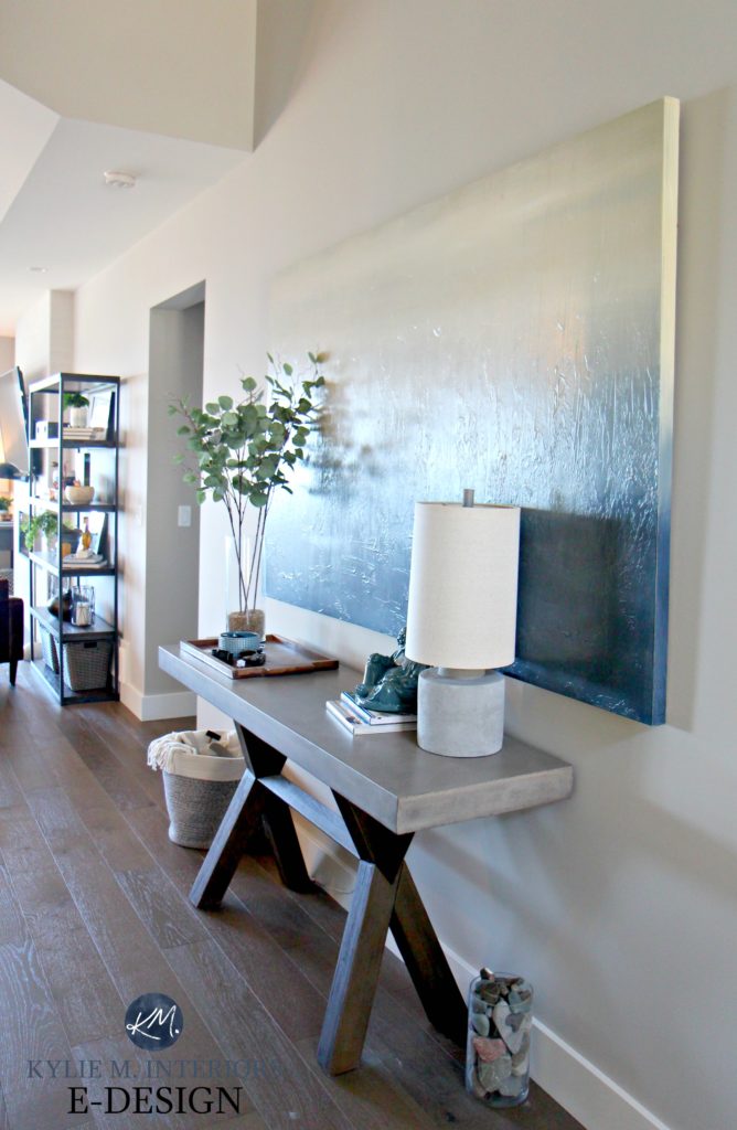
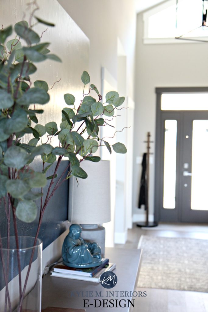
I had used this MASSIVE, seven-foot canvas piece in our last entryway and LOVED it. I’m so glad we have the perfect wall to accommodate it in this house too…
So there you have it – the beginning of our adventures with this house; stay tuned to see whether we keep it or if there’s already a for sale sign on the lawn.
READ MORE
Our Kitchen & Dining Room Remodel
The 12 Best WHOLE HOME Gray & Greige Paint Colours
The Best Warm Paint Colours That AREN’T BEIGE!
4 Tile & Shiplap Ideas for a Small Bathroom
NEED HELP WITH PAINT COLOURS?
Check out my affordable and FUN E-design and Online Paint Consulting packages

Chat soon,

ORIGINALLY WRITTEN IN 2018, UPDATED IN 2022 FOR GENERAL ERRORS
Comments
Leave a Reply
More Posts

The 5 Best Creamy White or Off-White Paint Colors
THE ELUSIVE ‘CREAMY WHITE NEUTRAL’ When it comes to light, warm neutrals, it’s all in the undertones. And other than pink and green, yellow is the undertone many of my
Read More

The 8 Best Warm Neutral Paint Colors With NO Yellow Undertones!
The Top Light Depth, Warm Colors That Aren’t Cream! When choosing the best warm neutral paint color for your home, whether creamy white, beige, taupe, or greige, your choices are
Read More

The 12 Best Farmhouse Sinks of 2024
FIND YOUR DREAM SINK HERE… While traditional farmhouse design was all the rage in previous years, the embers have definitely cooled. As for MODERN farmhouse, it’s still kickin’ its cowgirl
Read More


What color trim did you pair with Colonnade Gray? Looks great!
Author
Hi Sarah, thank you for asking! It was there when we moved in and it’s BM White Dove (my FAVE go-to white trim colour…)
Hi Kylie, what color is the ceiling? Love it!
Author
Ooo Jen, good question. The ceiling colour was there when we moved in and I’m inclined to say that is was similar to the trim, which I’m sure was BM White Dove :). What I might do, if I were to PICK a white to go with Colonnade is to take White Dove and have them add 4-6 drops of white to the gallon, just to clean it up a wink ;). I might also check out SW Pure White which is whiter and cleaner :).
Hi Kylie, Can I ask a few questions about your powder room
Powder Room Vanity
What kind of wood is the powder room vanity made of is it Maple? Where did you purchase it? We are having a very hard time finding a 30 inch vanity in a espresso finish with shaker style doors like yours.
Powder Room Mirror
May I ask where you purchased the mirror from
Thanks so much! Beautiful House!
Author
Hi Marie! That vanity was actually in place when we bought the home. It is maple with a shaker style door and I’m sure it would have been Merit Kitchens or maaaaybe Mid Island cabinets – I’m sure it was custom made vs prefab :). As for the mirror, it also came with the house, but I’ve seen some like it on Wayfair, Home Sense and sometimes Lowes/Home Depot!
What paint color is the white trim?
Author
Hi Jenae, that’s BM White Dove!
I have this color in my living room that’s north facing and I love it but hate it in my kitchen. My kitchen has cherry cabinets and it looks so dull and dark. Should I try cutting 25% all over or just go with a different color? I’ve been looking at accessible beige if I change.
Author
Hi Tiffany! I did Colonnade Gray lightened in one area of our home and liked it, I lost a bit of the green undertone, but it wasn’t a HUGE shift and it sounds like you want more of a change, which means you may want to explore another colour!
Hi Kylie!
Would you ever do an accent wall (the geometric wood ones) in a dining room using urbane bronze (Colonnade walls, pure white trim and urbane bronze front door)?
Love your home and advice! It’s been super helpful!
Hi Kylie, Thank you for sharing pictures & paint colors of your beautiful house. I would never leave! SW Collonade Gray’s LRV is 53, when lightened 25%, does the LRV or color becomes much lighter (around 60 LRV)? Or just barely noticeable difference in terms of lightness? Trying to get a paint color around 60 LRV that’s neutral and relaxing and Collonade looks really nice here!
Author
Hi Aggie! Well, I find that 25% is more like 3-4 points, more subtle for sure, but it does shift depending on how much black is in a colour :). What about Agreeable Gray?
Hi , I’m wondering if you have the link for the big entryway light. It is so pretty and I love how it has 2 rows of light. We need an entryway light that gives off a lot of light.
Author
Oh I’m sorry, I don’t – it was there when we bought the home, but I do know that there’s a VERY SIMILAR one on Wayfair!
Super! Thanks so much!