
Posted on September 27, 2023 by KylieMawdsley
TIPS & IDEAS: Mixing & matching patterns
Pattern mixing is a great way to add personality and visual interest to any room. However, it can be downright impossible if you don’t know the basic rules and guidelines. Does this stripe go with that floral? Does this ikat work with that jacquard? What the heck IS an ikat anyway?
But trying to explain the rules is a bit mind-numbing. This means that as you read the tips below, focus on the tips that resonate with you the most. For example, if you prefer to decorate with neutrals, don’t get too carried away with the tips about ‘pastels and brights.’
This post may contain affiliate links. If you make a purchase through links on our site, we may earn a commission.
This is why I’m sharing a few trade secrets to help you mix patterns til’ the cows come home! But before we go deep, let’s have a little chat…
1. CONSIDER QUALITY
Don’t mix junk with quality (more so with toss cushions than anything else). It’s like having a $100 bottle of wine with a McDonald’s two-cheeseburger meal—it just won’t feel good in the end. If it looks like quality fabric, then you’re good to go. On the other hand, if it looks poorly done and you partner it with a quality cushion, your less expensive one will look even more tragic.
Benjamin Moore Edgecomb Gray
Notice how the toss cushions all look comparable in quality—they could be expensive or affordable, but we don’t know because they’re all on an equal playing field.
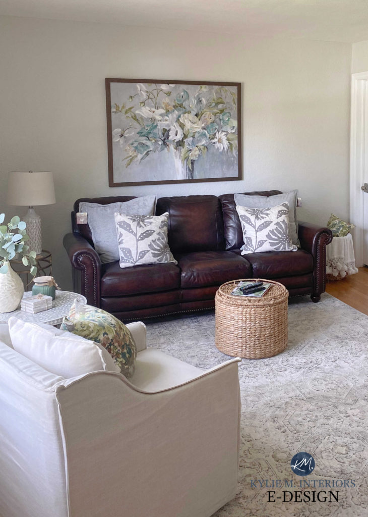
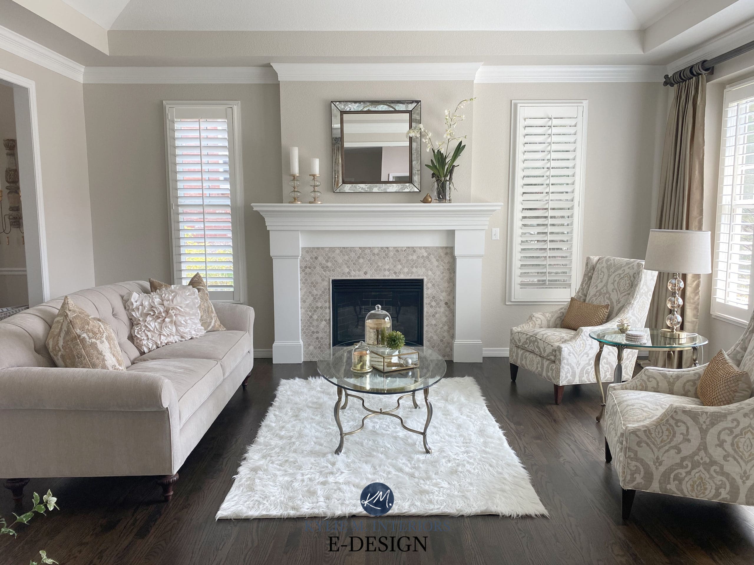
2. CONSIDER TEXTURE
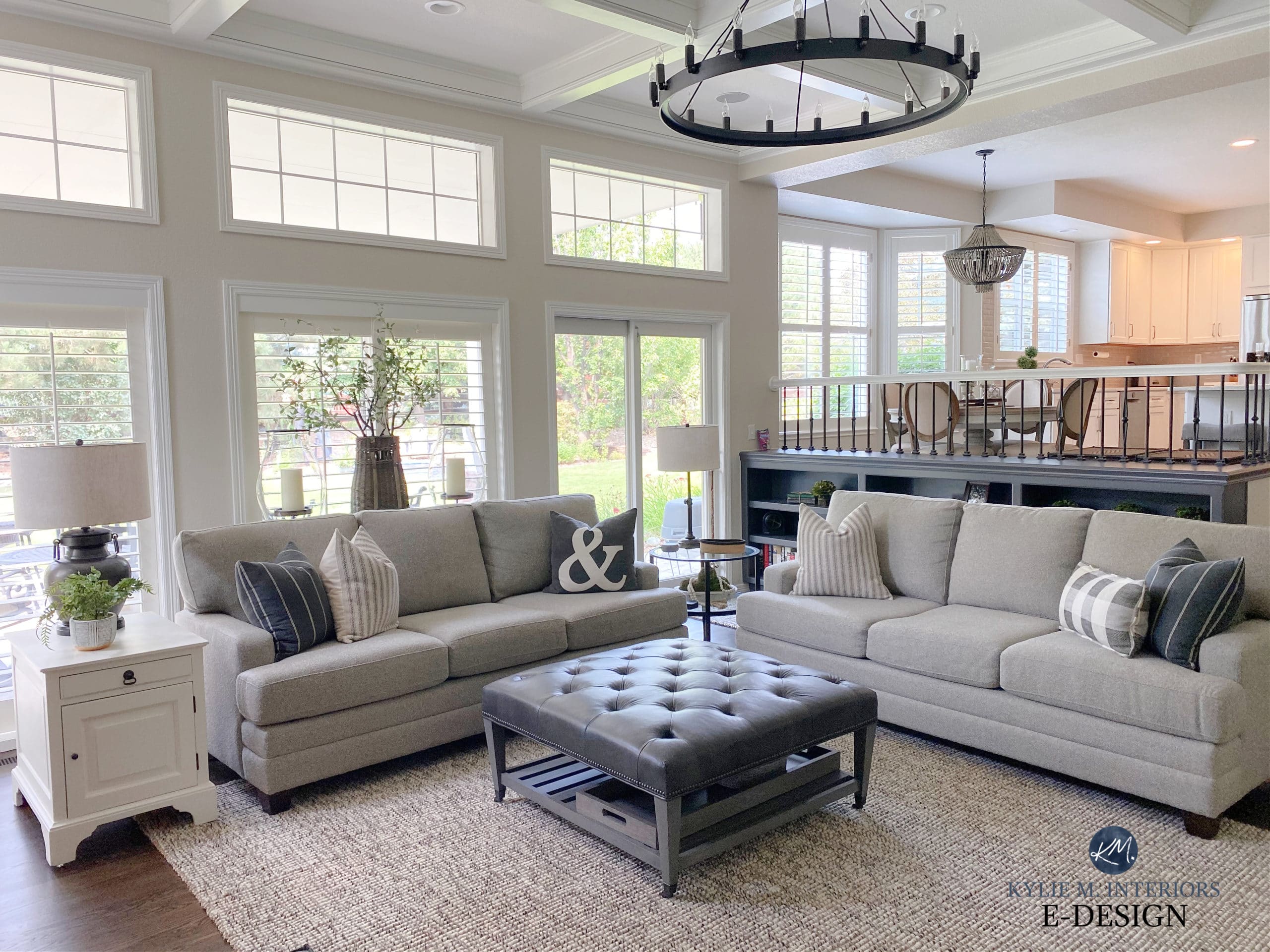
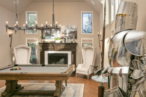
The more neutral your palette is, the more texture you need to add. Texture adds interest and substance and makes my world go round! Looking at the above family room, notice how the texture of the rug adds warmth and interest to the room. You can also see how the slight sheen on the leather plays off the more muted fabric finishes. This all adds up to create an inviting space!
Check out this next family room. It is totally neutral and totally textured…
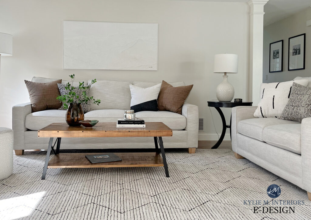
Not only does the area rug add texture and interest, but the sofas have a soft slub, along with the roughness of the wood coffee table. Just as the leather in the previous photo added a bit of sheen, notice how the sheen of the table lamp and the shiny decor on the coffee table add interest to the palette.
If you don’t have a neutral palette, you don’t necessarily need texture to add interest, but a little can go a long way!
3. CONSIDER STYLE
If you don’t like florals, don’t pick a floral just because it has your colors. Make sure the patterns you pick suit the feel and the theme of your room and suit each other.
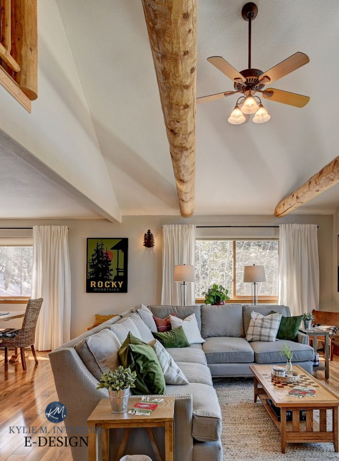
For example, this next rustic living room would look goofy with floral toss cushions or a flowered area rug…
How to Create a Timeless Home With Personality
Photo via Kylie M Interiors with V1 Real Estate Photography
On the other hand, this next living room looks perfect with its floral-inspired cushions and decor…
Sherwin Williams Egret White
In this next bedroom, notice how the pattern on the neutral linens makes sense with the wall decor. A seascape or landscape would look too cluttered with this slightly floral/organic pattern.
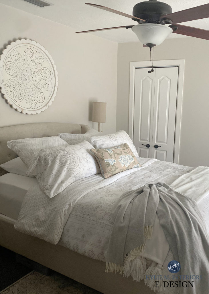
Sherwin Williams Egret White
4. FILL IT WITH FEATHERS
I personally detest cotton fiber-fill cushions.
It’s like stuffing my bra with toilet paper – it looks good from afar, but it sure doesn’t feel good to grab!
If you’re a fuss-budget like me, make sure your cushions have a cover that can be removed, and replace the innards with a lovely feather insert! Yes, they’re pokey, but you can also buy a liner to help with that.
While the cushions on this next bed are pretty and tie into the artwork, I feel like a few of these fellas could use a little feather…
Sherwin Williams Gossamer Veil / Benjamin Moore White Dove
5. IT’S NOT JUST ABOUT TOSS CUSHIONS!
While the focus of this blog post is on toss cushions, several other items need to be included in your pattern palette.
- AREA RUG
- DRAPES
- THROW BLANKETS
- FABRIC FURNITURE PIECES
- ARTWORK, IF IT HAS A PATTERN TO IT
A WELL-planned fabric palette from the sofas and rug right down to the cushions, ottomans, and throw blankets! Sherwin Williams Alabaster
And now, let’s dig into the guts and the glory of matching patterns!
STEP 1 FIGURE OUT YOUR COLOR FAMILY
If you live in the land of neutrals, you’ll find it easy to incorporate almost any colour scheme into your room. Chances are you already have a few things in your room that will give you clues as to what family you belong to. Here’s a list of a few colour families to consider…
NEUTRALS
When it comes to the wild world of colour, neutrals are by far the easiest and can be incorporated INTO other colour families.
- neutrals can range from white and brown to gray and black and everything in between
- neutrals often look best when there are a variety of depths and textures (if they aren’t mixed into other palettes)
- don’t be afraid to throw in one or two colors from another family to add some life to a neutral-on-neutral palette
See this WHOLE HOME makeover HERE
If you create a palette using all neutrals, you’ll find it much easier to mix and match without having to repeat colors from your MAIN pattern (which you’ll learn about below).
PASTELS
Pastels are the softies of the bunch.
- these gentle hues tend to be soft, Easter-inspired colors!
- pastels best suit white, fresh cream, and gray, although you can pull off the odd beige as long as it’s MAJORLY muted
PRIMARY COLOURS & BRIGHTS
These colors are jacked right up, so a little goes a LONG way with these bad boys.
- while there are exceptions, bright colors often partner best with each other OR black, white, clean charcoal, and dark brown
- a little can say a LOT when it comes to bright colors
EARTH TONES
Earth tones are colors that have some gray or brown in them, meaning they are toned down.
- these can be light and soft or dark and deep, as long as they have that neutral base (beige/brown or gray to calm them down)
- earth tones love being partnered with other earth tones and neutrals
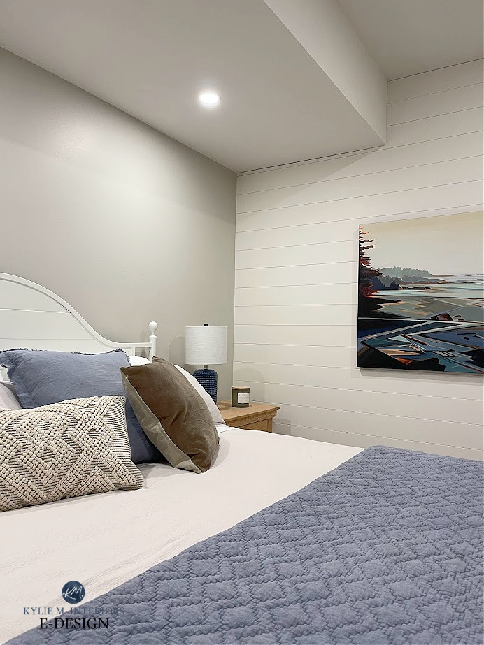
This next bedroom is a nice blend of neutrals with a touch of earthy green to add interest. The green cushion pulls into the artwork and also contrasts with the tartan throw…
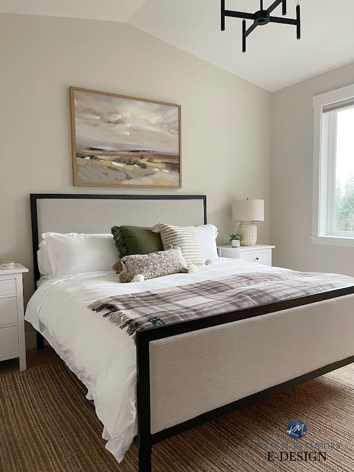
Sherwin Williams Aesthetic White
You might have your own color family or trend/style that you love, such as beach, vintage, traditional, romantic, etc., but these basic families should at least get you on the right track!
Moving along…
STEP 2 CHOOSE YOUR MAIN PATTERN
From your chosen color family (based on the above or your own color choices), decide on two or more favorite colors. These will be for your main pattern—the pattern that holds the colors you want to use.
Consider the following in your main pattern…
- aim to have at least ONE NEUTRAL in it (if you’re working with ONLY neutrals, fill yer boots!
- don’t be afraid to vary the depths of a particular colour; you don’t have to stick with one particular depth
- this pattern doesn’t need to be the LARGEST surface area (i.e., rug or drape). It can be a simple bolster cushion, just as long as it contains your colors and is an obvious player in the room!
- you can have two MAIN patterns in a space, as long as the patterns play off each other (i.e., one is floral and one is stripes, rather than two florals or two stripes)
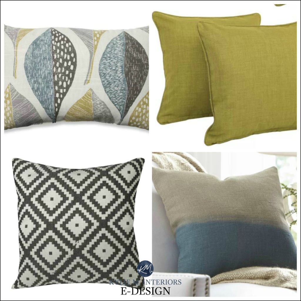
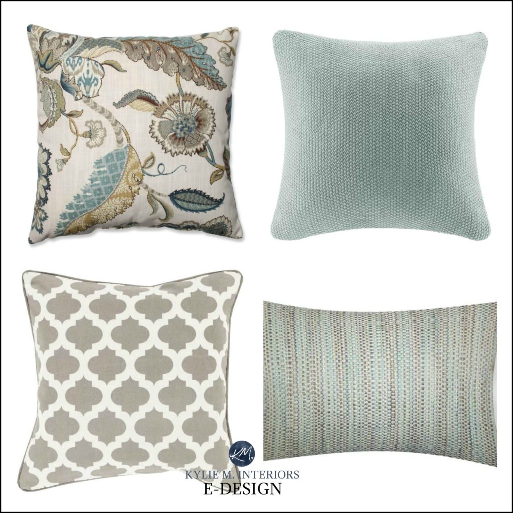
Here are some examples of MAIN patterns with a variety of colors to choose from when we move on to our secondary patterns/fabrics…
If you choose a pattern palette using all neutrals, your main pattern isn’t as important. What this means is that you’ll have a lot more room to mix and match within your chosen neutral range. However, when you add COLOR, you need to pay more attention to COLOUR REPETITION from one fabric to the next.
Remember, your main pattern doesn’t NEED to be on a cushion!
Again, while the focus of this blog post is on toss cushions (just to cover the basics), your DOMINANT MAIN pattern or COLOR PALETTE doesn’t need to be on a toss cushion and often isn’t. Consider these other items for inspiration…
- a reasonably dominant piece of ARTWORK
- an AREA RUG
- DRAPES
- fabric covered FURNITURE PIECES
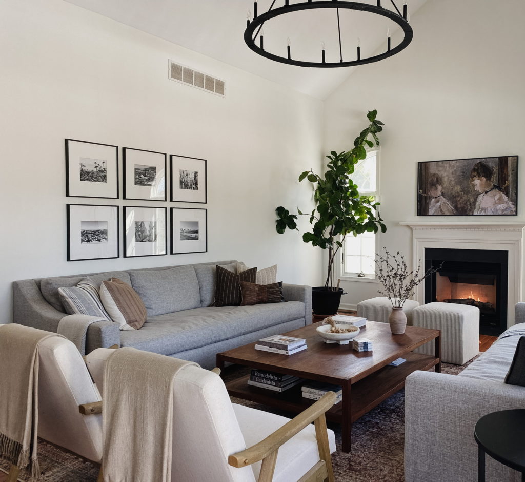
This next living room can handle a riot of amazing colors and fabrics thanks to the artwork…
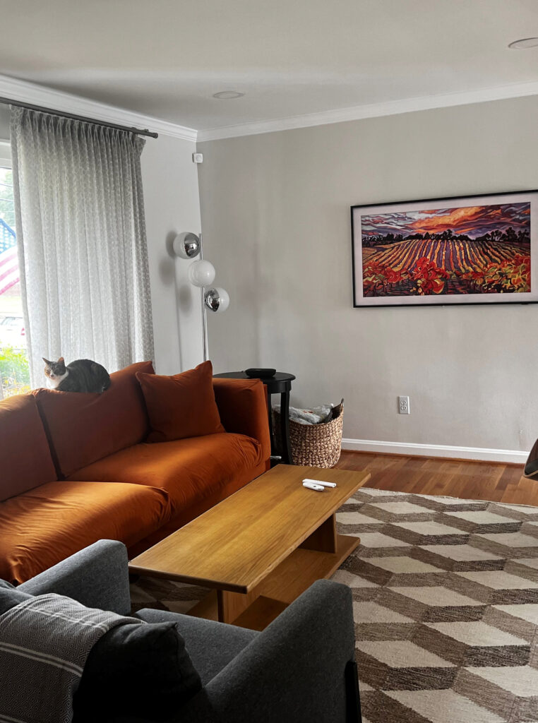
Remember, your inspiration piece doesn’t need to be a fabric at all!
I would SO love to see some gorgeous violet cushions on the sofa and a warmer, more peach-inspired area rug with less pattern and more texture (as the artwork says it all!). I LOVE how the orange of the sofa hits the artwork!
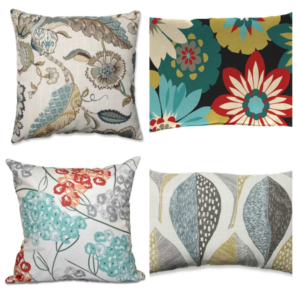
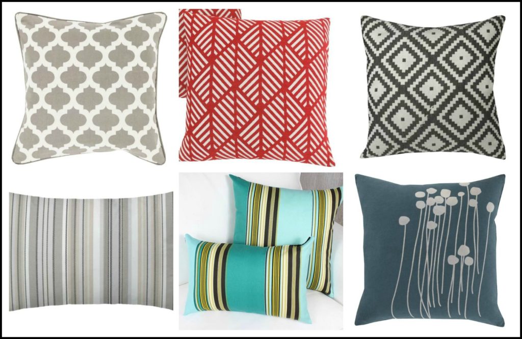
STEP 3: CHOOSE YOUR SECONDARY PATTERN/FABRIC
Choose TWO TO THREE COLOURS from your MAIN pattern that you’d like to repeat in a secondary, more simple pattern.
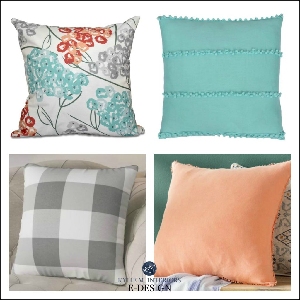
Here are some examples of secondary patterns. Some have only two tones or colors, while others have a variety…
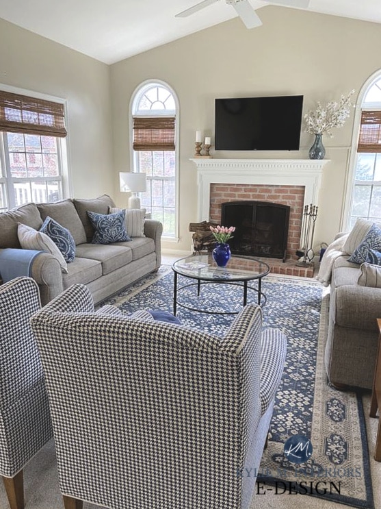
And it’s not always about going BUCKWILD with colors. As shown in this next living room, the area rug has a mix of blue, cream/off-white, and beige/taupe—colors that are repeated in the main furniture pieces and throw cushions. What keeps this palette interesting is the shift in patterns!
STEP 4 CHOOSE A SOLID COLOUR
The solid piece can be a color OR a neutral and can be either textured or smooth. It might have MINOR flecks of another colour, but keep it simple.
- you can have a multitude of solid colors in a room as long as they exist in your main piece (I wouldn’t do more than THREE)
- if your main pattern is all NEUTRALS, you can add almost any colour you like (within reason, there ARE exceptions – which are a blog post unto themselves), as long as it ties in with your room and overall theme
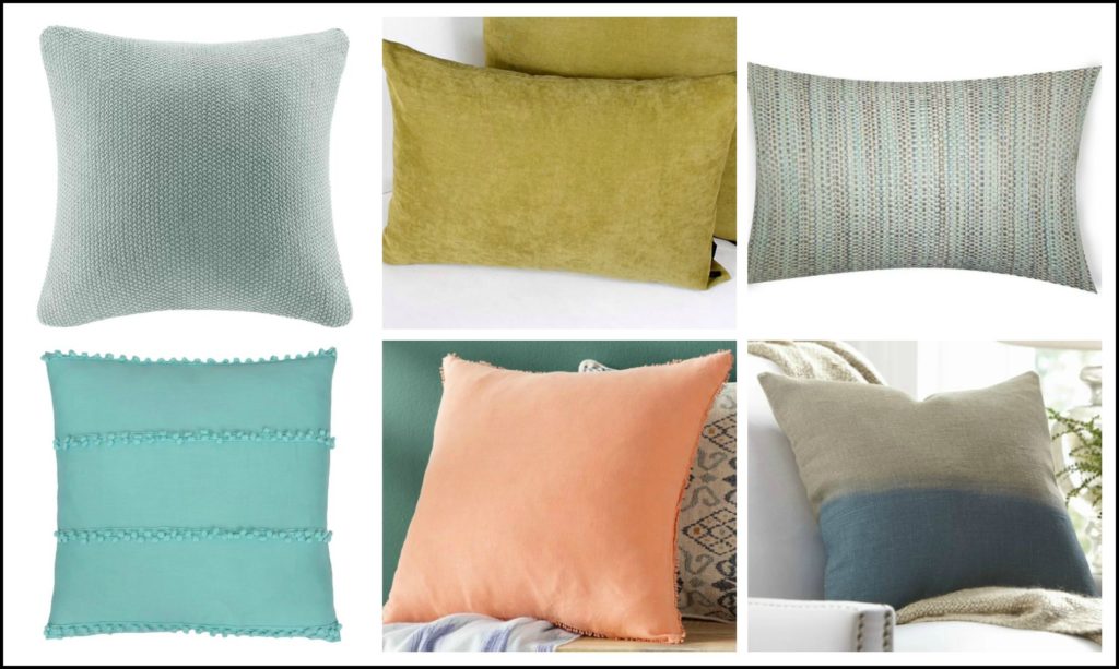
The two on the far right obviously aren’t SOLID colors, but in the absence of a solid, they could do the trick with their simplicity (tight, simple texture or basic two-tone).
CHECK OUT THE RESULTS OF STEPS 1-4
If I take my own tips and combine the above cushions, this is what I have…
MIX & MATCH FABRIC PALETTE #1
The cushion on the upper left is the MAIN pattern, as it holds all the colors found in the secondary patterns/fabrics…
Notice how the bottom right fabric has many of the same colors found in the main fabric, but the pattern is more subdued, so it doesn’t compete too much.
MIX & MATCH FABRIC PALETTE #2
The top left cushion is the MAIN pattern…
The above palette is a mix of earth tones and neutrals. But, had I put in a more COLORFUL cushion, it wouldn’t make sense as it would fall outside the colour palette (and isn’t in the MAIN pattern).
MIX & MATCH FABRIC PALETTE #3
The top left cushion is the MAIN pattern…
Notice how the cushion at the top right adds texture and interest to the palette. Likewise, the cushion at the bottom right, with its textured edge, adds interest to what would otherwise be a flat, boring cushion.
MIX & MATCH FABRIC PALETTE #3
The top left cushion is the MAIN pattern, although the top right takes a good shot at the title…
While there are many more wild and wonderful tips and ideas for mixing and matching patterns, these basics should get you started!
READ MORE
How to Create a Timeless Home – 4 PART SERIES
The Best Whole Home Warm Neutral Paint Colours
5 Budget-Friendly Ideas to Update Your 1990s Home
How Light Bulbs Affect Paint Colours
How to Update Your Living Room WITHOUT Spending Any Money!
Chat soon,

ORIGINALLY WRITTEN IN 2018, MASSIVELY UPDATED IN 2024
Comments
Leave a Reply
More Posts

The 12 Best Farmhouse Sinks of 2024
FIND YOUR DREAM SINK HERE… While traditional farmhouse design was all the rage in previous years, the embers have definitely cooled. As for MODERN farmhouse, it’s still kickin’ its cowgirl
Read More
Trendy & Popular Paint Colors for Your Kitchen Island (Mixed Bag!)
Islands, Vanities, Lower Cabinets? These Colors Have Em’ Covered…Literally It’s hard to beat paint when it comes to affordable kitchen and bathroom updates. However, whether you have wood cabinets or
Read More
The Best Paint Colors to Go With Golden Oak (Cabinets, Flooring, & Trim)
Modernize Your Outdated Golden Oak Home With COLOR! I’ve written a lot of blog posts on updating wood cabinets, covering a wide range of wood stains and grains. This one
Read More


LOVE this! Honestly, I get so much from your posts, thank you for all the solid tips!
I love this post! It all makes sense now. Thank you! One question: There’s a word missing in your post, and I need to know what it is! Under “Beach Inspired Colors,” the first bullet says, “… muted mustard or cold.” Cold what? This is my color pallet (you recommended Analytical Grey (SW) in a web consult. We painted our open floor plan AG, and love it!!!), so I’d love to know the second color. Thank you!
I’m pretty sure she meant gold.
Could it be a misprint for “gold?”
Fabulous Post….so helpful. I tend to stay on the minimalist side with alot of neutral. It is so much fun to see what you can achieve with some knowledge, colour and your excellent posts Kylie….
Thank you!
Gina, in reply to your question, I believe Kylie meant to type “gold,” instead of “cold.” That is the only thing that makes sense in the context.
Love this post, Kylie! The color combinations are beautiful.
I am so glad I found you Kylie! You are hilariously fun and always have the best advice!
Thank you for sharing this great information !
Hi Kylie! Thanks for the fabric tips. I am seeing mushroom paint pop up everywhere and thought I’d ask if you could explain this color. It is most often associated with Duvol cabinet mushroom paint. I am not sure if it is griege, beige or taupe. Thanks!
Author
Hi Liz, I JUST put out a blog post today on Mushroom Paint Colours – thanks to your question! You can check out the link if you aren’t a subscriber to my blog 🙂 https://www.kylieminteriors.ca/the-best-mushroom-paint-colours-benjamin-and-sherwin/
This post is a lifesaver! We recently purchased furniture and art for a midcentury-leaning home, but I’ve been at a loss as to how to add layers without it feeling too “themey”. I was overwhelmed with tooooooo many choices in pillow patterns (I love midcentury, but don’t want a ton of geometric pattern! Can I mix geo and floral? What if I have an ikat pillow I love?! How do I make it look like it belongs together, but wasn’t purchased as a package?! Where’s my wine?!?!?) and now, thanks to your post, I feel like I have the confidence to mix and match effortlessly. Now, whether or not I can pull that off is another story…. (wink)
Author
Wahoooo, that is just the type of comment that I love to get! And I type this as I sip my wine…CHEERS!
I love your blue rugs… the floral one in this article and a blue kinda geometric rug you used under the dining room table that was in a previous article…I would love to buy them but can’t find them…will you help?