
Posted on February 25, 2021 by KylieMawdsley
HOME DECOR IDEAS FOR A HOME WITH TIMELESS STYLE
In your quest to create a timeless home, a home that withstands the ebb and flow of trends, you run a serious risk of creating a space that is, well…boring. So, along with my other blog posts in this series, this one will show you some ideas that will stand the test of time while adding some PERSONALITY along the way!
This post may contain affiliate links. If you make a purchase through links on our site, we may earn a commission.
Creating a timeless home is about being inspired – with restraint. It’s about seeing the latest trends and applying them in a way so that in five years, you aren’t kicking yourself for doing an entire bathroom in forest green (a trend of the 90s) or all of your walls in shiplap (today’s trend). It’s about embracing what you love, what fires up your engines, without committing to it on such a large scale that your hubby has a jammer when you want to replace it in 2-3 years.
Now I’m not saying you can’t do those things, you CAN! However, if you are looking for style AND longevity, I have some suggestions…
BTW, if you’re a house flipper or selling in the next 2-3 years, then this info isn’t as important – TRENDS will be more important. HOWEVER, if you’re in it for the long haul and the spouse has put a cap on HOW MANY TIMES you can replace your sofa – then you might find this info helpful. Luckily, Tim hasn’t put a cap on me…yet.
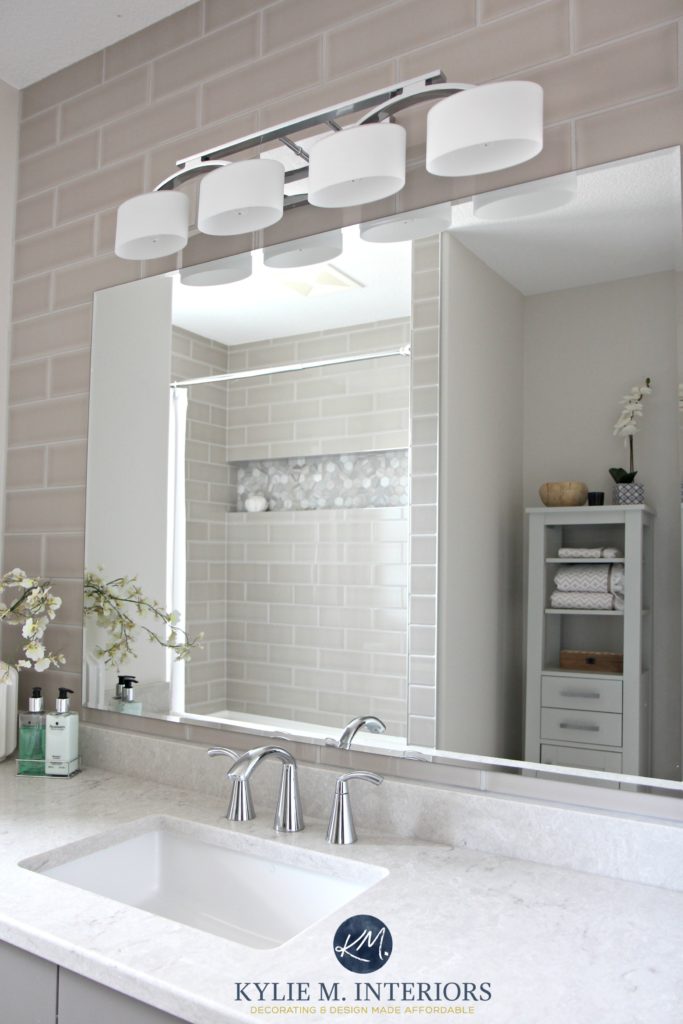
IDEA #1 Large Hard Surfaces Should Be Neutral
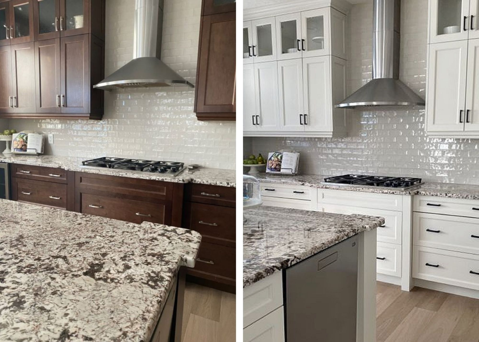
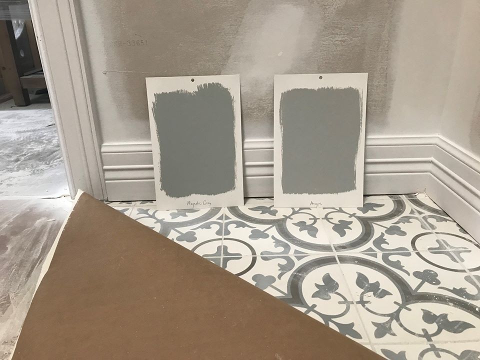
The key with hard surfaces is to go neutral. Whether it’s flooring, countertops, or a shower surround, if it’s expensive to replace, neutral is your best bet. Now, I’d like to say it’s hard to go wrong with neutral, but it’s not, it’s actually quite easy. In a world of products that are CHOCK full of undertones, do your research before you bite the bullet. Learn what TYPE of gray your potential countertop is or whether your new carpet is greige or taupe.

See the BEFORE & AFTER’S HERE
But still have some fun…
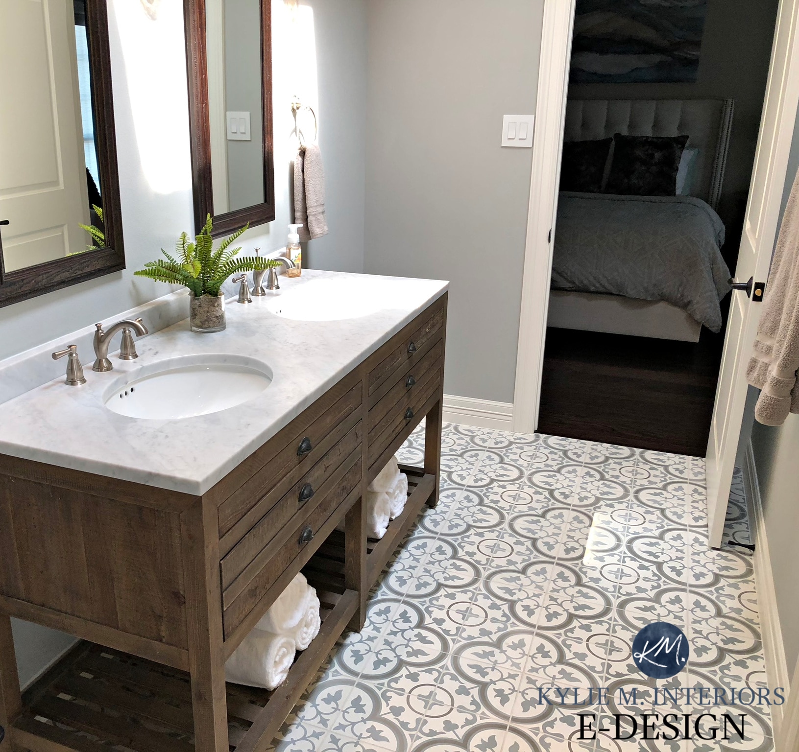
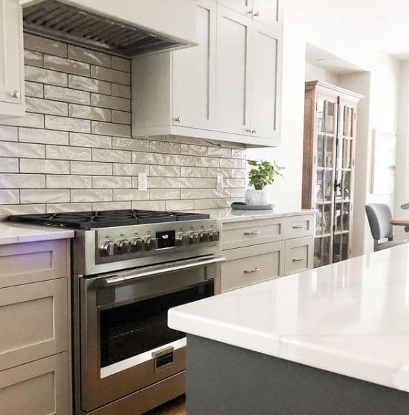
If you have a smaller surface area, like a shower niche, backsplash (within reason), or a powder room floor, these are places where you can embrace trends a bit more.
See the BEFORE & AFTER’S HERE
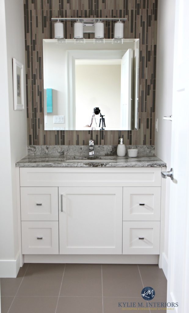
If in five years you need to replace 25 sq ft of tile or 10 sq ft of countertop – life will surely go on.
TIPS TO CONSIDER FOR A TIMELESS STYLE
- neutral works great, but you can also consider a finish with a variety of neutral colours in it, giving you a wide range to work with in the future
- to ensure a BIT more life, keep the colours as neutral as possible and maybe think about a classic pattern OVER colour, which leads us to our next topic…
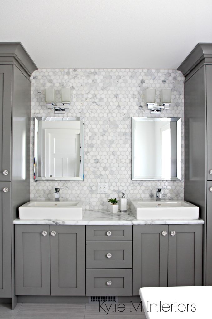
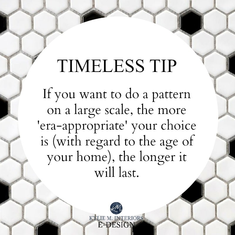
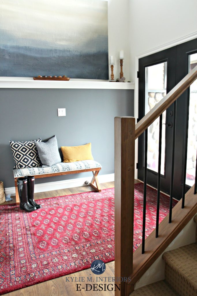
IDEA #2 Play it Safe with Pattern
I’m not one to talk, I LOVE a good pattern…to a point. It’s like, would I wear black and white polka dot underwear? Sure, it’s easy to change my underwear or even take it off if it’s uncomfortable. Would I wear a black and white polka dot pantsuit? Well, depends on how much wine I’ve had, but generally speaking – no, and if I DID, I would regret it the next day and wish I never bought it.
When it comes to patterns, it’s best to keep TRENDY patterns on items that are easy to replace or AT LEAST not a piggy-bank breaker if you do want to switch things up in a few years.
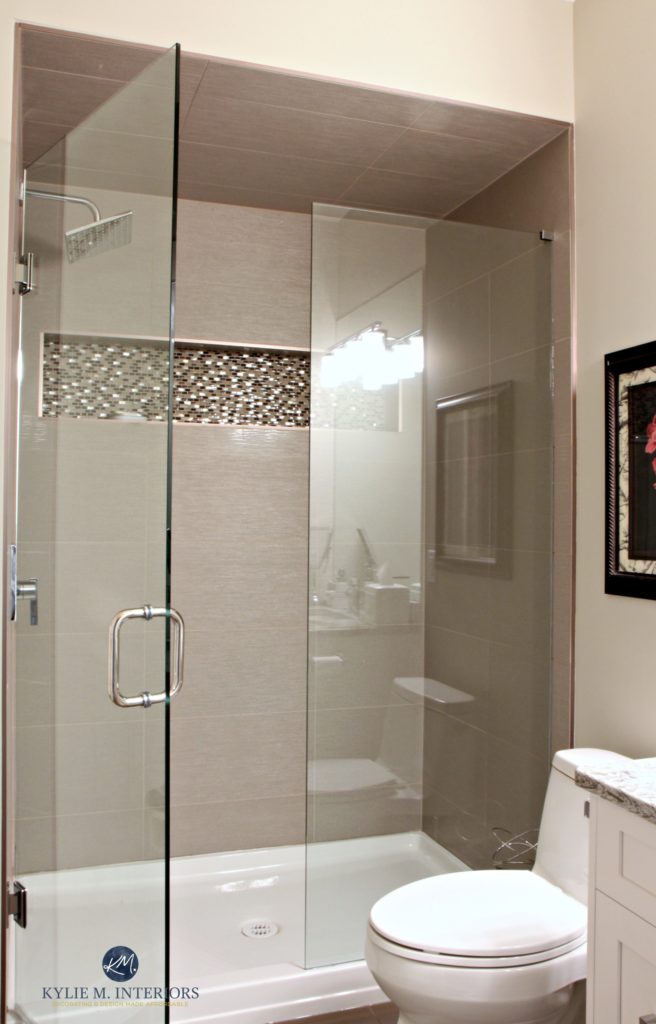
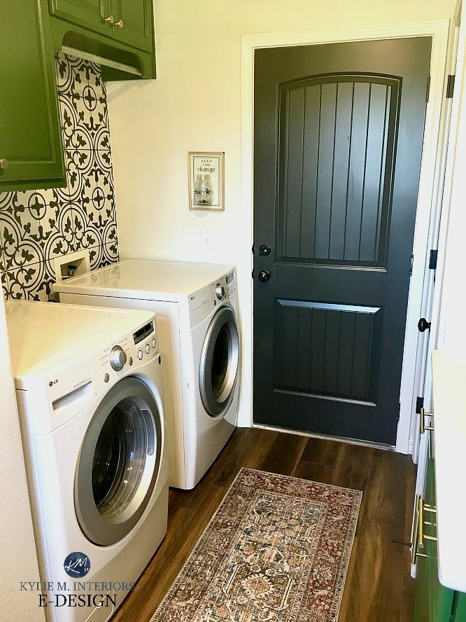
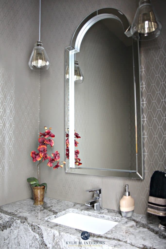
See the hexagon tile in the shower reflection? That’s about as much hexagon as I was willing to commit to in our greige inspired bathroom remodel.
But still have some fun
I’m not TOTALLY opposed to a pattern on a bathroom backsplash as it’s usually a smaller space compared to the kitchen. Plus, if you HAVE to change it to suit new trends/resale, while it’s a pain in the BUTT, it’s not terribly expensive in the big picture.
However, it’s HARD to go wrong with subway tile.
IDEA #3 Practice Moderation
Seems funny coming from me, the gal who drinks with a funnel and owned 8 dining tables and 24 chairs at one time (one of those is a true story, okay, maybe they both are).
MODERATION WITH WALL FINISHES
Do I even NEED to bring up the sponge painting/faux finishing phase that we all went through (or those of us born pre 1980 anyway)? Speciality wall finishes have a pretty tight shelf-life. Now I will ADMIT, shiplap has been around for a bit and I don’t see it going anywhere soon, but I STILL wouldn’t go overboard. The exception to this is a farmhouse/country style home (a la Fixer Upper) which will always BE a farmhouse country style home.
Having FUN with wall finishes
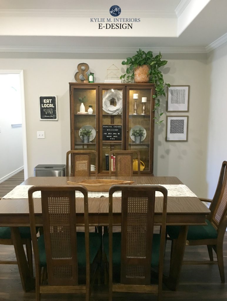
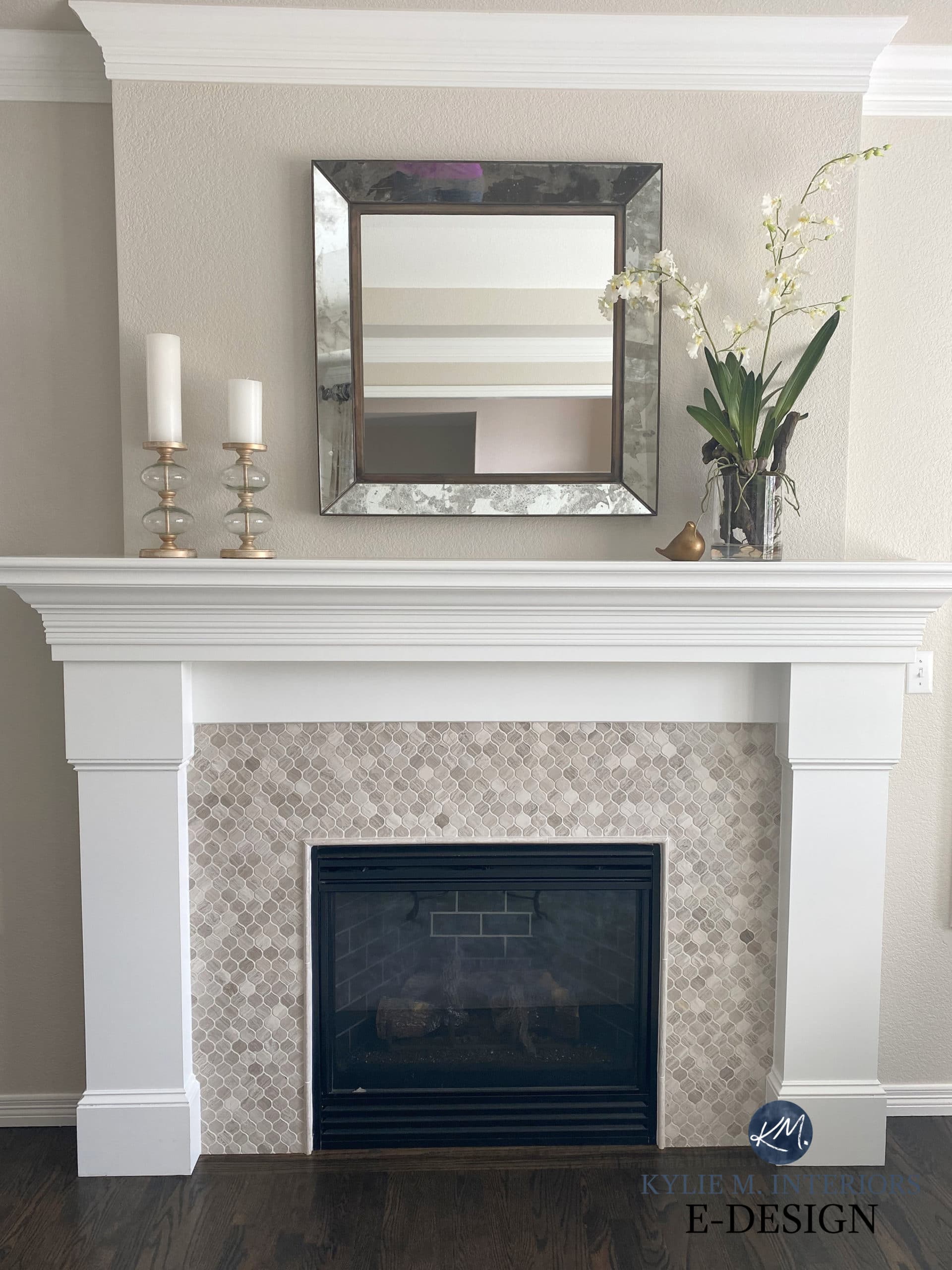
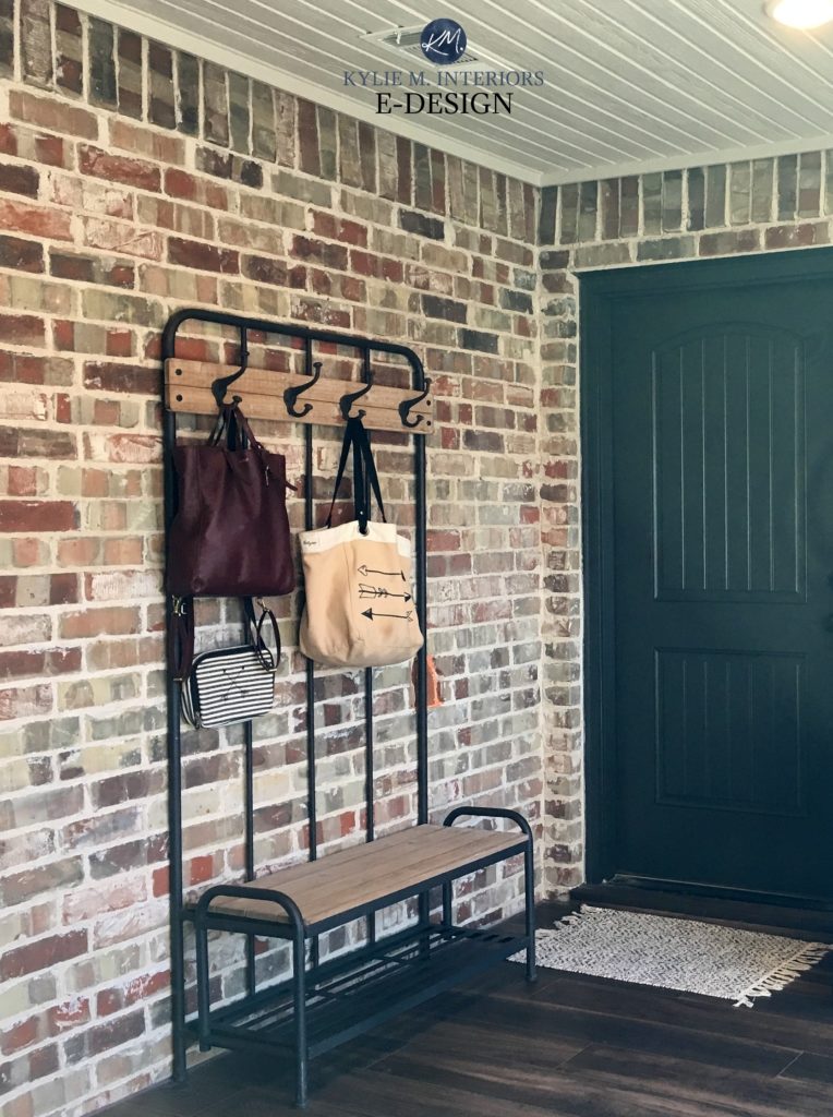
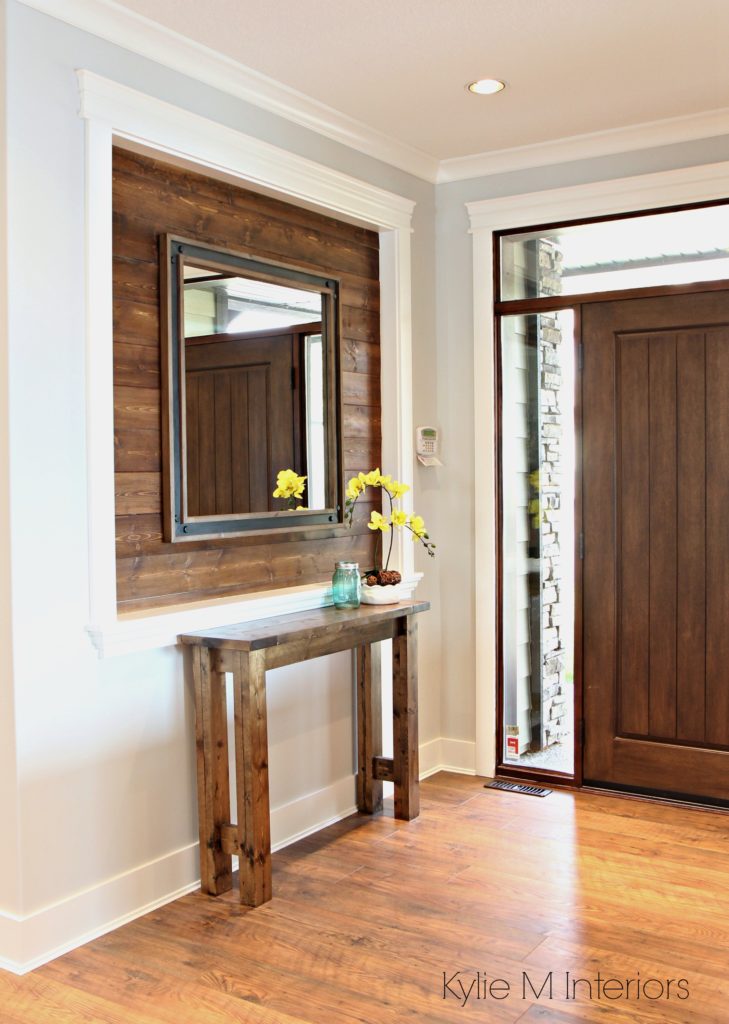
Pick one wall that is a natural feature wall (ie: behind the headboard, vanity, or fireplace) and do something wild and wonderous on that. White shiplap, reclaimed wood, hexagon tiles, encaustic tile and wallpaper are just a few ways to add some modern personality to space without going over the top.
MODERATION WITH FLOORING
So you like gray. Then I would suggest painting your WALLS gray, but maybe not committing to it on the floor. When it comes to paint colour trends, try to keep it at that – paint colour trends, not flooring trends. For some reason, we see paint colours and translate them to our flooring, whether it’s carpet, wood flooring or linoleum. The dusty roses and forest greens of the 90s were NOT limited to walls (unfortunately) and are still haunting the dreams of many of today’s homeowners.
For a timeless look, wood flooring should be a medium-toned brown. And trends will come and go with regard to how light, dark, rustic, smooth, etc… the flooring is, I like to say that the middle of the road is best. Don’t go drastic one way or another and things will last a LOT longer.
As far as tile, vinyl and carpet go, if today’s trend happens to be neutral (which it is – gray), then you will get a pretty decent life out of it. It’s when an actual ‘colour’ is a trend that it becomes more of an issue for the long term. That being said, many of the gray hard surfaces are ALREADY falling out of favour.
Having some fun with flooring
The smaller the flooring space is, the more room you have to be creative. Go all jazzy jeff on that little powder room, or grab that laundry room floor by the coattails and live out your wildest fantasies (without being awkward about it). These floor spaces tend to be more controlled, in that they don’t sprawl out into other spaces or cover a lot of sq footage and are, therefore, easier to replace if you get tired of them.
See how this E-DESIGN consultation turned out HERE!
MODERATION WITH PAINT COLOUR
When it comes to colour you don’t NEED to practice (as much) moderation. Why? Because it’s one of the LEAST expensive ways to change a space! So if in six months or six years you get tired of your blue/green walls or your navy blue room, you’re only a gallon or two away from it being fixed.
However, this is best embraced on a ‘per room scale, rather than a WHOLE HOME scale, as too much colour or variation in colours from room to room can be overwhelming.
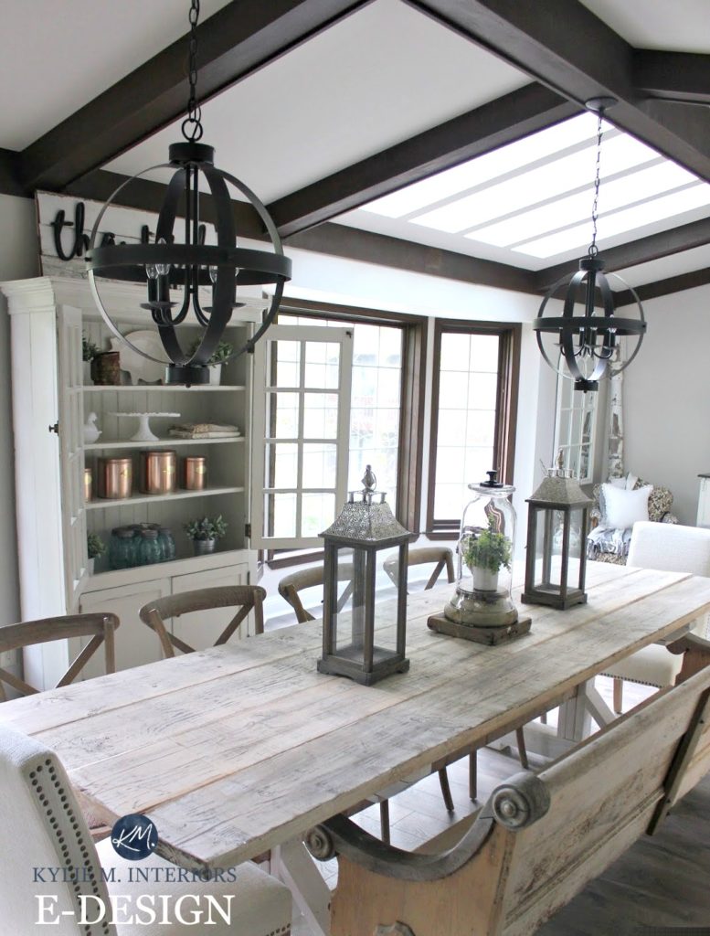
Check out this GORGEOUS farmhouse dining room blog post to see the before and after photos
…BUT fun is good too
- If you want to embrace colour, do it on a room-by-room basis. Don’t do your whole home in today’s popular blue/green, choose a few rooms and layer the depths for interest.
- A feature or accent wall is a great way to add today’s personality to a room, without killing it for tomorrow. The key is to wrap the other walls in a soft, simple neutral that is a constant, that doesn’t need to be changed when the feature wall is – the more simple this neutral is the better so that it stays versatile and flexible.
- If you prefer a more neutral approach, read this: The 12 Best WHOLE HOME Neutral Paint Colours
IDEA #4 Keep Large Soft Furnishings Simple
Soft furnishings are things like sofas, chairs, drapes – basically anything with fabric/leather on it. There are two levels of soft furnishings up for grabs here:
- Big and expensive soft furnishings: sofa, sectional, chairs, and some area rugs and drapes
- Small and affordable soft furnishings: toss cushions, drapes, area rugs, towels, bar stools, dining chairs with fabric seats (that can be recovered), throw blankets, ottomans, and poufs
It’s SO easy to go overboard with colour – I would know, as my first sofa and chair set was bright red and yes, I did regret it. Now the tricky thing is that if you want to create a timeless home for YOU and you’ve always LOVED red and have NEVER tired of it – then absolutely, get that red sofa. However, if you can see yourself getting a bit tired of a particular colour after a few years – then don’t commit to it on a large scale. And just because you’re SUPER jazzed about it now, doesn’t mean you will be in five years.
How to Mix & Match Fabrics in 4 Easy Steps
The bigger and more expensive your furnishing is, the more simple it should be. Sofas and sectionals should be neutral. And this can be gray, beige, cream, brown – whatever you like. Now, is that to say that your gray sectional will look good forever and ever amen? No, but it will have a HELL of a better chance than a teal one. A great example of this is my Mom’s old beige sofa and loveseat (she’s cringing right now btw). Seriously, she had those things for 25 years. The only thing I’ve had for 25 years is, well, nothing, I’ve had nothing for 25 years other than underarm odour and a perverse sense of humour.
So ANYWAYS, this sofa set was a medium-toned beige in a thick corduroy type of material. And dammit, if it didn’t stand the test of time! The colour and pattern made it easy to move from home to home, without clashing with the new decor or changing trends. Had it been red, blue or dusty rose, it would’ve been gone many moons before (this is not it in the next photo, I can only embarrass my Mom SO much).
So, LONG story short (as usual), if you are purchasing large, soft furnishings, they are an investment – don’t base your choice on today’s colour fetish (or any fetish, really, ya weirdo…)
The exception to this is an area rug. Most often, it’s the area rugs with the widest variety of colours in them that stand the test of time!
This is a great way to embrace a popular colour – by combining it with OTHER colours so that if your tastes change, you can tweak your decor to suit a different colour!
IDEA #5 Embrace ‘Decorating’ Trends
When you focus on the ‘design’ of your home, going timeless is undoubtedly safer. However, when it comes to DECORATING you can fill ‘yer boots with trends and have some fun with it!
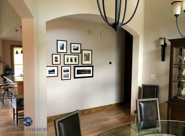
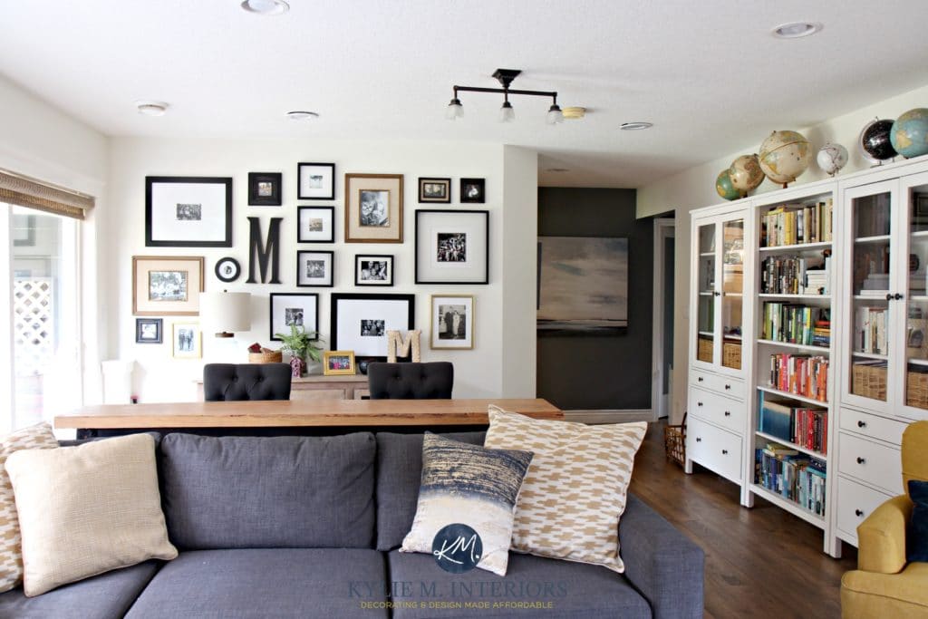
Add a Gallery Wall
Gallery walls are a great way to jazz up ANY neutral wall or boring room.

Add some fun with fabric!
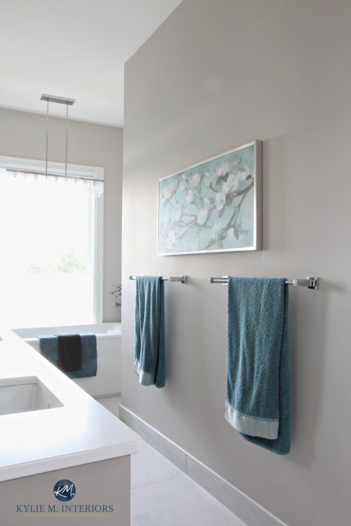
Toss cushions, towels and linens in today’s hot patterns, textures and colours can add personality to a neutral palette without going too far.
Now, of course, I could go on and on…and on, but that covers a WHOLE lot of ground and should get you off to a good start!
Want ideas on the best timeless looks for you and YOUR home?
Check out my affordable and fun E-design and Paint Colour packages!
Chat soon,

READ MORE IN THIS SERIES
The 3 Most Timeless Paint Colours
The Top 10 Most Timeless Finishes
The Best Way to Decorate With Trends & Save Money
6 Affordable Home Update Ideas
ORIGINALLY WRITTEN IN 2018, AWESOMELY UPDATED IN 2021
Comments
Leave a Reply
More Posts

The 5 Best Creamy White or Off-White Paint Colors
THE ELUSIVE ‘CREAMY WHITE NEUTRAL’ When it comes to light, warm neutrals, it’s all in the undertones. And other than pink and green, yellow is the undertone many of my
Read More

The 8 Best Warm Neutral Paint Colors With NO Yellow Undertones!
The Top Light Depth, Warm Colors That Aren’t Cream! When choosing the best warm neutral paint color for your home, whether creamy white, beige, taupe, or greige, your choices are
Read More

The 12 Best Farmhouse Sinks of 2024
FIND YOUR DREAM SINK HERE… While traditional farmhouse design was all the rage in previous years, the embers have definitely cooled. As for MODERN farmhouse, it’s still kickin’ its cowgirl
Read More


Hi Kylie,
Thank you so much for your easy to understand, funny guidance in all your posts. I’m considering Ballet White for my kitchen and living room (semi-open concept?) and. The kitchen has beautiful birch cupboards and other wood furniture that is medium orange toned and the floors are yellow oak. Will the oranges and yellows of all the wood reflect off such a light wall color causing the walls to look yellow???? (The walls are dark gold right now and I feel it takes away from the beauty of the wood)
Thank you I’m advanve from Canada 🙂
Shara
Author
Hmmmm, I think it will be more about the quality of light/exposure as well as your interior lighting that will cause things to reflect a bit more and in general, I wouldn’t worry about it too much as Ballet Whtie IS so calm and restful as while it has that warm creamy base, it has the neutral undertones that quiet things down 😉
Okay, thank you!
Kylie,
Can you email me? I want to discuss options and pricing for your e-consultation for Canadian clients.
Thanks,
Shara
So many great points!! I wish I had understood the importance of neutral furniture and the proper place trends have in homes when I was younger and just starting out on home ownership – so does my husband…and our bank account 😉 Thanks for another helpful article!
This is a great post Kylie! I wish I would have known the wisdom of going with neutrals with regard to tile, etc. when we were building. Sadly I chose things that I liked at the time ( peachy beige floor tile) that are now expensive to replace. Wall color is so much easier to change then flooring and tile work.
Nice work! how would you go about selection of a counter-top? Color and or stone look? Pick up the color of the walls or flooring?
Each item/concept you list is right on target and good advice for us all. Thanks for recapping this in a single post.
This is such great info! Thank you . Helpful, usable, understandable Great article.
Thank you again Kylie! Love your posts.
For some of us, paint is expensive because of an open concept home with 2 story walls (meaning we have to pay someone to paint our house). It’s still cheaper than getting a new floor throughout the house, but painting an entire downstairs is still pretty expensive . On that note, what is your suggestions regarding a neutral paint color? So would a super light off white stand the test of time for walls (such as BM Classic Gray or Windsbreath, etc.)? If so, what are some of your go-to neutral paint colors that are off white for walls? Or do you feel a neutral in a lower LVR is better for standing the test of time?
Are you like me, as far as looking at the decorating in homes that are in movies? Especially those big old classic homes? I could be wrong, but regardless of the age of the movie, it seems like very light neutrals are usually on the walls?
Thank You Kylie 🙂
Excellent advice, top to bottom! And great photos, too!
I pinned this one immediately!! Man is this post excellent. You always have me laughing out loud. So good for the soul . Really really helpful advice. Clear and concise. Much thanks!!
Your posts are always so enlightening, but this one was spot on the best!
“Creating a timeless home is about being inspired – with restraint.”
You are 100% correct. Sadly, most of the clients I work with are one or the other….inspired or restrained. The “inspired” clients need a guiding help to restrain their urges to be “over the top” on all aspects of design while the “restrained” client needs a firm push to leave their comfort zone.
Hi, Kylie! I am grateful for your willingness to educate through your blog! I was hoping you might add a bit of info to this post. I’m at a crossroads needing to choose wall texture for the Sheetrock in our total remodel. I’m not sure I really like much but want a simple backdrop and not a statement forever plastered on the walls. What timeless option is a safe and transitional choice? Thanks a zillion. It’s a bit overwhelming when it seems we all use the same terms but different definitions.
Author
Hi Cynthia! Well it seems in the States there is a lot more texture used on the walls, whereas in Canada its always always just plain flat drywall look – no texture – which to ME is the epitome of timelessness. If I had to do texture I would go for THE most passive one possible…
Thank you soooo much for making time for my question! Happy weekend!
So drapes should be neutral?
What about kitchen cabinets? Are white, woods, and grey the only solid options?
Author
Hi! Drapes are certainly more affordable and you could do something with personality as they are easier to change out in a few years. As for cabinets, in terms of longevity, wood and white are really the 2 BEST options. Even gray will eventually be out of sync. And i LOOOOVE coloured cabinets and if you’re staying in your home for a long-time, then absolutely! But for keeping things more timeless, wood and white are easier to coordinate with in the longterm
THE EXCEPTION: Some older vintage homes can EASILY pull off coloured cabinets without them falling out of style, it’s more the homes that are more modern with coloured cabinets, that eventually run out of decorative steam…
Kylie, I love The arabesque tile fireplace surround. Can you tell me where to buy it? It’s the only fireplace on this blog.