
Posted on July 13, 2018 by KylieMawdsley
How to Pick an Exterior Paint Colour
Are you trying to pick an exterior colour and second-guessing yourself at every turn? If not, you should be.
This post may contain affiliate links. If you make a purchase through links on our site, we may earn a commission.
That’s right, you SHOULD be second-guessing yourself. Why? Because choosing an exterior paint colour is a WHOLE different ball game compared to interior colours, which is why so many people find themselves picking the wrong one. It can also be CONSIDERABLY more expensive than interior projects, which is why choosing the RIGHT colour is even more important than ever.
Kylie M E-Design
So, how do you pick the right one? Prayer, toe crossing, salt throwing and multiple bottles glasses of wine. Oh, and read these tips…
1. EXTERIOR PAINT COLOURS: It could look lighter than you’d expect
Expect your colour to look about half a tone lighter or MORE than it does on that wee little chip. Why? Well, paint tends to look lighter when exposed to natural light, especially on a large surface. Regardless of the direction your home faces, the amount of natural light it gets can make your paint look a little, or a LOT lighter!
In fact, if your home gets a good dose of sun on it, your paint colour can look 2-3 tones lighter, which we’ll get into below in the ‘exposures’ section (no indecent exposure though…this time anyway).
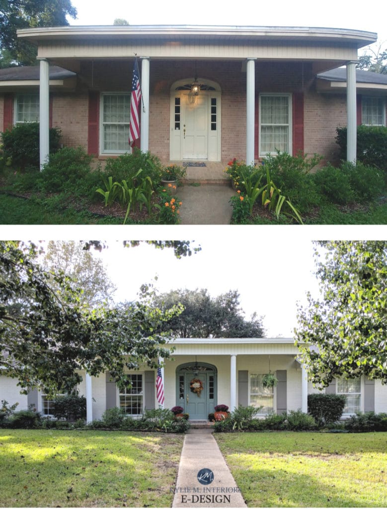
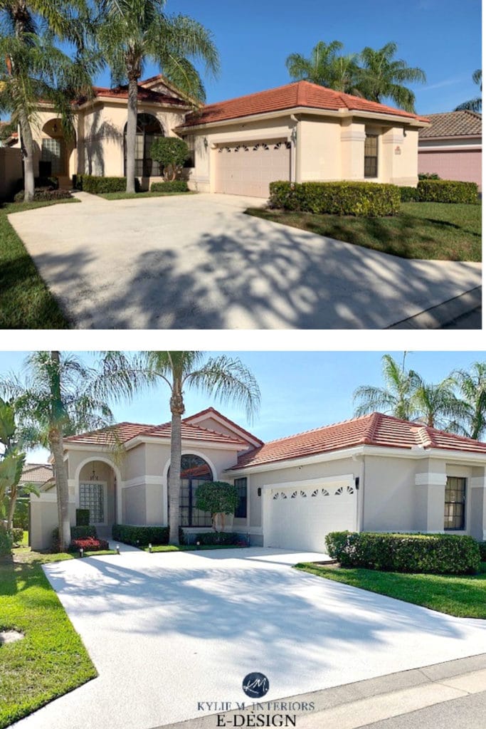
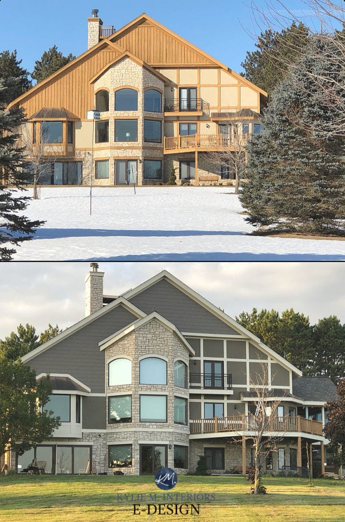
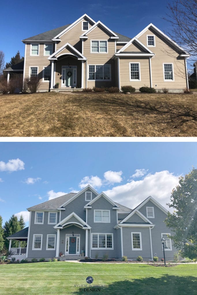
And because INFO can be boring, I’m also going to share with you some great before and after photos from my E-Design clients!
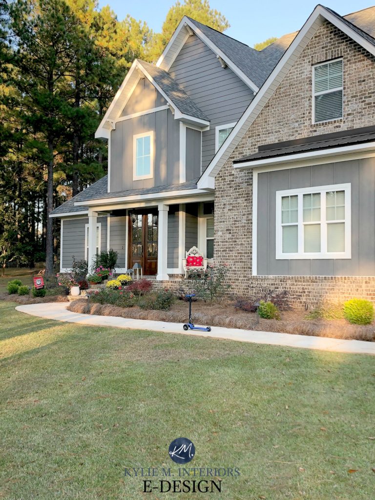
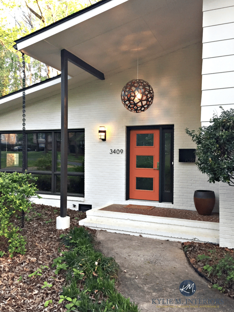
This home was tricky with its warm red terracotta tile roof, but it turned out GORGEOUS in the end with a greige and off-white paint colour palette…
Kylie M Interiors E-Design
The effect of natural light is hard to see on those wee little paint chips and even with larger paint samples (SAMPLIZE), which is why it’s VITAL that you look at your samples on ALL sides of your home and in different types of light (morning/afternoon/etc…).
- If you have a lot of landscaping that blocks natural light, then the colour won’t look as light as it would if it had DIRECT natural light
- If you find a colour that you love and worry that it will be too light – it probably will be. If you’re worried it’s too dark – don’t jump the gun as it could look lighter once it’s on the house
- With south-facing homes, the southern side will look at least one tone lighter OR MORE – until the sun starts going down obviously. At the height of the day the colour will look its most washed-out
- With north-facing homes, can look a bit lighter, but not as much as a south-facing side or morning eastern/afternoon western exposure
Read more: North, East, South, West: Which Paint Colour is the Best (Interior colours)
2. EXTERIOR PAINT COLOURS: Texture and shadows add depth
The above is not my E-design project, just a great example of a stucco finish
This is important for homes that have a stippled, stucco finish – I’m not talking about general ‘texture’ – I’m talking about the popcorn style of texture that has a lot of nooks and crannies. All of this texture creates shadows which can make the paint colour look slightly darker. If you have a home that has two types of exterior finishes (siding and stippled stucco) you can paint both areas the same colour and the stucco may look slightly darker than the siding.
- If your entire home is popcorn style stucco, by the time you take into account the craving for Orville Redenbacher’s, shadows from the stucco and the lightening from the natural light, your paint colour COULD turn out pretty darn close to the sample piece
- If part of your home is under an overhang that casts a shadow or is beneath landscaping/trees that reduce the quality of direct natural light, expect your paint colour to look darker
3. EXTERIOR PAINT COLOURS: Expect more colour
On an exterior, undertones can be a wink more obvious than what you see on those wee little paint chips (specifically the undertones hiding in neutral paint colours). Find out what the undertones of your colour are (if you are choosing a neutral) and decide if those are colours you can live with. I’m not saying they are going to go all dominatrix style on you, but they might be a bit more than passive.
The above shows you the variety of colours that can be found in gray!
These next before and after photos are the END-result of the above paint sampling process…
Click HERE or on the above image to see available packages!
Let’s take a quick break to talk about paint samples…
Undoubtedly, you’ll be heading out in the near future to grab paint samples – stop right there! I want you to check out SAMPLIZE. Samplize offers peel and stick paint samples that are more AFFORDABLE, EASIER and more ENVIRONMENTALLY FRIENDLY than traditional paint pots. Here are just a FEW reasons why I recommend Samplize to my clients…
- Samples arrive ON YOUR DOORSTEP in 1-3 business days, depending on location
- At $6.99, they’re more affordable than the samples pots/rollers/foam boards that are needing for traditional paint sampling
- If you keep the samples on their white paper, you can move them around the room
Visit the SAMPLIZE website HERE
4. EXTERIOR PAINT COLOURS: The EXPOSURE of your home will affect how the paint colour looks
North, east, south, west, which paint colour is the best? You’ll want to figure out the exposure of the MAIN side of your home, which is USUALLY the front of your home. Now, this doesn’t mean you ignore the other sides, but you WILL want to give preference to the side that is the most important for curb appeal.
While I have an ENTIRE BLOG POST dedicated to this topic, I want to touch briefly on a few things…
HOMES WITH SOUTH-FACING EXTERIORS
Southern light is yellow and warm and is known to enhance some ‘colours’, while at the height of the day, direct southern light (like sunbeams shining ON your house) will wash out colours. I know…it’s confusing. Sip sip. Okay, that’s better.

My TOP 10 E-DESIGN Exterior Makeovers
HOMES WITH NORTH-FACING EXPOSURES
Northern light is gray and slightly blue-toned and can slightly (very slightly) neutralize colours – but not enough to make the undertones irrelevant.

HOMES WITH EAST OR WEST-FACING EXPOSURES
East and west-facing exposures are always a bugger as they aren’t quite as predictable as north/south.
East-facing light: This light is brighter in the morning and will actually HIT your home, whereas in the afternoon it will fall into shadow.
West-facing light: This light is more shaded in the morning and will hit your home in the afternoon with some relatively intense warmth!
And of course, there are MIXED exposures, but I can only cover SO much here, and these tips are just designed to get you in the right direction.
My next Online Colour Consulting client wanted a bit more WOW for her home and was tired of the taupe/beige that was there…

And WOW is what she got – so gorgeous with some late-afternoon western sunshine!
In the above photo, just LOOK at the paint colour in the dappled areas that are hit with afternoon west-facing sunshine – pretty crazy!
READ MORE: 5 Steps to Picking Your Perfect Exterior Paint Colour
5. EXTERIOR PAINT COLOURS: Sheen can affect how colours look
Paint finish (sheen) can affect how a colour looks. OH, WILL THE MADNESS EVER END????? No. It won’t, that’s why wine was created.
When it comes to exteriors these are the recommended finishes and how you might expect them to act. However, depending on your geographical location, your local paint store might recommend other finishes that are better suited to your particular environment (ie: ocean/forest/prairies)…
THE BEST PAINT FINISH FOR SIDING: WOOD, VINYL OR HARDI-BOARD
Low-Lustre or Satin finish
The lower the sheen is on your paint, the less washable it will be, so if you go low-lustre make sure you buy QUALITY paint (BM has a good one – Aura). Satin is good for washability, but can enhance texture a more and look even a bit garish.
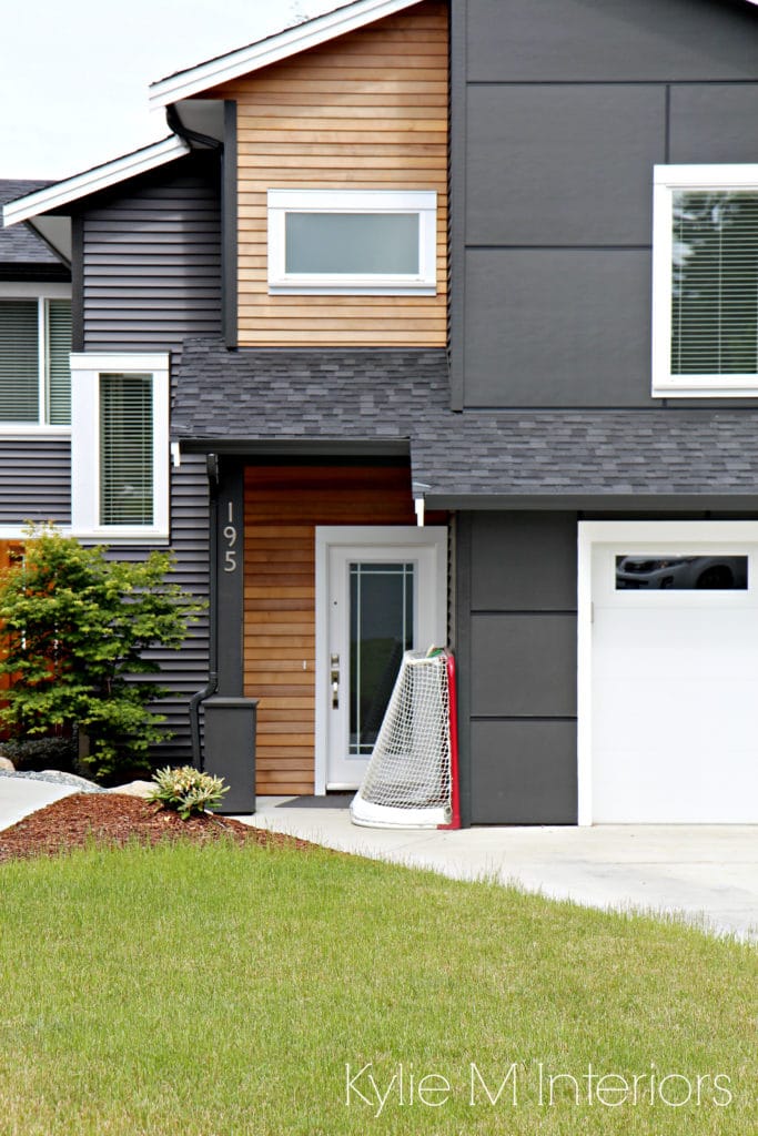
The above was just a sneaky drive-by on one of my local projects, so I couldn’t move the hockey net
- The more textured your wood is, the flatter your finish should be. Sheen enhances texture, so choosing a low sheen paint will keep things looking calmer
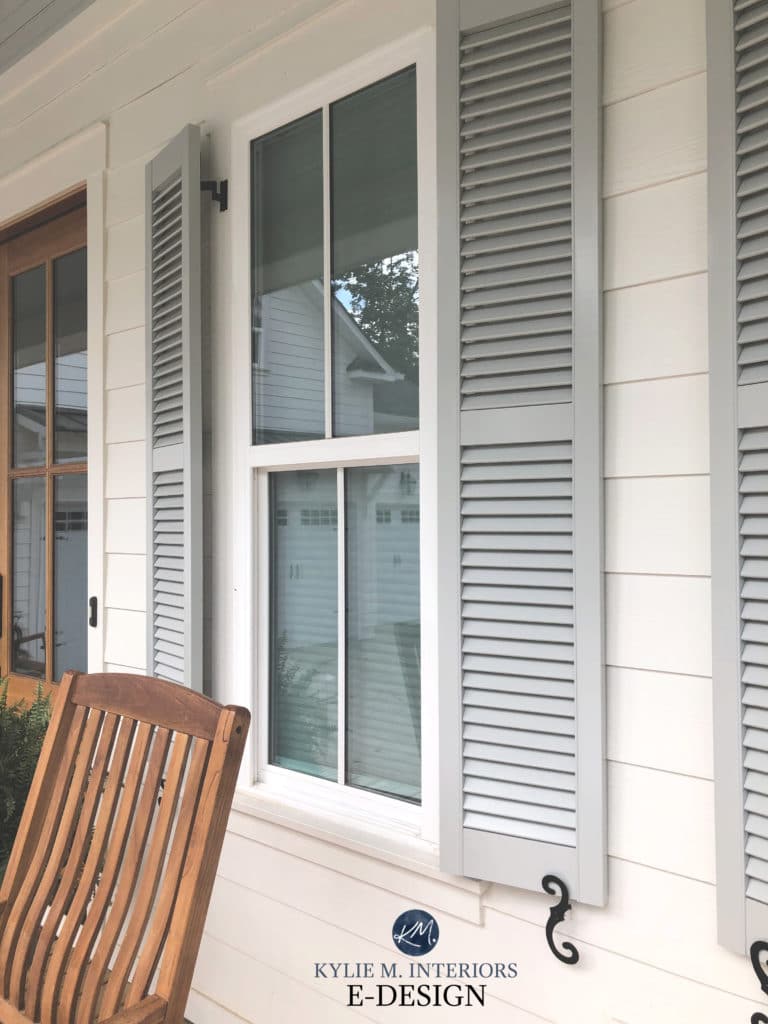
THE BEST PAINT FINISH FOR EXTERIOR TRIM, SHUTTERS AND DOORS
Satin (although some people do semi-gloss on doors)
Satin and semi-gloss are great finishes for trims, doors and garage doors. I lean toward satin on the garage door and front door with satin OR semi-gloss on the trims.
- Satin has just the right sheen to accommodate smooth or textured trim
- Satin is in between eggshell and semi-gloss. Semi-gloss is THE most washable.
- A satin or semi-gloss finish will make your colour feel just slightly more saturated (colourful/bright) than a flat or eggshell finish (compared to your paint chip)
- When light hits sheen it can make a colour wash-out more and look brighter AND reflective, so consider how much direct natural light you get when picking your finish
THE BEST PAINT FINISH FOR MASONRY: BRICK, STONE, CEMENT
Low-lustre or satin at the MOST
Satin finish can work for textured surfaces like brick and other masonry. This keeps it easy to hose down without creating a smudgy surface as brick is often on the lower portion of a home, where it gets the most dirt. However, I personally prefer a low-lustre/eggshell finish to keep the textured look down and reduce the sheen.
- Semi-gloss can be TOO much with the texture/pattern of masonry
- Satin is in between eggshell and semi-gloss. More wipeable than eggshell without the sheen of semi or high gloss paint
- A satin finish will make your colour feel just slightly more saturated (colourful/bright) than a flat finish (compared to your paint chip)
- Low-lustre will have some sheen to it, but not as much as a satin – but not as flat as a matte/flat
Not sure which paint colour to pick?
Check out my Online Decorating and Color Consulting Services – I’d love to help!

READ MORE
E-Design: A Brick Exterior with a Fresh New Look
How to Add Curb Appeal to Your Home’s Exterior: Budget-Friendly Ideas
The 12 Best Whole Home Gray and Greige Paint Colours – INTERIOR
Originally written in 2018, awesomely updated in 2020
Comments
Leave a Reply
More Posts

The 5 Best Creamy White or Off-White Paint Colors
THE ELUSIVE ‘CREAMY WHITE NEUTRAL’ When it comes to light, warm neutrals, it’s all in the undertones. And other than pink and green, yellow is the undertone many of my
Read More

The 8 Best Warm Neutral Paint Colors With NO Yellow Undertones!
The Top Light Depth, Warm Colors That Aren’t Cream! When choosing the best warm neutral paint color for your home, whether creamy white, beige, taupe, or greige, your choices are
Read More

The 12 Best Farmhouse Sinks of 2024
FIND YOUR DREAM SINK HERE… While traditional farmhouse design was all the rage in previous years, the embers have definitely cooled. As for MODERN farmhouse, it’s still kickin’ its cowgirl
Read More


We want to do new vinyl siding, or possibly Hardie board. Would selections of these items instead of paint color be covered in your services (hubby doesn’t want to paint again!)? Also wondering if Canadian vinyl color names carry over to the US?
Will darker colors hide the dirt that gets in the nooks and crannies of the popcorn stucco better than lighter colors? Or will it not make a difference?
Author
You bet it will!
I’ve been recommending paint colors for others for ten years, but when it comes to choosing my own exterior color, I’m shaking in my boots! I may call on you when the time comes!!
wish I read this before I painted. the color once dried on my house looks WAY LIGHTER than I wanted.
The color i just painted my front door and shutters is much lighter that the SW Rain color i had picked out showed. Very disappointed but will pick something darker to redo. I’d love any suggestion you might have.
My college friend Keith has been thinking about designs for his new custom home and has come across the problem of what color of paint he wants on the exterior of his house. I wanted to help him narrow down his choice, and so your article helped a lot when you went into detail about how paint may end up looking brighter or thinner on the outside due to natural light. Due to him being someone who takes looks and aesthetics seriously, I want him to be as informed as possible with his designed choice and so I’ll be sure to show this article to him before we get a residential painting service to help him out. Thank you!
Author
Awesome! I’m actually putting out a GREAT exterior blog post in the next 4-5 days all about choosing exterior colours/exposure, so watch for it, it could be really helpful! (I also have an accessible exterior package called ‘Quick Consult Colour Guidance’ if he just wants some help with ‘general direction’. Its sold out right now, but that one does open up more often than the others as I can do it quicker! https://www.kylieminteriors.ca/online-decorating-design-services/
BTW – you sound like a darned good friend to have ;).
Oh wait, read this one too… https://www.kylieminteriors.ca/dont-hire-a-painter-without-asking-these-10-questions-free-printable/
Hope that helps!
~Kylie
Thanks for your wonderful article.
Hi,
Can you tell me the actual paint colors on the house in this post with the reddish orange terra cotta roof?
Thank you!
Author
Hi Barbara! I have to be careful about how much info I give out online as clients did hire me to help them with their home specifically and it’s how I support my family! Thank you for asking though :).
I understand, Can you give me information about what it would cost to confer with you about this?
Thanks!
I’ve looked at your web page but don’t see how to access or purchase packages. Thanks.
Author
Hi Barbara! They do sell out QUITE quickly (often within minutes) on the days we open them up!
I love the color, as well. It’s beautiful.
By any chance do you know what paint color you used on the red brick Cape Cod cottage in the North facing light picture? It looks like a very light gray. Thanks so much!
This was the most informative and entertaining article I have read on exterior paint colours! I’m having a craving for wine though.
Thank-you!
Author
WAHOO, that’s what I love to hear! If you ever get a chance to try Canadian/Okanagan wines, Wild Goose is lovely 🙂