
Posted on March 10, 2024 by KylieMawdsley
THE MOST POPULAR Warm Neutral Color: Accessible Beige
If you said the word ‘beige’ to me a few years ago, I would’ve started twitchin’ and drinkin’ in the corner just thinking about all the ‘builder beiges’ from the early 2000s. But beige has come a LOOOONG way, baby, and Accessible Beige is one of my FAVE’s.
Why? Let’s take a closer look…
This post may contain affiliate links. If you make a purchase through links on our site, we may earn a commission.
WHAT TYPE OF COLOR IS SW ACCESSIBLE BEIGE?
Accessible Beige is a beige paint color, which means it’s a WARM paint color. With its unique blend of undertones and LRV, it’s also one of the more popular beige paint colors on the market!
However, as I alluded to earlier, beige has a bad rap, thanks to the early 2000s. Does Accessible Beige fall into that category of colors? HECK NO—it’snot THAT kind of beige; instead, it’s bodacious, beautiful, and begging to be on your walls!
When I have E-Design clients who like warm gray/greige paint colors, this one comes up quite often—even though it’s beige.
Why?
Well, if a client has a north-facing room, they sometimes find Accessible Beige grays out just enough to hit their comfort zone without falling cold and flat like some greige or gray paint colors can.
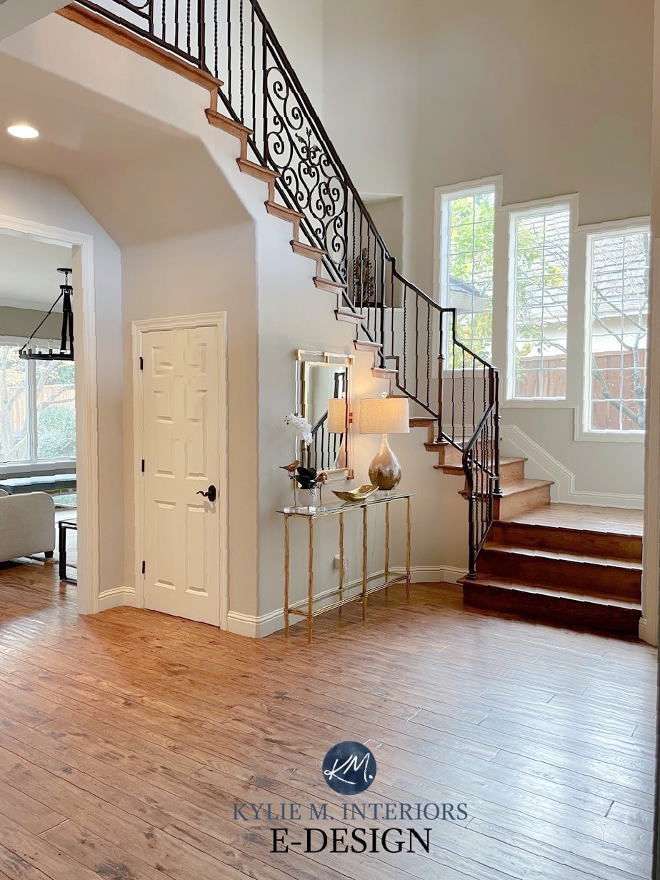
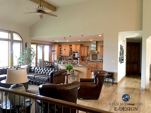
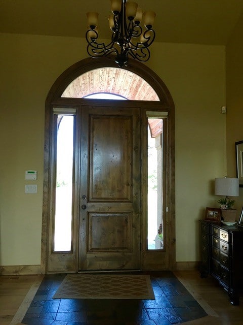
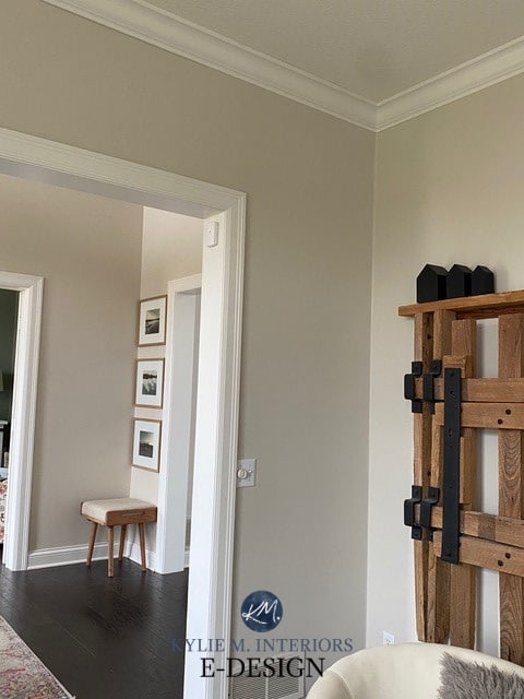
Before, this beautiful foyer was heavy-looking and dated…
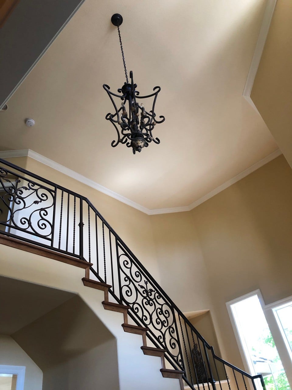
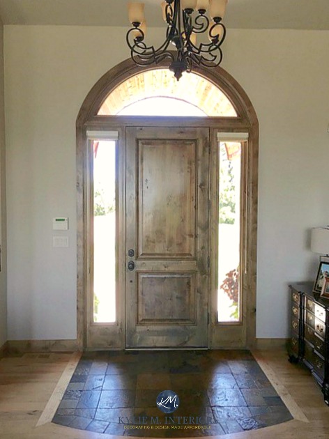
After, Accessible Beige offers a more modern approach to a traditional style…
WHAT’S THE LRV OF ACCESSIBLE BEIGE?
Accessible Beige has an LRV of 58, so it’s not quite in my magical range, but it’s getting there. Not sure what LRV is? You get three slaps with a wet noodle and should probably read this blog post—it might just save your paint-lovin’ life!
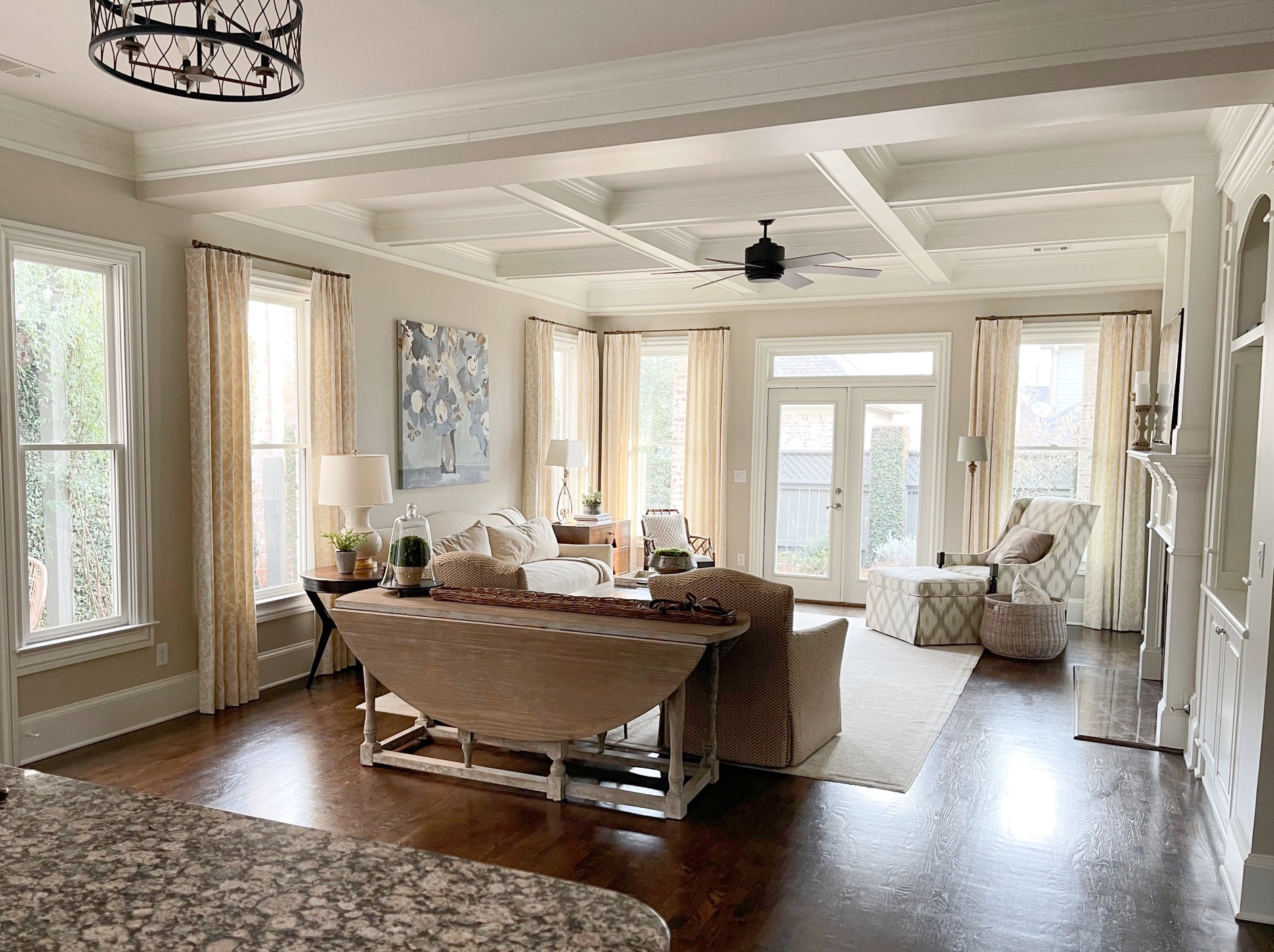
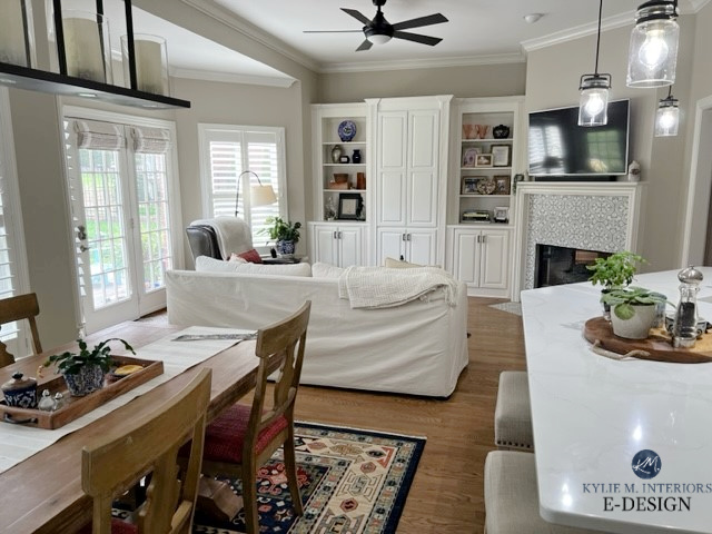
In this next photo (before), my client’s walls flashed a murky goldy-green, which did nothing for the home or its wood finishes and furnishings.
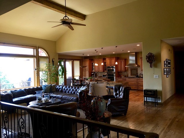
After (below), the LRV of Accessible Beige brightens the space considerably while keeping things soft and subtle. Everything comes to life—not just the furniture but also the wood cabinets, flooring, and window trims.
With an LRV of 58, you’ll find that Accessible Beige is, generally speaking, a ‘light’ color, although it’s not on the HIGH end of the scale. In the above photo, you’ll see that on walls with an average amount of light, this neutral color holds itself quite well. However, where it gets direct hits of light, it washes out, which is natural for any color with an LRV above 55 or so (and the sun WILL move its way along…or the earth will – whatever).
The Ultimate Guide to Choosing Paint Colors with LRV
WHAT ARE ACCESSIBLE BEIGE’S UNDERTONES?
When you look at Accessible Beige, you’re really looking at a beige with a feather-light, grayish undertone. A lot of the more old-school beige paint colors can flash quite yellow or orange—not this one. Accessible Beige is more soft, subtle, and neutral as it leans a bit to the gray side. Can it be TOO gray? In some lights, yes, but that’s also open to perception, as one person’s ‘too gray’ is another person’s ‘just perfect!’
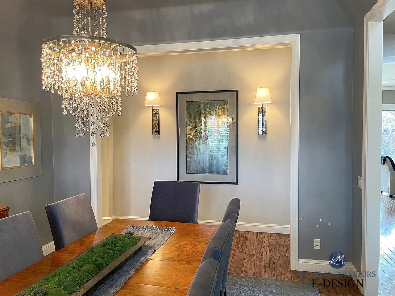
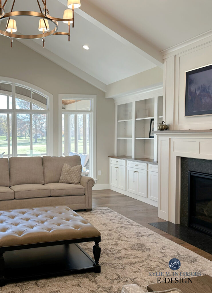
As shown in this next image, this is as cool as I’ve ever seen Accessible Beige look. This also shows how much a color can change in one room…
Aside from their main undertone (usually orange), beiges can pick up a touch of yellow, green, or pink. In the ODD light, Accessible Beige can pick up a weeee willy wink o’ green, most often with southern exposure. It’s subtle, but if you have an aversion, sample it carefully to see how it settles for you. And while Accessible Beige definitely isn’t inclined toward a pink undertone, it can depend on the surfaces you partner it with. Overall, unlike some beiges, which are super committed to one undertone or another, Accessible Beige is pretty non-committal.
Where this doesn’t work is with finishes that NEED color-commitment. For example, many travertine tiles cater to a strong orange-pink undertone, which can make Accessible Beige look drab and slightly green in comparison.
WHAT COLORS LOOK GOOD WITH ACCESSIBLE BEIGE?
Tim can only WISH I was as flexible as Accessible Beige. Oh honey, if you only knew me 20 years ago – toes to nose, baby! Being neutral with minimal undertones, Accessible Beige is pretty darn accommodating, so let’s look at the type of colors it loves the best:
- some warm grays that are darker than it
- some cooler grays that are, again, darker than it
- it looks wicked pretty with shades of greige, as long as they’re darker than Accessible Beige, including colors like Sherwin Williams Amazing Gray
- earth-toned colors (colors with a decent degree of gray or brown in them), e.g. Sherwin Williams Grizzle Gray, Cyberspace, and various medium to dark shades of green
WHAT COLORS DON’T GO WITH ACCESSIBLE BEIGE?
Accessible Beige doesn’t look as good with gray and greige paint colors with LRVs the same as or higher than itself (59+). It also doesn’t like colors that don’t have gray/brown in them. How do I know? It told me so whenever I tried different pairings. Because Accessible Beige has such an earth tone, it prefers to stay with this family.
SAVE MONEY ON PAINT SAMPLES – DELIVERED TO YOUR FRONT DOOR IN ONE DAY!
Get your PEEL & STICK SAMPLE of Accessible Beige
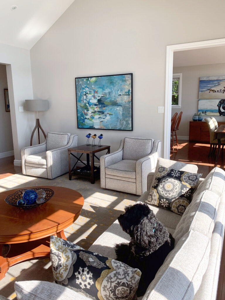
ACCESSIBLE BEIGE IN A SOUTH-FACING ROOM
In a south-facing room, you can expect Accessible Beige to be a soft, neutral beige with just that wink of gray and, more rarely, a nod towards green or pink (depending on your lighting/surrounding finishes). Unlike more saturated shades of beige, it won’t look as suffocatingly warm in the hot southern sun or afternoon western light – but it WILL look warmer than you’d expect!
North, East, South, West – Which Paint Color is the Best?
ACCESSIBLE BEIGE IN A NORTH-FACING ROOM
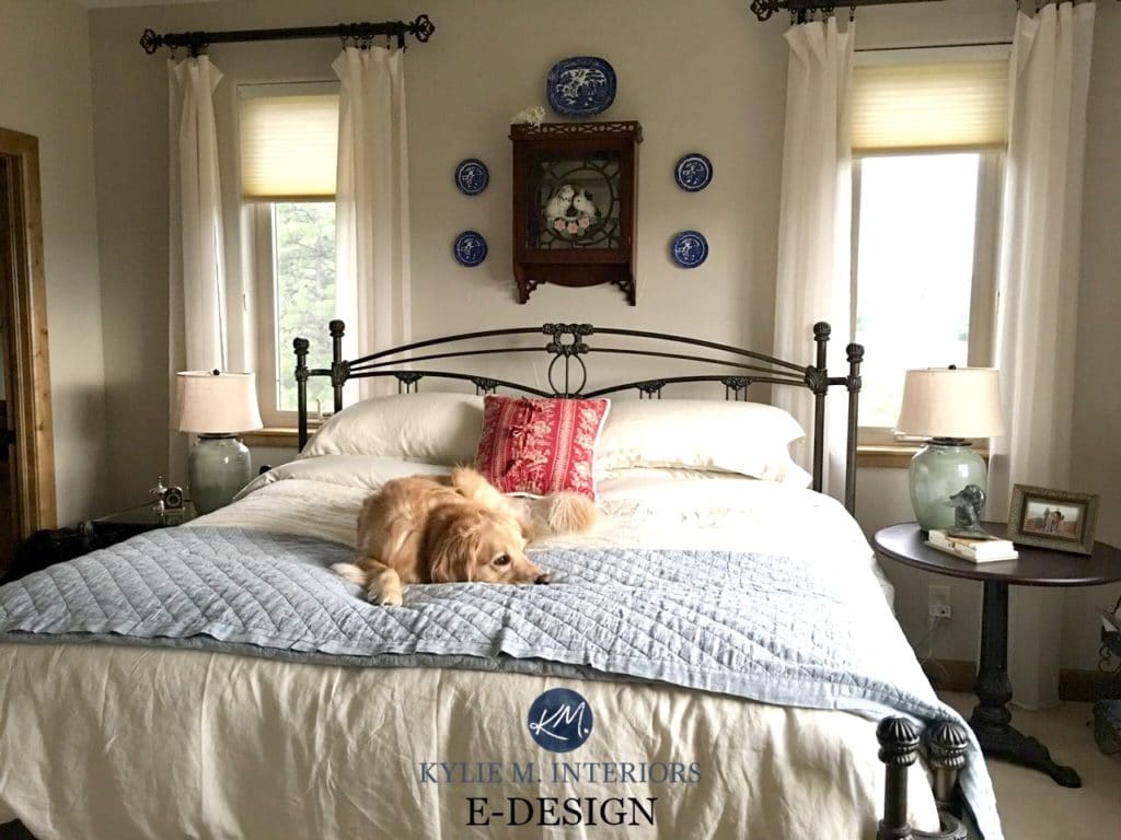
In a north-facing room, Accessible Beige will look slightly grayed-out, but not so much that it loses its warmth entirely—it is a beige at heart!
You also want to watch it in east-facing rooms. While these rooms get a lovely morning light, the afternoon light can make a color look pretty flat and drab.
Color Review: A Farmhouse Dining Room in Agreeable Gray
Before, a slightly creepy, golden warmth was flashing through this paint color…
After, see how Accessible Beige picks up a subtle gray cast (considering this area doesn’t get much natural light) without becoming greige or flattening out. It also looks beautiful with the wood trim…
IS ACCESSIBLE BEIGE A GOOD EXTERIOR PAINT COLOR?
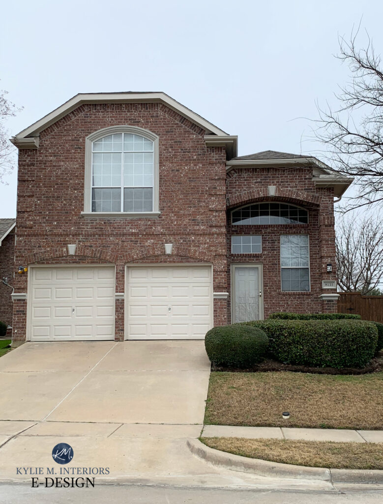
That’s definitely a loaded question. It all comes down to the color preferences of your roof, stonework, brick, and even your driveway can call the shots! However, with its passive warmth and moderate depth, Accessible Beige has found its way onto many exteriors, including siding and trim.
As shown on this next home, Accessible Beige looks great on the trim and garage door, as it coordinates with the brick…
WHAT’S THE BEST WHITE TRIM OR CABINET COLOR WITH ACCESSIBLE BEIGE?
Accessible Beige is reasonably flexible towards a range of white paint colors, but it DOES draw the line at ones that are overly cream/creamy.
Here are the three best shades…
- Sherwin Williams Pure White
- Benjamin Moore White Dove
- Sherwin Williams Alabaster
Of the three, Alabaster is the tip of the iceberg; anything more yellow is TOO yellow for Accessible Beige (even Alabaster is on the edge).
Sherwin Williams Accessible Beige and Alabaster cabinets/trim
If you’ve been eyeing up Sherwin Williams Creamy or Antique White and hoping to partner these creamy shades with Accessible Beige, I suggest you read this blog post instead.
WHAT COLORS ARE SIMILAR TO ACCESSIBLE BEIGE?
This is the FUN part! You never want to pick a paint color based on how it looks alone. COMPARE COMPARE COMPARE. Often, you end up with a totally different color than the one you THOUGHT you wanted!
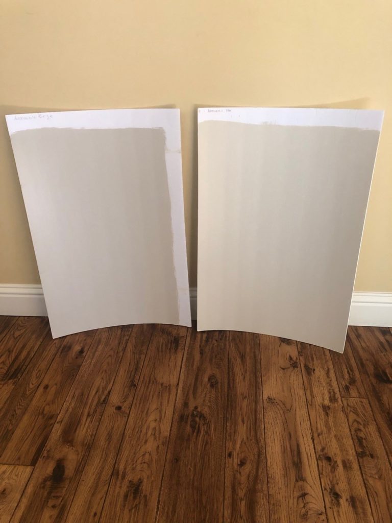
ACCESSIBLE BEIGE vs SHIITAKE
While Accessible Beige gets a lot of attention, there’s something to be said for the very comparable Shiitake. Depth-wise, Accessible Beige’s LRV is in the light range with its LRV of 58, whereas Shiitake is in the light-medium world with an LRV of 51. This lower number means Shiitake is a light-medium depth paint color. When you compare these with white trim or cabinets, you’ll see Shiitake offers a bit more contrast.
Where they’re most similar is in their approach to beige. Like Accessible Beige, Shiitake picks up a soft gray backdrop, which calms down its degree of color – at least compared to the usual bunch of beiges. Sure, it can pick up a TOUCH more pink compared to Accessible Beige, but neither shade is overly inclined this way.
ACCESSIBLE BEIGE vs. EDGECOMB GRAY
I love comparing these two popular shades. Starting with LRV/depth, Accessible Beige sits at 58 (on the lower end of the light range), whereas Edgecomb Gray has an LRV of 63.09, making it subtly but noticeably lighter.
Where these two REALLY hit each other head-on is in their general warmth, which is why they’re so fun to compare. Of the two, Accessible Beige is warmer and more beige; Edgecomb Gray is a greige-taupe, so it sits that touch cooler than Accessible Beige, but not by a ton. If you’re looking at Edgecomb Gray and worry it’s too cool, Accessible Beige can be a great alternative to sample. Likewise, if Accessible Beige comes up too warm, Edgecomb Gray could be just the tweak you need!
BTW, of the two, Edgecomb Gray tends to be more flexible for a range of finishes.
FULL Paint Color Review of Benjamin Moore Edgecomb Gray
ACCESSIBLE BEIGE vs. AGREEABLE GRAY
When it comes to popular warm neutrals from Sherwin Williams, these two are near the top of the list. However, they rarely vy for the same spot on your walls as they do different things.
Accessible Beige is a beige; Agreeable Gray is a warm gray-greige-taupe (based on perception). Agreeable Gray is more ‘gray-centric’ than Accessible Beige’s ‘beige-centric’ look. Agreeable Gray is also a smidge lighter than Accessible Beige, with an LRV of 60.
Really, unless your finishes happen to accommodate both of these colors (which isn’t common), there should be a clear winner between the two.
FULL Paint Color Review of Sherwin Williams Agreeable Gray
ACCESSIBLE BEIGE vs. NATURAL TAN
With trends leaning warmer, it’s no surprise that we see colors like Accessible Beige and Natural Tan popping up on our Instagram feeds (follow me HERE!)
Accessible Beige left / Natural Tan right.
Natural Tan has an LRV of 65, so it’s a good chunk lighter than Accessible Beige’s 58—in fact, it’s smack-dab in my favorite place. If you have a darker room and worry about Accessible Beige being too dark, Natural Tan could be a good one to check out.
Paint Color Review of Sherwin Williams Natural Tan
However, Natural Tan and Accessible Beige differ in depth, and there are also shifts in undertones. While Natural Tan doesn’t grab a ton of green compared to Accessible Beige, it’s more inclined this way. It’s also a bit more COLORFUL than Accessible Beige, which means its undertones are a bit more noticeable.
READ MORE
The 14 Best Beige Paint Colors for The MODERN HOME
Paint Color Review: Benjamin Moore Grant Beige
Paint Color Review of Sherwin Williams Natural Tan
Want THREE colors CUSTOM-PICKED for your room?
Check out my E-Design and Online Color Consulting packages!
Chat soon,

Originally written in October 2017, updated December 2024
Comments
Leave a Reply
More Posts

The 5 Best Creamy White or Off-White Paint Colors
THE ELUSIVE ‘CREAMY WHITE NEUTRAL’ When it comes to light, warm neutrals, it’s all in the undertones. And other than pink and green, yellow is the undertone many of my
Read More

The 8 Best Warm Neutral Paint Colors With NO Yellow Undertones!
The Top Light Depth, Warm Colors That Aren’t Cream! When choosing the best warm neutral paint color for your home, whether creamy white, beige, taupe, or greige, your choices are
Read More

The 12 Best Farmhouse Sinks of 2024
FIND YOUR DREAM SINK HERE… While traditional farmhouse design was all the rage in previous years, the embers have definitely cooled. As for MODERN farmhouse, it’s still kickin’ its cowgirl
Read More


Hi Kylie,
I love your blog and your obsession with paint colors! I share that obsession too—it keeps me up at night! I was wondering if you think AB would work with natural white oak cabinets? Our kitchen is south-facing and gets direct sunlight, and the popular white paint I am currently seeing is way too bright and blinding in our house. Or any other suggestions? Thank you!
Author
My only concern is if the cabinets end up looking a touch pink in comparison to Accessible Beige? Natural white oak can sometimes lean this way 🙂
Hi Kylie! I find your posts very helpful. I am planning to repaint the walls of our house (open concept). I am planning to leave the baseboards and trims, paint is BM Navajo white. Will Accessible Beige be a good wall paint? I’m also considering Natural Tan and BM Edgecomb Gray (might not work because I have dark brown kitchen cabinets). Not much light in the house (townhouse). I have 1 small south-facing window, then a sliding door and a big window both north-facing. Thank you!
Author
Hi Janis, if the TRIM paint is Navajo White, I HIIIIIGHLY suggest reading this blog post :). https://www.kylieminteriors.ca/the-16-best-wall-colours-for-cream-cabinets-trim/
If you meant that the current WALL colour is Navajo White and you want to change it to Accessible, yes, AB can be a great choice as long as it suits the interior finishes!
Hello! First, let me start by saying that I love your videos and blogs on paint colors! They have been super helpful for me when choosing a whole house color palette 🙂 In your most recent video on Accessible Beige, you came up with a color palette on the fly that I absolutely loved! After getting some peel and stick samples of several of the colors you mentioned, I think we are going to go with them and I’m so excited to see the finished product!
I just have one question for you if you can make a suggestion or give me your thoughts…I am looking for a shade in between Accessible Beige and Aesthetic White that will stay true to both with the undertones. I had the paint store lighten AB by 25% and 50%, but when painted both on some white boards, they seem to have strayed a little from the true color unless this is just me or I guess it could be the board I’m using…who knows. I feel like I lost a little of the gray in them.
Instead, I’m leaning towards using Natural Tan in the mix along with AB and AW to fill this need. Can you give me your thoughts please? Thanks in advance for any help you can provide.
Author
Hi Jackie! If you’ve already played around with Aesthetic White, then you’ve really done all you can do to get as CLOSE to what you’re wanting. I mean, you can also try lightening Accessible Beige because it IS a different colour profile, although VERY SIMILAR to Aesthetic White. Sometimes we assume that 50% lighter Aesthetic White might get us 1/2 way between it and Accessible, but that’s rarely teh case!
Hi Kylie! Thanks for your quick response! I’m sorry for the confusion…I was trying to say that I already had the paint store lighten Accessible Beige by 25% and 50%. To me, both seemed to turn out a little more beige in addition to being lighter than the original when I painted them on some white boards??? Instead of this, what are your thoughts on using Accessible Beige in some areas and Natural Tan in others in the same house? When I compare them, Natural Tan looks the closest to a lightened up shade of Accessible Beige to me. I plan to use Aesthetic White as well, but since it is so much lighter than Accessible Beige, I was really hoping to find something that would fit between them. I’m just worried about conflicting undertones in Natural Tan and Accessible Beige. Hope this makes sense 🙂
Thanks again!
Jackie
Author
Hey Jackie! Yup, I think you can shift between AB and NT and AW. With the way natural light changes, some people might still think it’s the same colour! Mind you, at night, that’s when you’ll see those differences in depth :).
Perfect! Thanks for your expert opinion and again for your speedy response! I really appreciate it 🙂
Have a great day!
I am thinking about doing the same thing. I painted most of my house Accessible Beige but my hallway is too dark. So I am thinking about repainting the hallway Natural Tan. How did that work out for you?
All I can say is THANK YOU !!!! We moved and sold all our furniture (old 2000ish stuff I loved) and decided to modernize a bit. This I realized was way out of my comfort zone. Have had the new furniture for a year now and after 110 visits to your website (probably not an exaggeration) and 20 samples of tan, beige, greige paint, I kept having Kylie M (and a glass of wine) in the back of my mind screaming – go Accessible Beige and you can cut the formula. (We face north with lots of windows, plus a loft, and paint was doing all sorts of funky stuff.) I finally added Accessible Beige at 25%, 50% and 100% to my stack of samples and wish I had listened to you sooner 🙂 – we ended up painting 100% in main room, 25% and 50% in the dark hallways – and it looks beautiful! Wish I had listened to you from the start. And thank you to Jill, my new Marketplace friend, who bought all my samples and is doing a really cool pour painting with them. Something tells me I need to buy that – it would make for a great story.
Author
Ahhhh, what a great comment to get,thank you, Stephanie!! And wine ALWAYS helps with the decision making process, if you ask em 🙂
I’m painting my mom’s house next week and she wants a beige with a white trim and a red door. You have recommended Accessible Beige and Pure White in some interior combos. I’m assuming it would be great exterior as well? Also wondering what red to use for her front door assuming this color combo works in exterior.
Pingback: The Best Fresh Warm Neutral Paint Colors for Your Home - Perfecting Places
Hi!! I love your website and it’s been so helpful!
What wall color would you recommend with AB trim? I’m looking for a creamy white that isn’t too bright/stark. All the living spaces in our house have west facing windows.
Our designer recommended Panda White or Ivory Lace (feels too yellow for me). We will also be taking AB onto our kitchen cabinets.
Thank you!
Author
Oooof, I wouldn’t do either of those – I’m glad you asked! With AB trim, try BM White Dove or maaaybe SW Pure White, as long as it’s warm enough for your exposure/everyday living. The challenge is that creamy whites are yellow based and Accessible Beige ISN’T, so you can’t really stretch it very far.
Thank you so much for responding and saving me from an expensive mistake!!
Hi Kylie, do you think Accessible Beige would work in a kitchen that has lots of natural light, but with dark brown cherry cabinets, Santa Cecilia granite, and swirly tan floor tile and backsplash? (I can’t afford to update all that dark hideous stuff right now — paint is all I can do).
Author
Oooo, Accessible Beige is tough as sometimes it doesn’t have enough orange for a particular room’s lighting/beige tile/etc…
Thanks Kylie – you were right. It looked “muddy” and too gray. I am going w Manchester Tan instead, which looks soft and creamy. I do think Manchester Tan is too light for my adjacent two story family room, which has a solid wall of windows and gets tons of light. Any color suggestions that would look ok next to Manchester Tan and not wash out? Do you think accessible beige would be ok? I’d like something with green undertones.
Hi Kylie,
I love your blogs and have learned so much from you! I wish I could show you a picture but will try to describe here the best I can. I have Accessible Beige in my great room and I am looking to decide on a paint color for a custom mantle shelf that has yet to be built. My fireplace is ledgestone with many shades of gray, tan, and even a tad bit of stone that looks a little burgandy. The stone is very earthy looking in terms of tones. My fireplace only goes up to the mantle shelf. I have a lot of natural light with big windows on north/south walls (length 23 1/2 feet) with the fireplace on the east wall (which is 15 1/2 feet width) . My trim in the great room is painted white. I have a dark chestnut stained credenza on the same wall as the fireplace and originally was going to have the custom mantle stained that color but feel like would be too dark and heavy. My floor is a is a taupe color white oak and my hearth is a light gray limestone. I am now thinking that I may have the mantle painted a light gray to coordinate with the limestone. I have been toying with Aethstetic White. What do you think? If not that color, do you have another suggestion of a light grey/griege color to try? Thank you so much!!
Hi Kylie,
I know this is an older post so hopefully you see this. Currently in the process of building a new home. We will have Fruitwood stained lower cabinets and I really want a creamy white upper cabinet that is sherwin williams per our cabinet maker. I am really leaning toward Dover White for the uppers will it look good with AB walls or should I stick to Natural Tan or Natural Linen? I’m having such a hard time trying to visualize all of this since we don’t even have drywall yet.
Author
Oooof, Dover White is pretty darn yellow! If you want a warm white like this, Alabaster would be better, but really, Accessible Beige prefers SW Pure White more :).
Hi Kylie,
I love your videos and value your opinion. Our main living spaces paint color is Accessible Beige with a semi open floor plan and tall ceilings white trim. Currently our kitchen is Fashion Gray by Behr. I still like the color, but we are updating our kitchen and adding Taj Mahal Quartzite and beige tile floors with a creamy white subway tile backsplash. Our cabinets and island are a rich dark wood stain. Are there other colors I should consider painting to update our kitchen walls while we are making these changes? I do love a gray or griege. Our kitchen is situated at the North East corner of our home with a good amount of natural of light on sunny days. Thank you so much for any suggestions you may have!