
Posted on March 29, 2019 by KylieMawdsley
How to Pick the Best Blue for You
If you’ve been trying to pick a blue paint colour for your walls, but can’t seem to land on a fave, I BET I know why! Either your room doesn’t SUIT blue (which we’ll get into below) or you’re looking at the wrong TYPE of blue.
This post may contain affiliate links. If you make a purchase through links on our site, we may earn a commission.
The wrong TYPE of blue? Isn’t blue BLUE? Well yes…and no.
The Two Types of Blue Paint Colours
Blue likes to tip two ways – green or purple. So, depending on where your fave blue sits on the colour wheel, it will either slide blue-green or blue-purple.
Now, of course, that’s the simplified version (which is my go-to ) as your blue isn’t really mixing WITH green or purple – it’s mixing with yellow (blue+yellow=green) or red (blue+red=purple), however, sometimes it’s easier to call it as we SEE it.
And there are some blues that are pretty darned blue, but they can be swayed SO easily by their environment as WELL as personal perception, so today, we’re focusing one blue-green and blue-purple.
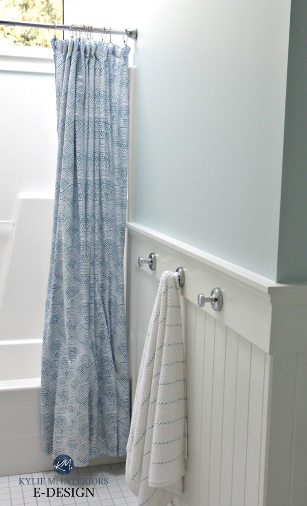
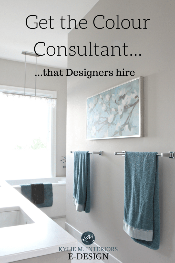
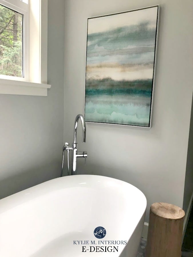
In the above bathroom photo, do you see plain old blue, blue-green or blue-purple? If you guessed blue-green you’d be the winner winner chicken dinner! You’re looking at Benjamin Moore Ocean Air which is a beautiful soft blue-green.
And because it’s definitely the most POPULAR these days, let’s hit on blue-green first.
Blue-Green
While blue-green is ‘technically’ cooler than a blue-purple, we know that it’s not all about technicalities when it comes to how a colour FEELS. Blue-greens TEND to feel softer and slightly warmer than blue-purples – go figure. And btw, this little detail could be very important if you’re thinking of painting ‘certain rooms’ blue – which we’ll get into shortly.
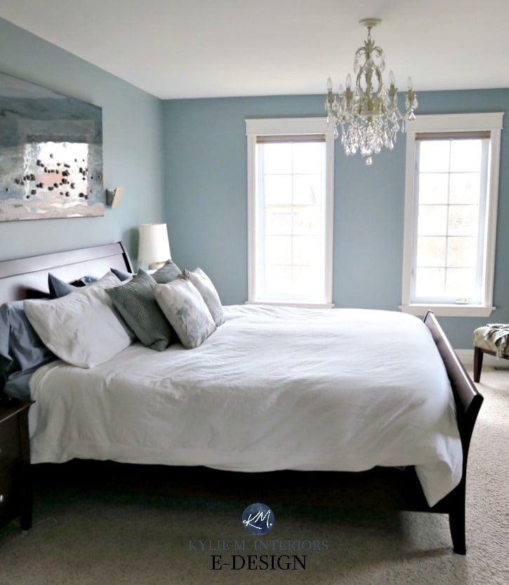
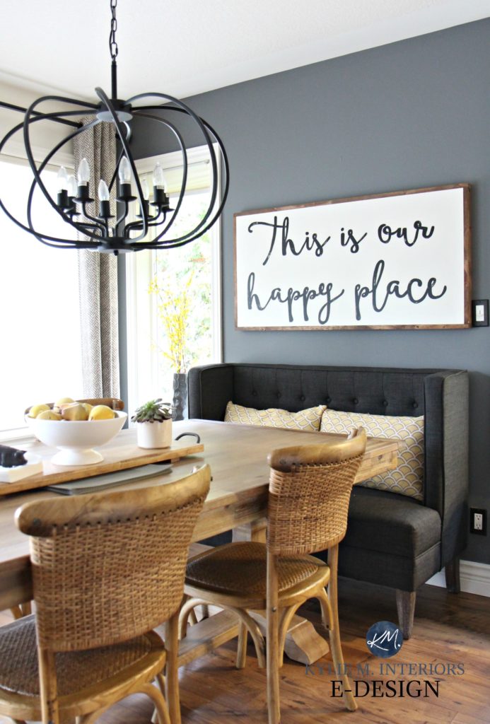
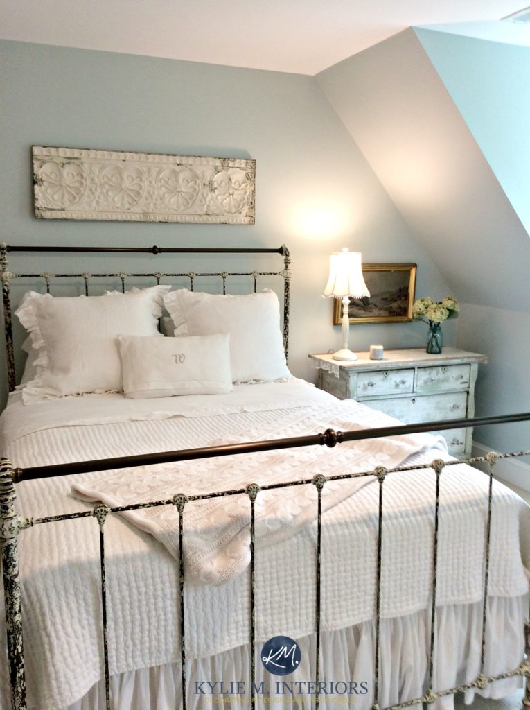
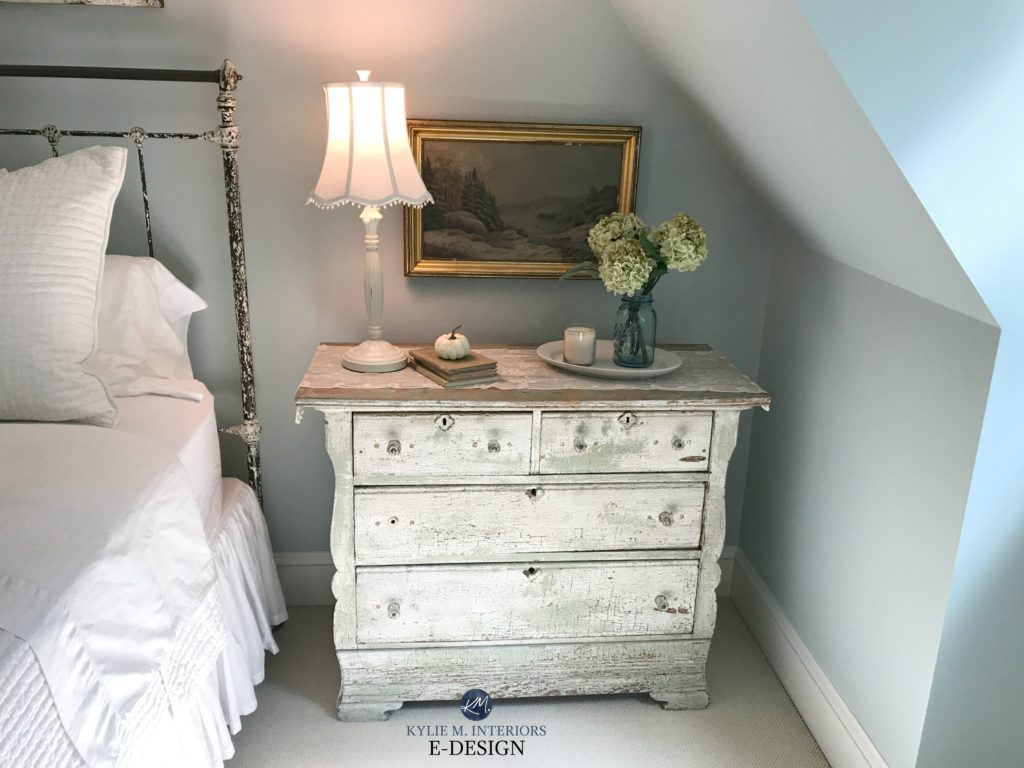
So, looking at a blue-green you should see blue FIRST with green mixed in. Now, if you add more and more green, you’re going to start tipping those scales and eventually, you’ll have a GREEN-blue, meaning it’s a green paint colour that leans into blue (think mint or aqua). In the last bedroom photo, you should see a blue that is nicely grayed-out – which is common with MOST popular blue paint colours. However, that is actually a blue-green – a mild one called Benjamin Moore Mount Saint Anne.
This next photo will show you a more obvious example of a blue-green…
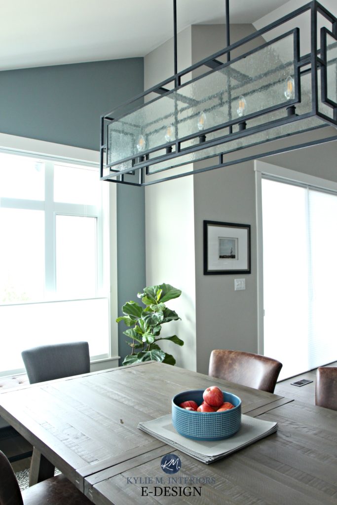
The simple shot above shows Benjamin Moore Gibraltar Cliffs, which is a gorgeous watery blend of blue-gray-green (see more in this blog post).
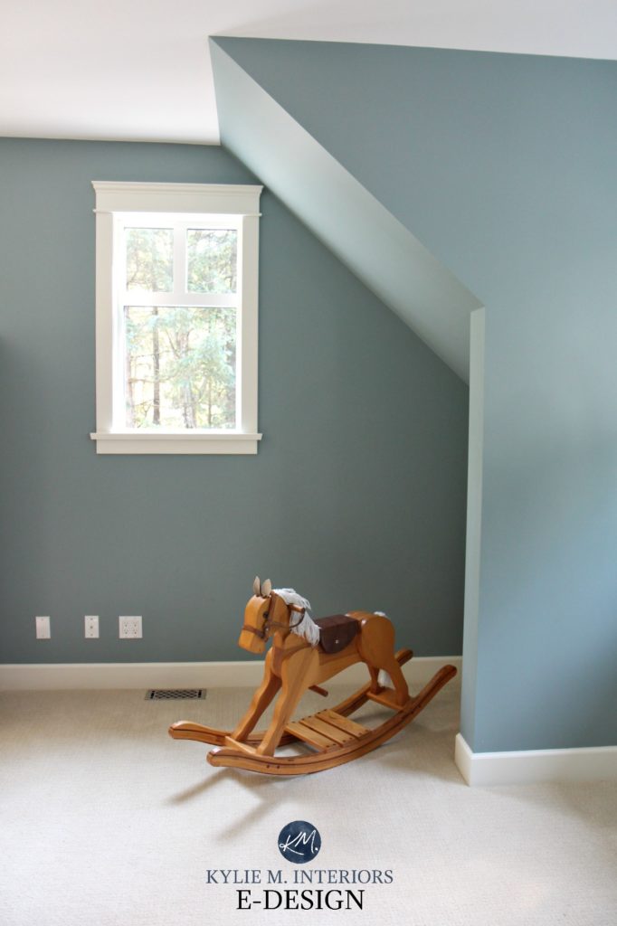
This next photo with the rocking horse shows Benjamin Moore Sea Star in all of its blue-green glory!
A bit more about blue-green
- If you add ENOUGH green you’ll get colours like teal and aqua coming out of the woodworks
- Blue-green is a more popular choice than blue-purple for a beach, coastal, or even modern farmhouse vibe
- Most popular blue-greens are mixed with a solid dose of gray to calm things down
Blue-Purple
Again, blue-purple should technically be a WARMER looking colour than blue-green, but it tends to FEEL cooler in a room – especially if you put it in a room that it’s not meant for. That’s right, just because you WANT to paint a room a certain colour (ie: blue), doesn’t mean you SHOULD, and we’re going to hit on that shortly.
Now the interesting thing is that in my E-design, I rarely refer to blue-purple – it just doesn’t suit as many rooms/styles. And because I ONLY use my E-design client’s images on my site, I actually don’t have many good photos of blue-purple projects – that’s how rarely I come across it.
HOWEVER, that doesn’t mean that it won’t suit YOUR room and in fact, most of the photos that I DO have are of my own home – well, our last few homes actually…
See more HERE
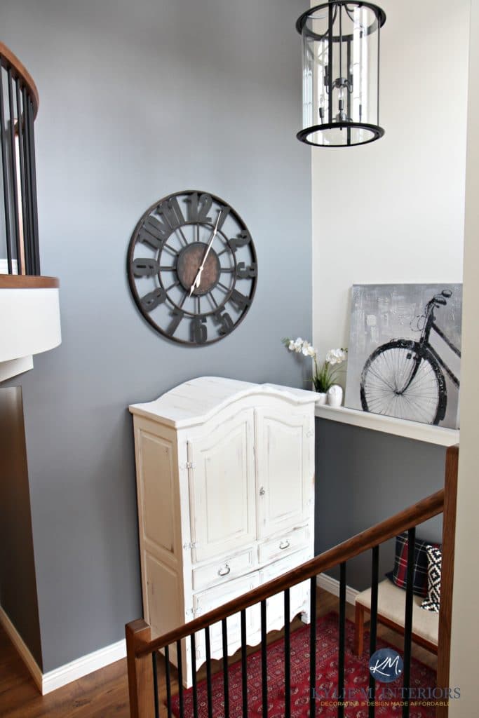
Benjamin Moore Steel Wool is a great example of a blue-purple (with a whole whack of gray). I can’t even TELL you how many people loved this freakin’ colour!
Here it is again in our entryway…
See more HERE
When looking at a blue-purple paint colour you should see blue – absolutely, but don’t be surprised if a lot of people see purple!
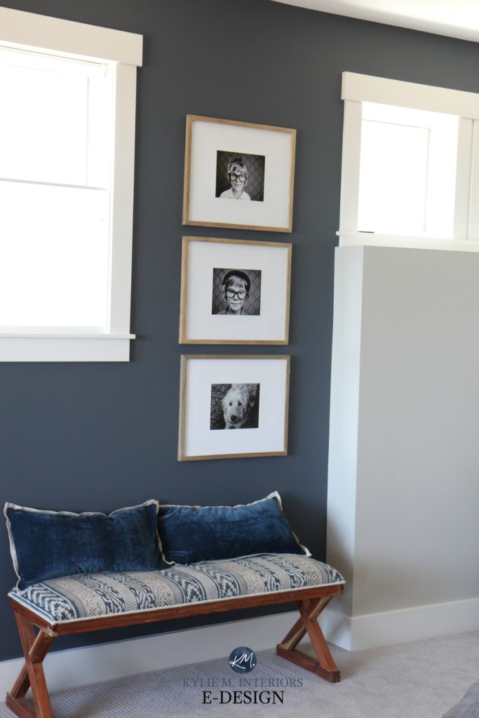
In another one of our homes, I played around with the navy blue vibe of Benjamin Moore Anchor Gray – a navy blue that leans slightly purple…
A bit more about blue-purple
- If you lean hard enough into the purple, you’ll start getting a periwinkle type of colour. Lean harder and you’ll get violet, the point where your blue becomes more of a purple with blue in it
- Blue-purple can feel a bit more formal than a blue-green, but it can also look more romantic and feminine, especially with a decent purple mixed in
- And don’t forget, even navy blue will have its preference for either green or purple!
Read more: The Best Navy Blue Paint Colours for Island, Cabinets, Front Doors and More!
Blue-Green and Blue-Purple in North Facing Rooms
Here’s the deal Ally McBeal (totally dating myself, I know), blue in a north-facing room is a tough sell. Why? Well, blue is a cold colour. North-facing light is a cool gray light with a blue cast to it. Combine these 2 and you have a DAMN cold-looking room! That northern light will further glorify the cool tone of your blue paint colour, leaving things feeling a weeee bit nipply.
Here’s Anchor Gray again in our last home which was EXTREMELY north-facing (and colder than Tim’s ex-girlfriend’s heart).

However, there are some workarounds for this (which are different from reach-arounds).
Choose blue-green in a north-facing room – not blue-purple
Blue-green, although it’s COOLER than blue-purple, tends to feel softer and warmer and is better suited to a north-facing room than a blue-purple.
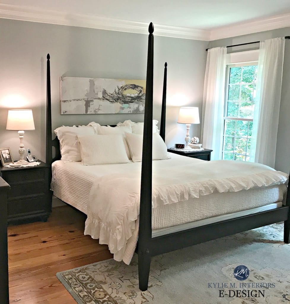
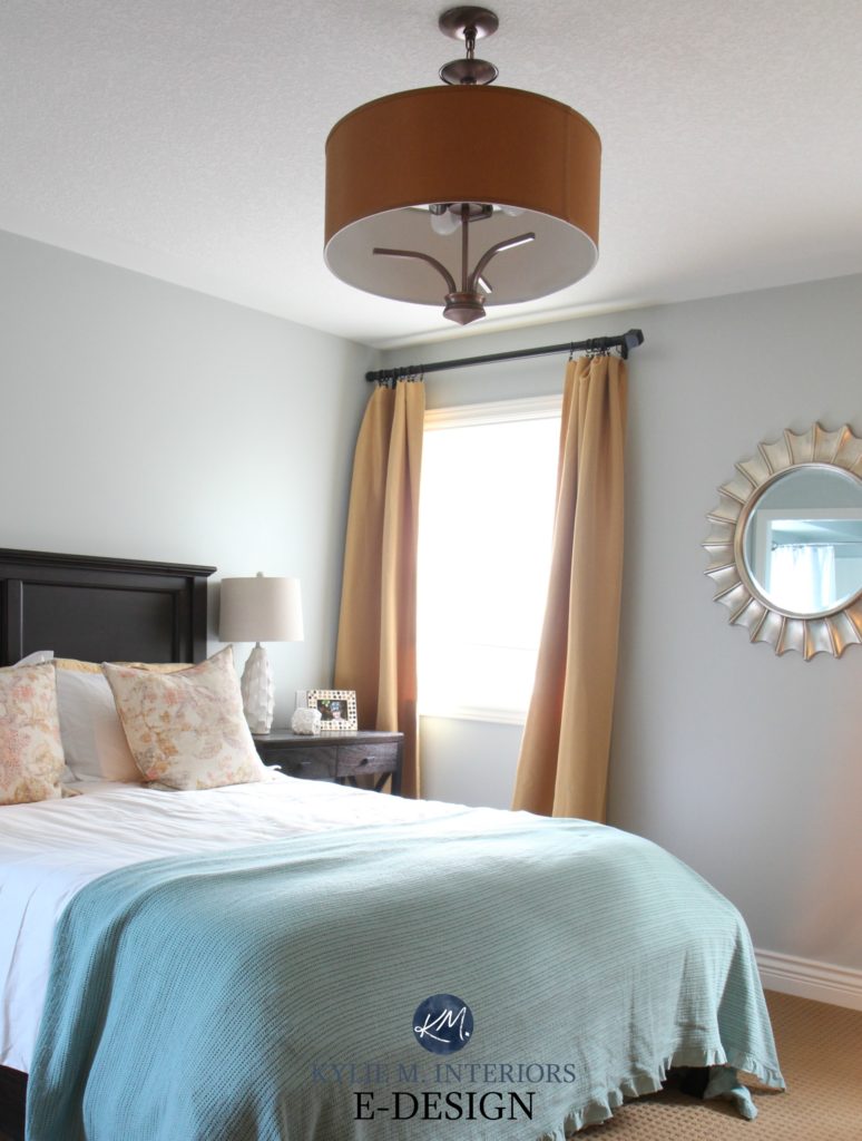
The above romantic farmhouse bedroom shows us Benjamin Moore Woodlawn Blue which is OFTEN mistaken for ‘blue’ when it is actually a blue-green.
And btw, I find the same can be said of east-facing rooms. While they don’t have that particularly cold cast, they are not warm feeling rooms in general and usually prefer blue-green (they told me so…or maybe it was the wine).
Use texture and warm ACCENT colours to add warmth to a north/blue-toned room
If you fall hard for a blue-purple, then you’ll want to add texture and softness to the room to help balance out that cold-on-cold look.
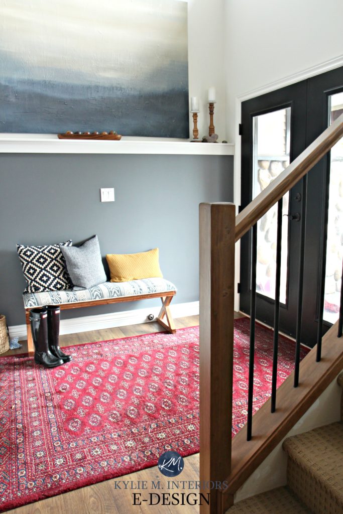
Notice how the red area rug and gold accent cushion add balance to the cool look of Steel Wool. In the photos of Anchor Gray you’ll see the same gold colour as well as texture which helps to balance out the cool paint colour and exposure.
And you might be thinking, ‘Ummm Kylie, you’re telling me that north-facing rooms don’t always suit a blue-purple yet YOU PAINTED A NORTH FACING ROOM BLUE-PURPLE!’ True. And the funny thing is that I’m generally not a FAN of blue-purple, however, when painting a room, it’s not always about what WE want, it’s also about what the room wants.
For example, let’s take a look at my Anchor Gray family room again. Notice the carpet – a gray with a soft purple undertone. Also, notice the stacked stone fireplace with its gray-purple veining…
Had I chosen a blue-green (which would’ve been WAY more up my alley) it would’ve been a hot mess. SO, for me, the happy medium was adding some depth (which I ALWAYS love) and leaning my blue slightly into purple. I can’t say I was ever CRAZY about the colour, but it was a great happy medium between what I prefer and the specific needs of my room.
Read more: The Best Paint Colours for a North Facing Room
Blue-Green and Blue-Purple in South Facing Rooms
South-facing rooms are MUCH better suited to blue – any type! Southern light can be SUPER warm and you might even find that a well-chosen blue will help to balance out the visual heat of a south-facing room.
Benjamin Moore Arctic Gray
The same can be said of west-facing rooms, however, they will have that more muted/flat light in the morning which will then get amped up from noon onwards.
Read more: North, East, South, West – Which Paint Colours is the Best?
And some more photos of beautiful blue-inspired rooms!

Benjamin Moore Kitty Gray – a dark blue-green-gray that can flash blue-green OR green-blue (with a dominant gray mixed in)
Sherwin Williams Rainwashed – blue-green-gray that tends to lean more into blue
Sherwin Williams Jubilee – a blue that leans nicely into purple with a good dose of gray
Sherwin Williams Network Gray – see it ALL here

Benjamin Moore Stonybrook – blue-green-gray that can favour blue or green depending on the room
Sherwin Williams Silver Strand – see more HERE
Benjamin Moore Wickham Gray – blue-green-gray blend that favours gray
Benjamin Moore Woodlawn Blue – a blue-green-gray blend that leans heavy on the blue
Not sure which BLUE is best for YOU?
Check out my fun and affordable E-design packages – I can help!
Chat soon,

RELATED BLOG POSTS
The 8 Best Blue and Green Blend Paint Colours
Comments
Leave a Reply
More Posts

The 12 Best Farmhouse Sinks of 2024
FIND YOUR DREAM SINK HERE… While traditional farmhouse design was all the rage in previous years, the embers have definitely cooled. As for MODERN farmhouse, it’s still kickin’ its cowgirl
Read More
Trendy & Popular Paint Colors for Your Kitchen Island (Mixed Bag!)
Islands, Vanities, Lower Cabinets? These Colors Have Em’ Covered…Literally It’s hard to beat paint when it comes to affordable kitchen and bathroom updates. However, whether you have wood cabinets or
Read More
The Best Paint Colors to Go With Golden Oak (Cabinets, Flooring, & Trim)
Modernize Your Outdated Golden Oak Home With COLOR! I’ve written a lot of blog posts on updating wood cabinets, covering a wide range of wood stains and grains. This one
Read More


Have you ever used BM Little Falls? Curious where it falls in the mix…
This came at the perfect time for me. I’ve been debating SW storm cloud or granite peak for my husbands dark masculine office, but it’s east facing, and both colors were just looking so purple. I guess I’ll need to find a “blue-green” blue. I do have a question though. We are in the process of picking out a stain color for red oak custom cabinets, and a slab of granite for his builtins. I’m so worried of picking a stain color that will clash with the type of color we want for the walls. Do you have any suggestions for picking out a neutral stain color for red oak cabinets?? We really like the Cygnus granite. Thanks in advance for any info you can help me with, and also thank you for this blog, I’ve spent many hours scouting it and reading comments.
Author
Hi Cori! Check out SW Foggy Day, it could be just the subtle shift you need without going too green! Now I don’t do much for stain colours and do try to focus more on paint colours as they are my strength! My best recommendation though is to go to a used building store and get an old red oak cabinet door (or a finishing store and buy some red oak that is unfinished). This way you can play around without messing with your own doors 🙂
Kylie picked the perfect green-blue-gray for my home with all sorts of west and northwest light flooding in. Love it!
Hi Coleen,
Which color did you use? Was it Woodlawn?
Thanks!
Perfect timing! I am looking for a blue paint color for my bedroom. It is a low light room with two windows on either side of the bed that faces west with a treed backyard. Based on the dark room, would you pick a blue green color or blue purple? LOVE your blog posts!!
SW Moody Blue is great in a North facing room!
Author
I’d do it!
Any suggestions for a soft gray that would go with tradewind and topsail?
Did you ever decide? these are the exact colors I’m looking for something to coordinate with…. It’s like a part time job, lol. thanks –
Great post!!! But what about an interior hall bathroom (zero natural light)? My sons room is Hale Navy (matte) and the adjacent hall bathroom is basic white tile with chrome fixtures. I was thinking a dark neutral navy to tie the two rooms together, but with zero natural light… Appreciate your thoughts!
Author
Hi Lisa! You want to be careful with dark colours in bathrooms as they a) show more moisture drips on the wall if the ventilation isn’t great and b) can show more lint from towels too! However, you could check out Van Deusen Blue, which is a slightly lighter navy blue from Hale Navy if you want dark navy or you can go the lighter, softer look of Jamestown Blue to give the navy a bit of relief ;).
Great post! About to have the greatroom/ kitchen of my coastal home painted BM Edgecomb gray. Looking for complimentary blue gray paint color for my east facing foyer ( white wainscoting below, bluegray above). Any suggestions? Considering BM Smoke, pale smoke & wales gray but not sure.
Author
I’m a BIG fan of BM Gibraltar C.liffs, which has a bit more depth than those. Those are PRETTY LIGHT and/or too blue to be partnered with Edgecomb Gray in a palette. Wales Gray is the best of the 3.
I took your advice about using a blue-green paint in my east facing dining room. I just painted it Woodlawn Blue and it turned out great! I have oak floors and the Woodlawn Blue looks surprisingly good with the wood tones. I added a Persian carpet with navy, light blue, and red tones and put up flowing sheer panels on the windows and it looks stunning.
Upstairs in the west facing guest bedroom I used Benjamin Moore Lily White which is a beautiful blue color – it’s not white at all. It looks luminous, light, and airy. I added a cream colored caved filagree pattern rug which makes the room looks cozy and up-dated.
Author
Wahoo, I love getting comments like this, I bet it looks GORGEOUS – good choice 🙂
I have been trying to choose a blue paint colour for 3 years! I have a huge south-facing window and live near a lake so am trying for a beach feel. The problem is that I have honey oak EVERYWHERE! The previous owner was an exceptional cabinet maker. I don’t want to paint the oak. My favourite accent colour seems to be aqua or real. Any suggestions? I like bold, deep colours. Thanks for reading this.
I’m looking at Pale Smoke or Woodlawn Blue for my south facing open living room/dining room/kitchen. Kitchen cabinets are white, backsplash is gray & white. Could use your input.