Two of the BEST Gray Paint Colours: Review and Compare!
Are you searching for the elusive ‘perfect gray paint colour’? And what IS the perfect gray? Is it cool or is it warm? Does it have subtle undertones, is it light, is it dark, is it…DRIVING YOU MAD!!!?
Well, if you’re on the internet looking for the best gray paint colour ideas, that’s probably the case and I’m glad you found me before hysteria set in. Today, we’re going to focus on two of my favourite gray paint colours, but first, let’s take a deep breath, a chug graceful sip of wine and talk about gray…
There are 2 types of grays:
WARM GRAYS
Warm grays are grays that have a bit of brown in them (no, not greiges – just warm grays for now).
BM Classic Gray is a popular warm gray
COOL GRAYS
Cool grays are grays that DON’T have brown in them. However, JUST because they don’t contain brown, doesn’t mean you’re left with THE perfect gray. What you’re left with is a gray…with undertones – dun dun dun (dramatic sound).
SW Network Gray – a popular cool gray by Sherwin Williams
Undertones are those sneaky colours that don’t jump out when you first look at the paint chip but slap you upside the face once you’ve gone to the effort of painting your entire room, only to realize your walls look blue/pink/green/fugly (insert twitching here).
Read more: Gray – The 3 Undertones You HAVE to Consider
Okay, maybe undertones aren’t always THAT obvious, but you do need to realize that grays have undertones. That’s just the way it is, so you need to figure out WHICH undertones you can live with, and I bet these explanations below will help!
Benjamin Moore Stonington Gray HC-170
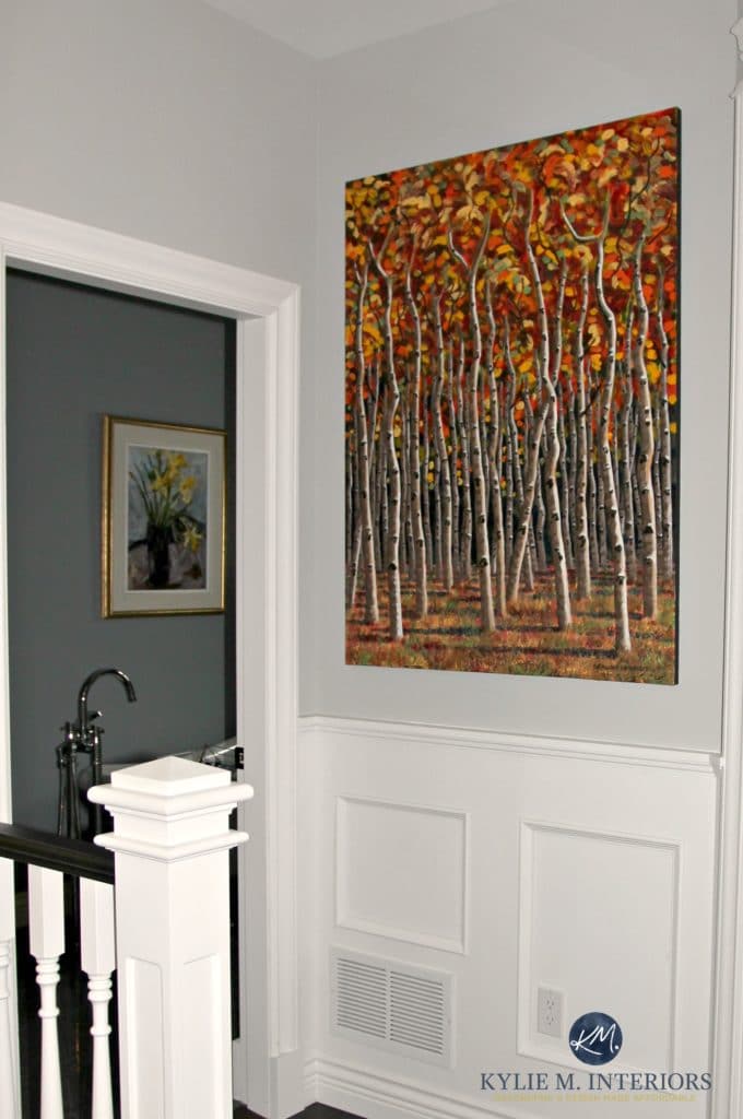
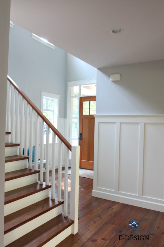
Stonington Gray is a soft, stormy looking gray. Why do I say stormy? Well, some consultants like to focus on the science of colour (which can be mildly mind-boggling – to put it lightly, but damn they’re good at it), while I like to keep things pretty meat n’ potatoes with how you can expect a paint colour to look on your walls.
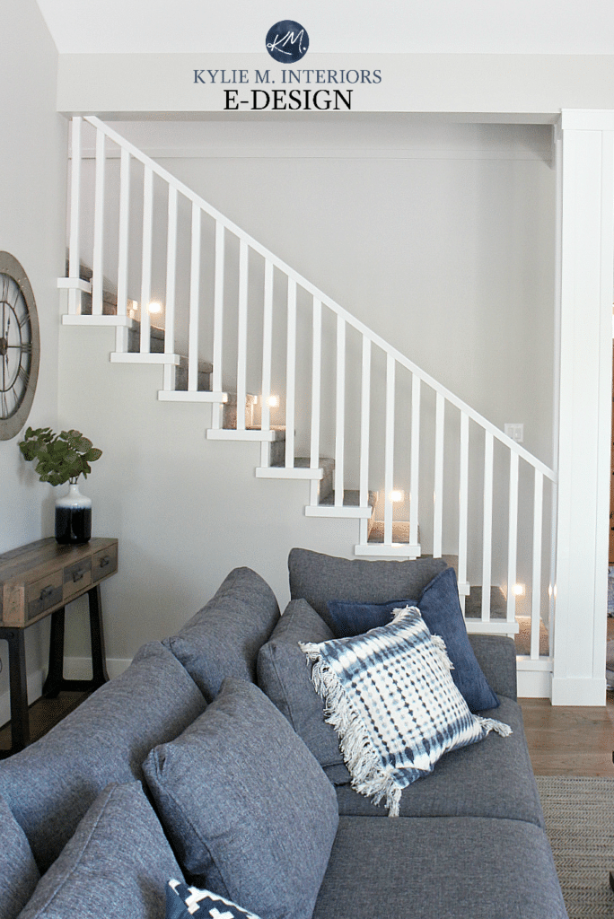
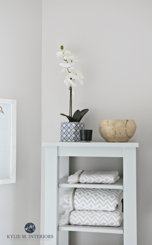
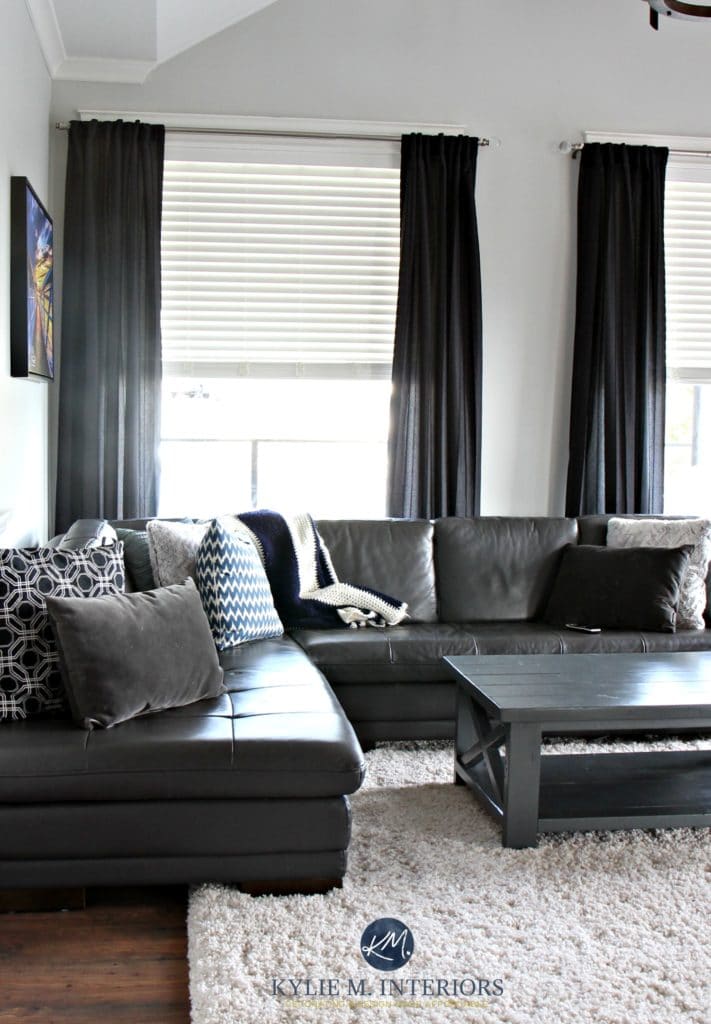
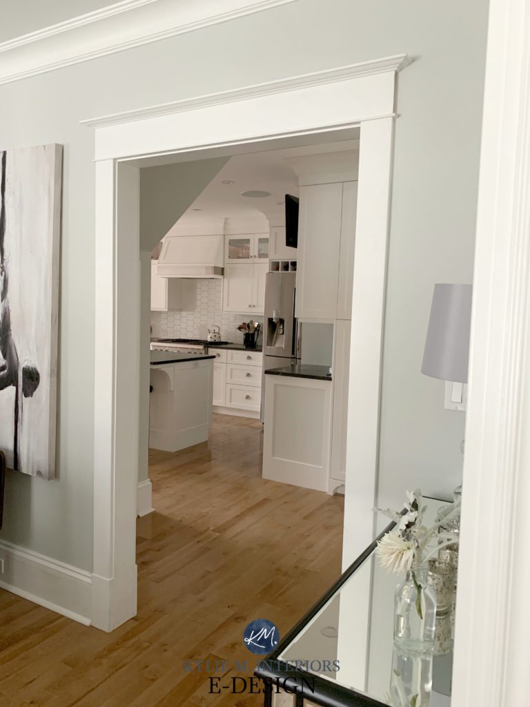
A stormy gray isn’t as fresh and clean looking as a gray with a cleaner blue or blue/green in it. It has a subtle, low-key look and can be a great backdrop for artwork as shown below. And while Stonington Gray does have a slight blue undertone (that can sometimes flash a bit green), it’s pretty soft and subtle.
A bit more about Stonington Gray
- It can pick up a bit of a cool blue undertone (you can see a bit more of it in the bottom photo)
- Stonington Gray has an LRV of 59. Not super bright, but definitely an LRV that will reflect some light back into a room
- I HAVE seen Stonington Gray pick up THE tiniest fraction of green, but I have to force it. This is more in comparison to a more cool purple base blue and isn’t something you should expect to see on your walls unless you have it up against products that have a blue-purple undertone
Read more: Using LRV to Pick the Perfect Paint Colour
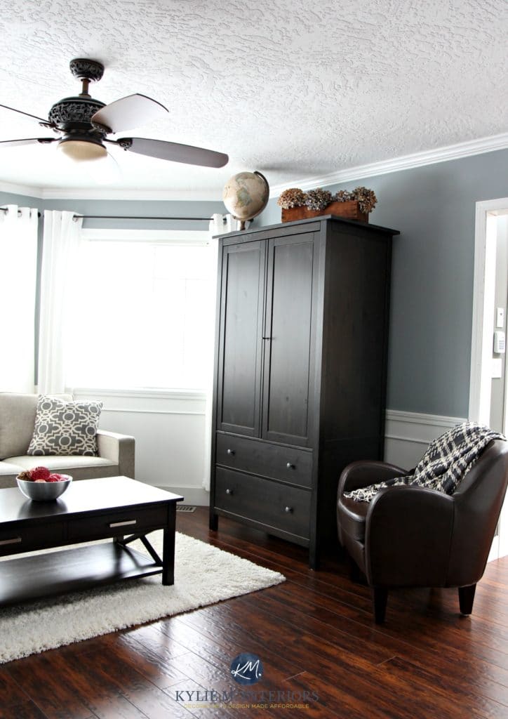
Benjamin Moore Gray Owl 2137-60
Gray Owl is definitely one of the most POPULAR gray paint colours, coming in a hot second to Benjamin Moore Revere Pewter. The funny thing is, Gray Owl is often referred to as a warm gray. And sure, it’s warmer than more traditional cool grays, but on your walls, you can expect it to look cool.
See more of this Gray Owl inspired project here
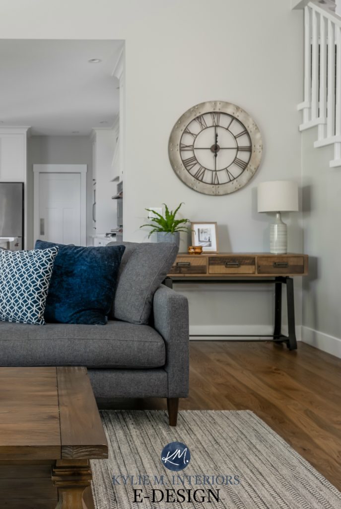
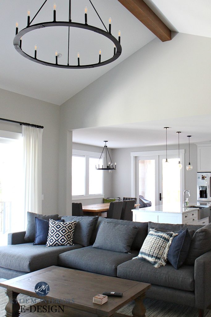
As for undertones, Gray Owl is a gray-green, but it likes to flash blue…a lot. And while its roots suggest that green would be dominant, you may find this colour is a bit of a chameleon as it bounces in between the two undertones.
Seriously, look at the above photo to see how the undertones can shift – compare the three layers of wall to each other…
- Far-left wall: Cool, fresh, almost blue undertone
- Center narrow wall space: Pretty ‘gray’
- Right side gallery wall: Subtle blue/green undertone
A bit more about Gray Owl…
- It has an LRV of 65, so it will reflect more light back into a room, making it appear brighter than Stonington Gray, but won’t save a dark room if there isn’t adequate lighting
Let’s take a quick break to talk about paint samples…
Undoubtedly, you’ll be heading out in the near future to grab paint samples – stop right there! I want you to check out SAMPLIZE. Samplize offers peel and stick paint samples that are more AFFORDABLE, EASIER and more ENVIRONMENTALLY FRIENDLY than traditional paint pots. Here are just a FEW reasons why I recommend Samplize to my clients…
- Samples arrive ON YOUR DOORSTEP in 1-3 business days, depending on location
- At $6.99, they’re more affordable than the samples pots/rollers/foam boards that are needing for traditional paint sampling
- If you keep the samples on their white paper, you can move them around the room
Visit the SAMPLIZE website HERE
Now that we’ve looked at Gray Owl and Stonington Gray separately, let’s compare the details
The LRV of Gray Owl vs Stonington Gray
LRV is a great place to start when deciding between colours. LRV will more or less let you know how light/dark a colour will look on the wall and can be a deal-breaker when you just can’t decide! (read much more about LRV here it’s vital)
STONINGTON GRAY
With an LRV of 59, Stonington Gray is a light, but not TERRIBLY light and bright paint colour. I find this adds to the slightly more stormy look of it. It’s what I would call a ‘heavy light colour’.
GRAY OWL
At 65, Gray Owl is undoubtedly a lighter colour and will reflect decent light back into your room. LRV isn’t an exact art, but I would say that Gray Owl is about one tone lighter than Stonington Gray. If you were to lighten Stonington Gray by approx. 25%, you would get closer to Gray Owl’s depth (but would probably need to go to 40% to make it almost the same).
If you have a dark room, you MIGHT prefer the lighter approach of Gray Owl. If you have a brighter room, you might like the bit more body and depth that Stonington Gray offers.
The Undertones of Gray Owl vs Stonington Gray
Gray Owl’s roots suggest that it should commit to a green undertone, however, in my experience, here’s what I’ve seen:
- Approx. 40% of the time it looks ‘gray’ with very little undertone
- Approx. 40% of the time it flashes a blue undertone
- Approx. 10% it picks up a green-blue undertone
- Approx. 10% of the time it looks green-gray
GRAY OWL
Stonington Gray has a slightly stronger stormy blue undertone. And while it does have a tiny (like minuscule) touch of green in it, it’s less inclined to show up to the party. The slightly soft and stormy approach of Stonington Gray really means it isn’t an icy colour, it’s more earth-toned/soft looking.
If you aren’t a FAN of undertones, you might find Gray Owl to be a slightly safer bet, but both are pretty passive.
STONINGTON GRAY
Click HERE or on the above image to see my fun packages!
The ‘Look’ of Gray Owl vs the ‘Look’ of Stonington Gray
Gray Owl and Stonington are both gray paint colours, but can be used quite differently.
- When my Online Consulting clients are looking for a beachy vibe, I’m more likely to suggest Gray Owl than Stonington Gray
- While Stonington Gray is soft and subtle, it doesn’t come across quite as beachy fresh as Gray Owl. I also find my clients often enjoy the chameleon-like undertones of Gray Owl as they work well with the ‘beach glass’ look.
GRAY OWL
STONINGTON GRAY
- If you prefer an earthy, soft, subtle gray, Stonington Gray could be a great contender
- Stonington Gray is a nice choice for more modern, contemporary interiors
- Both colours are flexible enough to work with the popular ‘modern farmhouse’ look as well as transitional styles
NEED HELP?
Wonder which gray is best for you and your home?
Check out my Online Color Consulting services!
Chat soon,
READ MORE
The Best Sherwin Williams Gray Paint Colours
Love your website Kylie and refer to it ALL THE TIME. Just wanted to say I have Gray Owl in my east facing spare room and it is always blue morning, noon, and night. Funny though, I was painting shelves in the same colour to go on the walls and I was in a southwest facing room as I painted. Well I thought I was going crazy because they looked green. Sure enough once I put them in the spare room they were blue.
Thank you SO much for that feedback Joan! It’s notes like that that help others decide what might work for them – and yes, it does seem to cater toward the blue end, doesn’t it!!!
(and you know I’d LOVE to see photos….)
~Kylie
I used Stonington Gray in a boy’s room, and while it had a tiny touch of blue undertone, it looks terrific with navy/red/white accessories.
It was not our intention to use Gray Owl in so many rooms of our home; however, we have used it frequently because it looks significantly different depending on the light conditions! Because of the green undertones we found it looks very beautiful in our loft that has a 150-year-old brick wall; for the same reason it looks lovely with warm-toned woods. I wanted to keep my art studio very light and combined a bright white on the ceiling and the top 3 feet of the walls, but painted the lower walls a warmer white. I separated the two wall colors with molding. So I have wonderful light reflection; but all my molding and doors are painted in gray owl creating a wonderful , sophisticated look in my studio without adding colors that can reflect and impact my canvases. Gray owl is elegant and incredibly versatile !
Gray Owl and Stonington are strong contenders for our master bath remodel. We will be using a Carrara Bianco tile on the shower walls and a Carrara Bianco basketweave for the flooring throughout. The bathroom does not have any windows so there will be minimal natural light coming in. Our master bedroom paint is BM Silver Cloud.
I should also mention that have already painted our living/dining area (larger open concept space) in Stonington and love it and definitely agree that it reads as an “earthy” gray.
Any suggestions b/w Owl and Stonington for the master bath (or perhaps another color that works really well w/ Carrara)?
Thanks!
Hi Kathryn, thank you for the note! Unfortunately do to the amount of questions and e-design consults I receive in a day, I am unable to answer personal questions. I try to give as much good info for free and if that doesn’t work – then e-design is the next step! If you would be interested, here’s the link if you are interested 🙂 https://www.kylieminteriors.ca/online-decorating-design-services/
Have you ever experienced Stonington Gray going purple? I’m testing paint samples in my condo that doesn’t have great natural light, and it’s showing very purple. It seems that any and all undertones are showing up in my samples (Revere Pewter looks brown/green, Balboa Mist is purple, Stonington Gray is purple, Pale Oak was almost pink/red, Edgecomb Gray was brown/green). I’ll keep digging through your blog posts for ideas, but any super passive gray undertone suggestions are appreciated! Thanks for all of your in-depth color reviews, they are super helpful!
Hi Michelle! There’s a few things that can do this. #1 – when you do your samples don’t paint them on your existing wall colour. Make sure you paint them on a white board, leaving a white frame around the sample so that you are separating your wall colour from the sample colour. #2 – yes, I’ve found that sometimes ‘colours’ can pop up a bit more in certain lighting situations, particularly north facing ones as north facing light can enhance any cool tones. The most passive gray (the most gray/least undertone) seems to be SW Big Chill, but it does have a vague blue (not as much as Stonington though!)
~Kylie
I have Stoningham Gray through my house and I love it everyone is copying me and painting their house this beautiful color! No purple undertones! So mild and calming! Love it!!!
Author
Thank you for sharing Sheila, it’s comments like yours that help others make their decision – thank you!
You help everyone so much, which is not normally done by color consultants. 🙂
In her book, Maria K indicates Stoninghton & Gray Owl are both blue greys; the purple cast must come from something else in the room including lights, windows and fixed textures? Maybe something blue and red are interfering. AND, these are lighter colors which require light. Donald Kaufman ““A light colour will never come to life in a dark room…” I guess some of them come to life.
Author
Thank you! And yes, I do love Maria and you’re VERY right about your points! Also make sure your sample is from Benjamin Moore, not SW or H.Depot :).
I am about to paint my living room and hallway with Stonington Gray. What white would you suggest for trim and wainscoting .
Thanks
Maureen
Hi Maureen, check out BM White (PM 2) which is just pretty darned white. I also really like SW Pure White… Short of that, you might like the softness of White Dove which is a softer slightly warm white (without being as yellow toned as Cloud White).
Hope that helps!
~Kylie
Hi Kylie,
I am wondering if you would ever recommend either of these grays (Gray Owl or Stonington Gray) for an exterior paint color?
Thanks,
Kate
Hi Kate, absolutely, as long as you are going for a considerably lighter look (particularly Gray Owl). Because of LRV and the fact that exterior colours tend to look a bit lighter once all is said and done, a colour like Gray Owl can look REALLY light (like off-white). Stonington Gray holds itself a bit better as it has a bit more depth 🙂
~Kylie
I am trying to choose a grey for kitchen cabinets to work with ” Noble Grey” quartz. I am choosing between Stonington Grey and Grey Owl. It’s a big investment. I am going with Grey Owl I think. Can you reassure me….or should I choose something else?
Hi Lynne! Normally I’d refer personal questions to my Online Consulting, but I’ll touch on things quick for you 🙂
Gray Owl can have unpredictable undertones and while it would be ‘pretty’ I don’t know that you’ll get what you expect. I also worry that the more cool purple undertone of Noble Gray might enhance the blue/green undertone of Gray Owl – same with Stonington Gray. If I had to choose one or the other, I kind of go to Stonington.
With those countertops, I might be more inclined toward a gray without much blue/green in it, something softer more along the lines of BM Smoke Embers. https://www.pinterest.com/search/pins/?q=benjamin%20moore%20smoke%20embers%20cabinets&rs=typed&term_meta%5B%5D=benjamin%7Ctyped&term_meta%5B%5D=moore%7Ctyped&term_meta%5B%5D=smoke%7Ctyped&term_meta%5B%5D=embers%7Ctyped&term_meta%5B%5D=cabinets%7Ctyped. It is a warmer gray, but it might sit a bit nicer with Noble Gray.
I hope that helps or atleast gets you on a good track that you feel comfortable with!
~Kylie
Hi Kylie, I am stressed out trying to decide on a gray for my new kitchen. I have dove white cabinets with a java glaze , silver honed travertine backsplash and American black granite. Owl gray, Stonington gray, wicker gray ugh This shouldn’t be so hard!
Hi Diane, I know, it can be tricky! I’m more than happy to help with my e-design. For 1 room it’s $45 and I can let you know the top 3 colours for your room and can explain why they would work – it might take a bit of your angst away! If that interests you, you can check out the details here 😉 https://www.kylieminteriors.ca/product-category/interior-paint-colors/
~Kylie
I love your website and I visit often. I thought by reading all your wonderful posts that I knew the exact paint I need for my small entry way. I picked wickham gray and was so happy until I painted. Then I wanted to cry! It looks white on my walls. I was afraid stoneington would be too dark but now I guess I should have gone with it. Can the wickham be darkened ? I sure wish I had your eye for color.
Author
Well that is weird! Do you have wood trim? Wood trim can make a light colour seem LIGHTER than you think it will. And yes, Wickham CAN be darkened. You can try 50%, but beyond that I might just look at a new colour choice…it’s okay, sometimes you just don’t know until you try something!
~Kylie
Good Morning, we painted our hallway Stonington gray and it’s reading very blue? Could it be that our dark woodwork is influencing how the color appears?
Author
Hi Diane! Yes, Stonington does have those undertones and sometimes they can come up in slightly darker spaces that don’t have tons of natural light. And yes, if you have warmer toned wood, the contrast could influence that. Also take a look at your trim. If your trimwork is not white, but it softer/warmer – again, that could do it (I know, it never ends). But the one thing you could EASILY control is your light bulbs! I don’t know what temp they are now, but play around between warm and daylight bulbs to see if that helps!
~Kylie
I did my kitchen and hallway in grey owl and i absolutely love it! Now I’m trying to decide on a darker grey for my cabinets and cannot choose. What suggestions do you have for grey cabinets that would go good with the grey owl?? I also have Wayne scouting and trim that is white!
Author
Hi Chris! There’s a few other things to consider like lighting/cabinet material/countertops/flooring, but off the top of my head I’d suggest either BM Chelsea Gray or BM Kendall Charcoal. I’m also a big fan of SW Classic French Gray!
~Kylie
Hey There,
Great information thank you. I love them both! Is it possible to use grey owl and stonington grey in the same house? I’m not good picking colours but love them both and was hoping to put grey owl in kitchen and livingrom and stonington in family room and playroom. Was wondering if because of the undertones they wouldn’t match.
Author
Hi Melissa! A lot would depend on each room and it’s colour needs for lighting/exposure/furniture. Off the top, you could, they wouldn’t be BAD together by any stretch… if you want me to take a lok, you may want to look at my e-design! It’s affordable, fun, and this way I can look at your photos/furnishings/quality of light/etc… and come up with ideas that work, rather than just guessing! https://www.kylieminteriors.ca/online-decorating-design-services/
The info I find on your site never ends! Just like undertones. Would stonnington be ok for an all over paint color in an open floor plan? And yes, I have tested it and yes it goes a bit blue but there is something about coventry, wickham and stonnington, I always buy the test pots but have never committed. I can’t wait until there is an LED bulb that isn’t too warm or cool, can’t find the mama bear of bulbs that doesn’t look weird. Have a great weekend!
Thanks Kylie-wonderful & helpful post!
This is so helpful! What is your opinion on Balboa Mist? Our realtor thinks it is the perfect shade of gray, but after seeing this article I’m now torn because I’m leaning towards Grey Owl. Also, do you have the perfect blue grey color to use for the front door that will compliment well? We’re going with french oak floors and the house is very open with a lot of natural light. Thank you so much!
Author
Oooo, I’m glad you asked. It’s lovely, but it’s a touch…feminine? Not that it IS purple, but those are the undertones it leans toward. There really isn’t any PERFECT shade of gray, but I’d say it’s not in my top 5 for ‘grayness’. Gray Owl is a bit better (although it can flash the undertones of blue or green). I also like SW Big Chill, a bit more predictable. Cool, but predictable… 🙂
~Kylie
Thanks Kylie! I’ll check out Big Chill also. Do you have a favorite color for the front door? I’m thinking a blue grey and have my eye on Nimbus right now.
Emily
Hi Kylie,
I, like others, have become blind to color searching for the perfect gray! I’m painting my exterior (1959 Rancher) and was convinced I wanted Revere Pewter. Do you find this looks tan/beige on such a large scale? After trying out BM samples of Revere Pewter, Gray Owl, Gray, Stonington, and Coventry…I’m tearing my hair out. To my surprise, when I put up Coventry it matched my current exterior perfectly. I am hesitant to go dark gray (although I find it pretty), as I’ve walked by too many people in my neighborhood who now have purple and green houses at certain times of the day!
Author
Hi Kristine! Yes, those grays can be tricky! And depending on your exposure, the natural light can make it look lighter, warmer, more gray, etc….I’ve played around a bit with Coventry, which is basically a gray with a vague stormy blue undertone – it’s a beauty!
Thank you Kylie! I do like Coventry but feel like I’d be choosing it simply from being overwhelmed (similar to what I have now). I love Revere Pewter everywhere I see it, but don’t want a ‘beige’ house, do you feel it tends to go beige/tan on exteriors? The colorist at my paint store recommended Thunder. Pretty, but now just another contender to further the madness! As I put that up, I think I might be going too warm? When I try to go lighter (Gray Owl) it looks silver. Again, walk past my neighbors newly painted ‘silver’ house every morning and feel it’s so cold and bland. Anything out there in between the warm greige and icy gray?
Hi Kylie,
THanks for your informative posts! We’re picking between Stonington and Grey Owl for a three bedroom condo and are looking to paint the entire place one color. Will the Stonington be too dark or would you suggest Grey Owl to keep it lighter?
Thanks!
Author
Hi Seema! If I had to choose between the 2, I’d PROBABLY hit up Gray Owl, just because it’s that bit softer…
Hi Kylie! I came across your post and it is very informative! I am painting a nursery and am looking for a gray with a hint of blue. Not too “baby-blue”. We currently have Stonington Gray in a few rooms in our house and it is beautiful but looks very blue. I am debating between BM Gray Owl, Pale Smoke, and Gray Cashmere. The lighting really throws me off because they all look extremely different than I expected, even after trying them on white sheets of paper. The room is east facing. Gray owl looks very beige but I can’t tell if it’s just the paint already on the walls throwing the lighting off or what. (The room is a bright blue from the previous owner) I look at pictures of Gray Owl and love it but for some reason in this room it looks beige. I’m afraid to start painting with one of the other two and have it look too blue! I would like a cool toned gray that will also look nice with different wood tones, and whites. (Neutral/safari theme) Any help would be appreciated ???? I’m afraid to start this paint project and not like it! Thank you ????
Author
Hi Katie! Due to the number of emails I get every day, I have to pick n’ choose which questions to answer, focusing first on the ones that have mass appeal! I do try to give as much complimentary info as I can on my blog and if that doesn’t help, it might be time for a closer look with my E-design. Otherwise, I’m just guessing as to the lighting in the room, flooring and all of the other things that matter when choosing a colour! https://www.kylieminteriors.ca/online-decorating-design-services/
I hope to hear from you!
~Kylie
My wife and I purchased our home back in November and the sellers had painted the kitchen in Stonington a while back. The kitchen doesn’t get a ton of natural light (they put in a beautiful family room addition on so that was the sacrifice). Needless to say, it goes quite blueish purple. The ceiling is painted a strange color and looks almost beige which doesn’t help. It’s going to get painted white (probably white dove which is the trim color throughout the house) which hopefully will help brighten up the room and show the beauty of the color. When we decide to re-do the kitchen, we will hit you up for an e-design! Leaning towards Gray Owl for the east facing 2 story foyer and halls, which are next to the also east facing dining room that is in Revere Pewter, and the west facing living room which is also Revere Pewter and looks nothing like the dining room… Amazing what a difference the natural lighting makes at different times of the day.
Author
I know, isn’t natural light just amazing! I’ve seen even the SAME colour used throughout a home and seen it shift DRASTICALLY from space to space – oh the joy of light! And gray is one of those colours that is just super susceptible to change too!
We are ready to update our master bath and have chosen Owl Gray for the walls in the bath and our bedroom. Do you think I’ll be able to plan on blue for accessories (bed quilt etc…) ? Or will I need to see how the color reflects in our light?
Author
Hi Jayne! I would definitely wait and see how Gray Owl reacts as it CAN go more green!
Painting a west facing bedroom Gray Owl – do you think White Dove OC 17 would work or should I go with Simply White? I have White Dove in the hallway but want to go with the better match with Gray Owl. Thanks Kylie!
Sorry Kylie – left out that I meant for the trim/baseboards!
Also just realized I have Simply White trim in the bathroom so obviously I’m good with mixing it up with those two depending on the light and the all colour lol
Hello! First off, I love your website! My husband and I just bought a new house and I had no ideas as far as paint. All of your posts and videos are super informative, especially the ones about undertones and LRV. However, I have painted my son’s west facing bedroom twice with two different greys and bought more samples and it seems that no matter what it shows purple! I did go with Gray Owl in my daughter’s room and love it. Do you think if I had Gray Owl darkened a little that it would show any purple at all?
Wow this site has helped me understand these confusing grays!! Thank you so much!! I used Gray owl in my den with intense white trim. I’m trying to decide to keep with the gray owl into the kitchen and living room but I also am liking the stonington gray as well. Do you think I could use both colors in the same room together? For example the walls in the kitchen gray owl and the sophet in stonington? Or three walls in the living room gray owl and accent wall in stonington? I guess what I’m wondering is if they will compliment/go together in the same room or just look almost like the same color? Thanks!!????
Author
Hi Erika, they are both EQUALLY gorgeous colours, but I wouldn’t use them in a room together. They are too similar in depth to really off-set each other, and their undertones are just that bit different that they will fight each other a bit. You could certainly do them in rooms that are NEXT to each other, divided by a door of some sort, but I wouldn’t do them right together ;).
Thank you so very much for the advice!! You have no idea how much I appreciate it as I’ve been agonizing over paint colors for weeks now lol. Now to choose which paint for which room……..kitchen and living room. I’m actually having another problem I’m sure you could help me with if you don’t mind……I’m not actually liking the intense white trim with the gray owl (doesn’t seem to have enough contrast). Which white do you recommend with the gray owl? I’m struggling between simply white, Chantilly lace, or decorators white. Or is there a better one you can recommend? I’m looking for a true white that’s going to compliment the gray owl nicely on the trim and ceilings without having any strong undertones…….is the simply white kind of yellowish and Chantilly lace kind of bluish? …. or is it just me hmmm lol! Thank you again!!????
I know that paint color is typically the last thing a designer does but… I am helping my church pick out colors for carpet and paint. We have purple upholstery on our pews. Leaning toward eggplant but not quite. So would it be easier to pick out cooler paint neutrals like grays with purple undertones and beiges first then find carpet? Thank you. Love your website!
Author
Well, if it were me I’d probably choose the carpet first as you’ll have FEWER choices that work with the upholstery. It would be nice if the carpet has flecks of the upholstery colour in it. And THEN, yes, I would lean into soft grays with a purple undertone (along the lines of BM Collingwood is a place to start :).
Hi Kylie, between Grey Owl and Stonington Grey, is there one of the two that you think would coordinate better with Bleeker Beige (i.e., wouldn’t be too jarring for adjoining rooms)? Thank you.
Author
STONINGTON GRAY! Its added depth makes it a nicer partner :).
Having the same problem most are having, choosing the right gray. Redoing main bathroom, espresso cabinets, Light gray floor and white with gray veining in shower. South facing small window and will have can lights. Do not want a purple undertone color. Please help. I want gray color first then undertones to show.
Im struggling to choose between grey owl and stonington for a cabinet color. I want to do a dual color effect, white upper cabinets and then a grey color for lower cabinets. Just a subtle contrast. White counter and grey flooring…which would you suggest. (not alot of natural light in my kitchen but good artificial lighting)
Author
PERSONALLY, I would do Stonington Gray over Gray Owl.