
Posted on February 26, 2020 by KylieMawdsley
Benjamin Moore Affinity Collection: Gray, Greige, Beige & Taupe
Looking for a gorgeous neutral paint colour with a bit of body and personality? Benjamin Moore’s Affinity line makes it EASY to find a paint colour that will light up your life – and your walls! By honing in on some of today’s TOP neutral paint colours, they have provided designers and homeowners with a handful of exquisite colours to choose from that are a step beyond the safer, more standard neutral paint colours.
This post may contain affiliate links. If you make a purchase through links on our site, we may earn a commission.

I love to show RELATEABLE & REAL homes, so ONLY use photos from my Online Colour Consulting clients. This means I don’t always have the quality or range of pics I need, but DEFINITELY have some SUPER helpful info to help you on your way!
So, for those who can’t find satisfaction (reminds me of a song) in the standard line of colours, let’s dive in…
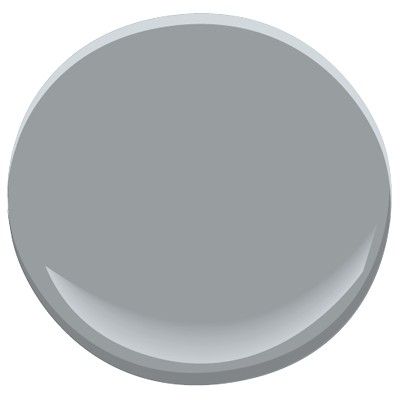
1. Benjamin Moore Metropolitan AF-690
Metropolitan is a light-medium depth gray paint colour with a stormy softness to it. And because Metropolitan is a COOL paint colour, you can expect to see undertones, in particular, a blue that can lean sliiiiightly blue-green the odd time.
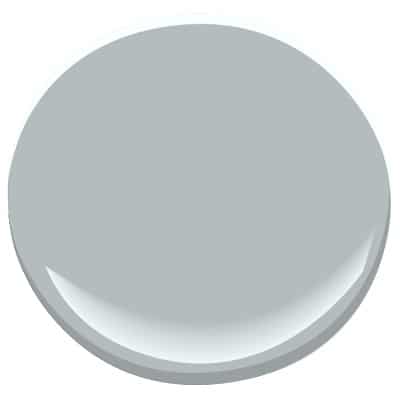
Being a cool gray, Metropolitan CAN look a bit chilly, however, the DEPTH of it and smooth look makes it comes across as fresh, yet intimate.
More about Metropolitan
- While Metropolitan favours a very minor blue undertone, it can often flash slightly blue-green
- Metropolitan ‘might’ could look a wink cool for a north-facing room, but would balance out the warmth of a south-facing room nicely
- For a similar look, check out Benjamin Moore Coventry Gray
- With an LRV of 50.5 Metropolitan sits right in the middle of light/dark, so it will handle itself well in a reasonably well-lit room, but might be a touch heavy in a dark room
Read More: The 9 Best Gray and Charcoal Paint Colours by Benjamin Moore
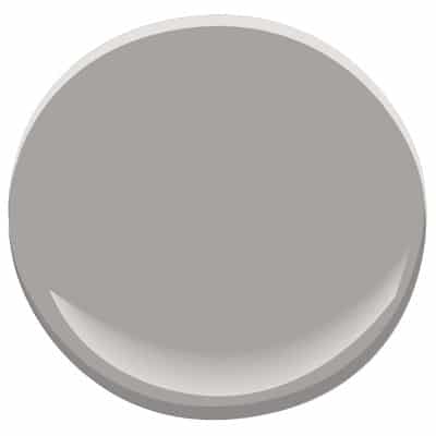
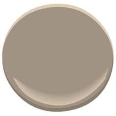
2. Benjamin Moore Pashmina AF-100
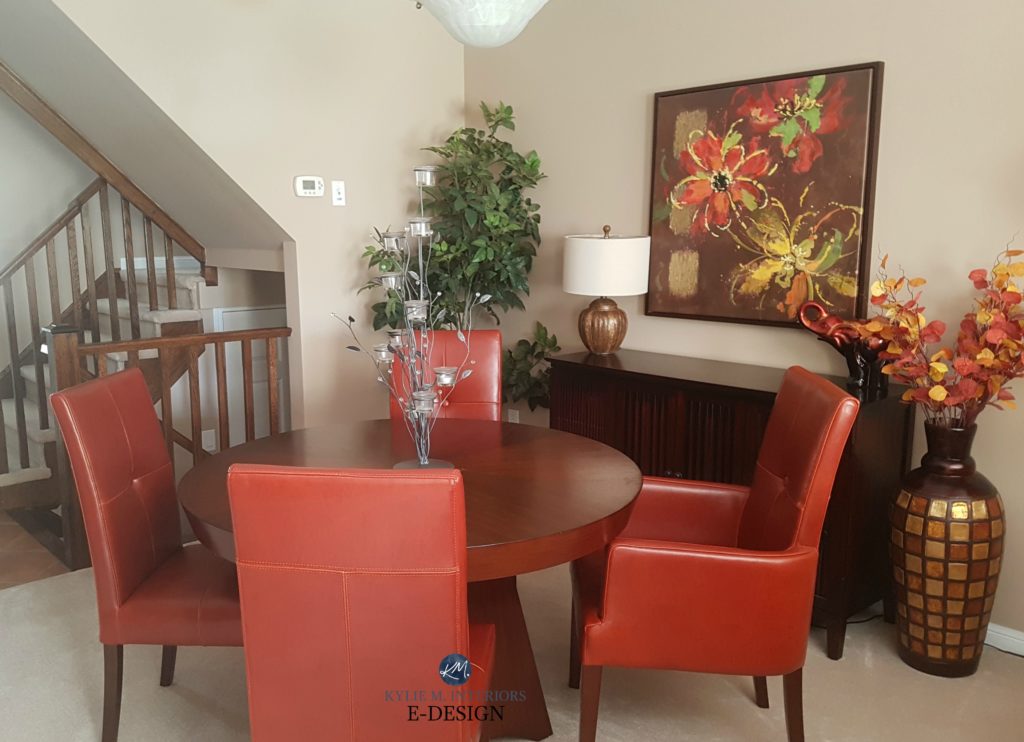
Pashmina is a greige paint colour, however, it leans MUCH harder into beige than gray. And while it does favour warmth, it can look quite well-balanced between gray and beige given the right environment (ie: a north-facing or east-facing room). 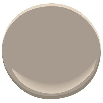
Pashmina is a rich earth-toned greige that offers a neutral backdrop to a room. with a bit more body than today’s popular gray and greige paint colours.
More about Pashmina
- Looks great with chocolate brown OR charcoal gray, not as good with lighter gray or greige paint colours
- Can look a bit heavy in a darker, north-facing room
- Pashmina has an LRV of 43, so it’s got some meat on its bones
FULL Paint Colour Review of Benjamin Moore Pashmina
Read more: All About LRV and Choosing Paint Colour
Click HERE or on the above image for available packages
3. Benjamin Moore Thunder AF-685
Thunder is a sultry, stormy gray that sits in the medium-depths. And not only is it stormy, but it’s ALSO slightly warm.
Now, that doesn’t mean Thunder would be considered a greige, but it’s definitely a warm-toned gray. And like many warm-toned gray and greige paint colours, it can pick up a very slight purple undertone and sometimes even nod at green. If you are looking for a slightly crisper and fresher gray, you might prefer Metropolitan. But if you love grays that are on the soft, earthy side of things, then Thunder might be the colour for you!
More about Thunder
- It’s loud and comes after lighting. Anyways…
- In comparison to Metropolitan, you’ll see how much warmer Thunder looks
- Thunder is similar to Revere Pewter in its general approach but has more depth than and a slightly lower chance of flashing green
- Thunder has an LRV of 48
Read more: Paint Colour Review: Benjamin Moore Revere Pewter
4. Benjamin Moore Kangaroo AF-145
Kangaroo is a warm beige paint colour but doesn’t have a GOLDEN warmth like some of the more traditional beiges that were popular in the early 2000s. Kangaroo can also pick up a MINOR green undertone (like a wee wink).
More about Kangaroo
- The warmth of it can help balance the cool light of a north-facing room
- While it’s a warm colour, it’s not OVERLY yellow, orange or red-toned
- Kangaroo has an LRV of 43.25 so it’s not too dark, not too light – it’s juuuust right!
Let’s take a quick break to talk about paint samples…
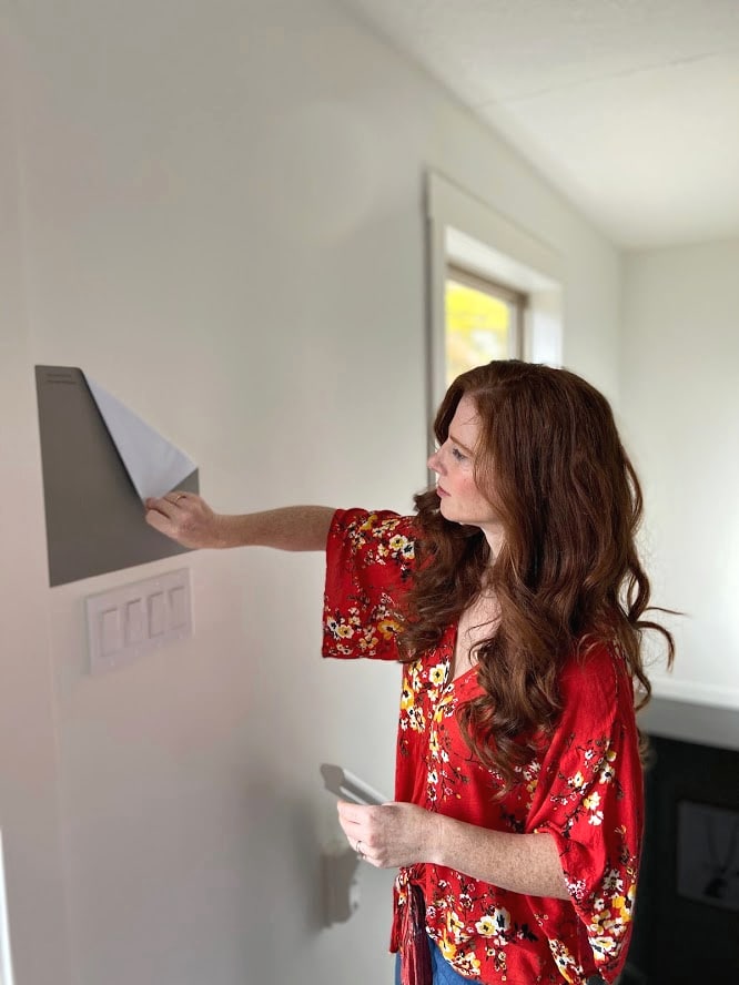
Undoubtedly, you’ll be heading out in the near future to grab paint samples – stop right there! I want you to check out SAMPLIZE. Samplize offers peel and stick paint samples that are more AFFORDABLE, EASIER and more ENVIRONMENTALLY FRIENDLY than traditional paint pots. Here are just a FEW reasons why I recommend Samplize to my clients…
- Samples arrive ON YOUR DOORSTEP in 1-3 business days, depending on location
- At $6.99, they’re more affordable than the samples pots/rollers/foam boards that are needing for traditional paint sampling
- If you keep the samples on their white paper, you can move them around the room
5. Benjamin Moore Storm AF-700
As its name suggests, Storm is a medium-depth gray paint colour with a gorgeous, rich, stormy look to it. And because EVERY gray paint colour has undertones, you can expect to see a cool purple undertone in Storm.
 While it would be a touch heavy for a dark room (unless you’re GOING for that look), as long as your room gets ‘average’ natural light it could be gorgeous. Storm is sneaky with its undertones as on first glance, it looks like a pretty straight-up gray, however, once applied, you’ll notice a kind of storm cloud purple (purple-blue) undertone (hence the name) so be wary if that’s not the look you’re going for!
More about Storm
- If you put it with opposite colours (ie: yellow/orange/green) you will bring out the purple undertones even more (opposites attract – just ask Tim)
- Storm can look amazing with cherry toned wood, walnut and espresso
- Storm has an LRV of 34.78 so it’s definitely in the medium-depths
Read more: The Best DARK Paint Colours for a DARK Room!
6. Benjamin Moore Weimaraner AF-155
Weimaraner is the PERFECT example of a taupe paint colour with its beautiful, rich undertones. And being a taupe, Weimaraner is a WARM paint colour, known for flashing a subtle WARM purple undertone (which means it’s purple-pink, not purple-blue).
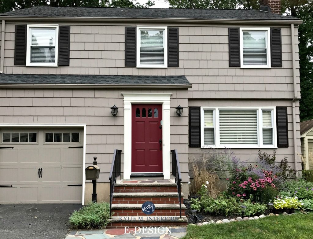
Look how light Weimaraner looks on an exterior – exteriors can be tricky!
Taupe is basically a brown-beige with a good shot of gray and a purple (often purple-pink) undertone tucked inside. And Weimaraner is NOT shy about its undertone!
More about Weimaraner
- Green will bring out the ‘Barney’ in this colour so be careful what you partner it with
- With an LRV of 29.98, Weimaraner is not for the faint of heart as it does have some depth to it, sitting WELL into the medium depths (learn more HERE)
NEED HELP?
Check out my Online Colour Consulting
Chat soon,

READ MORE
- The 8 Best WHOLE HOME Warm Paint Colours
- The 12 Best WHOLE HOME Gray and Greige Paint Colours
- Paint Colour Review of Sherwin Williams Dorian Gray
Originally written in 2017, updated in 2020
Comments
Leave a Reply
More Posts

The 5 Best Creamy White or Off-White Paint Colors
THE ELUSIVE ‘CREAMY WHITE NEUTRAL’ When it comes to light, warm neutrals, it’s all in the undertones. And other than pink and green, yellow is the undertone many of my
Read More

The 8 Best Warm Neutral Paint Colors With NO Yellow Undertones!
The Top Light Depth, Warm Colors That Aren’t Cream! When choosing the best warm neutral paint color for your home, whether creamy white, beige, taupe, or greige, your choices are
Read More

The 12 Best Farmhouse Sinks of 2024
FIND YOUR DREAM SINK HERE… While traditional farmhouse design was all the rage in previous years, the embers have definitely cooled. As for MODERN farmhouse, it’s still kickin’ its cowgirl
Read More


Great article! Entertaining and informative. Thank you.
Looking for a wall paint color that will look good with pashmina painted cabinets in a north facing kitchen with little light. Help!
Author
Hi Gloria1 When it comes to personal questions, there’s so much more for me to consider like countertop, flooring, quality of light coming in, etc…So, I would recommend you check out my E-design service which is affordable and fun! https://www.kylieminteriors.ca/online-decorating-design-services/ This way I can spend some quality time with your room, rather than just guessing.
~Kylie
Kylie,
I would love to see a blog post about how to merge the new, more gray-toned color schemes with existing warmer tan/beige/brown color schemes in a home. As a lot of people are trying to update and modernize their existing homes and are not starting from a blank canvas. There are existing elements that need to blend — adjacent/visible rooms painted in warmer tones, upholstered furniture and carpet that doesn’t ‘go’ with gray, and of course cabinetry/flooring, pillows/throws, artwork/accessories … all built around a different palette. Since most of us can’t throw out everything we have and start fresh we need to gradually transition to a newer, more modern look — perhaps starting with paint. Are there ways to blend or combine these tan/beige/brown tones with the newer grays without looking like a hot mess? Any words of wisdom would be greatly appreciated. Thanks!
Brenda
Author
Hi Brenda, I actually DO have that blog post – I hope you found some helpful tips in it! https://www.kylieminteriors.ca/how-to-change-from-beige-to-gray-greige/
~Kylie
Kylie,
How can I get your services. I have such a challenge with colors right now. Using Martha Stewart calla for trim and cabinets with st. cecilian gold granite., honey oak floors. I really want some gray but do not want it to appear real dark. The kitchen runs into a keeping room with high ceilings. I use brown leather furniture in this room. I know dark beiges look good but have had a lot of that in past and really wanted a drastic difference since it’s so costly to have painted.
Author
Hi Tammy, I’d love to help! You can check out my E-design packages here, there should be one that works perfectly for you! (Likely the Open Layout package). https://www.kylieminteriors.ca/online-decorating-design-services/
Hope to chat soon!
~Kylie
Thank you, I love your blog. You’re a ha educator and gifted designer.
I was looking at your comments on BM Pashmina AF 100. You start the LRV as 29.9 . When I went into BM they sat 43.62. Just thought you’d like to know. Pashmina looks similar in intensity to Kangaroo @42.12.
Author
Holy dinah, thank you for letting me know – you’re right! I must’ve been having a moment…or too much wine… 🙂
Kylie,
I realize the comments above date way back, but couldn’t help reinforcing what these ladies say about you… you are absolutely amazing! Not only for sharing such knowledge with the rest of us, but also for your great taste.
I do have a question for you: You mentioned above that there are no colors like Benjamin Moore out there. Do you actually prefer BM over Sherwin Williams? I have mostly purchased my paint from SW, but I’ve been secretly in love with BM color for a while! ???? How do you feel about it?
Thanks again for sharing your thoughts and ideas ????
Hi Kylie,
Quick question, Watch your YouTube videos and in one of the videos you reviewed perfect greige by Sherman Williams and versatile gray by Sherman Williams. I was wondering if you knew of a equal color by Benjamin Moore?
Thank you! I am loyal to BM I absolutely love their Aurora paint.
Thank you so much. I’m looking for a light but still cozy beige for my master bedroom-with cherry wood – I have green and blues in my bedding and blues in my rug.
I know that green undertones in my beige will look awful with my cherry wood Window trim and door trim.
So looking for a nice Trish lrv beige with purple undertones
Thank you!