
Posted on December 2, 2022 by KylieMawdsley
Repose Gray: is it warm, is it cool, is it POPULAR? Let’s find out!
Are you looking for the perfect gray paint color? Feeling nervous about those sneaky green, blue and violet undertones? Don’t be (insert Superman song here), as I’m on a mission to demystify my fave shades of gray, and today, we’re chatting about Repose Gray.

WHAT KIND OF GRAY IS REPOSE GRAY? WARM OR COOL?
This post may contain affiliate links. If you make a purchase through links on our site, we may earn a commission.
Repose Gray is a gray paint color (I’m not just good-looking, you know). However, it’s not a TRUE neutral gray as it has a weeee wink of a brown in it, making it a WARM gray.
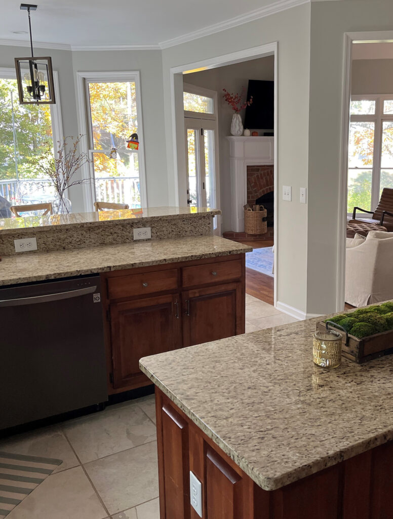
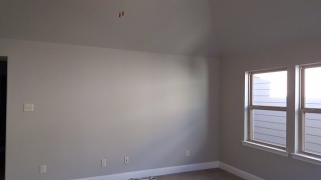
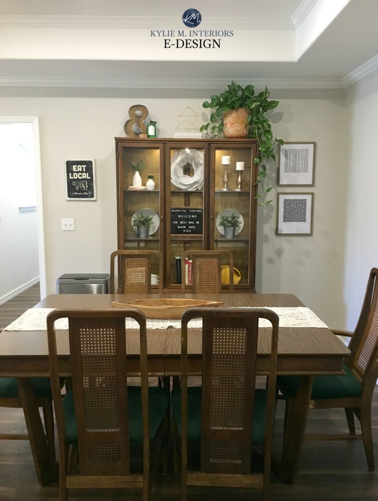
This next photo is AS WARM as I’ve ever seen Repose Gray look. Usually, it caters harder to gray…
IS REPOSE GRAY MORE GRAY, GREIGE OR BEIGE?
Without a doubt, Repose Gray is gray, although, in some lights, it can look a touch greige-taupe. And while it has some passive warmth, it looks nothing like beige – don’t worry.
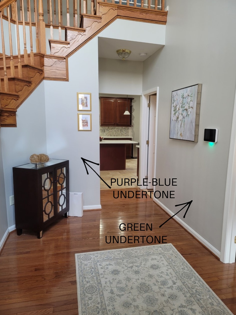
WHAT ARE REPOSE GRAY’S UNDERTONES?
While Repose Gray can favor a soft violet undertone, there’s also a bit of green undertone. And believe it or not, once in a while (given the right exposure/interior finishes), I’ve seen Repose Gray flash a touch blue. While every gray has undertones, some grays flex a bit more, and Repose Gray is DEFINITELY one of these grays. Because Repose Gray can be unpredictable, I highly recommend ordering the Samplize version to see how it settles in YOUR room.
When I mention violet undertones, my Online Color Consulting clients often get nervous with visions of Barney dancing through their heads. However, hints of an undertone like this can soften a color, stopping it from looking flat and boring – particularly in dark and gloomy or north-facing rooms.

BTW, my blog runs 100% on wine, Doritos and my Online Color Consulting client’s PHOTOS – thank you SO much for sending them in!
- Repose Gray is not a typical ‘fresh’ gray; it’s soft and warm, even though it can look cooler in some situations.
- If you don’t like violet undertones, you’ll want to tread carefully with this color. That being said, I have DOZENS of E-design clients who don’t like violet undertones who LOVE Repose Gray.
- If you were hoping for a COOLER approach, you may want to check out Sherwin Williams Light French Gray or On the Rocks instead.
Now to sum up the above info for those with more SPECIFIC questions…
WILL REPOSE GRAY LOOK BLUE?
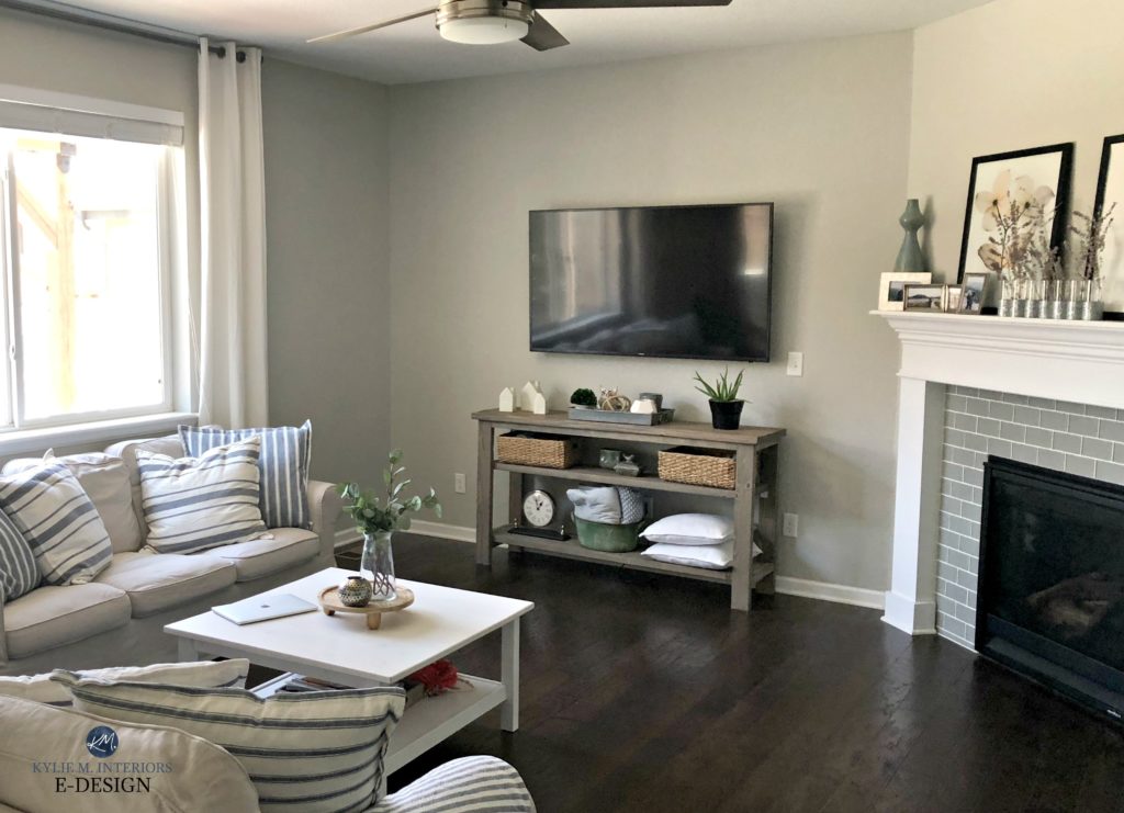
While Repose Gray doesn’t WANT to look blue in the right environment (i.e. exposure based or with trim that’s overly warm), it CAN pick up a blue hue. HOWEVER, of the three gray undertones, blue is the one that’s LEAST likely to show up, as shown in this next photo (hardly a wink of blue to be seen).
WILL REPOSE GRAY LOOK GREEN?
Repose Gray can nod politely at green but rarely commits on a LARGE scale.
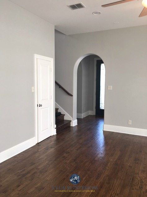
This next photo shows Repose Gray picking up a subtle green hue…
However, as shown earlier, notice how it shifts depending on which part of the room you’re looking at, the time of day, and the light bulb temperature…
If ANY degree of green makes you nervous, you may want to read this…
The Best Gray Paint Colors With VIOLET/Purple Undertones
WILL REPOSE GRAY LOOK VIOLET/PURPLE?
Just as with the green undertone, Repose Gray can pick up a touch of violet without hardcore commitment. If you don’t want ANY chance of violet – you’re looking at the wrong color. Instead, explore shades of gray that are more inclined towards green.
Remember, EVERY gray has undertones – find the one that best suits the finishes in your home!
WHAT’S REPOSE GRAY’S LRV?
Repose Gray has an LRV of 60. With an LRV of 60, Repose Gray won’t look like a heavy color in a room with an adequate amount of light, but it also won’t bring a TON of reflective value to the table (or the wall, in this case) if you have a darker room.
The Ultimate Guide to Choosing Paint Color with LRV
If you want to learn more about LRV, check out this article: LRV – What Do The Numbers Mean?
REPOSE GRAY IN A LOW-LIGHT/DARK ROOM (OR COOL EXPOSURE)
A room might have low or cool-toned natural light for a few reasons:
- it’s north-facing
- it has east-facing afternoon light or west-facing morning light
- there are a lot of trees outside blocking the sky
- it doesn’t have many windows (or any windows)
- there’s a large overhang outside the window (like a deck or large soffits)
And as you can see in this next photo, having another house close by can really affect the quality of light coming in the window!
Any of the above reasons will contribute toward Repose Gray changing its overall appearance, flexing through the cool undertones and going from being a warm gray to a slightly cooler-looking one. SAMPLE SAMPLE SAMPLE – make sure Repose Gray looks like you want it to in your space!
If you have a darker room, Repose Gray can look heavy and drab due to the color itself…
1. Repose Gray doesn’t have a lot of chroma or ‘color’ to it. Color is often used to add interest and personality to a room with muted light.
2. Repose Gray has a slightly lower-than-average LRV (as discussed earlier). That low LRV combined with the low chroma can leave it pretty flat looking. You need to improve your interior lighting and choose the right light bulbs to bring it to life!
In the end, if Repose Gray goes a wink too cool for you, check out Sherwin Williams Agreeable Gray, a gorgeously warmer alternative…
Color Review Sherwin Williams Agreeable Gray
Agreeable Gray vs Repose Gray, Revere Pewter & More
On the other hand, if Repose Gray seems too warm, you might like Benjamin Moore Stonington Gray…
Paint Color Review of Benjamin Moore Stonington Gray
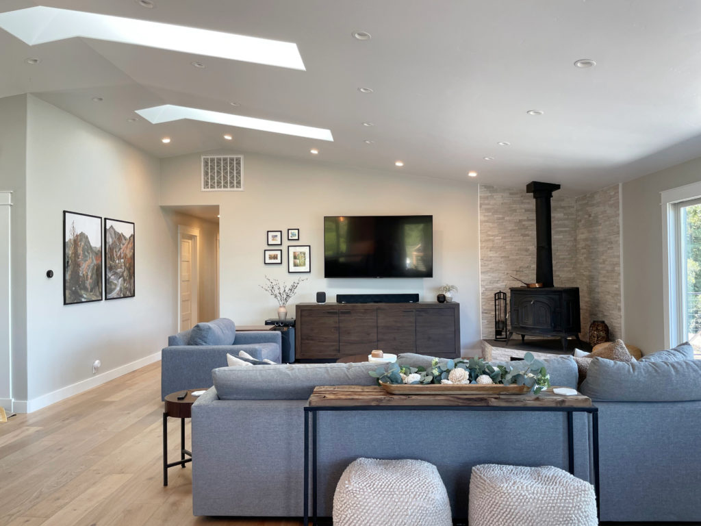
REPOSE GRAY IN A ROOM WITH AVERAGE NATURAL LIGHT
In a room with average natural light, Repose Gray holds itself well, sitting in the light zone without being washed out. Repose Gray is undoubtedly at its personal best in spaces like these.

REPOSE GRAY IN A BRIGHT ROOM
Because Repose Gray has an LRV of 60, it will still wash out a bit in an ULTRA-bright room, but will hold itself better than many of the lighter gray paint colors.
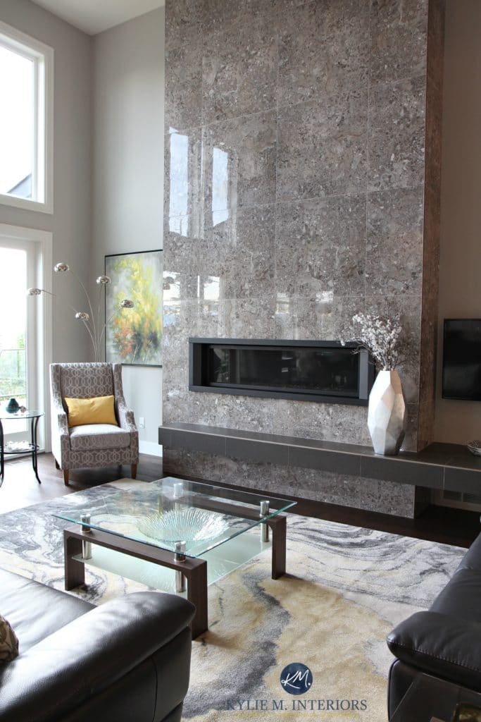
In this next photo, you can see a DRASTIC shift from the left side of the fireplace to the right. Notice how the depth and undertones change with the shift in natural light (the left side is bright northern light).
Let’s take a quick break to talk about paint samples…
Undoubtedly, you’ll be heading out shortly to grab paint samples – stop right there! Please check out SAMPLIZE Peel & Stick. Here are just a few reasons why I recommend Samplize to my clients…
- samples arrive ON YOUR DOORSTEP in 1-3 business days, depending on the location
- they’re more affordable than the samples pots/rollers/foam boards that are needed for traditional paint sampling
- if you keep the samples on their white paper, you can move them around the room
Visit the SAMPLIZE website HERE
WHAT WHITE TRIM COLOR GOES WITH REPOSE GRAY?
When looking for a white paint color for trim, cabinets, ceilings or doors, lean into those that aren’t OVERLY warm, for example…
- Sherwin Williams Pure White with its wink of softness
- Sherwin Williams High Reflective White for a cleaner approach
- Repose Gray does NOT want to be partnered up with an overly warm white!
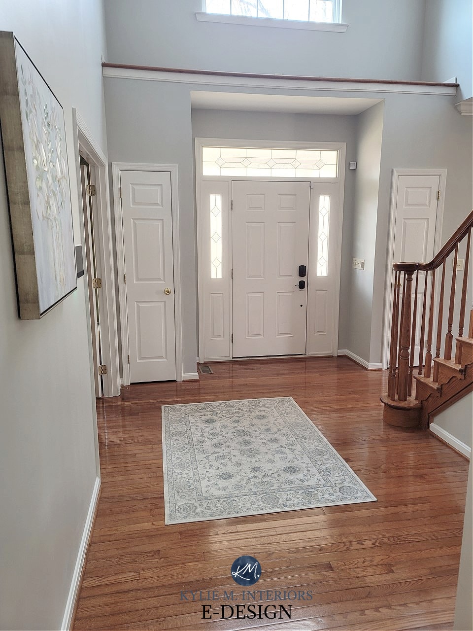
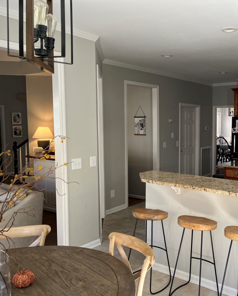
BTW, look at how much blue it grabs in this foyer! This isn’t common, but you still have to be careful!
Sherwin Williams 4 Best White Paint Colors
WHICH PAINT COLOR IS SIMILAR TO OR MATCHES REPOSE GRAY?
There will be NO perfect match when it comes to different brands – each color will have its nuances, undertones and intentions. This is even MORE the case with Repose Gray, as Benjamin Moore doesn’t have anything even CLOSE. However, these colors have similar intentions…
- Benjamin Moore Nimbus
- Benjamin Moore Cumulus Cloud (much warmer)
- also, check out Sherwin Williams On the Rocks and Knitting Needles for a slightly different look
And if you’re thinking of color matching between brands, you might want to read THIS first.
Sherwin Williams Agreeable Gray vs Repose Gray, Revere Pewter & More
WHAT PAINT COLORS GO WITH REPOSE GRAY?
If you’re looking for colors that compliment Repose Gray, check out…
- whites that are bright or only slightly warmer (i.e. Sherwin Williams Pure White)
- shades of gray with similar undertone profiles but more DEPTH, like Dorian Gray or Dovetail
- GRAY-blue-green blends, especially those in the light-medium or medium range (i.e. Sherwin Williams Argos is awesome)
- BLUE-GREEN-gray blends (meaning the gray takes a step back).
- DARKER green-grays like Sherwin Williams Grizzle Gray
- Repose Gray doesn’t always like paint colors that are cooler and lighter than itself OR darker and warmer
Finally, let’s cover a few common questions with…
PEOPLE ALSO ASK THIS ABOUT REPOSE GRAY…
IS REPOSE GRAY STILL A POPULAR PAINT COLOR – IS IT OUTDATED?
While Repose Gray has its following, with trends leaning warmer, it’s not popping up nearly as much. And while it’s not quite outdated, it’s also not the most UPdated approach. Also, there are other warm neutrals with more predictability and flexibility.
IS REPOSE GRAY BETTER THAN AGREEABLE GRAY?
A question like this is ALWAYS open to perception. However, in my Color Consulting, Agreeable Gray is FAR more popular than Repose Gray and is often the better choice for the average room.
DOES REPOSE GRAY GO WITH EVERYTHING?
Heck…no. While Repose Gray can be reasonably flexible, it’s often a bit too cool for interior finishes and rooms with ‘less than ideal’ lighting.
Not sure if Repose Gray is the right color for you? I’ve got more!
READ MORE
Paint Color Review of Sherwin Williams Colonnade Gray
Sherwin Williams Agreeable Gray Paint Color Review
Paint Color Review of Sherwin Williams Light French Gray
The 12 Best WHOLE HOME Gray & Greige Paint Colors
Not sure which gray is best for YOUR home?
Check out my Online Consulting / E-Design Services!
Chat soon,

Written in August 2015, updated in 2022
Comments
Leave a Reply
More Posts

The 5 Best Creamy White or Off-White Paint Colors
THE ELUSIVE ‘CREAMY WHITE NEUTRAL’ When it comes to light, warm neutrals, it’s all in the undertones. And other than pink and green, yellow is the undertone many of my
Read More

The 8 Best Warm Neutral Paint Colors With NO Yellow Undertones!
The Top Light Depth, Warm Colors That Aren’t Cream! When choosing the best warm neutral paint color for your home, whether creamy white, beige, taupe, or greige, your choices are
Read More

The 12 Best Farmhouse Sinks of 2024
FIND YOUR DREAM SINK HERE… While traditional farmhouse design was all the rage in previous years, the embers have definitely cooled. As for MODERN farmhouse, it’s still kickin’ its cowgirl
Read More


I just rented an apartment painted entirely in Repose Gray. I hate it. Not the color itself, but the fact that it doesn’t go with any of my furniture or rugs. Anything warm like tans with yellow in them look repulsive with the paint. If you have clear colors like greens or blues (I have both), forget it. The other thing I’d say about it is that it is best to use in a transitional or contemporary design. It makes good wood look really drab. Unfortunately, house flippers are still obsessed with using this color, so you see it everywhere. It is, in my opinion, by NO means a neutral go-with-anything color. Annnnd . . . remember the effect color has on mood. Gray mixed with brown, people.
Author
Oooo yes, Repose Gray is a TOUGH one. I’ve actually seen it fall out of favor quite a bit in the last few years! Thank you for your comment as it helps others make the best choice for THEIR homes!
Our whole house color is Repose Gray and it’s perfect to add a touch of warmth to our old home (1928). However, I’m struggling to find a coordinating color for our east facing bathroom that butts up against the repose gray hallway. I’ve tried sea salt and it’s too “seafoamy/minty” looking. Healing aloe is looking too minty as well. Do you have any east facing paint color recommendations that coordinate with Repose gray? I haev a small red persian area rug and white tile currently. Thank you!! I’m stuck!
Author
Oh, it’s SO hard to say without seeing the room, but have you checked out the likes of SW Silver Strand???
Hi Kylie, Love your blog and your sense of humor. I am perplexed!! I think I have every paint swatch that BM and SW makes in the grey family. My kitchen is small, western light. I want to paint the cabinets a light grey. My walls are White Dove, which looks very bright. My floors are off white tile which has a bit cream and grey but look light. My quartz is grey and black veining with gold veining on a light background.. I thought White Dove for cabinets or Agreeable Grey, or Repose grey. I want a slight difference from the walls. Any thoughts? Also I thought the quartz would favor a slightly darker cabinet!
Author
Ooo, it’s tough Karen, as White Dove can be a bit FUSSY about its cabinet partners! I wouldn’t do Repose Gray, and with Agreeable Gray, I might just bump down to the light-medium version, Anew Gray. It can also really depend on the undertones in the gray in your space, whether they cater to blue, violet, or green. I do know that REvere Pewter 25% darker looks LOVELY with White Dove (as i have this combo in my home!).
Thanks Kylie…. I just found Crushed Ice while looking for soft grey colors. I was thinking crushed ice on cabinets and white dove on walls. Would they complement each other? Thanks for answering!! 😄
Author
I miiiight just darken Crushed Ice by 25% or lighten White Dove by 25%. Or maybe just look at Pure White instead of White Dove 🙂